
Search results for "Land based wind" in Home Design Ideas
 ZeroEnergy Design
ZeroEnergy Design (ZED) created this modern home for a progressive family in the desirable community of Lexington.
Thoughtful Land Connection. The residence is carefully sited on the infill lot so as to create privacy from the road and neighbors, while cultivating a side yard that captures the southern sun. The terraced grade rises to meet the house, allowing for it to maintain a structured connection with the ground while also sitting above the high water table. The elevated outdoor living space maintains a strong connection with the indoor living space, while the stepped edge ties it back to the true ground plane. Siting and outdoor connections were completed by ZED in collaboration with landscape designer Soren Deniord Design Studio.
Exterior Finishes and Solar. The exterior finish materials include a palette of shiplapped wood siding, through-colored fiber cement panels and stucco. A rooftop parapet hides the solar panels above, while a gutter and site drainage system directs rainwater into an irrigation cistern and dry wells that recharge the groundwater.
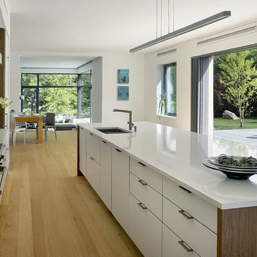
Cooking, Dining, Living. Inside, the kitchen, fabricated by Henrybuilt, is located between the indoor and outdoor dining areas. The expansive south-facing sliding door opens to seamlessly connect the spaces, using a retractable awning to provide shade during the summer while still admitting the warming winter sun. The indoor living space continues from the dining areas across to the sunken living area, with a view that returns again to the outside through the corner wall of glass.
Accessible Guest Suite. The design of the first level guest suite provides for both aging in place and guests who regularly visit for extended stays. The patio off the north side of the house affords guests their own private outdoor space, and privacy from the neighbor. Similarly, the second level master suite opens to an outdoor private roof deck.
Light and Access. The wide open interior stair with a glass panel rail leads from the top level down to the well insulated basement. The design of the basement, used as an away/play space, addresses the need for both natural light and easy access. In addition to the open stairwell, light is admitted to the north side of the area with a high performance, Passive House (PHI) certified skylight, covering a six by sixteen foot area. On the south side, a unique roof hatch set flush with the deck opens to reveal a glass door at the base of the stairwell which provides additional light and access from the deck above down to the play space.
Energy. Energy consumption is reduced by the high performance building envelope, high efficiency mechanical systems, and then offset with renewable energy. All windows and doors are made of high performance triple paned glass with thermally broken aluminum frames. The exterior wall assembly employs dense pack cellulose in the stud cavity, a continuous air barrier, and four inches exterior rigid foam insulation. The 10kW rooftop solar electric system provides clean energy production. The final air leakage testing yielded 0.6 ACH 50 - an extremely air tight house, a testament to the well-designed details, progress testing and quality construction. When compared to a new house built to code requirements, this home consumes only 19% of the energy.
Architecture & Energy Consulting: ZeroEnergy Design
Landscape Design: Soren Deniord Design
Paintings: Bernd Haussmann Studio
Photos: Eric Roth Photography
 Vision Interiors
The Holloway blends the recent revival of mid-century aesthetics with the timelessness of a country farmhouse. Each façade features playfully arranged windows tucked under steeply pitched gables. Natural wood lapped siding emphasizes this homes more modern elements, while classic white board & batten covers the core of this house. A rustic stone water table wraps around the base and contours down into the rear view-out terrace.
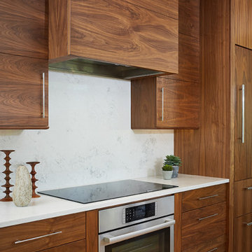
Inside, a wide hallway connects the foyer to the den and living spaces through smooth case-less openings. Featuring a grey stone fireplace, tall windows, and vaulted wood ceiling, the living room bridges between the kitchen and den. The kitchen picks up some mid-century through the use of flat-faced upper and lower cabinets with chrome pulls. Richly toned wood chairs and table cap off the dining room, which is surrounded by windows on three sides. The grand staircase, to the left, is viewable from the outside through a set of giant casement windows on the upper landing. A spacious master suite is situated off of this upper landing. Featuring separate closets, a tiled bath with tub and shower, this suite has a perfect view out to the rear yard through the bedroom's rear windows. All the way upstairs, and to the right of the staircase, is four separate bedrooms. Downstairs, under the master suite, is a gymnasium. This gymnasium is connected to the outdoors through an overhead door and is perfect for athletic activities or storing a boat during cold months. The lower level also features a living room with a view out windows and a private guest suite.
Architect: Visbeen Architects
Photographer: Ashley Avila Photography
Builder: AVB Inc.
 SunSwallow Design, LLC
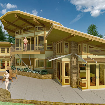
 The clients called me on the recommendation from a neighbor of mine who had met them at a conference and learned of their need for an architect. They contacted me and after meeting to discuss their project they invited me to visit their site, not far from White Salmon in Washington State.
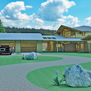
Initially, the couple discussed building a ‘Weekend’ retreat on their 20± acres of land. Their site was in the foothills of a range of mountains that offered views of both Mt. Adams to the North and Mt. Hood to the South. They wanted to develop a place that was ‘cabin-like’ but with a degree of refinement to it and take advantage of the primary views to the north, south and west. They also wanted to have a strong connection to their immediate outdoors.
Before long my clients came to the conclusion that they no longer perceived this as simply a weekend retreat but were now interested in making this their primary residence. With this new focus we concentrated on keeping the refined cabin approach but needed to add some additional functions and square feet to the original program.
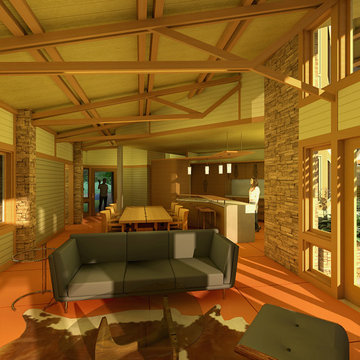
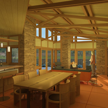
They wanted to downsize from their current 3,500± SF city residence to a more modest 2,000 – 2,500 SF space. They desired a singular open Living, Dining and Kitchen area but needed to have a separate room for their television and upright piano. They were empty nesters and wanted only two bedrooms and decided that they would have two ‘Master’ bedrooms, one on the lower floor and the other on the upper floor (they planned to build additional ‘Guest’ cabins to accommodate others in the near future). The original scheme for the weekend retreat was only one floor with the second bedroom tucked away on the north side of the house next to the breezeway opposite of the carport.
Another consideration that we had to resolve was that the particular location that was deemed the best building site had diametrically opposed advantages and disadvantages. The views and primary solar orientations were also the source of the prevailing winds, out of the Southwest.
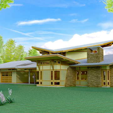
The resolve was to provide a semi-circular low-profile earth berm on the south/southwest side of the structure to serve as a wind-foil directing the strongest breezes up and over the structure. Because our selected site was in a saddle of land that then sloped off to the south/southwest the combination of the earth berm and the sloping hill would effectively created a ‘nestled’ form allowing the winds rushing up the hillside to shoot over most of the house. This allowed me to keep the favorable orientation to both the views and sun without being completely compromised by the winds.
Find the right local pro for your project
 Open Door Furniture
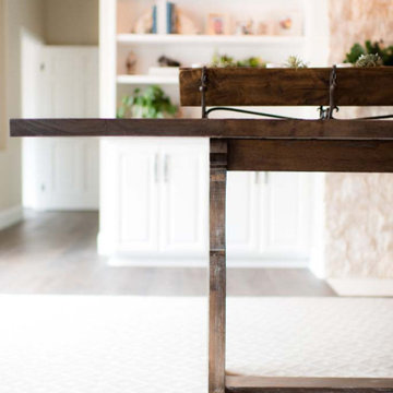
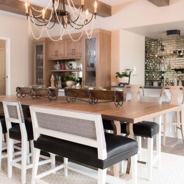
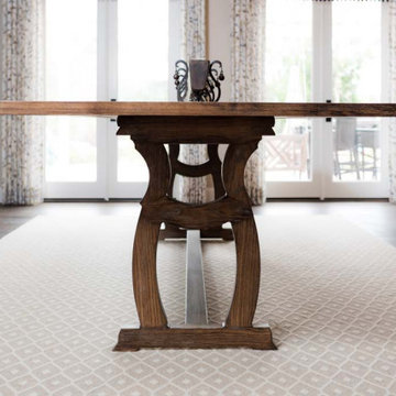
This is another beautiful piece we feel privileged to be a part of creating that was designed by Alicia Jonik of Tracy Lynn Studios. This is definitely the feature piece of this dining area and the seating decision to go without head chairs allows the eye to be drawn to this stunning custom table and base.
The base is style lands somewhere between transitional and contemporary which matches the overall vibe of this stunning dining room. It is 2" thick solid Ash wood to carry the load of the 1.5" thick solid Ash table top. The joints are all floating mortise and tenon joinery to ensure durability in this heirloom piece of furniture. There are 3 stretchers that tie the bases together into one unit to connect to the top. The stretchers will keep the top from sagging over time as well as prevent any racking of the outside legs. The base is slotted underneath at the connection points to allow for the substantial seasonal wood movement that will happen from the horizontal stacked plank table top. The top is laced with recessed steel c-channel to give the table a substantial amount of support and help keep it flat over time. The finish we came up with for this table was a custom mix of mid tone earth browns that are accented by whitewashed grain to help tie it to other light tones in the room.
What a beautiful space that this landed in. We are thrilled to have our table featured here!
 SunSwallow Design, LLC
 The clients called me on the recommendation from a neighbor of mine who had met them at a conference and learned of their need for an architect. They contacted me and after meeting to discuss their project they invited me to visit their site, not far from White Salmon in Washington State.
Initially, the couple discussed building a ‘Weekend’ retreat on their 20± acres of land. Their site was in the foothills of a range of mountains that offered views of both Mt. Adams to the North and Mt. Hood to the South. They wanted to develop a place that was ‘cabin-like’ but with a degree of refinement to it and take advantage of the primary views to the north, south and west. They also wanted to have a strong connection to their immediate outdoors.
Before long my clients came to the conclusion that they no longer perceived this as simply a weekend retreat but were now interested in making this their primary residence. With this new focus we concentrated on keeping the refined cabin approach but needed to add some additional functions and square feet to the original program.
They wanted to downsize from their current 3,500± SF city residence to a more modest 2,000 – 2,500 SF space. They desired a singular open Living, Dining and Kitchen area but needed to have a separate room for their television and upright piano. They were empty nesters and wanted only two bedrooms and decided that they would have two ‘Master’ bedrooms, one on the lower floor and the other on the upper floor (they planned to build additional ‘Guest’ cabins to accommodate others in the near future). The original scheme for the weekend retreat was only one floor with the second bedroom tucked away on the north side of the house next to the breezeway opposite of the carport.
Another consideration that we had to resolve was that the particular location that was deemed the best building site had diametrically opposed advantages and disadvantages. The views and primary solar orientations were also the source of the prevailing winds, out of the Southwest.
The resolve was to provide a semi-circular low-profile earth berm on the south/southwest side of the structure to serve as a wind-foil directing the strongest breezes up and over the structure. Because our selected site was in a saddle of land that then sloped off to the south/southwest the combination of the earth berm and the sloping hill would effectively created a ‘nestled’ form allowing the winds rushing up the hillside to shoot over most of the house. This allowed me to keep the favorable orientation to both the views and sun without being completely compromised by the winds.
 Open Door Furniture
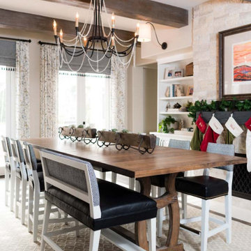
This is another beautiful piece we feel privileged to be a part of creating that was designed by Alicia Jonik of Tracy Lynn Studios. This is definitely the feature piece of this dining area and the seating decision to go without head chairs allows the eye to be drawn to this stunning custom table and base.
The base is style lands somewhere between transitional and contemporary which matches the overall vibe of this stunning dining room. It is 2" thick solid Ash wood to carry the load of the 1.5" thick solid Ash table top. The joints are all floating mortise and tenon joinery to ensure durability in this heirloom piece of furniture. There are 3 stretchers that tie the bases together into one unit to connect to the top. The stretchers will keep the top from sagging over time as well as prevent any racking of the outside legs. The base is slotted underneath at the connection points to allow for the substantial seasonal wood movement that will happen from the horizontal stacked plank table top. The top is laced with recessed steel c-channel to give the table a substantial amount of support and help keep it flat over time. The finish we came up with for this table was a custom mix of mid tone earth browns that are accented by whitewashed grain to help tie it to other light tones in the room.
What a beautiful space that this landed in. We are thrilled to have our table featured here!
 Open Door Furniture
This is another beautiful piece we feel privileged to be a part of creating that was designed by Alicia Jonik of Tracy Lynn Studios. This is definitely the feature piece of this dining area and the seating decision to go without head chairs allows the eye to be drawn to this stunning custom table and base.
The base is style lands somewhere between transitional and contemporary which matches the overall vibe of this stunning dining room. It is 2" thick solid Ash wood to carry the load of the 1.5" thick solid Ash table top. The joints are all floating mortise and tenon joinery to ensure durability in this heirloom piece of furniture. There are 3 stretchers that tie the bases together into one unit to connect to the top. The stretchers will keep the top from sagging over time as well as prevent any racking of the outside legs. The base is slotted underneath at the connection points to allow for the substantial seasonal wood movement that will happen from the horizontal stacked plank table top. The top is laced with recessed steel c-channel to give the table a substantial amount of support and help keep it flat over time. The finish we came up with for this table was a custom mix of mid tone earth browns that are accented by whitewashed grain to help tie it to other light tones in the room.
What a beautiful space that this landed in. We are thrilled to have our table featured here!

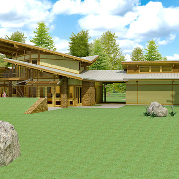 SunSwallow Design, LLC
 The clients called me on the recommendation from a neighbor of mine who had met them at a conference and learned of their need for an architect. They contacted me and after meeting to discuss their project they invited me to visit their site, not far from White Salmon in Washington State.
Initially, the couple discussed building a ‘Weekend’ retreat on their 20± acres of land. Their site was in the foothills of a range of mountains that offered views of both Mt. Adams to the North and Mt. Hood to the South. They wanted to develop a place that was ‘cabin-like’ but with a degree of refinement to it and take advantage of the primary views to the north, south and west. They also wanted to have a strong connection to their immediate outdoors.
Before long my clients came to the conclusion that they no longer perceived this as simply a weekend retreat but were now interested in making this their primary residence. With this new focus we concentrated on keeping the refined cabin approach but needed to add some additional functions and square feet to the original program.
They wanted to downsize from their current 3,500± SF city residence to a more modest 2,000 – 2,500 SF space. They desired a singular open Living, Dining and Kitchen area but needed to have a separate room for their television and upright piano. They were empty nesters and wanted only two bedrooms and decided that they would have two ‘Master’ bedrooms, one on the lower floor and the other on the upper floor (they planned to build additional ‘Guest’ cabins to accommodate others in the near future). The original scheme for the weekend retreat was only one floor with the second bedroom tucked away on the north side of the house next to the breezeway opposite of the carport.
Another consideration that we had to resolve was that the particular location that was deemed the best building site had diametrically opposed advantages and disadvantages. The views and primary solar orientations were also the source of the prevailing winds, out of the Southwest.
The resolve was to provide a semi-circular low-profile earth berm on the south/southwest side of the structure to serve as a wind-foil directing the strongest breezes up and over the structure. Because our selected site was in a saddle of land that then sloped off to the south/southwest the combination of the earth berm and the sloping hill would effectively created a ‘nestled’ form allowing the winds rushing up the hillside to shoot over most of the house. This allowed me to keep the favorable orientation to both the views and sun without being completely compromised by the winds.
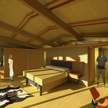 SunSwallow Design, LLC
 The clients called me on the recommendation from a neighbor of mine who had met them at a conference and learned of their need for an architect. They contacted me and after meeting to discuss their project they invited me to visit their site, not far from White Salmon in Washington State.
Initially, the couple discussed building a ‘Weekend’ retreat on their 20± acres of land. Their site was in the foothills of a range of mountains that offered views of both Mt. Adams to the North and Mt. Hood to the South. They wanted to develop a place that was ‘cabin-like’ but with a degree of refinement to it and take advantage of the primary views to the north, south and west. They also wanted to have a strong connection to their immediate outdoors.
Before long my clients came to the conclusion that they no longer perceived this as simply a weekend retreat but were now interested in making this their primary residence. With this new focus we concentrated on keeping the refined cabin approach but needed to add some additional functions and square feet to the original program.
They wanted to downsize from their current 3,500± SF city residence to a more modest 2,000 – 2,500 SF space. They desired a singular open Living, Dining and Kitchen area but needed to have a separate room for their television and upright piano. They were empty nesters and wanted only two bedrooms and decided that they would have two ‘Master’ bedrooms, one on the lower floor and the other on the upper floor (they planned to build additional ‘Guest’ cabins to accommodate others in the near future). The original scheme for the weekend retreat was only one floor with the second bedroom tucked away on the north side of the house next to the breezeway opposite of the carport.
Another consideration that we had to resolve was that the particular location that was deemed the best building site had diametrically opposed advantages and disadvantages. The views and primary solar orientations were also the source of the prevailing winds, out of the Southwest.
The resolve was to provide a semi-circular low-profile earth berm on the south/southwest side of the structure to serve as a wind-foil directing the strongest breezes up and over the structure. Because our selected site was in a saddle of land that then sloped off to the south/southwest the combination of the earth berm and the sloping hill would effectively created a ‘nestled’ form allowing the winds rushing up the hillside to shoot over most of the house. This allowed me to keep the favorable orientation to both the views and sun without being completely compromised by the winds.
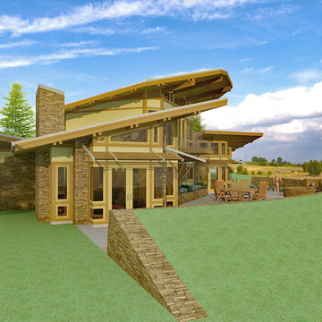 SunSwallow Design, LLC
 The clients called me on the recommendation from a neighbor of mine who had met them at a conference and learned of their need for an architect. They contacted me and after meeting to discuss their project they invited me to visit their site, not far from White Salmon in Washington State.
Initially, the couple discussed building a ‘Weekend’ retreat on their 20± acres of land. Their site was in the foothills of a range of mountains that offered views of both Mt. Adams to the North and Mt. Hood to the South. They wanted to develop a place that was ‘cabin-like’ but with a degree of refinement to it and take advantage of the primary views to the north, south and west. They also wanted to have a strong connection to their immediate outdoors.
Before long my clients came to the conclusion that they no longer perceived this as simply a weekend retreat but were now interested in making this their primary residence. With this new focus we concentrated on keeping the refined cabin approach but needed to add some additional functions and square feet to the original program.
They wanted to downsize from their current 3,500± SF city residence to a more modest 2,000 – 2,500 SF space. They desired a singular open Living, Dining and Kitchen area but needed to have a separate room for their television and upright piano. They were empty nesters and wanted only two bedrooms and decided that they would have two ‘Master’ bedrooms, one on the lower floor and the other on the upper floor (they planned to build additional ‘Guest’ cabins to accommodate others in the near future). The original scheme for the weekend retreat was only one floor with the second bedroom tucked away on the north side of the house next to the breezeway opposite of the carport.
Another consideration that we had to resolve was that the particular location that was deemed the best building site had diametrically opposed advantages and disadvantages. The views and primary solar orientations were also the source of the prevailing winds, out of the Southwest.
The resolve was to provide a semi-circular low-profile earth berm on the south/southwest side of the structure to serve as a wind-foil directing the strongest breezes up and over the structure. Because our selected site was in a saddle of land that then sloped off to the south/southwest the combination of the earth berm and the sloping hill would effectively created a ‘nestled’ form allowing the winds rushing up the hillside to shoot over most of the house. This allowed me to keep the favorable orientation to both the views and sun without being completely compromised by the winds.

 safe ZOnea
Ask a kitchen designer in Chicago which countertop question comes up most and you will hear the same answer: white or off-white quartz, and which shade. Homeowners walk into showrooms with a photo saved on their phone, usually a bright, veined slab from a magazine spread, and leave an hour later realizing there are a dozen versions of that same look. The confusion is not about taste. It is about the fact that "white quartz" covers a huge range of patterns, undertones, and price points, and nobody explains the differences before the sale.
Older bungalows and newer builds alike are getting stripped of their dated laminate and butcher block in favor of quartz, and the reasons are practical rather than trendy. Quartz does not need sealing, resists the kind of staining that granite can suffer over decades, and holds up to the freeze-thaw humidity swings that Chicago basements and kitchens go through every year. Once a homeowner commits to quartz, though, the real decision starts: which white, and does the pattern justify the difference in cost.
This piece walks through three specific slabs that keep showing up in Chicago renovation projects, why designers reach for them in different rooms, and what actually separates a flat white surface from one with real depth. None of this requires a design background to follow. It is mostly about paying attention to how a slab behaves under kitchen lighting, how busy the vending gets, and how it photographs versus how it looks in person.
Why White Quartz Took Over Chicago Kitchens
Ten years ago, granite dominated Chicago kitchen remodels almost by default. It was durable, it looked expensive, and every fabricator in the metro area carried a wide range of colors. Quartz has since taken over that position, and the shift happened faster than most contractors expected. Engineered stone gave homeowners a more predictable surface, since natural granite varies slab to slab while quartz is manufactured to a consistent pattern batch after batch.
The other driver is light. Chicago winters are long and gray, and a lot of kitchens, especially in older two-flats and courtyard buildings, do not get much direct sun. A dark granite countertop in a dim kitchen can make the whole room feel smaller. White and light-toned quartz reflects what little natural light comes through the windows, and it makes a galley kitchen or a north-facing space feel noticeably brighter without touching the cabinetry or the layout.
There is also a resale argument that local real estate agents bring up constantly. White quartz photographs well for listings, reads as updated and low-maintenance to buyers touring in person, and does not compete visually with whatever cabinet color the next owner might prefer. It is a safer bet than a bold veined marble look or a colored quartz that might feel dated in five years.
Arctic White and the Cost Question
Among the flatter, more uniform whites, arctic white quartz price comes up constantly in budget conversations because the slab sits at a more approachable point than the heavily veined Italian-marble-inspired patterns. It reads as clean and bright without the busy movement that some homeowners find overwhelming in a small kitchen. Fabricators in the Chicago area tend to keep it in stock precisely because demand stays steady across both new construction and remodel projects.
Part of what keeps this slab affordable relative to its heavily patterned cousins comes down to manufacturing complexity. A quartz surface with minimal veining and a consistent white base is simpler to produce at scale than one that mimics the irregular, high-contrast movement of natural Calacatta marble. That production difference shows up directly in what a homeowner pays per square foot, and it is worth asking a fabricator to walk through that pricing before assuming every white quartz costs the same.
Homeowners planning a full kitchen, including an island, backsplash, and perimeter counters, often use a flatter white like this specifically because it lets other elements carry the visual interest. A patterned tile backsplash or a bold cabinet color reads more clearly against a calm countertop than against one already fighting for attention with heavy veining. Designers frequently pair simpler whites with statement lighting fixtures for exactly this reason.
What Makes Calacatta Patterns Different
Calacatta refers to a family of marble originally quarried in Italy, known for a bright white background broken up by bold, often gold-toned veining that moves in thick, dramatic streaks rather than thin gray lines. Natural Calacatta marble is soft, porous, and expensive to maintain, which is exactly why quartz manufacturers spent years developing engineered versions that replicate the look without the upkeep headaches.
The challenge with any Calacatta-style quartz is getting the veining to look organic instead of printed. Early generations of engineered stone struggled with repetitive patterns that gave away the fact the slab was manufactured rather than cut from actual marble. Modern digital printing and layering techniques have closed that gap considerably, and the better Calacatta-inspired quartz lines now vary the veining across each slab batch so two counters in the same kitchen do not look identical.
Chicago designers gravitate toward Calacatta patterns for kitchens that function as the visual centerpiece of an open floor plan, which describes a large share of the gut renovations happening in neighborhoods like Lincoln Park, Roscoe Village, and the North Shore suburbs. When the kitchen island is visible from the living room and dining area, a dramatic veined surface becomes part of the home's overall design language rather than a purely functional work surface.
Calacatta Arno Under Kitchen Lighting
One of the more popular options in this category, calacatta arno quartz, balances a warm white base with soft gray and gold veining that avoids looking too stark under the cooler LED lighting common in newer Chicago builds. Homeowners touring showrooms sometimes make the mistake of judging a slab entirely under warm incandescent lighting, then get surprised when the same surface looks slightly different once installed under their kitchen's actual fixtures.
What separates this particular pattern from flatter competitors is how the veining clusters rather than spreading evenly across the slab. That clustering mimics the way real quarried marble forms, with denser mineral deposits in some sections and cleaner stretches in others. Fabricators cutting a large island slab from a single piece will often orient the pattern intentionally so the busiest veining lands somewhere visually interesting rather than getting cut off at an edge.
Because the background reads warmer than a stark white, this pattern tends to pair well with brass or matte gold hardware, a combination that has been showing up repeatedly in Chicago kitchen remodels over the past few renovation seasons. Cabinet painters report a similar trend, with more clients requesting warm white or greige cabinet colors specifically because they complement this kind of veined quartz better than a cooler, blue-toned white would.
Silestone's Version of the Calacatta Look
Manufacturers compete directly in this Calacatta-inspired category, and silestone eternal calacatta gold represents one brand's specific take on the pattern, distinguished by richer gold veining set against a brighter white base than some competing slabs in the same family. Silestone has built a reputation around anti-bacterial surface treatments in addition to the standard quartz durability, a detail some homeowners specifically ask about for kitchens used heavily by families with young children.
The veining in this particular slab tends to run in longer, more continuous lines compared to the clustered pattern found in some other Calacatta-style options, which gives large island surfaces a sense of visual flow from one end to the other. Fabricators working with bigger islands, the kind increasingly common in open-concept Chicago remodels, often favor patterns like this because there is less need to worry about seams interrupting a busy, disconnected pattern.
Price positioning for this slab tends to sit toward the upper end of the engineered quartz category, reflecting both the brand's manufacturing process and the complexity of replicating that continuous gold veining consistently across production batches. Homeowners weighing this option against other Calacatta-style quartz should ask their fabricator directly about batch availability, since premium patterns sometimes have longer lead times than standard stock colors.
Living With Quartz Day to Day
Beyond how a slab looks in a showroom or a listing photo, the daily experience of owning quartz countertops matters more once the renovation dust settles. Quartz resists scratching far better than laminate and holds up to the acidic spills, hot pans, and general abuse of an active kitchen without the sealing maintenance that natural stone requires every year or two. That low-maintenance reputation is a large part of why quartz overtook granite in the first place.
Heat resistance is a detail that gets less attention than it should. While quartz handles moderate heat well, manufacturers generally recommend using a trivet or pad for very hot pots straight off the stove, since sudden temperature shock can occasionally cause stress marks in the resin binder that holds the engineered stone together. This is a minor precaution rather than a major limitation, but it is worth mentioning to anyone assuming quartz is entirely indestructible.
Cleaning routines stay simple across almost every pattern in this category. A damp cloth and mild soap handle daily messes, and the nonporous surface means wine, coffee, and tomato-based sauces do not soak in the way they can with unsealed granite or marble. Homeowners moving from an older stone counter often mention how much less they worry about everyday spills once quartz is installed, which is a quality-of-life change that rarely makes it into the initial design conversation.
Choosing Between the Three
There is no single correct answer among these three slabs, and that is exactly why they keep coming up together in the same design conversations across Chicago renovation projects. A flatter white with minimal veining suits kitchens where other elements need to carry the visual interest, while a bolder Calacatta-inspired pattern makes sense when the countertop itself is meant to be the centerpiece of an open floor plan.
Budget matters too, and it is worth having a direct conversation with a fabricator about where each option lands before falling in love with a specific slab in a showroom. Lighting, cabinet color, and how the kitchen connects to the rest of the home all play into which pattern will actually look right once installation is finished rather than just in a photo.
Whatever direction a homeowner leans, seeing a full slab in person under actual kitchen lighting remains the single most useful step before signing off. Photos only go so far once the countertop is sitting in the room it will live in for years.
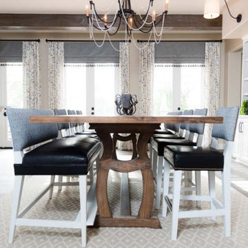 Open Door Furniture
This is another beautiful piece we feel privileged to be a part of creating that was designed by Alicia Jonik of Tracy Lynn Studios. This is definitely the feature piece of this dining area and the seating decision to go without head chairs allows the eye to be drawn to this stunning custom table and base.
The base is style lands somewhere between transitional and contemporary which matches the overall vibe of this stunning dining room. It is 2" thick solid Ash wood to carry the load of the 1.5" thick solid Ash table top. The joints are all floating mortise and tenon joinery to ensure durability in this heirloom piece of furniture. There are 3 stretchers that tie the bases together into one unit to connect to the top. The stretchers will keep the top from sagging over time as well as prevent any racking of the outside legs. The base is slotted underneath at the connection points to allow for the substantial seasonal wood movement that will happen from the horizontal stacked plank table top. The top is laced with recessed steel c-channel to give the table a substantial amount of support and help keep it flat over time. The finish we came up with for this table was a custom mix of mid tone earth browns that are accented by whitewashed grain to help tie it to other light tones in the room.
What a beautiful space that this landed in. We are thrilled to have our table featured here!
 Open Door Furniture
This is another beautiful piece we feel privileged to be a part of creating that was designed by Alicia Jonik of Tracy Lynn Studios. This is definitely the feature piece of this dining area and the seating decision to go without head chairs allows the eye to be drawn to this stunning custom table and base.
The base is style lands somewhere between transitional and contemporary which matches the overall vibe of this stunning dining room. It is 2" thick solid Ash wood to carry the load of the 1.5" thick solid Ash table top. The joints are all floating mortise and tenon joinery to ensure durability in this heirloom piece of furniture. There are 3 stretchers that tie the bases together into one unit to connect to the top. The stretchers will keep the top from sagging over time as well as prevent any racking of the outside legs. The base is slotted underneath at the connection points to allow for the substantial seasonal wood movement that will happen from the horizontal stacked plank table top. The top is laced with recessed steel c-channel to give the table a substantial amount of support and help keep it flat over time. The finish we came up with for this table was a custom mix of mid tone earth browns that are accented by whitewashed grain to help tie it to other light tones in the room.
What a beautiful space that this landed in. We are thrilled to have our table featured here!
 SunSwallow Design, LLC
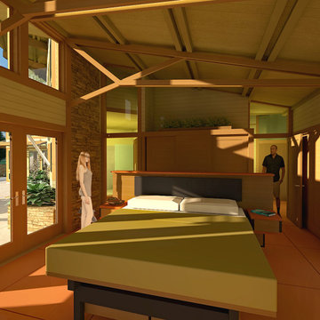
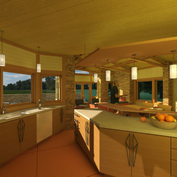
 The clients called me on the recommendation from a neighbor of mine who had met them at a conference and learned of their need for an architect. They contacted me and after meeting to discuss their project they invited me to visit their site, not far from White Salmon in Washington State.
Initially, the couple discussed building a ‘Weekend’ retreat on their 20± acres of land. Their site was in the foothills of a range of mountains that offered views of both Mt. Adams to the North and Mt. Hood to the South. They wanted to develop a place that was ‘cabin-like’ but with a degree of refinement to it and take advantage of the primary views to the north, south and west. They also wanted to have a strong connection to their immediate outdoors.
Before long my clients came to the conclusion that they no longer perceived this as simply a weekend retreat but were now interested in making this their primary residence. With this new focus we concentrated on keeping the refined cabin approach but needed to add some additional functions and square feet to the original program.
They wanted to downsize from their current 3,500± SF city residence to a more modest 2,000 – 2,500 SF space. They desired a singular open Living, Dining and Kitchen area but needed to have a separate room for their television and upright piano. They were empty nesters and wanted only two bedrooms and decided that they would have two ‘Master’ bedrooms, one on the lower floor and the other on the upper floor (they planned to build additional ‘Guest’ cabins to accommodate others in the near future). The original scheme for the weekend retreat was only one floor with the second bedroom tucked away on the north side of the house next to the breezeway opposite of the carport.
Another consideration that we had to resolve was that the particular location that was deemed the best building site had diametrically opposed advantages and disadvantages. The views and primary solar orientations were also the source of the prevailing winds, out of the Southwest.
The resolve was to provide a semi-circular low-profile earth berm on the south/southwest side of the structure to serve as a wind-foil directing the strongest breezes up and over the structure. Because our selected site was in a saddle of land that then sloped off to the south/southwest the combination of the earth berm and the sloping hill would effectively created a ‘nestled’ form allowing the winds rushing up the hillside to shoot over most of the house. This allowed me to keep the favorable orientation to both the views and sun without being completely compromised by the winds.
 SunSwallow Design, LLC
 The clients called me on the recommendation from a neighbor of mine who had met them at a conference and learned of their need for an architect. They contacted me and after meeting to discuss their project they invited me to visit their site, not far from White Salmon in Washington State.
Initially, the couple discussed building a ‘Weekend’ retreat on their 20± acres of land. Their site was in the foothills of a range of mountains that offered views of both Mt. Adams to the North and Mt. Hood to the South. They wanted to develop a place that was ‘cabin-like’ but with a degree of refinement to it and take advantage of the primary views to the north, south and west. They also wanted to have a strong connection to their immediate outdoors.
Before long my clients came to the conclusion that they no longer perceived this as simply a weekend retreat but were now interested in making this their primary residence. With this new focus we concentrated on keeping the refined cabin approach but needed to add some additional functions and square feet to the original program.
They wanted to downsize from their current 3,500± SF city residence to a more modest 2,000 – 2,500 SF space. They desired a singular open Living, Dining and Kitchen area but needed to have a separate room for their television and upright piano. They were empty nesters and wanted only two bedrooms and decided that they would have two ‘Master’ bedrooms, one on the lower floor and the other on the upper floor (they planned to build additional ‘Guest’ cabins to accommodate others in the near future). The original scheme for the weekend retreat was only one floor with the second bedroom tucked away on the north side of the house next to the breezeway opposite of the carport.
Another consideration that we had to resolve was that the particular location that was deemed the best building site had diametrically opposed advantages and disadvantages. The views and primary solar orientations were also the source of the prevailing winds, out of the Southwest.
The resolve was to provide a semi-circular low-profile earth berm on the south/southwest side of the structure to serve as a wind-foil directing the strongest breezes up and over the structure. Because our selected site was in a saddle of land that then sloped off to the south/southwest the combination of the earth berm and the sloping hill would effectively created a ‘nestled’ form allowing the winds rushing up the hillside to shoot over most of the house. This allowed me to keep the favorable orientation to both the views and sun without being completely compromised by the winds.
 SunSwallow Design, LLC
 The clients called me on the recommendation from a neighbor of mine who had met them at a conference and learned of their need for an architect. They contacted me and after meeting to discuss their project they invited me to visit their site, not far from White Salmon in Washington State.
Initially, the couple discussed building a ‘Weekend’ retreat on their 20± acres of land. Their site was in the foothills of a range of mountains that offered views of both Mt. Adams to the North and Mt. Hood to the South. They wanted to develop a place that was ‘cabin-like’ but with a degree of refinement to it and take advantage of the primary views to the north, south and west. They also wanted to have a strong connection to their immediate outdoors.
Before long my clients came to the conclusion that they no longer perceived this as simply a weekend retreat but were now interested in making this their primary residence. With this new focus we concentrated on keeping the refined cabin approach but needed to add some additional functions and square feet to the original program.
They wanted to downsize from their current 3,500± SF city residence to a more modest 2,000 – 2,500 SF space. They desired a singular open Living, Dining and Kitchen area but needed to have a separate room for their television and upright piano. They were empty nesters and wanted only two bedrooms and decided that they would have two ‘Master’ bedrooms, one on the lower floor and the other on the upper floor (they planned to build additional ‘Guest’ cabins to accommodate others in the near future). The original scheme for the weekend retreat was only one floor with the second bedroom tucked away on the north side of the house next to the breezeway opposite of the carport.
Another consideration that we had to resolve was that the particular location that was deemed the best building site had diametrically opposed advantages and disadvantages. The views and primary solar orientations were also the source of the prevailing winds, out of the Southwest.
The resolve was to provide a semi-circular low-profile earth berm on the south/southwest side of the structure to serve as a wind-foil directing the strongest breezes up and over the structure. Because our selected site was in a saddle of land that then sloped off to the south/southwest the combination of the earth berm and the sloping hill would effectively created a ‘nestled’ form allowing the winds rushing up the hillside to shoot over most of the house. This allowed me to keep the favorable orientation to both the views and sun without being completely compromised by the winds.
 SunSwallow Design, LLC
 The clients called me on the recommendation from a neighbor of mine who had met them at a conference and learned of their need for an architect. They contacted me and after meeting to discuss their project they invited me to visit their site, not far from White Salmon in Washington State.
Initially, the couple discussed building a ‘Weekend’ retreat on their 20± acres of land. Their site was in the foothills of a range of mountains that offered views of both Mt. Adams to the North and Mt. Hood to the South. They wanted to develop a place that was ‘cabin-like’ but with a degree of refinement to it and take advantage of the primary views to the north, south and west. They also wanted to have a strong connection to their immediate outdoors.
Before long my clients came to the conclusion that they no longer perceived this as simply a weekend retreat but were now interested in making this their primary residence. With this new focus we concentrated on keeping the refined cabin approach but needed to add some additional functions and square feet to the original program.
They wanted to downsize from their current 3,500± SF city residence to a more modest 2,000 – 2,500 SF space. They desired a singular open Living, Dining and Kitchen area but needed to have a separate room for their television and upright piano. They were empty nesters and wanted only two bedrooms and decided that they would have two ‘Master’ bedrooms, one on the lower floor and the other on the upper floor (they planned to build additional ‘Guest’ cabins to accommodate others in the near future). The original scheme for the weekend retreat was only one floor with the second bedroom tucked away on the north side of the house next to the breezeway opposite of the carport.
Another consideration that we had to resolve was that the particular location that was deemed the best building site had diametrically opposed advantages and disadvantages. The views and primary solar orientations were also the source of the prevailing winds, out of the Southwest.
The resolve was to provide a semi-circular low-profile earth berm on the south/southwest side of the structure to serve as a wind-foil directing the strongest breezes up and over the structure. Because our selected site was in a saddle of land that then sloped off to the south/southwest the combination of the earth berm and the sloping hill would effectively created a ‘nestled’ form allowing the winds rushing up the hillside to shoot over most of the house. This allowed me to keep the favorable orientation to both the views and sun without being completely compromised by the winds.

 SunSwallow Design, LLC
 The clients called me on the recommendation from a neighbor of mine who had met them at a conference and learned of their need for an architect. They contacted me and after meeting to discuss their project they invited me to visit their site, not far from White Salmon in Washington State.
Initially, the couple discussed building a ‘Weekend’ retreat on their 20± acres of land. Their site was in the foothills of a range of mountains that offered views of both Mt. Adams to the North and Mt. Hood to the South. They wanted to develop a place that was ‘cabin-like’ but with a degree of refinement to it and take advantage of the primary views to the north, south and west. They also wanted to have a strong connection to their immediate outdoors.
Before long my clients came to the conclusion that they no longer perceived this as simply a weekend retreat but were now interested in making this their primary residence. With this new focus we concentrated on keeping the refined cabin approach but needed to add some additional functions and square feet to the original program.
They wanted to downsize from their current 3,500± SF city residence to a more modest 2,000 – 2,500 SF space. They desired a singular open Living, Dining and Kitchen area but needed to have a separate room for their television and upright piano. They were empty nesters and wanted only two bedrooms and decided that they would have two ‘Master’ bedrooms, one on the lower floor and the other on the upper floor (they planned to build additional ‘Guest’ cabins to accommodate others in the near future). The original scheme for the weekend retreat was only one floor with the second bedroom tucked away on the north side of the house next to the breezeway opposite of the carport.
Another consideration that we had to resolve was that the particular location that was deemed the best building site had diametrically opposed advantages and disadvantages. The views and primary solar orientations were also the source of the prevailing winds, out of the Southwest.
The resolve was to provide a semi-circular low-profile earth berm on the south/southwest side of the structure to serve as a wind-foil directing the strongest breezes up and over the structure. Because our selected site was in a saddle of land that then sloped off to the south/southwest the combination of the earth berm and the sloping hill would effectively created a ‘nestled’ form allowing the winds rushing up the hillside to shoot over most of the house. This allowed me to keep the favorable orientation to both the views and sun without being completely compromised by the winds.
 Jon Allen Fine Metal Art
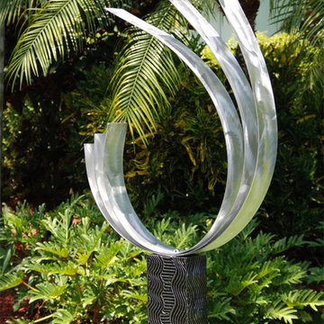
"Triple C" - Modern Abstract Metal Garden Sculpture
The three elements of this free-standing contemporary sculpture, visually weighty metal bands, unfurl themselves from a common point on the sculpture's base, opening up to the sky like an abstracted flower blossom. The brushed surface texture of the metal reflects light, making the piece dance in the sun.
Dimensions:
- Approximately 42"H x 18"L x 6"D including the 14" artistically textured wooden base.
- Ready to secure to a patio, deck or garden stone with the included pre-drilled mounting plate for easy installation.(Screws not included)
Color: All Natural Silver
Please note: custom pieces are available for your size and color specifications.
 Innovate Building Solutions
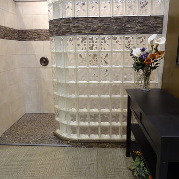
This glass block wall included a decorative tile row through one course of the blocks. In addition a barrier free ready for tile base was used to make this shower handicap accessible as well.
11