
Search results for "Larger task" in Home Design Ideas
 Amazing Spaces
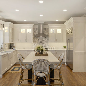
Using white as the backdrop color, deep navy blue cabinetry is used on the island and echoes the accent color in the backsplash mosaic tile behind the hood. Glass inserts are strategically integrated into lighted cabinets, adding interest and illumination to the white wall cabinets. The soothing grey beadboard backsplash adds texture and speaks to the beachy aesthetic. To ensure a durable solution especially behind the sink, the bead board is installed above a 5” tall piece of quartz. We opted for a statement chandelier over the dining table in lieu of pendant lighting over the island, and added a single sconce above the window over the farmhouse sink. Additional accent lighting inside the glass cabinets and below the wall cabinets adds ambient and task lighting. Modern rustic details include hammered shiny chrome hardware and floating reclaimed shelves.
Photo: Peter Krupenye
 Gallery KBNY
For our full gut renovation of this Manhattan loft penthouse, we partnered with architecture firm Todd Zwigard Architects. Many of our clients know us as experts in the full design-build approach, where we handle every aspect of the project. But in this case, architectural plans were already drawn, the full schedule was finished, and our clients needed a partner to execute on the architectural plans – enter Gallery. Construction management is as vital to a project as the design phase, so we’re happy to offer our expertise in this type of scenario.
A DIFFERENT APPROACH
Construction and design are often the face of most renovations, but the planning and follow-through are naturally just as necessary to make it all come together. The project itself was a fairly straightforward gut renovation of the loft. Everything was included: new floors, a new kitchen, new bathrooms, new lighting. Our task was to manage every aspect of the construction, ensuring that the planning work of Todd Zwigard Architects was executed to the exact vision imagined for this Manhattan loft renovation.
CONTEMPORARY GOES ECLECTIC
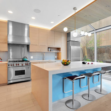
Although we didn’t contribute to the aesthetic of the interior design in this project, we did carry out the plans that brought it life. The tone was very modern, with some eclectic touches. The kitchen, featuring an island with a baby blue lacquered finish, blends contemporary clean lines into an industrial-tinged, almost futuristic aesthetic. Reclaimed wooden doors and art pieces collected throughout the years are an ode to the client's travels, an artistic touch from Todd Zwigard Architects.
LET’S TALK
Quality of work is of course important, but there are several components of construction management that are equally vital: communication; processes that make sure you're able to adhere to schedules; protocols with both safety and communication. You might say this is the nerding out of the construction process. It’s not often the face of a project, but it’s absolutely massive in terms of carrying out a successful renovation, whether it’s a penthouse loft in Manhattan, a condo in Prospect Heights, or a kitchen in a Brooklyn brownstone. Quality construction management is probably one of the biggest ways to separate professional contractors from those who aren’t.
ART FROM CHAOS
This was such a large project, so our ability to procure and source all the finishes and fixtures was hugely important to our clients. The sheer number of floors, tiles, and plumbing fixtures alone that need to be ordered, in addition to everything else, plus figuring out lead times, shipments, deliveries, and inspections. It can quickly become chaotic, but there’s an art to the planning and organization, and we’ve mastered it.
The larger a project is, the more likely that havoc will rear its head. The antidote is not only really proper planning and construction management, as we achieved in this Manhattan loft penthouse renovation, but also a great working relationship with everyone else involved in the project: contractors, architect, and clients alike.
GET IN TOUCH
Is a loft renovation in New York in your future? We’re experts in renovating New York homes, from apartment combinations in managed buildings to kitchens and bathrooms in co-ops and condos to gut renovations of historic spaces and landmark renovations.
Contact us to learn more about our approach as a design-and-build firm, where all aspects of your project are handled under the same roof. In addition to construction management, you’ll get our in-house architect in-house and the added renovation benefits of experts in design, material selection, and paperwork.
 Murphy Bros. Design | Build | Remodel
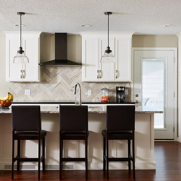
They waited 9-long years to solve their cramped, storage-stingy kitchen, their non-existing lower level shower and their tired 70’s entryway. In the homeowner’s own words, “The transformation will make your jaw drop.” We added a shower & vanity to the lower level, removed two walls blocking off the kitchen, added a full-view door to the deck, re-tasked & replaced appliances, added a larger island, custom cabinets, Cambria countertops in kitchen and bath, new LVT and engineered flooring, re-textured ceiling, changed wall paint color, replaced the dark walnut woodwork with new white wider trim & doors. A new rustic Mahogany entry door with sidelight completed the makeover. The family now has a new kitchen highly functional gathering place to share and make meals as wells as a fully capable bathroom the teenagers can call their own.
Mbros Design/build consultant — Cherie Poissant
Find the right local pro for your project
 Mapos Architects DPC
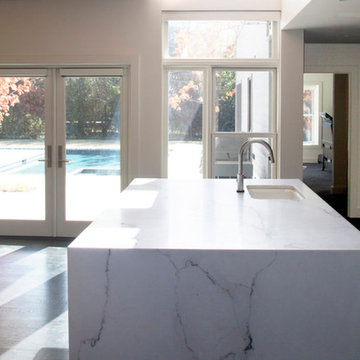
A doctor in Dallas hired Mapos to design his dream home in the upscale neighborhood of Bluffview that would serve as both a haven from his hectic days at the hospital and a space to support his active outdoor lifestyle. Mapos was tasked with designing a modern home that would function as a definitive counterpoint to the new, yet traditional McMansions on adjacent properties.
The client emphasized the necessity of informal living and dining areas for entertaining, spacious bedrooms, a home office, and plentiful storage space for his outdoor gear and automobiles. He also requested an outdoor pool, hot tub, and lush landscape to isolate the property and establish a sense of privacy.
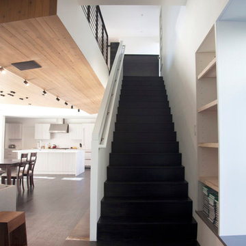
The two-story interior was designed as an open volume with the second floor inserted into a larger box, creating a dramatic interplay of double-height and compressed spaces on the lower level. For the exterior, Mapos composed the house out of four flat-roofed volumes, assembled to create welcoming front and rear outdoor spaces, intimate landscaped side gardens, and visual protection from the neighbors. The forms and proportions combined contain a rich assembly of indoor and outdoor spaces that will serve the client for years to come.
 Mapos Architects DPC
A doctor in Dallas hired Mapos to design his dream home in the upscale neighborhood of Bluffview that would serve as both a haven from his hectic days at the hospital and a space to support his active outdoor lifestyle. Mapos was tasked with designing a modern home that would function as a definitive counterpoint to the new, yet traditional McMansions on adjacent properties.
The client emphasized the necessity of informal living and dining areas for entertaining, spacious bedrooms, a home office, and plentiful storage space for his outdoor gear and automobiles. He also requested an outdoor pool, hot tub, and lush landscape to isolate the property and establish a sense of privacy.
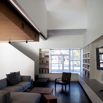
The two-story interior was designed as an open volume with the second floor inserted into a larger box, creating a dramatic interplay of double-height and compressed spaces on the lower level. For the exterior, Mapos composed the house out of four flat-roofed volumes, assembled to create welcoming front and rear outdoor spaces, intimate landscaped side gardens, and visual protection from the neighbors. The forms and proportions combined contain a rich assembly of indoor and outdoor spaces that will serve the client for years to come.
 Mapos Architects DPC
A doctor in Dallas hired Mapos to design his dream home in the upscale neighborhood of Bluffview that would serve as both a haven from his hectic days at the hospital and a space to support his active outdoor lifestyle. Mapos was tasked with designing a modern home that would function as a definitive counterpoint to the new, yet traditional McMansions on adjacent properties.
The client emphasized the necessity of informal living and dining areas for entertaining, spacious bedrooms, a home office, and plentiful storage space for his outdoor gear and automobiles. He also requested an outdoor pool, hot tub, and lush landscape to isolate the property and establish a sense of privacy.
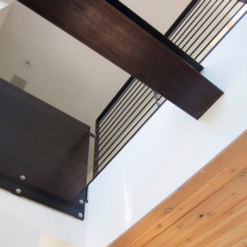
The two-story interior was designed as an open volume with the second floor inserted into a larger box, creating a dramatic interplay of double-height and compressed spaces on the lower level. For the exterior, Mapos composed the house out of four flat-roofed volumes, assembled to create welcoming front and rear outdoor spaces, intimate landscaped side gardens, and visual protection from the neighbors. The forms and proportions combined contain a rich assembly of indoor and outdoor spaces that will serve the client for years to come.
 Mapos Architects DPC
A doctor in Dallas hired Mapos to design his dream home in the upscale neighborhood of Bluffview that would serve as both a haven from his hectic days at the hospital and a space to support his active outdoor lifestyle. Mapos was tasked with designing a modern home that would function as a definitive counterpoint to the new, yet traditional McMansions on adjacent properties.
The client emphasized the necessity of informal living and dining areas for entertaining, spacious bedrooms, a home office, and plentiful storage space for his outdoor gear and automobiles. He also requested an outdoor pool, hot tub, and lush landscape to isolate the property and establish a sense of privacy.
The two-story interior was designed as an open volume with the second floor inserted into a larger box, creating a dramatic interplay of double-height and compressed spaces on the lower level. For the exterior, Mapos composed the house out of four flat-roofed volumes, assembled to create welcoming front and rear outdoor spaces, intimate landscaped side gardens, and visual protection from the neighbors. The forms and proportions combined contain a rich assembly of indoor and outdoor spaces that will serve the client for years to come.


 European Cabinets & Design Studios
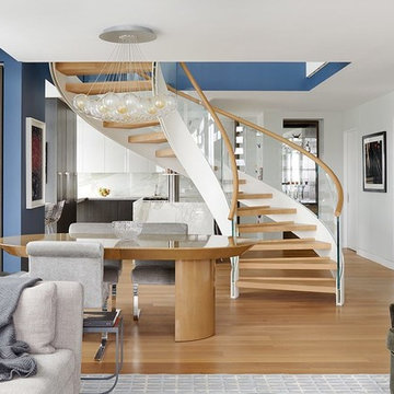
Swedish design firm Cortina & Käll were tasked with connecting a new 1,400-square-foot apartment to an existing 3,000-square-foot apartment in a New York City high-rise. Their goal was to give the apartment a scale and flow benefitting its new larger size.
“We envisioned a light and sculptural spiral staircase at the center of it all. The staircase and its opening allowed us to achieve the desired transparency and volume, creating a dramatically new and generous apartment,” said Francisco Cortina.
Read more about this project on our blog: https://www.europeancabinets.com/news/cast-curved-staircase-nyc-cortina-kall/
Photo: Tim Williams Photography
 Mapos Architects DPC
A doctor in Dallas hired Mapos to design his dream home in the upscale neighborhood of Bluffview that would serve as both a haven from his hectic days at the hospital and a space to support his active outdoor lifestyle. Mapos was tasked with designing a modern home that would function as a definitive counterpoint to the new, yet traditional McMansions on adjacent properties.
The client emphasized the necessity of informal living and dining areas for entertaining, spacious bedrooms, a home office, and plentiful storage space for his outdoor gear and automobiles. He also requested an outdoor pool, hot tub, and lush landscape to isolate the property and establish a sense of privacy.
The two-story interior was designed as an open volume with the second floor inserted into a larger box, creating a dramatic interplay of double-height and compressed spaces on the lower level. For the exterior, Mapos composed the house out of four flat-roofed volumes, assembled to create welcoming front and rear outdoor spaces, intimate landscaped side gardens, and visual protection from the neighbors. The forms and proportions combined contain a rich assembly of indoor and outdoor spaces that will serve the client for years to come.
 Mapos Architects DPC
A doctor in Dallas hired Mapos to design his dream home in the upscale neighborhood of Bluffview that would serve as both a haven from his hectic days at the hospital and a space to support his active outdoor lifestyle. Mapos was tasked with designing a modern home that would function as a definitive counterpoint to the new, yet traditional McMansions on adjacent properties.
The client emphasized the necessity of informal living and dining areas for entertaining, spacious bedrooms, a home office, and plentiful storage space for his outdoor gear and automobiles. He also requested an outdoor pool, hot tub, and lush landscape to isolate the property and establish a sense of privacy.
The two-story interior was designed as an open volume with the second floor inserted into a larger box, creating a dramatic interplay of double-height and compressed spaces on the lower level. For the exterior, Mapos composed the house out of four flat-roofed volumes, assembled to create welcoming front and rear outdoor spaces, intimate landscaped side gardens, and visual protection from the neighbors. The forms and proportions combined contain a rich assembly of indoor and outdoor spaces that will serve the client for years to come.
 Focal Point Hardware
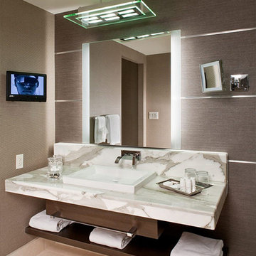
This Electric Mirror Product Features:
Lead-free, copper-free, corrosion-resistant DuraMirror glass
Forward-facing task lighting
Wall-glow ambient lighting on left and right side with diffuser for a finished side view
Forward-phase dimming technology
Suitable for damp bathroom environments
Environmentally sustainable
Energy efficient
Fast lead times
Easy installation
ADA compliant
Title 24 compliance available
Covered by one or more patents
Watts: 40
Dimension: 36"W x 36"H x 1.75"D
Weight: 37 lbs
Made in America with U.S. and global components
A singularly smart and modern alternative to bathroom sconces, Novo pairs incredible natural-looking illumination with ultra-soft wall glow, forming a harmonious combination of task and ambiance lighting.
 Nar Design Group
This home remodel is a celebration of curves and light. Starting from humble beginnings as a basic builder ranch style house, the design challenge was maximizing natural light throughout and providing the unique contemporary style the client’s craved.
The Entry offers a spectacular first impression and sets the tone with a large skylight and an illuminated curved wall covered in a wavy pattern Porcelanosa tile.
The chic entertaining kitchen was designed to celebrate a public lifestyle and plenty of entertaining. Celebrating height with a robust amount of interior architectural details, this dynamic kitchen still gives one that cozy feeling of home sweet home. The large “L” shaped island accommodates 7 for seating. Large pendants over the kitchen table and sink provide additional task lighting and whimsy. The Dekton “puzzle” countertop connection was designed to aid the transition between the two color countertops and is one of the homeowner’s favorite details. The built-in bistro table provides additional seating and flows easily into the Living Room.
A curved wall in the Living Room showcases a contemporary linear fireplace and tv which is tucked away in a niche. Placing the fireplace and furniture arrangement at an angle allowed for more natural walkway areas that communicated with the exterior doors and the kitchen working areas.
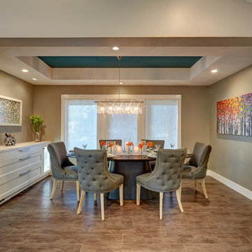
The dining room’s open plan is perfect for small groups and expands easily for larger events. Raising the ceiling created visual interest and bringing the pop of teal from the Kitchen cabinets ties the space together. A built-in buffet provides ample storage and display.
The Sitting Room (also called the Piano room for its previous life as such) is adjacent to the Kitchen and allows for easy conversation between chef and guests. It captures the homeowner’s chic sense of style and joie de vivre.
 nancekivell home planning & design
Eastview Before & After Exterior Renovation
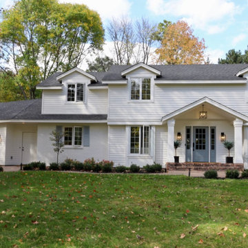
Enhancing a home’s exterior curb appeal doesn’t need to be a daunting task. With some simple design refinements and creative use of materials we transformed this tired 1950’s style colonial with second floor overhang into a classic east coast inspired gem. Design enhancements include the following:
• Replaced damaged vinyl siding with new LP SmartSide, lap siding and trim
• Added additional layers of trim board to give windows and trim additional dimension
• Applied a multi-layered banding treatment to the base of the second-floor overhang to create better balance and separation between the two levels of the house
• Extended the lower-level window boxes for visual interest and mass
• Refined the entry porch by replacing the round columns with square appropriately scaled columns and trim detailing, removed the arched ceiling and increased the ceiling height to create a more expansive feel
• Painted the exterior brick façade in the same exterior white to connect architectural components. A soft blue-green was used to accent the front entry and shutters
• Carriage style doors replaced bland windowless aluminum doors
• Larger scale lantern style lighting was used throughout the exterior

 Twelve Stones Designs, LLC
The owners of this kitchen had spent the money to upgrade the finishes in their kitchen upon building the home 12 years ago, but after living in the space for several years they realized how nonfunctional the layout really was. The (then) two preschool aged children had grown into busy, hungry teenagers with many friends who also liked to hang out at the house. So the family needed a more functional kitchen with better traffic flow, space for daily activities revolving around the kitchen at different times of day, and a kitchen that could accommodate cooking for and serving large groups. Furthermore, the dark, traditional finishes no longer reflected the homeowners’ style. They requested a brighter, more relaxed, coastal style that reflected their love of the seaside cities they like to visit.
Originally, the kitchen was U-shaped with a narrow island in the middle. The island created narrow aisles that bottle-necked at the dishwasher, refrigerator, and cooktop areas. There was a pass-through from the foyer into the kitchen, but the owners never liked that the pass-through was also located so close to the powder room. The awkward proximity was unappealing and made guests feel uncomfortable.
The kitchen’s storage was made up of lots of narrow cabinets, apothecary drawers, clipped corner units, and very few drawers. It lacked useful storage for the larger items the family used on a daily basis. And the kitchen’s only pantry was small closet that had only builder-grade, narrow shelving with no illumination to be able to see the contents inside.
Overall, the kitchen’s lighting plan was poorly executed. Only six recessed cans illuminated the entire kitchen and nook areas. The under cabinet lighting was not evenly distributed either. In fact, the builder had mis-placed the under cabinet lighting around the decorative pilasters which made for choppy, dark cubbies. Further, the builder didn’t include any lighting over the sink or the bar area, which meant whoever was doing the dishes was always in their own shadow. That, coupled with the steep overhang of the game room above made the bar area feel like a dim, cavernous space that wasn’t inviting or task oriented. The kitchen looked out into the main living space, but the raised bar and a narrow wall (which held the only large cabinet in the kitchen) created more of a barrier than a relationship to the living room or breakfast nook. In fact, one couldn’t even see the breakfast nook from the cooktop or sink areas due to its orientation. The raised bar top was too narrow to comfortably sit to either dine at or chat from due to the lack of knee space. The the homeowners confided that the kitchen felt more like a dark, dirty prison than place where the family, or their guests, wanted to gather and commune.
The clients' needs and desires were:
➢ to create a kitchen that would be a space the family loved to be in; to relate to the adjacent spaces all around, and to have better flow for entertaining large groups
➢ to remove the walls between the breakfast nook and living area and to be able to utilize the natural light from the windows in both those areas
➢ to incorporate a functional chopping block for prepping fresh food for home cooked meals, an island with a large sink and drain board, 2 pull out trash cans, and seating for at least the 2 teens to eat or do homework
➢ to design a kitchen and breakfast nook with an airy, coastal, relaxed vibe that blended with the rest of the house's coastal theme
➢ to integrate a layered lighting plan which would include ample general illumination, specific task lighting, decorative lighting, and lots of illuminated storage
➢ to design a kitchen with not only more storage for all the husband’s kitchen gadgets and collection of oils and spices, but smart storage, including a coffee/breakfast bar and a place to store and conceal the toaster oven and microwave
➢ to find a way to utilize the large open space between the kitchen, pantry area, and breakfast nook
Twelve Stones Designs achieved the owner's goals by:
➢ removing the walls between the kitchen and living room to allow the natural light to filter in from the adjacent rooms and to create a connection between the kitchen, nook, and living spaces for a sense of unity and communion
➢ removing the existing pantry and designing 3 large pantry style cabinets with LED tape lights and rollout drawers to house lots of kitchen appliances, gadgets, and tons of groceries. We also took the cabinets all the way up to the 9’ ceiling for additional storage for seasonal items and bulk storage.
➢ designing 2 islands - 1 with a gorgeous black walnut chopping block that houses a drawer for chopping and carving knives and a custom double pull out trash unit for point of use utilization - and 1 that houses the dishwasher, a large Blanco Gourmet sink with integrated drain board, woven baskets for fresh root vegetables and kitchen towels, plenty of drawer storage for kitchen items, and bar seating for up to 4 diners.
➢ closing off the space between the kitchen and the powder room to create a beautiful new private alcove for the powder room as well as adding some decorative storage. This also gave us space to include more tall storage near the new range for precision placement of the husband’s extensive oil and spice collection as well as a location for a combo-steam oven the wife wanted for baking and cooking healthy meals.
The project is enhanced functionally by:
➢ incorporated USB and standard receptacles for the kids’ laptops and phone charging in the large island
➢ designing the small island to include additional open shelving for items used on a daily basis such as a variety of bowls, plates, and colanders. This set up also works well for the husband who prefers to “plate” his dinners in restaurant-style fashion before presenting them to the table.
➢ the integration of specific storage units, such as double stacked cutlery drawers, a custom spice pull-out, a Kuerig coffee and tea pod drawer, and custom double stacked utensil drawers
➢ moving the refrigerator to the old oven location - this eliminated the bottle neck as well as created a better relationship to the eating table. It also utilizes the floor space between the pantry, nook, and kitchen
➢ creating a banquet style breakfast nook - this banquette seating not only doubles the amount of seating for large gatherings but it better utilizes the odd space between the kitchen and the previous nook area. It also helps to create a distinct pathway from the mudroom room through the pantry area, kitchen, nook, and living room.
➢ the coffee/breakfast bar area which includes the perfect location for the concealed microwave and toaster oven, convenient storage for the coffee pods and tea accoutrements. Roll-out drawers below also house the smoothie maker, hot water kettle, and a plethora of smoothie-making ingredients such as protein powders, smoothie additives, etc. Furthermore, the drawers below the Keurig house measuring utensil, cutlery, baking supplies and tupperware storage.
➢ incorporating lots of wide drawers and pullouts to accommodate large cookware.
➢ utilizing as much vertical space as possible by building storage to the ceiling which accommodates the family’s abundant amount of serving platters, baking sheets, bakeware, casserole dishes, and additional cutting boards.
The project is enhanced aesthetically by:
➢ new 5-piece Versailles pattern porcelain tile that now seamlessly joins the entire down stairs area together creating a bright, cohesiveness feeling instead of choppy separated spaces - it also adds a coastal feeling
➢ designing a cabinet to conceal the microwave and toaster oven
➢ the coastal influenced light fixtures over the nook table and island
➢ the sandy colors of the Langdon Cambria countertops. The swirling pattern and sparkling quartz pieces remind the homeowner of black-and-tan sandy beaches
➢ the striped banquet seating whose creamy white background and blue-green stripes were the inspiration for the cabinet and wall colors.
➢ All the interior doors were painted black to coordinate with the blacks and grays in the backsplash tile and countertop. This also adds a hint of tailored formality to an otherwise casual space.
➢ the use of WAC's Oculux small aperture LED units for the overhead lighting complimented with Diode LED strips for task lighting under the cabinets and inside the pantry and glass wall cabinets. All of the lighting applications are on separate dimmer switches.
Innovative uses of materials or construction methods by Realty Restoration LLC:
➢ Each 1-1/2” x 3” block of reclaimed end-grain black walnut that makes up the center island chopping block was hand milled and built in the shop. It was designed to look substantial and proportional to the surrounding elements, executed by creating the 4 inch tall top with a solid wood chamfered edge band.
➢ The metal doors on either side of the vent hood were also custom designed for this project and built in the Realty Restoration LLC shop. They are made 1x2, 11-gauge mild steel with ribbed glass. Weighing 60 lbs a piece, heavy duty cabinet hinges were added to support the weight of the door and keep them from sagging.
➢ Under-cabinet receptacles were added along the range wall in order to have a clean, uninterrupted backsplash.
Design obstacles to overcome:
➢ Because we were removing the demising walls between the kitchen and living room, we had to find a way to plumb and vent the new island. We did this by tunneling through the slab (the slab had post tension cables which prevented us from just trenching) to run a new wet vent through a nearby structural wall. We pulled the existing hot and cold lines between upper floor joists and ran them down the structural wall as well and up through a conduit in the tunnel.
➢ Since we were converting from wall overs to a gas range it allowed us to utilize the 220 feed for the wall ovens to provide a new sub panel for all the new kitchen circuits
➢ Due to framing deficiencies inherited from the original build there was a 1-1/2” differential in the floor-to-ceiling height over a 20 foot span; by utilizing the process of cutting and furring coupled with the crown moulding details on the cabinet elevations we were able to mask the problem and provide seamless transitions between the cabinet components.
Evidence of superior craftsmanship:
➢ uniquely designed, one-of-a-kind metal “X” end panels on the large island. The end panels were custom made in the Realty Restoration LLC shop and fitted to the exact dimensions of the island. The welding seams are completely indistinguishable - the posts look like they are cut from a single sheet of metal
➢ square metal posts on the small island were also custom made and designed to compliment and carry through the metal element s throughout the kitchen
➢ the beautiful, oversized end panels on the pantry cabinets which give the breakfast nook a tailored look
➢ integrating a large format 5 piece Versailles tile pattern to seamlessly flow from the existing spaces into the new kitchen space
➢ By constructing a custom cabinet that jogged around a corner we could not remodel (housing the entry way coat closet) we were able to camouflage the adjacent wall offset within the upper and lower cabinets. By designing around the existing jog in the structural walls we accomplished a few things: we were able to find the space to house, and hide, the microwave and toaster oven yet still have a clean cohesive appearance from the kitchen side. Additionally, the owners were able to keep their much needed coat closet and we didn’t have to increase the budget with unnecessary structural work.
 Chester County Kitchen & Bath
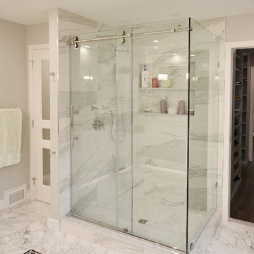
These clients were in desperate need of a new master bedroom and bath. We redesigned the space into a beautiful, luxurious Master Suite. The original bedroom and bath were gutted and the footprint was expanded into an adjoining office space. The new larger space was redesigned into a bedroom, walk in closet, and spacious new bath and toilet room. The master bedroom was tricked out with custom trim work and lighting. The new closet was filled with organized storage by Diplomat Closets ( West Chester PA ). Lighted clothes rods provide great accent and task lighting. New vinyl flooring ( a great durable alternative to wood ) was installed throughout the bedroom and closet as well. The spa like bathroom is exceptional from the ground up. The tile work from true marble floors with mosaic center piece to the clean large format linear set shower and wall tiles is gorgeous. Being a first floor bath we chose a large new frosted glass window so we could still have the light but maintain privacy. Fieldstone Cabinetry was designed with furniture toe kicks lit with LED lighting on a motion sensor. What else can I say? The pictures speak for themselves. This Master Suite is phenomenal with attention paid to every detail. Luxury Master Bath Retreat!
 nancekivell home planning & design
Eastview Before & After Exterior Renovation
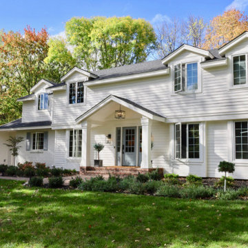
Enhancing a home’s exterior curb appeal doesn’t need to be a daunting task. With some simple design refinements and creative use of materials we transformed this tired 1950’s style colonial with second floor overhang into a classic east coast inspired gem. Design enhancements include the following:
• Replaced damaged vinyl siding with new LP SmartSide, lap siding and trim
• Added additional layers of trim board to give windows and trim additional dimension
• Applied a multi-layered banding treatment to the base of the second-floor overhang to create better balance and separation between the two levels of the house
• Extended the lower-level window boxes for visual interest and mass
• Refined the entry porch by replacing the round columns with square appropriately scaled columns and trim detailing, removed the arched ceiling and increased the ceiling height to create a more expansive feel
• Painted the exterior brick façade in the same exterior white to connect architectural components. A soft blue-green was used to accent the front entry and shutters
• Carriage style doors replaced bland windowless aluminum doors
• Larger scale lantern style lighting was used throughout the exterior
 European Cabinets & Design Studios
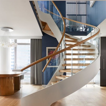
Swedish design firm Cortina & Käll were tasked with connecting a new 1,400-square-foot apartment to an existing 3,000-square-foot apartment in a New York City high-rise. Their goal was to give the apartment a scale and flow benefitting its new larger size.
“We envisioned a light and sculptural spiral staircase at the center of it all. The staircase and its opening allowed us to achieve the desired transparency and volume, creating a dramatically new and generous apartment,” said Francisco Cortina.
Read more about this project on our blog: https://www.europeancabinets.com/news/cast-curved-staircase-nyc-cortina-kall/
Photo: Tim Williams Photography
 Chester County Kitchen & Bath
These clients were in desperate need of a new master bedroom and bath. We redesigned the space into a beautiful, luxurious Master Suite. The original bedroom and bath were gutted and the footprint was expanded into an adjoining office space. The new larger space was redesigned into a bedroom, walk in closet, and spacious new bath and toilet room. The master bedroom was tricked out with custom trim work and lighting. The new closet was filled with organized storage by Diplomat Closets ( West Chester PA ). Lighted clothes rods provide great accent and task lighting. New vinyl flooring ( a great durable alternative to wood ) was installed throughout the bedroom and closet as well. The spa like bathroom is exceptional from the ground up. The tile work from true marble floors with mosaic center piece to the clean large format linear set shower and wall tiles is gorgeous. Being a first floor bath we chose a large new frosted glass window so we could still have the light but maintain privacy. Fieldstone Cabinetry was designed with furniture toe kicks lit with LED lighting on a motion sensor. What else can I say? The pictures speak for themselves. This Master Suite is phenomenal with attention paid to every detail. Luxury Master Bath Retreat!
 Twelve Stones Designs, LLC
The owners of this kitchen had spent the money to upgrade the finishes in their kitchen upon building the home 12 years ago, but after living in the space for several years they realized how nonfunctional the layout really was. The (then) two preschool aged children had grown into busy, hungry teenagers with many friends who also liked to hang out at the house. So the family needed a more functional kitchen with better traffic flow, space for daily activities revolving around the kitchen at different times of day, and a kitchen that could accommodate cooking for and serving large groups. Furthermore, the dark, traditional finishes no longer reflected the homeowners’ style. They requested a brighter, more relaxed, coastal style that reflected their love of the seaside cities they like to visit.
Originally, the kitchen was U-shaped with a narrow island in the middle. The island created narrow aisles that bottle-necked at the dishwasher, refrigerator, and cooktop areas. There was a pass-through from the foyer into the kitchen, but the owners never liked that the pass-through was also located so close to the powder room. The awkward proximity was unappealing and made guests feel uncomfortable.
The kitchen’s storage was made up of lots of narrow cabinets, apothecary drawers, clipped corner units, and very few drawers. It lacked useful storage for the larger items the family used on a daily basis. And the kitchen’s only pantry was small closet that had only builder-grade, narrow shelving with no illumination to be able to see the contents inside.
Overall, the kitchen’s lighting plan was poorly executed. Only six recessed cans illuminated the entire kitchen and nook areas. The under cabinet lighting was not evenly distributed either. In fact, the builder had mis-placed the under cabinet lighting around the decorative pilasters which made for choppy, dark cubbies. Further, the builder didn’t include any lighting over the sink or the bar area, which meant whoever was doing the dishes was always in their own shadow. That, coupled with the steep overhang of the game room above made the bar area feel like a dim, cavernous space that wasn’t inviting or task oriented. The kitchen looked out into the main living space, but the raised bar and a narrow wall (which held the only large cabinet in the kitchen) created more of a barrier than a relationship to the living room or breakfast nook. In fact, one couldn’t even see the breakfast nook from the cooktop or sink areas due to its orientation. The raised bar top was too narrow to comfortably sit to either dine at or chat from due to the lack of knee space. The the homeowners confided that the kitchen felt more like a dark, dirty prison than place where the family, or their guests, wanted to gather and commune.
The clients' needs and desires were:
➢ to create a kitchen that would be a space the family loved to be in; to relate to the adjacent spaces all around, and to have better flow for entertaining large groups
➢ to remove the walls between the breakfast nook and living area and to be able to utilize the natural light from the windows in both those areas
➢ to incorporate a functional chopping block for prepping fresh food for home cooked meals, an island with a large sink and drain board, 2 pull out trash cans, and seating for at least the 2 teens to eat or do homework
➢ to design a kitchen and breakfast nook with an airy, coastal, relaxed vibe that blended with the rest of the house's coastal theme
➢ to integrate a layered lighting plan which would include ample general illumination, specific task lighting, decorative lighting, and lots of illuminated storage
➢ to design a kitchen with not only more storage for all the husband’s kitchen gadgets and collection of oils and spices, but smart storage, including a coffee/breakfast bar and a place to store and conceal the toaster oven and microwave
➢ to find a way to utilize the large open space between the kitchen, pantry area, and breakfast nook
Twelve Stones Designs achieved the owner's goals by:
➢ removing the walls between the kitchen and living room to allow the natural light to filter in from the adjacent rooms and to create a connection between the kitchen, nook, and living spaces for a sense of unity and communion
➢ removing the existing pantry and designing 3 large pantry style cabinets with LED tape lights and rollout drawers to house lots of kitchen appliances, gadgets, and tons of groceries. We also took the cabinets all the way up to the 9’ ceiling for additional storage for seasonal items and bulk storage.
➢ designing 2 islands - 1 with a gorgeous black walnut chopping block that houses a drawer for chopping and carving knives and a custom double pull out trash unit for point of use utilization - and 1 that houses the dishwasher, a large Blanco Gourmet sink with integrated drain board, woven baskets for fresh root vegetables and kitchen towels, plenty of drawer storage for kitchen items, and bar seating for up to 4 diners.
➢ closing off the space between the kitchen and the powder room to create a beautiful new private alcove for the powder room as well as adding some decorative storage. This also gave us space to include more tall storage near the new range for precision placement of the husband’s extensive oil and spice collection as well as a location for a combo-steam oven the wife wanted for baking and cooking healthy meals.
The project is enhanced functionally by:
➢ incorporated USB and standard receptacles for the kids’ laptops and phone charging in the large island
➢ designing the small island to include additional open shelving for items used on a daily basis such as a variety of bowls, plates, and colanders. This set up also works well for the husband who prefers to “plate” his dinners in restaurant-style fashion before presenting them to the table.
➢ the integration of specific storage units, such as double stacked cutlery drawers, a custom spice pull-out, a Kuerig coffee and tea pod drawer, and custom double stacked utensil drawers
➢ moving the refrigerator to the old oven location - this eliminated the bottle neck as well as created a better relationship to the eating table. It also utilizes the floor space between the pantry, nook, and kitchen
➢ creating a banquet style breakfast nook - this banquette seating not only doubles the amount of seating for large gatherings but it better utilizes the odd space between the kitchen and the previous nook area. It also helps to create a distinct pathway from the mudroom room through the pantry area, kitchen, nook, and living room.
➢ the coffee/breakfast bar area which includes the perfect location for the concealed microwave and toaster oven, convenient storage for the coffee pods and tea accoutrements. Roll-out drawers below also house the smoothie maker, hot water kettle, and a plethora of smoothie-making ingredients such as protein powders, smoothie additives, etc. Furthermore, the drawers below the Keurig house measuring utensil, cutlery, baking supplies and tupperware storage.
➢ incorporating lots of wide drawers and pullouts to accommodate large cookware.
➢ utilizing as much vertical space as possible by building storage to the ceiling which accommodates the family’s abundant amount of serving platters, baking sheets, bakeware, casserole dishes, and additional cutting boards.
The project is enhanced aesthetically by:
➢ new 5-piece Versailles pattern porcelain tile that now seamlessly joins the entire down stairs area together creating a bright, cohesiveness feeling instead of choppy separated spaces - it also adds a coastal feeling
➢ designing a cabinet to conceal the microwave and toaster oven
➢ the coastal influenced light fixtures over the nook table and island
➢ the sandy colors of the Langdon Cambria countertops. The swirling pattern and sparkling quartz pieces remind the homeowner of black-and-tan sandy beaches
➢ the striped banquet seating whose creamy white background and blue-green stripes were the inspiration for the cabinet and wall colors.
➢ All the interior doors were painted black to coordinate with the blacks and grays in the backsplash tile and countertop. This also adds a hint of tailored formality to an otherwise casual space.
➢ the use of WAC's Oculux small aperture LED units for the overhead lighting complimented with Diode LED strips for task lighting under the cabinets and inside the pantry and glass wall cabinets. All of the lighting applications are on separate dimmer switches.
Innovative uses of materials or construction methods by Realty Restoration LLC:
➢ Each 1-1/2” x 3” block of reclaimed end-grain black walnut that makes up the center island chopping block was hand milled and built in the shop. It was designed to look substantial and proportional to the surrounding elements, executed by creating the 4 inch tall top with a solid wood chamfered edge band.
➢ The metal doors on either side of the vent hood were also custom designed for this project and built in the Realty Restoration LLC shop. They are made 1x2, 11-gauge mild steel with ribbed glass. Weighing 60 lbs a piece, heavy duty cabinet hinges were added to support the weight of the door and keep them from sagging.
➢ Under-cabinet receptacles were added along the range wall in order to have a clean, uninterrupted backsplash.
Design obstacles to overcome:
➢ Because we were removing the demising walls between the kitchen and living room, we had to find a way to plumb and vent the new island. We did this by tunneling through the slab (the slab had post tension cables which prevented us from just trenching) to run a new wet vent through a nearby structural wall. We pulled the existing hot and cold lines between upper floor joists and ran them down the structural wall as well and up through a conduit in the tunnel.
➢ Since we were converting from wall overs to a gas range it allowed us to utilize the 220 feed for the wall ovens to provide a new sub panel for all the new kitchen circuits
➢ Due to framing deficiencies inherited from the original build there was a 1-1/2” differential in the floor-to-ceiling height over a 20 foot span; by utilizing the process of cutting and furring coupled with the crown moulding details on the cabinet elevations we were able to mask the problem and provide seamless transitions between the cabinet components.
Evidence of superior craftsmanship:
➢ uniquely designed, one-of-a-kind metal “X” end panels on the large island. The end panels were custom made in the Realty Restoration LLC shop and fitted to the exact dimensions of the island. The welding seams are completely indistinguishable - the posts look like they are cut from a single sheet of metal
➢ square metal posts on the small island were also custom made and designed to compliment and carry through the metal element s throughout the kitchen
➢ the beautiful, oversized end panels on the pantry cabinets which give the breakfast nook a tailored look
➢ integrating a large format 5 piece Versailles tile pattern to seamlessly flow from the existing spaces into the new kitchen space
➢ By constructing a custom cabinet that jogged around a corner we could not remodel (housing the entry way coat closet) we were able to camouflage the adjacent wall offset within the upper and lower cabinets. By designing around the existing jog in the structural walls we accomplished a few things: we were able to find the space to house, and hide, the microwave and toaster oven yet still have a clean cohesive appearance from the kitchen side. Additionally, the owners were able to keep their much needed coat closet and we didn’t have to increase the budget with unnecessary structural work.
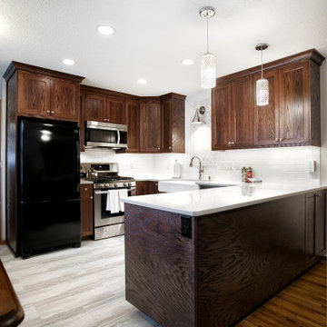
 Castle Building & Remodeling
Homeowners in Richfield came to Castle looking to update their 1956 Kitchen in their ranch style home. The goal was to keep the same U-Shaped footprint of the kitchen while maximizing the cabinet layout configuration. The overall transformation is stunning.
One major adjustment was installing the upper cabinets to the ceiling. This draws your eyes up and gives the room a larger feel with the added storage that was previously nonexistent. The java color stained Crystal Cabinets are balanced with clean polished nickel hardware.
Another part of the project that was important to the homeowners was lighting. The existing configuration was dark, with very little over head light or task lighting. With adding in disc LED light fixtures in the ceiling, decorative pendant and wall sconce lighting over the sink, the space now is light and bright even with selecting darker finishes.
To top off this project, Designer Tracy O’Donnell curated a gorgeous tile feature above the farmhouse sink. The picture framed Carrara marble herringbone mosaic tile features natural colors that play off the countertop and warmth of the cabinets beautifully. Overall, the homeowners couldn’t be happier with how it all turned out!
18