
Search results for "Larger task" in Home Design Ideas
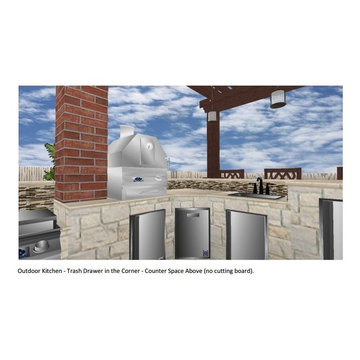
 InnovationLand
3D Drawing Preview
Outdoor Kitchen Island
A two-level pergola, circular firepit area and outdoor kitchen with a charcoal-gas combo grill star in this Houston patio addition designed for entertaining large crowds in style.
"The client was an attorney with a passion for cooking and entertaining," says the project's principal designer, Lisha Maxey of LGH Designs. "Her main objective with this space was to create a large area for 10 to 20 guests, including seating and the prep and cooking of meals."
Located in the backyard of the client's home in Spring, TX, this beautiful outdoor living and entertaining space includes a 28-by-12-foot patio with Fantastico silver travertine tile flooring, arranged in a Versailles pattern. The walkway is Oklahoma wister flagstone.
Providing filtered shade for the patio is a two-level pergola of treated pine stained honey gold. The larger, higher tier is about 18 by 10 feet; the smaller, lower tier is about 10 feet square.
"We covered the entire pergola with Lexan - a high-quality, clear acrylic sheet that provides protection from the sun, heat and rain," says Outdoor Homescapes of Houston owner Wayne Franks.
Beneath the lower tier of the pergola sits an L-shaped, 12-by-9-foot outdoor kitchen island faced with Carmel Country ledgestone. The island houses a Fire Magic® combination charcoal-gas grill and lowered power burner, a Pacific Living countertop pizza oven and a stainless steel RCS trash drawer and sink. The countertops and raised bar are Fantastico silver travertine (18-square-inch tiles) and the backsplash is real quartz.
"The most unique design item of this kitchen area is the hexagon/circular table we added to the end of the long bar," says Lisha. This enabled the client to add seating for her dining guests."
Under the higher, larger tier of the pergola is a seating area, made up of a coffee table and espresso-colored rattan sofa and club chairs with spring-green-and-white cushions.
"Lighting also plays an important role in this space, since the client often entertains in the evening," says Wayne. Enter the chandelier over the patio seating arrangement and - over the outdoor kitchen - pendant lamps and an industrial-modern ceiling fan with a light fixture in the center. "It's important to layer your lighting for ambiance, security and safety - from an all-over ambient light that fills the space to under-the-counter task lighting for food prep and cooking to path and retaining wall lighting."
Off the patio is a transition area of crushed granite and floating flagstone pavers, leading to a circular firepit area of stamped concrete.
At the center of this circle is the standalone firepit, framed at the back by a curved stone bench. The walls of the bench and column bases for the pergola, by the way, are the same ledgestone as the kitchen island. The top slab on the bench is a hearth piece of manmade stone.
"I think the finish materials blend with the home really well," says Wayne. "We met her objectives of being able to entertain with 10 to 12 to 20 people at one time and being able to cook with charcoal and gas separately in one unit. And of course, the project was on time, on budget."
"It is truly a paradise," says the client in her Houzz review of the project. "They listened to my vision and incorporated their expertise to create an outdoor living space just perfect for me and my family!"
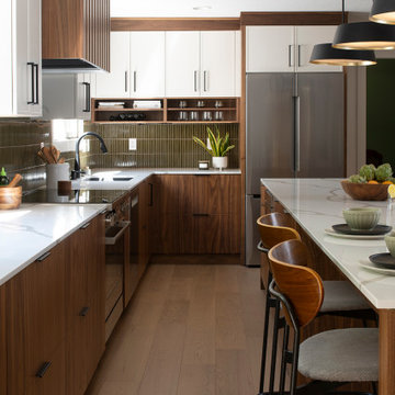
 Revival House
This kitchen remodel of a 70’s home reflects the character of the existing home and some design features of that era while giving it a fresh, modern look. The client wanted the remodeled space to blend in with the rest of the home, retaining some of the 1970’s character while including all the best features of today’s kitchens.
Removing the wall separating the informal eating area from the family room provided a nice open space allowing for a larger kitchen footprint and plenty of light throughout.
A combination of Decor's Dove Wing painted and Natural stained Walnut cabinetry was chosen. The dark walnut, slab lower cabinets unite the kitchen with the darker wood theme found throughout the home, while the white, slim-shaker upper cabinets give the space a light and airy feeling. The beautiful vertical grain of the walnut is the foundation of a theme that is echoed throughout the space: tall & thin vertical lines without bulk or needless ornamentation. The unique design detail gives the kitchen a great balance of depth and character while still brightening the space. Walnut crown molding throughout defines the space and ties everything together.
The vertical-set green Japanese tile from Virginia Tile, also characteristic of the 1970’s, serves as the backsplash and fills the range wall. The tall & slim theme is underscored by several design elements from the vertical tile and tall cabinet pulls in matte black from Top Knobs, to the thin quartz countertops, skinny shaker cabinet door style, and tall, slim refrigerator doors, all meant to eliminate excess bulk and lighten up the space.
An impressive focal point in this kitchen is the custom walnut reeded hood, designed to reflect a popular 1970’s feature. Narrow walnut shelves below the white upper cabinets near the refrigerator provide a nice surprise to the eye. An extra long island, decked in polished 2cm Corian Quartz countertop in Novello, provides ample seating, storage, and task space, making it an ideal surface for serving, eating, meal prep, gathering, and entertaining. The client desired a long island with comfortable counter seating at one end for a family of five, including space for a baby’s high chair.
High-end Bosch appliances and functional storage were also priorities. The dry bar on the opposite wall features additional storage and an Elica beverage refrigerator, framed by tall walnut larder cabinets on each end. The white larder cabinet doors pocket into the sides, revealing beautiful finished walnut interiors.
Wall cabinets feature Decor’s integrated under-cabinet lighting, while puck lights illuminate the beverage center counter. This kitchen is bursting with integrated storage. Many deep drawers feature interior double drawers making smaller items more accessible. Decor’s spice drawer to the right of the range keeps spices organized, while divided tray storage on the left of the range keeps these taller items handy.
While the design is inspired by the 1970’s, it exemplifies the best of the 2020’s, and the new space is open, bright, and functional for this family with young children.
 Drury Design
The existing kitchen wasn’t cutting it anymore. The homeowners designed and built this home about 20 years ago, but since then, their taste and needs changed. The outdated finishes felt outdated. There weren’t enough work areas. Some counterspace stations were just awkward due to the layout. Adjoining spaces around the kitchen were also in need of an update, but it was decided that the kitchen would undergo a transformation first.
Design Objectives
-Rework the overall layout (kitchen, laundry and butler’s pantry) to have a better flow and utilize the space better
-Incorporate materials with wow and pizzazz to reflect the homeowner’s style
-Design large work areas for cooking with two or more people at a time
-Provide seating at an island in addition to table seating
-Update surrounding spaces since the kitchen is open to the rest of the home
Design Challenges:
-Include a vast array of cooking appliances while having enough of cabinet storage
-Adjacent rooms need to feel updated and flow with new Kitchen
-Having multiple focal points with different materials but not have the space feel like a hodge podge
-Provide different task, accent and overall lighting to brighten up space
Design Solutions:
-The homeowner loves to cook and wanted to maximize her abilities. We incorporated a 48” rangetop with a griddle, a single oven, steam oven, microwave drawer and 15” induction cooktop next to a 48” Galley Ideal Workstation with two faucets. In order to have room for all of these appliances, the floor plan needed to accommodate more cabinetry. Both dining room entrances were closed off and the laundry room entrance were moved to the opposite end of the wall to allow two long walls for additional cabinets.
-The existing round columns throughout the first floor were outdated. To keep the architectural element of the columns, we wrapped the new columns to have a square shape with a flat panel on all four sides. Then, we painted them black (to tie in with the kitchen tops and curved hood surround) and added simple crown molding. For the flow of the space, closing up the odd corner that connected the laundry and dining room and relocating both room entrances allowed the space to actually feel larger and more continuous. --Adding the same square columns to the main dining room entrance, by the front door, also tied in the front of the house with the kitchen.
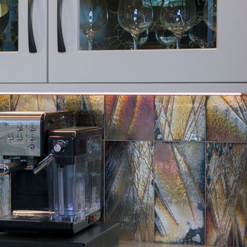
-The homeowner loves unique and bold materials. The main focal point of the kitchen is definitely the custom metal hood that incorporates two finishes and is set on a Lumix quartzite full-high back and side splashes. To make this area even more pronounced, a hearth-like drywall arch encloses the space. Once your eye moves off the hood, you start to notice the mirrored refrigerator panels, high gloss island cabinets, mirrored metal backsplash tile, delicate pendant island lights and the stunning island countertop material! There is a good mix of materials that make every space shine. The blacks, golds and pewter finishes help tie everything together.
-Lighting in a large kitchen is important. This space, besides getting a lot of natural light, needed lots of additional lighting due to the dark finishes. For overall lighting we have plenty of can lights in addition to lighting at the tops of the wall cabinets (that shine on the ceiling), undercabinet task lighting to make the tops sparkle and provide abundant lighting while prepping, pendant accent lighting over the island and a fandolier to add a little sparkle over the pub table. Voila!
Find the right local pro for your project
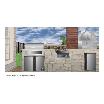 InnovationLand
3D Graphic Drawing
Outdoor Kitchen Island
A two-level pergola, circular firepit area and outdoor kitchen with a charcoal-gas combo grill star in this Houston patio addition designed for entertaining large crowds in style.
"The client was an attorney with a passion for cooking and entertaining," says the project's principal designer, Lisha Maxey of LGH Designs. "Her main objective with this space was to create a large area for 10 to 20 guests, including seating and the prep and cooking of meals."
Located in the backyard of the client's home in Spring, TX, this beautiful outdoor living and entertaining space includes a 28-by-12-foot patio with Fantastico silver travertine tile flooring, arranged in a Versailles pattern. The walkway is Oklahoma wister flagstone.
Providing filtered shade for the patio is a two-level pergola of treated pine stained honey gold. The larger, higher tier is about 18 by 10 feet; the smaller, lower tier is about 10 feet square.
"We covered the entire pergola with Lexan - a high-quality, clear acrylic sheet that provides protection from the sun, heat and rain," says Outdoor Homescapes of Houston owner Wayne Franks.
Beneath the lower tier of the pergola sits an L-shaped, 12-by-9-foot outdoor kitchen island faced with Carmel Country ledgestone. The island houses a Fire Magic® combination charcoal-gas grill and lowered power burner, a Pacific Living countertop pizza oven and a stainless steel RCS trash drawer and sink. The countertops and raised bar are Fantastico silver travertine (18-square-inch tiles) and the backsplash is real quartz.
"The most unique design item of this kitchen area is the hexagon/circular table we added to the end of the long bar," says Lisha. This enabled the client to add seating for her dining guests."
Under the higher, larger tier of the pergola is a seating area, made up of a coffee table and espresso-colored rattan sofa and club chairs with spring-green-and-white cushions.
"Lighting also plays an important role in this space, since the client often entertains in the evening," says Wayne. Enter the chandelier over the patio seating arrangement and - over the outdoor kitchen - pendant lamps and an industrial-modern ceiling fan with a light fixture in the center. "It's important to layer your lighting for ambiance, security and safety - from an all-over ambient light that fills the space to under-the-counter task lighting for food prep and cooking to path and retaining wall lighting."
Off the patio is a transition area of crushed granite and floating flagstone pavers, leading to a circular firepit area of stamped concrete.
At the center of this circle is the standalone firepit, framed at the back by a curved stone bench. The walls of the bench and column bases for the pergola, by the way, are the same ledgestone as the kitchen island. The top slab on the bench is a hearth piece of manmade stone.
"I think the finish materials blend with the home really well," says Wayne. "We met her objectives of being able to entertain with 10 to 12 to 20 people at one time and being able to cook with charcoal and gas separately in one unit. And of course, the project was on time, on budget."
"It is truly a paradise," says client Carvanna Cloud in her Houzz review of the project. "They listened to my vision and incorporated their expertise to create an outdoor living space just perfect for me and my family!"
 Tile Doctor Ltd
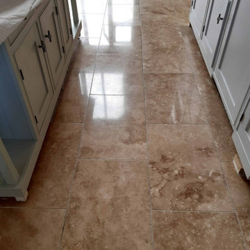
Located in Burgh Castle West of Great Yarmouth, this Travertine stone floor was a classic example of an incomplete installation. By incomplete I mean the tiler had done a fine job of laying and grouting the tiles but had left it at that and not sealed the stone. Natural stone like Travertine is porous and needs a sealer to stop dirt becoming ingrained in its pores, a sealer will also improve its appearance.
Without a sealer this floor now looked very dull, pale, rather damaged with pitting and heavily soiled with ingrained dirt. Pitting in stone like this is a natural feature of Travertine however it can be exacerbated with the use of acid cleaning products. This was a floor in urgent need of a face lift, and I was confident it could be transformed into a very beautiful floor.
I think it is true to say that most tilers will skilfully lay a floor for you but usually don’t have the knowledge, experience or equipment to finish the surface properly and when it comes to sealing many will recommend a product and suggest you take care of it yourself. Naturally if your find yourself in that position don’t insist the tiler does it, better to give us a call and have it done properly.
Our first job was to backfill the larger pits in the stone which as I mentioned are a natural feature of travertine material, but they can trap dirt and so its best if they are plugged with a suitably rigid filler. Also, if left alone the larger holes can quickly become larger as their edges crumble and break up leading to the entire tile becoming unstable. Replacing a tile in a floor like this is possible however its an extremely awkward job to do and it can be difficult to find an exact match for replacement.
Filling was done using a two-part, neutral cream-coloured polyester compound which gels in about fifteen minutes after addition of the catalyst. After this initial period, the excess product is trimmed off level with the surface of the tile before it sets harder than the stone itself in around sixty minutes. The fully cured compound can then be cut and machined as though it were part of the stone structure.
Our second job was to remove deep scratches caused by the unprotected feet of workmen’s ladders. This was done using Tile Doctor 50-grit and 100-grit diamond hand burnishing pads with a little water as a cutting medium. Shallower scratching present across the rest of the floor was removed using a Tile Doctor 200-grit soft milling pad driven by our Klindex 17″ rotary machine.
This abrasive action produces a fine slurry which was then rinsed with water and extracted using our 400psi Ninja machine in preparation for the next stage of the refinishing process. These machines were an expensive investment for our business however they are very robust and effective producing a good result that saves time.
Next task was to restore the polished appearance of the Travertine which was done using the application of a set of Tile Doctor burnishing pads. The process starts by applying a coarse 400-grit diamond pad, again fitted to the Klindex rotary machine. This cleans the tile and improves the matt finish left by the milling pad; again, the slurry was rinse-extracted before moving on to the next pad in the set. Next came the finer diamond polishing stages of 800 grit and 1500 grit, slurry being removed as before between the grades. By this time, all the scratches had been removed and the Travertine floor had visually pleasing even sheen across the whole surface. The last pad in the set is applied dry with a little water sprayed onto the tile so we left the area to dry out thoroughly overnight with the assistance of our large capacity dehumidifier.
Returning the following morning, we found that the floor had dried out perfectly and was ready to be vacuumed and spray burnished with the last pad in the set which is a 3000-grit very fine pad applied using a small amount of water sprayed from a trigger bottle resulting in a deep, rich shine across the floor surface.
Last step in the face lift was to seal the floor with a generous coat of Tile Doctor Ultra-Seal, a premium grade penetrating sealer recommended for use in Kitchens and food preparation areas. Having left the floor to soak up as much of the Tile Doctor Ultra-Seal as it could, the excess product was removed and the whole area allowed to dry completely with the assistance of our industrial air moving fan. Finally, the floor was spray buffed to a deep shine using a white maintenance pad.
The client was extremely pleased with our results and was amazed at the variation of colours within the stone which had never been visible previously.
Nick White
Norfolk Tile Doctor
 Drury Design
The existing kitchen wasn’t cutting it anymore. The homeowners designed and built this home about 20 years ago, but since then, their taste and needs changed. The outdated finishes felt outdated. There weren’t enough work areas. Some counterspace stations were just awkward due to the layout. Adjoining spaces around the kitchen were also in need of an update, but it was decided that the kitchen would undergo a transformation first.
Design Objectives
-Rework the overall layout (kitchen, laundry and butler’s pantry) to have a better flow and utilize the space better
-Incorporate materials with wow and pizzazz to reflect the homeowner’s style
-Design large work areas for cooking with two or more people at a time
-Provide seating at an island in addition to table seating
-Update surrounding spaces since the kitchen is open to the rest of the home
Design Challenges:
-Include a vast array of cooking appliances while having enough of cabinet storage
-Adjacent rooms need to feel updated and flow with new Kitchen
-Having multiple focal points with different materials but not have the space feel like a hodge podge
-Provide different task, accent and overall lighting to brighten up space
Design Solutions:
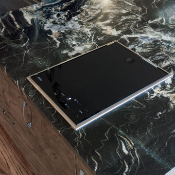
-The homeowner loves to cook and wanted to maximize her abilities. We incorporated a 48” rangetop with a griddle, a single oven, steam oven, microwave drawer and 15” induction cooktop next to a 48” Galley Ideal Workstation with two faucets. In order to have room for all of these appliances, the floor plan needed to accommodate more cabinetry. Both dining room entrances were closed off and the laundry room entrance were moved to the opposite end of the wall to allow two long walls for additional cabinets.
-The existing round columns throughout the first floor were outdated. To keep the architectural element of the columns, we wrapped the new columns to have a square shape with a flat panel on all four sides. Then, we painted them black (to tie in with the kitchen tops and curved hood surround) and added simple crown molding. For the flow of the space, closing up the odd corner that connected the laundry and dining room and relocating both room entrances allowed the space to actually feel larger and more continuous. --Adding the same square columns to the main dining room entrance, by the front door, also tied in the front of the house with the kitchen.
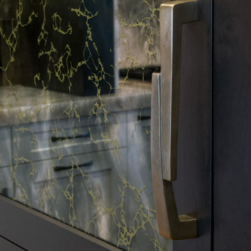
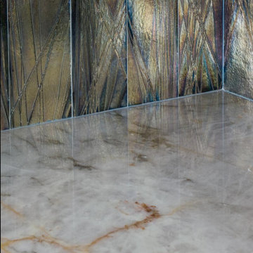
-The homeowner loves unique and bold materials. The main focal point of the kitchen is definitely the custom metal hood that incorporates two finishes and is set on a Lumix quartzite full-high back and side splashes. To make this area even more pronounced, a hearth-like drywall arch encloses the space. Once your eye moves off the hood, you start to notice the mirrored refrigerator panels, high gloss island cabinets, mirrored metal backsplash tile, delicate pendant island lights and the stunning island countertop material! There is a good mix of materials that make every space shine. The blacks, golds and pewter finishes help tie everything together.
-Lighting in a large kitchen is important. This space, besides getting a lot of natural light, needed lots of additional lighting due to the dark finishes. For overall lighting we have plenty of can lights in addition to lighting at the tops of the wall cabinets (that shine on the ceiling), undercabinet task lighting to make the tops sparkle and provide abundant lighting while prepping, pendant accent lighting over the island and a fandolier to add a little sparkle over the pub table. Voila!
 Drury Design
The existing kitchen wasn’t cutting it anymore. The homeowners designed and built this home about 20 years ago, but since then, their taste and needs changed. The outdated finishes felt outdated. There weren’t enough work areas. Some counterspace stations were just awkward due to the layout. Adjoining spaces around the kitchen were also in need of an update, but it was decided that the kitchen would undergo a transformation first.
Design Objectives
-Rework the overall layout (kitchen, laundry and butler’s pantry) to have a better flow and utilize the space better
-Incorporate materials with wow and pizzazz to reflect the homeowner’s style
-Design large work areas for cooking with two or more people at a time
-Provide seating at an island in addition to table seating
-Update surrounding spaces since the kitchen is open to the rest of the home
Design Challenges:
-Include a vast array of cooking appliances while having enough of cabinet storage
-Adjacent rooms need to feel updated and flow with new Kitchen
-Having multiple focal points with different materials but not have the space feel like a hodge podge
-Provide different task, accent and overall lighting to brighten up space
Design Solutions:
-The homeowner loves to cook and wanted to maximize her abilities. We incorporated a 48” rangetop with a griddle, a single oven, steam oven, microwave drawer and 15” induction cooktop next to a 48” Galley Ideal Workstation with two faucets. In order to have room for all of these appliances, the floor plan needed to accommodate more cabinetry. Both dining room entrances were closed off and the laundry room entrance were moved to the opposite end of the wall to allow two long walls for additional cabinets.
-The existing round columns throughout the first floor were outdated. To keep the architectural element of the columns, we wrapped the new columns to have a square shape with a flat panel on all four sides. Then, we painted them black (to tie in with the kitchen tops and curved hood surround) and added simple crown molding. For the flow of the space, closing up the odd corner that connected the laundry and dining room and relocating both room entrances allowed the space to actually feel larger and more continuous. --Adding the same square columns to the main dining room entrance, by the front door, also tied in the front of the house with the kitchen.
-The homeowner loves unique and bold materials. The main focal point of the kitchen is definitely the custom metal hood that incorporates two finishes and is set on a Lumix quartzite full-high back and side splashes. To make this area even more pronounced, a hearth-like drywall arch encloses the space. Once your eye moves off the hood, you start to notice the mirrored refrigerator panels, high gloss island cabinets, mirrored metal backsplash tile, delicate pendant island lights and the stunning island countertop material! There is a good mix of materials that make every space shine. The blacks, golds and pewter finishes help tie everything together.
-Lighting in a large kitchen is important. This space, besides getting a lot of natural light, needed lots of additional lighting due to the dark finishes. For overall lighting we have plenty of can lights in addition to lighting at the tops of the wall cabinets (that shine on the ceiling), undercabinet task lighting to make the tops sparkle and provide abundant lighting while prepping, pendant accent lighting over the island and a fandolier to add a little sparkle over the pub table. Voila!


 Drury Design
The existing kitchen wasn’t cutting it anymore. The homeowners designed and built this home about 20 years ago, but since then, their taste and needs changed. The outdated finishes felt outdated. There weren’t enough work areas. Some counterspace stations were just awkward due to the layout. Adjoining spaces around the kitchen were also in need of an update, but it was decided that the kitchen would undergo a transformation first.
Design Objectives
-Rework the overall layout (kitchen, laundry and butler’s pantry) to have a better flow and utilize the space better
-Incorporate materials with wow and pizzazz to reflect the homeowner’s style
-Design large work areas for cooking with two or more people at a time
-Provide seating at an island in addition to table seating
-Update surrounding spaces since the kitchen is open to the rest of the home
Design Challenges:
-Include a vast array of cooking appliances while having enough of cabinet storage
-Adjacent rooms need to feel updated and flow with new Kitchen
-Having multiple focal points with different materials but not have the space feel like a hodge podge
-Provide different task, accent and overall lighting to brighten up space
Design Solutions:
-The homeowner loves to cook and wanted to maximize her abilities. We incorporated a 48” rangetop with a griddle, a single oven, steam oven, microwave drawer and 15” induction cooktop next to a 48” Galley Ideal Workstation with two faucets. In order to have room for all of these appliances, the floor plan needed to accommodate more cabinetry. Both dining room entrances were closed off and the laundry room entrance were moved to the opposite end of the wall to allow two long walls for additional cabinets.
-The existing round columns throughout the first floor were outdated. To keep the architectural element of the columns, we wrapped the new columns to have a square shape with a flat panel on all four sides. Then, we painted them black (to tie in with the kitchen tops and curved hood surround) and added simple crown molding. For the flow of the space, closing up the odd corner that connected the laundry and dining room and relocating both room entrances allowed the space to actually feel larger and more continuous. --Adding the same square columns to the main dining room entrance, by the front door, also tied in the front of the house with the kitchen.
-The homeowner loves unique and bold materials. The main focal point of the kitchen is definitely the custom metal hood that incorporates two finishes and is set on a Lumix quartzite full-high back and side splashes. To make this area even more pronounced, a hearth-like drywall arch encloses the space. Once your eye moves off the hood, you start to notice the mirrored refrigerator panels, high gloss island cabinets, mirrored metal backsplash tile, delicate pendant island lights and the stunning island countertop material! There is a good mix of materials that make every space shine. The blacks, golds and pewter finishes help tie everything together.
-Lighting in a large kitchen is important. This space, besides getting a lot of natural light, needed lots of additional lighting due to the dark finishes. For overall lighting we have plenty of can lights in addition to lighting at the tops of the wall cabinets (that shine on the ceiling), undercabinet task lighting to make the tops sparkle and provide abundant lighting while prepping, pendant accent lighting over the island and a fandolier to add a little sparkle over the pub table. Voila!
 Twelve Stones Designs, LLC
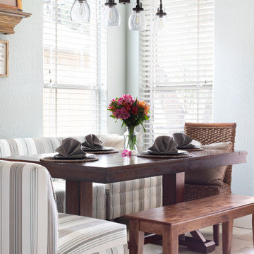
The owners of this kitchen had spent the money to upgrade the finishes in their kitchen upon building the home 12 years ago, but after living in the space for several years they realized how nonfunctional the layout really was. The (then) two preschool aged children had grown into busy, hungry teenagers with many friends who also liked to hang out at the house. So the family needed a more functional kitchen with better traffic flow, space for daily activities revolving around the kitchen at different times of day, and a kitchen that could accommodate cooking for and serving large groups. Furthermore, the dark, traditional finishes no longer reflected the homeowners’ style. They requested a brighter, more relaxed, coastal style that reflected their love of the seaside cities they like to visit.
Originally, the kitchen was U-shaped with a narrow island in the middle. The island created narrow aisles that bottle-necked at the dishwasher, refrigerator, and cooktop areas. There was a pass-through from the foyer into the kitchen, but the owners never liked that the pass-through was also located so close to the powder room. The awkward proximity was unappealing and made guests feel uncomfortable.
The kitchen’s storage was made up of lots of narrow cabinets, apothecary drawers, clipped corner units, and very few drawers. It lacked useful storage for the larger items the family used on a daily basis. And the kitchen’s only pantry was small closet that had only builder-grade, narrow shelving with no illumination to be able to see the contents inside.
Overall, the kitchen’s lighting plan was poorly executed. Only six recessed cans illuminated the entire kitchen and nook areas. The under cabinet lighting was not evenly distributed either. In fact, the builder had mis-placed the under cabinet lighting around the decorative pilasters which made for choppy, dark cubbies. Further, the builder didn’t include any lighting over the sink or the bar area, which meant whoever was doing the dishes was always in their own shadow. That, coupled with the steep overhang of the game room above made the bar area feel like a dim, cavernous space that wasn’t inviting or task oriented. The kitchen looked out into the main living space, but the raised bar and a narrow wall (which held the only large cabinet in the kitchen) created more of a barrier than a relationship to the living room or breakfast nook. In fact, one couldn’t even see the breakfast nook from the cooktop or sink areas due to its orientation. The raised bar top was too narrow to comfortably sit to either dine at or chat from due to the lack of knee space. The the homeowners confided that the kitchen felt more like a dark, dirty prison than place where the family, or their guests, wanted to gather and commune.
The clients' needs and desires were:
➢ to create a kitchen that would be a space the family loved to be in; to relate to the adjacent spaces all around, and to have better flow for entertaining large groups
➢ to remove the walls between the breakfast nook and living area and to be able to utilize the natural light from the windows in both those areas
➢ to incorporate a functional chopping block for prepping fresh food for home cooked meals, an island with a large sink and drain board, 2 pull out trash cans, and seating for at least the 2 teens to eat or do homework
➢ to design a kitchen and breakfast nook with an airy, coastal, relaxed vibe that blended with the rest of the house's coastal theme
➢ to integrate a layered lighting plan which would include ample general illumination, specific task lighting, decorative lighting, and lots of illuminated storage
➢ to design a kitchen with not only more storage for all the husband’s kitchen gadgets and collection of oils and spices, but smart storage, including a coffee/breakfast bar and a place to store and conceal the toaster oven and microwave
➢ to find a way to utilize the large open space between the kitchen, pantry area, and breakfast nook
Twelve Stones Designs achieved the owner's goals by:
➢ removing the walls between the kitchen and living room to allow the natural light to filter in from the adjacent rooms and to create a connection between the kitchen, nook, and living spaces for a sense of unity and communion
➢ removing the existing pantry and designing 3 large pantry style cabinets with LED tape lights and rollout drawers to house lots of kitchen appliances, gadgets, and tons of groceries. We also took the cabinets all the way up to the 9’ ceiling for additional storage for seasonal items and bulk storage.
➢ designing 2 islands - 1 with a gorgeous black walnut chopping block that houses a drawer for chopping and carving knives and a custom double pull out trash unit for point of use utilization - and 1 that houses the dishwasher, a large Blanco Gourmet sink with integrated drain board, woven baskets for fresh root vegetables and kitchen towels, plenty of drawer storage for kitchen items, and bar seating for up to 4 diners.
➢ closing off the space between the kitchen and the powder room to create a beautiful new private alcove for the powder room as well as adding some decorative storage. This also gave us space to include more tall storage near the new range for precision placement of the husband’s extensive oil and spice collection as well as a location for a combo-steam oven the wife wanted for baking and cooking healthy meals.
The project is enhanced functionally by:
➢ incorporated USB and standard receptacles for the kids’ laptops and phone charging in the large island
➢ designing the small island to include additional open shelving for items used on a daily basis such as a variety of bowls, plates, and colanders. This set up also works well for the husband who prefers to “plate” his dinners in restaurant-style fashion before presenting them to the table.
➢ the integration of specific storage units, such as double stacked cutlery drawers, a custom spice pull-out, a Kuerig coffee and tea pod drawer, and custom double stacked utensil drawers
➢ moving the refrigerator to the old oven location - this eliminated the bottle neck as well as created a better relationship to the eating table. It also utilizes the floor space between the pantry, nook, and kitchen
➢ creating a banquet style breakfast nook - this banquette seating not only doubles the amount of seating for large gatherings but it better utilizes the odd space between the kitchen and the previous nook area. It also helps to create a distinct pathway from the mudroom room through the pantry area, kitchen, nook, and living room.
➢ the coffee/breakfast bar area which includes the perfect location for the concealed microwave and toaster oven, convenient storage for the coffee pods and tea accoutrements. Roll-out drawers below also house the smoothie maker, hot water kettle, and a plethora of smoothie-making ingredients such as protein powders, smoothie additives, etc. Furthermore, the drawers below the Keurig house measuring utensil, cutlery, baking supplies and tupperware storage.
➢ incorporating lots of wide drawers and pullouts to accommodate large cookware.
➢ utilizing as much vertical space as possible by building storage to the ceiling which accommodates the family’s abundant amount of serving platters, baking sheets, bakeware, casserole dishes, and additional cutting boards.
The project is enhanced aesthetically by:
➢ new 5-piece Versailles pattern porcelain tile that now seamlessly joins the entire down stairs area together creating a bright, cohesiveness feeling instead of choppy separated spaces - it also adds a coastal feeling
➢ designing a cabinet to conceal the microwave and toaster oven
➢ the coastal influenced light fixtures over the nook table and island
➢ the sandy colors of the Langdon Cambria countertops. The swirling pattern and sparkling quartz pieces remind the homeowner of black-and-tan sandy beaches
➢ the striped banquet seating whose creamy white background and blue-green stripes were the inspiration for the cabinet and wall colors.
➢ All the interior doors were painted black to coordinate with the blacks and grays in the backsplash tile and countertop. This also adds a hint of tailored formality to an otherwise casual space.
➢ the use of WAC's Oculux small aperture LED units for the overhead lighting complimented with Diode LED strips for task lighting under the cabinets and inside the pantry and glass wall cabinets. All of the lighting applications are on separate dimmer switches.
Innovative uses of materials or construction methods by Realty Restoration LLC:
➢ Each 1-1/2” x 3” block of reclaimed end-grain black walnut that makes up the center island chopping block was hand milled and built in the shop. It was designed to look substantial and proportional to the surrounding elements, executed by creating the 4 inch tall top with a solid wood chamfered edge band.
➢ The metal doors on either side of the vent hood were also custom designed for this project and built in the Realty Restoration LLC shop. They are made 1x2, 11-gauge mild steel with ribbed glass. Weighing 60 lbs a piece, heavy duty cabinet hinges were added to support the weight of the door and keep them from sagging.
➢ Under-cabinet receptacles were added along the range wall in order to have a clean, uninterrupted backsplash.
Design obstacles to overcome:
➢ Because we were removing the demising walls between the kitchen and living room, we had to find a way to plumb and vent the new island. We did this by tunneling through the slab (the slab had post tension cables which prevented us from just trenching) to run a new wet vent through a nearby structural wall. We pulled the existing hot and cold lines between upper floor joists and ran them down the structural wall as well and up through a conduit in the tunnel.
➢ Since we were converting from wall overs to a gas range it allowed us to utilize the 220 feed for the wall ovens to provide a new sub panel for all the new kitchen circuits
➢ Due to framing deficiencies inherited from the original build there was a 1-1/2” differential in the floor-to-ceiling height over a 20 foot span; by utilizing the process of cutting and furring coupled with the crown moulding details on the cabinet elevations we were able to mask the problem and provide seamless transitions between the cabinet components.
Evidence of superior craftsmanship:
➢ uniquely designed, one-of-a-kind metal “X” end panels on the large island. The end panels were custom made in the Realty Restoration LLC shop and fitted to the exact dimensions of the island. The welding seams are completely indistinguishable - the posts look like they are cut from a single sheet of metal
➢ square metal posts on the small island were also custom made and designed to compliment and carry through the metal element s throughout the kitchen
➢ the beautiful, oversized end panels on the pantry cabinets which give the breakfast nook a tailored look
➢ integrating a large format 5 piece Versailles tile pattern to seamlessly flow from the existing spaces into the new kitchen space
➢ By constructing a custom cabinet that jogged around a corner we could not remodel (housing the entry way coat closet) we were able to camouflage the adjacent wall offset within the upper and lower cabinets. By designing around the existing jog in the structural walls we accomplished a few things: we were able to find the space to house, and hide, the microwave and toaster oven yet still have a clean cohesive appearance from the kitchen side. Additionally, the owners were able to keep their much needed coat closet and we didn’t have to increase the budget with unnecessary structural work.
 Drury Design
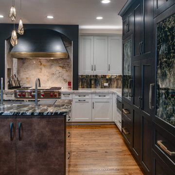
The existing kitchen wasn’t cutting it anymore. The homeowners designed and built this home about 20 years ago, but since then, their taste and needs changed. The outdated finishes felt outdated. There weren’t enough work areas. Some counterspace stations were just awkward due to the layout. Adjoining spaces around the kitchen were also in need of an update, but it was decided that the kitchen would undergo a transformation first.
Design Objectives
-Rework the overall layout (kitchen, laundry and butler’s pantry) to have a better flow and utilize the space better
-Incorporate materials with wow and pizzazz to reflect the homeowner’s style
-Design large work areas for cooking with two or more people at a time
-Provide seating at an island in addition to table seating
-Update surrounding spaces since the kitchen is open to the rest of the home
Design Challenges:
-Include a vast array of cooking appliances while having enough of cabinet storage
-Adjacent rooms need to feel updated and flow with new Kitchen
-Having multiple focal points with different materials but not have the space feel like a hodge podge
-Provide different task, accent and overall lighting to brighten up space
Design Solutions:
-The homeowner loves to cook and wanted to maximize her abilities. We incorporated a 48” rangetop with a griddle, a single oven, steam oven, microwave drawer and 15” induction cooktop next to a 48” Galley Ideal Workstation with two faucets. In order to have room for all of these appliances, the floor plan needed to accommodate more cabinetry. Both dining room entrances were closed off and the laundry room entrance were moved to the opposite end of the wall to allow two long walls for additional cabinets.
-The existing round columns throughout the first floor were outdated. To keep the architectural element of the columns, we wrapped the new columns to have a square shape with a flat panel on all four sides. Then, we painted them black (to tie in with the kitchen tops and curved hood surround) and added simple crown molding. For the flow of the space, closing up the odd corner that connected the laundry and dining room and relocating both room entrances allowed the space to actually feel larger and more continuous. --Adding the same square columns to the main dining room entrance, by the front door, also tied in the front of the house with the kitchen.
-The homeowner loves unique and bold materials. The main focal point of the kitchen is definitely the custom metal hood that incorporates two finishes and is set on a Lumix quartzite full-high back and side splashes. To make this area even more pronounced, a hearth-like drywall arch encloses the space. Once your eye moves off the hood, you start to notice the mirrored refrigerator panels, high gloss island cabinets, mirrored metal backsplash tile, delicate pendant island lights and the stunning island countertop material! There is a good mix of materials that make every space shine. The blacks, golds and pewter finishes help tie everything together.
-Lighting in a large kitchen is important. This space, besides getting a lot of natural light, needed lots of additional lighting due to the dark finishes. For overall lighting we have plenty of can lights in addition to lighting at the tops of the wall cabinets (that shine on the ceiling), undercabinet task lighting to make the tops sparkle and provide abundant lighting while prepping, pendant accent lighting over the island and a fandolier to add a little sparkle over the pub table. Voila!
 InnovationLand
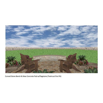
3D Drawing
A two-level pergola, circular firepit area and outdoor kitchen with a charcoal-gas combo grill star in this Houston patio addition designed for entertaining large crowds in style.
"The client was an attorney with a passion for cooking and entertaining," says the project's principal designer, Lisha Maxey of LGH Designs. "Her main objective with this space was to create a large area for 10 to 20 guests, including seating and the prep and cooking of meals."
Located in the backyard of the client's home in Spring, TX, this beautiful outdoor living and entertaining space includes a 28-by-12-foot patio with Fantastico silver travertine tile flooring, arranged in a Versailles pattern. The walkway is Oklahoma wister flagstone.
Providing filtered shade for the patio is a two-level pergola of treated pine stained honey gold. The larger, higher tier is about 18 by 10 feet; the smaller, lower tier is about 10 feet square.
"We covered the entire pergola with Lexan - a high-quality, clear acrylic sheet that provides protection from the sun, heat and rain," says Outdoor Homescapes of Houston owner Wayne Franks.
Beneath the lower tier of the pergola sits an L-shaped, 12-by-9-foot outdoor kitchen island faced with Carmel Country ledgestone. The island houses a Fire Magic® combination charcoal-gas grill and lowered power burner, a Pacific Living countertop pizza oven and a stainless steel RCS trash drawer and sink. The countertops and raised bar are Fantastico silver travertine (18-square-inch tiles) and the backsplash is real quartz.
"The most unique design item of this kitchen area is the hexagon/circular table we added to the end of the long bar," says Lisha. This enabled the client to add seating for her dining guests."
Under the higher, larger tier of the pergola is a seating area, made up of a coffee table and espresso-colored rattan sofa and club chairs with spring-green-and-white cushions.
"Lighting also plays an important role in this space, since the client often entertains in the evening," says Wayne. Enter the chandelier over the patio seating arrangement and - over the outdoor kitchen - pendant lamps and an industrial-modern ceiling fan with a light fixture in the center. "It's important to layer your lighting for ambiance, security and safety - from an all-over ambient light that fills the space to under-the-counter task lighting for food prep and cooking to path and retaining wall lighting."
Off the patio is a transition area of crushed granite and floating flagstone pavers, leading to a circular firepit area of stamped concrete.
At the center of this circle is the standalone firepit, framed at the back by a curved stone bench. The walls of the bench and column bases for the pergola, by the way, are the same ledgestone as the kitchen island. The top slab on the bench is a hearth piece of manmade stone.
"I think the finish materials blend with the home really well," says Wayne. "We met her objectives of being able to entertain with 10 to 12 to 20 people at one time and being able to cook with charcoal and gas separately in one unit. And of course, the project was on time, on budget."
"It is truly a paradise," says the client in her Houzz review of the project. "They listened to my vision and incorporated their expertise to create an outdoor living space just perfect for me and my family!"
 Revival House
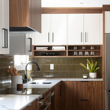
This kitchen remodel of a 70’s home reflects the character of the existing home and some design features of that era while giving it a fresh, modern look. The client wanted the remodeled space to blend in with the rest of the home, retaining some of the 1970’s character while including all the best features of today’s kitchens.
Removing the wall separating the informal eating area from the family room provided a nice open space allowing for a larger kitchen footprint and plenty of light throughout.
A combination of Decor's Dove Wing painted and Natural stained Walnut cabinetry was chosen. The dark walnut, slab lower cabinets unite the kitchen with the darker wood theme found throughout the home, while the white, slim-shaker upper cabinets give the space a light and airy feeling. The beautiful vertical grain of the walnut is the foundation of a theme that is echoed throughout the space: tall & thin vertical lines without bulk or needless ornamentation. The unique design detail gives the kitchen a great balance of depth and character while still brightening the space. Walnut crown molding throughout defines the space and ties everything together.
The vertical-set green Japanese tile from Virginia Tile, also characteristic of the 1970’s, serves as the backsplash and fills the range wall. The tall & slim theme is underscored by several design elements from the vertical tile and tall cabinet pulls in matte black from Top Knobs, to the thin quartz countertops, skinny shaker cabinet door style, and tall, slim refrigerator doors, all meant to eliminate excess bulk and lighten up the space.
An impressive focal point in this kitchen is the custom walnut reeded hood, designed to reflect a popular 1970’s feature. Narrow walnut shelves below the white upper cabinets near the refrigerator provide a nice surprise to the eye. An extra long island, decked in polished 2cm Corian Quartz countertop in Novello, provides ample seating, storage, and task space, making it an ideal surface for serving, eating, meal prep, gathering, and entertaining. The client desired a long island with comfortable counter seating at one end for a family of five, including space for a baby’s high chair.
High-end Bosch appliances and functional storage were also priorities. The dry bar on the opposite wall features additional storage and an Elica beverage refrigerator, framed by tall walnut larder cabinets on each end. The white larder cabinet doors pocket into the sides, revealing beautiful finished walnut interiors.
Wall cabinets feature Decor’s integrated under-cabinet lighting, while puck lights illuminate the beverage center counter. This kitchen is bursting with integrated storage. Many deep drawers feature interior double drawers making smaller items more accessible. Decor’s spice drawer to the right of the range keeps spices organized, while divided tray storage on the left of the range keeps these taller items handy.
While the design is inspired by the 1970’s, it exemplifies the best of the 2020’s, and the new space is open, bright, and functional for this family with young children.
 SabaRehman Abdulrehman
In today’s world of smart interiors and luxury-inspired home décor, LED Mirror backlit designs have become a defining trend. From elegant bathrooms to sophisticated dressing areas and premium commercial spaces, LED Mirrors are now more than just reflective surfaces—they are statement pieces that combine technology, style, and functionality.
Whether you are renovating your home, upgrading a salon, designing a hotel, or creating a modern workspace, investing in a high-quality LED mirror can instantly elevate the atmosphere. The perfect balance of illumination and aesthetics makes these mirrors one of the most sought-after interior additions in contemporary architecture.
This blog explores everything you need to know about LED Mirror backlit solutions, their benefits, applications, features, and why they are becoming essential in modern living spaces.
What Is an LED Mirror Backlit Design?
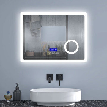
An LED Mirror backlit system refers to a mirror equipped with LED lighting installed behind the mirror surface. Instead of visible front-facing bulbs, the light gently radiates from the rear edges, producing a soft halo effect around the mirror.
This indirect illumination creates a luxurious and ambient glow while providing practical lighting for everyday tasks such as grooming, makeup application, shaving, and skincare routines.
Unlike traditional mirrors, LED Mirrors offer:
- Energy-efficient illumination
- Elegant visual appeal
- Better light distribution
- Enhanced functionality
- Modern smart features
- Bathrooms
- Bedrooms
- Dressing rooms
- Salons
- Hotels
- Restaurants
- Retail stores
- Reduces harsh shadows
- Improves visibility
- Enhances facial clarity
- Creates a comfortable lighting experience
- Reduce energy bills
- Lower electricity usage
- Support eco-friendly living
- Increase long-term savings
- Turn lights on/off
- Adjust brightness
- Change color temperature
- Bright white light for makeup application
- Warm soft light for relaxation
- Neutral lighting for everyday grooming
- Bluetooth speakers
- Digital clocks
- Temperature displays
- Voice control
- Motion sensors
- Better lighting for shaving and makeup
- Enhanced bathroom aesthetics
- Increased property value
- Luxurious visual appeal
- Salons
- Spas
- Hotels
- Restaurants
- Retail stores
- Compact rectangular mirrors work best
- Oversized backlit mirrors create a dramatic statement
- Rectangular
- Oval
- Round
- Square
- Custom geometric designs
- Warm White (cozy ambiance)
- Cool White (bright and crisp)
- Natural White (balanced daylight effect)
- Improve visual appeal
- Increase perceived luxury
- Enhance property value
- Small bathrooms
- Compact apartments
- Narrow dressing areas

 Proven Winners
Close up of 'Amy Cotta' flowers. In cool weather, leaf color is dark purple.
Inspiration for a mid-sized traditional partial sun landscaping in Chicago for spring.
Inspiration for a mid-sized traditional partial sun landscaping in Chicago for spring.
 Revival House
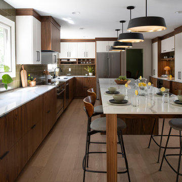
This kitchen remodel of a 70’s home reflects the character of the existing home and some design features of that era while giving it a fresh, modern look. The client wanted the remodeled space to blend in with the rest of the home, retaining some of the 1970’s character while including all the best features of today’s kitchens.
Removing the wall separating the informal eating area from the family room provided a nice open space allowing for a larger kitchen footprint and plenty of light throughout.
A combination of Decor's Dove Wing painted and Natural stained Walnut cabinetry was chosen. The dark walnut, slab lower cabinets unite the kitchen with the darker wood theme found throughout the home, while the white, slim-shaker upper cabinets give the space a light and airy feeling. The beautiful vertical grain of the walnut is the foundation of a theme that is echoed throughout the space: tall & thin vertical lines without bulk or needless ornamentation. The unique design detail gives the kitchen a great balance of depth and character while still brightening the space. Walnut crown molding throughout defines the space and ties everything together.
The vertical-set green Japanese tile from Virginia Tile, also characteristic of the 1970’s, serves as the backsplash and fills the range wall. The tall & slim theme is underscored by several design elements from the vertical tile and tall cabinet pulls in matte black from Top Knobs, to the thin quartz countertops, skinny shaker cabinet door style, and tall, slim refrigerator doors, all meant to eliminate excess bulk and lighten up the space.
An impressive focal point in this kitchen is the custom walnut reeded hood, designed to reflect a popular 1970’s feature. Narrow walnut shelves below the white upper cabinets near the refrigerator provide a nice surprise to the eye. An extra long island, decked in polished 2cm Corian Quartz countertop in Novello, provides ample seating, storage, and task space, making it an ideal surface for serving, eating, meal prep, gathering, and entertaining. The client desired a long island with comfortable counter seating at one end for a family of five, including space for a baby’s high chair.
High-end Bosch appliances and functional storage were also priorities. The dry bar on the opposite wall features additional storage and an Elica beverage refrigerator, framed by tall walnut larder cabinets on each end. The white larder cabinet doors pocket into the sides, revealing beautiful finished walnut interiors.
Wall cabinets feature Decor’s integrated under-cabinet lighting, while puck lights illuminate the beverage center counter. This kitchen is bursting with integrated storage. Many deep drawers feature interior double drawers making smaller items more accessible. Decor’s spice drawer to the right of the range keeps spices organized, while divided tray storage on the left of the range keeps these taller items handy.
While the design is inspired by the 1970’s, it exemplifies the best of the 2020’s, and the new space is open, bright, and functional for this family with young children.
 Benson Homes LLC
This remodeling story is a wonderful example of how removing and shifting walls can have an amazing impact on the functionality and visual appeal of an entire level of a home. When our clients reached out to us, they were looking to create an open concept Kitchen that would allow for easy entertaining. The couple had recently purchased this townhome so his mother could be closer to the family.
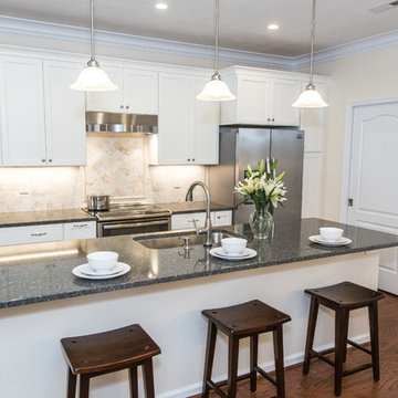
The existing floorplan offered first floor living, but the Kitchen was tucked in the back and was separated from the rest of the living space by a full wall with a small pass through into the Dining Room. Our design involved removing the dividing wall between the Dining Room and Kitchen as well as the fake columns and beam that separated the Dining Room and Living Room. The entire space was opened up to allow for easy flow and view throughout the first floor living space. The wall shared by the Kitchen and large Master Bedroom was shifted back just enough to provide a full wall of additional cabinetry including a much-needed large double Pantry cabinet. Now that we had opened up the Kitchen area we could focus on the cabinetry layout and selections.
The existing wood toned cabinets were replaced with white cabinets and crown molding to match the rest of the home. The larger, open space allowed for more cabinetry and the addition of an island with new undermount sink, dishwasher and convenient trash pullout along with seating for the grandchildren. A new range hood was installed and vented to the exterior of the house to replace the old recirculating hood. We were able to repurpose the some of the existing cabinets for use above the washer and dryer in the adjoining Laundry Room and swapped out the existing swinging door for a pocket door to free up traffic flow when doing Laundry and working in the Kitchen. The slate-look ceramic tile was replaced with a pre-engineered hardwood floor that creates a sense of warmth while easy to clean. The new Cambria countertop compliments the slate-look tile found in the Dining Room and Living Room and a natural field tile backsplash offsets the cabinets beautifully.
The single fluorescent ceiling light was outdated and did not provide adequate lighting for the new Kitchen. The new lighting plan was carefully thought out to provide general illumination through well placed recessed lighting; task lighting through pendant lighting over the island and under cabinet lighting; and aesthetic fluidity with an eye-catching chandelier for the Dining Room table. Special details include a touch faucet, under counter microwave and glass front cabinetry for displaying dishes.
By removing and shifting walls, we improved the entire flow of the first floor visually as well as functionally and created a beautiful, light-filled space for cooking and entertaining. Grandma can easily prepare meals in her new Kitchen and still chat with her guests and grandchildren who love to sit at the island as well as in the adjoining Dining Room and Living Room.
The Benson Homes team really enjoyed creating this space for this family and we hope they will enjoy spending time with friends and family for years to come.
 Revival House
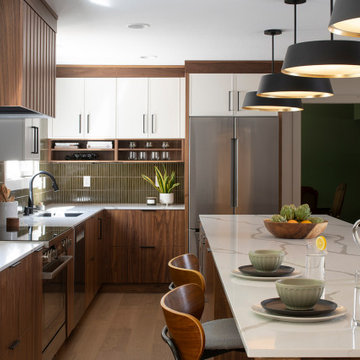
This kitchen remodel of a 70’s home reflects the character of the existing home and some design features of that era while giving it a fresh, modern look. The client wanted the remodeled space to blend in with the rest of the home, retaining some of the 1970’s character while including all the best features of today’s kitchens.
Removing the wall separating the informal eating area from the family room provided a nice open space allowing for a larger kitchen footprint and plenty of light throughout.
A combination of Decor's Dove Wing painted and Natural stained Walnut cabinetry was chosen. The dark walnut, slab lower cabinets unite the kitchen with the darker wood theme found throughout the home, while the white, slim-shaker upper cabinets give the space a light and airy feeling. The beautiful vertical grain of the walnut is the foundation of a theme that is echoed throughout the space: tall & thin vertical lines without bulk or needless ornamentation. The unique design detail gives the kitchen a great balance of depth and character while still brightening the space. Walnut crown molding throughout defines the space and ties everything together.
The vertical-set green Japanese tile from Virginia Tile, also characteristic of the 1970’s, serves as the backsplash and fills the range wall. The tall & slim theme is underscored by several design elements from the vertical tile and tall cabinet pulls in matte black from Top Knobs, to the thin quartz countertops, skinny shaker cabinet door style, and tall, slim refrigerator doors, all meant to eliminate excess bulk and lighten up the space.
An impressive focal point in this kitchen is the custom walnut reeded hood, designed to reflect a popular 1970’s feature. Narrow walnut shelves below the white upper cabinets near the refrigerator provide a nice surprise to the eye. An extra long island, decked in polished 2cm Corian Quartz countertop in Novello, provides ample seating, storage, and task space, making it an ideal surface for serving, eating, meal prep, gathering, and entertaining. The client desired a long island with comfortable counter seating at one end for a family of five, including space for a baby’s high chair.
High-end Bosch appliances and functional storage were also priorities. The dry bar on the opposite wall features additional storage and an Elica beverage refrigerator, framed by tall walnut larder cabinets on each end. The white larder cabinet doors pocket into the sides, revealing beautiful finished walnut interiors.
Wall cabinets feature Decor’s integrated under-cabinet lighting, while puck lights illuminate the beverage center counter. This kitchen is bursting with integrated storage. Many deep drawers feature interior double drawers making smaller items more accessible. Decor’s spice drawer to the right of the range keeps spices organized, while divided tray storage on the left of the range keeps these taller items handy.
While the design is inspired by the 1970’s, it exemplifies the best of the 2020’s, and the new space is open, bright, and functional for this family with young children.
 Inhabit | Space
Whon Photography
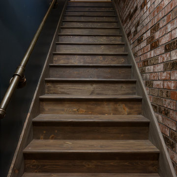
Large urban underground carpeted staircase photo in Indianapolis with gray walls and no fireplace
Large urban underground carpeted staircase photo in Indianapolis with gray walls and no fireplace
 Benson Homes LLC
This remodeling story is a wonderful example of how removing and shifting walls can have an amazing impact on the functionality and visual appeal of an entire level of a home. When our clients reached out to us, they were looking to create an open concept Kitchen that would allow for easy entertaining. The couple had recently purchased this townhome so his mother could be closer to the family.
The existing floorplan offered first floor living, but the Kitchen was tucked in the back and was separated from the rest of the living space by a full wall with a small pass through into the Dining Room. Our design involved removing the dividing wall between the Dining Room and Kitchen as well as the fake columns and beam that separated the Dining Room and Living Room. The entire space was opened up to allow for easy flow and view throughout the first floor living space. The wall shared by the Kitchen and large Master Bedroom was shifted back just enough to provide a full wall of additional cabinetry including a much-needed large double Pantry cabinet. Now that we had opened up the Kitchen area we could focus on the cabinetry layout and selections.
The existing wood toned cabinets were replaced with white cabinets and crown molding to match the rest of the home. The larger, open space allowed for more cabinetry and the addition of an island with new undermount sink, dishwasher and convenient trash pullout along with seating for the grandchildren. A new range hood was installed and vented to the exterior of the house to replace the old recirculating hood. We were able to repurpose the some of the existing cabinets for use above the washer and dryer in the adjoining Laundry Room and swapped out the existing swinging door for a pocket door to free up traffic flow when doing Laundry and working in the Kitchen. The slate-look ceramic tile was replaced with a pre-engineered hardwood floor that creates a sense of warmth while easy to clean. The new Cambria countertop compliments the slate-look tile found in the Dining Room and Living Room and a natural field tile backsplash offsets the cabinets beautifully.
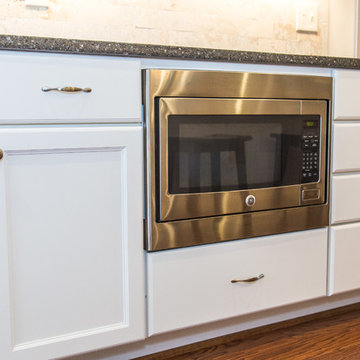
The single fluorescent ceiling light was outdated and did not provide adequate lighting for the new Kitchen. The new lighting plan was carefully thought out to provide general illumination through well placed recessed lighting; task lighting through pendant lighting over the island and under cabinet lighting; and aesthetic fluidity with an eye-catching chandelier for the Dining Room table. Special details include a touch faucet, under counter microwave and glass front cabinetry for displaying dishes.
By removing and shifting walls, we improved the entire flow of the first floor visually as well as functionally and created a beautiful, light-filled space for cooking and entertaining. Grandma can easily prepare meals in her new Kitchen and still chat with her guests and grandchildren who love to sit at the island as well as in the adjoining Dining Room and Living Room.
The Benson Homes team really enjoyed creating this space for this family and we hope they will enjoy spending time with friends and family for years to come.
 Benson Homes LLC
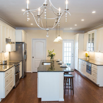
This remodeling story is a wonderful example of how removing and shifting walls can have an amazing impact on the functionality and visual appeal of an entire level of a home. When our clients reached out to us, they were looking to create an open concept Kitchen that would allow for easy entertaining. The couple had recently purchased this townhome so his mother could be closer to the family.
The existing floorplan offered first floor living, but the Kitchen was tucked in the back and was separated from the rest of the living space by a full wall with a small pass through into the Dining Room. Our design involved removing the dividing wall between the Dining Room and Kitchen as well as the fake columns and beam that separated the Dining Room and Living Room. The entire space was opened up to allow for easy flow and view throughout the first floor living space. The wall shared by the Kitchen and large Master Bedroom was shifted back just enough to provide a full wall of additional cabinetry including a much-needed large double Pantry cabinet. Now that we had opened up the Kitchen area we could focus on the cabinetry layout and selections.
The existing wood toned cabinets were replaced with white cabinets and crown molding to match the rest of the home. The larger, open space allowed for more cabinetry and the addition of an island with new undermount sink, dishwasher and convenient trash pullout along with seating for the grandchildren. A new range hood was installed and vented to the exterior of the house to replace the old recirculating hood. We were able to repurpose the some of the existing cabinets for use above the washer and dryer in the adjoining Laundry Room and swapped out the existing swinging door for a pocket door to free up traffic flow when doing Laundry and working in the Kitchen. The slate-look ceramic tile was replaced with a pre-engineered hardwood floor that creates a sense of warmth while easy to clean. The new Cambria countertop compliments the slate-look tile found in the Dining Room and Living Room and a natural field tile backsplash offsets the cabinets beautifully.
The single fluorescent ceiling light was outdated and did not provide adequate lighting for the new Kitchen. The new lighting plan was carefully thought out to provide general illumination through well placed recessed lighting; task lighting through pendant lighting over the island and under cabinet lighting; and aesthetic fluidity with an eye-catching chandelier for the Dining Room table. Special details include a touch faucet, under counter microwave and glass front cabinetry for displaying dishes.
By removing and shifting walls, we improved the entire flow of the first floor visually as well as functionally and created a beautiful, light-filled space for cooking and entertaining. Grandma can easily prepare meals in her new Kitchen and still chat with her guests and grandchildren who love to sit at the island as well as in the adjoining Dining Room and Living Room.
The Benson Homes team really enjoyed creating this space for this family and we hope they will enjoy spending time with friends and family for years to come.
31