
Search results for "Larger task" in Home Design Ideas
 Gallery KBNY
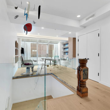
For our full gut renovation of this Manhattan loft penthouse, we partnered with architecture firm Todd Zwigard Architects. Many of our clients know us as experts in the full design-build approach, where we handle every aspect of the project. But in this case, architectural plans were already drawn, the full schedule was finished, and our clients needed a partner to execute on the architectural plans – enter Gallery. Construction management is as vital to a project as the design phase, so we’re happy to offer our expertise in this type of scenario.
A DIFFERENT APPROACH
Construction and design are often the face of most renovations, but the planning and follow-through are naturally just as necessary to make it all come together. The project itself was a fairly straightforward gut renovation of the loft. Everything was included: new floors, a new kitchen, new bathrooms, new lighting. Our task was to manage every aspect of the construction, ensuring that the planning work of Todd Zwigard Architects was executed to the exact vision imagined for this Manhattan loft renovation.
CONTEMPORARY GOES ECLECTIC
Although we didn’t contribute to the aesthetic of the interior design in this project, we did carry out the plans that brought it life. The tone was very modern, with some eclectic touches. The kitchen, featuring an island with a baby blue lacquered finish, blends contemporary clean lines into an industrial-tinged, almost futuristic aesthetic. Reclaimed wooden doors and art pieces collected throughout the years are an ode to the client's travels, an artistic touch from Todd Zwigard Architects.
LET’S TALK
Quality of work is of course important, but there are several components of construction management that are equally vital: communication; processes that make sure you're able to adhere to schedules; protocols with both safety and communication. You might say this is the nerding out of the construction process. It’s not often the face of a project, but it’s absolutely massive in terms of carrying out a successful renovation, whether it’s a penthouse loft in Manhattan, a condo in Prospect Heights, or a kitchen in a Brooklyn brownstone. Quality construction management is probably one of the biggest ways to separate professional contractors from those who aren’t.
ART FROM CHAOS
This was such a large project, so our ability to procure and source all the finishes and fixtures was hugely important to our clients. The sheer number of floors, tiles, and plumbing fixtures alone that need to be ordered, in addition to everything else, plus figuring out lead times, shipments, deliveries, and inspections. It can quickly become chaotic, but there’s an art to the planning and organization, and we’ve mastered it.
The larger a project is, the more likely that havoc will rear its head. The antidote is not only really proper planning and construction management, as we achieved in this Manhattan loft penthouse renovation, but also a great working relationship with everyone else involved in the project: contractors, architect, and clients alike.
GET IN TOUCH
Is a loft renovation in New York in your future? We’re experts in renovating New York homes, from apartment combinations in managed buildings to kitchens and bathrooms in co-ops and condos to gut renovations of historic spaces and landmark renovations.
Contact us to learn more about our approach as a design-and-build firm, where all aspects of your project are handled under the same roof. In addition to construction management, you’ll get our in-house architect in-house and the added renovation benefits of experts in design, material selection, and paperwork.
 Twelve Stones Designs, LLC
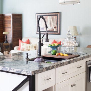
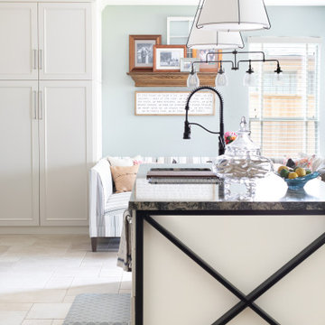
The owners of this kitchen had spent the money to upgrade the finishes in their kitchen upon building the home 12 years ago, but after living in the space for several years they realized how nonfunctional the layout really was. The (then) two preschool aged children had grown into busy, hungry teenagers with many friends who also liked to hang out at the house. So the family needed a more functional kitchen with better traffic flow, space for daily activities revolving around the kitchen at different times of day, and a kitchen that could accommodate cooking for and serving large groups. Furthermore, the dark, traditional finishes no longer reflected the homeowners’ style. They requested a brighter, more relaxed, coastal style that reflected their love of the seaside cities they like to visit.
Originally, the kitchen was U-shaped with a narrow island in the middle. The island created narrow aisles that bottle-necked at the dishwasher, refrigerator, and cooktop areas. There was a pass-through from the foyer into the kitchen, but the owners never liked that the pass-through was also located so close to the powder room. The awkward proximity was unappealing and made guests feel uncomfortable.
The kitchen’s storage was made up of lots of narrow cabinets, apothecary drawers, clipped corner units, and very few drawers. It lacked useful storage for the larger items the family used on a daily basis. And the kitchen’s only pantry was small closet that had only builder-grade, narrow shelving with no illumination to be able to see the contents inside.
Overall, the kitchen’s lighting plan was poorly executed. Only six recessed cans illuminated the entire kitchen and nook areas. The under cabinet lighting was not evenly distributed either. In fact, the builder had mis-placed the under cabinet lighting around the decorative pilasters which made for choppy, dark cubbies. Further, the builder didn’t include any lighting over the sink or the bar area, which meant whoever was doing the dishes was always in their own shadow. That, coupled with the steep overhang of the game room above made the bar area feel like a dim, cavernous space that wasn’t inviting or task oriented. The kitchen looked out into the main living space, but the raised bar and a narrow wall (which held the only large cabinet in the kitchen) created more of a barrier than a relationship to the living room or breakfast nook. In fact, one couldn’t even see the breakfast nook from the cooktop or sink areas due to its orientation. The raised bar top was too narrow to comfortably sit to either dine at or chat from due to the lack of knee space. The the homeowners confided that the kitchen felt more like a dark, dirty prison than place where the family, or their guests, wanted to gather and commune.
The clients' needs and desires were:
➢ to create a kitchen that would be a space the family loved to be in; to relate to the adjacent spaces all around, and to have better flow for entertaining large groups
➢ to remove the walls between the breakfast nook and living area and to be able to utilize the natural light from the windows in both those areas
➢ to incorporate a functional chopping block for prepping fresh food for home cooked meals, an island with a large sink and drain board, 2 pull out trash cans, and seating for at least the 2 teens to eat or do homework
➢ to design a kitchen and breakfast nook with an airy, coastal, relaxed vibe that blended with the rest of the house's coastal theme
➢ to integrate a layered lighting plan which would include ample general illumination, specific task lighting, decorative lighting, and lots of illuminated storage
➢ to design a kitchen with not only more storage for all the husband’s kitchen gadgets and collection of oils and spices, but smart storage, including a coffee/breakfast bar and a place to store and conceal the toaster oven and microwave
➢ to find a way to utilize the large open space between the kitchen, pantry area, and breakfast nook
Twelve Stones Designs achieved the owner's goals by:
➢ removing the walls between the kitchen and living room to allow the natural light to filter in from the adjacent rooms and to create a connection between the kitchen, nook, and living spaces for a sense of unity and communion
➢ removing the existing pantry and designing 3 large pantry style cabinets with LED tape lights and rollout drawers to house lots of kitchen appliances, gadgets, and tons of groceries. We also took the cabinets all the way up to the 9’ ceiling for additional storage for seasonal items and bulk storage.
➢ designing 2 islands - 1 with a gorgeous black walnut chopping block that houses a drawer for chopping and carving knives and a custom double pull out trash unit for point of use utilization - and 1 that houses the dishwasher, a large Blanco Gourmet sink with integrated drain board, woven baskets for fresh root vegetables and kitchen towels, plenty of drawer storage for kitchen items, and bar seating for up to 4 diners.
➢ closing off the space between the kitchen and the powder room to create a beautiful new private alcove for the powder room as well as adding some decorative storage. This also gave us space to include more tall storage near the new range for precision placement of the husband’s extensive oil and spice collection as well as a location for a combo-steam oven the wife wanted for baking and cooking healthy meals.
The project is enhanced functionally by:
➢ incorporated USB and standard receptacles for the kids’ laptops and phone charging in the large island
➢ designing the small island to include additional open shelving for items used on a daily basis such as a variety of bowls, plates, and colanders. This set up also works well for the husband who prefers to “plate” his dinners in restaurant-style fashion before presenting them to the table.
➢ the integration of specific storage units, such as double stacked cutlery drawers, a custom spice pull-out, a Kuerig coffee and tea pod drawer, and custom double stacked utensil drawers
➢ moving the refrigerator to the old oven location - this eliminated the bottle neck as well as created a better relationship to the eating table. It also utilizes the floor space between the pantry, nook, and kitchen
➢ creating a banquet style breakfast nook - this banquette seating not only doubles the amount of seating for large gatherings but it better utilizes the odd space between the kitchen and the previous nook area. It also helps to create a distinct pathway from the mudroom room through the pantry area, kitchen, nook, and living room.
➢ the coffee/breakfast bar area which includes the perfect location for the concealed microwave and toaster oven, convenient storage for the coffee pods and tea accoutrements. Roll-out drawers below also house the smoothie maker, hot water kettle, and a plethora of smoothie-making ingredients such as protein powders, smoothie additives, etc. Furthermore, the drawers below the Keurig house measuring utensil, cutlery, baking supplies and tupperware storage.
➢ incorporating lots of wide drawers and pullouts to accommodate large cookware.
➢ utilizing as much vertical space as possible by building storage to the ceiling which accommodates the family’s abundant amount of serving platters, baking sheets, bakeware, casserole dishes, and additional cutting boards.
The project is enhanced aesthetically by:
➢ new 5-piece Versailles pattern porcelain tile that now seamlessly joins the entire down stairs area together creating a bright, cohesiveness feeling instead of choppy separated spaces - it also adds a coastal feeling
➢ designing a cabinet to conceal the microwave and toaster oven
➢ the coastal influenced light fixtures over the nook table and island
➢ the sandy colors of the Langdon Cambria countertops. The swirling pattern and sparkling quartz pieces remind the homeowner of black-and-tan sandy beaches
➢ the striped banquet seating whose creamy white background and blue-green stripes were the inspiration for the cabinet and wall colors.
➢ All the interior doors were painted black to coordinate with the blacks and grays in the backsplash tile and countertop. This also adds a hint of tailored formality to an otherwise casual space.
➢ the use of WAC's Oculux small aperture LED units for the overhead lighting complimented with Diode LED strips for task lighting under the cabinets and inside the pantry and glass wall cabinets. All of the lighting applications are on separate dimmer switches.
Innovative uses of materials or construction methods by Realty Restoration LLC:
➢ Each 1-1/2” x 3” block of reclaimed end-grain black walnut that makes up the center island chopping block was hand milled and built in the shop. It was designed to look substantial and proportional to the surrounding elements, executed by creating the 4 inch tall top with a solid wood chamfered edge band.
➢ The metal doors on either side of the vent hood were also custom designed for this project and built in the Realty Restoration LLC shop. They are made 1x2, 11-gauge mild steel with ribbed glass. Weighing 60 lbs a piece, heavy duty cabinet hinges were added to support the weight of the door and keep them from sagging.
➢ Under-cabinet receptacles were added along the range wall in order to have a clean, uninterrupted backsplash.
Design obstacles to overcome:
➢ Because we were removing the demising walls between the kitchen and living room, we had to find a way to plumb and vent the new island. We did this by tunneling through the slab (the slab had post tension cables which prevented us from just trenching) to run a new wet vent through a nearby structural wall. We pulled the existing hot and cold lines between upper floor joists and ran them down the structural wall as well and up through a conduit in the tunnel.
➢ Since we were converting from wall overs to a gas range it allowed us to utilize the 220 feed for the wall ovens to provide a new sub panel for all the new kitchen circuits
➢ Due to framing deficiencies inherited from the original build there was a 1-1/2” differential in the floor-to-ceiling height over a 20 foot span; by utilizing the process of cutting and furring coupled with the crown moulding details on the cabinet elevations we were able to mask the problem and provide seamless transitions between the cabinet components.
Evidence of superior craftsmanship:
➢ uniquely designed, one-of-a-kind metal “X” end panels on the large island. The end panels were custom made in the Realty Restoration LLC shop and fitted to the exact dimensions of the island. The welding seams are completely indistinguishable - the posts look like they are cut from a single sheet of metal
➢ square metal posts on the small island were also custom made and designed to compliment and carry through the metal element s throughout the kitchen
➢ the beautiful, oversized end panels on the pantry cabinets which give the breakfast nook a tailored look
➢ integrating a large format 5 piece Versailles tile pattern to seamlessly flow from the existing spaces into the new kitchen space
➢ By constructing a custom cabinet that jogged around a corner we could not remodel (housing the entry way coat closet) we were able to camouflage the adjacent wall offset within the upper and lower cabinets. By designing around the existing jog in the structural walls we accomplished a few things: we were able to find the space to house, and hide, the microwave and toaster oven yet still have a clean cohesive appearance from the kitchen side. Additionally, the owners were able to keep their much needed coat closet and we didn’t have to increase the budget with unnecessary structural work.
 Twelve Stones Designs, LLC
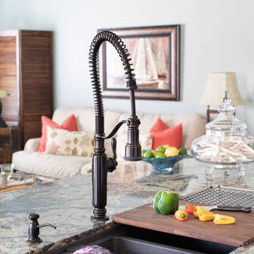
The owners of this kitchen had spent the money to upgrade the finishes in their kitchen upon building the home 12 years ago, but after living in the space for several years they realized how nonfunctional the layout really was. The (then) two preschool aged children had grown into busy, hungry teenagers with many friends who also liked to hang out at the house. So the family needed a more functional kitchen with better traffic flow, space for daily activities revolving around the kitchen at different times of day, and a kitchen that could accommodate cooking for and serving large groups. Furthermore, the dark, traditional finishes no longer reflected the homeowners’ style. They requested a brighter, more relaxed, coastal style that reflected their love of the seaside cities they like to visit.
Originally, the kitchen was U-shaped with a narrow island in the middle. The island created narrow aisles that bottle-necked at the dishwasher, refrigerator, and cooktop areas. There was a pass-through from the foyer into the kitchen, but the owners never liked that the pass-through was also located so close to the powder room. The awkward proximity was unappealing and made guests feel uncomfortable.
The kitchen’s storage was made up of lots of narrow cabinets, apothecary drawers, clipped corner units, and very few drawers. It lacked useful storage for the larger items the family used on a daily basis. And the kitchen’s only pantry was small closet that had only builder-grade, narrow shelving with no illumination to be able to see the contents inside.
Overall, the kitchen’s lighting plan was poorly executed. Only six recessed cans illuminated the entire kitchen and nook areas. The under cabinet lighting was not evenly distributed either. In fact, the builder had mis-placed the under cabinet lighting around the decorative pilasters which made for choppy, dark cubbies. Further, the builder didn’t include any lighting over the sink or the bar area, which meant whoever was doing the dishes was always in their own shadow. That, coupled with the steep overhang of the game room above made the bar area feel like a dim, cavernous space that wasn’t inviting or task oriented. The kitchen looked out into the main living space, but the raised bar and a narrow wall (which held the only large cabinet in the kitchen) created more of a barrier than a relationship to the living room or breakfast nook. In fact, one couldn’t even see the breakfast nook from the cooktop or sink areas due to its orientation. The raised bar top was too narrow to comfortably sit to either dine at or chat from due to the lack of knee space. The the homeowners confided that the kitchen felt more like a dark, dirty prison than place where the family, or their guests, wanted to gather and commune.
The clients' needs and desires were:
➢ to create a kitchen that would be a space the family loved to be in; to relate to the adjacent spaces all around, and to have better flow for entertaining large groups
➢ to remove the walls between the breakfast nook and living area and to be able to utilize the natural light from the windows in both those areas
➢ to incorporate a functional chopping block for prepping fresh food for home cooked meals, an island with a large sink and drain board, 2 pull out trash cans, and seating for at least the 2 teens to eat or do homework
➢ to design a kitchen and breakfast nook with an airy, coastal, relaxed vibe that blended with the rest of the house's coastal theme
➢ to integrate a layered lighting plan which would include ample general illumination, specific task lighting, decorative lighting, and lots of illuminated storage
➢ to design a kitchen with not only more storage for all the husband’s kitchen gadgets and collection of oils and spices, but smart storage, including a coffee/breakfast bar and a place to store and conceal the toaster oven and microwave
➢ to find a way to utilize the large open space between the kitchen, pantry area, and breakfast nook
Twelve Stones Designs achieved the owner's goals by:
➢ removing the walls between the kitchen and living room to allow the natural light to filter in from the adjacent rooms and to create a connection between the kitchen, nook, and living spaces for a sense of unity and communion
➢ removing the existing pantry and designing 3 large pantry style cabinets with LED tape lights and rollout drawers to house lots of kitchen appliances, gadgets, and tons of groceries. We also took the cabinets all the way up to the 9’ ceiling for additional storage for seasonal items and bulk storage.
➢ designing 2 islands - 1 with a gorgeous black walnut chopping block that houses a drawer for chopping and carving knives and a custom double pull out trash unit for point of use utilization - and 1 that houses the dishwasher, a large Blanco Gourmet sink with integrated drain board, woven baskets for fresh root vegetables and kitchen towels, plenty of drawer storage for kitchen items, and bar seating for up to 4 diners.
➢ closing off the space between the kitchen and the powder room to create a beautiful new private alcove for the powder room as well as adding some decorative storage. This also gave us space to include more tall storage near the new range for precision placement of the husband’s extensive oil and spice collection as well as a location for a combo-steam oven the wife wanted for baking and cooking healthy meals.
The project is enhanced functionally by:
➢ incorporated USB and standard receptacles for the kids’ laptops and phone charging in the large island
➢ designing the small island to include additional open shelving for items used on a daily basis such as a variety of bowls, plates, and colanders. This set up also works well for the husband who prefers to “plate” his dinners in restaurant-style fashion before presenting them to the table.
➢ the integration of specific storage units, such as double stacked cutlery drawers, a custom spice pull-out, a Kuerig coffee and tea pod drawer, and custom double stacked utensil drawers
➢ moving the refrigerator to the old oven location - this eliminated the bottle neck as well as created a better relationship to the eating table. It also utilizes the floor space between the pantry, nook, and kitchen
➢ creating a banquet style breakfast nook - this banquette seating not only doubles the amount of seating for large gatherings but it better utilizes the odd space between the kitchen and the previous nook area. It also helps to create a distinct pathway from the mudroom room through the pantry area, kitchen, nook, and living room.
➢ the coffee/breakfast bar area which includes the perfect location for the concealed microwave and toaster oven, convenient storage for the coffee pods and tea accoutrements. Roll-out drawers below also house the smoothie maker, hot water kettle, and a plethora of smoothie-making ingredients such as protein powders, smoothie additives, etc. Furthermore, the drawers below the Keurig house measuring utensil, cutlery, baking supplies and tupperware storage.
➢ incorporating lots of wide drawers and pullouts to accommodate large cookware.
➢ utilizing as much vertical space as possible by building storage to the ceiling which accommodates the family’s abundant amount of serving platters, baking sheets, bakeware, casserole dishes, and additional cutting boards.
The project is enhanced aesthetically by:
➢ new 5-piece Versailles pattern porcelain tile that now seamlessly joins the entire down stairs area together creating a bright, cohesiveness feeling instead of choppy separated spaces - it also adds a coastal feeling
➢ designing a cabinet to conceal the microwave and toaster oven
➢ the coastal influenced light fixtures over the nook table and island
➢ the sandy colors of the Langdon Cambria countertops. The swirling pattern and sparkling quartz pieces remind the homeowner of black-and-tan sandy beaches
➢ the striped banquet seating whose creamy white background and blue-green stripes were the inspiration for the cabinet and wall colors.
➢ All the interior doors were painted black to coordinate with the blacks and grays in the backsplash tile and countertop. This also adds a hint of tailored formality to an otherwise casual space.
➢ the use of WAC's Oculux small aperture LED units for the overhead lighting complimented with Diode LED strips for task lighting under the cabinets and inside the pantry and glass wall cabinets. All of the lighting applications are on separate dimmer switches.
Innovative uses of materials or construction methods by Realty Restoration LLC:
➢ Each 1-1/2” x 3” block of reclaimed end-grain black walnut that makes up the center island chopping block was hand milled and built in the shop. It was designed to look substantial and proportional to the surrounding elements, executed by creating the 4 inch tall top with a solid wood chamfered edge band.
➢ The metal doors on either side of the vent hood were also custom designed for this project and built in the Realty Restoration LLC shop. They are made 1x2, 11-gauge mild steel with ribbed glass. Weighing 60 lbs a piece, heavy duty cabinet hinges were added to support the weight of the door and keep them from sagging.
➢ Under-cabinet receptacles were added along the range wall in order to have a clean, uninterrupted backsplash.
Design obstacles to overcome:
➢ Because we were removing the demising walls between the kitchen and living room, we had to find a way to plumb and vent the new island. We did this by tunneling through the slab (the slab had post tension cables which prevented us from just trenching) to run a new wet vent through a nearby structural wall. We pulled the existing hot and cold lines between upper floor joists and ran them down the structural wall as well and up through a conduit in the tunnel.
➢ Since we were converting from wall overs to a gas range it allowed us to utilize the 220 feed for the wall ovens to provide a new sub panel for all the new kitchen circuits
➢ Due to framing deficiencies inherited from the original build there was a 1-1/2” differential in the floor-to-ceiling height over a 20 foot span; by utilizing the process of cutting and furring coupled with the crown moulding details on the cabinet elevations we were able to mask the problem and provide seamless transitions between the cabinet components.
Evidence of superior craftsmanship:
➢ uniquely designed, one-of-a-kind metal “X” end panels on the large island. The end panels were custom made in the Realty Restoration LLC shop and fitted to the exact dimensions of the island. The welding seams are completely indistinguishable - the posts look like they are cut from a single sheet of metal
➢ square metal posts on the small island were also custom made and designed to compliment and carry through the metal element s throughout the kitchen
➢ the beautiful, oversized end panels on the pantry cabinets which give the breakfast nook a tailored look
➢ integrating a large format 5 piece Versailles tile pattern to seamlessly flow from the existing spaces into the new kitchen space
➢ By constructing a custom cabinet that jogged around a corner we could not remodel (housing the entry way coat closet) we were able to camouflage the adjacent wall offset within the upper and lower cabinets. By designing around the existing jog in the structural walls we accomplished a few things: we were able to find the space to house, and hide, the microwave and toaster oven yet still have a clean cohesive appearance from the kitchen side. Additionally, the owners were able to keep their much needed coat closet and we didn’t have to increase the budget with unnecessary structural work.
Find the right local pro for your project
 Love Your Room LLC
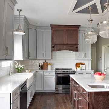
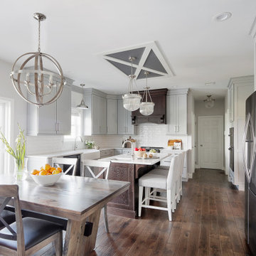
When meeting with our homeowners for this kitchen renovation project, they presented us with a large wish list. This busy family of five loves to cook and entertain for their large extended family. They felt their current kitchen was not functioning to its fullest potential. It felt cramped, dark, outdated, and had no flair. They wanted more room for storage, and convenient areas to hold their cookware. They had an unorganized pantry that wasn’t working for them, and a desk area that had become a clutter zone. They showed us examples of a cool toned color palette that they loved and asked us to bring in some farmhouse style elements with a modern aesthetic. We could not wait to transform this room!
We began by reimagining the flow of the kitchen. In order to give them more counter space to use for food preparation, we moved the fridge to the wall where the desk was. We eliminated the messy pantry closet, and installed a tall cabinet to house an additional oven and built-in microwave. We added a large pantry cabinet to the right of the refrigerator to give them plenty of organized storage space, allowing easy access to snacks from the family room. On the left side of the fridge, we incorporated a drop zone area where they can leave their keys and mail when coming in from the garage. In the island we included a pull-out trash easily accessible from both the sink and the cooking areas, and added a vegetable sink to create an extended area for food prep. For the perimeter of the kitchen, we moved the range down to allow for a corner lazy susan and drawer bank for pots and pans, and provided them with a deep farmhouse sink to aid in washing larger items. By running the cabinetry up to the ceiling, we were able to provide them with additional storage space. We finished the cabinetry off with a beautiful decorative hood surround and capped the cabinets with a large stacked crown molding.
The finishes we chose for the kitchen help modernize the space while keeping the room feeling warm and inviting. We used a soft grey paint on the perimeter cabinets and infused a warm chestnut stain on the island and decorative hood. We incorporated corbel details at both the hood and island to add some depth to the design. We included a very unique focal point to the ceiling above the island; it is a custom trim detail in the shape of an X, with dark paint as an accent. We topped the cabinetry with a luxurious calacatta quartz counter that created movement with large beautiful veining details. Hand-cut high gloss white subway tiles added brightness and sophistication to the space. Touches of silver were brought in with cabinet hardware and gooseneck faucets. We added an abundance of lighting including recessed lights, a farmhouse style silver pendant over the sink, two vintage style pendants at the island with ribbed glass, and a large wood and silver chandelier over the table, giving ample light and making the room feel bright. Adding under cabinet lighting provided our client with much needed task lighting while doing food prep. We finished the room off by using four comfortable upholstered counter stools with distressed white painted legs, adding to the farmhouse feel. New hand scraped oak plank hardwood flooring was added throughout the first floor along with large baseboard trim to tie the rest of the house in with the new kitchen design. Our client now has a large, updated, modernized kitchen to conjure up delicious meals for their family and friends.
 Twelve Stones Designs, LLC
The owners of this kitchen had spent the money to upgrade the finishes in their kitchen upon building the home 12 years ago, but after living in the space for several years they realized how nonfunctional the layout really was. The (then) two preschool aged children had grown into busy, hungry teenagers with many friends who also liked to hang out at the house. So the family needed a more functional kitchen with better traffic flow, space for daily activities revolving around the kitchen at different times of day, and a kitchen that could accommodate cooking for and serving large groups. Furthermore, the dark, traditional finishes no longer reflected the homeowners’ style. They requested a brighter, more relaxed, coastal style that reflected their love of the seaside cities they like to visit.
Originally, the kitchen was U-shaped with a narrow island in the middle. The island created narrow aisles that bottle-necked at the dishwasher, refrigerator, and cooktop areas. There was a pass-through from the foyer into the kitchen, but the owners never liked that the pass-through was also located so close to the powder room. The awkward proximity was unappealing and made guests feel uncomfortable.
The kitchen’s storage was made up of lots of narrow cabinets, apothecary drawers, clipped corner units, and very few drawers. It lacked useful storage for the larger items the family used on a daily basis. And the kitchen’s only pantry was small closet that had only builder-grade, narrow shelving with no illumination to be able to see the contents inside.
Overall, the kitchen’s lighting plan was poorly executed. Only six recessed cans illuminated the entire kitchen and nook areas. The under cabinet lighting was not evenly distributed either. In fact, the builder had mis-placed the under cabinet lighting around the decorative pilasters which made for choppy, dark cubbies. Further, the builder didn’t include any lighting over the sink or the bar area, which meant whoever was doing the dishes was always in their own shadow. That, coupled with the steep overhang of the game room above made the bar area feel like a dim, cavernous space that wasn’t inviting or task oriented. The kitchen looked out into the main living space, but the raised bar and a narrow wall (which held the only large cabinet in the kitchen) created more of a barrier than a relationship to the living room or breakfast nook. In fact, one couldn’t even see the breakfast nook from the cooktop or sink areas due to its orientation. The raised bar top was too narrow to comfortably sit to either dine at or chat from due to the lack of knee space. The the homeowners confided that the kitchen felt more like a dark, dirty prison than place where the family, or their guests, wanted to gather and commune.
The clients' needs and desires were:
➢ to create a kitchen that would be a space the family loved to be in; to relate to the adjacent spaces all around, and to have better flow for entertaining large groups
➢ to remove the walls between the breakfast nook and living area and to be able to utilize the natural light from the windows in both those areas
➢ to incorporate a functional chopping block for prepping fresh food for home cooked meals, an island with a large sink and drain board, 2 pull out trash cans, and seating for at least the 2 teens to eat or do homework
➢ to design a kitchen and breakfast nook with an airy, coastal, relaxed vibe that blended with the rest of the house's coastal theme
➢ to integrate a layered lighting plan which would include ample general illumination, specific task lighting, decorative lighting, and lots of illuminated storage
➢ to design a kitchen with not only more storage for all the husband’s kitchen gadgets and collection of oils and spices, but smart storage, including a coffee/breakfast bar and a place to store and conceal the toaster oven and microwave
➢ to find a way to utilize the large open space between the kitchen, pantry area, and breakfast nook
Twelve Stones Designs achieved the owner's goals by:
➢ removing the walls between the kitchen and living room to allow the natural light to filter in from the adjacent rooms and to create a connection between the kitchen, nook, and living spaces for a sense of unity and communion
➢ removing the existing pantry and designing 3 large pantry style cabinets with LED tape lights and rollout drawers to house lots of kitchen appliances, gadgets, and tons of groceries. We also took the cabinets all the way up to the 9’ ceiling for additional storage for seasonal items and bulk storage.
➢ designing 2 islands - 1 with a gorgeous black walnut chopping block that houses a drawer for chopping and carving knives and a custom double pull out trash unit for point of use utilization - and 1 that houses the dishwasher, a large Blanco Gourmet sink with integrated drain board, woven baskets for fresh root vegetables and kitchen towels, plenty of drawer storage for kitchen items, and bar seating for up to 4 diners.
➢ closing off the space between the kitchen and the powder room to create a beautiful new private alcove for the powder room as well as adding some decorative storage. This also gave us space to include more tall storage near the new range for precision placement of the husband’s extensive oil and spice collection as well as a location for a combo-steam oven the wife wanted for baking and cooking healthy meals.
The project is enhanced functionally by:
➢ incorporated USB and standard receptacles for the kids’ laptops and phone charging in the large island
➢ designing the small island to include additional open shelving for items used on a daily basis such as a variety of bowls, plates, and colanders. This set up also works well for the husband who prefers to “plate” his dinners in restaurant-style fashion before presenting them to the table.
➢ the integration of specific storage units, such as double stacked cutlery drawers, a custom spice pull-out, a Kuerig coffee and tea pod drawer, and custom double stacked utensil drawers
➢ moving the refrigerator to the old oven location - this eliminated the bottle neck as well as created a better relationship to the eating table. It also utilizes the floor space between the pantry, nook, and kitchen
➢ creating a banquet style breakfast nook - this banquette seating not only doubles the amount of seating for large gatherings but it better utilizes the odd space between the kitchen and the previous nook area. It also helps to create a distinct pathway from the mudroom room through the pantry area, kitchen, nook, and living room.
➢ the coffee/breakfast bar area which includes the perfect location for the concealed microwave and toaster oven, convenient storage for the coffee pods and tea accoutrements. Roll-out drawers below also house the smoothie maker, hot water kettle, and a plethora of smoothie-making ingredients such as protein powders, smoothie additives, etc. Furthermore, the drawers below the Keurig house measuring utensil, cutlery, baking supplies and tupperware storage.
➢ incorporating lots of wide drawers and pullouts to accommodate large cookware.
➢ utilizing as much vertical space as possible by building storage to the ceiling which accommodates the family’s abundant amount of serving platters, baking sheets, bakeware, casserole dishes, and additional cutting boards.
The project is enhanced aesthetically by:
➢ new 5-piece Versailles pattern porcelain tile that now seamlessly joins the entire down stairs area together creating a bright, cohesiveness feeling instead of choppy separated spaces - it also adds a coastal feeling
➢ designing a cabinet to conceal the microwave and toaster oven
➢ the coastal influenced light fixtures over the nook table and island
➢ the sandy colors of the Langdon Cambria countertops. The swirling pattern and sparkling quartz pieces remind the homeowner of black-and-tan sandy beaches
➢ the striped banquet seating whose creamy white background and blue-green stripes were the inspiration for the cabinet and wall colors.
➢ All the interior doors were painted black to coordinate with the blacks and grays in the backsplash tile and countertop. This also adds a hint of tailored formality to an otherwise casual space.
➢ the use of WAC's Oculux small aperture LED units for the overhead lighting complimented with Diode LED strips for task lighting under the cabinets and inside the pantry and glass wall cabinets. All of the lighting applications are on separate dimmer switches.
Innovative uses of materials or construction methods by Realty Restoration LLC:
➢ Each 1-1/2” x 3” block of reclaimed end-grain black walnut that makes up the center island chopping block was hand milled and built in the shop. It was designed to look substantial and proportional to the surrounding elements, executed by creating the 4 inch tall top with a solid wood chamfered edge band.
➢ The metal doors on either side of the vent hood were also custom designed for this project and built in the Realty Restoration LLC shop. They are made 1x2, 11-gauge mild steel with ribbed glass. Weighing 60 lbs a piece, heavy duty cabinet hinges were added to support the weight of the door and keep them from sagging.
➢ Under-cabinet receptacles were added along the range wall in order to have a clean, uninterrupted backsplash.
Design obstacles to overcome:
➢ Because we were removing the demising walls between the kitchen and living room, we had to find a way to plumb and vent the new island. We did this by tunneling through the slab (the slab had post tension cables which prevented us from just trenching) to run a new wet vent through a nearby structural wall. We pulled the existing hot and cold lines between upper floor joists and ran them down the structural wall as well and up through a conduit in the tunnel.
➢ Since we were converting from wall overs to a gas range it allowed us to utilize the 220 feed for the wall ovens to provide a new sub panel for all the new kitchen circuits
➢ Due to framing deficiencies inherited from the original build there was a 1-1/2” differential in the floor-to-ceiling height over a 20 foot span; by utilizing the process of cutting and furring coupled with the crown moulding details on the cabinet elevations we were able to mask the problem and provide seamless transitions between the cabinet components.
Evidence of superior craftsmanship:
➢ uniquely designed, one-of-a-kind metal “X” end panels on the large island. The end panels were custom made in the Realty Restoration LLC shop and fitted to the exact dimensions of the island. The welding seams are completely indistinguishable - the posts look like they are cut from a single sheet of metal
➢ square metal posts on the small island were also custom made and designed to compliment and carry through the metal element s throughout the kitchen
➢ the beautiful, oversized end panels on the pantry cabinets which give the breakfast nook a tailored look
➢ integrating a large format 5 piece Versailles tile pattern to seamlessly flow from the existing spaces into the new kitchen space
➢ By constructing a custom cabinet that jogged around a corner we could not remodel (housing the entry way coat closet) we were able to camouflage the adjacent wall offset within the upper and lower cabinets. By designing around the existing jog in the structural walls we accomplished a few things: we were able to find the space to house, and hide, the microwave and toaster oven yet still have a clean cohesive appearance from the kitchen side. Additionally, the owners were able to keep their much needed coat closet and we didn’t have to increase the budget with unnecessary structural work.
 Love Your Room LLC
When meeting with our homeowners for this kitchen renovation project, they presented us with a large wish list. This busy family of five loves to cook and entertain for their large extended family. They felt their current kitchen was not functioning to its fullest potential. It felt cramped, dark, outdated, and had no flair. They wanted more room for storage, and convenient areas to hold their cookware. They had an unorganized pantry that wasn’t working for them, and a desk area that had become a clutter zone. They showed us examples of a cool toned color palette that they loved and asked us to bring in some farmhouse style elements with a modern aesthetic. We could not wait to transform this room!
We began by reimagining the flow of the kitchen. In order to give them more counter space to use for food preparation, we moved the fridge to the wall where the desk was. We eliminated the messy pantry closet, and installed a tall cabinet to house an additional oven and built-in microwave. We added a large pantry cabinet to the right of the refrigerator to give them plenty of organized storage space, allowing easy access to snacks from the family room. On the left side of the fridge, we incorporated a drop zone area where they can leave their keys and mail when coming in from the garage. In the island we included a pull-out trash easily accessible from both the sink and the cooking areas, and added a vegetable sink to create an extended area for food prep. For the perimeter of the kitchen, we moved the range down to allow for a corner lazy susan and drawer bank for pots and pans, and provided them with a deep farmhouse sink to aid in washing larger items. By running the cabinetry up to the ceiling, we were able to provide them with additional storage space. We finished the cabinetry off with a beautiful decorative hood surround and capped the cabinets with a large stacked crown molding.
The finishes we chose for the kitchen help modernize the space while keeping the room feeling warm and inviting. We used a soft grey paint on the perimeter cabinets and infused a warm chestnut stain on the island and decorative hood. We incorporated corbel details at both the hood and island to add some depth to the design. We included a very unique focal point to the ceiling above the island; it is a custom trim detail in the shape of an X, with dark paint as an accent. We topped the cabinetry with a luxurious calacatta quartz counter that created movement with large beautiful veining details. Hand-cut high gloss white subway tiles added brightness and sophistication to the space. Touches of silver were brought in with cabinet hardware and gooseneck faucets. We added an abundance of lighting including recessed lights, a farmhouse style silver pendant over the sink, two vintage style pendants at the island with ribbed glass, and a large wood and silver chandelier over the table, giving ample light and making the room feel bright. Adding under cabinet lighting provided our client with much needed task lighting while doing food prep. We finished the room off by using four comfortable upholstered counter stools with distressed white painted legs, adding to the farmhouse feel. New hand scraped oak plank hardwood flooring was added throughout the first floor along with large baseboard trim to tie the rest of the house in with the new kitchen design. Our client now has a large, updated, modernized kitchen to conjure up delicious meals for their family and friends.
 Neumann & Rudy Architecture
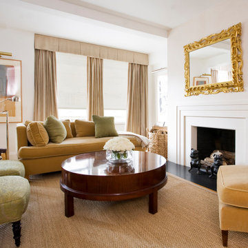
This is a compact, pre-war urban parlor handled with the confidence of a much larger room, and its success rests on a disciplined negotiation between rectilinear architecture and curvilinear furnishings. The volume is defined by two competing datum lines: a substantial dropped beam and soffit bridging the left-hand window wall, and the crisp stepped architrave of the fireplace surround opposite, which projects into the room as the primary architectural event. That mantel—executed in tiered, chamfered planes with a shallow reveal and a honed black stone hearth extending as a cantilevered shelf—reads as a stripped-classical or Art Deco–inflected aedicule, its symmetry anchoring the seating plan. Circulation is organized on a diagonal: the long axis established by the low, tight-back sofa beneath the fenestration is intercepted by the oval mahogany cocktail table, whose ellipse dissolves the room's orthogonal grid and permits comfortable passage on all sides. Sightlines are deliberately layered—the gilt mirror above the mantel captures a reflected register of the opposing wall's cornice, drapery, and framed art, effectively doubling the perceived depth of the plan and admitting borrowed light. The furniture is uniformly low-slung, an intentional strategy that preserves headroom and visually raises the ceiling plane, while the exposed leg profiles (turned casters, tapered mahogany posts, square-section table legs) keep the floor plane continuous and the composition buoyant rather than freighted.
The palette is a masterclass in tonal modulation within a narrow chromatic band—warm ivory plaster walls with a faintly pinkish undertone provide the neutral ground against which a family of golds, ochres, and honeyed camels is arranged in ascending saturation. The sofa's cut velvet in a deep saffron-caramel is the room's chromatic keystone, echoed in the club chair at right and moderated by two temperature-shifting accents: sage and moss velvet cushions that introduce a cool, desaturated counterpoint, and a damask-woven celadon slipper chair with matching ottoman whose subtle jacquard relief supplies pattern without noise. Textiles are stratified by pile depth and light response—the matte, slightly slubbed linen of the box-pleated pelmet and floor-length panels absorbs light, while the velvets refract it, producing that characteristic gilded bloom along the seat rolls and cushion edges. Against these soft goods, the designer sets three hard, contrasting registers: the French-polished mahogany table, whose figured, mirror-like top functions as a horizontal reflector; the water-gilded, deeply carved acanthus mirror frame, its burnished high points offering the room's only true metallic brilliance; and the patinated bronze bulldog andirons and blackened firebox, which supply necessary chromatic weight. Underfoot, a coarse woven sisal or seagrass rug provides the essential textural antithesis—dry, granular, and vernacular—as do the loose-woven rush baskets flanking the window, grounding the room's refinement in something agrarian and unpretentious.
Daylighting is generous but rigorously controlled: the twin windows are filtered through translucent roller blinds that diffuse direct sun into an even, high-key wash, and the pelmet with its softly gathered box pleats crops the aperture to conceal hardware and reinforce the horizontal. The result is a luminous, almost overexposed north-facing quality along the left flank that gradates into softer shadow at the hearth wall—a chiaroscuro that gives the room its sense of depth and repose. Artificial illumination is deliberately architectural and understated rather than decorative: a swing-arm picture light above the abstract framed work at left, a second slim picture light on the return wall, and an articulating chrome task/floor lamp with a polished conical shade positioned to serve the reading corner. Notably, there is no central fixture; the strategy is entirely peripheral and layered, calibrated for evening intimacy at cushion height. Stylistically, the room synthesizes into what one might call Restrained American Traditionalism, or more precisely a Warm Modern Classicism—the vocabulary of a New York or London town-house drawing room, edited of clutter and pattern, retaining the ceremonial gestures (gilt overmantel mirror, tailored drapery, symmetrical hearth) while adopting modernist restraint in silhouette, chromatic economy, and the absence of ornament on the case goods. The reference points span Deco, Regency, and mid-century upholstery forms, yet the assembly feels neither eclectic nor historicist. It is, instead, a quietly authoritative interior—luxurious in material and light, ascetic in gesture, and calibrated for daily habitation rather than display.



 Tile Doctor Ltd
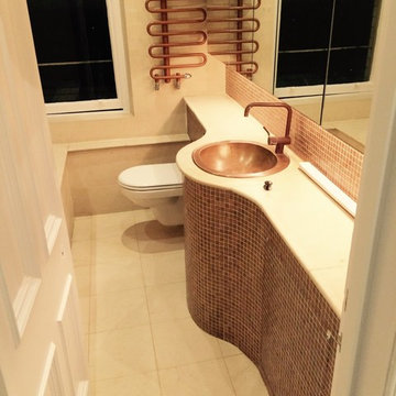
This was a substantial engagement at a luxury rental apartment in Brighton rejuvenating the Limestone tiles in two bathrooms and a hallway taking six days of hard work. In addition, I would be working around two decorators, making for even more testing work conditions.
I first set to work on the smallest bathroom, which featured limestone tiles from floor to ceiling, as well as a large bath, copper sink and a tiled surround. Limestone is a very popular choice for interior and exterior decoration, but the tiles in this bathroom were in need of some care to get them looking their best again. My initial task was to strip away any previous sealer by hand; this was done using a mixture of warm water and Tile Doctor Pro-Clean which, along with Limestone, is also suitable for use on other types of natural stone, such as Granite, Slate and Travertine. Pro-Clean serves both as an effective stripper and cleaner, meaning that once the sealer had been stripped away, the tiles also received a thorough clean. Once I had cleaned the tiles, I sucked up any excess water and residue using a Wet-Dry Vac machine.
Since the tiles would have to be left to dry for a couple of days, I offered to restore the copper sink for the customer, even though this was not actually part of my job description. After conducting some research into copper cleaning, I opted to use a combination of lemon juice, vinegar and salt. The research paid off as, once I began to apply the solution to the sink, the bright orange and brown colours of the copper quickly rose to the surface. Within the space of an hour, I had transformed what initially appeared to be a ruined sink into a lovely, shimmering copper feature for the bathroom. Both the decorators and I were truly amazed at the results – but all credit goes to Google!
The larger of the two bathrooms was a much stiffer test for the Tile Doctor products. It had not been left in great condition, as the shower area had clearly not been sealed correctly, and the tiles had been left in such a manner that soap scum from shampoos, soaps and shower gels had built up on the window sill. In fact, the damage was significant enough that I had to explain to the customer before starting the work that whilst I could greatly improve the appearance of the tiles, I would not be able to restore them to new. This is because many shampoo and body wash products are acidic and can cause permanent damage to stone work especially when left to dwell for a long time.
My choice of product was Tile Doctor Mould Away, a formula which, over time, seeps deeply into the pores of the stone, effectively lifting away the muck. In cases of particularly stubborn areas, it is necessary to apply another covering of Mould Away and leave it for an extended period of time. This is exactly what I did over the next few days, leaving the product overnight to work its magic. The change was certainly drastic, if not perfect.
As both bathrooms required extended periods of drying, I spent two days working on the hallway, which had been partially covered with a plastic sealing for the previous six months due to building work. Needless to say, the hallway was in need of a good clean. I set about cleaning the hallway with a solution of warm water and Tile Doctor Pro-Clean, before once again using a Wet-Dry Vac machine to remove any excess water to prepare the floor for sealing at a later point. It is very important to remove any residue of cleaning solution before sealing, as this may impact the performance of the sealer. Following this, I left the hallway to dry for two days, providing the builders with strict instructions to cover it with blankets for protection while they were working.
While the floor was drying, I sealed the bathrooms – both now fully dried – with Tile Doctor Colour Grow Sealer, a solvent-based sealer that was highly effective at enhancing the colour of the brown tiles around the sinks. The product will also provide durable surface protection. I spent the final of the six days sealing the hallway floor with Tile Doctor Seal & Go, which provides both a stain-resistant surface seal and a durable, low-sheen finish. This was an ideal choice of product, as the customer requested a hard-wearing, yet shiny finish.
The hard work really paid off, as both the customer and the decorators were very impressed with the final results in the two bathrooms and the hallway. I was extremely pleased that I was able to complete this big job to the highest possible standards.
 Editor
When it comes to selecting fixtures for your kitchen or bathroom, few options offer the blend of elegance, durability, and functionality like brass bridge faucets. These faucets, with their vintage charm and modern efficiency, bring a unique aesthetic and practical benefits to any space. This article explores the appeal of brass bridge faucets, their key features, benefits, and tips on how to choose and maintain them.
The Charm of Brass Bridge Faucets
Classic Aesthetic
Brass bridge faucets are known for their classic, timeless look. The warm, golden hue of brass adds a touch of luxury and sophistication, making these faucets a focal point in any kitchen or bathroom. Their vintage design can seamlessly blend with various décor styles, from rustic to contemporary.
Durability
One of the standout qualities of brass is its durability. Brass is resistant to corrosion and can withstand daily wear and tear, ensuring that your faucet remains in excellent condition for years. This makes brass bridge faucets a long-term investment for your home.
Versatility
Available in various finishes such as polished, brushed, or antique brass, these faucets can complement a wide range of design themes. Whether you want a shiny, reflective finish or a more subdued, matte look, there’s a brass bridge faucet to suit your taste.
Key Features of Brass Bridge Faucets
Elevated Bridge Design
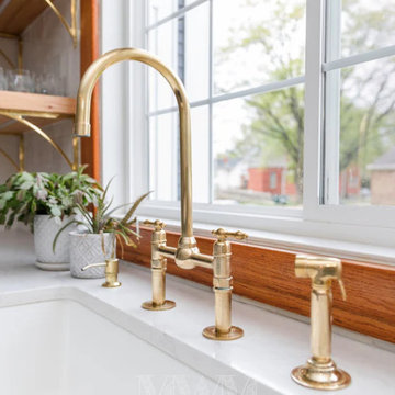
The distinctive feature of bridge faucets is the elevated connecting pipe that links the hot and cold water lines. This bridge not only enhances the faucet's aesthetic appeal but also provides additional clearance, making it easier to clean large pots and pans or to accommodate larger sinks.
Dual Handles
Brass bridge faucets typically feature dual handles, allowing for precise control over water temperature. This functionality ensures a balanced mix of hot and cold water, providing you with the perfect temperature for your needs.
Classic Spout Designs
These faucets often come with high-arc or gooseneck spouts, which are both practical and stylish. The high spout design provides ample space for washing and filling containers, adding to the faucet’s functionality.
Benefits of Brass Bridge Faucets
Visual Appeal
Brass bridge faucets serve as a statement piece in any room. Their elegant design and warm finish add a touch of luxury and can elevate the overall aesthetic of your kitchen or bathroom.
Functionality
Beyond their beauty, brass bridge faucets are highly functional. The dual-handle design allows for precise temperature control, while the elevated bridge offers extra clearance for various tasks. This combination of form and function makes them a practical choice for busy households.
Hygienic Properties
Brass has natural antimicrobial properties, making it a hygienic choice for kitchen and bathroom fixtures. This can be particularly beneficial in spaces where cleanliness is paramount.
Choosing the Right Brass Bridge Faucet
Finish Options
When selecting a brass bridge faucet, consider the finish that best matches your existing décor. Polished brass offers a shiny, reflective surface, while antique brass provides a more vintage, weathered look. Brushed brass has a matte finish that hides fingerprints and water spots.
Coordination with Other Fixtures
Ensure that your brass bridge faucet complements other fixtures in your kitchen or bathroom. Coordinating the faucet with cabinet handles, lighting fixtures, and other hardware can create a cohesive and harmonious look.
Installation Requirements
Check the installation requirements before purchasing a brass bridge faucet. These faucets typically require a three-hole installation, so make sure your sink or countertop is compatible.
Maintenance Tips
Regular Cleaning
To maintain the luster of your brass bridge faucet, clean it regularly with a soft cloth and mild soap. Avoid using abrasive cleaners or scrubbers that can scratch the surface.
Preventing Water Spots
After cleaning, dry the faucet thoroughly to prevent water spots. This is particularly important for polished brass finishes, which are more prone to showing spots and fingerprints.
Addressing Tarnish
Brass can tarnish over time. To address this, use a brass cleaner or a mixture of lemon juice and baking soda to gently polish the surface. Regular polishing can keep your faucet looking its best.
Conclusion
Brass bridge faucets are a beautiful and functional addition to any home. Their timeless design, durability, and practicality make them a worthwhile investment for your kitchen or bathroom. By choosing the right finish and maintaining it properly, you can enjoy the elegance and charm of a brass bridge faucet for years to come. Embrace the classic appeal of brass and elevate the look of your home with this stunning fixture.
 Lemon Remodeling & Services
Planning a Modern Kitchen Remodel
Every successful kitchen remodeling project begins with careful planning. Before construction starts, it is important to evaluate the existing layout, cabinet storage, lighting conditions, appliance placement, and how the kitchen connects to surrounding living spaces.
For this project, the primary design goals included:
Creating a brighter open concept kitchen
Improving functionality and circulation
Increasing pantry and cabinet storage
Maximizing natural light with skylight integration
Creating a clean and timeless design aesthetic
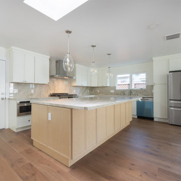
The final layout centered around a large kitchen island that functions as both a workspace and gathering area. Open concept kitchens remain highly desirable because they improve communication between living areas while helping the home feel larger and more connected.
Importance of Natural Light
Natural lighting plays a major role in modern kitchen remodeling. In this renovation, the skylight significantly improved brightness throughout the space and helped create a softer, more inviting atmosphere during the day.
Combined with recessed lighting and pendant fixtures above the island, the layered lighting design provides both functional task lighting and balanced ambient illumination.
Construction and Material Selection
Kitchen remodeling projects require coordination between multiple construction trades including demolition, framing, electrical, plumbing, drywall, flooring, cabinetry, countertops, and finish carpentry.
Bi-Color Kitchen Remodel Design
One of the standout features of this project is the bi-color kitchen remodel design. The warm natural wood island creates contrast against the surrounding white cabinetry while maintaining a clean and balanced appearance.
This approach helps:
Add visual depth to the kitchen
Create separation between functional zones
Prevent the space from feeling overly monochromatic
Introduce warmth into modern kitchen designs
The oversized island also provides additional storage, countertop workspace, and seating opportunities for everyday use and entertaining.
Countertops, Cabinetry, and Finishes
The kitchen includes:
Quartz countertops with waterfall-style edges
Custom shaker-style cabinetry
Stainless steel appliances
Modern pendant lighting
Wide plank engineered hardwood flooring
Full-height backsplash surfaces
The neutral color palette was selected to create a timeless appearance while allowing flexibility for future décor and furniture changes.
Pantry Kitchen Renovation
Storage planning is one of the most important aspects of kitchen remodeling. The pantry kitchen renovation focused on improving organization and accessibility while maximizing usable storage space.
Modern pantry systems help homeowners:
Reduce countertop clutter
Improve kitchen organization
Store small appliances more efficiently
Increase long-term functionality
Thoughtful storage design can significantly improve the daily usability of a kitchen without increasing square footage.
Real Estate Value and Long-Term Benefits
Kitchen remodeling remains one of the highest-value residential renovation projects in the Bay Area real estate market. A professionally designed open concept kitchen can improve buyer perception, increase property appeal, and modernize outdated layouts.
Features such as large islands, skylights, pantry storage, and bi-color cabinetry continue to remain highly desirable among homeowners and future buyers alike.
Common Kitchen Remodeling Mistakes
Some common mistakes homeowners should avoid include:
Insufficient lighting design
Poor circulation planning
Limited storage solutions
Choosing low-durability materials
Overcrowded layouts
Inadequate electrical preparation
Working with experienced remodeling professionals can help avoid costly design and construction issues later in the process.
Common Questions
How long does a kitchen remodel usually take?
Most kitchen remodeling projects take approximately 6–12 weeks depending on the project scope, inspections, material lead times, and structural modifications.
Do kitchen remodels require permits?
Permits are often required when plumbing, electrical, structural, or layout changes are involved. Requirements vary depending on the city and scope of work.
What is a bi-color kitchen remodel?
A bi-color kitchen remodel uses two cabinet finishes or tones to create visual contrast and a more customized design appearance.
Does an open concept kitchen increase home value?
Open concept kitchens are highly desirable because they improve functionality, natural lighting, and overall flow throughout the home.
Conclusion
A well-planned kitchen remodeling project combines thoughtful design, quality craftsmanship, and durable materials to create a space that is both functional and visually appealing. Features such as skylight integration, open concept layouts, pantry kitchen renovations, and bi-color cabinetry continue to remain popular among Bay Area homeowners seeking timeless and practical kitchen designs.
Careful planning, professional coordination, and attention to detail are essential for creating a kitchen that performs well aesthetically and functionally for many years.
------->
If you’re planning a kitchen remodeling project, consulting with an experienced contractor can help simplify the design and construction process while avoiding costly mistakes.
Book a consultation:
calendly.com/lemonremodeling
 FLOORIANS
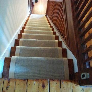
Natural Sisal Carpet runner on wood staircase. Neutral colour carpet and edging, Custom work.
Example of an island style carpeted straight staircase design in Toronto with carpeted risers
Example of an island style carpeted straight staircase design in Toronto with carpeted risers
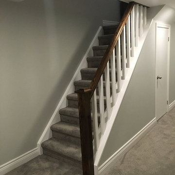
 Hadley-Irvine General Contracting LTD
Staircase - mid-sized traditional carpeted and underground carpeted and gray floor staircase idea in Toronto with wooden risers, gray walls and no fireplace
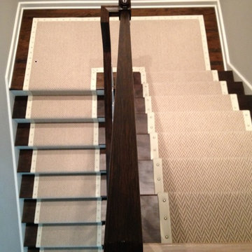
 User
UserWool Patterned Field Carpet with Linen Wide Binding & Chrome Upholstery Nails
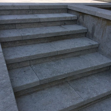
Mid-sized transitional carpeted u-shaped staircase photo in Chicago with carpeted risers
Mid-sized transitional carpeted u-shaped staircase photo in Chicago with carpeted risers
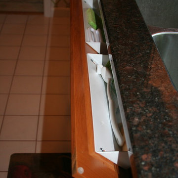
 Cypress Design Co.
Example of a large classic l-shaped ceramic tile eat-in kitchen design in Providence with an island, raised-panel cabinets, medium tone wood cabinets, granite countertops, beige backsplash, ceramic backsplash, stainless steel appliances, an undermount sink and green walls

 Bloomington Carpet One
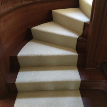
Beautiful custom runner to match the unique measurements of this staircase.
Small wooden curved staircase photo in Minneapolis with wooden risers
Small wooden curved staircase photo in Minneapolis with wooden risers
 Whitt Carpet One Floor & Home
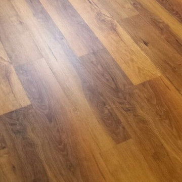
Mannington Adura LVT Napa, color Tanin
Elegant vinyl floor bedroom photo
Elegant vinyl floor bedroom photo

34