
Search results for "Latter's" in Home Design Ideas
 Storm Architects
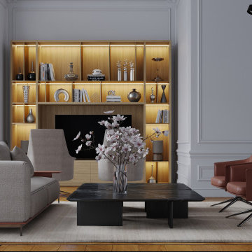
Materials can be categorized into authentic and new, with a deliberate contemporary quality for the latter. Marble, oak parquet, and golden walnut create a harmonious interplay, and bronze fittings were replaced with replicas with a patina layer.
 TKS Design Group
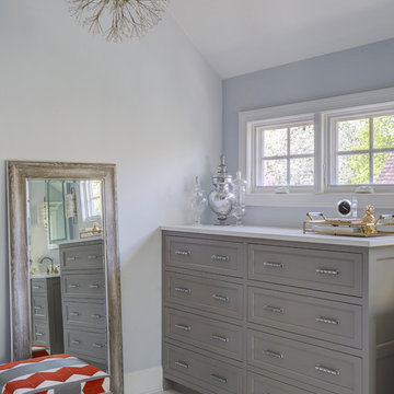
The goal of this project, completed in collaboration with Julie Dunfee Designs, was to achieve a layout and contemporary feel more in tune with the client’s needs. The original bathroom was very traditional, and the layout consisted of two spaces – the vanity area and a large makeup dressing room area, the latter not being something the new homeowner felt they would use.
So, we dove in and eliminated the divider wall making one large open space which now feels open, airy and bright. In addition to new vanity cabinets, a custom dresser was designed to provide additional storage for the homeowner.
New herringbone white Thasos marble covers the entire floor and provides a sparkly backdrop for the dark gray cabinets and polished nickel accents. The existing tub and shower were re-purposed, and a new heated towel bar was added at the shower area. Unique lighting, mosaic tile at the tub area and lighted mirrors add the modern touches the homeowner was looking for.
Designed by: Susan Klimala, CKBD
Interior Designer: Julie Dunfee Designs
Photography by: Michael Alan Kaskel
For more information on kitchen and bath design ideas go to: www.kitchenstudio-ge.com
 User
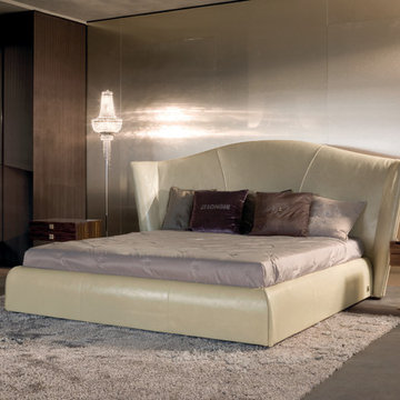
UserEDEN is a family of products for relaxation and slumber, including a chaise longue, a bed and a sofa-bed. The particular feature of the collection is the original frame in metal and wood, entirely covered with cowhide, giving the product a precise connotation of luxury, functioning as the back of the chaise longue or the headboard of the bed and sofa-bed. In the daybed version the L-shaped back forms a support for soft down cushions. The bed comes with a base in wooden slats, with or without a storage compartment, and the headboard can be enhanced by two adjustable lateral wings that open to accommodate small bedside tables. The sofa-bed has a wooden slat platform and comes as a double bed or two twin beds; in the latter solution, the second extractable bed is raised off the ground with a simple touch of the foot, thanks to a patented mechanism that greatly facilitates the operation.
Find the right local pro for your project
 Lola Cwikowski Studio
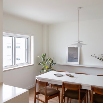
In the residential periphery of Lisbon, two physicians are establishing a home to grow their family. The original interior was conscientiously updated to serve as a pristine haven for the pair of professionals with busy schedules. Neutral walls, left bare to the interplay between light and shadow, are humanized by a verdant leitmotif inspired by their love of outdoor travel. Custom furniture from local craftsmen features simple volumes in wood and white tones that evoke a sense of both the natural and the minimal. Robust yet luxurious, child- and pet-friendly materials dress the interior.
The kitchen and dining room were united into one open entertaining space at the heart of the home. Composite countertops chosen to match the existing stone window sills allot ample workspace and serve as a buffet for the adjacent dining room. There, a custom-crafted table and floating shelf provide a neutral canvas for soirées, while mid-century chairs and a dry floral arrangement by a local ikebana artist add a spray of color. The kitchen entrance was transformed into a virescent, multi-purpose pantry corridor, complete with integrated refrigerator and freezer.
A corner niche in the foyer features the ceramic sculpture Gato Assanhado (Hissing Cat) by Bordallo Pinheiro, and a bespoke mirror reflects upon double doors to a living room configured for both work and relaxation; a tailored desk and drawer unit support the former, an ample couch and welcoming armchairs the latter. A vintage wooden sideboard and finishing touches from Portuguese flea markets imbue the space with local soul.
PHOTOGRAPHY: © ALEXANDER BOGORODSKIY
 Kessick Wine Storage Systems
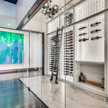
This unique contemporary wine room is an artistic showpiece in this private resident. Kessick partnered with Vineyard Wine Cellars in Dallas TX to produce this modern wine space. High gloss architectural casework houses the Elevate Wine Storage System for the ultimate wine storage display. This refrigerated wine room also incorporates Parallel wine hardware, a rolling library latter and comprehensive LED display lighting.
 LCS Master Construction
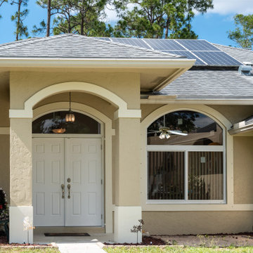
Exchanges of all windows and doors for hurricane proof. The customer was in doubt between PGT and ES Windows products, the latter being chosen mainly because of the faster delivery time at the time of purchase. The doors were extremely well installed, with smooth glide and secure locks.
 M. M. Moore Fine Gardens & Masonry
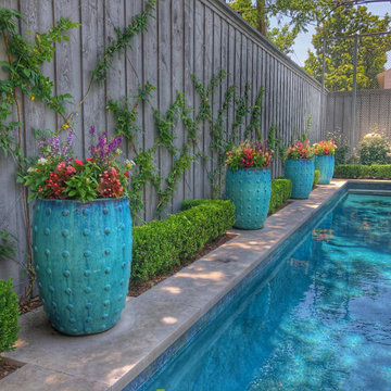
This Highland Park home on Westway was built in 1929 and loaded with character. The homeowner was looking to remodel the pool but wanted to know if they should consider a redesign that included removal of the old pool and coming back with a new pool and landscape that was cohesive. They opted for the latter and this is the result. A more modern pool to transition the style a little, a new fire pit for the family to enjoy and a lot more usable space.


 Design Matters
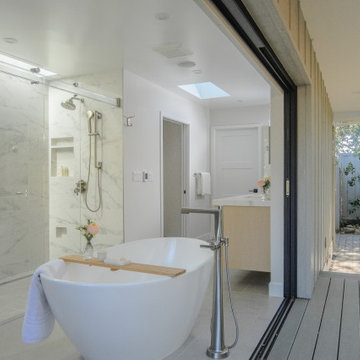
The clients sought a serene indoor-outdoor retreat to unwind, featuring a spa-like bath with disappearing walls, a spacious freestanding tub, and abundant natural light. The layout was reconfigured for functionality, privacy, and a calm, timeless design that blends harmoniously with the home's aesthetic, creating a perfect space for relaxation and family visits. Notable Products and Materials: Signature Custom Cabinetry, Colonial Door, Rift Cut White Oak, Stained Irish Cream / Countertop by Stoneville USA, White Calacatta Polished / Shower Wall - Cerim Exalt 12" x 24" Magic White Lucido, Porcelain Tile from Tile Shop / Flooring from Tile Shop - Concrete looking porcelain, Floor Gres Industrial Sage / Axis Modern Sconce Satin Nickel by Hammerton
 M Atelier
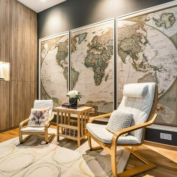
If there is one big mistake that homeowners make when carrying out the decoration tasks of their interior design project, that would be over-accessorising. Indeed, experts in interior design in Singapore agree that there are styles where “more is more,” and there are also those where “less is more.”
While as a homeowner you may choose either of these two style directions, you should first think about the different aspects of interior design and make sure that your style choice fits with these elements. Not doing so may not only result to a poorly executed renovation, but a home that you will find uncomfortable to live in.
So how do you avoid the tendency of over-accessorising? You may want to follow these pieces of advice coming from professionals in interior design in Singapore:
Mistake #1: Using the same fabric on almost all surfaces.
It is common practice among most homeowners to use almost the same fabric on all table surfaces, and sometimes even on sofa covers and drapes. Indeed, this can be cost effective, but it does not contribute to the development of the home’s overall design.
This is because there are fabrics are created to meet specific purposes. For example, lace is often used as table runners, as they give more definition and style to these specific furniture pieces. However, they do not do your windows any favours when used as curtains.
Opaque and heavy fabrics are often intended for curtains and drapes for rooms that require more privacy; in contrast, sheer and fabric materials are more suited for living room windows as they allow natural light and ventilation to move around the house.
Mistake #2: Placing more accents than you actually need.
Another mistake which homeowners are prone to make when decorating their home is placing more accents than needed. There are homes you can see side tables that are overpopulated with picture frames, trinkets, and fancy souvenirs that do not have any connection to each other. Sometimes, you can find numerous throw pillows occupying almost the entire sofa, to the point that all the seats are already occupied.
These are classic examples of “fear of empty spaces,” which is prevalent in most Asian societies, and even in some Western countries. But while it is common practice to occupy empty spaces, you may also want to think about what to do with the space first.
Instead of piling up all your memorabilia in the side tables of your bedroom or living room, why not use a tiered stand so that they can be presented in an organised manner? You may also want to choose a designated area for your trinkets, such as a wall or an unoccupied corner in your room.
Mistake #3: Overdoing the lighting fixtures.
Some homeowners want to imitate the homes of the celebrities they see on TV, and apart from following the same colour schemes and choice of furniture, they also choose to add more lights in their rooms than necessary.
Well, you should understand that the purpose of lighting fixtures is to illuminate the rooms of the house, but this doesn’t mean that you have to brighten up your home all the time. You may want to use lamps that spread the light across the room, rather than several smaller bulbs. The latter only lights up specific parts of the room, and when all these bulbs are lit simultaneously, they only spike up your electric bill.
It would be better to choose lighting fixtures according to your need and the function of the room. Doing so not only illuminates your home properly, but also creates an ambiance that gives you the comfort you are looking for in a dwelling space.
 Grand Appliance and TV
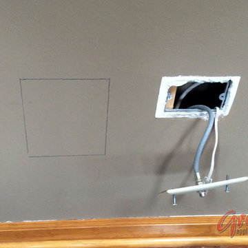
Placement of your TV relative to your furniture, speakers, etc. is crucial to the overall design aesthetic. If your TV will be mounted above a cabinet with nothing on top of it, we typically recommend the bottom of the TV be no less than two inches and no more than six inches from the top of the cabinet. The latter, six inches, should only be with very large TVs and/or very tall ceilings.
If there will be a speaker or some sort of decoration on top of the table, we typically error on the side of less space from the top of whatever that is to the bottom of the TV rather than more.
This job was particularly interesting because we were dealing with a curved TV mounted above a soundbar with the added design challenge of incorporating the existing chair rail on the wall.
In the end, we decided to marry the bottom of the soundbar with the top of the chair rail.
From that decision, we could determine the top of the soundbar and place the TV wall bracket in such a way that there would be a 1-2 inch gap between the bottom of the TV and the wall mounted soundbar.
Note that your TV mount comes in two parts. One part attaches to the wall, the other part is usually two arms that connect to the TV. The two parts essentially hook together for an easy hanging installation. Its important to measure according to where the hooking will take place (rather than the outside edge of the TV per se) in order to achieve proper spacing.
 Glenn Gissler Design
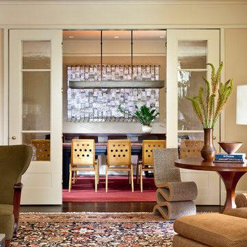
An eclectic array of furniture marks the transition from Living Room to Dining Room, the latter seen through wide French doors. In the Living Room, an antique Italian armchair by Ulrich Guglielmo, Italy, 1950s echoes the curves of the Danish Modern rosewood pedestal table, the Frank Gehry Wiggle Chair, and Herve van der Straeten "Tornade" lamp
Photo: Gross & Daley
 TKS Design Group
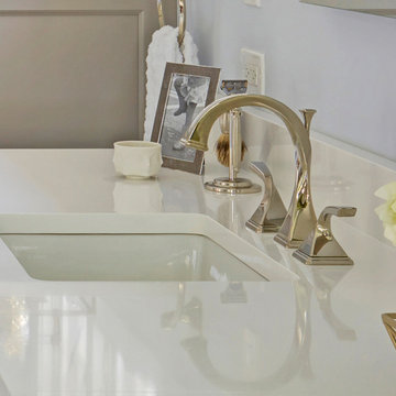
The goal of this project, completed in collaboration with Julie Dunfee Designs, was to achieve a layout and contemporary feel more in tune with the client’s needs. The original bathroom was very traditional, and the layout consisted of two spaces – the vanity area and a large makeup dressing room area, the latter not being something the new homeowner felt they would use.
So, we dove in and eliminated the divider wall making one large open space which now feels open, airy and bright. In addition to new vanity cabinets, a custom dresser was designed to provide additional storage for the homeowner.
New herringbone white Thasos marble covers the entire floor and provides a sparkly backdrop for the dark gray cabinets and polished nickel accents. The existing tub and shower were re-purposed, and a new heated towel bar was added at the shower area. Unique lighting, mosaic tile at the tub area and lighted mirrors add the modern touches the homeowner was looking for.
Designed by: Susan Klimala, CKBD
Interior Designer: Julie Dunfee Designs
Photography by: Michael Alan Kaskel
For more information on kitchen and bath design ideas go to: www.kitchenstudio-ge.com
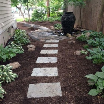
 Landscapes by sharon
Design ideas for a mid-sized shade side yard stone water fountain landscape in New York.
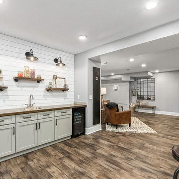
Sponsored
Sunbury, OH

J.Holderby - Renovations
Franklin County's Leading General Contractors - 2X Best of Houzz!
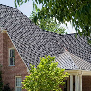
 Allcon Roofing
AFTER - New Roof is a Certainteed Presidential Shake with KYNAR Coated standing seam accent
Home design - transitional home design idea in Other
Home design - transitional home design idea in Other
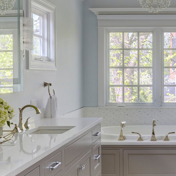 TKS Design Group
The goal of this project, completed in collaboration with Julie Dunfee Designs, was to achieve a layout and contemporary feel more in tune with the client’s needs. The original bathroom was very traditional, and the layout consisted of two spaces – the vanity area and a large makeup dressing room area, the latter not being something the new homeowner felt they would use.
So, we dove in and eliminated the divider wall making one large open space which now feels open, airy and bright. In addition to new vanity cabinets, a custom dresser was designed to provide additional storage for the homeowner.
New herringbone white Thasos marble covers the entire floor and provides a sparkly backdrop for the dark gray cabinets and polished nickel accents. The existing tub and shower were re-purposed, and a new heated towel bar was added at the shower area. Unique lighting, mosaic tile at the tub area and lighted mirrors add the modern touches the homeowner was looking for.
Designed by: Susan Klimala, CKBD
Interior Designer: Julie Dunfee Designs
Photography by: Michael Alan Kaskel
For more information on kitchen and bath design ideas go to: www.kitchenstudio-ge.com
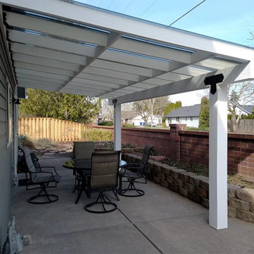
 Casa Bella Construction, LLC.
We customize each cover in any way you can imagine. Our standard single-pitch patio covers allow natural light in and have pressure-treated posts for longevity. From there, let your vision go wild. Do you want the trim work to match your house? Are you a fan of accent pieces? We have even made rustic ranch-style a-frame covers.
Types of Patio Covers
A-frame
Patio Roof Risers
Polycarbonate Roofing
Metal Roofing
& More!
Factors & Solutions
Each house is different, and each person has an end-goal in mind. Our job is to determine the best creative solution.
Height – Sometimes, we recommend attaching roof risers for higher clearance so you can walk around freely without worrying about needing to duck.
Lighting – If natural light is important to you, polycarbonate is the best option. But, if you are sold on another roofing aesthetic, we can incorporate lighting.
Ceilings – Open ceilings and rafters give it an understated look. Soffits, or ceilings, can bring the space to life. Several of our customers request a cedar tongue and groove ceiling to have that warm cabin-feel.
Trim – We can wrap with cedar, pine, or even exterior trim. Some customers choose the latter in combination with architectural roofing to match the house.
We invite you to visit our website or call us for a FREE QUOTE
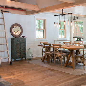
 Ambrose Custom Builders, Inc.
Derek MacDonald
Example of a beach style dining room design in Burlington
Example of a beach style dining room design in Burlington
Sponsored
Sunbury, OH
J.Holderby - Renovations
Franklin County's Leading General Contractors - 2X Best of Houzz!
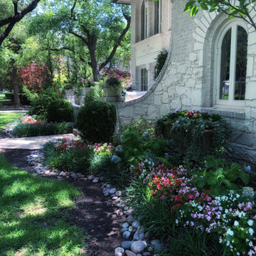 M. M. Moore Fine Gardens & Masonry
This Highland Park home on Westway was built in 1929 and loaded with character. The homeowner was looking to remodel the pool but wanted to know if they should consider a redesign that included removal of the old pool and coming back with a new pool and landscape that was cohesive. They opted for the latter and this is the result. A more modern pool to transition the style a little, a new fire pit for the family to enjoy and a lot more usable space.
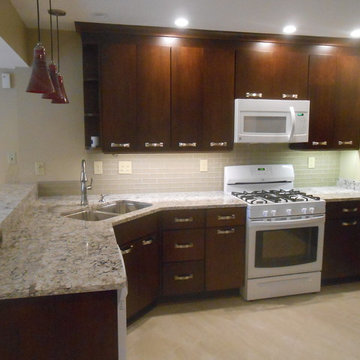
 Before and After Builders, Inc.
Mid-sized minimalist l-shaped porcelain tile eat-in kitchen photo in Nashville with an undermount sink, flat-panel cabinets, dark wood cabinets, quartz countertops, beige backsplash, glass tile backsplash, white appliances and no island
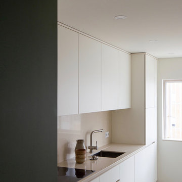 Lola Cwikowski Studio
In the residential periphery of Lisbon, two physicians are establishing a home to grow their family. The original interior was conscientiously updated to serve as a pristine haven for the pair of professionals with busy schedules. Neutral walls, left bare to the interplay between light and shadow, are humanized by a verdant leitmotif inspired by their love of outdoor travel. Custom furniture from local craftsmen features simple volumes in wood and white tones that evoke a sense of both the natural and the minimal. Robust yet luxurious, child- and pet-friendly materials dress the interior.
The kitchen and dining room were united into one open entertaining space at the heart of the home. Composite countertops chosen to match the existing stone window sills allot ample workspace and serve as a buffet for the adjacent dining room. There, a custom-crafted table and floating shelf provide a neutral canvas for soirées, while mid-century chairs and a dry floral arrangement by a local ikebana artist add a spray of color. The kitchen entrance was transformed into a virescent, multi-purpose pantry corridor, complete with integrated refrigerator and freezer.
A corner niche in the foyer features the ceramic sculpture Gato Assanhado (Hissing Cat) by Bordallo Pinheiro, and a bespoke mirror reflects upon double doors to a living room configured for both work and relaxation; a tailored desk and drawer unit support the former, an ample couch and welcoming armchairs the latter. A vintage wooden sideboard and finishing touches from Portuguese flea markets imbue the space with local soul.
PHOTOGRAPHY: © ALEXANDER BOGORODSKIY
33