
Search results for "Level strategies" in Home Design Ideas
 DesignARC
LOS ANGELES, CA / SINGLE FAMILY RESIDENTIAL
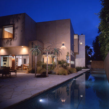
The commission for this 4,300-square-foot residence came with significant challenges for the architects – a house had once existed on the lot but had burned down and the attempt to replace the house had stalled, leading to an abatement order and a lapse of permits.
Our first challenge was to revive the lapsed construction permit by proposing to “modify” the existing structure. The practical effect this had was to fix the footprint of the new home to the existing structure’s plan outline. Having thereby inherited the large, dense block of the original house, the new strategy became one of substituting selective areas of indoor space for outdoor courtyard.
This strategy of trading indoor space for outdoor courtyard allowed an erosion of the formerly monolithic structure into a series of distinct volumetric elements, and further suggested that the architectural pieces could cohere as a “village.” The main level is further eroded by large, glazed planes, merging indoor with outdoor, and virtually stretching the landscape across interior space. Moving the detached garage from the rear yard to beneath the new living space allowed for a 75-meter lap pool and a shaded olive garden.
The gardens include built-in seating, extensive use of ornamental grasses and Zen-like interior courtyards. A material palette of fossilized stone, bonderized-galvanized metal, and natural Douglas fir allows for the warmth desired by the wife, while providing the modernity required by the husband. Programmatically, her music room borrows from the calm and protected olive court in the rear, while his office becomes a pavilion set in the landscape, which both addresses the street and acts as a sheltering monument for the terraced entry garden.
 DesignARC
LOS ANGELES, CA / SINGLE FAMILY RESIDENTIAL
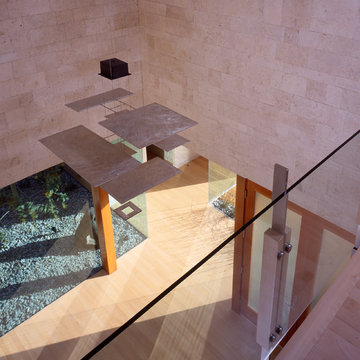
The commission for this 4,300-square-foot residence came with significant challenges for the architects – a house had once existed on the lot but had burned down and the attempt to replace the house had stalled, leading to an abatement order and a lapse of permits.
Our first challenge was to revive the lapsed construction permit by proposing to “modify” the existing structure. The practical effect this had was to fix the footprint of the new home to the existing structure’s plan outline. Having thereby inherited the large, dense block of the original house, the new strategy became one of substituting selective areas of indoor space for outdoor courtyard.
This strategy of trading indoor space for outdoor courtyard allowed an erosion of the formerly monolithic structure into a series of distinct volumetric elements, and further suggested that the architectural pieces could cohere as a “village.” The main level is further eroded by large, glazed planes, merging indoor with outdoor, and virtually stretching the landscape across interior space. Moving the detached garage from the rear yard to beneath the new living space allowed for a 75-meter lap pool and a shaded olive garden.
The gardens include built-in seating, extensive use of ornamental grasses and Zen-like interior courtyards. A material palette of fossilized stone, bonderized-galvanized metal, and natural Douglas fir allows for the warmth desired by the wife, while providing the modernity required by the husband. Programmatically, her music room borrows from the calm and protected olive court in the rear, while his office becomes a pavilion set in the landscape, which both addresses the street and acts as a sheltering monument for the terraced entry garden.
 DesignARC
LOS ANGELES, CA / SINGLE FAMILY RESIDENTIAL
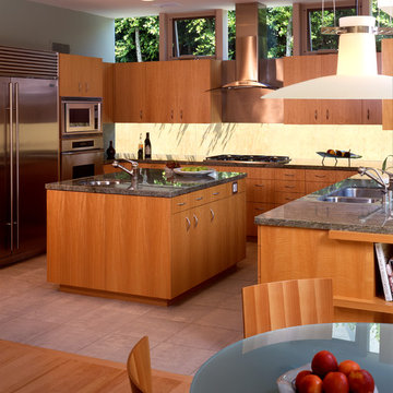
The commission for this 4,300-square-foot residence came with significant challenges for the architects – a house had once existed on the lot but had burned down and the attempt to replace the house had stalled, leading to an abatement order and a lapse of permits.
Our first challenge was to revive the lapsed construction permit by proposing to “modify” the existing structure. The practical effect this had was to fix the footprint of the new home to the existing structure’s plan outline. Having thereby inherited the large, dense block of the original house, the new strategy became one of substituting selective areas of indoor space for outdoor courtyard.
This strategy of trading indoor space for outdoor courtyard allowed an erosion of the formerly monolithic structure into a series of distinct volumetric elements, and further suggested that the architectural pieces could cohere as a “village.” The main level is further eroded by large, glazed planes, merging indoor with outdoor, and virtually stretching the landscape across interior space. Moving the detached garage from the rear yard to beneath the new living space allowed for a 75-meter lap pool and a shaded olive garden.
The gardens include built-in seating, extensive use of ornamental grasses and Zen-like interior courtyards. A material palette of fossilized stone, bonderized-galvanized metal, and natural Douglas fir allows for the warmth desired by the wife, while providing the modernity required by the husband. Programmatically, her music room borrows from the calm and protected olive court in the rear, while his office becomes a pavilion set in the landscape, which both addresses the street and acts as a sheltering monument for the terraced entry garden.
Find the right local pro for your project
 DesignARC
LOS ANGELES, CA / SINGLE FAMILY RESIDENTIAL
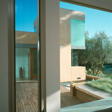
The commission for this 4,300-square-foot residence came with significant challenges for the architects – a house had once existed on the lot but had burned down and the attempt to replace the house had stalled, leading to an abatement order and a lapse of permits.
Our first challenge was to revive the lapsed construction permit by proposing to “modify” the existing structure. The practical effect this had was to fix the footprint of the new home to the existing structure’s plan outline. Having thereby inherited the large, dense block of the original house, the new strategy became one of substituting selective areas of indoor space for outdoor courtyard.
This strategy of trading indoor space for outdoor courtyard allowed an erosion of the formerly monolithic structure into a series of distinct volumetric elements, and further suggested that the architectural pieces could cohere as a “village.” The main level is further eroded by large, glazed planes, merging indoor with outdoor, and virtually stretching the landscape across interior space. Moving the detached garage from the rear yard to beneath the new living space allowed for a 75-meter lap pool and a shaded olive garden.
The gardens include built-in seating, extensive use of ornamental grasses and Zen-like interior courtyards. A material palette of fossilized stone, bonderized-galvanized metal, and natural Douglas fir allows for the warmth desired by the wife, while providing the modernity required by the husband. Programmatically, her music room borrows from the calm and protected olive court in the rear, while his office becomes a pavilion set in the landscape, which both addresses the street and acts as a sheltering monument for the terraced entry garden.
 Shuler Architecture
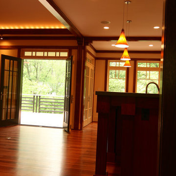
This 3 BR, 3 1/2 bath home allows the owners to live on one level most of the time. The Master Suite is on the main level along with the Living Room, Kitchen, Dining, pantries, Sun Room and service areas. The upper level houses two ample bedrooms while the lower level supports a rec center, media room, wine cellar, shop and full wet bar. Conceived as a Great Room house, the main level is designed as one seamless space that flows onto an ample deck overlooking the rear yard.
We also incorporated a variety of green building techniques - photo-voltaic shingles on the roof of the garage to generate a portion of the home's energy, a super insulated building envelope, rain water harvesting, high performance windows and doors, a high efficiency heat pump, low flow bath & kitchen fixtures, Energy Star appliances and LED lighting - that greatly reduced this structure's carbon footprint. All of the strategies amounted to a 30% reduction in the energy consumption in this home relative to comparable structures.
 DesignARC
LOS ANGELES, CA / SINGLE FAMILY RESIDENTIAL
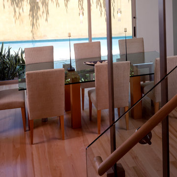
The commission for this 4,300-square-foot residence came with significant challenges for the architects – a house had once existed on the lot but had burned down and the attempt to replace the house had stalled, leading to an abatement order and a lapse of permits.
Our first challenge was to revive the lapsed construction permit by proposing to “modify” the existing structure. The practical effect this had was to fix the footprint of the new home to the existing structure’s plan outline. Having thereby inherited the large, dense block of the original house, the new strategy became one of substituting selective areas of indoor space for outdoor courtyard.
This strategy of trading indoor space for outdoor courtyard allowed an erosion of the formerly monolithic structure into a series of distinct volumetric elements, and further suggested that the architectural pieces could cohere as a “village.” The main level is further eroded by large, glazed planes, merging indoor with outdoor, and virtually stretching the landscape across interior space. Moving the detached garage from the rear yard to beneath the new living space allowed for a 75-meter lap pool and a shaded olive garden.
The gardens include built-in seating, extensive use of ornamental grasses and Zen-like interior courtyards. A material palette of fossilized stone, bonderized-galvanized metal, and natural Douglas fir allows for the warmth desired by the wife, while providing the modernity required by the husband. Programmatically, her music room borrows from the calm and protected olive court in the rear, while his office becomes a pavilion set in the landscape, which both addresses the street and acts as a sheltering monument for the terraced entry garden.
 ZeroEnergy Design
This renovated brick rowhome in Boston’s South End offers a modern aesthetic within a historic structure, creative use of space, exceptional thermal comfort, a reduced carbon footprint, and a passive stream of income.
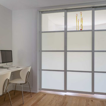
DESIGN PRIORITIES. The goals for the project were clear - design the primary unit to accommodate the family’s modern lifestyle, rework the layout to create a desirable rental unit, improve thermal comfort and introduce a modern aesthetic. We designed the street-level entry as a shared entrance for both the primary and rental unit. The family uses it as their everyday entrance - we planned for bike storage and an open mudroom with bench and shoe storage to facilitate the change from shoes to slippers or bare feet as they enter their home. On the main level, we expanded the kitchen into the dining room to create an eat-in space with generous counter space and storage, as well as a comfortable connection to the living space. The second floor serves as master suite for the couple - a bedroom with a walk-in-closet and ensuite bathroom, and an adjacent study, with refinished original pumpkin pine floors. The upper floor, aside from a guest bedroom, is the child's domain with interconnected spaces for sleeping, work and play. In the play space, which can be separated from the work space with new translucent sliding doors, we incorporated recreational features inspired by adventurous and competitive television shows, at their son’s request.
MODERN MEETS TRADITIONAL. We left the historic front facade of the building largely unchanged - the security bars were removed from the windows and the single pane windows were replaced with higher performing historic replicas. We designed the interior and rear facade with a vision of warm modernism, weaving in the notable period features. Each element was either restored or reinterpreted to blend with the modern aesthetic. The detailed ceiling in the living space, for example, has a new matte monochromatic finish, and the wood stairs are covered in a dark grey floor paint, whereas the mahogany doors were simply refinished. New wide plank wood flooring with a neutral finish, floor-to-ceiling casework, and bold splashes of color in wall paint and tile, and oversized high-performance windows (on the rear facade) round out the modern aesthetic.
RENTAL INCOME. The existing rowhome was zoned for a 2-family dwelling but included an undesirable, single-floor studio apartment at the garden level with low ceiling heights and questionable emergency egress. In order to increase the quality and quantity of space in the rental unit, we reimagined it as a two-floor, 1 or 2 bedroom, 2 bathroom apartment with a modern aesthetic, increased ceiling height on the lowest level and provided an in-unit washer/dryer. The apartment was listed with Jackie O'Connor Real Estate and rented immediately, providing the owners with a source of passive income.
ENCLOSURE WITH BENEFITS. The homeowners sought a minimal carbon footprint, enabled by their urban location and lifestyle decisions, paired with the benefits of a high-performance home. The extent of the renovation allowed us to implement a deep energy retrofit (DER) to address air tightness, insulation, and high-performance windows. The historic front facade is insulated from the interior, while the rear facade is insulated on the exterior. Together with these building enclosure improvements, we designed an HVAC system comprised of continuous fresh air ventilation, and an efficient, all-electric heating and cooling system to decouple the house from natural gas. This strategy provides optimal thermal comfort and indoor air quality, improved acoustic isolation from street noise and neighbors, as well as a further reduced carbon footprint. We also took measures to prepare the roof for future solar panels, for when the South End neighborhood’s aging electrical infrastructure is upgraded to allow them.
URBAN LIVING. The desirable neighborhood location allows the both the homeowners and tenant to walk, bike, and use public transportation to access the city, while each charging their respective plug-in electric cars behind the building to travel greater distances.
OVERALL. The understated rowhouse is now ready for another century of urban living, offering the owners comfort and convenience as they live life as an expression of their values.
Eric Roth Photo

 Michael Nash Design, Build & Homes
2011 NATIONAL NARI COTY SOUTHEAST REGIONAL AWARD
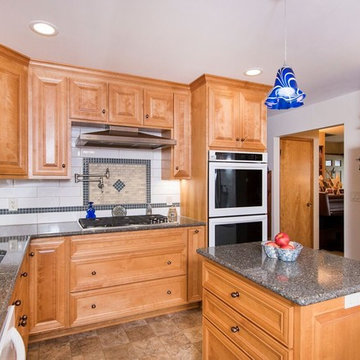
This family of four living in a 1987 brick colonial had to make dramatic changes now that their 85 years old grandmother was about to move in. They needed a mother-in-law suite complete with bathroom facilities to meet her needs. Because they were remodeling anyway, they decided to overhaul the rest of the home to create the house they have always dreamed about, including a grand two-story entry.
Starting in the basement, the homeowner added a home theatre room, added storage and a larger bathroom. Hard wood floors and a new stairway were also added.
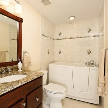
The main level boasts the new two-story entry foyer. To its left is the mother-in-law suite with a large front bay window and its own walk-in closet and private bath. The bath is furnished with a walk-in jetted tub and aging-in-place accessories. Other first floor highlights include a music room and gourmet kitchen.
Kitchen amenities the client always wanted were added, including a large center island, extended cabinets, double layered crown molding, exotic granite top and wide board mahogany floors throughout entire first floor.
The entire second floor and stairs going up were reconfigured too. The master bedroom is larger with a new tray ceiling and recess lights. The new walk- in closet is now adjacent to the master bath instead of being across the room. The master bathroom was totally gutted and re-positioned. It includes an enlarged shower with bench and frameless shower door, toilet hidden behind a closet and new whirlpool surround with beautiful travertine tile and long double vanity space.
This new renovation is truly a testament to the possibilities of aging-in-place remodeling strategies. Three generations are now living comfortably in this home.
 Susan Yeley Homes
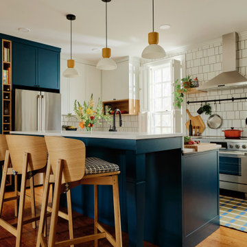
The tall shuttered windows stayed — too lovely to touch, and the plants needed them — so we tucked drawers beneath each one and let the home's traditional bones lead: crown molding, original hardwood floors, grasscloth wainscoting. The palette emerged, navy below, crisp white above, a two-tone strategy that grounds the color while drawing the eye upward, making a modest kitchen feel larger than it is. Against variably-sized white tile with dark grout, it delivers exactly the punch the clients wanted — vibrant and traditional at once, right at home in an older Bloomington house and unlike anyone else's kitchen. Warm wood and color pull the contrast back from the edge: oak stools with plaid cushions, a built-in wine rack, a butcher block that looks integrated but isn't, ochre-capped pendants, and a plaid runner tying mustard, olive, and blue together at floor level. Every finish chosen, nothing defaulted.
 Susan Yeley Homes
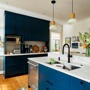
The tall shuttered windows stayed — too lovely to touch, and the plants needed them — so we tucked drawers beneath each one and let the home's traditional bones lead: crown molding, original hardwood floors, grasscloth wainscoting. The palette emerged, navy below, crisp white above, a two-tone strategy that grounds the color while drawing the eye upward, making a modest kitchen feel larger than it is. Against variably-sized white tile with dark grout, it delivers exactly the punch the clients wanted — vibrant and traditional at once, right at home in an older Bloomington house and unlike anyone else's kitchen. Warm wood and color pull the contrast back from the edge: oak stools with plaid cushions, a built-in wine rack, a butcher block that looks integrated but isn't, ochre-capped pendants, and a plaid runner tying mustard, olive, and blue together at floor level. Every finish chosen, nothing defaulted.
 Susan Yeley Homes
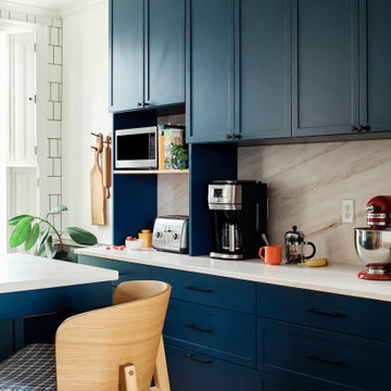
The tall shuttered windows stayed — too lovely to touch, and the plants needed them — so we tucked drawers beneath each one and let the home's traditional bones lead: crown molding, original hardwood floors, grasscloth wainscoting. The palette emerged, navy below, crisp white above, a two-tone strategy that grounds the color while drawing the eye upward, making a modest kitchen feel larger than it is. Against variably-sized white tile with dark grout, it delivers exactly the punch the clients wanted — vibrant and traditional at once, right at home in an older Bloomington house and unlike anyone else's kitchen. Warm wood and color pull the contrast back from the edge: oak stools with plaid cushions, a built-in wine rack, a butcher block that looks integrated but isn't, ochre-capped pendants, and a plaid runner tying mustard, olive, and blue together at floor level. Every finish chosen, nothing defaulted.
 Susan Yeley Homes
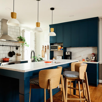
The tall shuttered windows stayed — too lovely to touch, and the plants needed them — so we tucked drawers beneath each one and let the home's traditional bones lead: crown molding, original hardwood floors, grasscloth wainscoting. The palette emerged, navy below, crisp white above, a two-tone strategy that grounds the color while drawing the eye upward, making a modest kitchen feel larger than it is. Against variably-sized white tile with dark grout, it delivers exactly the punch the clients wanted — vibrant and traditional at once, right at home in an older Bloomington house and unlike anyone else's kitchen. Warm wood and color pull the contrast back from the edge: oak stools with plaid cushions, a built-in wine rack, a butcher block that looks integrated but isn't, ochre-capped pendants, and a plaid runner tying mustard, olive, and blue together at floor level. Every finish chosen, nothing defaulted.
 River Valley Landscapes
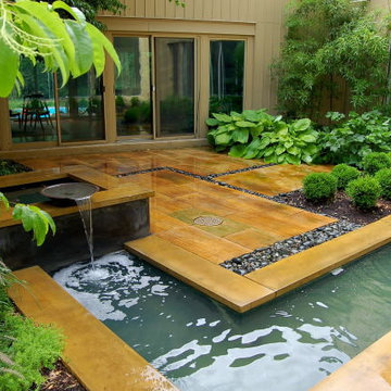
Blending contemporary forms and lush plantings, this Garden maximizes the sensory experience of the materials and planting from inside and outside the home. The garden occupies an interior courtyard framed by four interior walls. The home, designed by Architect Cliff May was built in 1948 and the following year was featured in House Beautiful Magazine. The clients list of needs and desires was brief. They wanted a space that would complement the mid century modern home and provide visual interest from inside the home. Some form of water was also requested. They had a budget of $30,000. In order to stay within their budget the clients performed the demolition of the old garden. The designer’s intent was to create a garden that would possess a clear sculptural quality and would be as visually striking from inside the home as it would be from inside the courtyard. The strategy behind the design was to use hardscape materials characterized by simple geometric forms and a planting palette that would emphasize form over color, and then to arrange the materials to achieve an interpretation of modern aesthetic.
The views from inside the homes three main living rooms present the garden as a graphic composition of space, hardscape materials and planting. Inside the courtyard the edges are defined by stone and planting. The floor is composed of rectangular slabs of Teakwood flagstone with a counterpoint of Mexican beach pebbles set within the joints and around the edges. Concrete along the edges of the Teakwood pads reduces migration of the modified stone and sand base. The contrast of the Mexican beach pebbles accentuates the pattern of the flagstone. The outside perimeter of the pebbles is contained with low profile edging. An existing catch drain was utilized for storm water runoff. A concrete block pier set on a concrete footing is covered with black stucco and provides a perch for a custom made copper bowl that circulates water into the L shaped water feature. The water features subterranean basin is constructed of pressure treated wood with a custom box liner insert. Since the Teakwood flagstone was unavailable as coping for the water feature, the designer chose Shawnee Buff stone to complement the Teakwood flagstone. The subtle sound of water spilling from the copper bowl and the reflective qualities of the water help to create an atmosphere of relaxation. The planting is composed of shades of green with white flowers in order to accentuate the graphic design. ‘Justin Brouwer’ Boxwood, ‘Sum and Substance’ Hosta, white Anemones, black bamboo and ornamental grasses contrast dramatically with the clean lines of the hardscape elements. The black bamboo is set in 30” diameter concrete containers to control the vigorous plant from spreading.
The construction of the interior courtyard space challenged the building team. They set up baffles between the front door and the door to the courtyard as well as temporary protection over the floor to allow the process to move forward without too much disturbance to the client’s lives. All of the materials were shuffled through the temporary portal.
The clients love the space and recently said that “the design is so well thought out and simple that they would never get tired of it.” The designs sculptural quality compliments the modern feel of the home and creates a sublime yet dramatic view from within the house or within the courtyard. The clients plan to purchase two black Bertoia Diamond chairs with red cushions which should perfectly integrate with the space.
Sponsored
Columbus, OH

Hope Restoration & General Contracting
Columbus Design-Build, Kitchen & Bath Remodeling, Historic Renovations
 Susan Yeley Homes
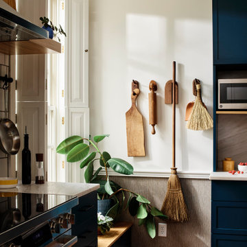
The tall shuttered windows stayed — too lovely to touch, and the plants needed them — so we tucked drawers beneath each one and let the home's traditional bones lead: crown molding, original hardwood floors, grasscloth wainscoting. The palette emerged, navy below, crisp white above, a two-tone strategy that grounds the color while drawing the eye upward, making a modest kitchen feel larger than it is. Against variably-sized white tile with dark grout, it delivers exactly the punch the clients wanted — vibrant and traditional at once, right at home in an older Bloomington house and unlike anyone else's kitchen. Warm wood and color pull the contrast back from the edge: oak stools with plaid cushions, a built-in wine rack, a butcher block that looks integrated but isn't, ochre-capped pendants, and a plaid runner tying mustard, olive, and blue together at floor level. Every finish chosen, nothing defaulted.
 Susan Yeley Homes
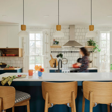
The tall shuttered windows stayed — too lovely to touch, and the plants needed them — so we tucked drawers beneath each one and let the home's traditional bones lead: crown molding, original hardwood floors, grasscloth wainscoting. The palette emerged, navy below, crisp white above, a two-tone strategy that grounds the color while drawing the eye upward, making a modest kitchen feel larger than it is. Against variably-sized white tile with dark grout, it delivers exactly the punch the clients wanted — vibrant and traditional at once, right at home in an older Bloomington house and unlike anyone else's kitchen. Warm wood and color pull the contrast back from the edge: oak stools with plaid cushions, a built-in wine rack, a butcher block that looks integrated but isn't, ochre-capped pendants, and a plaid runner tying mustard, olive, and blue together at floor level. Every finish chosen, nothing defaulted.
 ZeroEnergy Design
This renovated brick rowhome in Boston’s South End offers a modern aesthetic within a historic structure, creative use of space, exceptional thermal comfort, a reduced carbon footprint, and a passive stream of income.
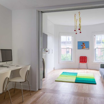
DESIGN PRIORITIES. The goals for the project were clear - design the primary unit to accommodate the family’s modern lifestyle, rework the layout to create a desirable rental unit, improve thermal comfort and introduce a modern aesthetic. We designed the street-level entry as a shared entrance for both the primary and rental unit. The family uses it as their everyday entrance - we planned for bike storage and an open mudroom with bench and shoe storage to facilitate the change from shoes to slippers or bare feet as they enter their home. On the main level, we expanded the kitchen into the dining room to create an eat-in space with generous counter space and storage, as well as a comfortable connection to the living space. The second floor serves as master suite for the couple - a bedroom with a walk-in-closet and ensuite bathroom, and an adjacent study, with refinished original pumpkin pine floors. The upper floor, aside from a guest bedroom, is the child's domain with interconnected spaces for sleeping, work and play. In the play space, which can be separated from the work space with new translucent sliding doors, we incorporated recreational features inspired by adventurous and competitive television shows, at their son’s request.
MODERN MEETS TRADITIONAL. We left the historic front facade of the building largely unchanged - the security bars were removed from the windows and the single pane windows were replaced with higher performing historic replicas. We designed the interior and rear facade with a vision of warm modernism, weaving in the notable period features. Each element was either restored or reinterpreted to blend with the modern aesthetic. The detailed ceiling in the living space, for example, has a new matte monochromatic finish, and the wood stairs are covered in a dark grey floor paint, whereas the mahogany doors were simply refinished. New wide plank wood flooring with a neutral finish, floor-to-ceiling casework, and bold splashes of color in wall paint and tile, and oversized high-performance windows (on the rear facade) round out the modern aesthetic.
RENTAL INCOME. The existing rowhome was zoned for a 2-family dwelling but included an undesirable, single-floor studio apartment at the garden level with low ceiling heights and questionable emergency egress. In order to increase the quality and quantity of space in the rental unit, we reimagined it as a two-floor, 1 or 2 bedroom, 2 bathroom apartment with a modern aesthetic, increased ceiling height on the lowest level and provided an in-unit washer/dryer. The apartment was listed with Jackie O'Connor Real Estate and rented immediately, providing the owners with a source of passive income.
ENCLOSURE WITH BENEFITS. The homeowners sought a minimal carbon footprint, enabled by their urban location and lifestyle decisions, paired with the benefits of a high-performance home. The extent of the renovation allowed us to implement a deep energy retrofit (DER) to address air tightness, insulation, and high-performance windows. The historic front facade is insulated from the interior, while the rear facade is insulated on the exterior. Together with these building enclosure improvements, we designed an HVAC system comprised of continuous fresh air ventilation, and an efficient, all-electric heating and cooling system to decouple the house from natural gas. This strategy provides optimal thermal comfort and indoor air quality, improved acoustic isolation from street noise and neighbors, as well as a further reduced carbon footprint. We also took measures to prepare the roof for future solar panels, for when the South End neighborhood’s aging electrical infrastructure is upgraded to allow them.
URBAN LIVING. The desirable neighborhood location allows the both the homeowners and tenant to walk, bike, and use public transportation to access the city, while each charging their respective plug-in electric cars behind the building to travel greater distances.
OVERALL. The understated rowhouse is now ready for another century of urban living, offering the owners comfort and convenience as they live life as an expression of their values.
Eric Roth Photo
 Susan Yeley Homes
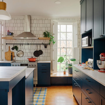
The tall shuttered windows stayed — too lovely to touch, and the plants needed them — so we tucked drawers beneath each one and let the home's traditional bones lead: crown molding, original hardwood floors, grasscloth wainscoting. The palette emerged, navy below, crisp white above, a two-tone strategy that grounds the color while drawing the eye upward, making a modest kitchen feel larger than it is. Against variably-sized white tile with dark grout, it delivers exactly the punch the clients wanted — vibrant and traditional at once, right at home in an older Bloomington house and unlike anyone else's kitchen. Warm wood and color pull the contrast back from the edge: oak stools with plaid cushions, a built-in wine rack, a butcher block that looks integrated but isn't, ochre-capped pendants, and a plaid runner tying mustard, olive, and blue together at floor level. Every finish chosen, nothing defaulted.

Sponsored
Delaware, OH

Buckeye Basements, Inc.
Central Ohio's Basement Finishing ExpertsBest Of Houzz '13-'21
 Susan Yeley Homes
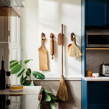
The tall shuttered windows stayed — too lovely to touch, and the plants needed them — so we tucked drawers beneath each one and let the home's traditional bones lead: crown molding, original hardwood floors, grasscloth wainscoting. The palette emerged, navy below, crisp white above, a two-tone strategy that grounds the color while drawing the eye upward, making a modest kitchen feel larger than it is. Against variably-sized white tile with dark grout, it delivers exactly the punch the clients wanted — vibrant and traditional at once, right at home in an older Bloomington house and unlike anyone else's kitchen. Warm wood and color pull the contrast back from the edge: oak stools with plaid cushions, a built-in wine rack, a butcher block that looks integrated but isn't, ochre-capped pendants, and a plaid runner tying mustard, olive, and blue together at floor level. Every finish chosen, nothing defaulted.
 Susan Yeley Homes
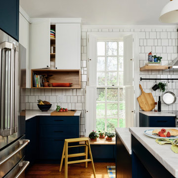
The tall shuttered windows stayed — too lovely to touch, and the plants needed them — so we tucked drawers beneath each one and let the home's traditional bones lead: crown molding, original hardwood floors, grasscloth wainscoting. The palette emerged, navy below, crisp white above, a two-tone strategy that grounds the color while drawing the eye upward, making a modest kitchen feel larger than it is. Against variably-sized white tile with dark grout, it delivers exactly the punch the clients wanted — vibrant and traditional at once, right at home in an older Bloomington house and unlike anyone else's kitchen. Warm wood and color pull the contrast back from the edge: oak stools with plaid cushions, a built-in wine rack, a butcher block that looks integrated but isn't, ochre-capped pendants, and a plaid runner tying mustard, olive, and blue together at floor level. Every finish chosen, nothing defaulted.
 Susan Yeley Homes
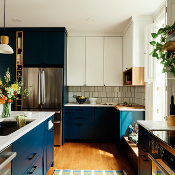
The tall shuttered windows stayed — too lovely to touch, and the plants needed them — so we tucked drawers beneath each one and let the home's traditional bones lead: crown molding, original hardwood floors, grasscloth wainscoting. The palette emerged, navy below, crisp white above, a two-tone strategy that grounds the color while drawing the eye upward, making a modest kitchen feel larger than it is. Against variably-sized white tile with dark grout, it delivers exactly the punch the clients wanted — vibrant and traditional at once, right at home in an older Bloomington house and unlike anyone else's kitchen. Warm wood and color pull the contrast back from the edge: oak stools with plaid cushions, a built-in wine rack, a butcher block that looks integrated but isn't, ochre-capped pendants, and a plaid runner tying mustard, olive, and blue together at floor level. Every finish chosen, nothing defaulted.
10