
Search results for "Life objectives" in Home Design Ideas
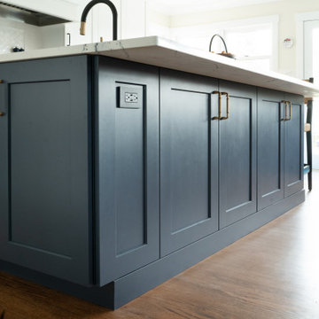
 Drury Design
THE SETUP
“You have to figure out how to rebuild a life worth living,” Basia Kozub’s client says. Her husband passed away suddenly three years ago. Holidays with family became more important, and she found herself struggling with a 37-year old kitchen that was falling apart. “I made a decision to move forward,” she says. “I went, ‘You know what? I’m redoing the kitchen.'”
The big task of getting started was as easy as having a conversation – literally. Basia was on the job, helping the client sort through priorities, wishes and ideas. Basia’s client is 5′ 4″, likes keeping an eye on the kiddoes in the backyard and wanted certain things to have their own place.
THE REMODEL
The objectives were:
Enlarge and open the space
Find a classic look that incorporates blues
Upgrade to easy-to-use appliances
Hide an office space within the space
Ample storage for dishes
Design challenges:
Uneven window alignment on the back wall
Original kitchen smaller than desired, stuctural concerns if walls to be moved
Keep folks close – figure out seating for entertaining
Main sink in corner is ideal, but windows are hard to reach
Lots of storage needed for dishes, glass collection, pantry items, bar bottles and office supplies
Specific storage needs for oft-used spices and utensils
THE RENEWED SPACE
Design solutions:
Replace back wall windows, establish window size continuity
Take out two walls to open up the space, tall shallow cabinet and a tall filler added to conceal a new header
Large island that seats six easily
Custom corner sink cabinet with recessed edge allows vertically challenged homeowner to reach the windows
Mindful storage planning features: plenty of cabinets, pull-out bar bottle storage, file drawers & cubbies with pocket doors for office appliances, magic corner pullouts, and appliance garages with pocket doors
Shelf behind range for easy access to daily-use spices and oils. Also: spice and utensil pullouts on either side of range
The clients says every priority and wish box got checked. The highly functional design absorbed everything that used to be in that area of the house, but now those things are out of the way.
“In the past, we were all spread out when we gathered for the holidays, because we had to spread out. Now, we’re all in here together, including my 92-year old mother. We’re visiting, cooking, laughing… everyone is here. And I’m really learning how to use these appliances. This kitchen has given me a whole new life.”

 Charmean Neithart Interiors
Photos by Erika Bierman
www.erikabiermanphotography.com
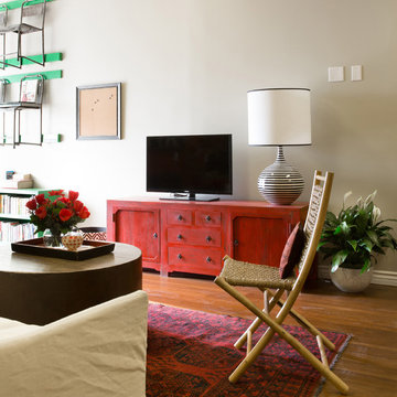
Inspiration for an eclectic living room remodel in Los Angeles
Inspiration for an eclectic living room remodel in Los Angeles
Find the right local pro for your project
 K2 Interior Designs
This project was featured in Midwest Home magazine as the winner of ASID Life in Color. The addition of a kitchen with custom shaker-style cabinetry and a large shiplap island is perfect for entertaining and hosting events for family and friends. Quartz counters that mimic the look of marble were chosen for their durability and ease of maintenance. Open shelving with brass sconces above the sink create a focal point for the large open space.
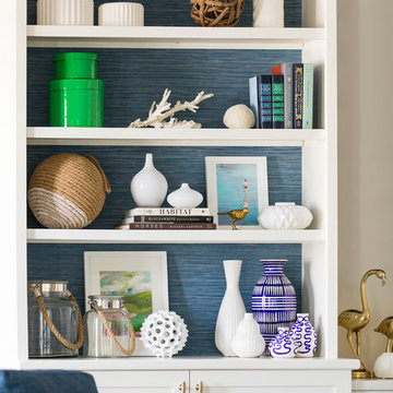
Putting a modern spin on the traditional nautical/coastal theme was a goal. We took the quintessential palette of navy and white and added pops of green, stylish patterns, and unexpected artwork to create a fresh bright space. Grasscloth on the back of the built in bookshelves and console table along with rattan and the bentwood side table add warm texture. Finishes and furnishings were selected with a practicality to fit their lifestyle and the connection to the outdoors. A large sectional along with the custom cocktail table in the living room area provide ample room for game night or a quiet evening watching movies with the kids.
To learn more visit https://k2interiordesigns.com
To view article in Midwest Home visit https://midwesthome.com/interior-spaces/life-in-color-2019/
Photography - Spacecrafting
 John R. Schroeder, AIA
Photography by Caryn B. Davis
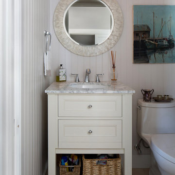
Located in the Cornfield Point area of Old Saybrook along Long Island Sound, this project brought a classic, yet forgotten beach house back to life. Through a little detective work and some creative ingenuity, we restored and enhanced the exterior to it’s former glory and transformed the interior to a highly efficient and functional home all the while uplifting its quaint cottage charm. On the exterior, we recreated a wonderful, airy front porch with cozy bench seats that look out to the water. The white cedar shingle siding is pre-bleached with a subtle flair at the bottom and a delicate break at mid-elevation. The asphalt shingles are not only beautifully matched with the siding, but offer superior reflective qualities to dissipate the heat of the summer sun. On the interior, we joined the front seasonal porch with the family room to form a larger, open living and dining space with paneled walls and ceilings anchored by the original round stone fireplace. In the rear, we carefully crafted a galley kitchen and laundry space with an adjacent first floor master suite. The diminutive house and property posed multiple practical and regulatory challenges which were overcome by a strong team effort, due diligence, and a commitment to the process.
John R. Schroeder, AIA is a professional design firm specializing in architecture, interiors, and planning. We have over 30 years experience with projects of all types, sizes, and levels of complexity. Because we love what we do, we approach our work with enthusiasm and dedication. We are committed to the highest level of design and service on each and every project. We engage our clients in positive and rewarding collaborations. We strive to exceed expectations through our attention to detail, our understanding of the “big picture”, and our ability to effectively manage a team of design professionals, industry representatives, and building contractors. We carefully analyze budgets and project objectives to assist clients with wise fund allocation.
We continually monitor and research advances in technology, materials, and construction methods, both sustainable and otherwise, to provide a responsible, well-suited, and cost effective product. Our design solutions are highly functional using both innovative and traditional approaches. Our aesthetic style is flexible and open, blending cues from client desires, building function, site context, and material properties, making each project unique, personalized, and enduring.
 John R. Schroeder, AIA
Photography by Caryn B. Davis
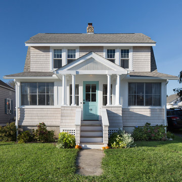
Located in the Cornfield Point area of Old Saybrook along Long Island Sound, this project brought a classic, yet forgotten beach house back to life. Through a little detective work and some creative ingenuity, we restored and enhanced the exterior to it’s former glory and transformed the interior to a highly efficient and functional home all the while uplifting its quaint cottage charm. On the exterior, we recreated a wonderful, airy front porch with cozy bench seats that look out to the water. The white cedar shingle siding is pre-bleached with a subtle flair at the bottom and a delicate break at mid-elevation. The asphalt shingles are not only beautifully matched with the siding, but offer superior reflective qualities to dissipate the heat of the summer sun. On the interior, we joined the front seasonal porch with the family room to form a larger, open living and dining space with paneled walls and ceilings anchored by the original round stone fireplace. In the rear, we carefully crafted a galley kitchen and laundry space with an adjacent first floor master suite. The diminutive house and property posed multiple practical and regulatory challenges which were overcome by a strong team effort, due diligence, and a commitment to the process.
John R. Schroeder, AIA is a professional design firm specializing in architecture, interiors, and planning. We have over 30 years experience with projects of all types, sizes, and levels of complexity. Because we love what we do, we approach our work with enthusiasm and dedication. We are committed to the highest level of design and service on each and every project. We engage our clients in positive and rewarding collaborations. We strive to exceed expectations through our attention to detail, our understanding of the “big picture”, and our ability to effectively manage a team of design professionals, industry representatives, and building contractors. We carefully analyze budgets and project objectives to assist clients with wise fund allocation.
We continually monitor and research advances in technology, materials, and construction methods, both sustainable and otherwise, to provide a responsible, well-suited, and cost effective product. Our design solutions are highly functional using both innovative and traditional approaches. Our aesthetic style is flexible and open, blending cues from client desires, building function, site context, and material properties, making each project unique, personalized, and enduring.
 John R. Schroeder, AIA
Photography by Caryn B. Davis
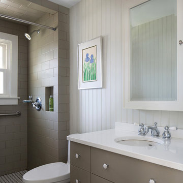
Located in the Cornfield Point area of Old Saybrook along Long Island Sound, this project brought a classic, yet forgotten beach house back to life. Through a little detective work and some creative ingenuity, we restored and enhanced the exterior to it’s former glory and transformed the interior to a highly efficient and functional home all the while uplifting its quaint cottage charm. On the exterior, we recreated a wonderful, airy front porch with cozy bench seats that look out to the water. The white cedar shingle siding is pre-bleached with a subtle flair at the bottom and a delicate break at mid-elevation. The asphalt shingles are not only beautifully matched with the siding, but offer superior reflective qualities to dissipate the heat of the summer sun. On the interior, we joined the front seasonal porch with the family room to form a larger, open living and dining space with paneled walls and ceilings anchored by the original round stone fireplace. In the rear, we carefully crafted a galley kitchen and laundry space with an adjacent first floor master suite. The diminutive house and property posed multiple practical and regulatory challenges which were overcome by a strong team effort, due diligence, and a commitment to the process.
John R. Schroeder, AIA is a professional design firm specializing in architecture, interiors, and planning. We have over 30 years experience with projects of all types, sizes, and levels of complexity. Because we love what we do, we approach our work with enthusiasm and dedication. We are committed to the highest level of design and service on each and every project. We engage our clients in positive and rewarding collaborations. We strive to exceed expectations through our attention to detail, our understanding of the “big picture”, and our ability to effectively manage a team of design professionals, industry representatives, and building contractors. We carefully analyze budgets and project objectives to assist clients with wise fund allocation.
We continually monitor and research advances in technology, materials, and construction methods, both sustainable and otherwise, to provide a responsible, well-suited, and cost effective product. Our design solutions are highly functional using both innovative and traditional approaches. Our aesthetic style is flexible and open, blending cues from client desires, building function, site context, and material properties, making each project unique, personalized, and enduring.

Sponsored
Columbus, OH

Wannemacher Interiors
Customized Award-Winning Interior Design Solutions in Franklin Cnty OH
 Ernest M. Ferizi
German Embassy in Pristina - Kosovo, contracted the architecture office “Ferizi + Ferizi Architects” to plan and implement an Annex Office building for their purposes. As detached part of this building is designed the waiting area, as alone standing structure.
This Office Building is constructed by assembling of Eight used office containers that were delivered on trucks and set up after only a few hours on the basis of the LEGO principle, according to the planning on strip foundations.
By removing the flexible exterior wall panels, a large room of 115 m² was created, with the counter wall as a room partition between two office spaces, each with seven workstations as well as three counters for agents on one side and a room for visitors on the other side.
With this system, room solutions can be easily implemented in all dimensions.
The container, seen as a geometric shape, is a simple, octagonal, solid box.
The standardized perfection of its dimensions is striking: 2.44 meters wide, 2.59 meters high and 6.06 meters or 12.19 meters long.
Since its introduction in 1956 by the American transport entrepreneur Malcom McLean, the container has become a standardized transport module worldwide, whether on ships, trucks or construction sites.
The shipping containers have additionally revolutionized the transport industry, pushed the globalization noticeably, and thus directly or indirectly influenced all our lives.
But after only a few years, when the first overseas containers wore out, many engineers recognized the positive properties of used shipping containers for building houses, especially since they are robust, flexible, multifunctional and second-hand relatively inexpensive to purchase. The time has long passed by to treat containers exclusively as transport objects.
As a "measure of all things", containers can hardly be ignored in construction.
Their use is no longer limited to temporary use since school containers, information containers, office containers or entire residential buildings are now part of our everyday life in the construction industry.
However, current examples of the container architecture prove that even the most demanding solutions for container building are feasible. For their specific aesthetic and spatial qualities, containers also serve as design parameters for the development of new forms of architecture and urbanity.
The office building as an extension of the visa section, characterized by modern materials and contemporary aesthetics has been designed and built mainly as a low-energy building.
Extensive insulation to achieve a comfortable and sustainable constant temperature in the interior, high window quality and low energy consumption make the building energy-efficient.
The sophisticated lighting technology, networks, heating systems and air-conditioning systems are also components of this equipment.
It creates an overall harmonic picture and guarantees the highest standard in sustainable construction, taking into consideration the fact that environmentally friendly recycling and reutilization have become an increasingly important issue in our society.
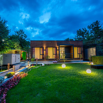
West and East side of the wooden facade is compact and has few openings, while the southern facade is completely open with lot of glass. Its spatial openness ensures a transparent, friendly work environment, which allows a lot of light into the space.
This openness allows an uninterrupted, pleasant and close-to-nature view from interior spaces into the beautiful garden. During the installation of sophisticated light sources in the garden, emphasis was not only put on functionality and security, but also on the beauty of the garden shown through the illumination in the evening.
Large, horizontal white “brisole” serve as external sun protection systems, mounted on the canopies of the entrance areas of the modular construction and the enclosure, adeptly cast shade on these areas and at the same time shape the entire architectural language.
While on one hand, the two quadratic ledges suspended in the air, are docked with steel stairs and match the wooden façade, lead the staff to their office space, the artful modern interior, on the other hand, perfectly unites the functionality, innovative technology, culture and positive effects on the employees' efficiency and wellbeing.
A lot of white, interjected by warm wooden and colored accents, determines the ambience.
In the case of the lighting solution, the mainly linear ceiling lighting is used as the overlapping design element both for the offices of the visa section as well as for the counters and the waiting area for the visitors.
They underline the puristic design in order to create a pleasant light for a desired general illumination and ensure optimal light conditions without causing disturbing reflections on the computer screens.
In addition, precisely positioned pendant luminaires are installed at the workstations, which ensure pleasant room brightness.
In the entrance area, the harmonic and uniform lighting effect from the ground highlights the integration of photography and architecture.
Photographs of landscapes, people, places, expressing unforgettable, impressive moments and memories have been lovingly engraved on 8 x 8cm square oak blocks.
The idea of an effective, impressive environment that stimulates and inspires the work was the premiss on which the whole design concept was based. Consequently, the modular construction was no longer viewed through its history of utilization and scars, but rather as a structure of work ambiance, art and elegance.
FERIZI + FERIZI Architects
Photo: Arben Llapashtica
 Traci Connell Interiors
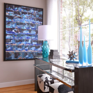
In front of a large open window in the living space, we chose to place a contemporary glass console table with two cowhide poufs below for extra seating. The bright turquoise abstract art brings the space to life with color.
 Betsy Bassett Interiors
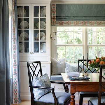
Dining room - mid-sized traditional medium tone wood floor and tray ceiling dining room idea in Boston
 The Detroit Wallpaper Co.
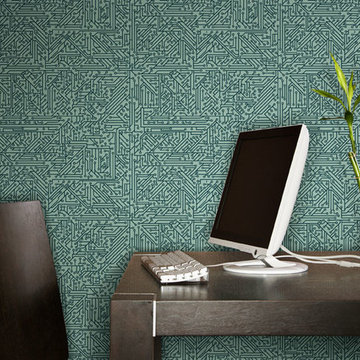
Gone are the days where nerds were the objects of ridicule. Across an array of media, the nerd has become the newest modern age sex symbol. As technology has filtered its way into every aspect of modern life, our Circuit Board wallpaper makes a clear statement of our love of gadgets be it recreationally or professionally.
- See more at: http://detroitwallpaper.com/collections/wallgazer/circuitboard.html#sthash.LOappDDm.dpuf
 Myers Constructs, Inc.
We recently took on an exciting whole-home renovation for this lovely historic Trinity in Center City Philadelphia. Originally built in the mid-1800s, the house footprint is just over 17’ x 13’. As is typical of this type of 3-story house, the kitchen is located in the basement, making this house four floors of occupied space with overall square footage totaling just under 900 square feet.
The homeowner felt the former kitchen was cramped, dimly lit, and inefficiently designed, and she was in search of help in bringing her artistic vision for the space to life, blending both old and new elements through an exciting mix of textures and character. High on her priority list was integrating her wonderful collection of objects gathered from her travels around the world.
We brought our design skills and construction experience to the team, working with the homeowner and the designer to develop a host of creative solutions, including the installation of an Indonesian screen as a sliding door covering a newly reconfigured utility area, which includes a new on-demand hot water heater, mounted next to a new electrical panel with ample room for service and access.
Other Noteworthy Features and Solutions:
New crisp drywall blended with original masonry wall textures and original exposed beams
Custom-glazed adler wood cabinets, beautiful fusion Quartzite and custom cherry counters, and a copper sink were selected for a wonderful interplay of colors, textures, and Old World feel
Small-space efficiencies designed for real-size humans, including built-ins wherever possible, limited free-standing furniture, and no upper cabinets
Built-in storage and appliances under the counter (refrigerator, freezer, washer, dryer, and microwave drawer)
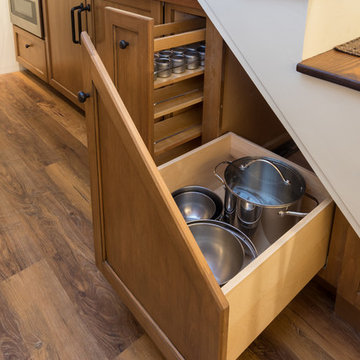
Additional multi-function storage under stairs
Extensive lighting plan with multiple sources and types of light to make this partially below-grade space feel bright and cheery
Enlarged window well to bring much more light into the space
Insulation added to create sound buffer from the floor above
All Photos by Linda McManus Photography
 Drury Design
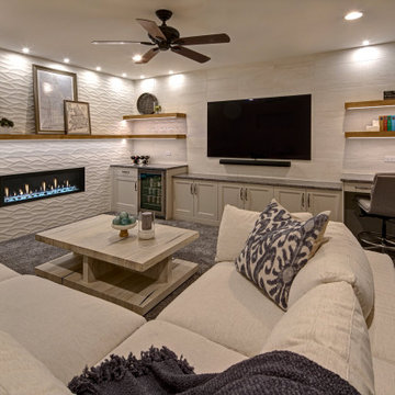
A young growing family purchased a great home in Chicago’s West Bucktown, right by Logan Square. It had good bones. The basement had been redone at some point, but it was due for another refresh. It made sense to plan a mindful remodel that would acommodate life as the kids got older.
“A nice place to just hang out” is what the owners told us they wanted. “You want your kids to want to be in your house. When friends are over, you want them to have a nice space to go to and enjoy.”
Design Objectives:
Level up the style to suit this young family
Add bar area, desk, and plenty of storage
Include dramatic linear fireplace
Plan for new sectional
Improve overall lighting
THE REMODEL
Design Challenges:
Awkward corner fireplace creates a challenge laying out furniture
No storage for kids’ toys and games
Existing space was missing the wow factor – it needs some drama
Update the lighting scheme
Design Solutions:
Remove the existing corner fireplace and dated mantle, replace with sleek linear fireplace
Add tile to both fireplace wall and tv wall for interest and drama
Include open shelving for storage and display
Create bar area, ample storage, and desk area
THE RENEWED SPACE
The homeowners love their renewed basement. It’s truly a welcoming, functional space. They can enjoy it together as a family, and it also serves as a peaceful retreat for the parents once the kids are tucked in for the night.
 Nystrom Design
Caroline Johnson Photography
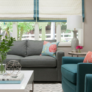
When this family moved to Lafayette, the objective was to create an inviting living space that combines a relaxed lifestyle with a few sleek elements to reference their past urban life in San Francisco. The color palette was influenced by the lush garden setting and the saturated colors of a summer garden. We selected the large-scale acrylic chandelier to highlight the vaulted ceiling and play tribute to the ranch-style architecture.
 Ernest M. Ferizi
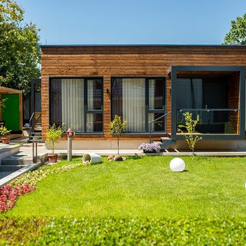
German Embassy in Pristina - Kosovo, contracted the architecture office “Ferizi + Ferizi Architects” to plan and implement an Annex Office building for their purposes. As detached part of this building is designed the waiting area, as alone standing structure.
This Office Building is constructed by assembling of Eight used office containers that were delivered on trucks and set up after only a few hours on the basis of the LEGO principle, according to the planning on strip foundations.
By removing the flexible exterior wall panels, a large room of 115 m² was created, with the counter wall as a room partition between two office spaces, each with seven workstations as well as three counters for agents on one side and a room for visitors on the other side.
With this system, room solutions can be easily implemented in all dimensions.
The container, seen as a geometric shape, is a simple, octagonal, solid box.
The standardized perfection of its dimensions is striking: 2.44 meters wide, 2.59 meters high and 6.06 meters or 12.19 meters long.
Since its introduction in 1956 by the American transport entrepreneur Malcom McLean, the container has become a standardized transport module worldwide, whether on ships, trucks or construction sites.
The shipping containers have additionally revolutionized the transport industry, pushed the globalization noticeably, and thus directly or indirectly influenced all our lives.
But after only a few years, when the first overseas containers wore out, many engineers recognized the positive properties of used shipping containers for building houses, especially since they are robust, flexible, multifunctional and second-hand relatively inexpensive to purchase. The time has long passed by to treat containers exclusively as transport objects.
As a "measure of all things", containers can hardly be ignored in construction.
Their use is no longer limited to temporary use since school containers, information containers, office containers or entire residential buildings are now part of our everyday life in the construction industry.
However, current examples of the container architecture prove that even the most demanding solutions for container building are feasible. For their specific aesthetic and spatial qualities, containers also serve as design parameters for the development of new forms of architecture and urbanity.
The office building as an extension of the visa section, characterized by modern materials and contemporary aesthetics has been designed and built mainly as a low-energy building.
Extensive insulation to achieve a comfortable and sustainable constant temperature in the interior, high window quality and low energy consumption make the building energy-efficient.
The sophisticated lighting technology, networks, heating systems and air-conditioning systems are also components of this equipment.
It creates an overall harmonic picture and guarantees the highest standard in sustainable construction, taking into consideration the fact that environmentally friendly recycling and reutilization have become an increasingly important issue in our society.
West and East side of the wooden facade is compact and has few openings, while the southern facade is completely open with lot of glass. Its spatial openness ensures a transparent, friendly work environment, which allows a lot of light into the space.
This openness allows an uninterrupted, pleasant and close-to-nature view from interior spaces into the beautiful garden. During the installation of sophisticated light sources in the garden, emphasis was not only put on functionality and security, but also on the beauty of the garden shown through the illumination in the evening.
Large, horizontal white “brisole” serve as external sun protection systems, mounted on the canopies of the entrance areas of the modular construction and the enclosure, adeptly cast shade on these areas and at the same time shape the entire architectural language.
While on one hand, the two quadratic ledges suspended in the air, are docked with steel stairs and match the wooden façade, lead the staff to their office space, the artful modern interior, on the other hand, perfectly unites the functionality, innovative technology, culture and positive effects on the employees' efficiency and wellbeing.
A lot of white, interjected by warm wooden and colored accents, determines the ambience.
In the case of the lighting solution, the mainly linear ceiling lighting is used as the overlapping design element both for the offices of the visa section as well as for the counters and the waiting area for the visitors.
They underline the puristic design in order to create a pleasant light for a desired general illumination and ensure optimal light conditions without causing disturbing reflections on the computer screens.
In addition, precisely positioned pendant luminaires are installed at the workstations, which ensure pleasant room brightness.
In the entrance area, the harmonic and uniform lighting effect from the ground highlights the integration of photography and architecture.
Photographs of landscapes, people, places, expressing unforgettable, impressive moments and memories have been lovingly engraved on 8 x 8cm square oak blocks.
The idea of an effective, impressive environment that stimulates and inspires the work was the premiss on which the whole design concept was based. Consequently, the modular construction was no longer viewed through its history of utilization and scars, but rather as a structure of work ambiance, art and elegance.
FERIZI + FERIZI Architects
Photo: Arben Llapashtica
 Ageloff Design Group
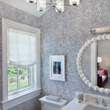
This second floor family bedroom and en-suite bathroom is envisioned for a collage-age young woman and as a room that can serve multiple purposes. It is a sleeping room, a place for quiet contemplation, a place for reading and study, and a place to gather with a few friends. It is in essence a sophisticated getaway within a sizable family home, a place of solitude or conversation, and a place of inspiration combining new elements, vintage accents, and favorite objects from life.
Photos by Mark LaRosa
 Kimberley Bryan
Photo: Kimberley Bryan © 2015 Houzz
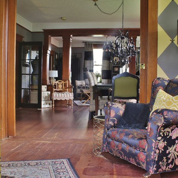
Inspiration for a mid-sized eclectic enclosed medium tone wood floor living room remodel in Seattle with multicolored walls, a standard fireplace and no tv
Inspiration for a mid-sized eclectic enclosed medium tone wood floor living room remodel in Seattle with multicolored walls, a standard fireplace and no tv
 One Coast Design - Summerville, SC
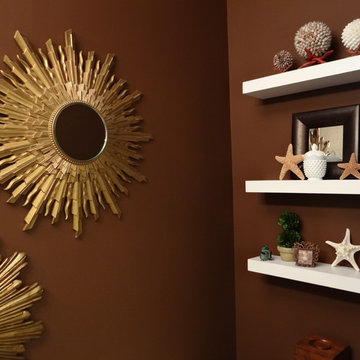
This is another view of the Chocolate Brown Downstairs Powder Room for the Spring Lake House, near Pinehurst, NC. One Coast Design
Small transitional 3/4 medium tone wood floor and beige floor bathroom photo in Raleigh with flat-panel cabinets, dark wood cabinets, a one-piece toilet and brown walls
Small transitional 3/4 medium tone wood floor and beige floor bathroom photo in Raleigh with flat-panel cabinets, dark wood cabinets, a one-piece toilet and brown walls
 Drury Design
THE SETUP
Located in a luxury high rise in Chicago’s Gold Coast Neighborhood, the condo’s existing primary bath was “fine,” but a bit underwhelming. It was a sea of beige, with very little personality or drama. The client is very well traveled, and wanted the space to feel luxe and glamorous, like a bath in a fine European hotel.
Design objectives:
- Add loads of beautiful high end finishes
- Create drama and contrast
- Create luxe showering and bathing experiences
- Improve storage for toiletries and essentials
THE REMODEL
Design challenges:
- Unable to reconfigure layout due to location in the high rise
- Seek out unique, dramatic tile materials
- Introduce “BLING”
- Find glamorous lighting
Design solutions:
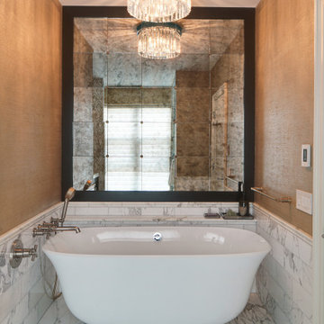
- Keep existing layout, with change from built in to free-standing tub
- Gorgeous Calacatta gold marble was our inspiration
- Ornate Art deco marble mosaic to be the focal point, with satin gold accents to create shimmer
- Glass and crystal light fixtures add the needed sparkle
THE RENEWED SPACE
After the remodel began, our client’s vision for her bath took a turn that was inspired by a trip to Paris. Initially, the plan was a modest design to allocate resources for her kitchen’s marble slabs… but then she had a vision while admiring the marble bathroom of her Parisian hotel.
She was determined to infuse her bathroom with the same sense of luxury. They went back to the drawing board and started over with all-marble.
Her new stunning bath space radiates glamour and sophistication. The “bling” flows to her bedroom where we matched the gorgeous custom wall treatment that mimics grasscloth on an accent wall. With its marble landscape, shimmering tile and walls, the primary bath’s ambiance creates a swanky hotel feel that our client adores and considers her sanctuary.
 Drury Design
THE SETUP
Located in a luxury high rise in Chicago’s Gold Coast Neighborhood, the condo’s existing primary bath was “fine,” but a bit underwhelming. It was a sea of beige, with very little personality or drama. The client is very well traveled, and wanted the space to feel luxe and glamorous, like a bath in a fine European hotel.
Design objectives:
- Add loads of beautiful high end finishes
- Create drama and contrast
- Create luxe showering and bathing experiences
- Improve storage for toiletries and essentials
THE REMODEL
Design challenges:
- Unable to reconfigure layout due to location in the high rise
- Seek out unique, dramatic tile materials
- Introduce “BLING”
- Find glamorous lighting
Design solutions:
- Keep existing layout, with change from built in to free-standing tub
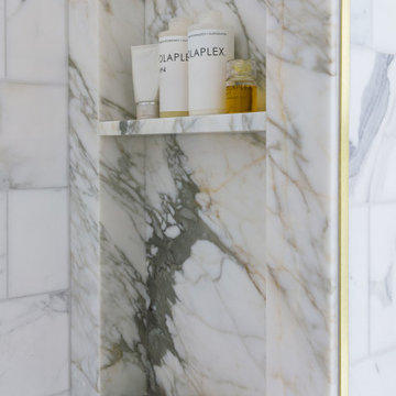
- Gorgeous Calacatta gold marble was our inspiration
- Ornate Art deco marble mosaic to be the focal point, with satin gold accents to create shimmer
- Glass and crystal light fixtures add the needed sparkle
THE RENEWED SPACE
After the remodel began, our client’s vision for her bath took a turn that was inspired by a trip to Paris. Initially, the plan was a modest design to allocate resources for her kitchen’s marble slabs… but then she had a vision while admiring the marble bathroom of her Parisian hotel.
She was determined to infuse her bathroom with the same sense of luxury. They went back to the drawing board and started over with all-marble.
Her new stunning bath space radiates glamour and sophistication. The “bling” flows to her bedroom where we matched the gorgeous custom wall treatment that mimics grasscloth on an accent wall. With its marble landscape, shimmering tile and walls, the primary bath’s ambiance creates a swanky hotel feel that our client adores and considers her sanctuary.
14