
Search results for "Life objectives" in Home Design Ideas
 Basements & Beyond
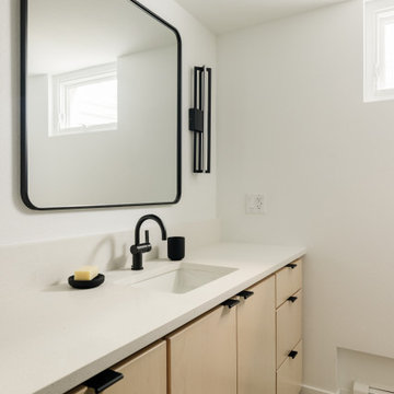
This basement remodel in a classic mid-century home was designed to seamlessly extend the elegance and functionality of the main floor. Preserving the iconic design flow of the era, B&B transformed the basement into a cohesive, livable space that honors the home’s original architectural intent. The homeowner, an architecture enthusiast and passionate collector of mid-century objects from around the world, brought their unique vision to life through carefully selected furnishings and decor. Clean lines, warm wood tones, and carefully curated materials create a harmonious extension, blending modern functionality with timeless mid-century design principles.
 Sia Moore Architecture Interior Design
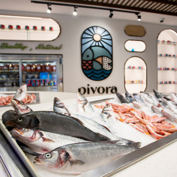
Sia Moore's design objective for Pivora, was to create a Mediterranean, luxurious and a boho-chic modern restaurant design. The restaurant is a two-storey space, composed of ground floor with the main hall and a mezzanine with dishwashing unit, electrical room and staff room. For the ground floor, the space was divided into two zones - the main dining room and the bar with three elliptical seafood showcase, refrigerators, wine racks and wall-mounted divided into two parts with the main hall on the ground floor and the banquet hall on the first floor. The restaurant space was originally built as one-storey area. However, during the design stage, building a mezzanine was proposed to client to provide a dining area with high ceiling and spacious feeling. Electrical and mechanical rooms, staff room and dishwashing unit was then located to the mezzanine floor, which was covered by glass film with an attempt to conceal the space from the gazes of guest dining area.
Capturing the Mediterranean Spirit
The restaurant is filled with rough unprocessed surfaces - complex brickwork, terrazzo flooring, exposed ceiling design. Many of the decoration details implies the seafood and organic life. Connotations that are vastly related to marine theme appear in the paintings or large elliptical seafood showcase and in the large kitchen window where the fresh food is cooked in front of the dining tables, and in the emerald green bar tiles, that is inspired by the colors of the fascinating underwater habitat.
Reflecting the vibrant and energetic spirit of the Mediterranean culture, Pivora presents a warm seafood restaurant experience. From its custom design wooden furniture and bar decorations to the brickworks on the wall of main dining room and its boho-chic lighting solutions completed by indoor plants hanging over the ceiling are aiming to set the mood for a comfortable dining experience; an experience in which the joy rises with sharing. Not to forget, Pivora offers a wide selection of local shrimps, sea bass and a large assortment of white wines from all around the world.
 Drury Design
The Setup:
After purchasing this home, the homeowners faced a unique opportunity to reimagine their kitchen and nearby spaces. Water damage from a burst pipe had left much of the home’s interior in need of repair, and while the existing kitchen was functional and in relatively good shape, it didn’t align with the family’s vision for their new home. The layout included a peninsula that wasn’t ideal, and there were some druthers with the nearby pantry.
Since the space needed to be rebuilt anyway, the homeowners saw this as a chance to create a kitchen that was both highly functional for their four young children and timeless in its design. The project also included a refresh of the adjacent message center and dining room — spaces that play key roles in the family’s daily life. The goal was to create a cohesive flow between these areas, balancing modern functionality with the craftsman-inspired character of the rest of the home.
Design Objectives:
- Replace the outdated peninsula with a large island to maximize counter space and create new seating options.
- Open up the space visually by removing soffits and rethinking the cabinetry layout.
Incorporate concealed refrigeration and freezer units to provide significant storage for the family while maintaining a streamlined aesthetic.
- Integrate black cabinetry into the design without making the space feel harsh or heavy.
- Ensure the lighting plan balances functional task lighting with ambient accent lighting.
- Avoid visual clutter in the cabinetry design while still giving a nod to the craftsman aesthetic.
- Incorporate a slab backsplash as a key design feature.
Design Challenges:
- The outdated peninsula left dead space in the kitchen and lacked sufficient seating for the family.
- The cooktop wall was cramped, with small cabinets flanking the hood, limited storage, and soffits that made the space feel closed-in.
- The family needed significant refrigeration space (two refrigerators and a freezer) but wanted to avoid a cluttered look with visible stainless steel appliances.
- Adding black cabinetry risked making the space feel too dark or heavy.
- The original lighting plan was insufficient, particularly over the dining table where a decorative fixture proved too dim.
- The family wanted shaker-style drawer fronts to match the home’s arts-and-crafts design but worried that too much shaker cabinetry might look overly busy.
- Prioritizing a slab backsplash in the wish list priority planning.
The Renewed Space
Design Solutions:
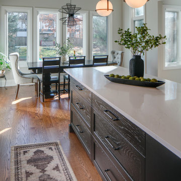
- A functional island: The peninsula was replaced with a large island that provides continuous countertop space for prepping and serving. The island also features seating for four people, creating a central hub for informal meals and activities.
- Streamlined cooktop wall: The soffits were removed, and the upper cabinets on the cooktop wall were eliminated to create a more open, streamlined design. A custom oversized hood became the focal point of the wall, with the blower unit offset inside it to align with the cooktop while maintaining exterior visual symmetry.
- Concealed refrigeration: Two column refrigerators and one freezer were integrated into the cabinetry, concealing them behind wood paneling that blends seamlessly with the overall design.
- Warm black cabinetry: The black cabinetry was crafted from hickory with a visible grain, softening its appearance and adding warmth. The grain detail gives the cabinetry a rich, textured look that avoids feeling stark or overpowering.
- Additional lighting: In the dining area, recessed can lights were added during an additional installation phase to supplement the gorgeous decorative fixture’s dim output. The new lighting plan creates a layered effect, combining functional task lighting with softer ambient lighting.
- Simplified cabinetry details: Slab drawer fronts were used on the upper drawers, while five-piece shaker fronts (with slightly less prominent rail and stile pieces) were reserved for the middle and lower drawers. This approach simplified the overall look while maintaining the craftsman-inspired aesthetic.
- Slab backsplash priority: The slab backsplash was prioritized by making thoughtful adjustments elsewhere, like opting not to extend cabinetry to the ceiling, which also helped visually prioritize the gorgeous slab backsplash. This decision also enhanced the kitchen’s furniture-like feel, aligning with the home’s craftsman character.
- This kitchen perfectly balances practicality with timeless style. By addressing the family’s functional needs — ample seating, smart storage, and effective lighting — while incorporating thoughtful design elements like warm black cabinetry and a striking slab backsplash, Alicia created a space that works beautifully for a busy household. The result is a cohesive, inviting kitchen that honors the home’s craftsman roots and will serve the family well for years to come.
Find the right local pro for your project
 Ferriss - Architectural Renderings
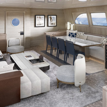
The future has arrived. Ferriss provides 3D architectural rendering, interior and exterior design services including animations, walkthroughs, and virtual reality tours to businesses in the fields of architecture, design, and construction.
Click here for more information - https://www.ferriss.co/ How do you like our yacht design?
#ferriss #We_bring_objects_to_life #3drendering #architecture #San_Francisco
 Klopf Architecture
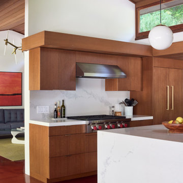
Nestled in the hills of Orinda, California, this 1951 residence is one of only seven extant homes, now known as “The Magnificent Seven”, designed by architect Olof Dahlstrand, a protégé of Frank Lloyd Wright. With its low-slung rooflines, natural materials, and deep integration with the sloping landscape, the home is a pristine example of mid-century modern design inspired by Wright’s organic principles. Over the years, prior homeowners have emphasized preservation, ensuring that the house remained relatively untouched. Each owner has respected the original architecture and stayed true to Dahlstrand’s intent. When a family of five—two college-aged sons and a middle school-aged daughter—acquired the property, they were captivated by its history, legacy of care, and architectural significance. While they appreciated Dahlstrand’s original vision, they also recognized the need to adapt the home for contemporary living while preserving its design integrity.
The remodel was conceived as a thoughtful response to the past—an effort to bring the house into the 21st century without compromising its soul. The primary mandate was to maintain architectural continuity while improving the functionality, comfort, and livability for a modern family. The design team—architects and contractor alike—worked with a shared reverence for the original architecture, allowing that mindset to guide even the most technical or pragmatic decisions.
A key objective was to increase natural light in the kitchen—a departure from Wrightian principles of enclosed, intimate cooking spaces—while maintaining the home’s architectural language. The kitchen was reconfigured to foster a stronger connection to adjacent living spaces while retaining the underlying concept of spatial separation. One of the most transformative architectural changes was the removal of a ridge beam that was originally planned to remain visible through the kitchen. During construction, the team collaborated on a better solution: a wide-flanged steel beam concealed within the roof envelope. This subtle move preserved the clean lines and ceiling continuity, a modern update carried out with utmost respect for the existing framework.
The home’s original powder room, previously accessible only through the kitchen, was relocated for better flow and privacy. A new powder room was carved out of former kitchen cabinetry—a narrow, interior space that could have felt dark and enclosed. To avoid this, the design extended the line of original transom windows into the new powder room and added a skylight above the vanity. The result is a bright and airy space that feels consistent with the rest of the home. Other updates included the installation of new solid-core interior doors with veneers carefully matched to the original mahogany, enhancing the continuity of the interiors. Even smaller decisions, such as placing the door knobs at 42 inches high, mirrored the original proportions. Every choice reflected a shared belief between the architect, contractor, and client: that new work should serve the integrity of the old.
The home’s extensive interior redwood millwork and paneling was meticulously restored. Where new materials were introduced—such as the replacement redwood soffit paneling—the contractor took pains to find finish nails that matched the original, rather than using modern equivalents. This level of craftsmanship and collaboration defined the project. It extended even to the detailing of a blind door to the new powder room, which had to disappear into the existing redwood board-and-batten wall. It was a team effort: the owner found a suitable handle, the architects devised the custom in-swing mechanism, and the contractor executed it so the door aligned precisely with the battens. Throughout, the homeowners were deeply engaged in the design process. One, a meticulous design enthusiast, focused on aesthetic integrity and historic detail. The other brought a practical and function-driven perspective, ensuring that new fixtures and materials would be durable and require minimal maintenance.
While the home’s location posed no major site challenges, sustainability was a key concern. The team upgraded the roof insulation, installed solar panels with battery storage, and added ductless mini-split cooling systems. Lighting was another area where modern technology was woven into a historic framework: new square LED fixtures echo the original custom perimeter soffit lights, maintaining the design language while offering advanced performance.
A planned expansion of a bedroom into suite with a bathroom had to be shelved due to budget constraints and the high cost of below-grade foundation work. Still, the team focused their efforts on making the most of the existing footprint, resolving constraints through design ingenuity rather than adding square footage. This renovation represents a collaborative achievement in preserving and evolving a historically significant home. Every decision was shaped by a shared ethos among clients, architects, and contractor: to maintain the home’s architectural soul while updating it for contemporary life. The result is a timeless modernist residence that continues Olof Dahlstrand’s legacy, remaining grounded in nature, craftsmanship, and human-scale design.
Klopf Architecture Team: John Klopf, AIA, Klara Kevane, Fernanda Bernardes
Interior Architectural Design: Klopf Architecture
Structural Engineer: Daniel Bastiao
Contractor: Don Larwood, Larwood Construction
Photography: Mariko Reed
Year Completed: 2022
 Danielle Rose Design Co.
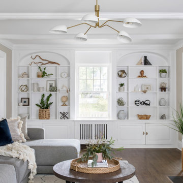
This room is right off the entryway and features large southern exposure windows, stately moldings, a fireplace, and two showstopping built-ins.
The two arched built-ins were original to this early 1900's colonial home. They infused so much history and character into the room, and they were so much fun to style!
We used a mixture of natural and organic elements in the styling of the built-ins. Some of my favorite pieces include the large driftwood branch, alabaster shapes, oversized air plants, bone beads, and framed geo stones. I also love the funky objects and ceramic vases used throughout. Lastly, we used a mixture of plants to add life and visual interest to the display.
 Ferriss - Architectural Renderings
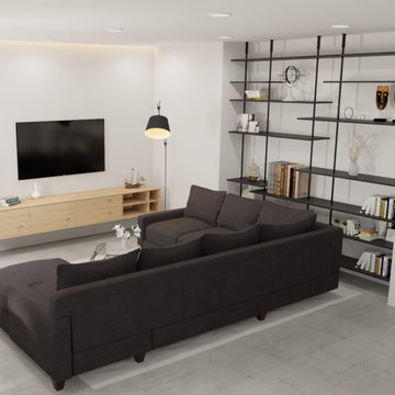
Here are some practical tips for creating a beautiful, comfortable and thoughtful living room design.
The living room in the house is the place where, as the name suggests, receives guests. However, the owners themselves relax here, spending time in front of the TV or a book, with drinks, pleasant conversation and other activities. Therefore, the living room should be the most comfortable place in your home.
The place of the sofa in the design of the living room
The sofa does not need to be placed in a draft. This means that it should not be on an imaginary line from window to door - if you drew a floor plan, it will just be easy to trace.
1. The sofa in front of the TV, diagonally from the door, is a great location. As if inviting you to sit down :)
2. Sofa near the door. A good solution if you often have overnight guests.
3. Corner sofa in the living room. Best placed in the farthest corner from the door. This will make the room look more spacious.
Correct opening of the door in the living room. Inward or outward?
Open inward or outward? There is no clear rule here, because everything depends on the layout and on the furniture placed. The main thing is that the door leaf opens freely and does not interfere with entering and exiting the room. Also, the door should not interfere with free access to the closet or dressing room.
TV in living room size and location. Location.
The TV is placed on the wall opposite to the sofa - this is the most logical and reasonable place for it in the living room. Moreover, the distance to it does not really matter: modern TV models can be placed close to the sofa.
Cabinet or bracket? To your taste. The main thing is that the television zone looks neat and presentable. Provide in advance a cable channel in which all the wires and numerous sockets for the receiver, modem, set-top box, sound bar will hide. Nothing spoils a design like sticking wires!
Height from the floor. It is optimal to place the TV 1 m from the floor to the middle of the screen - this is exactly the level of the eyes of a seated person.
Diagonal size. If there is a financial opportunity, consider options from 50 inches - smaller screens look lonely and lonely on an empty wall.
Living room furniture.
Armchair. Often the chair becomes an accent item in the interior, then its shade, and sometimes its shape, differ from the rest of the furniture. When choosing a chair, be guided also by your habits: for example, it will be more convenient to climb up with your feet and read a book in an armchair with dimensions of 90x90 cm, and you can “just sit comfortably” in a fireplace chair with a high back, comfortable armrests and with a seat 80x80 cm.
TV stand. Large TV stands are no longer as relevant as they used to be, when it was necessary to store a player, cassettes and discs there. For now, a console table or a narrow elegant pedestal is enough.
Coffee table. Nice piece of furniture that creates a cozy atmosphere. Some models, if necessary, can be transformed into a more spacious table for receiving guests - however, finding comfortable and beautiful specimens is not easy, plus they usually cost a lot.
Rack. An extremely useful type of furniture. :) Firstly, a large number of decor items can be beautifully placed on the rack. And secondly, it can also play the role of a light through partition, which divides the room into zones and does not select light at the same time. This is a very big plus for small apartments.
Fireplace. Here we are talking about electric fireplaces. Some of them come with a humidifier and heated, so 3-in-1 models can be very helpful. Fireplace portals have different styles: classic, antique, modern. Inconsistency with the general style of the living room can greatly spoil the impression of the room, so be careful with creativity. Sizing is an important issue. A large wall with a high ceiling also needs a proportionate fireplace; in horror, a small portal will look lonely and ridiculous.
What do you think about our new living room project?
https://www.ferriss.co
#ferriss #We_bring_objects_to_life #3drendering #architecture #San_Francisco

Sponsored
Columbus, OH

Wannemacher Interiors
Customized Award-Winning Interior Design Solutions in Franklin Cnty OH
 Design Outside the Lines
Snow Creek Consort
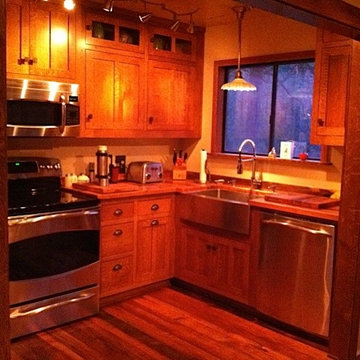
A forest’s textured layers of bark upon the trunk of a tree and the variation of shadow and light through a tree’s leaves inspired a warm and cozy natural home. Focusing on natural reclaimed materials, rich colors and idea of layering rustic elements with mid century modern objects create the aura of the space through grand architectural elements and delicate modern moments. The desire to create a home away from the busy city life allowed for an easy going rural retreat to emerge and blend in with the mountainous environment around.
 OH LA LA !
Italian Different Concept
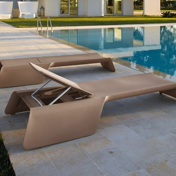
A real laboratory of ideas. Myyour is a reality where the most innovative design ideas are chosen and transformed into new and unique decorative solutions... solutions that are able to express elegance and color, functionality and aesthetics, versatility and prestige. A result that has been achieved thanks to the upshot of the series of research, assessments, studies and applications that have been carried out for each of the collections... An uninterrupted series of formal and technological trials to help us reach our final objective: a vanguard product that is best characterized as a perfect blend of craftsmanship and innovation and which is destined to become the protagonist of the most diverse spaces: a product designed to take over the scene by giving a touch of exclusivity and originality to the home, office, public setting...
The founding pillars of the Myyour philosophy are the surprising stateliness of its products and the distinction of a manufacturing process, which is meticulously followed as to ensure perfection; from the development of the project to the selection of the materials, but also from the execution of the project to the attention and care that are paid to every single minimum detail along the way. This is how the Myyour quality came to life. A must that is always more and more appreciated on an international level and by a clientele who has witnessed the potential artistic expression of these decorative creations. These solutions have managed to fill an empty space and are always in perfect harmony with their outside beauty and intrinsic functionalities. These creations always manage to trigger the creativity of individuals, architects, decorators and designers.
 COSWICK LTD
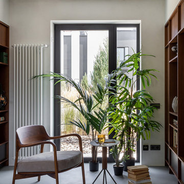
Modern minimalism as a basis for unusual, expressive art objects and author’s painting. This is what determined the main style of the living space. The concept was based on such materials as concrete and plaster, natural wood and stone. The interior had to be as natural as possible, reflecting the architectural image of the residential complex and the beauty of the surrounding nature. “The most important thing for me in this project is the result. Customers say that the interior has become their place of power! They want to return home, invite guests, spend a lot of time in their house and enjoy life here! It is very valuable and important that the project was realized almost 100%, while the customers themselves were interested not to deviate even a millimeter from the project, but to do everything exactly as the Author intended,” emphasized project designer Ksenia Mitskevich.
Coswick oak Cinnamon hardwood flooring was used in the project.
Designer: Ksenia Mitskevich.
Photo by Sergey Pilipovich.
Coswick’s partner: Domani.
 Atlas Roofing - Shingles
Summer will soon be knocking at your door, begging you to come outside and spend time in its warm sunshine. The nicer weather means hosting family barbecues and parties, kicking back in the shade with a good book or floating around in the pool, allowing the stresses of everyday life to slowly drift away.
Outdoor Seating - Sectional
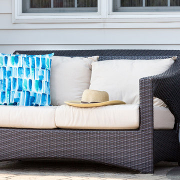
Is your back yard ready for all of the summertime fun? More specifically, take a good look at your patio furniture. Perhaps certain pieces should be spruced up or repurposed, while others may need to be replaced altogether.
Whether you’re dealing with a big or small project, don’t let the details intimidate you. With the right preparation and planning, you can transform your outdoor living space into an oasis where everyone can relax and enjoy themselves.
Choose Your Aesthetic
Before you dive into an outdoor renovation and end up feeling like you’re drowning in all of the possibilities and decisions, take some time to think about how you envision your new space. How will you be using it? Do you spend more time entertaining or relaxing? What kind of seating do you need? Does it need to be kid- and/or pet-friendly? Do you prefer clean, modern lines or playful, colorful textures? Do you like harder surfaces, such as wood, or softer ones, like cushions?
Addressing these questions should help you narrow down the outdoor seating options that work best for your family.
Get Trendy
Once you’ve honed in on your desired aesthetic, start putting your ideas into action. Looking at this year’s trends can help.
For instance, the biggest trend of 2017 is bringing the indoor look outdoors. This theme incorporates plush sofas made from durable fabrics, side tables, ottomans, vibrant-colored throw pillows and outdoor rugs. To protect their outdoor living room, many homeowners also opt for a patio cover, which can be either a hard cover or soft awning.
Outdoor Seating - Benches
This year’s outdoor furniture also blends wood-grain finishes with worn surface textures and pairs neutral colors with pastels for a washed-out effect. When it comes to dining tables and chairs, classic wrought-iron tea garden furniture is always in style.
Go Green
Adding a new chair or replacing an entire outdoor living room can be a great opportunity to bring in materials that look great and are also good for the environment. You can make your own (try these ideas from WooHome) or purchase eco-friendly furniture from shops such as Breezesta and Viesso, which offer “green” seating options in a variety of styles and colors.
Create A Warm Front
While you’ll probably focus on furnishing your back yard, don’t forget to pay some attention to the front of your house, too. Curb appeal counts – it’s the first thing your friends and neighbors see, so making a good impression is a must.
Be sure to keep the area clean. As for décor, don’t over-decorate. A simple rocking chair or swing can generate a warm, welcoming feeling for all.
Stay On Budget
Outdoor Seating - Wicker
Whether money is no object or you follow a strict budget, options are available for every wallet.
High-end luxury furniture sites such as Frontgate, offer posh designer couches, mosaic dining tables, cushioned hammocks and even a hanging daybed.
However, affordable, luxurious-looking options are available, too — especially if you’re not afraid to roll up your sleeves and do some of the work yourself. Pinterest provides countless design inspirations for do-it-yourselfers, such as repurposing an old tire into a cushioned seat and building a lawn chair using wood pallets, among others.
Plus, check out money-saving suggestions from Better Homes and Gardens’ Budget-Friendly Ideas for Outdoor Rooms, DIY Network’s 10 Outdoor Rooms on a Budget and HGTV’s 25 Budget-Friendly Ideas for Small Outdoor Spaces.
Remember, you don’t have to do everything at once. Concentrate on small areas and budget your time and money for the items that will best fit each space.
Have you recently redone your outdoor living space? We’d love to see photos! Post them in the comments below.
 COSWICK LTD
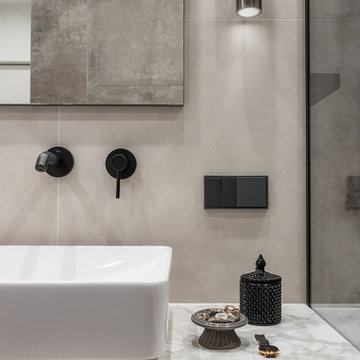
Modern minimalism as a basis for unusual, expressive art objects and author’s painting. This is what determined the main style of the living space. The concept was based on such materials as concrete and plaster, natural wood and stone. The interior had to be as natural as possible, reflecting the architectural image of the residential complex and the beauty of the surrounding nature. “The most important thing for me in this project is the result. Customers say that the interior has become their place of power! They want to return home, invite guests, spend a lot of time in their house and enjoy life here! It is very valuable and important that the project was realized almost 100%, while the customers themselves were interested not to deviate even a millimeter from the project, but to do everything exactly as the Author intended,” emphasized project designer Ksenia Mitskevich.
Coswick oak Cinnamon hardwood flooring was used in the project.
Designer: Ksenia Mitskevich.
Photo by Sergey Pilipovich.
Coswick’s partner: Domani.

 PapersNetwork
It's known as the PISA/TIMSS voyaging convoy. Every time worldwide tests results are discharged with association tables indicating champs and failures a gaggle of scientists, scholastics and grouped kindred explorers plummet on the most astounding performing nation or instruction framework to break down and write about "world's best practice".
The objective continues evolving
One issue with thusly of deduction is that nobody framework reliably beats the rest. In light of the 1995 and 1999 TIMSS (Trends in International Math and Science Study) results, Asian instruction frameworks in Singapore, Japan, South Korea and Taiwan overwhelmed. Accordingly, the emphasis was immovably on recognizing the reasons the Asian tigers were performing so well.
In the PISA (Program for International Student Assessment) 2000 results, Finland positioned first in education, fourth in arithmetic and third in science. Finland became the overwhelming focus and specialists and scholastics ran to Helsinki to find the reasons Finnish understudies performed at or close to the highest point of the table.
By 2012, at the end of the day, an alternate training framework turned into the focal point of consideration. Finland descended the PISA rankings as another champ, Shanghai, rose as first in arithmetic, science and perusing.
Apples aren't being contrasted with apples
A second issue when making correlations is that the spots we've recognized as examples of overcoming adversity are distinctive to Australia. City-states like Singapore and instruction frameworks in profoundly performing spots like Hong Kong and Shanghai have remarkable qualities that separate them from nations like Australia, England and the USA.
Contrasts in topography, the quantities of understudies and schools, the understudy cosmetics (as far as dialect, society and financial profile) and how schools, including educational modules and appraisal, are organized and oversaw significantly affect results.
Singapore, when contrasted with Australia, is little topographically, more homogenous as far as dialect and culture and utilizes instructive practices that have long been out of support in Australia. These incorporate gushing kids in view of their abilities, and high-chance, focused tests and examinations.
As noted in a paper titled How not to prevail upon PISA information: an unexpected examination, there are additionally social components clarifying solid execution that are troublesome, if not unimaginable, to exchange starting with one instruction framework then onto the next.
Evident cases incorporate the effect of Confucian qualities and morals that stretch appreciation for power (particularly instructors), the conviction that achievement is conceivable with inspiration, fixation and diligent work, and the thought that training is focal if one is to accomplish a superior life.
Confounding circumstances and end results
Befuddling what has driven these nations to achievement speaks to the third trouble in expecting that what seems to prompt accomplishment in one nation can without much of a stretch be exchanged to another.
To expect that everything we need to do in Australia to enhance test outcomes is to lessen the impact of the Australian Education Union, while being appealing to some, is both undemocratic and blameworthy of accepting circumstances and end results.
There are a few advantages of abroad correlations
PISA and TIMSS tests have been held for a long time. Thus, there is a decent arrangement of examination recognizing the attributes of more grounded performing instruction frameworks from which states and domains can learn.
The early ethnographic work recording Japanese and American classes nitty gritty in Harvard distribution The Teaching Gap uncovers how the lessons in Asian classrooms are more unequivocal, obviously organized and sound and there is a desire that all understudies, with the essential offer and applications, some assistance with canning succeed.
A later distribution by the Grattan Institute, Catching up: gaining from the best educational systems in East Asia, likewise distinguishes imperative lessons from fruitful Asian instruction frameworks.
Positive variables incorporate giving instructors more opportunity to work cooperatively and to tutor each other, guaranteeing that educator training, course readings and the educational modules are commonly steady and concentrate on enhancing classroom rehearse.
It ought to additionally be noticed that while Australian understudies don't perform in the top level in PISA and TIMSS tests, there is some reason for festivity. Understudies in the Australian Capital Territory perform well over the Australian normal and frequently coordinate the execution of top-performing abroad instruction frameworks.
As far as lifting the execution of understudies from distraught foundations it is additionally critical to take note of that Catholic schools, in light of an investigation of the 2009 PISA results completed by the Australian Council for Educational Research, accomplish a value rating surpassing that of Finland.
About the Author: Amy Parker writes too many academic papers for people who have troubles with it. She always gives needed advices, shows the examples of the papers and helps with writing at http://papersnetwork.net
 Drury Design
THE SETUP
Senior Designer Diana Burton’s client loved her sixties-era home – it just needed some work. The cozy galley kitchen was narrow and mostly closed off from the family room. A pass-through window served as a limited pipeline for treats and chatter. The appliances were failing, too. It was simply time for an overhaul.
Design Objectives:
Remove load bearing wall and open kitchen to the family room
Omit large unused fireplace in family room
Increase work surfaces and overall storage solutions
Dedicated small countertop appliance storage
Seating for 3 or 4 at island
Add pantry storage
Offer solution for lack of mudroom
Upgrade all appliances
THE REMODEL
Design Challenges:
Finding a location to hide structural support for new beam
Reworking awkward configuration of existing walls
Adding a walk-in pantry
Creating mudroom storage
Allowing room for large sectional in family room
Design Solutions:
Add a discreet column by the fridge to hide essential support
Flush out wall by bath to be even with the range wall, where the new walk in pantry exists
Use void space behind new wall for large appliance garage
Create combination walk in pantry/mudroom by adding bench with shoe storage and hooks
Maintain island depth for comfortable seating without infringing on space for the sectional
THE RENEWED SPACE
This cramped, dated kitchen has a new lease on life! Opening it to the family room dramatically transformed the space. Diana’s client now has plenty of storage, a big island for food prep, and an open-concept space that’s perfect for entertaining and hanging out with friends and family.
 Drury Design
This client is in the beauty industry, so – in additional to great style – she has more beauty products than most people do. Before the renovation, there were products all over the counters and in temporary roll-in shelving units that got wheeled into the bathroom.
It was time for a change.
Design objectives:
-Add tons of storage
-Feature blingy, reflective materials
-Improve lighting
-Omit unused built-in tub
-Create a large luxurious shower
-Include large mirrors to the ceiling
THE REMODEL
With the right storage solutions, a bathroom loaded with products and gadgets can look virtually empty. Elegance and order contribute to living life artfully.
Design challenges:
-Standard vanities don’t offer much storage
-The existing window was in an ideal spot for a shower
-The client prefers large mirrors, so we needed an alternative to medicine cabinets
Design solutions:
-Replace the existing window with a waterproof privacy window
-Create dresser-style vanities with u-shaped drawers for maximum storage
-Include a tall cabinet with roll-out shelves for maximum storage and organization
THE RENEWED SPACE
Beauty products and daily needs are organized and out of the way – out of sight but easy to access. With a creative, modern palette of colors, patterns and textures, the bathroom’s aura is inviting, relaxing and luxurious.
 Drury Design
The Setup:
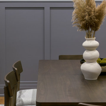
After purchasing this home, the homeowners faced a unique opportunity to reimagine their kitchen and nearby spaces. Water damage from a burst pipe had left much of the home’s interior in need of repair, and while the existing kitchen was functional and in relatively good shape, it didn’t align with the family’s vision for their new home. The layout included a peninsula that wasn’t ideal, and there were some druthers with the nearby pantry.
Since the space needed to be rebuilt anyway, the homeowners saw this as a chance to create a kitchen that was both highly functional for their four young children and timeless in its design. The project also included a refresh of the adjacent message center and dining room — spaces that play key roles in the family’s daily life. The goal was to create a cohesive flow between these areas, balancing modern functionality with the craftsman-inspired character of the rest of the home.
Design Objectives:
- Replace the outdated peninsula with a large island to maximize counter space and create new seating options.
- Open up the space visually by removing soffits and rethinking the cabinetry layout.
Incorporate concealed refrigeration and freezer units to provide significant storage for the family while maintaining a streamlined aesthetic.
- Integrate black cabinetry into the design without making the space feel harsh or heavy.
- Ensure the lighting plan balances functional task lighting with ambient accent lighting.
- Avoid visual clutter in the cabinetry design while still giving a nod to the craftsman aesthetic.
- Incorporate a slab backsplash as a key design feature.
Design Challenges:
- The outdated peninsula left dead space in the kitchen and lacked sufficient seating for the family.
- The cooktop wall was cramped, with small cabinets flanking the hood, limited storage, and soffits that made the space feel closed-in.
- The family needed significant refrigeration space (two refrigerators and a freezer) but wanted to avoid a cluttered look with visible stainless steel appliances.
- Adding black cabinetry risked making the space feel too dark or heavy.
- The original lighting plan was insufficient, particularly over the dining table where a decorative fixture proved too dim.
- The family wanted shaker-style drawer fronts to match the home’s arts-and-crafts design but worried that too much shaker cabinetry might look overly busy.
- Prioritizing a slab backsplash in the wish list priority planning.
The Renewed Space
Design Solutions:
- A functional island: The peninsula was replaced with a large island that provides continuous countertop space for prepping and serving. The island also features seating for four people, creating a central hub for informal meals and activities.
- Streamlined cooktop wall: The soffits were removed, and the upper cabinets on the cooktop wall were eliminated to create a more open, streamlined design. A custom oversized hood became the focal point of the wall, with the blower unit offset inside it to align with the cooktop while maintaining exterior visual symmetry.
- Concealed refrigeration: Two column refrigerators and one freezer were integrated into the cabinetry, concealing them behind wood paneling that blends seamlessly with the overall design.
- Warm black cabinetry: The black cabinetry was crafted from hickory with a visible grain, softening its appearance and adding warmth. The grain detail gives the cabinetry a rich, textured look that avoids feeling stark or overpowering.
- Additional lighting: In the dining area, recessed can lights were added during an additional installation phase to supplement the gorgeous decorative fixture’s dim output. The new lighting plan creates a layered effect, combining functional task lighting with softer ambient lighting.
- Simplified cabinetry details: Slab drawer fronts were used on the upper drawers, while five-piece shaker fronts (with slightly less prominent rail and stile pieces) were reserved for the middle and lower drawers. This approach simplified the overall look while maintaining the craftsman-inspired aesthetic.
- Slab backsplash priority: The slab backsplash was prioritized by making thoughtful adjustments elsewhere, like opting not to extend cabinetry to the ceiling, which also helped visually prioritize the gorgeous slab backsplash. This decision also enhanced the kitchen’s furniture-like feel, aligning with the home’s craftsman character.
- This kitchen perfectly balances practicality with timeless style. By addressing the family’s functional needs — ample seating, smart storage, and effective lighting — while incorporating thoughtful design elements like warm black cabinetry and a striking slab backsplash, Alicia created a space that works beautifully for a busy household. The result is a cohesive, inviting kitchen that honors the home’s craftsman roots and will serve the family well for years to come.
 COSWICK LTD
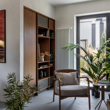
Modern minimalism as a basis for unusual, expressive art objects and author’s painting. This is what determined the main style of the living space. The concept was based on such materials as concrete and plaster, natural wood and stone. The interior had to be as natural as possible, reflecting the architectural image of the residential complex and the beauty of the surrounding nature. “The most important thing for me in this project is the result. Customers say that the interior has become their place of power! They want to return home, invite guests, spend a lot of time in their house and enjoy life here! It is very valuable and important that the project was realized almost 100%, while the customers themselves were interested not to deviate even a millimeter from the project, but to do everything exactly as the Author intended,” emphasized project designer Ksenia Mitskevich.
Coswick oak Cinnamon hardwood flooring was used in the project.
Designer: Ksenia Mitskevich.
Photo by Sergey Pilipovich.
Coswick’s partner: Domani.
 Klopf Architecture
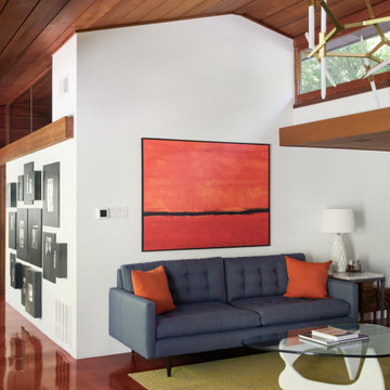
Nestled in the hills of Orinda, California, this 1951 residence is one of only seven extant homes, now known as “The Magnificent Seven”, designed by architect Olof Dahlstrand, a protégé of Frank Lloyd Wright. With its low-slung rooflines, natural materials, and deep integration with the sloping landscape, the home is a pristine example of mid-century modern design inspired by Wright’s organic principles. Over the years, prior homeowners have emphasized preservation, ensuring that the house remained relatively untouched. Each owner has respected the original architecture and stayed true to Dahlstrand’s intent. When a family of five—two college-aged sons and a middle school-aged daughter—acquired the property, they were captivated by its history, legacy of care, and architectural significance. While they appreciated Dahlstrand’s original vision, they also recognized the need to adapt the home for contemporary living while preserving its design integrity.
The remodel was conceived as a thoughtful response to the past—an effort to bring the house into the 21st century without compromising its soul. The primary mandate was to maintain architectural continuity while improving the functionality, comfort, and livability for a modern family. The design team—architects and contractor alike—worked with a shared reverence for the original architecture, allowing that mindset to guide even the most technical or pragmatic decisions.
A key objective was to increase natural light in the kitchen—a departure from Wrightian principles of enclosed, intimate cooking spaces—while maintaining the home’s architectural language. The kitchen was reconfigured to foster a stronger connection to adjacent living spaces while retaining the underlying concept of spatial separation. One of the most transformative architectural changes was the removal of a ridge beam that was originally planned to remain visible through the kitchen. During construction, the team collaborated on a better solution: a wide-flanged steel beam concealed within the roof envelope. This subtle move preserved the clean lines and ceiling continuity, a modern update carried out with utmost respect for the existing framework.
The home’s original powder room, previously accessible only through the kitchen, was relocated for better flow and privacy. A new powder room was carved out of former kitchen cabinetry—a narrow, interior space that could have felt dark and enclosed. To avoid this, the design extended the line of original transom windows into the new powder room and added a skylight above the vanity. The result is a bright and airy space that feels consistent with the rest of the home. Other updates included the installation of new solid-core interior doors with veneers carefully matched to the original mahogany, enhancing the continuity of the interiors. Even smaller decisions, such as placing the door knobs at 42 inches high, mirrored the original proportions. Every choice reflected a shared belief between the architect, contractor, and client: that new work should serve the integrity of the old.
The home’s extensive interior redwood millwork and paneling was meticulously restored. Where new materials were introduced—such as the replacement redwood soffit paneling—the contractor took pains to find finish nails that matched the original, rather than using modern equivalents. This level of craftsmanship and collaboration defined the project. It extended even to the detailing of a blind door to the new powder room, which had to disappear into the existing redwood board-and-batten wall. It was a team effort: the owner found a suitable handle, the architects devised the custom in-swing mechanism, and the contractor executed it so the door aligned precisely with the battens. Throughout, the homeowners were deeply engaged in the design process. One, a meticulous design enthusiast, focused on aesthetic integrity and historic detail. The other brought a practical and function-driven perspective, ensuring that new fixtures and materials would be durable and require minimal maintenance.
While the home’s location posed no major site challenges, sustainability was a key concern. The team upgraded the roof insulation, installed solar panels with battery storage, and added ductless mini-split cooling systems. Lighting was another area where modern technology was woven into a historic framework: new square LED fixtures echo the original custom perimeter soffit lights, maintaining the design language while offering advanced performance.
A planned expansion of a bedroom into suite with a bathroom had to be shelved due to budget constraints and the high cost of below-grade foundation work. Still, the team focused their efforts on making the most of the existing footprint, resolving constraints through design ingenuity rather than adding square footage. This renovation represents a collaborative achievement in preserving and evolving a historically significant home. Every decision was shaped by a shared ethos among clients, architects, and contractor: to maintain the home’s architectural soul while updating it for contemporary life. The result is a timeless modernist residence that continues Olof Dahlstrand’s legacy, remaining grounded in nature, craftsmanship, and human-scale design.
Klopf Architecture Team: John Klopf, AIA, Klara Kevane, Fernanda Bernardes
Interior Architectural Design: Klopf Architecture
Structural Engineer: Daniel Bastiao
Contractor: Don Larwood, Larwood Construction
Photography: Mariko Reed
Year Completed: 2022
 Drury Design
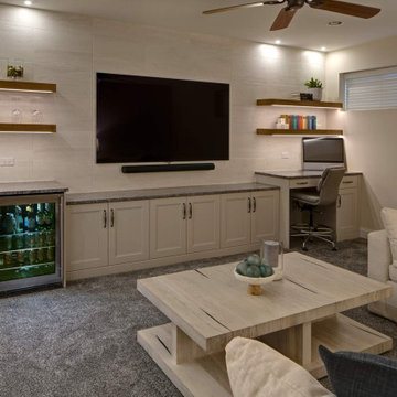
A young growing family purchased a great home in Chicago’s West Bucktown, right by Logan Square. It had good bones. The basement had been redone at some point, but it was due for another refresh. It made sense to plan a mindful remodel that would acommodate life as the kids got older.
“A nice place to just hang out” is what the owners told us they wanted. “You want your kids to want to be in your house. When friends are over, you want them to have a nice space to go to and enjoy.”
Design Objectives:
Level up the style to suit this young family
Add bar area, desk, and plenty of storage
Include dramatic linear fireplace
Plan for new sectional
Improve overall lighting
THE REMODEL
Design Challenges:
Awkward corner fireplace creates a challenge laying out furniture
No storage for kids’ toys and games
Existing space was missing the wow factor – it needs some drama
Update the lighting scheme
Design Solutions:
Remove the existing corner fireplace and dated mantle, replace with sleek linear fireplace
Add tile to both fireplace wall and tv wall for interest and drama
Include open shelving for storage and display
Create bar area, ample storage, and desk area
THE RENEWED SPACE
The homeowners love their renewed basement. It’s truly a welcoming, functional space. They can enjoy it together as a family, and it also serves as a peaceful retreat for the parents once the kids are tucked in for the night.
 Artist's Proof
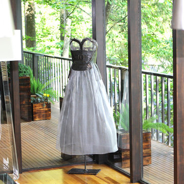
“Fashion is well known as a reliable reflection of cultural trends and historical events. On a personal level, it has become my creative vehicle for exploring the emotional roller coaster of life.
My inspiration arose from contemplating the dichotomy between the perception of women as fragile, delicate creatures, and the reality that most women are defined by resiliency and steely resolve. I employ a juxtaposition of extremes such as lightness and gravity, suppleness and intransigence, to convey feminine sensibilities.
Crafted of steel and embellished with flourishes of wire mesh, screening, cut-outs and bits of found objects, the dresses are at once both elegant and imposing. I like the duplicitous nature of steel which can be manipulated to appear feminine and soft while actually maintaining its strength and rigidity—an expression in contrasts and complements.”
-Donna McCullough
21