
Search results for "Life objectives" in Home Design Ideas
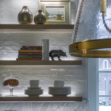
 Drury Design
THE SETUP
Once these empty nest homeowners decided to stay put, they knew a new kitchen was in order. Passionate about cooking, entertaining, and hosting holiday gatherings, they found their existing kitchen inadequate. The space, with its traditional style and outdated layout, was far from ideal. They longed for an elegant, timeless kitchen that was not only show-stopping but also functional, seamlessly catering to both their daily routines and special occasions with friends and family. Another key factor was its future appeal to potential buyers, as they’re ready to enjoy their new kitchen while also considering downsizing in the future.
Design Objectives:
Create a more streamlined, open space
Eliminate traditional elements
Improve flow for entertaining and everyday use
Omit dated posts and soffits
Include storage for small appliances to keep counters clutter-free
Address mail organization and phone charging concerns
THE REMODEL
Design Challenges:
Compensate for lost storage from omitted wall cabinets
Revise floorplan to feature a single, spacious island
Enhance island seating proximity for a more engaging atmosphere
Address awkward space above existing built-ins
Improve natural light blocked by wall cabinet near the window
Create a highly functional space tailored for entertaining
Design Solutions:
Tall cabinetry and pull-outs maximize storage efficiency
A generous single island promotes seamless flow and ample prep space
Strategic island seating arrangement fosters easy conversation
New built-ins fill arched openings, ensuring a custom, clutter-free look
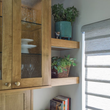
Replace wall cabinet with lighted open shelves for an airy feel
Galley Dresser and Workstation offer impeccable organization and versatility, creating the perfect setup for entertaining with everything easily accessible.
THE RENEWED SPACE
The new kitchen exceeded every expectation, thrilling the clients with its revitalized, expansive design and thoughtful functionality. The transformation brought to life an open space adorned with marble accents, a state-of-the-art steam oven, and the seamless integration of the Galley Dresser, crafting a kitchen not just to be used, but to be cherished. This is more than a culinary space; it’s a new heart of their home, ready to host countless memories and culinary adventures.
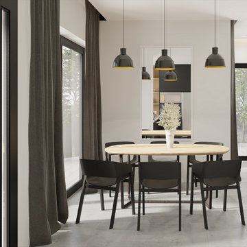
 Ferriss - Architectural Renderings
Here are some practical tips for creating a beautiful, comfortable and thoughtful living room design.
The living room in the house is the place where, as the name suggests, receives guests. However, the owners themselves relax here, spending time in front of the TV or a book, with drinks, pleasant conversation and other activities. Therefore, the living room should be the most comfortable place in your home.
The place of the sofa in the design of the living room
The sofa does not need to be placed in a draft. This means that it should not be on an imaginary line from window to door - if you drew a floor plan, it will just be easy to trace.
1. The sofa in front of the TV, diagonally from the door, is a great location. As if inviting you to sit down :)
2. Sofa near the door. A good solution if you often have overnight guests.
3. Corner sofa in the living room. Best placed in the farthest corner from the door. This will make the room look more spacious.
Correct opening of the door in the living room. Inward or outward?
Open inward or outward? There is no clear rule here, because everything depends on the layout and on the furniture placed. The main thing is that the door leaf opens freely and does not interfere with entering and exiting the room. Also, the door should not interfere with free access to the closet or dressing room.
TV in living room size and location. Location.
The TV is placed on the wall opposite to the sofa - this is the most logical and reasonable place for it in the living room. Moreover, the distance to it does not really matter: modern TV models can be placed close to the sofa.
Cabinet or bracket? To your taste. The main thing is that the television zone looks neat and presentable. Provide in advance a cable channel in which all the wires and numerous sockets for the receiver, modem, set-top box, sound bar will hide. Nothing spoils a design like sticking wires!
Height from the floor. It is optimal to place the TV 1 m from the floor to the middle of the screen - this is exactly the level of the eyes of a seated person.
Diagonal size. If there is a financial opportunity, consider options from 50 inches - smaller screens look lonely and lonely on an empty wall.
Living room furniture.
Armchair. Often the chair becomes an accent item in the interior, then its shade, and sometimes its shape, differ from the rest of the furniture. When choosing a chair, be guided also by your habits: for example, it will be more convenient to climb up with your feet and read a book in an armchair with dimensions of 90x90 cm, and you can “just sit comfortably” in a fireplace chair with a high back, comfortable armrests and with a seat 80x80 cm.
TV stand. Large TV stands are no longer as relevant as they used to be, when it was necessary to store a player, cassettes and discs there. For now, a console table or a narrow elegant pedestal is enough.
Coffee table. Nice piece of furniture that creates a cozy atmosphere. Some models, if necessary, can be transformed into a more spacious table for receiving guests - however, finding comfortable and beautiful specimens is not easy, plus they usually cost a lot.
Rack. An extremely useful type of furniture. :) Firstly, a large number of decor items can be beautifully placed on the rack. And secondly, it can also play the role of a light through partition, which divides the room into zones and does not select light at the same time. This is a very big plus for small apartments.
Fireplace. Here we are talking about electric fireplaces. Some of them come with a humidifier and heated, so 3-in-1 models can be very helpful. Fireplace portals have different styles: classic, antique, modern. Inconsistency with the general style of the living room can greatly spoil the impression of the room, so be careful with creativity. Sizing is an important issue. A large wall with a high ceiling also needs a proportionate fireplace; in horror, a small portal will look lonely and ridiculous.
What do you think about our new living room project?
https://www.ferriss.co
#ferriss #We_bring_objects_to_life #3drendering #architecture #San_Francisco
 Fiorito Interior Design
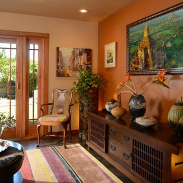
After a decade of being bi-coastal, my clients decided to retire from the east coast to the west. But the task of packing up a whole lifetime in a home was quite daunting so they hired me to comb through their furniture and accessories to see what could fit, what should be left behind, and what should make the move. The job proved difficult since my clients have a wealth of absolutely gorgeous objects and furnishings collected from trips to exotic, far-flung locales like Nepal, or inherited from relatives in England. It was tough to pare down, but after hours of diligent measuring, I mapped out what would migrate west and where it would be placed once here, and I filled in some blank spaces with new pieces.
They bought their recent Craftsman-style home from the contractor who had designed and built it for his family. The only architectural work we did was to transform the den at the rear of the house into a television/garden room. My clients did not want the television to be on display, and sticking a TV in an armoire just doesn’t cut it anymore. I recommended installing a hidden, mirror TV with accompanying invisible in-wall speakers. To do this, we removed an unnecessary small door in the corner of the room to free up the entire wall. Now, at the touch of a remote, what looks like a beautiful wall mirror mounted over a Japanese tansu console comes to life, and sound magically floats out from the wall around it! We also replaced a bank of windows with French doors to allow easy access to the garden.
While the house is extremely well made, the interiors were bland. The warm woodwork was lost in a sea of beige, so I chose a deep aqua color palette for the front rooms of the house which makes the woodwork sing. And we discovered a wonderful art niche over the fireplace that the previous owners had covered with a framed print. Conversely, a warm color palette in the TV room contrasts nicely with the greenery from the garden seen through the new French doors.
Photo by Bernardo Grijalva
Find the right local pro for your project
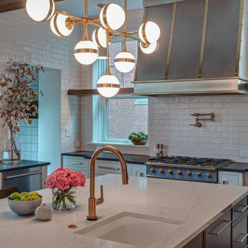 Drury Design
Design Objectives:
Respect the home’s vintage feel while bringing the kitchen up to date
Open up the kitchen area to create an open space for gathering and entertaining
Upgrade appliances to top-of-the-line models
Include a large island with seating
Include seating for casual family meals in a space that won’t be a replacement for the adjacent formal dining room
THE REMODEL
Design Challenges:
Remove a load-bearing wall and combine smaller rooms to create one big kitchen
A powder room in the back corner of the existing kitchen was a huge obstacle to updating the layout
Maintain large windows with views of the yard while still providing ample storage
Design Solutions:
Relocating the powder room to another part of the first floor (a large closet under the stairs) opened up the space dramatically
Create space for a larger island by recessing the fridge/freezer and shifting the pantry to a space adjacent to the kitchen
A banquette saves space and offers a perfect solution for casual dining
The walnut banquette table beautifully complements the fridge/freezer armoire
Utilize a gap created by the new fridge location to create a tall shallow cabinet for liquor storage w/ a wine cubby
Closing off one doorway into the dining room and using the “between the studs” space for a tall storage cabinet
Dish organizing drawers offer handy storage for plates, bowls, and serving dishes right by main sink and dishwasher
Cabinetry backing up to the dining room offers ample storage for glassware and functions both as a coffee station and cocktail bar
Open shelves flanking the hood add storage without blocking views and daylight
A beam was required where the wall was removed. Additional beams added architectural interest and helped integrate the beams into the space
Statement lighting adds drama and personality to the space
THE RENEWED SPACE
This project exemplifies the transformative power of good design. Simply put, good design allows you to live life artfully. The newly remodeled kitchen effortlessly combines functionality and aesthetic appeal, providing a delightful space for cooking and spending quality time together. It’s comfy for regular meals but ultimately outfitted for those special gatherings. Infused with classic finishes and a timeless charm, the kitchen emanates an enduring atmosphere that will never go out of style.
 Michael Nash Design, Build & Homes
2012 NARI CAPITAL COTY, FINALIST AWARD WINNER, RESIDENTIAL EXTERIOR UNDER $100,000
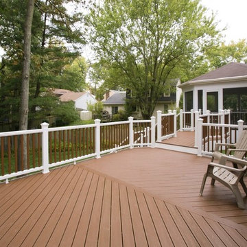
The outdoor life means the world to this couple and their three children in Springfield, Virginia. Sports and having friends over are a big part of their lives so having a nice outdoor living space off their home is very important.
Unfortunately, the home they purchased had not only a small, crumbling deck, but the backyard landscaping left much to be desired. The main objectives of their outdoor living renovation were to be able to have a large enough patio, deck and screen porch so they could all be outside enjoying their own activities at the same time.
Working with Michael Nash Design, Build & Homes, the homeowners decided to add a large deck on the right side of the back of the house and a 20’ x 20’ octagonal screen porch on the left side. In order not to interfere with windows and the placement of utilities on the lower level, the Michael Nash team created a brick walkway which leads to double sided stairways. Maintenance-free decking and accessories are used throughout. A high cathedral ceiling with beaded panels, recessed lights and a ceiling fan make the screened-in porch a family favorite.
On the lower level, several trees were removed and the yard was graded level for a new flagstone patio with short stone seating walls. A bed for plants and flower with stone rocks was placed around the utility meters to create a more desirable appearance.
The sound of kids playing soccer in backyard while dad is grilling and mom is relaxing on the deck is a dream come true for this family.
 Flourish Interiors by Vanessa C Smith
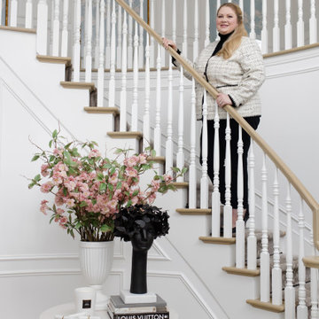
Welcome to the foyer at The French Chateau. This is the space I first fell in love with; as I have wanted a home with a curved staircase since I was a little girl. Immediately upon entering, you are greeted with the view of our round foyer table as seen here. The objects I have chosen to accentuate this area are meaningful to me. For example, the tall pink cherry blossoms put my favorite color, pink, on display. The gardenia candle is intended to welcome guests with a soft, pretty scent. The sculpture is called "Butterflies for Brains". My name, Vanessa, means butterfly. My maternal grandmother, Ruth, loved butterflies as well. So this sculpture not only visually reminds me of her, but it also is symbolic of who I am and how I view the world. At first blush the phrase 'butterflies for brains" may imply being flighty or whimsical...but to me instead it means being creative and living life as a creative, always looking for beauty.
 Drury Design
Design Objectives:
Remove load bearing wall and open kitchen to the family room
Omit large unused fireplace in family room
Increase work surfaces and overall storage solutions
Dedicated small countertop appliance storage
Seating for 3 or 4 at island
Add pantry storage
Offer solution for lack of mudroom
Upgrade all appliances
THE REMODEL
Design Challenges:
Finding a location to hide structural support for new beam
Reworking awkward configuration of existing walls
Adding a walk-in pantry
Creating mudroom storage
Allowing room for large sectional in family room
Design Solutions:
Add a discreet column by the fridge to hide essential support
Flush out wall by bath to be even with the range wall, where the new walk in pantry exists
Use void space behind new wall for large appliance garage
Create combination walk in pantry/mudroom by adding bench with shoe storage and hooks
Maintain island depth for comfortable seating without infringing on space for the sectional
THE RENEWED SPACE
This cramped, dated kitchen has a new lease on life! Opening it to the family room dramatically transformed the space. Diana’s client now has plenty of storage, a big island for food prep, and an open-concept space that’s perfect for entertaining and hanging out with friends and family.

Sponsored
Columbus, OH

Wannemacher Interiors
Customized Award-Winning Interior Design Solutions in Franklin Cnty OH
 Drury Design
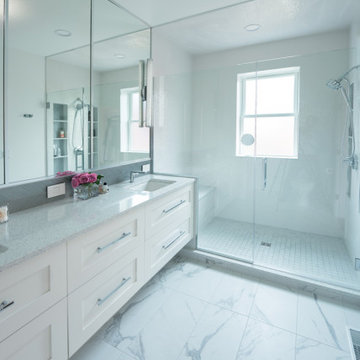
This client is in the beauty industry, so – in additional to great style – she has more beauty products than most people do. Before the renovation, there were products all over the counters and in temporary roll-in shelving units that got wheeled into the bathroom.
It was time for a change.
Design objectives:
-Add tons of storage
-Feature blingy, reflective materials
-Improve lighting
-Omit unused built-in tub
-Create a large luxurious shower
-Include large mirrors to the ceiling
THE REMODEL
With the right storage solutions, a bathroom loaded with products and gadgets can look virtually empty. Elegance and order contribute to living life artfully.
Design challenges:
-Standard vanities don’t offer much storage
-The existing window was in an ideal spot for a shower
-The client prefers large mirrors, so we needed an alternative to medicine cabinets
Design solutions:
-Replace the existing window with a waterproof privacy window
-Create dresser-style vanities with u-shaped drawers for maximum storage
-Include a tall cabinet with roll-out shelves for maximum storage and organization
THE RENEWED SPACE
Beauty products and daily needs are organized and out of the way – out of sight but easy to access. With a creative, modern palette of colors, patterns and textures, the bathroom’s aura is inviting, relaxing and luxurious.
 Drury Design
THE SETUP
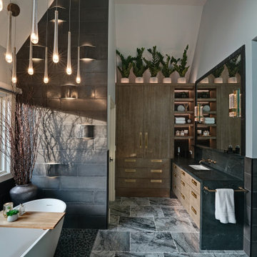
Upon moving to Glen Ellyn, the homeowners were eager to infuse their new residence with a style that resonated with their modern aesthetic sensibilities. The primary bathroom, while spacious and structurally impressive with its dramatic high ceilings, presented a dated, overly traditional appearance that clashed with their vision.
Design objectives:
Transform the space into a serene, modern spa-like sanctuary.
Integrate a palette of deep, earthy tones to create a rich, enveloping ambiance.
Employ a blend of organic and natural textures to foster a connection with nature.
THE REMODEL
Design challenges:
Take full advantage of the vaulted ceiling
Source unique marble that is more grounding than fanciful
Design minimal, modern cabinetry with a natural, organic finish
Offer a unique lighting plan to create a sexy, Zen vibe
Design solutions:
To highlight the vaulted ceiling, we extended the shower tile to the ceiling and added a skylight to bathe the area in natural light.
Sourced unique marble with raw, chiseled edges that provide a tactile, earthy element.
Our custom-designed cabinetry in a minimal, modern style features a natural finish, complementing the organic theme.
A truly creative layered lighting strategy dials in the perfect Zen-like atmosphere. The wavy protruding wall tile lights triggered our inspiration but came with an unintended harsh direct-light effect so we sourced a solution: bespoke diffusers measured and cut for the top and bottom of each tile light gap.
THE RENEWED SPACE
The homeowners dreamed of a tranquil, luxurious retreat that embraced natural materials and a captivating color scheme. Our collaborative effort brought this vision to life, creating a bathroom that not only meets the clients’ functional needs but also serves as a daily sanctuary. The carefully chosen materials and lighting design enable the space to shift its character with the changing light of day.
“Trust the process and it will all come together,” the home owners shared. “Sometimes we just stand here and think, ‘Wow, this is lovely!'”
 Basements & Beyond
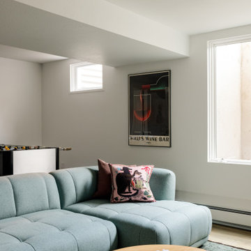
This basement remodel in a classic mid-century home was designed to seamlessly extend the elegance and functionality of the main floor. Preserving the iconic design flow of the era, B&B transformed the basement into a cohesive, livable space that honors the home’s original architectural intent. The homeowner, an architecture enthusiast and passionate collector of mid-century objects from around the world, brought their unique vision to life through carefully selected furnishings and decor. Clean lines, warm wood tones, and carefully curated materials create a harmonious extension, blending modern functionality with timeless mid-century design principles.
 A036 Architecture, Design NYC and Chicago
Project Objective
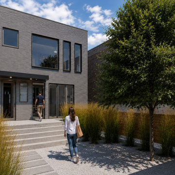
A complete transformation of an existing two-family residence into a contemporary single-family home. The design reimagines the interior as a cohesive living environment where openness, clarity, and spatial continuity define the experience of home.
Design Intent
Conceived as a sequence of interconnected, light-filled spaces, the home blurs the boundaries between rooms through carefully orchestrated volumes, framed views, and a restrained material palette. Natural light and refined detailing shape an atmosphere that is both calm and expressive, creating a timeless residence where architecture enriches everyday life.
 Drury Design
The Setup:
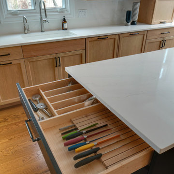
After purchasing this home, the homeowners faced a unique opportunity to reimagine their kitchen and nearby spaces. Water damage from a burst pipe had left much of the home’s interior in need of repair, and while the existing kitchen was functional and in relatively good shape, it didn’t align with the family’s vision for their new home. The layout included a peninsula that wasn’t ideal, and there were some druthers with the nearby pantry.
Since the space needed to be rebuilt anyway, the homeowners saw this as a chance to create a kitchen that was both highly functional for their four young children and timeless in its design. The project also included a refresh of the adjacent message center and dining room — spaces that play key roles in the family’s daily life. The goal was to create a cohesive flow between these areas, balancing modern functionality with the craftsman-inspired character of the rest of the home.
Design Objectives:
- Replace the outdated peninsula with a large island to maximize counter space and create new seating options.
- Open up the space visually by removing soffits and rethinking the cabinetry layout.
Incorporate concealed refrigeration and freezer units to provide significant storage for the family while maintaining a streamlined aesthetic.
- Integrate black cabinetry into the design without making the space feel harsh or heavy.
- Ensure the lighting plan balances functional task lighting with ambient accent lighting.
- Avoid visual clutter in the cabinetry design while still giving a nod to the craftsman aesthetic.
- Incorporate a slab backsplash as a key design feature.
Design Challenges:
- The outdated peninsula left dead space in the kitchen and lacked sufficient seating for the family.
- The cooktop wall was cramped, with small cabinets flanking the hood, limited storage, and soffits that made the space feel closed-in.
- The family needed significant refrigeration space (two refrigerators and a freezer) but wanted to avoid a cluttered look with visible stainless steel appliances.
- Adding black cabinetry risked making the space feel too dark or heavy.
- The original lighting plan was insufficient, particularly over the dining table where a decorative fixture proved too dim.
- The family wanted shaker-style drawer fronts to match the home’s arts-and-crafts design but worried that too much shaker cabinetry might look overly busy.
- Prioritizing a slab backsplash in the wish list priority planning.
The Renewed Space
Design Solutions:
- A functional island: The peninsula was replaced with a large island that provides continuous countertop space for prepping and serving. The island also features seating for four people, creating a central hub for informal meals and activities.
- Streamlined cooktop wall: The soffits were removed, and the upper cabinets on the cooktop wall were eliminated to create a more open, streamlined design. A custom oversized hood became the focal point of the wall, with the blower unit offset inside it to align with the cooktop while maintaining exterior visual symmetry.
- Concealed refrigeration: Two column refrigerators and one freezer were integrated into the cabinetry, concealing them behind wood paneling that blends seamlessly with the overall design.
- Warm black cabinetry: The black cabinetry was crafted from hickory with a visible grain, softening its appearance and adding warmth. The grain detail gives the cabinetry a rich, textured look that avoids feeling stark or overpowering.
- Additional lighting: In the dining area, recessed can lights were added during an additional installation phase to supplement the gorgeous decorative fixture’s dim output. The new lighting plan creates a layered effect, combining functional task lighting with softer ambient lighting.
- Simplified cabinetry details: Slab drawer fronts were used on the upper drawers, while five-piece shaker fronts (with slightly less prominent rail and stile pieces) were reserved for the middle and lower drawers. This approach simplified the overall look while maintaining the craftsman-inspired aesthetic.
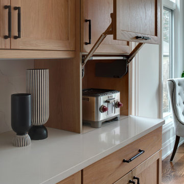
- Slab backsplash priority: The slab backsplash was prioritized by making thoughtful adjustments elsewhere, like opting not to extend cabinetry to the ceiling, which also helped visually prioritize the gorgeous slab backsplash. This decision also enhanced the kitchen’s furniture-like feel, aligning with the home’s craftsman character.
- This kitchen perfectly balances practicality with timeless style. By addressing the family’s functional needs — ample seating, smart storage, and effective lighting — while incorporating thoughtful design elements like warm black cabinetry and a striking slab backsplash, Alicia created a space that works beautifully for a busy household. The result is a cohesive, inviting kitchen that honors the home’s craftsman roots and will serve the family well for years to come.
 Drury Design
The Setup:
After purchasing this home, the homeowners faced a unique opportunity to reimagine their kitchen and nearby spaces. Water damage from a burst pipe had left much of the home’s interior in need of repair, and while the existing kitchen was functional and in relatively good shape, it didn’t align with the family’s vision for their new home. The layout included a peninsula that wasn’t ideal, and there were some druthers with the nearby pantry.
Since the space needed to be rebuilt anyway, the homeowners saw this as a chance to create a kitchen that was both highly functional for their four young children and timeless in its design. The project also included a refresh of the adjacent message center and dining room — spaces that play key roles in the family’s daily life. The goal was to create a cohesive flow between these areas, balancing modern functionality with the craftsman-inspired character of the rest of the home.
Design Objectives:
- Replace the outdated peninsula with a large island to maximize counter space and create new seating options.
- Open up the space visually by removing soffits and rethinking the cabinetry layout.
Incorporate concealed refrigeration and freezer units to provide significant storage for the family while maintaining a streamlined aesthetic.
- Integrate black cabinetry into the design without making the space feel harsh or heavy.
- Ensure the lighting plan balances functional task lighting with ambient accent lighting.
- Avoid visual clutter in the cabinetry design while still giving a nod to the craftsman aesthetic.
- Incorporate a slab backsplash as a key design feature.
Design Challenges:
- The outdated peninsula left dead space in the kitchen and lacked sufficient seating for the family.
- The cooktop wall was cramped, with small cabinets flanking the hood, limited storage, and soffits that made the space feel closed-in.
- The family needed significant refrigeration space (two refrigerators and a freezer) but wanted to avoid a cluttered look with visible stainless steel appliances.
- Adding black cabinetry risked making the space feel too dark or heavy.
- The original lighting plan was insufficient, particularly over the dining table where a decorative fixture proved too dim.
- The family wanted shaker-style drawer fronts to match the home’s arts-and-crafts design but worried that too much shaker cabinetry might look overly busy.
- Prioritizing a slab backsplash in the wish list priority planning.
The Renewed Space
Design Solutions:
- A functional island: The peninsula was replaced with a large island that provides continuous countertop space for prepping and serving. The island also features seating for four people, creating a central hub for informal meals and activities.
- Streamlined cooktop wall: The soffits were removed, and the upper cabinets on the cooktop wall were eliminated to create a more open, streamlined design. A custom oversized hood became the focal point of the wall, with the blower unit offset inside it to align with the cooktop while maintaining exterior visual symmetry.
- Concealed refrigeration: Two column refrigerators and one freezer were integrated into the cabinetry, concealing them behind wood paneling that blends seamlessly with the overall design.
- Warm black cabinetry: The black cabinetry was crafted from hickory with a visible grain, softening its appearance and adding warmth. The grain detail gives the cabinetry a rich, textured look that avoids feeling stark or overpowering.
- Additional lighting: In the dining area, recessed can lights were added during an additional installation phase to supplement the gorgeous decorative fixture’s dim output. The new lighting plan creates a layered effect, combining functional task lighting with softer ambient lighting.
- Simplified cabinetry details: Slab drawer fronts were used on the upper drawers, while five-piece shaker fronts (with slightly less prominent rail and stile pieces) were reserved for the middle and lower drawers. This approach simplified the overall look while maintaining the craftsman-inspired aesthetic.
- Slab backsplash priority: The slab backsplash was prioritized by making thoughtful adjustments elsewhere, like opting not to extend cabinetry to the ceiling, which also helped visually prioritize the gorgeous slab backsplash. This decision also enhanced the kitchen’s furniture-like feel, aligning with the home’s craftsman character.
- This kitchen perfectly balances practicality with timeless style. By addressing the family’s functional needs — ample seating, smart storage, and effective lighting — while incorporating thoughtful design elements like warm black cabinetry and a striking slab backsplash, Alicia created a space that works beautifully for a busy household. The result is a cohesive, inviting kitchen that honors the home’s craftsman roots and will serve the family well for years to come.

 Inviting Home Inc
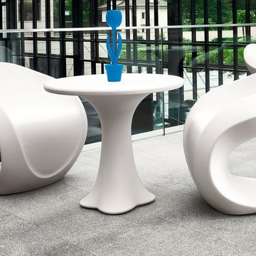
Victorian engineers loved to tinker with design, and make things look interesting and especially larger then life. A pocket watch transformed into a desk watch, convex optical glass magnifiers showing an enlarged dial and hands. Not exactly a travel watch this one, more desk bound, an object that delights with its translation of form. Turning into a gem under soft lamp light, this clock doesn't easily get lost while always telling time. Victorian clock combines various time zones to function as a richly nostalgic, gracious world time clock.
 OH LA LA !
Italian Different Concept
A real laboratory of ideas. Myyour is a reality where the most innovative design ideas are chosen and transformed into new and unique decorative solutions... solutions that are able to express elegance and color, functionality and aesthetics, versatility and prestige. A result that has been achieved thanks to the upshot of the series of research, assessments, studies and applications that have been carried out for each of the collections... An uninterrupted series of formal and technological trials to help us reach our final objective: a vanguard product that is best characterized as a perfect blend of craftsmanship and innovation and which is destined to become the protagonist of the most diverse spaces: a product designed to take over the scene by giving a touch of exclusivity and originality to the home, office, public setting...
The founding pillars of the Myyour philosophy are the surprising stateliness of its products and the distinction of a manufacturing process, which is meticulously followed as to ensure perfection; from the development of the project to the selection of the materials, but also from the execution of the project to the attention and care that are paid to every single minimum detail along the way. This is how the Myyour quality came to life. A must that is always more and more appreciated on an international level and by a clientele who has witnessed the potential artistic expression of these decorative creations. These solutions have managed to fill an empty space and are always in perfect harmony with their outside beauty and intrinsic functionalities. These creations always manage to trigger the creativity of individuals, architects, decorators and designers.
 Drury Design
THE SETUP
Upon moving to Glen Ellyn, the homeowners were eager to infuse their new residence with a style that resonated with their modern aesthetic sensibilities. The primary bathroom, while spacious and structurally impressive with its dramatic high ceilings, presented a dated, overly traditional appearance that clashed with their vision.
Design objectives:
Transform the space into a serene, modern spa-like sanctuary.
Integrate a palette of deep, earthy tones to create a rich, enveloping ambiance.
Employ a blend of organic and natural textures to foster a connection with nature.
THE REMODEL
Design challenges:
Take full advantage of the vaulted ceiling
Source unique marble that is more grounding than fanciful
Design minimal, modern cabinetry with a natural, organic finish
Offer a unique lighting plan to create a sexy, Zen vibe
Design solutions:
To highlight the vaulted ceiling, we extended the shower tile to the ceiling and added a skylight to bathe the area in natural light.
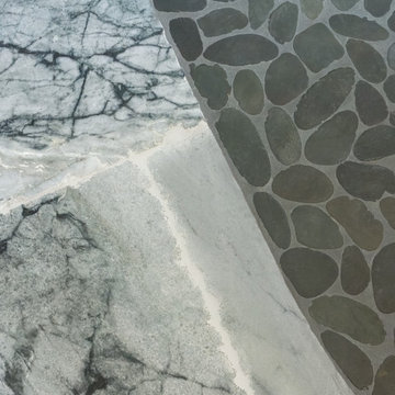
Sourced unique marble with raw, chiseled edges that provide a tactile, earthy element.
Our custom-designed cabinetry in a minimal, modern style features a natural finish, complementing the organic theme.
A truly creative layered lighting strategy dials in the perfect Zen-like atmosphere. The wavy protruding wall tile lights triggered our inspiration but came with an unintended harsh direct-light effect so we sourced a solution: bespoke diffusers measured and cut for the top and bottom of each tile light gap.
THE RENEWED SPACE
The homeowners dreamed of a tranquil, luxurious retreat that embraced natural materials and a captivating color scheme. Our collaborative effort brought this vision to life, creating a bathroom that not only meets the clients’ functional needs but also serves as a daily sanctuary. The carefully chosen materials and lighting design enable the space to shift its character with the changing light of day.
“Trust the process and it will all come together,” the home owners shared. “Sometimes we just stand here and think, ‘Wow, this is lovely!'”
 Mandeville Canyon Designs
Nat Rea
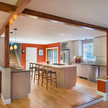
Large trendy galley light wood floor and beige floor kitchen photo in Other with stainless steel appliances, an island, an undermount sink, flat-panel cabinets, white cabinets, solid surface countertops, gray backsplash and glass tile backsplash
Large trendy galley light wood floor and beige floor kitchen photo in Other with stainless steel appliances, an island, an undermount sink, flat-panel cabinets, white cabinets, solid surface countertops, gray backsplash and glass tile backsplash
 Drury Design
THE SETUP
This client lives in a great high-rise condo in downtown Chicago. Alicia has already remodeled a few areas of her home, including her kitchen and home office. The bathroom is one of the last big places the client wanted to update. The existing bathroom had a large, outdated whirlpool tub in the corner. It was a darker space that had a lack of natural light. There are no windows (due to the bathroom’s location within the high-rise building). So, the idea was to brighten up the space and give the client an updated, elegant primary bathroom that is more her style and tailor-made for her routines.
Design Objectives:
- Make the space brighter.
- Create different daily routine stations to maximize functionality while keeping things clutter-free – a makeup station, a blow-dry station, and a sink-needs station.
- Achieve the client’s specific style and function needs while also keeping the look and design open to future possibilities: different users of the space/resale clients.
Design Challenges:
- Toilet cannot be moved. (In a high-rise, you can’t really move plumbing around too much when reimagining a space)
- Existing bathroom had a soffit that hid a lot of electrical wiring, so completely removing the soffit wasn’t an option.
- The blow-dry station needs to accommodate the client’s preference for standing up.
- Finding a place for the make-up station, which the client wants oriented for sitting.
- Create storage within the shower that can eliminate the clutter of personal care products that are actually needed every day. Do this, while keeping the client’s favorite things about the existing shower: the shower bench, a tub filler faucet (for rinsing shaving cream when shaving legs) and a low niche for placing her foot when shaving her legs.
THE RENEWED SPACE
Design Solutions:
- Extended a bit of wall near the toilet to give the commode its own area within the space, but without closing it off into a claustrophobic WC.
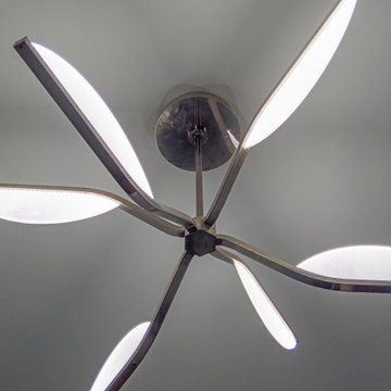
- Worked within the reality of the existing soffit situation, reshaping it to align with the new shower. Can lights were also added. Installed a beautiful ceiling light fixture that works within the new soffit shape, commanding attention and adding light, as if the sofit shape was chosen for it.
- Created a nice, furniture-looking 42”-high cabinet with pullout drawers to be the blow-dry station, complete with a mirror and a nice top. The pullout drawers are all powered, concealing a Dyson dryer and curling iron (and all the accoutrements) while keeping them plugged in, which is ideal for easy usage and put away. A stylish mirror on the wall above the cabinet, and proper lighting, make this the perfect blow-dry station. The top has a grommet that can accommodate a power cord should the client ever want to have a powered device on top of the cabinet.
- Put the sit-down makeup station where the tub used to be, putting the mirror back into a new recessed wall just a bit, allowing the area to have more room.
- Created a niche in the shower’s inner wall so that you can’t see it unless you are literally inside the shower. At the client’s request, it also has a hook so she can hang her loofa. Hiding the utility niche in this way allowed us to use the full main wall of the shower as a canvas for a beautiful accent stripe of raised decorative tile. The new shower has her old favorites, too: the tub filler, foot niche and bench.
Alicia’s client loves her new primary bathroom, especially the blow dry area. It is very accommodating for her, as a tall lady, while being very easy to use. The drawers store everything. Being powered, they make using already-plugged in appliances very easy to use and put away.
Her previous makeup station was a freestanding vanity with a single drawer, so beauty products were all over the surface top. With her new makeup station, everything is nicely tucked away and organized in drawers.
The new lighting is fantastic and the colors are light and soft. The clients loves the overall look and feel of her new bathroom and raves about how well the functionality-minded design makes her morning routine – and her life – easier and enjoyable!
 Drury Design
The Setup:
After purchasing this home, the homeowners faced a unique opportunity to reimagine their kitchen and nearby spaces. Water damage from a burst pipe had left much of the home’s interior in need of repair, and while the existing kitchen was functional and in relatively good shape, it didn’t align with the family’s vision for their new home. The layout included a peninsula that wasn’t ideal, and there were some druthers with the nearby pantry.
Since the space needed to be rebuilt anyway, the homeowners saw this as a chance to create a kitchen that was both highly functional for their four young children and timeless in its design. The project also included a refresh of the adjacent message center and dining room — spaces that play key roles in the family’s daily life. The goal was to create a cohesive flow between these areas, balancing modern functionality with the craftsman-inspired character of the rest of the home.
Design Objectives:
- Replace the outdated peninsula with a large island to maximize counter space and create new seating options.
- Open up the space visually by removing soffits and rethinking the cabinetry layout.
Incorporate concealed refrigeration and freezer units to provide significant storage for the family while maintaining a streamlined aesthetic.
- Integrate black cabinetry into the design without making the space feel harsh or heavy.
- Ensure the lighting plan balances functional task lighting with ambient accent lighting.
- Avoid visual clutter in the cabinetry design while still giving a nod to the craftsman aesthetic.
- Incorporate a slab backsplash as a key design feature.
Design Challenges:
- The outdated peninsula left dead space in the kitchen and lacked sufficient seating for the family.
- The cooktop wall was cramped, with small cabinets flanking the hood, limited storage, and soffits that made the space feel closed-in.
- The family needed significant refrigeration space (two refrigerators and a freezer) but wanted to avoid a cluttered look with visible stainless steel appliances.
- Adding black cabinetry risked making the space feel too dark or heavy.
- The original lighting plan was insufficient, particularly over the dining table where a decorative fixture proved too dim.
- The family wanted shaker-style drawer fronts to match the home’s arts-and-crafts design but worried that too much shaker cabinetry might look overly busy.
- Prioritizing a slab backsplash in the wish list priority planning.
The Renewed Space
Design Solutions:
- A functional island: The peninsula was replaced with a large island that provides continuous countertop space for prepping and serving. The island also features seating for four people, creating a central hub for informal meals and activities.
- Streamlined cooktop wall: The soffits were removed, and the upper cabinets on the cooktop wall were eliminated to create a more open, streamlined design. A custom oversized hood became the focal point of the wall, with the blower unit offset inside it to align with the cooktop while maintaining exterior visual symmetry.
- Concealed refrigeration: Two column refrigerators and one freezer were integrated into the cabinetry, concealing them behind wood paneling that blends seamlessly with the overall design.
- Warm black cabinetry: The black cabinetry was crafted from hickory with a visible grain, softening its appearance and adding warmth. The grain detail gives the cabinetry a rich, textured look that avoids feeling stark or overpowering.
- Additional lighting: In the dining area, recessed can lights were added during an additional installation phase to supplement the gorgeous decorative fixture’s dim output. The new lighting plan creates a layered effect, combining functional task lighting with softer ambient lighting.
- Simplified cabinetry details: Slab drawer fronts were used on the upper drawers, while five-piece shaker fronts (with slightly less prominent rail and stile pieces) were reserved for the middle and lower drawers. This approach simplified the overall look while maintaining the craftsman-inspired aesthetic.
- Slab backsplash priority: The slab backsplash was prioritized by making thoughtful adjustments elsewhere, like opting not to extend cabinetry to the ceiling, which also helped visually prioritize the gorgeous slab backsplash. This decision also enhanced the kitchen’s furniture-like feel, aligning with the home’s craftsman character.
- This kitchen perfectly balances practicality with timeless style. By addressing the family’s functional needs — ample seating, smart storage, and effective lighting — while incorporating thoughtful design elements like warm black cabinetry and a striking slab backsplash, Alicia created a space that works beautifully for a busy household. The result is a cohesive, inviting kitchen that honors the home’s craftsman roots and will serve the family well for years to come.
 Pedini Kitchens
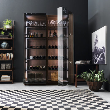
Arts & Crafts; The philosophy of the project refers to the coupled term, “vintage – innovation”. Intended as vocation towards the past which sets a new life, style, and design. This new style proposes to evolve the minimalism: from the contact to object intended as simplicity and clearness of shapes to the recovery of rationalism and functionality, tied to the real qualities and to the materials that characterize the kitchen.
22