
Search results for "Life objectives" in Home Design Ideas
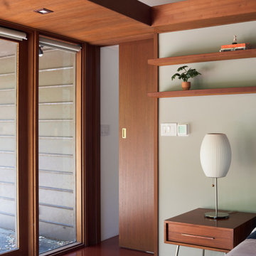
 Klopf Architecture
Nestled in the hills of Orinda, California, this 1951 residence is one of only seven extant homes, now known as “The Magnificent Seven”, designed by architect Olof Dahlstrand, a protégé of Frank Lloyd Wright. With its low-slung rooflines, natural materials, and deep integration with the sloping landscape, the home is a pristine example of mid-century modern design inspired by Wright’s organic principles. Over the years, prior homeowners have emphasized preservation, ensuring that the house remained relatively untouched. Each owner has respected the original architecture and stayed true to Dahlstrand’s intent. When a family of five—two college-aged sons and a middle school-aged daughter—acquired the property, they were captivated by its history, legacy of care, and architectural significance. While they appreciated Dahlstrand’s original vision, they also recognized the need to adapt the home for contemporary living while preserving its design integrity.
The remodel was conceived as a thoughtful response to the past—an effort to bring the house into the 21st century without compromising its soul. The primary mandate was to maintain architectural continuity while improving the functionality, comfort, and livability for a modern family. The design team—architects and contractor alike—worked with a shared reverence for the original architecture, allowing that mindset to guide even the most technical or pragmatic decisions.
A key objective was to increase natural light in the kitchen—a departure from Wrightian principles of enclosed, intimate cooking spaces—while maintaining the home’s architectural language. The kitchen was reconfigured to foster a stronger connection to adjacent living spaces while retaining the underlying concept of spatial separation. One of the most transformative architectural changes was the removal of a ridge beam that was originally planned to remain visible through the kitchen. During construction, the team collaborated on a better solution: a wide-flanged steel beam concealed within the roof envelope. This subtle move preserved the clean lines and ceiling continuity, a modern update carried out with utmost respect for the existing framework.
The home’s original powder room, previously accessible only through the kitchen, was relocated for better flow and privacy. A new powder room was carved out of former kitchen cabinetry—a narrow, interior space that could have felt dark and enclosed. To avoid this, the design extended the line of original transom windows into the new powder room and added a skylight above the vanity. The result is a bright and airy space that feels consistent with the rest of the home. Other updates included the installation of new solid-core interior doors with veneers carefully matched to the original mahogany, enhancing the continuity of the interiors. Even smaller decisions, such as placing the door knobs at 42 inches high, mirrored the original proportions. Every choice reflected a shared belief between the architect, contractor, and client: that new work should serve the integrity of the old.
The home’s extensive interior redwood millwork and paneling was meticulously restored. Where new materials were introduced—such as the replacement redwood soffit paneling—the contractor took pains to find finish nails that matched the original, rather than using modern equivalents. This level of craftsmanship and collaboration defined the project. It extended even to the detailing of a blind door to the new powder room, which had to disappear into the existing redwood board-and-batten wall. It was a team effort: the owner found a suitable handle, the architects devised the custom in-swing mechanism, and the contractor executed it so the door aligned precisely with the battens. Throughout, the homeowners were deeply engaged in the design process. One, a meticulous design enthusiast, focused on aesthetic integrity and historic detail. The other brought a practical and function-driven perspective, ensuring that new fixtures and materials would be durable and require minimal maintenance.
While the home’s location posed no major site challenges, sustainability was a key concern. The team upgraded the roof insulation, installed solar panels with battery storage, and added ductless mini-split cooling systems. Lighting was another area where modern technology was woven into a historic framework: new square LED fixtures echo the original custom perimeter soffit lights, maintaining the design language while offering advanced performance.
A planned expansion of a bedroom into suite with a bathroom had to be shelved due to budget constraints and the high cost of below-grade foundation work. Still, the team focused their efforts on making the most of the existing footprint, resolving constraints through design ingenuity rather than adding square footage. This renovation represents a collaborative achievement in preserving and evolving a historically significant home. Every decision was shaped by a shared ethos among clients, architects, and contractor: to maintain the home’s architectural soul while updating it for contemporary life. The result is a timeless modernist residence that continues Olof Dahlstrand’s legacy, remaining grounded in nature, craftsmanship, and human-scale design.
Klopf Architecture Team: John Klopf, AIA, Klara Kevane, Fernanda Bernardes
Interior Architectural Design: Klopf Architecture
Structural Engineer: Daniel Bastiao
Contractor: Don Larwood, Larwood Construction
Photography: Mariko Reed
Year Completed: 2022

 Drury Design
This client is in the beauty industry, so – in additional to great style – she has more beauty products than most people do. Before the renovation, there were products all over the counters and in temporary roll-in shelving units that got wheeled into the bathroom.
It was time for a change.
Design objectives:
-Add tons of storage
-Feature blingy, reflective materials
-Improve lighting
-Omit unused built-in tub
-Create a large luxurious shower
-Include large mirrors to the ceiling
THE REMODEL
With the right storage solutions, a bathroom loaded with products and gadgets can look virtually empty. Elegance and order contribute to living life artfully.
Design challenges:
-Standard vanities don’t offer much storage
-The existing window was in an ideal spot for a shower
-The client prefers large mirrors, so we needed an alternative to medicine cabinets
Design solutions:
-Replace the existing window with a waterproof privacy window
-Create dresser-style vanities with u-shaped drawers for maximum storage
-Include a tall cabinet with roll-out shelves for maximum storage and organization
THE RENEWED SPACE
Beauty products and daily needs are organized and out of the way – out of sight but easy to access. With a creative, modern palette of colors, patterns and textures, the bathroom’s aura is inviting, relaxing and luxurious.
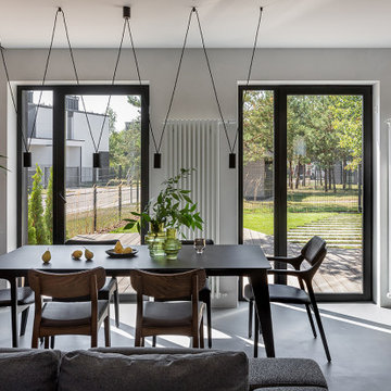
 COSWICK LTD
Modern minimalism as a basis for unusual, expressive art objects and author’s painting. This is what determined the main style of the living space. The concept was based on such materials as concrete and plaster, natural wood and stone. The interior had to be as natural as possible, reflecting the architectural image of the residential complex and the beauty of the surrounding nature. “The most important thing for me in this project is the result. Customers say that the interior has become their place of power! They want to return home, invite guests, spend a lot of time in their house and enjoy life here! It is very valuable and important that the project was realized almost 100%, while the customers themselves were interested not to deviate even a millimeter from the project, but to do everything exactly as the Author intended,” emphasized project designer Ksenia Mitskevich.
Coswick oak Cinnamon hardwood flooring was used in the project.
Designer: Ksenia Mitskevich.
Photo by Sergey Pilipovich.
Coswick’s partner: Domani.
Find the right local pro for your project
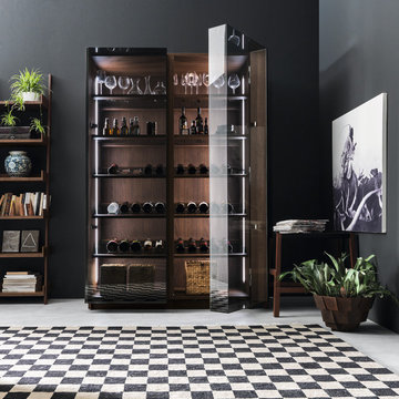
 Pedini Kitchens
Arts & Crafts; The philosophy of the project refers to the coupled term, “vintage – innovation”. Intended as vocation towards the past which sets a new life, style, and design. This new style proposes to evolve the minimalism: from the contact to object intended as simplicity and clearness of shapes to the recovery of rationalism and functionality, tied to the real qualities and to the materials that characterize the kitchen.
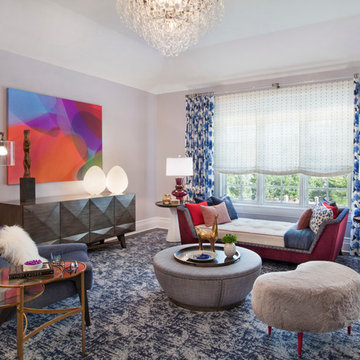
 Ageloff Design Group
This second floor family bedroom and en-suite bathroom is envisioned for a collage-age young woman and as a room that can serve multiple purposes. It is a sleeping room, a place for quiet contemplation, a place for reading and study, and a place to gather with a few friends. It is in essence a sophisticated getaway within a sizable family home, a place of solitude or conversation, and a place of inspiration combining new elements, vintage accents, and favorite objects from life.
Photos by Mark LaRosa
 Ferriss - Architectural Renderings
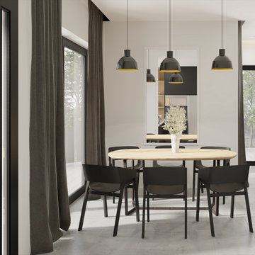
Here are some practical tips for creating a beautiful, comfortable and thoughtful living room design.
The living room in the house is the place where, as the name suggests, receives guests. However, the owners themselves relax here, spending time in front of the TV or a book, with drinks, pleasant conversation and other activities. Therefore, the living room should be the most comfortable place in your home.
The place of the sofa in the design of the living room
The sofa does not need to be placed in a draft. This means that it should not be on an imaginary line from window to door - if you drew a floor plan, it will just be easy to trace.
1. The sofa in front of the TV, diagonally from the door, is a great location. As if inviting you to sit down :)
2. Sofa near the door. A good solution if you often have overnight guests.
3. Corner sofa in the living room. Best placed in the farthest corner from the door. This will make the room look more spacious.
Correct opening of the door in the living room. Inward or outward?
Open inward or outward? There is no clear rule here, because everything depends on the layout and on the furniture placed. The main thing is that the door leaf opens freely and does not interfere with entering and exiting the room. Also, the door should not interfere with free access to the closet or dressing room.
TV in living room size and location. Location.
The TV is placed on the wall opposite to the sofa - this is the most logical and reasonable place for it in the living room. Moreover, the distance to it does not really matter: modern TV models can be placed close to the sofa.
Cabinet or bracket? To your taste. The main thing is that the television zone looks neat and presentable. Provide in advance a cable channel in which all the wires and numerous sockets for the receiver, modem, set-top box, sound bar will hide. Nothing spoils a design like sticking wires!
Height from the floor. It is optimal to place the TV 1 m from the floor to the middle of the screen - this is exactly the level of the eyes of a seated person.
Diagonal size. If there is a financial opportunity, consider options from 50 inches - smaller screens look lonely and lonely on an empty wall.
Living room furniture.
Armchair. Often the chair becomes an accent item in the interior, then its shade, and sometimes its shape, differ from the rest of the furniture. When choosing a chair, be guided also by your habits: for example, it will be more convenient to climb up with your feet and read a book in an armchair with dimensions of 90x90 cm, and you can “just sit comfortably” in a fireplace chair with a high back, comfortable armrests and with a seat 80x80 cm.
TV stand. Large TV stands are no longer as relevant as they used to be, when it was necessary to store a player, cassettes and discs there. For now, a console table or a narrow elegant pedestal is enough.
Coffee table. Nice piece of furniture that creates a cozy atmosphere. Some models, if necessary, can be transformed into a more spacious table for receiving guests - however, finding comfortable and beautiful specimens is not easy, plus they usually cost a lot.
Rack. An extremely useful type of furniture. :) Firstly, a large number of decor items can be beautifully placed on the rack. And secondly, it can also play the role of a light through partition, which divides the room into zones and does not select light at the same time. This is a very big plus for small apartments.
Fireplace. Here we are talking about electric fireplaces. Some of them come with a humidifier and heated, so 3-in-1 models can be very helpful. Fireplace portals have different styles: classic, antique, modern. Inconsistency with the general style of the living room can greatly spoil the impression of the room, so be careful with creativity. Sizing is an important issue. A large wall with a high ceiling also needs a proportionate fireplace; in horror, a small portal will look lonely and ridiculous.
What do you think about our new living room project?
https://www.ferriss.co
#ferriss #We_bring_objects_to_life #3drendering #architecture #San_Francisco
 Michael Nash Design, Build & Homes
2013 NARI Capital CotY, Merit Award Winner, Creative Solutions under $15,000
Objective:
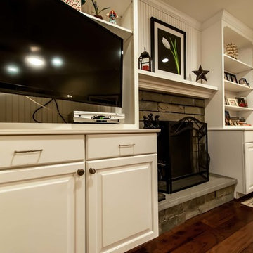
This couple was tired of the old brick look of their family room and its embedded fireplace.
They wanted to uplift the entire room, with better lighting, updated built ins and new gas log fireplace.
Challenges:
It was not an easy task to get rid of all masonry and brick wall.
Gas lines and powder line were quite distance away and the family room floor was a concrete slab.
Design solutions:
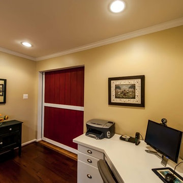
It was important for the couple to create an optional separation between the family room and the kitchen for times that she is having her book club gang over and husband wanted to watch his sporting events.
Part of the wall between kitchen and family room was taken by a closet.
We have removed that entire wall and implemented a 6” wide Barn door for a partial solution to their problem.
New wiring for light and cable wires were running into the old masonry wall.
Gas line gave the old wood burning fireplace and new life.
Custom built in cabinetry was placed in place old masonry wall.
A new stone hearth and surround wrapped around the new fireplace.
New hardwood wide plank flooring gave this family room warmth.
New recess lighting has offered a much brighter room.
Outcome:
He gets to enjoy his favorite football team beat up the rebels while she gets to have her tea party around the kitchen table.
And in all other occasions they get to cuddle by the flames of a new fireplace.

Sponsored
Columbus, OH

Wannemacher Interiors
Customized Award-Winning Interior Design Solutions in Franklin Cnty OH
 OH LA LA !
Italian Different Concept
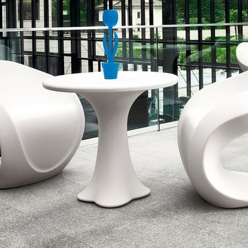
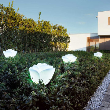
A real laboratory of ideas. Myyour is a reality where the most innovative design ideas are chosen and transformed into new and unique decorative solutions... solutions that are able to express elegance and color, functionality and aesthetics, versatility and prestige. A result that has been achieved thanks to the upshot of the series of research, assessments, studies and applications that have been carried out for each of the collections... An uninterrupted series of formal and technological trials to help us reach our final objective: a vanguard product that is best characterized as a perfect blend of craftsmanship and innovation and which is destined to become the protagonist of the most diverse spaces: a product designed to take over the scene by giving a touch of exclusivity and originality to the home, office, public setting...
The founding pillars of the Myyour philosophy are the surprising stateliness of its products and the distinction of a manufacturing process, which is meticulously followed as to ensure perfection; from the development of the project to the selection of the materials, but also from the execution of the project to the attention and care that are paid to every single minimum detail along the way. This is how the Myyour quality came to life. A must that is always more and more appreciated on an international level and by a clientele who has witnessed the potential artistic expression of these decorative creations. These solutions have managed to fill an empty space and are always in perfect harmony with their outside beauty and intrinsic functionalities. These creations always manage to trigger the creativity of individuals, architects, decorators and designers.
 Drury Design
The Setup:
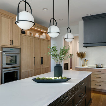
After purchasing this home, the homeowners faced a unique opportunity to reimagine their kitchen and nearby spaces. Water damage from a burst pipe had left much of the home’s interior in need of repair, and while the existing kitchen was functional and in relatively good shape, it didn’t align with the family’s vision for their new home. The layout included a peninsula that wasn’t ideal, and there were some druthers with the nearby pantry.
Since the space needed to be rebuilt anyway, the homeowners saw this as a chance to create a kitchen that was both highly functional for their four young children and timeless in its design. The project also included a refresh of the adjacent message center and dining room — spaces that play key roles in the family’s daily life. The goal was to create a cohesive flow between these areas, balancing modern functionality with the craftsman-inspired character of the rest of the home.
Design Objectives:
- Replace the outdated peninsula with a large island to maximize counter space and create new seating options.
- Open up the space visually by removing soffits and rethinking the cabinetry layout.
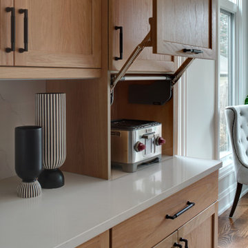
Incorporate concealed refrigeration and freezer units to provide significant storage for the family while maintaining a streamlined aesthetic.
- Integrate black cabinetry into the design without making the space feel harsh or heavy.
- Ensure the lighting plan balances functional task lighting with ambient accent lighting.
- Avoid visual clutter in the cabinetry design while still giving a nod to the craftsman aesthetic.
- Incorporate a slab backsplash as a key design feature.
Design Challenges:
- The outdated peninsula left dead space in the kitchen and lacked sufficient seating for the family.
- The cooktop wall was cramped, with small cabinets flanking the hood, limited storage, and soffits that made the space feel closed-in.
- The family needed significant refrigeration space (two refrigerators and a freezer) but wanted to avoid a cluttered look with visible stainless steel appliances.
- Adding black cabinetry risked making the space feel too dark or heavy.
- The original lighting plan was insufficient, particularly over the dining table where a decorative fixture proved too dim.
- The family wanted shaker-style drawer fronts to match the home’s arts-and-crafts design but worried that too much shaker cabinetry might look overly busy.
- Prioritizing a slab backsplash in the wish list priority planning.
The Renewed Space
Design Solutions:
- A functional island: The peninsula was replaced with a large island that provides continuous countertop space for prepping and serving. The island also features seating for four people, creating a central hub for informal meals and activities.
- Streamlined cooktop wall: The soffits were removed, and the upper cabinets on the cooktop wall were eliminated to create a more open, streamlined design. A custom oversized hood became the focal point of the wall, with the blower unit offset inside it to align with the cooktop while maintaining exterior visual symmetry.
- Concealed refrigeration: Two column refrigerators and one freezer were integrated into the cabinetry, concealing them behind wood paneling that blends seamlessly with the overall design.
- Warm black cabinetry: The black cabinetry was crafted from hickory with a visible grain, softening its appearance and adding warmth. The grain detail gives the cabinetry a rich, textured look that avoids feeling stark or overpowering.
- Additional lighting: In the dining area, recessed can lights were added during an additional installation phase to supplement the gorgeous decorative fixture’s dim output. The new lighting plan creates a layered effect, combining functional task lighting with softer ambient lighting.
- Simplified cabinetry details: Slab drawer fronts were used on the upper drawers, while five-piece shaker fronts (with slightly less prominent rail and stile pieces) were reserved for the middle and lower drawers. This approach simplified the overall look while maintaining the craftsman-inspired aesthetic.
- Slab backsplash priority: The slab backsplash was prioritized by making thoughtful adjustments elsewhere, like opting not to extend cabinetry to the ceiling, which also helped visually prioritize the gorgeous slab backsplash. This decision also enhanced the kitchen’s furniture-like feel, aligning with the home’s craftsman character.
- This kitchen perfectly balances practicality with timeless style. By addressing the family’s functional needs — ample seating, smart storage, and effective lighting — while incorporating thoughtful design elements like warm black cabinetry and a striking slab backsplash, Alicia created a space that works beautifully for a busy household. The result is a cohesive, inviting kitchen that honors the home’s craftsman roots and will serve the family well for years to come.
 Myers Constructs, Inc.
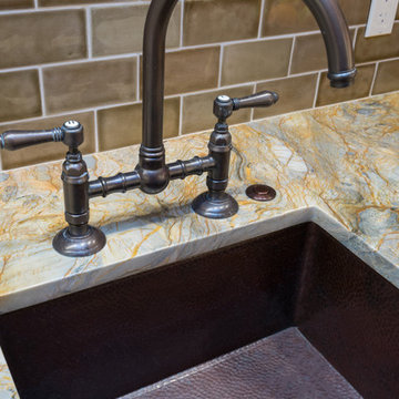
We recently took on an exciting whole-home renovation for this lovely historic Trinity in Center City Philadelphia. Originally built in the mid-1800s, the house footprint is just over 17’ x 13’. As is typical of this type of 3-story house, the kitchen is located in the basement, making this house four floors of occupied space with overall square footage totaling just under 900 square feet.
The homeowner felt the former kitchen was cramped, dimly lit, and inefficiently designed, and she was in search of help in bringing her artistic vision for the space to life, blending both old and new elements through an exciting mix of textures and character. High on her priority list was integrating her wonderful collection of objects gathered from her travels around the world.
We brought our design skills and construction experience to the team, working with the homeowner and the designer to develop a host of creative solutions, including the installation of an Indonesian screen as a sliding door covering a newly reconfigured utility area, which includes a new on-demand hot water heater, mounted next to a new electrical panel with ample room for service and access.
Other Noteworthy Features and Solutions:
New crisp drywall blended with original masonry wall textures and original exposed beams
Custom-glazed adler wood cabinets, beautiful fusion Quartzite and custom cherry counters, and a copper sink were selected for a wonderful interplay of colors, textures, and Old World feel
Small-space efficiencies designed for real-size humans, including built-ins wherever possible, limited free-standing furniture, and no upper cabinets
Built-in storage and appliances under the counter (refrigerator, freezer, washer, dryer, and microwave drawer)
Additional multi-function storage under stairs
Extensive lighting plan with multiple sources and types of light to make this partially below-grade space feel bright and cheery
Enlarged window well to bring much more light into the space
Insulation added to create sound buffer from the floor above
All Photos by Linda McManus Photography

 Inviting Home Inc
Victorian engineers loved to tinker with design, and make things look interesting and especially larger then life. A pocket watch transformed into a desk watch, convex optical glass magnifiers showing an enlarged dial and hands. Not exactly a travel watch this one, more desk bound, an object that delights with its translation of form. Turning into a gem under soft lamp light, this clock doesn't easily get lost while always telling time. Victorian clock combines various time zones to function as a richly nostalgic, gracious world time clock.
 SpinRest
Villa Beach is located in one of the most beautiful places on the Costa Blanca, between the Torre de la Horadada and the Pilar de la Horadada. We invite you to live in a wonderful place just 300m from the beach and very close to El Pilar de la Horadada. Surrounded by all the amenities you need such as two shopping centers and several golf courses. Our villas have been designed to offer the best orientation. Distribution of spaces, using the best qualities of the market. Our main objective is to offer you a quiet life in a place where you will never want to leave…
 Basements & Beyond
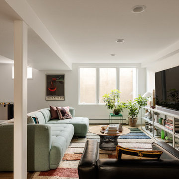
This basement remodel in a classic mid-century home was designed to seamlessly extend the elegance and functionality of the main floor. Preserving the iconic design flow of the era, B&B transformed the basement into a cohesive, livable space that honors the home’s original architectural intent. The homeowner, an architecture enthusiast and passionate collector of mid-century objects from around the world, brought their unique vision to life through carefully selected furnishings and decor. Clean lines, warm wood tones, and carefully curated materials create a harmonious extension, blending modern functionality with timeless mid-century design principles.
 Leo Rose Interior Design
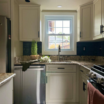
This project presented an exciting challenge: breathing new life into a 90's-era kitchen renovation that our clients had called home for years. The primary objective was to create a dramatic transformation without the need for major demolition or a complete cabinet overhaul.
 Drury Design
The Setup:
After purchasing this home, the homeowners faced a unique opportunity to reimagine their kitchen and nearby spaces. Water damage from a burst pipe had left much of the home’s interior in need of repair, and while the existing kitchen was functional and in relatively good shape, it didn’t align with the family’s vision for their new home. The layout included a peninsula that wasn’t ideal, and there were some druthers with the nearby pantry.
Since the space needed to be rebuilt anyway, the homeowners saw this as a chance to create a kitchen that was both highly functional for their four young children and timeless in its design. The project also included a refresh of the adjacent message center and dining room — spaces that play key roles in the family’s daily life. The goal was to create a cohesive flow between these areas, balancing modern functionality with the craftsman-inspired character of the rest of the home.
Design Objectives:
- Replace the outdated peninsula with a large island to maximize counter space and create new seating options.
- Open up the space visually by removing soffits and rethinking the cabinetry layout.
Incorporate concealed refrigeration and freezer units to provide significant storage for the family while maintaining a streamlined aesthetic.
- Integrate black cabinetry into the design without making the space feel harsh or heavy.
- Ensure the lighting plan balances functional task lighting with ambient accent lighting.
- Avoid visual clutter in the cabinetry design while still giving a nod to the craftsman aesthetic.
- Incorporate a slab backsplash as a key design feature.
Design Challenges:
- The outdated peninsula left dead space in the kitchen and lacked sufficient seating for the family.
- The cooktop wall was cramped, with small cabinets flanking the hood, limited storage, and soffits that made the space feel closed-in.
- The family needed significant refrigeration space (two refrigerators and a freezer) but wanted to avoid a cluttered look with visible stainless steel appliances.
- Adding black cabinetry risked making the space feel too dark or heavy.
- The original lighting plan was insufficient, particularly over the dining table where a decorative fixture proved too dim.
- The family wanted shaker-style drawer fronts to match the home’s arts-and-crafts design but worried that too much shaker cabinetry might look overly busy.
- Prioritizing a slab backsplash in the wish list priority planning.
The Renewed Space
Design Solutions:
- A functional island: The peninsula was replaced with a large island that provides continuous countertop space for prepping and serving. The island also features seating for four people, creating a central hub for informal meals and activities.
- Streamlined cooktop wall: The soffits were removed, and the upper cabinets on the cooktop wall were eliminated to create a more open, streamlined design. A custom oversized hood became the focal point of the wall, with the blower unit offset inside it to align with the cooktop while maintaining exterior visual symmetry.
- Concealed refrigeration: Two column refrigerators and one freezer were integrated into the cabinetry, concealing them behind wood paneling that blends seamlessly with the overall design.
- Warm black cabinetry: The black cabinetry was crafted from hickory with a visible grain, softening its appearance and adding warmth. The grain detail gives the cabinetry a rich, textured look that avoids feeling stark or overpowering.
- Additional lighting: In the dining area, recessed can lights were added during an additional installation phase to supplement the gorgeous decorative fixture’s dim output. The new lighting plan creates a layered effect, combining functional task lighting with softer ambient lighting.
- Simplified cabinetry details: Slab drawer fronts were used on the upper drawers, while five-piece shaker fronts (with slightly less prominent rail and stile pieces) were reserved for the middle and lower drawers. This approach simplified the overall look while maintaining the craftsman-inspired aesthetic.
- Slab backsplash priority: The slab backsplash was prioritized by making thoughtful adjustments elsewhere, like opting not to extend cabinetry to the ceiling, which also helped visually prioritize the gorgeous slab backsplash. This decision also enhanced the kitchen’s furniture-like feel, aligning with the home’s craftsman character.
- This kitchen perfectly balances practicality with timeless style. By addressing the family’s functional needs — ample seating, smart storage, and effective lighting — while incorporating thoughtful design elements like warm black cabinetry and a striking slab backsplash, Alicia created a space that works beautifully for a busy household. The result is a cohesive, inviting kitchen that honors the home’s craftsman roots and will serve the family well for years to come.
 Michael Nash Design, Build & Homes
2013 NARI Capital CotY, Merit Award Winner, Creative Solutions under $15,000
Objective:
This couple was tired of the old brick look of their family room and its embedded fireplace.
They wanted to uplift the entire room, with better lighting, updated built ins and new gas log fireplace.
Challenges:
It was not an easy task to get rid of all masonry and brick wall.
Gas lines and powder line were quite distance away and the family room floor was a concrete slab.
Design solutions:
It was important for the couple to create an optional separation between the family room and the kitchen for times that she is having her book club gang over and husband wanted to watch his sporting events.
Part of the wall between kitchen and family room was taken by a closet.
We have removed that entire wall and implemented a 6” wide Barn door for a partial solution to their problem.
New wiring for light and cable wires were running into the old masonry wall.
Gas line gave the old wood burning fireplace and new life.
Custom built in cabinetry was placed in place old masonry wall.
A new stone hearth and surround wrapped around the new fireplace.
New hardwood wide plank flooring gave this family room warmth.
New recess lighting has offered a much brighter room.
Outcome:
He gets to enjoy his favorite football team beat up the rebels while she gets to have her tea party around the kitchen table.
And in all other occasions they get to cuddle by the flames of a new fireplace.
 OH LA LA !
Italian Different Concept
A real laboratory of ideas. Myyour is a reality where the most innovative design ideas are chosen and transformed into new and unique decorative solutions... solutions that are able to express elegance and color, functionality and aesthetics, versatility and prestige. A result that has been achieved thanks to the upshot of the series of research, assessments, studies and applications that have been carried out for each of the collections... An uninterrupted series of formal and technological trials to help us reach our final objective: a vanguard product that is best characterized as a perfect blend of craftsmanship and innovation and which is destined to become the protagonist of the most diverse spaces: a product designed to take over the scene by giving a touch of exclusivity and originality to the home, office, public setting...
The founding pillars of the Myyour philosophy are the surprising stateliness of its products and the distinction of a manufacturing process, which is meticulously followed as to ensure perfection; from the development of the project to the selection of the materials, but also from the execution of the project to the attention and care that are paid to every single minimum detail along the way. This is how the Myyour quality came to life. A must that is always more and more appreciated on an international level and by a clientele who has witnessed the potential artistic expression of these decorative creations. These solutions have managed to fill an empty space and are always in perfect harmony with their outside beauty and intrinsic functionalities. These creations always manage to trigger the creativity of individuals, architects, decorators and designers.
 Advance Design Studio, Ltd.
Raza and Baneen purchased their home in Schaumburg IL. knowing it needed work, but they saw the incredible potential it had with its expanse of beautiful kitchen windows and spacious floor plan.
The kitchen technically functioned fine, but was desperately outdated with its honey oak cabinets and plain countertops. This family loved to cook and host parties so it was an easy decision that the kitchen remodel was the first project they needed to tackle to make their home come to life.
Baneen had very specific ideas for her new dream kitchen and had been thinking about it for over 10 years! When they met Advance Design’s Project Designer Claudia Pop, Baneen felt an instant connection.
“From the first meeting, I knew that Claudia would guide us without putting down our ideas,” Baneen said.
The couple had two fears common among remodeling home owners: Would the project be done on time? And, would the project stay on budget? Advance Design was able to alleviate their fears early on, as Claudia shared the “Common Sense Remodeling” process. Raza and Baneen absolutely loved the custom project analysis that helped them understand how a budget could be accurately predicted and then safeguarded during the design process.
“Advance Design was spot on with both the budget and the project timeframe,” Baneen said. “Overall there were no surprises, and the budget was exactly what we were quoted. The experience was phenomenal, everybody was professional, everybody was courteous, everyone was nice, everyone was friendly. It wasn't stressful for us, they still left the house in a presentable state. It wasn't like we would come home and we were bring the kids in and it was going to be hazardous."
After the relationship was cemented, Raza, Baneen and Claudia began to finalize the kitchen design. The main objective was to create a functional space for preparing meals and to create an inviting space for their family and friends to enjoy, while incorporating interesting design elements such as the iconic blue island and reclaimed Chicago brick walls. Sufficient storage space was really important to Baneen, and high quality appliances were a priority. As the overall layout was being completed, together they reviewed each cabinet to determine exactly what would be stored there.
Because cooking was a high priority for this family, Claudia incorporated spice racks close to the range and included two mixer lift shelves for their larger countertop appliances.
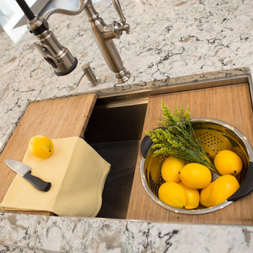
The focal point of the kitchen is the striking blue island constructed from custom colored Dura Supreme cabinets. Designed with decorative shelving and a highly functional prep sink. The couple loves the “galley” prep sink, it adds even more functionality and significantly shortens preparation and cleaning time. This island also includes a 24" Bosch Dishwasher with matching panel to blend in.
"Aesthetically, and in terms of functionality, the island everything I imagined," Baneen said. "I love how beautiful it looks and how functional it is. It just brings everybody together."
The Praa Sands Quartz countertop with an ogee edge profile provides excellent contrast by blending it's subtle tones with the outer cabinetry. It ties the island together with the rest of the space. Overlooking the beautiful backyard through spacious windows, the crisp white farmhouse sink is something that Baneen envisioned in her kitchen for years.
Two tones of Dura Supreme Cabinetry were used throughout the rest of the kitchen. Chestnut Cherry cabinets grace the range and decorative range hood and as panels over the Wolf refrigerator and freezer. Antique White cabinets surround the perimeter, creating a warm balance that beckons guests into the softly rounded space.
Drawing the eye immediately to the custom wood hood hiding a powerful 1,500 CFM ventilation system and spectacular 60” Duel Fuel Wolf range, a creatively patterned Tessen in Café & Brine backsplash detail stands out from the white subway tile backsplash spanning the outer walls. The vibrant space reflects the lively personality of the family who now loves spending time both cooking and enjoying this kitchen as a family.
“The end result is a beautiful and extremely functional kitchen that is able to handle a growing family, lots of parties and lots of cooking,” Claudia said.
“Advance Design was wonderfully professional and a pleasure to work with. They catered to what my needs and ideas were, while skillfully guiding us to make the right choices where we seemed lost,” Baneen said.
 Tapis Rouge
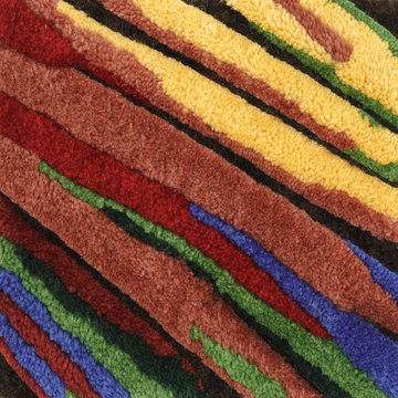
In 17th century Isaac Newton identified the colors (red, orange, yellow, green, blue, indigo, and violet) that make up the visible spectrum. And as his discovery at a time shocked the world and became a first step for a new era of discoveries and world evolution, we believe that the new Electric collection, creation of which is based on a solid theory of photon spectrum and physical characteristics of 4 speeds of rays which travel between Gamma as form of nuclear and cosmic radiation to infrared rays, a result of movement of lower-energy photons, will become a breakthrough of contemporary interior design.
This collection reflects a principally new approach to perception of rug in interior making it an art object at the first place. Nevertheless, very important value that remains untouched whatever we do and however futuristic our works are is extreme care about ecologic background and sustainability of our product. Through all the history of Atelier Tapis Rouge each of our rugs has been manually drawn by the team of our designers and afterwards tinted and knotted by hands of best Nepalese craftsmen, who carefully maintain tradition of rug knotting throughout the centuries.
The world has gone through a very hard time during last 2 years and perception of things, behavior, philosophic approach of people has changed drastically. We all need a recharge of energy and inspiration to restart our live paths in a new reality and there is no better place where we get energetic feed as home and family. Therefore, having created Electtrico we meant to boost the homes with warm solar energy – eternal source of life and continuity and we believe that it is a good start for new conquests.
Designed by Natalia Enze
 COSWICK LTD
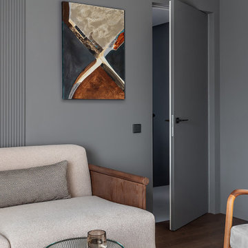
Modern minimalism as a basis for unusual, expressive art objects and author’s painting. This is what determined the main style of the living space. The concept was based on such materials as concrete and plaster, natural wood and stone. The interior had to be as natural as possible, reflecting the architectural image of the residential complex and the beauty of the surrounding nature. “The most important thing for me in this project is the result. Customers say that the interior has become their place of power! They want to return home, invite guests, spend a lot of time in their house and enjoy life here! It is very valuable and important that the project was realized almost 100%, while the customers themselves were interested not to deviate even a millimeter from the project, but to do everything exactly as the Author intended,” emphasized project designer Ksenia Mitskevich.
Coswick oak Cinnamon hardwood flooring was used in the project.
Designer: Ksenia Mitskevich.
Photo by Sergey Pilipovich.
Coswick’s partner: Domani.
19