
Search results for "Light over kitchen table" in Home Design Ideas
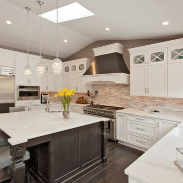
Kitchen - large contemporary u-shaped kitchen idea in DC Metro with shaker cabinets, white cabinets, marble countertops, stone tile backsplash, stainless steel appliances and an island
 Niemand Interiors LLC
Photo: HomeServices of Illinois, LLC
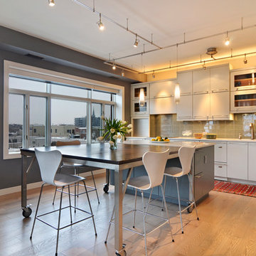
Kitchen/dining room combo - mid-sized contemporary light wood floor and brown floor kitchen/dining room combo idea in Chicago with gray walls and no fireplace
Kitchen/dining room combo - mid-sized contemporary light wood floor and brown floor kitchen/dining room combo idea in Chicago with gray walls and no fireplace
 Platinum Homes by Mark Molthan
Page // Agency
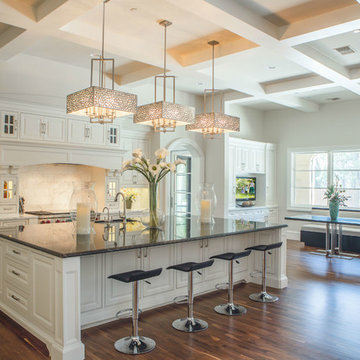
Inspiration for a huge transitional medium tone wood floor eat-in kitchen remodel in Dallas with an undermount sink, raised-panel cabinets, white cabinets, marble countertops, white backsplash, stainless steel appliances and an island
Inspiration for a huge transitional medium tone wood floor eat-in kitchen remodel in Dallas with an undermount sink, raised-panel cabinets, white cabinets, marble countertops, white backsplash, stainless steel appliances and an island
Find the right local pro for your project
 Tracy Herbert Interiors, LLC
Tracy Herbert Interiors, LLC
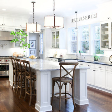
Elegant u-shaped eat-in kitchen photo in Portland with a farmhouse sink, shaker cabinets, white cabinets, quartzite countertops, white backsplash, subway tile backsplash and stainless steel appliances
Elegant u-shaped eat-in kitchen photo in Portland with a farmhouse sink, shaker cabinets, white cabinets, quartzite countertops, white backsplash, subway tile backsplash and stainless steel appliances
 Haven Design and Construction
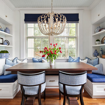
This 1902 San Antonio home was beautiful both inside and out, except for the kitchen, which was dark and dated. The original kitchen layout consisted of a breakfast room and a small kitchen separated by a wall. There was also a very small screened in porch off of the kitchen. The homeowners dreamed of a light and bright new kitchen and that would accommodate a 48" gas range, built in refrigerator, an island and a walk in pantry. At first, it seemed almost impossible, but with a little imagination, we were able to give them every item on their wish list. We took down the wall separating the breakfast and kitchen areas, recessed the new Subzero refrigerator under the stairs, and turned the tiny screened porch into a walk in pantry with a gorgeous blue and white tile floor. The french doors in the breakfast area were replaced with a single transom door to mirror the door to the pantry. The new transoms make quite a statement on either side of the 48" Wolf range set against a marble tile wall. A lovely banquette area was created where the old breakfast table once was and is now graced by a lovely beaded chandelier. Pillows in shades of blue and white and a custom walnut table complete the cozy nook. The soapstone island with a walnut butcher block seating area adds warmth and character to the space. The navy barstools with chrome nailhead trim echo the design of the transoms and repeat the navy and chrome detailing on the custom range hood. A 42" Shaws farmhouse sink completes the kitchen work triangle. Off of the kitchen, the small hallway to the dining room got a facelift, as well. We added a decorative china cabinet and mirrored doors to the homeowner's storage closet to provide light and character to the passageway. After the project was completed, the homeowners told us that "this kitchen was the one that our historic house was always meant to have." There is no greater reward for what we do than that.
 TKS Design Group
Free ebook, Creating the Ideal Kitchen. DOWNLOAD NOW
One of my favorite things to work on is older homes with a bit of history because I find it an interesting challenge to marry the historical architectural features of a home with modern design elements that work well for my client’s current lifestyle.
This home was particularly fun because it was the second kitchen we had done for this family and was quite a departure from the style of the first kitchen.
The before shot of the kitchen shows a view from the family room. See the dropped ceiling? We were curious, was this just part of the design or was the dropped ceiling there to hide mechanicals? Well we soon found out that it was mostly decorative (yay!), and with the exception of a little bit of work to some plumbing from an upstairs bathroom and rerouting of the ventilation system within the original floor joists, we were in the clear, phew! The shot of the completed kitchen from roughly the same vantage point shows how much taller the ceilings are. It makes a huge difference in the feel of the space. Dark and gloomy turned fresh and light!
Another serious consideration was what do we do with the skinny transom window above the refrigerator. After much back and forth, we decided to eliminate it and do some open shelving instead. This ended up being one of the nicest areas in the room. I am calling it the “fun zone” because it houses all the barware, wine cubbies and a bar fridge — the perfect little buffet spot for entertaining. It is flanked on either side by pull out pantries that I’m sure will get a ton of use. Since the neighboring room has literally three walls of almost full height windows, the kitchen gets plenty of light.
The gold shelving brackets, large pendant fixtures over the island and the tile mural behind the range all pay subtle homage to the home’s prairie style architecture and bring a bit of sparkle to the room.
Even though the room is quite large, the work triangle is very tight with the large Subzero fridge, sink and range all nearby for easy maneuvering during meal prep. There is seating for four at the island, and work aisles are generous.
Designed by: Susan Klimala, CKD, CBD
Photography by: LOMA Studios
For more information on kitchen and bath design ideas go to: www.kitchenstudio-ge.com
 Klopf Architecture
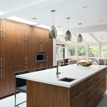
The owners of this property had been away from the Bay Area for many years, and looked forward to returning to an elegant mid-century modern house. The one they bought was anything but that. Faced with a “remuddled” kitchen from one decade, a haphazard bedroom / family room addition from another, and an otherwise disjointed and generally run-down mid-century modern house, the owners asked Klopf Architecture and Envision Landscape Studio to re-imagine this house and property as a unified, flowing, sophisticated, warm, modern indoor / outdoor living space for a family of five.
Opening up the spaces internally and from inside to out was the first order of business. The formerly disjointed eat-in kitchen with 7 foot high ceilings were opened up to the living room, re-oriented, and replaced with a spacious cook's kitchen complete with a row of skylights bringing light into the space. Adjacent the living room wall was completely opened up with La Cantina folding door system, connecting the interior living space to a new wood deck that acts as a continuation of the wood floor. People can flow from kitchen to the living / dining room and the deck seamlessly, making the main entertainment space feel at once unified and complete, and at the same time open and limitless.
Klopf opened up the bedroom with a large sliding panel, and turned what was once a large walk-in closet into an office area, again with a large sliding panel. The master bathroom has high windows all along one wall to bring in light, and a large wet room area for the shower and tub. The dark, solid roof structure over the patio was replaced with an open trellis that allows plenty of light, brightening the new deck area as well as the interior of the house.
All the materials of the house were replaced, apart from the framing and the ceiling boards. This allowed Klopf to unify the materials from space to space, running the same wood flooring throughout, using the same paint colors, and generally creating a consistent look from room to room. Located in Lafayette, CA this remodeled single-family house is 3,363 square foot, 4 bedroom, and 3.5 bathroom.
Klopf Architecture Project Team: John Klopf, AIA, Jackie Detamore, and Jeffrey Prose
Landscape Design: Envision Landscape Studio
Structural Engineer: Brian Dotson Consulting Engineers
Contractor: Kasten Builders
Photography ©2015 Mariko Reed
Staging: The Design Shop
Location: Lafayette, CA
Year completed: 2014
Sponsored
Sunbury, OH

J.Holderby - Renovations
Franklin County's Leading General Contractors - 2X Best of Houzz!
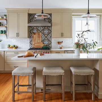 TKS Design Group
Download our free ebook, Creating the Ideal Kitchen. DOWNLOAD NOW
The homeowners came to us looking to update the kitchen in their historic 1897 home. The home had gone through an extensive renovation several years earlier that added a master bedroom suite and updates to the front façade. The kitchen however was not part of that update and a prior 1990’s update had left much to be desired. The client is an avid cook, and it was just not very functional for the family.
The original kitchen was very choppy and included a large eat in area that took up more than its fair share of the space. On the wish list was a place where the family could comfortably congregate, that was easy and to cook in, that feels lived in and in check with the rest of the home’s décor. They also wanted a space that was not cluttered and dark – a happy, light and airy room. A small powder room off the space also needed some attention so we set out to include that in the remodel as well.
See that arch in the neighboring dining room? The homeowner really wanted to make the opening to the dining room an arch to match, so we incorporated that into the design.
Another unfortunate eyesore was the state of the ceiling and soffits. Turns out it was just a series of shortcuts from the prior renovation, and we were surprised and delighted that we were easily able to flatten out almost the entire ceiling with a couple of little reworks.
Other changes we made were to add new windows that were appropriate to the new design, which included moving the sink window over slightly to give the work zone more breathing room. We also adjusted the height of the windows in what was previously the eat-in area that were too low for a countertop to work. We tried to keep an old island in the plan since it was a well-loved vintage find, but the tradeoff for the function of the new island was not worth it in the end. We hope the old found a new home, perhaps as a potting table.
Designed by: Susan Klimala, CKD, CBD
Photography by: Michael Kaskel
For more information on kitchen and bath design ideas go to: www.kitchenstudio-ge.com

 IS Architecture
The kitchen, breakfast room and family room are all open to one another. The kitchen has a large twelve foot island topped with Calacatta marble and features a roll-out kneading table, and room to seat the whole family. The sunlight breakfast room opens onto the patio which has a built-in barbeque, and both bar top seating and a built in bench for outdoor dining. The large family room features a cozy fireplace, TV media, and a large built-in bookcase. The adjoining craft room is separated by a set of pocket french doors; where the kids can be visible from the family room as they do their homework.
 TKS Design Group
Download our free ebook, Creating the Ideal Kitchen. DOWNLOAD NOW
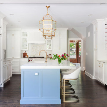
This client was referred to us from a past client. They are a busy 2-career household with young children and enjoy entertaining friends and family in their home. They have a beautiful open concept home but unfortunately the kitchen was not fitting for the rest of the home. They were not quite sure what to do with the space. We talked about trying to refresh it or do more of a minor remodel, but in the end they decided a full gut would get them to where they wanted to be.
One problem was there was no place for guests to hang out other than the large and awkward banquette area. The brick wall and tiled hood area were feeling a bit dated and tired. The space was just not functional for their lifestyle. There was no prep space near the cooktop and no landing area for items coming out of the ovens or refrigerator, plus a big dead zone in the center of the room.
Banquettes, like the one they previously had in the space, are great for small spaces, but when they get really large like this one, it makes getting in and out of the seating area awkward and uncomfortable. Plus, there was room for a large table, so we eliminated the awkward built in.
We started by removing the faux brick wall between the kitchen and back entry. We relocated the entry to the garage over a couple feet in order to get every last inch out of the new kitchen. We also made the decision to close up the primary window that faced the pretty ho hum brick wall of the neighbor’s house. There was plenty of light coming in from the seating area, so we just didn’t feel the window was adding much to the room.
Construction went smoothy. There was a bit of rework with electrical, flooring and HVAC, but in the end, we think it was well worth it.
The clients really wanted a sleek contemporary look, and we originally had planned for a full height slab backsplash, but due to it’s size, it was a budget buster. Instead, we got creative and settled on large format porcelain tiles that have a similar feel but were a fraction of the cost. We made sure the wall was plumb and level so that the fit and finish would mimic that of slab material.
The final space was quite a change. A large prep sink sits directly across from the new pro-style range with plenty additional prep space on the large island. The refrigerator and ovens now have miles of landing space, and a nice tight work triangle makes cooking a breeze.
Since we wanted a more contemporary feel, not many wall cabinets were included. Instead, we outfitted some of the drawers for dish storage with a peg system. Two large pantries flanking the refrigerator hold baking supplies and small appliances. Large drawers by the cooktop hold pots and pans, and an appliance garage tucked away to the left of the range hides away miscellaneous items. The large island also houses a microwave drawer and tons of storage, most of which is drawers offering maximum convenience.
The island now seats 5-6 people comfortably along with the new table in the seating area which can seat up to 8. Entertaining will be a breeze in this space. With such a clean backdrop, we knew we would need some drama with the lighting, so we chose two sets of staggered pendants, which we adjusted for the right visual balance above the island.
We also included a small coffee station to the right of the main kitchen, which helps keep the coffee clutter out of the kitchen proper. Two tones of complimentary gray are featured in this kitchen. The perimeter is a light gray that reads almost white. The island is a gray stain that adds some depth and interest with the visible wood texture. The countertops are clean white quartz, and the hardware, barstools and light fixtures add warm brass tones. I see lots of cooking and entertaining with family and friends in the near future in this bright and airy new space.
Designed by: Susan Klimala, CKD, CBD
Photography by: Michael Kaskel
For more information on kitchen and bath design ideas go to: www.kitchenstudio-ge.com

 Studio Dearborn
A hip young family moving from Boston tackled an enormous makeover of an antique colonial revival home in downtown Larchmont. The kitchen area was quite spacious but benefitted from a small bump out for a banquette and additional windows. Navy blue island and tall cabinetry matched to Benjamin Moore’s Van Deusen blue is balanced by crisp white (Benjamin Moore’s Chantilly Lace) cabinetry on the perimeter. The mid-century inspired suspended fireplace adds warmth and style to the kitchen. A tile covered range hood blends the ventilation into the walls. Brushed brass hardware by Lewis Dolan in a contemporary T-bar shape offer clean lines in a warm metallic tone.
White Marble countertops on the perimeter are balanced by white quartz composite on the island. Kitchen design and custom cabinetry by Studio Dearborn. Countertops by Rye Marble. Refrigerator--Subzero; Range—Viking French door oven--Viking. Dacor Wine Station. Dishwashers—Bosch. Ventilation—Best. Hardware—Lewis Dolan. Lighting—Rejuvenation. Sink--Franke. Stools—Soho Concept. Photography Adam Kane Macchia.
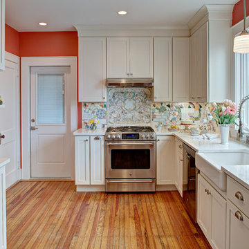
 Tracey Stephens Design, LLC
Wing Wong, Memories TTL
Inspiration for a mid-sized eclectic medium tone wood floor enclosed kitchen remodel in New York with a farmhouse sink, shaker cabinets, white cabinets, quartz countertops, multicolored backsplash, stainless steel appliances and no island
Inspiration for a mid-sized eclectic medium tone wood floor enclosed kitchen remodel in New York with a farmhouse sink, shaker cabinets, white cabinets, quartz countertops, multicolored backsplash, stainless steel appliances and no island
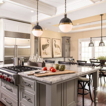
 alairhomesdecatur
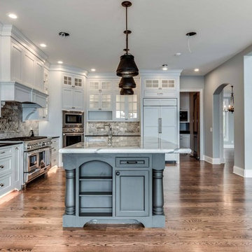
Inspiration for a transitional dark wood floor eat-in kitchen remodel in Atlanta with beaded inset cabinets, gray cabinets, white backsplash, stainless steel appliances and an island
Sponsored
Columbus, OH

Trish Takacs Design
Award Winning & Highly Skilled Kitchen & Bath Designer in Columbus
 Trend Interior Design
Kitchen by Trend Interior Design
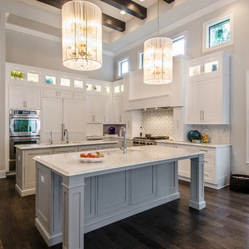
Inspiration for a transitional l-shaped dark wood floor open concept kitchen remodel in Tampa with an undermount sink, recessed-panel cabinets, white cabinets, marble countertops, white backsplash, stainless steel appliances and two islands
Inspiration for a transitional l-shaped dark wood floor open concept kitchen remodel in Tampa with an undermount sink, recessed-panel cabinets, white cabinets, marble countertops, white backsplash, stainless steel appliances and two islands
 Turan Designs, Inc.
Huge Contemporary Kitchen
Designer: Teri Turan
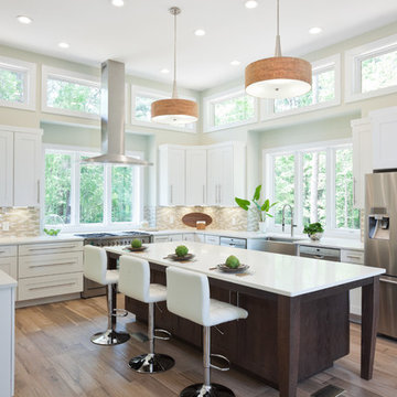
Example of a huge transitional u-shaped porcelain tile and beige floor kitchen design in Atlanta with a farmhouse sink, shaker cabinets, white cabinets, quartz countertops, beige backsplash, glass tile backsplash, stainless steel appliances, an island and white countertops
Example of a huge transitional u-shaped porcelain tile and beige floor kitchen design in Atlanta with a farmhouse sink, shaker cabinets, white cabinets, quartz countertops, beige backsplash, glass tile backsplash, stainless steel appliances, an island and white countertops
 Divine Custom Homes
Home built by Divine Custom Homes
Photos by Spacecrafting
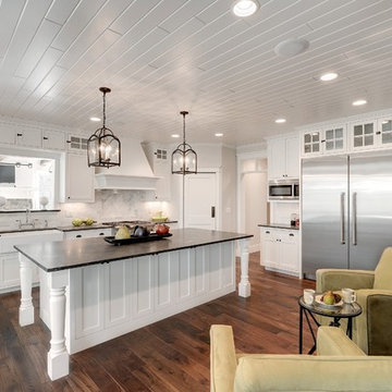
Mid-sized elegant l-shaped dark wood floor and brown floor enclosed kitchen photo in Minneapolis with a farmhouse sink, white cabinets, white backsplash, subway tile backsplash, stainless steel appliances, soapstone countertops, an island and shaker cabinets
Mid-sized elegant l-shaped dark wood floor and brown floor enclosed kitchen photo in Minneapolis with a farmhouse sink, white cabinets, white backsplash, subway tile backsplash, stainless steel appliances, soapstone countertops, an island and shaker cabinets

 Liz Schupanitz Designs
Cooking for Two
Location: Plymouth, MN, United States
When this couple’s last child graduated from college they began the process of looking for a new home. After a lengthy search they decided to stay with the neighborhood they loved, saving money by remodeling rather than starting over.
The top priorities on their wish list were adding character to their 1990’s era home with a classic white kitchen and a larger island while keeping within the existing footprint. With the intention of honing their cooking skills, they were also considering better appliances and two ovens.
Challenges and Solutions
Design a larger island with seating for at least two. The existing island was small and the area behind the seating was less than recommended clearances.
To solve this challenge, the seating area of the island was extended out into the open area of the kitchen. This created a larger island with seating for three, extra storage and a bookshelf across from the range.
The original kitchen had a range with microwave above, so adding another oven was a challenge with limited wall space.
Because the adjoining dining room is used infrequently, the homeowner was open to placing the second oven and microwave in the walkway. This made room for the small buffet between the built in refrigerator and ovens, creating one of her favorite areas.
The client requested a white painted kitchen but wanted to make sure it had warmth and character. To achieve this the following elements were chosen:
1) Cabinets painted with Benjamin Moore Capitol White, a luminous and warm shade of white.
2) The Range hood was painted with warm metallic shades to reflect the bronze of the Ashley Norton hardware.
3) Black Aqua Grantique granite was chosen for countertops because it looks like soapstone and adds contrast.
4) Walker Zanger Café tile in Latte was chosen for it’s handmade look with uneven edges.
5) The to-the-counter-cabinet with glass door shows off serving dishes and lends sophisticated charm.
The result is a welcoming classic kitchen, where this couple enjoys cooking more often and sharpening their skills with gourmet appliances.
Liz Schupanitz Designs
Photographed by: Andrea Rugg Photography
Sponsored
Fredericksburg, OH

High Point Cabinets
Columbus' Experienced Custom Cabinet Builder | 4x Best of Houzz Winner
 Camelot Homes
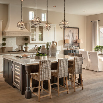
This light and airy kitchen invites entertaining and features multiple seating areas. The cluster of light fixtures over the island adds a special touch
 Pennville Custom Cabinetry
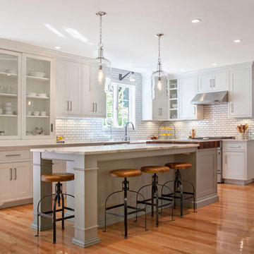
Karen Swanson, owner of New England Design Works in Manchester, MA keeps designing award winning Pennville Custom Cabinetry kitchens. You may remember that earlier this year, Karen won both the regional Sub-Zero Design Contest and the National Kitchen & Bath Association's medium kitchen of the year.
nedesignworks@gmail.com
978.500.1096.
 Donald Lococo Architects
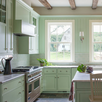
The owner said "any color but white" for her farmhouse kitchen country kitchen. Earthy and elemental materials are selected for the home that reference the barn without directly mimicking it. Wooden members found inside the barn and from other barns bridge ceilings and are used in floors along with rustic slate adding to a sense of simplicity to the farmhouse design.
3