
Search results for "Limit accessibility" in Home Design Ideas


 Drury Design
The Setup
For this primary bathroom project, the homeowners sought to transform their outdated, beige-toned space into a bright, functional sanctuary. The existing bathroom felt cramped and lifeless, with a small shower and limited storage options. The goal was to create a fresh, updated bathroom that maximizes the existing footprint while addressing specific desires for a more open, organized space with timeless materials.
Design objectives:
Brighten the bathroom and eliminate the dated beige color scheme
Install a freestanding tub in a compact space
Create a larger, more open shower without encroaching on the existing foot print too much
Incorporate hidden storage solutions
Maintain the existing bathroom layout while improving functionality
Update lighting and fixtures to create a contemporary feel
The Remodel
Design challenges to be solved:
- Compact Space Utilization – The small bathroom required careful planning to accommodate a freestanding tub while maintaining functionality and avoiding overcrowding.
- Hidden Storage Integration – The clients wanted a discreet hamper solution that wouldn’t clutter the limited floor space.
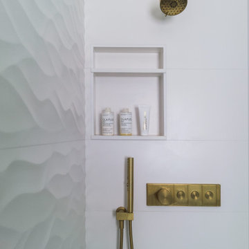
- Shower Niche Placement – With plumbing limitations and the clients’ desire to preserve their wavy accent tile wall, finding the perfect niche spot became a creative puzzle.
- Tile and Finish Coordination – Selecting complementary white tile and floor materials that worked harmoniously together.
- Larger Shower Space – Make the shower feel more open and brighter
The Renewed Space
Design solutions:
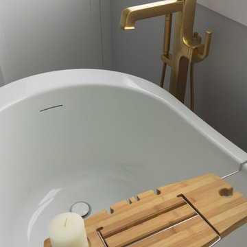
- Strategic Tub Placement – The freestanding tub was carefully positioned to maximize space, with its faucet strategically placed to allow easy access while preserving walking room. We reduced the counter depth just a bit by the tub, allowing more room for hamper cabinet and window access.
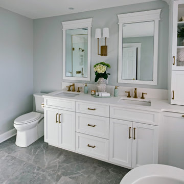
- Concealed Hamper Storage – A custom pull-out hamper was integrated into the vanity (right side, by tub), providing discreet storage within an 18-inch depth constraint.
- Shower Plumbing Wall Niche – We shifted the niche left, just enough to work around the plumbing infrastructure and still score a roomy storage spot that looks intentional.
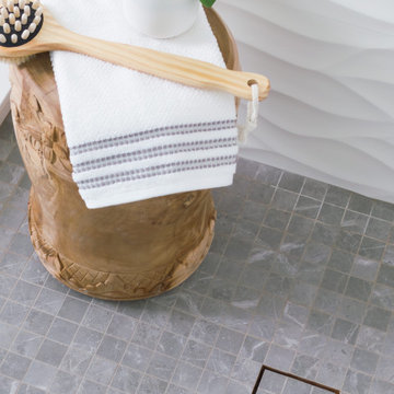
- Sophisticated Selections – Porcelanosa curvy white tile, Kohler brushed gold fixtures, and a neutral grey tile floor created a simple, timeless aesthetic that will be loved years to come.
- Open Shower – Replacing the side wall with a clear glass surround, continuing the tile on the ceiling and extending the footprint opened up this area to the room while allowing more natural lighting into the shower space.
This bathroom transformation shows how thoughtful design turns challenges into opportunities. Brushed gold fixtures add warmth to the fresh white palette, while the perfectly balanced floor tile brings just the right depth. A partially glass-fronted vanity introduces subtle charm, giving the space a unique edge. Once cramped and outdated, this bathroom now feels bright, spacious, and serene—a testament to how every design detail makes a difference.
 Drury Design
The Setup
For this primary bathroom project, the homeowners sought to transform their outdated, beige-toned space into a bright, functional sanctuary. The existing bathroom felt cramped and lifeless, with a small shower and limited storage options. The goal was to create a fresh, updated bathroom that maximizes the existing footprint while addressing specific desires for a more open, organized space with timeless materials.
Design objectives:
Brighten the bathroom and eliminate the dated beige color scheme
Install a freestanding tub in a compact space
Create a larger, more open shower without encroaching on the existing foot print too much
Incorporate hidden storage solutions
Maintain the existing bathroom layout while improving functionality
Update lighting and fixtures to create a contemporary feel
The Remodel
Design challenges to be solved:
- Compact Space Utilization – The small bathroom required careful planning to accommodate a freestanding tub while maintaining functionality and avoiding overcrowding.
- Hidden Storage Integration – The clients wanted a discreet hamper solution that wouldn’t clutter the limited floor space.
- Shower Niche Placement – With plumbing limitations and the clients’ desire to preserve their wavy accent tile wall, finding the perfect niche spot became a creative puzzle.
- Tile and Finish Coordination – Selecting complementary white tile and floor materials that worked harmoniously together.
- Larger Shower Space – Make the shower feel more open and brighter
The Renewed Space
Design solutions:
- Strategic Tub Placement – The freestanding tub was carefully positioned to maximize space, with its faucet strategically placed to allow easy access while preserving walking room. We reduced the counter depth just a bit by the tub, allowing more room for hamper cabinet and window access.
- Concealed Hamper Storage – A custom pull-out hamper was integrated into the vanity (right side, by tub), providing discreet storage within an 18-inch depth constraint.
- Shower Plumbing Wall Niche – We shifted the niche left, just enough to work around the plumbing infrastructure and still score a roomy storage spot that looks intentional.
- Sophisticated Selections – Porcelanosa curvy white tile, Kohler brushed gold fixtures, and a neutral grey tile floor created a simple, timeless aesthetic that will be loved years to come.
- Open Shower – Replacing the side wall with a clear glass surround, continuing the tile on the ceiling and extending the footprint opened up this area to the room while allowing more natural lighting into the shower space.
This bathroom transformation shows how thoughtful design turns challenges into opportunities. Brushed gold fixtures add warmth to the fresh white palette, while the perfectly balanced floor tile brings just the right depth. A partially glass-fronted vanity introduces subtle charm, giving the space a unique edge. Once cramped and outdated, this bathroom now feels bright, spacious, and serene—a testament to how every design detail makes a difference.
Find the right local pro for your project
 Drury Design
The Setup
For this primary bathroom project, the homeowners sought to transform their outdated, beige-toned space into a bright, functional sanctuary. The existing bathroom felt cramped and lifeless, with a small shower and limited storage options. The goal was to create a fresh, updated bathroom that maximizes the existing footprint while addressing specific desires for a more open, organized space with timeless materials.
Design objectives:
Brighten the bathroom and eliminate the dated beige color scheme
Install a freestanding tub in a compact space
Create a larger, more open shower without encroaching on the existing foot print too much
Incorporate hidden storage solutions
Maintain the existing bathroom layout while improving functionality
Update lighting and fixtures to create a contemporary feel
The Remodel
Design challenges to be solved:
- Compact Space Utilization – The small bathroom required careful planning to accommodate a freestanding tub while maintaining functionality and avoiding overcrowding.
- Hidden Storage Integration – The clients wanted a discreet hamper solution that wouldn’t clutter the limited floor space.
- Shower Niche Placement – With plumbing limitations and the clients’ desire to preserve their wavy accent tile wall, finding the perfect niche spot became a creative puzzle.
- Tile and Finish Coordination – Selecting complementary white tile and floor materials that worked harmoniously together.
- Larger Shower Space – Make the shower feel more open and brighter
The Renewed Space
Design solutions:
- Strategic Tub Placement – The freestanding tub was carefully positioned to maximize space, with its faucet strategically placed to allow easy access while preserving walking room. We reduced the counter depth just a bit by the tub, allowing more room for hamper cabinet and window access.
- Concealed Hamper Storage – A custom pull-out hamper was integrated into the vanity (right side, by tub), providing discreet storage within an 18-inch depth constraint.
- Shower Plumbing Wall Niche – We shifted the niche left, just enough to work around the plumbing infrastructure and still score a roomy storage spot that looks intentional.
- Sophisticated Selections – Porcelanosa curvy white tile, Kohler brushed gold fixtures, and a neutral grey tile floor created a simple, timeless aesthetic that will be loved years to come.
- Open Shower – Replacing the side wall with a clear glass surround, continuing the tile on the ceiling and extending the footprint opened up this area to the room while allowing more natural lighting into the shower space.
This bathroom transformation shows how thoughtful design turns challenges into opportunities. Brushed gold fixtures add warmth to the fresh white palette, while the perfectly balanced floor tile brings just the right depth. A partially glass-fronted vanity introduces subtle charm, giving the space a unique edge. Once cramped and outdated, this bathroom now feels bright, spacious, and serene—a testament to how every design detail makes a difference.
 Drury Design
The Setup
For this primary bathroom project, the homeowners sought to transform their outdated, beige-toned space into a bright, functional sanctuary. The existing bathroom felt cramped and lifeless, with a small shower and limited storage options. The goal was to create a fresh, updated bathroom that maximizes the existing footprint while addressing specific desires for a more open, organized space with timeless materials.
Design objectives:
Brighten the bathroom and eliminate the dated beige color scheme
Install a freestanding tub in a compact space
Create a larger, more open shower without encroaching on the existing foot print too much
Incorporate hidden storage solutions
Maintain the existing bathroom layout while improving functionality
Update lighting and fixtures to create a contemporary feel
The Remodel
Design challenges to be solved:
- Compact Space Utilization – The small bathroom required careful planning to accommodate a freestanding tub while maintaining functionality and avoiding overcrowding.
- Hidden Storage Integration – The clients wanted a discreet hamper solution that wouldn’t clutter the limited floor space.
- Shower Niche Placement – With plumbing limitations and the clients’ desire to preserve their wavy accent tile wall, finding the perfect niche spot became a creative puzzle.
- Tile and Finish Coordination – Selecting complementary white tile and floor materials that worked harmoniously together.
- Larger Shower Space – Make the shower feel more open and brighter
The Renewed Space
Design solutions:
- Strategic Tub Placement – The freestanding tub was carefully positioned to maximize space, with its faucet strategically placed to allow easy access while preserving walking room. We reduced the counter depth just a bit by the tub, allowing more room for hamper cabinet and window access.
- Concealed Hamper Storage – A custom pull-out hamper was integrated into the vanity (right side, by tub), providing discreet storage within an 18-inch depth constraint.
- Shower Plumbing Wall Niche – We shifted the niche left, just enough to work around the plumbing infrastructure and still score a roomy storage spot that looks intentional.
- Sophisticated Selections – Porcelanosa curvy white tile, Kohler brushed gold fixtures, and a neutral grey tile floor created a simple, timeless aesthetic that will be loved years to come.
- Open Shower – Replacing the side wall with a clear glass surround, continuing the tile on the ceiling and extending the footprint opened up this area to the room while allowing more natural lighting into the shower space.
This bathroom transformation shows how thoughtful design turns challenges into opportunities. Brushed gold fixtures add warmth to the fresh white palette, while the perfectly balanced floor tile brings just the right depth. A partially glass-fronted vanity introduces subtle charm, giving the space a unique edge. Once cramped and outdated, this bathroom now feels bright, spacious, and serene—a testament to how every design detail makes a difference.
 StudioLAB
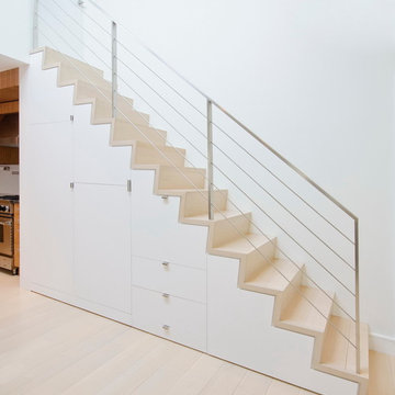
A young couple with three small children purchased this full floor loft in Tribeca in need of a gut renovation. The existing apartment was plagued with awkward spaces, limited natural light and an outdated décor. It was also lacking the required third child’s bedroom desperately needed for their newly expanded family. StudioLAB aimed for a fluid open-plan layout in the larger public spaces while creating smaller, tighter quarters in the rear private spaces to satisfy the family’s programmatic wishes. 3 small children’s bedrooms were carved out of the rear lower level connected by a communal playroom and a shared kid’s bathroom. Upstairs, the master bedroom and master bathroom float above the kid’s rooms on a mezzanine accessed by a newly built staircase. Ample new storage was built underneath the staircase as an extension of the open kitchen and dining areas. A custom pull out drawer containing the food and water bowls was installed for the family’s two dogs to be hidden away out of site when not in use. All wall surfaces, existing and new, were limited to a bright but warm white finish to create a seamless integration in the ceiling and wall structures allowing the spatial progression of the space and sculptural quality of the midcentury modern furniture pieces and colorful original artwork, painted by the wife’s brother, to enhance the space. The existing tin ceiling was left in the living room to maximize ceiling heights and remain a reminder of the historical details of the original construction. A new central AC system was added with an exposed cylindrical duct running along the long living room wall. A small office nook was built next to the elevator tucked away to be out of site.
 Danze & Davis Architects, Inc.
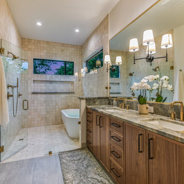
Bathroom - transitional master beige tile and stone tile ceramic tile, gray floor and double-sink bathroom idea in Austin with recessed-panel cabinets, medium tone wood cabinets, white walls, an undermount sink, quartz countertops, a hinged shower door, gray countertops and a built-in vanity

Sponsored
Columbus, OH
Free consultation for landscape design!

Peabody Landscape Group
Columbus' Reliable Landscape Design & Contracting
 ODS Architecture
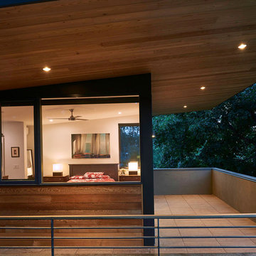
This new contemporary home was commissioned by a design-loving family in Boulder, Colorado who had just purchased a house on a corner lot and wanted to build something new and contemporary with views of the Flatiron mountain range beyond. Working over a distance was easy with extensive 3D modeling leading the way.
Though not on a super-busy corner, limited openings to the street were utilized counter-balanced by extensive glass and access to the side and rear yards. A detached garage was necessary because of off-street parking access from an existing alley that ran behind the house, so a breezeway connecting roof was designed to join the structures visually and provide cover in snow and rain.
Hydronic radiant heated floors run throughout and large windows reveal selective views to the neighborhood. Exposed steel beams and wood framing tell the story of structure inside. White-white kitchen and baths provide clean neutral environments for food and bathing. Upstairs high ceilings allow clerestory windows inviting light but not view. The master bedroom is aimed at the Flatiron Mountains as is the large wraparound walking deck with flying roof overhead, all clad in red cedar.
Much was learned about the local Colorado building environment along the way, guided by nearby structural engineers and contractor. Boulder has strict sun-shadow rules where 3D modeling was critical to show compliance. Energy and heat-loss concerns limited glazing at certain exposures but allowed us to open things up elsewhere. This home is a great example of working within a strict budget and achieve high design quality results. Built by Morningstar Homes with photos by Patterson Architecture + Interior Photography.
 Noble Architects, LLC
Photography: Garett + Carrie Buell of Studiobuell/ studiobuell.com
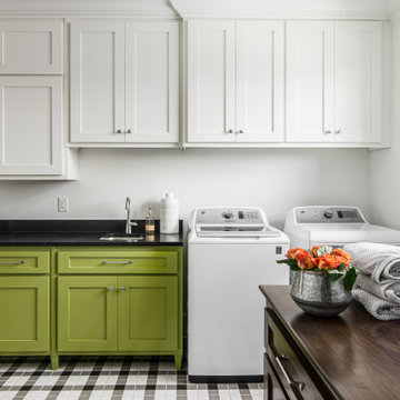
Example of a mid-sized transitional porcelain tile and multicolored floor dedicated laundry room design in Nashville with an undermount sink, shaker cabinets, white walls, a side-by-side washer/dryer, black countertops and green cabinets
Example of a mid-sized transitional porcelain tile and multicolored floor dedicated laundry room design in Nashville with an undermount sink, shaker cabinets, white walls, a side-by-side washer/dryer, black countertops and green cabinets
 Betz Pools Limited
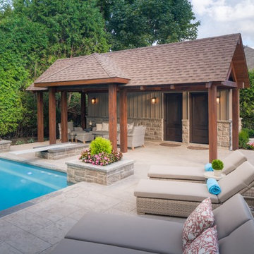
The cabana is clad in stone with board and batten to match the architecture of the home. It features a covered lounge area and three interior rooms, a washroom, a change room and pool equipment room which is accessed on the side.
 GMI Design Group
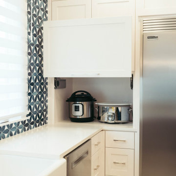
This dark, dreary kitchen was large, but not being used well. The family of 7 had outgrown the limited storage and experienced traffic bottlenecks when in the kitchen together. A bright, cheerful and more functional kitchen was desired, as well as a new pantry space.
We gutted the kitchen and closed off the landing through the door to the garage to create a new pantry. A frosted glass pocket door eliminates door swing issues. In the pantry, a small access door opens to the garage so groceries can be loaded easily. Grey wood-look tile was laid everywhere.
We replaced the small window and added a 6’x4’ window, instantly adding tons of natural light. A modern motorized sheer roller shade helps control early morning glare. Three free-floating shelves are to the right of the window for favorite décor and collectables.
White, ceiling-height cabinets surround the room. The full-overlay doors keep the look seamless. Double dishwashers, double ovens and a double refrigerator are essentials for this busy, large family. An induction cooktop was chosen for energy efficiency, child safety, and reliability in cooking. An appliance garage and a mixer lift house the much-used small appliances.
An ice maker and beverage center were added to the side wall cabinet bank. The microwave and TV are hidden but have easy access.
The inspiration for the room was an exclusive glass mosaic tile. The large island is a glossy classic blue. White quartz countertops feature small flecks of silver. Plus, the stainless metal accent was even added to the toe kick!
Upper cabinet, under-cabinet and pendant ambient lighting, all on dimmers, was added and every light (even ceiling lights) is LED for energy efficiency.
White-on-white modern counter stools are easy to clean. Plus, throughout the room, strategically placed USB outlets give tidy charging options.
 TKS Design Group
Download our free ebook, Creating the Ideal Kitchen. DOWNLOAD NOW
For many, extra time at home during COVID left them wanting more from their homes. Whether you realized the shortcomings of your space or simply wanted to combat boredom, a well-designed and functional home was no longer a want, it became a need. Tina found herself wanting more from her Old Irving Park home and reached out to The Kitchen Studio about adding function to her kitchen to make the most of the available real estate.
At the end of the day, there is nothing better than returning home to a bright and happy space you love. And this kitchen wasn’t that for Tina. Dark and dated, with a palette from the past and features that didn’t make the most of the available square footage, this remodel required vision and a fresh approach to the space. Lead designer, Stephanie Cole’s main design goal was better flow, while adding greater functionality with organized storage, accessible open shelving, and an overall sense of cohesion with the adjoining family room.
The original kitchen featured a large pizza oven, which was rarely used, yet its footprint limited storage space. The nearby pantry had become a catch-all, lacking the organization needed in the home. The initial plan was to keep the pizza oven, but eventually Tina realized she preferred the design possibilities that came from removing this cumbersome feature, with the goal of adding function throughout the upgraded and elevated space. Eliminating the pantry added square footage and length to the kitchen for greater function and more storage. This redesigned space reflects how she lives and uses her home, as well as her love for entertaining.
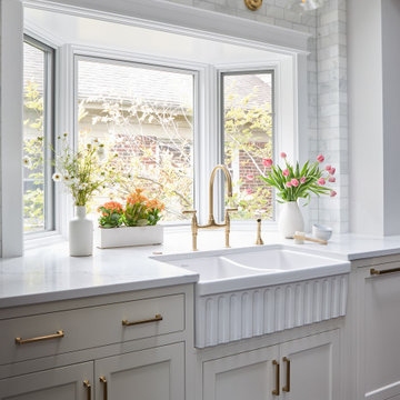
The kitchen features a classic, clean, and timeless palette. White cabinetry, with brass and bronze finishes, contrasts with rich wood flooring, and lets the large, deep blue island in Woodland’s custom color Harbor – a neutral, yet statement color – draw your eye.
The kitchen was the main priority. In addition to updating and elevating this space, Tina wanted to maximize what her home had to offer. From moving the location of the patio door and eliminating a window to removing an existing closet in the mudroom and the cluttered pantry, the kitchen footprint grew. Once the floorplan was set, it was time to bring cohesion to her home, creating connection between the kitchen and surrounding spaces.
The color palette carries into the mudroom, where we added beautiful new cabinetry, practical bench seating, and accessible hooks, perfect for guests and everyday living. The nearby bar continues the aesthetic, with stunning Carrara marble subway tile, hints of brass and bronze, and a design that further captures the vibe of the kitchen.
Every home has its unique design challenges. But with a fresh perspective and a bit of creativity, there is always a way to give the client exactly what they want [and need]. In this particular kitchen, the existing soffits and high slanted ceilings added a layer of complexity to the lighting layout and upper perimeter cabinets.
While a space needs to look good, it also needs to function well. This meant making the most of the height of the room and accounting for the varied ceiling features, while also giving Tina everything she wanted and more. Pendants and task lighting paired with an abundance of natural light amplify the bright aesthetic. The cabinetry layout and design compliments the soffits with subtle profile details that bring everything together. The tile selections add visual interest, drawing the eye to the focal area above the range. Glass-doored cabinets further customize the space and give the illusion of even more height within the room.
While her family may be grown and out of the house, Tina was focused on adding function without sacrificing a stunning aesthetic and dreamy finishes that make the kitchen the gathering place of any home. It was time to love her kitchen again, and if you’re wondering what she loves most, it’s the niche with glass door cabinetry and open shelving for display paired with the marble mosaic backsplash over the range and complimenting hood. Each of these features is a stunning point of interest within the kitchen – both brag-worthy additions to a perimeter layout that previously felt limited and lacking.
Whether your remodel is the result of special needs in your home or simply the excitement of focusing your energy on creating a fun new aesthetic, we are here for it. We love a good challenge because there is always a way to make a space better – adding function and beauty simultaneously.
 CHRISTOPHER STROM ARCHITECTS
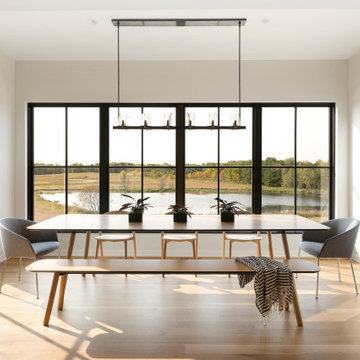
Eye-Land: Named for the expansive white oak savanna views, this beautiful 5,200-square foot family home offers seamless indoor/outdoor living with five bedrooms and three baths, and space for two more bedrooms and a bathroom.
The site posed unique design challenges. The home was ultimately nestled into the hillside, instead of placed on top of the hill, so that it didn’t dominate the dramatic landscape. The openness of the savanna exposes all sides of the house to the public, which required creative use of form and materials. The home’s one-and-a-half story form pays tribute to the site’s farming history. The simplicity of the gable roof puts a modern edge on a traditional form, and the exterior color palette is limited to black tones to strike a stunning contrast to the golden savanna.
The main public spaces have oversized south-facing windows and easy access to an outdoor terrace with views overlooking a protected wetland. The connection to the land is further strengthened by strategically placed windows that allow for views from the kitchen to the driveway and auto court to see visitors approach and children play. There is a formal living room adjacent to the front entry for entertaining and a separate family room that opens to the kitchen for immediate family to gather before and after mealtime.
Sponsored
Sunbury, OH

J.Holderby - Renovations
Franklin County's Leading General Contractors - 2X Best of Houzz!
 Zola European Windows
Located in, Summit Park, Park City UT lies one of the most efficient houses in the country. The Summit Haus – designed and built by Chris Price of PCD+B, is an exploration in design and construction of advanced high performance housing. Seeing a rising demand for sustainable housing along with rising Carbon emissions leading to global warming, this house strives to show that sensible, good design can create spaces adequate for today’s housing demands while adhering to strict standards. The house was designed to meet the very rigid Passiv House rating system – 90% more efficient than a typical home in the area.
The house itself was intended to nestle neatly into the 45 degree sloped site and to take full advantage of the limited solar access and views. The views range from short, highly wooded views to a long corridor out towards the Uinta Mountain range towards the east. The house was designed and built based off Passiv Haus standards, and the framing and ventilation became critical elements to maintain such minimal energy requirements.
Zola triple-pane, tilt-and-turn Thermo uPVC windows contribute substantially to the home’s energy efficiency, and takes advantage of the beautiful surrounding of the location, including forrest views from the deck off of the kitchen.
Photographer: George Oakley
 Ellen Farber Strategic Design
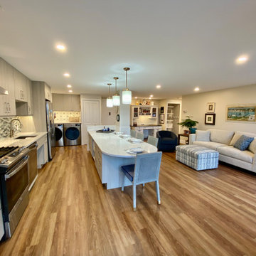
The new open plan living/dining room. The countertop that contains all the appliances is at standard height of 36". Although the sink has a recessed wheelchair accessible approach, maintaining the 36" counter height allows our client to stand and put dishes away in the cabinets above. The kitchen island is for dining and meal prep and is the "command central" of the apartment . Beneath the kitchen island are four drawers for the food pantry, a microwave, pots and pan drawers within easy reach to the cooktop and storage drawers. There is 48" between the kitchen island and the island to allow for easy wheelchair access, while full wheelchair turns are made easy on either end of the island. The living room leaves plenty of space for her wheelchair to join the sitting area while the ottoman in front of the sofa serves as a footrest or place to put things when a tray is placed on top of it. The ottoman pulls the room together with a multi color fabric much like a rug would do...we were not able to have a rug in the space due to space limitations as well as the need to keep an open path behind the dining chairs.
 Lentz Kitchen & Bath
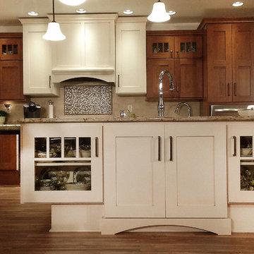
The island, by Crystal Keyline, is finished in Antique Ivory w/Brown Highlights and glass doors. It is the focal point of the kitchen, contrasting nicely with the Toasted Rye w/Brown Highlights cabinetry. The range-hood and cooktop area, also finished in Antique Ivory w/Brown Highlights, add an extra punch of interest. The Bayfield door style unifies the design.
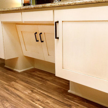
This custom kitchen required the complete customization of the space to the specific needs of the client, due to the on-set of a neuromuscular disorder.
The space also had to function well for his wife who does most the cooking on a daily basis. The layout was designed for the couple to be able to work together in the kitchen, or independently.
Although largely dictated by her husband's need for accessibility, the universal design of this kitchen is also extremely friendly for a the wife's smaller stature.
The couple feels at home in this kitchen yet, it’s not obvious that someone with physical limitations utilizes this space.
Typhoon Bordeaux granite countertops are layered in staggered heights for added visual interest.
 Lentz Kitchen & Bath
The on-set of a neuromuscular disorder was the basis for this custom kitchen. Specific design solutions & necessary amenities required the complete customization of this space, over and above accessible guidelines. The kitchen design was tailored to the specific needs of the client, connoisseur of unique (& delicious) soups, as well as to his wife who does most the cooking on a daily basis. The layout was designed for the couple to be able to work together in the kitchen, or independently.
Because not all wheelchair users have the same needs, the designer took specific measurements of the client in various positions in his power chair which has elevator capabilities. The height and depth of the cabinet toe-space was designed to accommodate the user relative to his arm length, torso height, and his specific power chair model.
Base cabinets featuring drawers and roll-out trays are extremely useful for the couple. The wall cabinets were also placed at a specific height set by the clients, to accommodate a comfortable reach from a seated or standing position.
The couple feels at home in this kitchen yet, it’s not obvious that someone with physical limitations utilizes this space.
Sponsored
Columbus, OH
Free consultation for landscape design!
Peabody Landscape Group
Columbus' Reliable Landscape Design & Contracting
 Clawson Architects, LLC
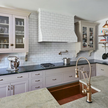
The goals included a Victorian Period look and universal design features. Wider isles for wheelchair mobility was incorporated. The farm sink is pulled forward for access. the touch less faucet and anti-microbial copper sink are never a bad idea. Other interesting features include armoire doors on the oven and refrigerator and freezer doors provide access. Cabinet surrounds features flush inset doors by Woodharbor painted Morel, and features Soapstone counters. Walnut shelves by Woodharbor for Clawson Cabinets, Antique Brackets and hardware— “customer find”. Brass rail and s hooks by deVOL. All details that provide access at the lower level for both children and people with reach limitations. The kitchen features and induction cooktop and a gas component both by Wolf. the pot filler and glass cabinets with bracket details and antique hardware complete the look.
 CPI Home AV
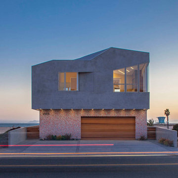
This custom built beach house posed many challenged including the specific design criteria, space requirements, and limited wall space as 75% of the walls are glass. The AV closet was built into the stair spandrel, space that would have otherwise been unused. Certain walls were thickened allowing recessed TVs to sit perfectly flush with the wall. The automated buttons throughout the house control functions such as Welcome, Goodnight, & Party Mode. The home automation was designed for anyone to be able to walk into the house and use the system.
 Nautilus Homes
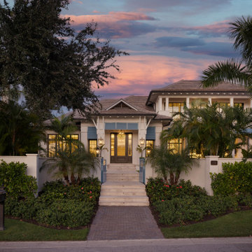
Framed by mature trees and nestled within Sarasota’s historic McClellan Park, Sunset Place is a home shaped by a deep understanding of, and sensibility for, its setting—reflecting the charm of the neighborhood, the rhythm of downtown living, and the client’s vision of entertaining, connection, and family life. Every decision—from site strategy to spatial flow—was made with intention: to support a lifestyle centered on warmth, community, and a strong sense of place.
At its core, the project is a masterclass in leveraging zoning and code to unlock the full potential of a complex site. Though landlocked, the home lives like waterfront—offering openness, privacy, and expansive sunset views. Placing the pool in the front yard, within the 25-foot setback, redefines the entry experience. It captures the western light and sets a relaxed, resort-like tone from the very first step inside the gate. Paired with a rear-loaded garage, accessed discreetly via the side setback, the layout transforms the site’s limitations into its greatest assets. Architecture and landscape take center stage, while the full buildable envelope is maximized without compromise.
A natural rise of eight feet from front to back—rare in Sarasota—was embraced as an opportunity. Site walls function as both retaining structures and architectural elements, elevating the pool terrace and entry by over four feet to align with the main interior floor level. The result is a fluid connection between indoors and out: kitchen, dining, and living spaces unfold onto the terrace, blurring boundaries and enhancing everyday rituals as well as social gatherings.
Architecturally, the home is coastal contemporary: open yet composed, airy yet grounded. Clarity in the massing tells a story of the inhabitants from the first glance, while the interior planning offers spatial generosity and ease. The interiors echo this sensibility with a palette that is soft, natural, and tactile—serene without being neutral. The landscape design provides a lush tropical frame, softening edges and reinforcing privacy through layered plantings rather than enclosure.
Ultimately, Sunset Place is not defined by any single gesture, but by the way the home reflects its owners. Their gracious, family-centered nature informed every layer of design—resulting in a space that feels deeply personal, tailored for connection and ease, and perfectly suited for gathering, unwinding, and watching the sun slip behind the trees from the comfort of home.
24