
Search results for "Lively involve" in Home Design Ideas

 Haven Design and Construction
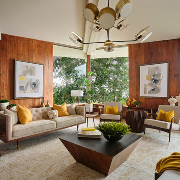
The cantilevered living room of this incredible mid century modern home still features the original wood wall paneling and brick floors. We were so fortunate to have these amazing original features to work with. Our design team brought in a new modern light fixture, MCM furnishings, lamps and accessories. We utilized the client's existing rug and pulled our room's inspiration colors from it. Bright citron yellow accents add a punch of color to the room. The surrounding built-in bookcases are also original to the room.
 Penza Bailey Architects
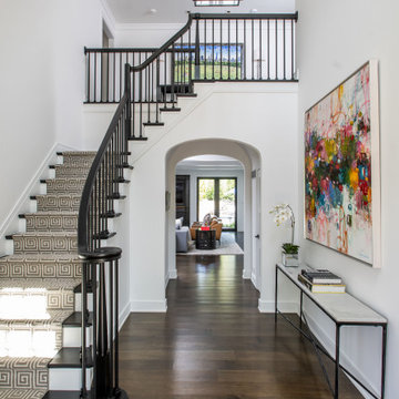
An intimate understanding of the clients led to the immaculate renovation of this Baltimore County project by Penza Bailey Architects. After conducting a feasibility study to assist the clients in selecting the right home, the firm got to work, removing traditional trim and dated finishes to craft a contemporary retreat. In addition to cosmetic upgrades, the home received a four-foot addition to expand the living and dining rooms, now with expansive windows overlooking the new resort style pool, cabana, and complementing pool house perfect for summer gatherings or solo swims. Inside, a four-foot expansion enhances the open-concept floor plan. Contemporary finishes, like the wide plank flooring, outfit the more casual office located in the pool house and complement the main home’s aesthetic.
Find the right local pro for your project

 Casa Smith Designs, LLC
Inspiration for a large traditional drought-tolerant and full sun front yard concrete paver and metal fence landscaping in Portland with a fire pit.
 Lands End Development - Designers & Builders
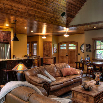
Example of a mountain style living room design in Minneapolis
 Astaneh Construction General Contractor
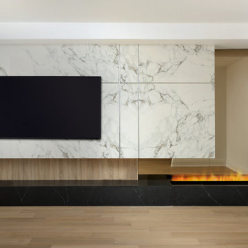
The renovation project at Hollywood Avenue in North York took a total of five months from start to finish. Astaneh Construction was hired to undertake the project, which involved a complete transformation of the house. The scope of work included creating an open concept living area, renovating the kitchen and bathrooms, painting the entire house, upgrading the flooring and trim work.
The project began with a thorough assessment of the existing space and a detailed plan was developed to ensure that the final outcome would meet the client's expectations. The team at Astaneh Construction worked diligently to ensure that every detail of the project was completed to the highest standard. The end result was a beautiful and modern living space that exceeded the client's expectations.
The open concept design allowed for a seamless flow of natural light throughout the space, creating a bright and welcoming environment. The kitchen was completely renovated with modern fixtures and finishes, providing a functional and aesthetically pleasing workspace for the homeowners. The bathrooms were also transformed with new tiling, fixtures and vanities, creating a spa-like atmosphere.
The entire house was painted with a fresh coat of paint, creating a clean and modern look. The flooring was upgraded to high-quality materials, providing durability and comfort underfoot. The trim work was also upgraded, adding a touch of elegance to the space.
In summary, Astaneh Construction successfully completed a comprehensive renovation of Hollywood Avenue in North York, creating a beautiful and modern living space for the homeowners. The project took five months to complete and involved creating an open concept living area, renovating the kitchen and bathrooms, painting, flooring and upgrading the trim work.
 Legno Bastone Wide Plank Flooring
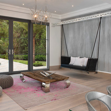
Trendy open concept light wood floor living room photo in Miami with gray walls
Sponsored
Columbus, OH

HomeCraft Remodeling
Custom Craftsmanship & Build Solutions in Franklin County, Ohio
 Hudson Street Design
Empire Contracting Inc
707.884.9789
Photos By: Sea Ranch Images
www.searanchimages.com
707.653.6866
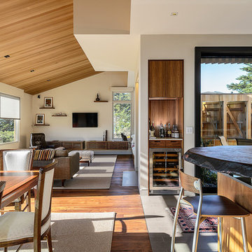
Living room - 1960s living room idea in San Francisco
Living room - 1960s living room idea in San Francisco
 Dallas Builders Association
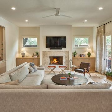
This week’s home feature is located in University Park on Purdue Street and was recently renovated by Alair Dallas-Fort Worth.
Originally built in 2004, our clients purchased this home in 2019 because they liked the location and the layout. They knew they wanted to update it as a lot of the spaces felt dark and dated. The extensive renovation included an entirely new kitchen, primary bath, powder, with significant upgrades to the living room, bar, study, mudroom and secondary baths. Because the homeowners have a large dog, they chose to live in the home during the remodel. The live-in renovation was made possible by Alair’s careful planning around the family’s schedules along with the temporary addition of an operable kitchen and dining setup in the formal living room. Mid-remodel, COVID-19 struck, but the Alair team quickly adapted and continued to work efficiently to complete the project on time.
Upon entering the home, you are greeted by a grand staircase. A bright living room is situated to the left of the entrance and a formal dining room is to the right, punctuated by a marvelous chandelier. The home features a large combined family room and kitchen area featuring a dark-hued, custom metal commercial vent-a-hood that draws a stark contrast to the brilliant white marble slab island. The overhauled bar area includes the addition of a wine room featuring ample storage for the homeowners’ collection. This combined living area is truly an entertainer’s dream.
The second floor consists of the renovated primary suite, two additional bedrooms and a refinished media room. The primary suite is complete with a large, walk-in closet and a spa-inspired bath with a large soaking bathtub, rain shower, double vanities and floor-to-ceiling custom wood cabinets.
Alair Dallas-Fort Worth is an award-winning custom home building and renovation company currently serving the great communities of Park Cities, Preston Hollow, North Dallas, East Dallas, Plano, Frisco, Prosper, Salina, Rockwall, Richardson and surrounding areas. Utilizing their proprietary construction management system, Client Control™, Alair builds a full-disclosure partnership with its clients by allowing customers to maximize their involvement in the home building and renovation process. Alair truly believes that Living Better Starts Here™; from multi-million dollar whole home remodels, additions and custom new builds to major kitchen and bath renovations, all with the same level of care, craftsmanship, and top-notch customer service.
For more information, visit www.alairdfw.com or find us on Instagram @alairhomesdallas_fortworth.
This Home of the Week is presented by the Dallas Builders Association. For information on the Association please visit www.dallasbuilders.com.
 Cape Associates, Inc.
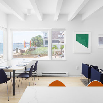
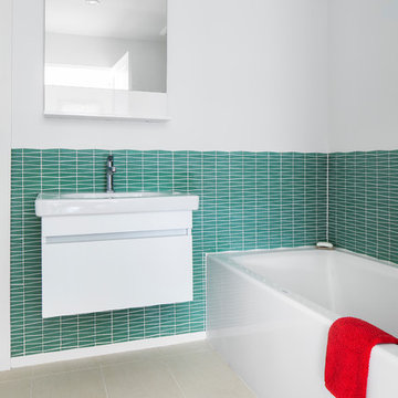
This 1,200 square-foot Provincetown condominium lives large, both functionally and aesthetically, thanks to its recent renovation. The waterfront home, overlooking Cape Cod Bay, is part of an historic grouping of three individual buildings on Commercial Street that have been combined into condominiums.
Begun in November 2014 and completed just in time for summer in May 2016, b Architecture Studios and Cape Associates Builders worked with a budget of $366,000 to transform this prosaic dwelling into a stunning light-flooded space—designed to maximize both the living space and the mesmerizing views of the bay.
“The space was totally reconfigured,” said project manager Jon Ziperman. “It was a total gut job requiring leveling of floors, straightening of walls, removing a chimney and fireplace that ran up to the above neighbors’ unit.” The renovation also required a complete rewiring and plumbing system that involved wires and pipes that were integrated into the surrounding units. From wall to wall and floor to ceiling, there was nothing that could be salvaged from the original space.
One of the most prominent changes was moving the stairway from its original placement, where it originally broke up the living and dining space and blocked views to the bay beyond. The stairway now sits on the opposite side of the condominium. With the stairs tucked to the left side of the living area, the sightline now extends from the entry straight through the living and dining areas to the water. The new design allowed for storage space beneath the stairs, which lead to an airy sleeping loft, and room for a desk niche. A light well, where the former sleeping area was, and new windows bring abundant natural light to the central living area.
Innovative features in the entry room include a Murphy bed and sliding glass door separating it from the living area, so that the space can double as a guest room.
“The Murphy bed fit in nicely, allowing for a flush wall at the entry/guest room and a desk niche in the adjacent room,” Brown said. “Convincing the client to create the wrap-around chair rail, lined up with the divided lights of the sliding glass door, makes a purposeful connection in a small space.”
Neolith countertops in the open kitchen and details like the flush minimal baseboard contribute to the sleek, modern aesthetic, now complemented by the owner’s contemporary furnishings. This complete renovation has rendered this compact home worthy of its beautiful setting.
 Cape Associates, Inc.
This 1,200 square-foot Provincetown condominium lives large, both functionally and aesthetically, thanks to its recent renovation. The waterfront home, overlooking Cape Cod Bay, is part of an historic grouping of three individual buildings on Commercial Street that have been combined into condominiums.
Begun in November 2014 and completed just in time for summer in May 2016, b Architecture Studios and Cape Associates Builders worked with a budget of $366,000 to transform this prosaic dwelling into a stunning light-flooded space—designed to maximize both the living space and the mesmerizing views of the bay.
“The space was totally reconfigured,” said project manager Jon Ziperman. “It was a total gut job requiring leveling of floors, straightening of walls, removing a chimney and fireplace that ran up to the above neighbors’ unit.” The renovation also required a complete rewiring and plumbing system that involved wires and pipes that were integrated into the surrounding units. From wall to wall and floor to ceiling, there was nothing that could be salvaged from the original space.
One of the most prominent changes was moving the stairway from its original placement, where it originally broke up the living and dining space and blocked views to the bay beyond. The stairway now sits on the opposite side of the condominium. With the stairs tucked to the left side of the living area, the sightline now extends from the entry straight through the living and dining areas to the water. The new design allowed for storage space beneath the stairs, which lead to an airy sleeping loft, and room for a desk niche. A light well, where the former sleeping area was, and new windows bring abundant natural light to the central living area.
Innovative features in the entry room include a Murphy bed and sliding glass door separating it from the living area, so that the space can double as a guest room.
“The Murphy bed fit in nicely, allowing for a flush wall at the entry/guest room and a desk niche in the adjacent room,” Brown said. “Convincing the client to create the wrap-around chair rail, lined up with the divided lights of the sliding glass door, makes a purposeful connection in a small space.”
Neolith countertops in the open kitchen and details like the flush minimal baseboard contribute to the sleek, modern aesthetic, now complemented by the owner’s contemporary furnishings. This complete renovation has rendered this compact home worthy of its beautiful setting.

 safe ZOnea
Staging a home for sale or for a major transition is a strange in-between state. You are still living in the space, but you are also preparing it to impress strangers, support showings, and remain functional until the final move-out day. That tension between “home” and “product” is where storage quietly becomes one of your smartest tools. Used well, storage lets you reduce clutter, protect important items, and create the kind of rooms that photograph beautifully and feel calm when buyers walk through the door.
A staged move is rarely just about shifting boxes from one address to another. It is about managing timing, presentation, and stress at the same time. When storage is built into the plan from day one, the entire process feels less rushed and more strategic. Rooms open up gradually, essentials stay accessible, and you never feel like you are drowning in half-packed chaos. Understanding how to use storage as a staging partner, not just a place to dump excess stuff, is what turns a messy transition into a controlled, professional-looking move.
Why Storage Is the Backbone of Every Staged Move
Visual space is emotional space. When every surface is covered, and every corner is full, buyers feel crowded before they have even evaluated the layout. Storage gives you a way to pull back without making drastic decisions about what to keep or donate. Seasonal décor, bulky furniture, duplicate items, archives, and personal collections can be moved out early, so the home reads cleaner and more open while still feeling lived-in. That balance between warmth and simplicity is exactly what good staging tries to achieve.
In more complex situations, such as live-work properties or home offices, storage becomes even more important. You may need to keep a business running while also presenting a polished environment to viewers. Partnering with local movers in Boston makes it easier to shift equipment, files, and nonessential pieces into storage in phases, so work can continue while the visible areas of the property stay controlled and presentable.
How Staging and Storage Work Together to Control Visual Impact
Staging works best when every object in a room has a clear purpose. A sofa frames a conversation. A table suggests gathering. A lamp softens the mood. Everything else that is not essential to that story competes for attention. Storage supports staging by giving you a clean staging bench off-site, where nonessential items can wait without being constantly shuffled between rooms or piled into overstuffed closets.
The art lies in deciding what stays and what goes. Family photos, extensive collections, excess seating, and rarely used appliances often move into storage first. What remains should be enough to show scale, comfort, and function without revealing the full weight of daily life. Commercial properties go through a similar filtering process. Extra desks, surplus equipment, outdated signage, and inactive files often move out early so the active workspace feels lean, efficient, and future-ready before a relocation supported by commercial movers takes place.
Strategic Timing of Storage before the Actual Move
The worst time to think about storage is when boxes are already stacked in the hallway. In a staged move, storage decisions ideally begin as soon as you know the property will be listed or the space will be transitioned. That might be a month or more before the main moving date. Starting early gives you time to sort, label, and prioritize instead of throwing things together in a panic.
An early storage phase also helps you test how the home feels with less in it. You may discover that removing a few large pieces transforms a cramped room into an open, inviting space. For commercial spaces, early storage lets operations continue with fewer interruptions. Departments can send nonessential items out in waves. When the main relocation comes, much of the excess is already safely stored, and what remains is easier for a commercial movers Boston team to handle with speed and care.
The Emotional Psychology behind Letting Storage Hold Your Belongings
Letting belongings leave the house ahead of you can feel unsettling. There is always a quiet fear that once something is out of sight, it will be forgotten, damaged, or harder to reclaim. That is why some people resist using storage even when they know it would make the staging process easier. Acknowledging that emotion instead of dismissing it helps you plan more honestly and avoids last-minute regret.
The reality is that good storage is not a black hole; it is a temporary pause. When items are packed thoughtfully, labeled clearly, and placed in an environment you trust, they become easier to manage than when they are tucked into random cupboards or stacked in spare rooms. For many people, living with fewer visible possessions during staging actually reduces tension. The home feels lighter and easier to maintain. Businesses notice the same effect when storage removes outdated equipment and clutter from the floor. The workspace looks more focused, and staff can concentrate on current tasks instead of navigating around accumulated history.
Protecting Assets While They Live in Storage
Sending belongings into storage is only a good idea if they come back in the same or better condition. That is where quality control matters. Furniture, textiles, electronics, files, and artwork each have different vulnerabilities. Moisture, temperature swings, dust, and rough handling can all damage them in ways that only become obvious later. Choosing the right type of storage and packing accordingly is central to the genius of using storage as part of a staged move rather than as a desperate overflow container.
Climate-controlled units, padded wrapping, elevated pallets, careful stacking, and clearly marked boxes all reduce risk. The goal is to handle items fewer times, not more. When storage is integrated into the move plan, belongings can travel directly from the home to storage and later from storage to the new address with minimal extra movement. Many owners coordinate those transfers through a well trusted movers in Boston, so the same team that moves items out early also manages their final delivery, preserving continuity and accountability.
How Storage Reduces Risk during Multi-Phase Moves
Few staged moves happen in a single clean step. There are often gaps between listing and selling, between selling and closing, between closing and final move-out. If renovations, inspections, or office reconfigurations are involved, the timeline becomes even more layered. Storage absorbs those gaps, so you are not forced to live among towers of boxes or stack equipment in hallways waiting for the next phase.
By treating storage as a flexible middle ground, you can move things out gradually while still having access when needed. For example, archived files can go first, followed by seasonal décor, then surplus furniture. As each stage ends, fewer items remain to be shifted on the final date. This phased approach reduces the risk of rushed, late-night packing sessions, careless stacking, and damaged items. It also makes it easier for commercial moving crews to work efficiently because they are handling a manageable volume of goods at each phase rather than everything at once.
Using Storage to Maintain Clean Show-Ready Conditions
One of the hardest parts of staging is keeping the property consistently show-ready. Every viewing becomes its own small event. Floors need to be cleared, surfaces wiped, and personal items tucked away. When too many belongings remain in the home, each showing takes a heavy amount of effort. Storage cuts that workload dramatically by taking nonessentials completely off the stage.
With fewer items to move and hide, maintaining a neutral, inviting look becomes much more realistic. You are not scrambling to stuff things into closets or push items under the bed. Instead, the home sits closer to show condition all the time, and the final touches before a viewing are minimal. In commercial environments, using storage helps maintain a professional appearance for clients and staff, even while the space is being prepared for a larger transition. Active tools and furniture stay in play, while inactive pieces quietly support the future from storage.
Storage as a Strategic Tool in Business Relocation Planning
For businesses, storage is more than a convenience; it is part of risk management. Office relocations and staged commercial moves have to juggle lease deadlines, equipment deliveries, IT cutovers, and staffing realities. Trying to shift everything in one move often results in downtime, lost files, and strained teams. Storage turns the move into a series of controlled steps instead of a single disruptive jump.
Unused furniture, archived documents, and non-critical inventory can be moved into storage weeks ahead of the main relocation. As the new space becomes ready, items can move out of storage and directly into position. This reduces double-handling and keeps the old and new locations from filling with half-unpacked material. A business that coordinates these flows with professional commercial movers in Boston usually experiences smoother transitions, because storage is treated as a working part of the operational plan rather than a leftover problem.
The Hidden Cost Benefits of Proper Storage Planning
On paper, storage looks like an extra expense. In reality, poorly managed moves cost far more. When everything is rushed into boxes at the last minute, items are damaged, misplaced, or transported multiple times. Extra labor hours, emergency packing supplies, replacement furniture, and extended timelines quickly outweigh the cost of well-used storage. Staging without storage also tends to keep homes and offices crowded longer, which can hurt impressions and, in the case of a sale, influence offers.
When storage is integrated from the beginning, you minimize waste. You handle items fewer times, you know where things are, and you avoid paying people to shift the same objects repeatedly. Staged homes that look better often sell faster or draw stronger interest, which helps recover investment on the back end. Businesses benefit from less downtime, safer handling of equipment, and predictable work schedules. Those gains are why many clients prefer partnering with a commercial moving company in Boston that understands storage as a cost-control tool, not just a place to park overflow.
Conclusion
The true genius of using storage during a staged home move is that it quietly rewrites the rules of transition. Instead of treating space as something that must absorb every box and belonging until the last possible moment, you treat storage as a flexible extension of the home or office. This shift in thinking opens rooms, clears sightlines, and makes every phase of the move more intentional. Staging becomes easier, maintenance becomes lighter, and the stress of living in a half-moved environment drops noticeably. When storage is chosen carefully, used early, and coordinated with the overall moving plan, it protects both physical assets and emotional energy. Buyers and visitors see a calm, collected space. You experience a less chaotic path from “here” to “there.” Whether you are selling a home, repositioning a business, or managing a complex phased relocation, storage can turn a disruptive event into a managed, almost elegant process.
For people who want that level of control and care during a staged move, Stairhopper movers have built a strong reputation by treating storage, timing, and transport as parts of one connected strategy. Their team is known for listening closely, planning around real-life constraints, and moving both residential and commercial clients through transitions with calm, steady execution. They approach every project as a partnership, aligning storage use, staging needs, and final delivery so that what matters most arrives safely, on schedule, and with as little disruption as possible.
Frequently Asked Questions
Q1. When should I arrange storage for a staged home move?
Ideally, four to six weeks before listing or transition, so clearing, packing, and staging can happen gradually without rushed decisions or last-minute stress.
Q2. Is climate-controlled storage necessary for staged moves?
It is highly recommended for wood furniture, electronics, artwork, and documents, since temperature and humidity swings can quietly damage materials over time.
Q3. How does storage help keep a home show-ready?
By moving nonessential items off-site, daily tidying becomes simpler, and each room can stay closer to a staged condition between viewings or inspections.
Q4. Can storage reduce the length of the final moving day?
Yes. When many items are moved into storage in advance, the final moving day focuses on essentials, which shortens timelines and reduces physical and mental strain.
Q5. Is storage useful for short-term business relocations?
Even in short relocations, storage helps prevent overcrowded offices and allows departments to move in phases without interrupting everyday operations.
Q6. How do I decide what should go into storage first?
Start with rarely used items, seasonal décor, surplus furniture, and archived materials, then work toward pieces that are visually distracting or make rooms feel cramped.
Q7. Will using storage make it harder to find things later?
Not if packing and labeling are done carefully. Clear categories, room-based labels, and simple inventories make stored items easier to locate than when scattered at home.
Q8. Does storage still make sense if my move happens in one day?
Yes, because staging and preparation begin well before that day. Storage keeps the home functional and attractive during the weeks leading up to the final move.

 Karv One Design
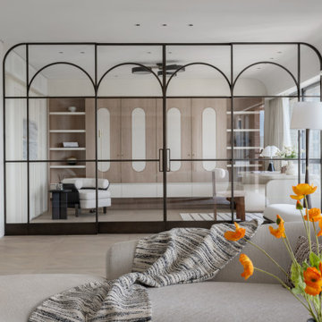
The Mid-Levels of Hong Kong Island is one of the most prominent luxury residential areas. This project - Estoril Court in Mid-Levels Central is one of the rare heritage mansions in Hong Kong with a "thousand-year lease," comprising a total of 240 units.
The young couple, with their two daughters, have settled here. For the wide experience husband, the most important aspect of a home is that it carries the "depth of love." His wife's preferences and the children's interests were frequently mentioned during this project. "I hope the design can break through conventions and avoid falling into the trap of popular but clichéd styles. Kyle and I resonate deeply on this point; we both pursue a 'more personal expression.' Family life should be relaxing, natural, and bringing joy to my family members."
This residence features a square layout and excellent natural lighting, with a practicality rate of nearly 90%. However, its over 40-year-old structure poses numerous constraints on renovations. Adhering to the existing structure and the wisdom of geomancy, Karv One Design has re-examined the relationship among the landscape, windows, and functional flow within the home. They have integrated practicality, beauty, and self-expression into every corner, enhancing the happiness of living.
Once stepping into the living room, you are greeted by Hong Kong's most spectacular vistas. The ever-changing scenery of Victoria Harbour, both day and night, the immense skyscrapers of different banks and commercial buildings and the panoramic views of the Peak are all within sight. The expansive dimensions of the living room are a response to the surrounding environment, providing ample space for family bonding and companionship, while also allowing the breathtaking skyline views to seamlessly integrate into daily life.
Unlike traditional whole-house decoration, the design of Hong Kong homes emphasizes collage and customization. The minimalist aesthetic of the space corresponds to the luxurious craftsmanship and time costs involved. Elements such as natural stone, artistic paint, parquet flooring, wood veneer, and leather have all been meticulously coordinated in terms of color and proportion, while a significant amount of storage space has been cleverly concealed within the walls.
The study room is deliberately positioned to one side of the living room, embracing the gentle stretch of sunlight. The arched iron partition, exuding a vintage flavor and traces of time, not only serves as a natural divider of space but also becomes a highlight of the interior decoration with its unique artistic form, creating a serene yet stylish atmosphere. It ensures privacy without compromising on openness, allowing the home owner to work in the study room while still keeping an eye on the children playing in the living room.
Custom-made artisanal furniture offers a whole new expression of comfort and practicality to the space. The Giorgetti HUG armchair combines a sculptural sense of form with a flowing sense of shape. When natural light filters in, a rich artistic atmosphere permeates and grows within, making the home a place of tranquility and peace of mind.
The fireplace plays a significant role in the dining room. In the warm climate of Hong Kong, the fireplace rarely serves a practical purpose; it is designed to create a cozy atmosphere for family gatherings. During the winter Christmas season, it will be adorned with gifts wrapped in beautiful paper, serving as a nostalgic reminder of memories and expressions of love.
The original open-plan layout of the master bedroom has been reconfigured and divided. The ultimate goal of the enclosed space is to provide comfort and ease of sleep. The pale green color is also carefully coordinated, focusing on creating a serene and pleasant atmosphere. The combination of "green," "wood," and "metal elements" is based on Feng Shui considerations, serving to stabilize and concentrate the energy flow.
The children's room is simple yet cozy, where sunlight awakens the space and transparent glass windows bring in the ocean view. The palette of pale blue and white adds warmth and vitality to the space, inspiring children's boundless imagination about the unknown world and giving them the courage to see mountains, seas, and the world beyond.
The unique, customized storage design is cleverly hidden within the space, blending handicraft and industrial design. Adorned with delicate textures such as rounded corners and layered elements, the craftsmanship is meticulous and exquisite, demonstrating exceptional ingenuity. It adds a sense of depth and artistry to the visual experience.
The lighting system in the space brings more enjoyable experiences to "living as you desire." The smart system caters to various states of living scenarios at different times, as well as to the subtle needs of ambient temperature, brightness, and tactile atmosphere. Whether it's solo time or family moments, day or night, everyone has a comfortable place to be.
The "Estoril Court" project is a full-service case that last for 12 months. We had hundreds of communications and exchanges with the home owner, and continuously coordinated and collaborated with the property management, on-site construction and installation workers, manufacturers, and various suppliers, striving for perfection in craftsmanship and meticulous attention to detail in execution. Finally, seeing the satisfied expressions of the home owner and their family, we felt that it was an ideal conveyance.
 Metropolitan Custom Homes
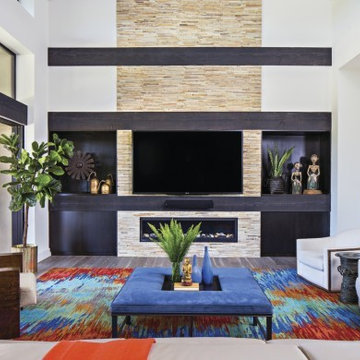
PRIMARY COLORS The Noakeses are not afraid of color, which found an outlet in the brilliant red, orange and blue of the Tufenkian Borealis Pacific Fire rug anchoring the living room. On the following spread, the homeowners’ art hangs on a dining room wall and is the soulmate to the living room rug’s deeply saturated colors as well as to the bright oranges in the wool and silk rug under the dining table.
Glamour is a driving force in the house, but it never overwhelms. As a backdrop in the dining room, golden Lori Weitzner wallpaper lines the display shelf where Perry and Suzy Noakes display treasures from their travels.
In the kitchen, a grouping of seeded blown glass cylinder pendants illuminates Bright Group stools and a generously proportioned island that’s big enough to seat eight guests.
The entry’s bright-red lacquered console is a place for the homeowners’ Buddha collection to get attention.
Pieces from Laura Britt’s sustainable furniture line Vervano populate the bedroom, including the Noakeses use for media storage.
Pieces from Laura Britt’s sustainable furniture line Vervano populate the bedroom, including the chair underneath the windows
The gray theme continues in the master bath, where vein-cut travertine slabs on the floor set off the sculptural flair of the bathtub.
“Homes didn’t mean anything to us,” says Perry Noakes, “except as a place to put our keys and get ready for the next journey.” The retired high-tech company executive and his wife, Suzy, are avid globe-trotters. The couple had also lived in Asia for 15 years as part of Perry’s work. Finding a place to live was a well-rehearsed exercise that figured into their system for settling in to a foreign country. But all that changed when Perry and Suzy decided to downsize to a new house in Austin. A friend told them about a spec house under construction, the project of a dream team of Austin-based design professionals that included builder Keith Husbands, architect Bob Wetmore of Cornerstone Architects, and interior designer Laura Britt and her staff. “We went to see it,” says Perry, “and loved it.” The couple quickly bought the framed-out 5,800-square-foot building.
The fact that the two-story dwelling was near a golf course was a bonus for the two golfers, but the low-slung four-bedroom, four-bath house also backs up onto a nature preserve. “The land offered us great opportunity to nestle the house into the topography, giving us both privacy and stunning views,” says Wetmore, who had to negotiate his design for the native stone, stucco and metal house to fit onto the steeply sloping and oddly elongated lot. The Hill Country contemporary house stretches out just below the rim of the slope, comfortably settled into the topography courtesy of terraced landscaping that defines the front approach to the house. “We turned a negative into a positive,” says Wetmore about the difficult site. The rough-and-ready landscape accounts for the building’s quiet dynamics, which Wetmore chronicled with the roofline, a series of horizontal areas that correspond to transitional spaces inside, interrupted by a clerestory that caps the entry and living room.
The process of taking a house from the framing stage to completion was a new experience for the couple. “We had never participated in the building process,” says Suzy. They threw themselves into it as if it were just another one of their adventures. “I think of it as my first project after I retired,” says Perry.
The budding design enthusiast so endeared himself to Britt that she and her staff awarded him with a beret to wear to design meetings, in honor of his artistic verve. “We were able to redesign a lot of the house since we came into the process so early,” says Suzy. “The house started as a spec house,” says Britt, “but it quickly became a custom home with the Noakeses’ involvement.”
Britt started the process by helping the couple select materials and lighting, opting for an earthy glamour that became the touchstone of the house. For pure wow factor, the living room’s stone and steel fireplace—sliced horizontally by three massive wood beams—is a tour de force of drama. In the kitchen, an oversize island (big enough to seat eight) is topped with a slab of dramatically veined marble; the countertops are a quieter quartzite. In the master bath, bold vein-cut travertine pavers on the floor are a counterpoint to the linear-cut mosaic tiles that back the vanity and reach all the way to the skylit ceiling. The pièce de résistance is the shimmering white pebble wall behind the free-standing tub that creates the effect of water frozen in free fall.
Britt used contrast as a backdrop to all the drama, opting for a forged metal chandelier in the shape of a lotus leaf in the entry—a worthy match to the darkened-steel front door. She designed a dining room table (through Vervano, her furniture design company) topped with patinaed steel; overhead, a massive steel-framed drum pendant with mica panels casts a delicate glow over the room. The designer was careful to leave wall space for the homeowners’ art collection, as well as to add space wherever possible. The dining room’s asymmetrical built-in is a place to display Buddhas and other pieces the couple has collected in their travels.
“We wanted this house to be about us and who we are,” says Suzy. That’s understandable since, after 16 previous homes that were really just places to live, the freedom of expression is obviously a thrill. Maybe even too much of a thrill—although this house is the couple’s dream home, they were completely enthralled with the design process. Could house No. 17 be the best and last? Maybe not. But if there is another house in the Noakeses’ future, one thing is certain, says Perry: “We won’t make a move without consulting Laura first.”
https://modernluxury.com/interiors-texas/story/smooth-move
 Cape Associates, Inc.
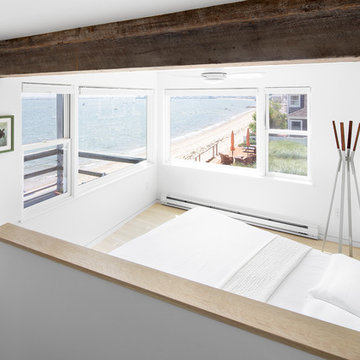
This 1,200 square-foot Provincetown condominium lives large, both functionally and aesthetically, thanks to its recent renovation. The waterfront home, overlooking Cape Cod Bay, is part of an historic grouping of three individual buildings on Commercial Street that have been combined into condominiums.
Begun in November 2014 and completed just in time for summer in May 2016, b Architecture Studios and Cape Associates Builders worked with a budget of $366,000 to transform this prosaic dwelling into a stunning light-flooded space—designed to maximize both the living space and the mesmerizing views of the bay.
“The space was totally reconfigured,” said project manager Jon Ziperman. “It was a total gut job requiring leveling of floors, straightening of walls, removing a chimney and fireplace that ran up to the above neighbors’ unit.” The renovation also required a complete rewiring and plumbing system that involved wires and pipes that were integrated into the surrounding units. From wall to wall and floor to ceiling, there was nothing that could be salvaged from the original space.
One of the most prominent changes was moving the stairway from its original placement, where it originally broke up the living and dining space and blocked views to the bay beyond. The stairway now sits on the opposite side of the condominium. With the stairs tucked to the left side of the living area, the sightline now extends from the entry straight through the living and dining areas to the water. The new design allowed for storage space beneath the stairs, which lead to an airy sleeping loft, and room for a desk niche. A light well, where the former sleeping area was, and new windows bring abundant natural light to the central living area.
Innovative features in the entry room include a Murphy bed and sliding glass door separating it from the living area, so that the space can double as a guest room.
“The Murphy bed fit in nicely, allowing for a flush wall at the entry/guest room and a desk niche in the adjacent room,” Brown said. “Convincing the client to create the wrap-around chair rail, lined up with the divided lights of the sliding glass door, makes a purposeful connection in a small space.”
Neolith countertops in the open kitchen and details like the flush minimal baseboard contribute to the sleek, modern aesthetic, now complemented by the owner’s contemporary furnishings. This complete renovation has rendered this compact home worthy of its beautiful setting.
 Cape Associates, Inc.
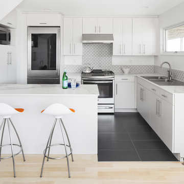
This 1,200 square-foot Provincetown condominium lives large, both functionally and aesthetically, thanks to its recent renovation. The waterfront home, overlooking Cape Cod Bay, is part of an historic grouping of three individual buildings on Commercial Street that have been combined into condominiums.
Begun in November 2014 and completed just in time for summer in May 2016, b Architecture Studios and Cape Associates Builders worked with a budget of $366,000 to transform this prosaic dwelling into a stunning light-flooded space—designed to maximize both the living space and the mesmerizing views of the bay.
“The space was totally reconfigured,” said project manager Jon Ziperman. “It was a total gut job requiring leveling of floors, straightening of walls, removing a chimney and fireplace that ran up to the above neighbors’ unit.” The renovation also required a complete rewiring and plumbing system that involved wires and pipes that were integrated into the surrounding units. From wall to wall and floor to ceiling, there was nothing that could be salvaged from the original space.
One of the most prominent changes was moving the stairway from its original placement, where it originally broke up the living and dining space and blocked views to the bay beyond. The stairway now sits on the opposite side of the condominium. With the stairs tucked to the left side of the living area, the sightline now extends from the entry straight through the living and dining areas to the water. The new design allowed for storage space beneath the stairs, which lead to an airy sleeping loft, and room for a desk niche. A light well, where the former sleeping area was, and new windows bring abundant natural light to the central living area.
Innovative features in the entry room include a Murphy bed and sliding glass door separating it from the living area, so that the space can double as a guest room.
“The Murphy bed fit in nicely, allowing for a flush wall at the entry/guest room and a desk niche in the adjacent room,” Brown said. “Convincing the client to create the wrap-around chair rail, lined up with the divided lights of the sliding glass door, makes a purposeful connection in a small space.”
Neolith countertops in the open kitchen and details like the flush minimal baseboard contribute to the sleek, modern aesthetic, now complemented by the owner’s contemporary furnishings. This complete renovation has rendered this compact home worthy of its beautiful setting.
Sponsored
Sunbury, OH

J.Holderby - Renovations
Franklin County's Leading General Contractors - 2X Best of Houzz!
 RWH Architect PLLC
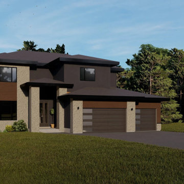
The Whistle Hill Lot 9 Residence is a defining example of RWH Architect’s vision for a new architectural era in Southern New Hampshire. With its bold geometry, refined material palette, and thoughtfully layered rooflines, this home embodies contemporary living while setting a fresh design standard for the region.
From the moment you approach the residence, the interplay of stone accents, vertical elements, and expansive windows establishes a striking yet inviting presence. Inside, a two-story entryway welcomes guests with light and volume, introducing an interior designed for both comfort and sophistication. The open-concept first floor seamlessly integrates the kitchen, great room, and dining/breakfast area, all flowing naturally toward a covered patio that extends the living space outdoors. A walk-in pantry, a private den, and a mudroom with built-in bench and hooks—conveniently located off the two-car attached garage, one bay featuring an oversized door—enhance the home’s functional rhythm. An expansive basement provides room for future recreation or storage, ensuring the home continues to evolve with the family who lives in it.
The second floor hosts four well-proportioned bedrooms, including a master suite designed as a private retreat. The suite features a generous walk-in closet and a luxurious soaking tub, paired with thoughtfully arranged natural light to create a sense of calm and rejuvenation. Two full bathrooms and one half bathroom support the needs of modern family living while maintaining architectural cohesion throughout the home.
Designing this residence presented several challenges that ultimately pushed the architectural expression forward. One key challenge was blending multiple rooflines into a unified modern aesthetic without losing the clarity of the home’s form. RWH resolved this by composing a series of carefully layered planes, each one calibrated to complement the others, resulting in a dynamic yet harmonious silhouette. Another challenge involved balancing the mix of exterior materials—such as stone, horizontal siding, and broad window openings—while maintaining a sense of order and visual stability. This was achieved by aligning materials with structural elements and strengthening vertical features, creating rhythm and cohesion across the façade. A further challenge was delivering an open, light-filled interior despite the structural demands of a two-story entry and several cantilevered forms. RWH overcame this through advanced framing techniques and discreet structural steel placement, allowing for expansive glazing and generous interior spans while preserving the home’s clean, uncluttered aesthetic.
The Whistle Hill Lot 9 Residence stands as a testament to forward-thinking residential design and the evolution of architectural expectations in the area. Through innovative solutions, intentional detailing, and a commitment to elevating everyday living, RWH Architect has created a home that not only meets the needs of modern families but also sets a new benchmark for contemporary architecture in the region.
 RWH Architect PLLC
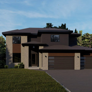
The Whistle Hill Lot 9 Residence is a defining example of RWH Architect’s vision for a new architectural era in Southern New Hampshire. With its bold geometry, refined material palette, and thoughtfully layered rooflines, this home embodies contemporary living while setting a fresh design standard for the region.
From the moment you approach the residence, the interplay of stone accents, vertical elements, and expansive windows establishes a striking yet inviting presence. Inside, a two-story entryway welcomes guests with light and volume, introducing an interior designed for both comfort and sophistication. The open-concept first floor seamlessly integrates the kitchen, great room, and dining/breakfast area, all flowing naturally toward a covered patio that extends the living space outdoors. A walk-in pantry, a private den, and a mudroom with built-in bench and hooks—conveniently located off the two-car attached garage, one bay featuring an oversized door—enhance the home’s functional rhythm. An expansive basement provides room for future recreation or storage, ensuring the home continues to evolve with the family who lives in it.
The second floor hosts four well-proportioned bedrooms, including a master suite designed as a private retreat. The suite features a generous walk-in closet and a luxurious soaking tub, paired with thoughtfully arranged natural light to create a sense of calm and rejuvenation. Two full bathrooms and one half bathroom support the needs of modern family living while maintaining architectural cohesion throughout the home.
Designing this residence presented several challenges that ultimately pushed the architectural expression forward. One key challenge was blending multiple rooflines into a unified modern aesthetic without losing the clarity of the home’s form. RWH resolved this by composing a series of carefully layered planes, each one calibrated to complement the others, resulting in a dynamic yet harmonious silhouette. Another challenge involved balancing the mix of exterior materials—such as stone, horizontal siding, and broad window openings—while maintaining a sense of order and visual stability. This was achieved by aligning materials with structural elements and strengthening vertical features, creating rhythm and cohesion across the façade. A further challenge was delivering an open, light-filled interior despite the structural demands of a two-story entry and several cantilevered forms. RWH overcame this through advanced framing techniques and discreet structural steel placement, allowing for expansive glazing and generous interior spans while preserving the home’s clean, uncluttered aesthetic.
The Whistle Hill Lot 9 Residence stands as a testament to forward-thinking residential design and the evolution of architectural expectations in the area. Through innovative solutions, intentional detailing, and a commitment to elevating everyday living, RWH Architect has created a home that not only meets the needs of modern families but also sets a new benchmark for contemporary architecture in the region.
 Cape Associates, Inc.
This 1,200 square-foot Provincetown condominium lives large, both functionally and aesthetically, thanks to its recent renovation. The waterfront home, overlooking Cape Cod Bay, is part of an historic grouping of three individual buildings on Commercial Street that have been combined into condominiums.
Begun in November 2014 and completed just in time for summer in May 2016, b Architecture Studios and Cape Associates Builders worked with a budget of $366,000 to transform this prosaic dwelling into a stunning light-flooded space—designed to maximize both the living space and the mesmerizing views of the bay.
“The space was totally reconfigured,” said project manager Jon Ziperman. “It was a total gut job requiring leveling of floors, straightening of walls, removing a chimney and fireplace that ran up to the above neighbors’ unit.” The renovation also required a complete rewiring and plumbing system that involved wires and pipes that were integrated into the surrounding units. From wall to wall and floor to ceiling, there was nothing that could be salvaged from the original space.
One of the most prominent changes was moving the stairway from its original placement, where it originally broke up the living and dining space and blocked views to the bay beyond. The stairway now sits on the opposite side of the condominium. With the stairs tucked to the left side of the living area, the sightline now extends from the entry straight through the living and dining areas to the water. The new design allowed for storage space beneath the stairs, which lead to an airy sleeping loft, and room for a desk niche. A light well, where the former sleeping area was, and new windows bring abundant natural light to the central living area.
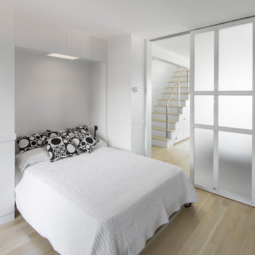
Innovative features in the entry room include a Murphy bed and sliding glass door separating it from the living area, so that the space can double as a guest room.
“The Murphy bed fit in nicely, allowing for a flush wall at the entry/guest room and a desk niche in the adjacent room,” Brown said. “Convincing the client to create the wrap-around chair rail, lined up with the divided lights of the sliding glass door, makes a purposeful connection in a small space.”
Neolith countertops in the open kitchen and details like the flush minimal baseboard contribute to the sleek, modern aesthetic, now complemented by the owner’s contemporary furnishings. This complete renovation has rendered this compact home worthy of its beautiful setting.
30