
Search results for "Location prints" in Home Design Ideas

 RAJ Kitchen and Bath, LLC
**Check out the video of this transformation on our website**
This small kitchen was way too small for this 2 bedrooms, 2 bathrooms apartment. Not only was it a very small kitchen, but the physical location of it made it very difficult to make it any bigger. There wasn't much that could have been done without incurring astronomical cost, which would get little or no return on the investment. The client wanted a kitchen that can be optimized in its current location to add a ton of value for resale.
This was difficult to do, because there was no moving of any mechanical around in the kitchen and even if we wanted to, the management of the building would not allow. For those of you who live in condos, co-ops or apartment building, you know how difficult it is to rework these foot prints. When we showed up, we saw the problems, but we also saw a huge opportunity where we can achieve those goals in the small space. This was accomplished by making some key changes and to incorporate some new things that was not possible when this kitchen was built years ago.
The crucial part of the design that would drive the entire new layout, was selecting the only appliance; that was the Refrigerator. Once we nailed down that refrigerator, we then proceeded to design the kitchen around it. We moved it to the other side of the wall where the sink was so that we can tap into the water line from the sink plumbing. It was crucial that it stays exactly 24" deep, not an inch more because we had to keep the entry as open as possible. Also, it was going to be directly in front of another big storage unit - The pantry. It is not ideal in most cases, but we needed the rest of the space to ramp up the design and open feel towards the side where all of the activities would take place, which happend to be the dining room and the view.
Once all that was figured out, we re-positioned the sink, dishwasher and the range and proceeded to wrap the cabinets around the columns to integrate them into the space. Thirty- six inches cabinets height was used so that they can be installed higher towards the ceiling height to give more room rather than the standard 18" required height between the counter tops. This was done to make the room feel a lot bigger than it really was. Not to mention, we also didn't want the faucet to be buried under the cabinets so that was also a necessary design detail for the space.
We then lowered both knee walls so that the counter top can sit on top of them, by removing that stop point that would have otherwise defined the kitchen area. This allowed us to pick up that extra footprint into the room for added prep space and enabled us to create the illusion of a kitchen that is looking longer than it really is. Every inch mattered when designing this kitchen and we made a conscious decision to use every one of that inch.
White cabinets were selected to do just what white cabinets are design to do; make a small or dark room appear bigger, brighter and more open. In this kitchen, this was amplified the more because of the kitchen location. It was perfect! We knew we did justice to the space because while we were there taking some photos, a few potential buyers walked in and went straight for the kitchen! They said its design just to fit the apartment.
Pantry roll out shelving, Double recycle bin, fancy handles, LED lighting, Quartz counter top, beautiful backslash tiles and grey linen floors finished off the kitchen which looked over a beautiful view of the George Washington Bridge from the top of this lovely 4th floor apartment.
Credit to Masterpiece Tile and Marble (Annmarie on the selection of Tiles and countertop and Val on the Construction to complete this project).
Davor Kokic Photography

 Maraya Interior Design
Old world Spanish Villa with deep, thick plaster walls and groin vaults. Arches are plentiful, along with views of the Thousand Oaks and Westlake valley. This comfortable home is designed for a wonderful, fun family with two children. The place of many gatherings of friends and family, it radiates a warmth and love of good times with great friends. Deep rich blues, aqua and terra cotta colors throughout this home, with travertine versaille patterned floors.
Deep loggia and patios all around the home take advantage of all the mountain and valley views, while keeping the family and friends warm in cooler times. The entire sprawling villa is wrapped around an inside patio with a fountain and hand made Malibu Tile pots. All furniture is hand made, from distressed and rustic tables to custom upholstery in jewel tones. A built in bar for entertaining in the great room, a very large family room with deep blue fabric wrap around sofa, hand knotted rugs in the living room, master bedroom and family room. A master suite with light creamy white walls, a plaster fireplace and a metal poster bed looks through a sitting room with turquoise accents. The home has 6 fireplaces, of which three are outside, some carved in limestone, others in spanish plaster.
Designed by Maraya Interior Design. From their beautiful resort town of Ojai, they serve clients in Montecito, Hope Ranch, Malibu, Westlake and Calabasas, across the tri-county areas of Santa Barbara, Ventura and Los Angeles, south to Hidden Hills- north through Solvang and more. Patrick Price photography

 Stephanie Kraus Designs, LLC
Kyle Born Photography
Inspiration for a transitional family room remodel in Philadelphia
Inspiration for a transitional family room remodel in Philadelphia
Find the right local pro for your project
 RAJ Kitchen and Bath, LLC
**Check out the video of this transformation on our website**
This small kitchen was way too small for this 2 bedrooms, 2 bathrooms apartment. Not only was it a very small kitchen, but the physical location of it made it very difficult to make it any bigger. There wasn't much that could have been done without incurring astronomical cost, which would get little or no return on the investment. The client wanted a kitchen that can be optimized in its current location to add a ton of value for resale.
This was difficult to do, because there was no moving of any mechanical around in the kitchen and even if we wanted to, the management of the building would not allow. For those of you who live in condos, co-ops or apartment building, you know how difficult it is to rework these foot prints. When we showed up, we saw the problems, but we also saw a huge opportunity where we can achieve those goals in the small space. This was accomplished by making some key changes and to incorporate some new things that was not possible when this kitchen was built years ago.
The crucial part of the design that would drive the entire new layout, was selecting the only appliance; that was the Refrigerator. Once we nailed down that refrigerator, we then proceeded to design the kitchen around it. We moved it to the other side of the wall where the sink was so that we can tap into the water line from the sink plumbing. It was crucial that it stays exactly 24" deep, not an inch more because we had to keep the entry as open as possible. Also, it was going to be directly in front of another big storage unit - The pantry. It is not ideal in most cases, but we needed the rest of the space to ramp up the design and open feel towards the side where all of the activities would take place, which happend to be the dining room and the view.
Once all that was figured out, we re-positioned the sink, dishwasher and the range and proceeded to wrap the cabinets around the columns to integrate them into the space. Thirty- six inches cabinets height was used so that they can be installed higher towards the ceiling height to give more room rather than the standard 18" required height between the counter tops. This was done to make the room feel a lot bigger than it really was. Not to mention, we also didn't want the faucet to be buried under the cabinets so that was also a necessary design detail for the space.
We then lowered both knee walls so that the counter top can sit on top of them, by removing that stop point that would have otherwise defined the kitchen area. This allowed us to pick up that extra footprint into the room for added prep space and enabled us to create the illusion of a kitchen that is looking longer than it really is. Every inch mattered when designing this kitchen and we made a conscious decision to use every one of that inch.
White cabinets were selected to do just what white cabinets are design to do; make a small or dark room appear bigger, brighter and more open. In this kitchen, this was amplified the more because of the kitchen location. It was perfect! We knew we did justice to the space because while we were there taking some photos, a few potential buyers walked in and went straight for the kitchen! They said its design just to fit the apartment.
Pantry roll out shelving, Double recycle bin, fancy handles, LED lighting, Quartz counter top, beautiful backslash tiles and grey linen floors finished off the kitchen which looked over a beautiful view of the George Washington Bridge from the top of this lovely 4th floor apartment.
Credit to Masterpiece Tile and Marble (Annmarie on the selection of Tiles and countertop and Val on the Construction to complete this project).
Davor Kokic Photography


 Joel Reis Architecture and Real Estate Photography
Bathroom - mid-sized farmhouse master gray tile and marble tile bathroom idea in Los Angeles with recessed-panel cabinets, distressed cabinets, white walls, an undermount sink, marble countertops and white countertops


 Custom Design & Construction
This Transitional Whole Home Remodel required that the interior of the home be gutted in order to create the open concept kitchen / great room. The floors, walls and roofs were all reinsulated. The exterior was also updated with new stucco, paint and roof. Note the craftsman style front door in black! We also updated the plumbing, electrical and mechanical. The location and size of the new windows were all optimized for lighting. Adding to the homes new look are Louvered Shutters on all of the windows. The homeowners couldn’t be happier with their NEW home!
The kitchen features white shaker cabinet doors and Torquay Cambria countertops. White subway tile is warmed by the Dark Oak Wood floor. The home office space was customized for the homeowners. It features white shaker style cabinets and a custom built-in desk to optimize space and functionality. The master bathroom features DeWils cabinetry in walnut with a shadow gray stain. The new vanity cabinet was specially designed to offer more storage. The stylistic niche design in the shower runs the entire width of the shower for a modernized and clean look. The same Cambria countertop is used in the bathrooms as was used in the kitchen. "Natural looking" materials, subtle with various surface textures in shades of white and gray, contrast the vanity color. The shower floor is Stone Cobbles while the bathroom flooring is a white concrete looking tile, both from DalTile. The Wood Looking Shower Tiles are from Arizona Tile. The hall or guest bathroom features the same materials as the master bath but also offers the homeowners a bathtub. The laundry room has white shaker style custom built in tall and upper cabinets. The flooring in the laundry room matches the bathroom flooring.
 Custom Design & Construction
This Transitional Whole Home Remodel required that the interior of the home be gutted in order to create the open concept kitchen / great room. The floors, walls and roofs were all reinsulated. The exterior was also updated with new stucco, paint and roof. Note the craftsman style front door in black! We also updated the plumbing, electrical and mechanical. The location and size of the new windows were all optimized for lighting. Adding to the homes new look are Louvered Shutters on all of the windows. The homeowners couldn’t be happier with their NEW home!
The kitchen features white shaker cabinet doors and Torquay Cambria countertops. White subway tile is warmed by the Dark Oak Wood floor. The home office space was customized for the homeowners. It features white shaker style cabinets and a custom built-in desk to optimize space and functionality. The master bathroom features DeWils cabinetry in walnut with a shadow gray stain. The new vanity cabinet was specially designed to offer more storage. The stylistic niche design in the shower runs the entire width of the shower for a modernized and clean look. The same Cambria countertop is used in the bathrooms as was used in the kitchen. "Natural looking" materials, subtle with various surface textures in shades of white and gray, contrast the vanity color. The shower floor is Stone Cobbles while the bathroom flooring is a white concrete looking tile, both from DalTile. The Wood Looking Shower Tiles are from Arizona Tile. The hall or guest bathroom features the same materials as the master bath but also offers the homeowners a bathtub. The laundry room has white shaker style custom built in tall and upper cabinets. The flooring in the laundry room matches the bathroom flooring.

 ASR DESIGN STUDIO
Our mission was to create an ocean and California lifestyle-inspired space that would invite consistent clicks, bookings and five-star reviews.
To make the most of the great location, we designed Project 11 for travelling singles and couples searching for a cozy and welcoming condo within walking distance to downtown San Diego.
Project 11 would also be used by our clients when it was unoccupied, so it had to be practical, functional and beautiful, too.
Our clients had a limited budget, so we got thrifty and sourced furnishings from Target, Ikea, Amazon and Etsy.
The oversized art prints – which set the tone for our relaxing and soothing beachy theme – were hunted down and found at Etsy of California Lifestyle.
We made the most of layers, colors and texture to create spaces that conjured calming ocean vibes and felt wholeheartedly welcoming.
We couldn’t repaint the walls, but they gave us a neutral color palette to work with. We built on it by adding in pops of color while maintaining a minimalist approach to understated style.
Then we had some fun and added in cute touches like Cali and San Diego inspired mugs, an adorable Kerig to tie in the colors of the ocean again, a swivel chair to view the sunrise and sunset and a totally pimped-out kitchen with all the cooking accessories a guest would need to feel at home in Project 11.
By the time we were done, we were tempted to scoop up the first available booking for ourselves!
Finally, we invested our energy in designing for effortless functionality so our client’s guests had everything they needed during their stay.
Photography: Meg Marie


 Simply Home Decorating
This beautiful North Vancouver home belongs to a nature-loving and health-conscious couple, Emma and Vince (names changed), their two young children, and their dog, Jasper. When they contacted us about renovating and furnishing their kitchen and family room, we walked in and saw a world of potential waiting to be uncovered.
Before: Larkhall Crescent Home:
Like many original North Vancouver homes, the interior was definitely dated. We encountered late ‘80s finishes in powder pink and teal green, old carpet, and a kitchen that wasn’t maximized to suit this family’s modern-day lifestyle. However, the size of the rooms offered us a ton of space with which to get creative.
Knowing our clients’ love of cooking, need for work spaces (Emma and Vince both work remotely), and growing family, we developed a design concept that would increase usable space, optimize storage, and create intimacy in this large area. As for the style, we were inspired by their European roots, inventing a new and modern take on “Belgian Farmhouse” style. Now, the home is truly one-of-a-kind.
After: Warm & Cozy Family Room:
Fresh, bright, and comfortable, this living area has been transformed! We started with the fireplace as a focal point, selecting aged brick tiles for added texture and a crisp wood mantle. The taupe-coloured sectional infuses the room with visual warmth and serves the added purpose of separating the family room from the kitchen.
Emma and Vince were also keen on using non-toxic materials in their home, and we were happy to oblige. To meet their needs, we sourced natural wood elements and sought out Canadian-made products - that adhere to high health standards - whenever possible.
Look closer at the elements of this space, and you will find this stunning, honeycomb-patterned rug in earthy gold, beige, and charcoal tones. It’s plush to the touch and full of visual texture that brings this room’s colour palette together. We sourced these two-tone chairs with caning, petrified wood side table, black sconces, and botanical prints in greyscale from local artist, Heather Johnston.
We topped off the space with this dark wood and rattan console that offers storage facing the kitchen and presents an opportunity to display cherished items. The result is a cozy lounging space brimming with comfort and functionality. It’s perfect for enjoying quality family time, or Emma can simply slide the coffee table away to make room for her morning yoga practice.
Now, let’s turn around and give some attention to the kitchen. Do you remember what the original kitchen looked like? If not, scroll back up, because the transformation is shocking…
Moody & Welcoming Kitchen for Healthy Living:
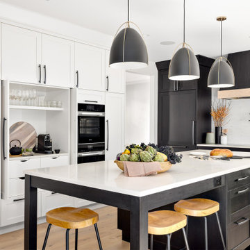
This kitchen looks very different from how it started, right? Though we didn’t touch any walls, the kitchen has almost doubled in usable space! We created a long, extended island with storage, an outlet for small appliances, and seating for comfortable prep, after-school snacking, or mingling among friends.
On the other side of the island, the family has even more storage and an integrated dishwasher within easy reach of the sink, perfect for quick clean-up. From this angle, you can also see the expansive custom Shaker cabinetry in white and the integrated double ovens. These facilitate their cooking experience and gave us the opportunity to add an additional surprise…
A coffee garage station and more hidden storage! Keeping these items located along the perimeter allows them to be accessed by the family or their guests without someone getting under the cook’s feet. These are the little details that make everyday life easier and more enjoyable.
Moving deeper into the kitchen, the seamless induction cooktop topped with a freestanding concealed hood fan commands attention in a soft yet prominent way. The natural wood accent mirrors the fireplace mantle, and the choice of off-black wood-grain cabinets not only continues our black-and-white colour palette but adds a sense of depth and contrast. The corner sink is located to the right and perfectly positioned with a view of their thriving backyard.
To invite more of this family’s character into the space, we mixed metals for interest — matte black, dark pewter, and warm brass — and created open shelves in white oak for their plants and decor. You can also glimpse the tumbled edge of the backsplash tile, which echoes the rustic brick of the fireplace. It adds that farmhouse charm while still feeling timeless and sophisticated.
Last but not least, we designed this dining banquette in the bay window (with integrated bench storage, of course), where the family can share a meal together, the kids can do homework, or Emma and Vince can work and enjoy a change of scenery from their offices. Like the other spaces in the home, it was designed to be beautiful, multi-functional, and long-lasting.
Praise from Our Clients:
It is clear that we love this home, but what did our clients have to say?
“Lori is a visionary and masters execution to the finest detail all at the same time. When she first met us to know more about who we are and how we live, she could right away envision how we could use the space in our kitchen and living room…The results exceeded our expectations.
Lori and her team were also a delight to work with — coordination with all the trades, fast problem-solving, regular updates, professional and friendly attitude of her entire team — made it the dream team. Thank you SHD for making our space so beautiful!”
In turn, we are so grateful for this family’s trust, their open communication, and for being wonderful people with whom to work. (So, thank you!)

 Whiski Kitchen Design Studio
In this 1905 Tudor home, the intent of this design was to take advantage of the classic architecture of the home and incorporate modern conveniences.
Located in the Joseph Berry Subdivision in Detroit, this stellar home presented several design challenges. The most difficult challenge to overcome was the 11” slope from one end of the kitchen to the other, caused by 110 years of settling. All new floor joists were installed and the floor by the side door was then recessed down one step. This created a cozy nook when you first enter the kitchen. A tiered ceiling with strategically planned cabinetry heights and crown molding concealed the slope of the walls at the ceiling level.
The second challenge in this historic home was the awkward foot print of the kitchen. It’s likely that this kitchen had a butler’s pantry originally. However it was remodeled sometime in the 70’s and all original character was erased. Clever pantry storage was added to an awkward corner creating a space that mimicked the essence of a butler’s pantry, while providing storage desired in kitchens today.
Keeping the large footprint of the kitchen presented obstacles with the working triangle; the distance from the sink to the cooktop is several feet. The solution was installation of a pot filler over the cooktop that added convenience and elegance (not sure about this word). Not everything in this project was a challenge; the discovery of a brick chimney hiding behind plaster was a welcome surprise and brought character back honoring the historic charm of this beautiful home.
Kitchen Designer: Rebekah Tull of Whiski Kitchen Design Studio
Remodeling Contractor: Renaissance Restorations, Inc.
Counter Top Fabricator: Lakeside Solid Surfaces - Cambria
Cabinetry: Legacy Crafted Cabinets
Photographer: Shermin Photography
Tile: TileBar.com
Tresco Undercabinet LED Lighting
Sponsored
Columbus, OH
Free consultation for landscape design!

Peabody Landscape Group
Columbus' Reliable Landscape Design & Contracting
 Whiski Kitchen Design Studio
In this 1905 Tudor home, the intent of this design was to take advantage of the classic architecture of the home and incorporate modern conveniences.
Located in the Joseph Berry Subdivision in Detroit, this stellar home presented several design challenges. The most difficult challenge to overcome was the 11” slope from one end of the kitchen to the other, caused by 110 years of settling. All new floor joists were installed and the floor by the side door was then recessed down one step. This created a cozy nook when you first enter the kitchen. A tiered ceiling with strategically planned cabinetry heights and crown molding concealed the slope of the walls at the ceiling level.
The second challenge in this historic home was the awkward foot print of the kitchen. It’s likely that this kitchen had a butler’s pantry originally. However it was remodeled sometime in the 70’s and all original character was erased. Clever pantry storage was added to an awkward corner creating a space that mimicked the essence of a butler’s pantry, while providing storage desired in kitchens today.
Keeping the large footprint of the kitchen presented obstacles with the working triangle; the distance from the sink to the cooktop is several feet. The solution was installation of a pot filler over the cooktop that added convenience and elegance (not sure about this word). Not everything in this project was a challenge; the discovery of a brick chimney hiding behind plaster was a welcome surprise and brought character back honoring the historic charm of this beautiful home.
Kitchen Designer: Rebekah Tull of Whiski Kitchen Design Studio
Remodeling Contractor: Renaissance Restorations, Inc.
Counter Top Fabricator: Lakeside Solid Surfaces - Cambria
Cabinetry: Legacy Crafted Cabinets
Photographer: Shermin Photography
Lighting: Rejuvenation
Tile: TileBar.com
 Thyme & Place Design LLC
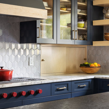
The client requested a kitchen that would not only provide a great space to cook and enjoy family meals but one that would fit in with her unique design sense. An avid collector of contemporary art, she wanted something unexpected in her 100-year-old home in both color and finishes but still providing a great layout with improved lighting, storage, and superior cooking abilities. The existing kitchen was in a closed off space trapped between the family room and the living. If you were in the kitchen, you were isolated from the rest of the house. Making the kitchen an integrated part of the home was a paramount request.
Step one, remove the wall separating the kitchen from the other rooms in the home which allowed the new kitchen to become an integrated space instead of an isolation room for the cook. Next, we relocated the pantry access which was in the family room to the kitchen integrating a poorly used recess which had become a catch all area which did not provide any usable space for storage or working area. To add valuable function in the kitchen we began by capturing unused "cubbies", adding a walk-in pantry from the kitchen, increasing the storage lost to un-needed drop ceilings and bring light and design to the space with a new large awning window, improved lighting, and combining interesting finishes and colors to reflect the artistic attitude of the client.
A bathroom located above the kitchen had been leaking into the plaster ceiling for several years. That along with knob and tube wiring, rotted beams and a brick wall from the back of the fireplace in the adjacent living room all needed to be brought to code. The walls, ceiling and floors in this 100+ year old home were completely out of level and the room’s foot print could not be increased.
The choice of a Sub-Zero wolf product is a standard in my kitchen designs. The quality of the product, its manufacturing and commitment to food preservation is the reason I specify Sub Zero Wolf. For the cook top, the integrated line of the contemporary cooktop and the signature red knobs against the navy blue of the cabinets added to the design vibe of the kitchen. The cooking performance and the large continuous grate on the cooktop makes it an obvious choice for a cook looking for a great cook top with professional results in a more streamlined profile. We selected a Sharp microwave drawer for the island, an XO wine refrigerator, Bosch dishwasher and Kitchen Aid double convection wall ovens to round out the appliance package.
A recess created by the fireplace was outfitted with a cabinet which now holds small appliances within easy reach of my very petite client. Natural maple accents were used inside all the wall cabinets and repeated on the front of the hood and for the sliding door appliance cabinet and the floating shelves. This allows a brighter interior for the painted cabinets instead of the traditional same interior as exterior finish choice. The was an amazing transformation from the old to the new.
The final touches are the honey bronze hardware from Top Knobs, Mitzi pendants from Hudson Valley Lighting group,
a fabulous faucet from Brizo. To eliminate the old freestanding bottled water cooler, we specified a matching water filter faucet.
 Simply Home Decorating
This beautiful North Vancouver home belongs to a nature-loving and health-conscious couple, Emma and Vince (names changed), their two young children, and their dog, Jasper. When they contacted us about renovating and furnishing their kitchen and family room, we walked in and saw a world of potential waiting to be uncovered.
Before: Larkhall Crescent Home:
Like many original North Vancouver homes, the interior was definitely dated. We encountered late ‘80s finishes in powder pink and teal green, old carpet, and a kitchen that wasn’t maximized to suit this family’s modern-day lifestyle. However, the size of the rooms offered us a ton of space with which to get creative.
Knowing our clients’ love of cooking, need for work spaces (Emma and Vince both work remotely), and growing family, we developed a design concept that would increase usable space, optimize storage, and create intimacy in this large area. As for the style, we were inspired by their European roots, inventing a new and modern take on “Belgian Farmhouse” style. Now, the home is truly one-of-a-kind.
After: Warm & Cozy Family Room:
Fresh, bright, and comfortable, this living area has been transformed! We started with the fireplace as a focal point, selecting aged brick tiles for added texture and a crisp wood mantle. The taupe-coloured sectional infuses the room with visual warmth and serves the added purpose of separating the family room from the kitchen.
Emma and Vince were also keen on using non-toxic materials in their home, and we were happy to oblige. To meet their needs, we sourced natural wood elements and sought out Canadian-made products - that adhere to high health standards - whenever possible.
Look closer at the elements of this space, and you will find this stunning, honeycomb-patterned rug in earthy gold, beige, and charcoal tones. It’s plush to the touch and full of visual texture that brings this room’s colour palette together. We sourced these two-tone chairs with caning, petrified wood side table, black sconces, and botanical prints in greyscale from local artist, Heather Johnston.
We topped off the space with this dark wood and rattan console that offers storage facing the kitchen and presents an opportunity to display cherished items. The result is a cozy lounging space brimming with comfort and functionality. It’s perfect for enjoying quality family time, or Emma can simply slide the coffee table away to make room for her morning yoga practice.
Now, let’s turn around and give some attention to the kitchen. Do you remember what the original kitchen looked like? If not, scroll back up, because the transformation is shocking…
Moody & Welcoming Kitchen for Healthy Living:
This kitchen looks very different from how it started, right? Though we didn’t touch any walls, the kitchen has almost doubled in usable space! We created a long, extended island with storage, an outlet for small appliances, and seating for comfortable prep, after-school snacking, or mingling among friends.
On the other side of the island, the family has even more storage and an integrated dishwasher within easy reach of the sink, perfect for quick clean-up. From this angle, you can also see the expansive custom Shaker cabinetry in white and the integrated double ovens. These facilitate their cooking experience and gave us the opportunity to add an additional surprise…
A coffee garage station and more hidden storage! Keeping these items located along the perimeter allows them to be accessed by the family or their guests without someone getting under the cook’s feet. These are the little details that make everyday life easier and more enjoyable.
Moving deeper into the kitchen, the seamless induction cooktop topped with a freestanding concealed hood fan commands attention in a soft yet prominent way. The natural wood accent mirrors the fireplace mantle, and the choice of off-black wood-grain cabinets not only continues our black-and-white colour palette but adds a sense of depth and contrast. The corner sink is located to the right and perfectly positioned with a view of their thriving backyard.
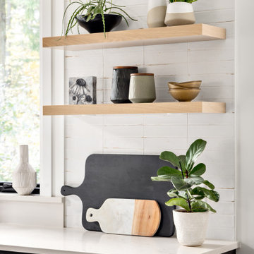
To invite more of this family’s character into the space, we mixed metals for interest — matte black, dark pewter, and warm brass — and created open shelves in white oak for their plants and decor. You can also glimpse the tumbled edge of the backsplash tile, which echoes the rustic brick of the fireplace. It adds that farmhouse charm while still feeling timeless and sophisticated.
Last but not least, we designed this dining banquette in the bay window (with integrated bench storage, of course), where the family can share a meal together, the kids can do homework, or Emma and Vince can work and enjoy a change of scenery from their offices. Like the other spaces in the home, it was designed to be beautiful, multi-functional, and long-lasting.
Praise from Our Clients:
It is clear that we love this home, but what did our clients have to say?
“Lori is a visionary and masters execution to the finest detail all at the same time. When she first met us to know more about who we are and how we live, she could right away envision how we could use the space in our kitchen and living room…The results exceeded our expectations.
Lori and her team were also a delight to work with — coordination with all the trades, fast problem-solving, regular updates, professional and friendly attitude of her entire team — made it the dream team. Thank you SHD for making our space so beautiful!”
In turn, we are so grateful for this family’s trust, their open communication, and for being wonderful people with whom to work. (So, thank you!)
 Jon Allen Fine Metal Art
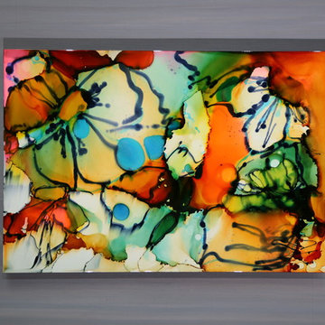
Tropics by Jon Allen is an abstract take on a nature inspired painting. It has a vaguely floral undertone but in very unexpected and delightful colors. Jon truly captures the spirit of the tropics with these beautiful, bright colors. Hand-painted on aluminum, this stunning abstract piece will complement any contemporary or modern, decor.
Number of Pieces: 1
Dimensions: 35" x 24" x 2" off the wall
Care & Cleaning: Clean with a soft cloth and plain soap & water
Other Features: Hardware is pre-installed for simple hanging and art will “float” 2” off the wall
Sponsored
Columbus, OH
Free consultation for landscape design!
Peabody Landscape Group
Columbus' Reliable Landscape Design & Contracting
 Marvin
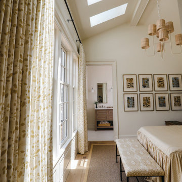
The 2021 Southern Living Idea House is inspiring on multiple levels—from the stunning location in Louisville, Kentucky overlooking the Ohio river, to the design-driven home that marries European countryside vibes with a timeless aesthetic. Dubbed the “forever home,” the concept was to design for all stages of life, with thoughtful spaces that meet the ever-evolving needs of families today.
The 5,545-square-foot, Colonial Greek Revival Cottage-style home is located in The Breakers at Prospect community and is the collective effort of many. While it may have formerly been a trend to embrace open layout living spaces, following the pandemic families are seeking spaces in the home that feel separated, to allow for privacy. Rooms with clear intentions allow more options for areas in which to spend time, depending on your mood, and this home perfectly balances livable and lively ideas.
Marvin products were chosen for this project to maximize the use of natural light, allow airflow from outdoors to indoors, and provide expansive views that overlook the Ohio River.
MARVIN PRODUCTS USED:
Marvin Awaken Skylight
Marvin Ultimate Casement Window
Marvin Ultimate Double Hung G2 Window
Marvin Ultimate Picture Window
Marvin Ultimate Direct Glaze Round Top Window
Marvin Ultimate Swinging French Door G2
BUILDER: Jason Black and Jimmy King of Artisan Signature Homes
ARCHITECT: Brandon Ingram of C. Brandon Ingram Design
INTERIOR DESIGNER: Sarah Bartholomew, Sarah Bartholomew Design
LANDSCAPE ARCHITECT: Josh Myers of Myers & Co. Landscape Architecture
PHOTOGRAPHY: Laurey W. Glenn, Marta Xochilt Perez, and Kriech-Higdon Photography for Southern Living

 Concetti
Custom millwork and layers of lighting bring an abundance of sophisticated charm without ever sacrificing functionality. A standout feature is the custom built-in bookshelves complete with a bench seat for the daughter to indulge her love of reading. The rich colors and crisp patterns create a unique yet timeless space.
 ASR DESIGN STUDIO
Our mission was to create an ocean and California lifestyle-inspired space that would invite consistent clicks, bookings and five-star reviews.
To make the most of the great location, we designed Project 11 for travelling singles and couples searching for a cozy and welcoming condo within walking distance to downtown San Diego.
Project 11 would also be used by our clients when it was unoccupied, so it had to be practical, functional and beautiful, too.
Our clients had a limited budget, so we got thrifty and sourced furnishings from Target, Ikea, Amazon and Etsy.
The oversized art prints – which set the tone for our relaxing and soothing beachy theme – were hunted down and found at Etsy of California Lifestyle.
We made the most of layers, colors and texture to create spaces that conjured calming ocean vibes and felt wholeheartedly welcoming.
We couldn’t repaint the walls, but they gave us a neutral color palette to work with. We built on it by adding in pops of color while maintaining a minimalist approach to understated style.
Then we had some fun and added in cute touches like Cali and San Diego inspired mugs, an adorable Kerig to tie in the colors of the ocean again, a swivel chair to view the sunrise and sunset and a totally pimped-out kitchen with all the cooking accessories a guest would need to feel at home in Project 11.
By the time we were done, we were tempted to scoop up the first available booking for ourselves!
Finally, we invested our energy in designing for effortless functionality so our client’s guests had everything they needed during their stay.
Photography: Meg Marie
92