
Search results for "Location prints" in Home Design Ideas


 RAJ Kitchen and Bath, LLC
**Check out the video of this transformation on our website**
This small kitchen was way too small for this 2 bedrooms, 2 bathrooms apartment. Not only was it a very small kitchen, but the physical location of it made it very difficult to make it any bigger. There wasn't much that could have been done without incurring astronomical cost, which would get little or no return on the investment. The client wanted a kitchen that can be optimized in its current location to add a ton of value for resale.
This was difficult to do, because there was no moving of any mechanical around in the kitchen and even if we wanted to, the management of the building would not allow. For those of you who live in condos, co-ops or apartment building, you know how difficult it is to rework these foot prints. When we showed up, we saw the problems, but we also saw a huge opportunity where we can achieve those goals in the small space. This was accomplished by making some key changes and to incorporate some new things that was not possible when this kitchen was built years ago.
The crucial part of the design that would drive the entire new layout, was selecting the only appliance; that was the Refrigerator. Once we nailed down that refrigerator, we then proceeded to design the kitchen around it. We moved it to the other side of the wall where the sink was so that we can tap into the water line from the sink plumbing. It was crucial that it stays exactly 24" deep, not an inch more because we had to keep the entry as open as possible. Also, it was going to be directly in front of another big storage unit - The pantry. It is not ideal in most cases, but we needed the rest of the space to ramp up the design and open feel towards the side where all of the activities would take place, which happend to be the dining room and the view.
Once all that was figured out, we re-positioned the sink, dishwasher and the range and proceeded to wrap the cabinets around the columns to integrate them into the space. Thirty- six inches cabinets height was used so that they can be installed higher towards the ceiling height to give more room rather than the standard 18" required height between the counter tops. This was done to make the room feel a lot bigger than it really was. Not to mention, we also didn't want the faucet to be buried under the cabinets so that was also a necessary design detail for the space.
We then lowered both knee walls so that the counter top can sit on top of them, by removing that stop point that would have otherwise defined the kitchen area. This allowed us to pick up that extra footprint into the room for added prep space and enabled us to create the illusion of a kitchen that is looking longer than it really is. Every inch mattered when designing this kitchen and we made a conscious decision to use every one of that inch.
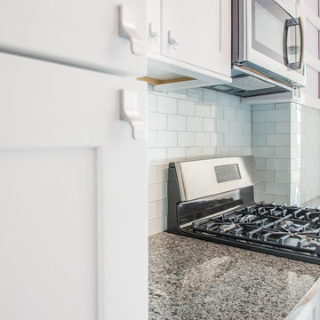
White cabinets were selected to do just what white cabinets are design to do; make a small or dark room appear bigger, brighter and more open. In this kitchen, this was amplified the more because of the kitchen location. It was perfect! We knew we did justice to the space because while we were there taking some photos, a few potential buyers walked in and went straight for the kitchen! They said its design just to fit the apartment.
Pantry roll out shelving, Double recycle bin, fancy handles, LED lighting, Quartz counter top, beautiful backslash tiles and grey linen floors finished off the kitchen which looked over a beautiful view of the George Washington Bridge from the top of this lovely 4th floor apartment.
Credit to Masterpiece Tile and Marble (Annmarie on the selection of Tiles and countertop and Val on the Construction to complete this project).
Davor Kokic Photography
 Simply Home Decorating
This beautiful North Vancouver home belongs to a nature-loving and health-conscious couple, Emma and Vince (names changed), their two young children, and their dog, Jasper. When they contacted us about renovating and furnishing their kitchen and family room, we walked in and saw a world of potential waiting to be uncovered.
Before: Larkhall Crescent Home:
Like many original North Vancouver homes, the interior was definitely dated. We encountered late ‘80s finishes in powder pink and teal green, old carpet, and a kitchen that wasn’t maximized to suit this family’s modern-day lifestyle. However, the size of the rooms offered us a ton of space with which to get creative.
Knowing our clients’ love of cooking, need for work spaces (Emma and Vince both work remotely), and growing family, we developed a design concept that would increase usable space, optimize storage, and create intimacy in this large area. As for the style, we were inspired by their European roots, inventing a new and modern take on “Belgian Farmhouse” style. Now, the home is truly one-of-a-kind.
After: Warm & Cozy Family Room:
Fresh, bright, and comfortable, this living area has been transformed! We started with the fireplace as a focal point, selecting aged brick tiles for added texture and a crisp wood mantle. The taupe-coloured sectional infuses the room with visual warmth and serves the added purpose of separating the family room from the kitchen.
Emma and Vince were also keen on using non-toxic materials in their home, and we were happy to oblige. To meet their needs, we sourced natural wood elements and sought out Canadian-made products - that adhere to high health standards - whenever possible.
Look closer at the elements of this space, and you will find this stunning, honeycomb-patterned rug in earthy gold, beige, and charcoal tones. It’s plush to the touch and full of visual texture that brings this room’s colour palette together. We sourced these two-tone chairs with caning, petrified wood side table, black sconces, and botanical prints in greyscale from local artist, Heather Johnston.
We topped off the space with this dark wood and rattan console that offers storage facing the kitchen and presents an opportunity to display cherished items. The result is a cozy lounging space brimming with comfort and functionality. It’s perfect for enjoying quality family time, or Emma can simply slide the coffee table away to make room for her morning yoga practice.
Now, let’s turn around and give some attention to the kitchen. Do you remember what the original kitchen looked like? If not, scroll back up, because the transformation is shocking…
Moody & Welcoming Kitchen for Healthy Living:
This kitchen looks very different from how it started, right? Though we didn’t touch any walls, the kitchen has almost doubled in usable space! We created a long, extended island with storage, an outlet for small appliances, and seating for comfortable prep, after-school snacking, or mingling among friends.
On the other side of the island, the family has even more storage and an integrated dishwasher within easy reach of the sink, perfect for quick clean-up. From this angle, you can also see the expansive custom Shaker cabinetry in white and the integrated double ovens. These facilitate their cooking experience and gave us the opportunity to add an additional surprise…
A coffee garage station and more hidden storage! Keeping these items located along the perimeter allows them to be accessed by the family or their guests without someone getting under the cook’s feet. These are the little details that make everyday life easier and more enjoyable.
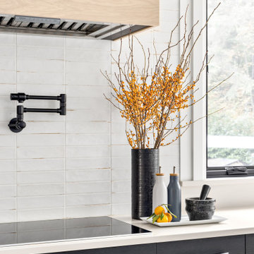
Moving deeper into the kitchen, the seamless induction cooktop topped with a freestanding concealed hood fan commands attention in a soft yet prominent way. The natural wood accent mirrors the fireplace mantle, and the choice of off-black wood-grain cabinets not only continues our black-and-white colour palette but adds a sense of depth and contrast. The corner sink is located to the right and perfectly positioned with a view of their thriving backyard.
To invite more of this family’s character into the space, we mixed metals for interest — matte black, dark pewter, and warm brass — and created open shelves in white oak for their plants and decor. You can also glimpse the tumbled edge of the backsplash tile, which echoes the rustic brick of the fireplace. It adds that farmhouse charm while still feeling timeless and sophisticated.
Last but not least, we designed this dining banquette in the bay window (with integrated bench storage, of course), where the family can share a meal together, the kids can do homework, or Emma and Vince can work and enjoy a change of scenery from their offices. Like the other spaces in the home, it was designed to be beautiful, multi-functional, and long-lasting.
Praise from Our Clients:
It is clear that we love this home, but what did our clients have to say?
“Lori is a visionary and masters execution to the finest detail all at the same time. When she first met us to know more about who we are and how we live, she could right away envision how we could use the space in our kitchen and living room…The results exceeded our expectations.
Lori and her team were also a delight to work with — coordination with all the trades, fast problem-solving, regular updates, professional and friendly attitude of her entire team — made it the dream team. Thank you SHD for making our space so beautiful!”
In turn, we are so grateful for this family’s trust, their open communication, and for being wonderful people with whom to work. (So, thank you!)
Find the right local pro for your project

 ASR DESIGN STUDIO
Our mission was to create an ocean and California lifestyle-inspired space that would invite consistent clicks, bookings and five-star reviews.
To make the most of the great location, we designed Project 11 for travelling singles and couples searching for a cozy and welcoming condo within walking distance to downtown San Diego.
Project 11 would also be used by our clients when it was unoccupied, so it had to be practical, functional and beautiful, too.
Our clients had a limited budget, so we got thrifty and sourced furnishings from Target, Ikea, Amazon and Etsy.
The oversized art prints – which set the tone for our relaxing and soothing beachy theme – were hunted down and found at Etsy of California Lifestyle.
We made the most of layers, colors and texture to create spaces that conjured calming ocean vibes and felt wholeheartedly welcoming.
We couldn’t repaint the walls, but they gave us a neutral color palette to work with. We built on it by adding in pops of color while maintaining a minimalist approach to understated style.
Then we had some fun and added in cute touches like Cali and San Diego inspired mugs, an adorable Kerig to tie in the colors of the ocean again, a swivel chair to view the sunrise and sunset and a totally pimped-out kitchen with all the cooking accessories a guest would need to feel at home in Project 11.
By the time we were done, we were tempted to scoop up the first available booking for ourselves!
Finally, we invested our energy in designing for effortless functionality so our client’s guests had everything they needed during their stay.
Photography: Meg Marie


 RAJ Kitchen and Bath, LLC
**Check out the video of this transformation on our website**
This small kitchen was way too small for this 2 bedrooms, 2 bathrooms apartment. Not only was it a very small kitchen, but the physical location of it made it very difficult to make it any bigger. There wasn't much that could have been done without incurring astronomical cost, which would get little or no return on the investment. The client wanted a kitchen that can be optimized in its current location to add a ton of value for resale.
This was difficult to do, because there was no moving of any mechanical around in the kitchen and even if we wanted to, the management of the building would not allow. For those of you who live in condos, co-ops or apartment building, you know how difficult it is to rework these foot prints. When we showed up, we saw the problems, but we also saw a huge opportunity where we can achieve those goals in the small space. This was accomplished by making some key changes and to incorporate some new things that was not possible when this kitchen was built years ago.
The crucial part of the design that would drive the entire new layout, was selecting the only appliance; that was the Refrigerator. Once we nailed down that refrigerator, we then proceeded to design the kitchen around it. We moved it to the other side of the wall where the sink was so that we can tap into the water line from the sink plumbing. It was crucial that it stays exactly 24" deep, not an inch more because we had to keep the entry as open as possible. Also, it was going to be directly in front of another big storage unit - The pantry. It is not ideal in most cases, but we needed the rest of the space to ramp up the design and open feel towards the side where all of the activities would take place, which happend to be the dining room and the view.
Once all that was figured out, we re-positioned the sink, dishwasher and the range and proceeded to wrap the cabinets around the columns to integrate them into the space. Thirty- six inches cabinets height was used so that they can be installed higher towards the ceiling height to give more room rather than the standard 18" required height between the counter tops. This was done to make the room feel a lot bigger than it really was. Not to mention, we also didn't want the faucet to be buried under the cabinets so that was also a necessary design detail for the space.
We then lowered both knee walls so that the counter top can sit on top of them, by removing that stop point that would have otherwise defined the kitchen area. This allowed us to pick up that extra footprint into the room for added prep space and enabled us to create the illusion of a kitchen that is looking longer than it really is. Every inch mattered when designing this kitchen and we made a conscious decision to use every one of that inch.
White cabinets were selected to do just what white cabinets are design to do; make a small or dark room appear bigger, brighter and more open. In this kitchen, this was amplified the more because of the kitchen location. It was perfect! We knew we did justice to the space because while we were there taking some photos, a few potential buyers walked in and went straight for the kitchen! They said its design just to fit the apartment.
Pantry roll out shelving, Double recycle bin, fancy handles, LED lighting, Quartz counter top, beautiful backslash tiles and grey linen floors finished off the kitchen which looked over a beautiful view of the George Washington Bridge from the top of this lovely 4th floor apartment.
Credit to Masterpiece Tile and Marble (Annmarie on the selection of Tiles and countertop and Val on the Construction to complete this project).
Davor Kokic Photography
 ASR DESIGN STUDIO
Our mission was to create an ocean and California lifestyle-inspired space that would invite consistent clicks, bookings and five-star reviews.
To make the most of the great location, we designed Project 11 for travelling singles and couples searching for a cozy and welcoming condo within walking distance to downtown San Diego.
Project 11 would also be used by our clients when it was unoccupied, so it had to be practical, functional and beautiful, too.
Our clients had a limited budget, so we got thrifty and sourced furnishings from Target, Ikea, Amazon and Etsy.
The oversized art prints – which set the tone for our relaxing and soothing beachy theme – were hunted down and found at Etsy of California Lifestyle.
We made the most of layers, colors and texture to create spaces that conjured calming ocean vibes and felt wholeheartedly welcoming.
We couldn’t repaint the walls, but they gave us a neutral color palette to work with. We built on it by adding in pops of color while maintaining a minimalist approach to understated style.
Then we had some fun and added in cute touches like Cali and San Diego inspired mugs, an adorable Kerig to tie in the colors of the ocean again, a swivel chair to view the sunrise and sunset and a totally pimped-out kitchen with all the cooking accessories a guest would need to feel at home in Project 11.
By the time we were done, we were tempted to scoop up the first available booking for ourselves!
Finally, we invested our energy in designing for effortless functionality so our client’s guests had everything they needed during their stay.
Photography: Meg Marie
Sponsored
Columbus, OH

Hope Restoration & General Contracting
Columbus Design-Build, Kitchen & Bath Remodeling, Historic Renovations

 Beth Dotolo, ASID, RID, NCIDQ
A jewel box townhouse with a high/low approach gave our busy working couple a design-forward space, arousing a new sense of happiness and pride in their home. With a love for entertaining, our clients needed a space that would meet their functional needs and be a reflection of them. They brought on Pulp to create a vision that would functionally articulate their style. Our design team imagined this edgy concept with lots of unique style elements, texture, and contrast. Pulp mixed luxury items, such as the bone-inlay cocktail table and textual black croc wall covering, and offset them with more affordable whimsical touches, like individual framed feathers. Beth and Carolina pushed their tastes to the limit with unexpected touches, like the split face bookends and the teak hand chair, to add a quirky layer and graphic edge that our homeowners would come to fall in love with.
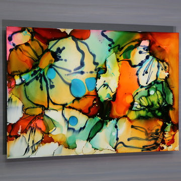
 Jon Allen Fine Metal Art
Tropics by Jon Allen is an abstract take on a nature inspired painting. It has a vaguely floral undertone but in very unexpected and delightful colors. Jon truly captures the spirit of the tropics with these beautiful, bright colors. Hand-painted on aluminum, this stunning abstract piece will complement any contemporary or modern, decor.
Number of Pieces: 1
Dimensions: 35" x 24" x 2" off the wall
Care & Cleaning: Clean with a soft cloth and plain soap & water
Other Features: Hardware is pre-installed for simple hanging and art will “float” 2” off the wall
 RAJ Kitchen and Bath, LLC
**Check out the video of this transformation on our website**
This small kitchen was way too small for this 2 bedrooms, 2 bathrooms apartment. Not only was it a very small kitchen, but the physical location of it made it very difficult to make it any bigger. There wasn't much that could have been done without incurring astronomical cost, which would get little or no return on the investment. The client wanted a kitchen that can be optimized in its current location to add a ton of value for resale.
This was difficult to do, because there was no moving of any mechanical around in the kitchen and even if we wanted to, the management of the building would not allow. For those of you who live in condos, co-ops or apartment building, you know how difficult it is to rework these foot prints. When we showed up, we saw the problems, but we also saw a huge opportunity where we can achieve those goals in the small space. This was accomplished by making some key changes and to incorporate some new things that was not possible when this kitchen was built years ago.
The crucial part of the design that would drive the entire new layout, was selecting the only appliance; that was the Refrigerator. Once we nailed down that refrigerator, we then proceeded to design the kitchen around it. We moved it to the other side of the wall where the sink was so that we can tap into the water line from the sink plumbing. It was crucial that it stays exactly 24" deep, not an inch more because we had to keep the entry as open as possible. Also, it was going to be directly in front of another big storage unit - The pantry. It is not ideal in most cases, but we needed the rest of the space to ramp up the design and open feel towards the side where all of the activities would take place, which happend to be the dining room and the view.
Once all that was figured out, we re-positioned the sink, dishwasher and the range and proceeded to wrap the cabinets around the columns to integrate them into the space. Thirty- six inches cabinets height was used so that they can be installed higher towards the ceiling height to give more room rather than the standard 18" required height between the counter tops. This was done to make the room feel a lot bigger than it really was. Not to mention, we also didn't want the faucet to be buried under the cabinets so that was also a necessary design detail for the space.
We then lowered both knee walls so that the counter top can sit on top of them, by removing that stop point that would have otherwise defined the kitchen area. This allowed us to pick up that extra footprint into the room for added prep space and enabled us to create the illusion of a kitchen that is looking longer than it really is. Every inch mattered when designing this kitchen and we made a conscious decision to use every one of that inch.
White cabinets were selected to do just what white cabinets are design to do; make a small or dark room appear bigger, brighter and more open. In this kitchen, this was amplified the more because of the kitchen location. It was perfect! We knew we did justice to the space because while we were there taking some photos, a few potential buyers walked in and went straight for the kitchen! They said its design just to fit the apartment.
Pantry roll out shelving, Double recycle bin, fancy handles, LED lighting, Quartz counter top, beautiful backslash tiles and grey linen floors finished off the kitchen which looked over a beautiful view of the George Washington Bridge from the top of this lovely 4th floor apartment.
Credit to Masterpiece Tile and Marble (Annmarie on the selection of Tiles and countertop and Val on the Construction to complete this project).
Davor Kokic Photography
 ASR DESIGN STUDIO
Our mission was to create an ocean and California lifestyle-inspired space that would invite consistent clicks, bookings and five-star reviews.
To make the most of the great location, we designed Project 11 for travelling singles and couples searching for a cozy and welcoming condo within walking distance to downtown San Diego.
Project 11 would also be used by our clients when it was unoccupied, so it had to be practical, functional and beautiful, too.
Our clients had a limited budget, so we got thrifty and sourced furnishings from Target, Ikea, Amazon and Etsy.
The oversized art prints – which set the tone for our relaxing and soothing beachy theme – were hunted down and found at Etsy of California Lifestyle.
We made the most of layers, colors and texture to create spaces that conjured calming ocean vibes and felt wholeheartedly welcoming.
We couldn’t repaint the walls, but they gave us a neutral color palette to work with. We built on it by adding in pops of color while maintaining a minimalist approach to understated style.
Then we had some fun and added in cute touches like Cali and San Diego inspired mugs, an adorable Kerig to tie in the colors of the ocean again, a swivel chair to view the sunrise and sunset and a totally pimped-out kitchen with all the cooking accessories a guest would need to feel at home in Project 11.
By the time we were done, we were tempted to scoop up the first available booking for ourselves!
Finally, we invested our energy in designing for effortless functionality so our client’s guests had everything they needed during their stay.
Photography: Meg Marie

 Cascade West Development
The Ascension - Super Ranch on Acreage in Ridgefield Washington by Cascade West Development Inc.
This plan is designed for people who value family togetherness, natural beauty, social gatherings and all of the little moments in-between.
We hope you enjoy this home. At Cascade West we strive to surpass the needs, wants and expectations of every client and create a home that unifies and compliments their lifestyle.
Cascade West Facebook: https://goo.gl/MCD2U1
Cascade West Website: https://goo.gl/XHm7Un
These photos, like many of ours, were taken by the good people of ExposioHDR - Portland, Or
Exposio Facebook: https://goo.gl/SpSvyo
Exposio Website: https://goo.gl/Cbm8Ya
 TKS Design Group
Download our free ebook, Creating the Ideal Kitchen. DOWNLOAD NOW
This master bath remodel is the cat's meow for more than one reason! The materials in the room are soothing and give a nice vintage vibe in keeping with the rest of the home. We completed a kitchen remodel for this client a few years’ ago and were delighted when she contacted us for help with her master bath!
The bathroom was fine but was lacking in interesting design elements, and the shower was very small. We started by eliminating the shower curb which allowed us to enlarge the footprint of the shower all the way to the edge of the bathtub, creating a modified wet room. The shower is pitched toward a linear drain so the water stays in the shower. A glass divider allows for the light from the window to expand into the room, while a freestanding tub adds a spa like feel.
The radiator was removed and both heated flooring and a towel warmer were added to provide heat. Since the unit is on the top floor in a multi-unit building it shares some of the heat from the floors below, so this was a great solution for the space.
The custom vanity includes a spot for storing styling tools and a new built in linen cabinet provides plenty of the storage. The doors at the top of the linen cabinet open to stow away towels and other personal care products, and are lighted to ensure everything is easy to find. The doors below are false doors that disguise a hidden storage area. The hidden storage area features a custom litterbox pull out for the homeowner’s cat! Her kitty enters through the cutout, and the pull out drawer allows for easy clean ups.
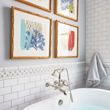
The materials in the room – white and gray marble, charcoal blue cabinetry and gold accents – have a vintage vibe in keeping with the rest of the home. Polished nickel fixtures and hardware add sparkle, while colorful artwork adds some life to the space.
Sponsored
Columbus, OH

Structural Remodeling
Franklin County's Heavy Timber Specialists | Best of Houzz 2020!

 Sandra Hambley
A charming Airbnb, favorite restaurant, cozy coffee house, or a piece of artwork can all serve as design inspiration for your decor. How wonderful would it be to bring the colors, patterns, shapes, fabrics, or textures of those beloved places or things into your own home? That is exactly what Janet Aurora’s client was hoping to do. Her favorite restaurant, The Ivy Chelsea Garden, is located in London and features tufted leather sofas and benches, hues of salmon and sage, botanical patterns, and artwork surrounded by lush gardens and flowers. Take a look at how Janet used this point of inspiration in the client’s living room, dining room, entryway and study.
~ Dining Room ~
To accommodate space for a dining room table that would seat eight, we eliminated the existing fireplace. Janet custom designed a table with a beautiful wrought iron base and marble top, selected botanical prints for a gallery wall, and floral valances for the windows, all set against a fresh turquoise backdrop.
~ Living Room ~
Nods to The Ivy Chelsea Garden can be seen throughout the living room and entryway. A custom leather tufted sofa anchors the living room and compliments a beloved “Grandma’s chair” with crewel fabric, which was restored to its former beauty. Walls painted with Benjamin Moore’s Dreamcatcher 640 and dark salmon hued draperies create a color palette that is strikingly similar to the al fresco setting in London. In the entryway, floral patterned wallpaper introduces the garden fresh theme seen throughout the home.
~ The Study ~
Janet transformed an existing bedroom into a study by claiming the space from two reach-in closets to create custom built-ins with lighting. Many of the homeowner’s own furnishings were used in this room, but Janet added a much-needed reading chair in turquoise to bring a nice pop of color, window treatments, and an area rug to tie the space together. Benjamin Moore’s Deep Mauve was used on the walls and Ruby Dusk was added to the back of the cabinetry to add depth and interest. We also added French doors that lead out to a small balcony for a place to take a break or have lunch.
We love the way these spaces turned out and hope our clients will enjoy their spaces inspired by their favorite restaurant.
 ASR DESIGN STUDIO
Our mission was to create an ocean and California lifestyle-inspired space that would invite consistent clicks, bookings and five-star reviews.
To make the most of the great location, we designed Project 11 for travelling singles and couples searching for a cozy and welcoming condo within walking distance to downtown San Diego.
Project 11 would also be used by our clients when it was unoccupied, so it had to be practical, functional and beautiful, too.
Our clients had a limited budget, so we got thrifty and sourced furnishings from Target, Ikea, Amazon and Etsy.
The oversized art prints – which set the tone for our relaxing and soothing beachy theme – were hunted down and found at Etsy of California Lifestyle.
We made the most of layers, colors and texture to create spaces that conjured calming ocean vibes and felt wholeheartedly welcoming.
We couldn’t repaint the walls, but they gave us a neutral color palette to work with. We built on it by adding in pops of color while maintaining a minimalist approach to understated style.
Then we had some fun and added in cute touches like Cali and San Diego inspired mugs, an adorable Kerig to tie in the colors of the ocean again, a swivel chair to view the sunrise and sunset and a totally pimped-out kitchen with all the cooking accessories a guest would need to feel at home in Project 11.
By the time we were done, we were tempted to scoop up the first available booking for ourselves!
Finally, we invested our energy in designing for effortless functionality so our client’s guests had everything they needed during their stay.
Photography: Meg Marie
 ASR DESIGN STUDIO
Our mission was to create an ocean and California lifestyle-inspired space that would invite consistent clicks, bookings and five-star reviews.
To make the most of the great location, we designed Project 11 for travelling singles and couples searching for a cozy and welcoming condo within walking distance to downtown San Diego.
Project 11 would also be used by our clients when it was unoccupied, so it had to be practical, functional and beautiful, too.
Our clients had a limited budget, so we got thrifty and sourced furnishings from Target, Ikea, Amazon and Etsy.
The oversized art prints – which set the tone for our relaxing and soothing beachy theme – were hunted down and found at Etsy of California Lifestyle.
We made the most of layers, colors and texture to create spaces that conjured calming ocean vibes and felt wholeheartedly welcoming.
We couldn’t repaint the walls, but they gave us a neutral color palette to work with. We built on it by adding in pops of color while maintaining a minimalist approach to understated style.
Then we had some fun and added in cute touches like Cali and San Diego inspired mugs, an adorable Kerig to tie in the colors of the ocean again, a swivel chair to view the sunrise and sunset and a totally pimped-out kitchen with all the cooking accessories a guest would need to feel at home in Project 11.
By the time we were done, we were tempted to scoop up the first available booking for ourselves!
Finally, we invested our energy in designing for effortless functionality so our client’s guests had everything they needed during their stay.
Photography: Meg Marie

Sponsored
Columbus, OH
Free consultation for landscape design!

Peabody Landscape Group
Franklin County's Reliable Landscape Design & Contracting
 ASR DESIGN STUDIO
Our mission was to create an ocean and California lifestyle-inspired space that would invite consistent clicks, bookings and five-star reviews.
To make the most of the great location, we designed Project 11 for travelling singles and couples searching for a cozy and welcoming condo within walking distance to downtown San Diego.
Project 11 would also be used by our clients when it was unoccupied, so it had to be practical, functional and beautiful, too.
Our clients had a limited budget, so we got thrifty and sourced furnishings from Target, Ikea, Amazon and Etsy.
The oversized art prints – which set the tone for our relaxing and soothing beachy theme – were hunted down and found at Etsy of California Lifestyle.
We made the most of layers, colors and texture to create spaces that conjured calming ocean vibes and felt wholeheartedly welcoming.
We couldn’t repaint the walls, but they gave us a neutral color palette to work with. We built on it by adding in pops of color while maintaining a minimalist approach to understated style.
Then we had some fun and added in cute touches like Cali and San Diego inspired mugs, an adorable Kerig to tie in the colors of the ocean again, a swivel chair to view the sunrise and sunset and a totally pimped-out kitchen with all the cooking accessories a guest would need to feel at home in Project 11.
By the time we were done, we were tempted to scoop up the first available booking for ourselves!
Finally, we invested our energy in designing for effortless functionality so our client’s guests had everything they needed during their stay.
Photography: Meg Marie
 ASR DESIGN STUDIO
Our mission was to create an ocean and California lifestyle-inspired space that would invite consistent clicks, bookings and five-star reviews.
To make the most of the great location, we designed Project 11 for travelling singles and couples searching for a cozy and welcoming condo within walking distance to downtown San Diego.
Project 11 would also be used by our clients when it was unoccupied, so it had to be practical, functional and beautiful, too.
Our clients had a limited budget, so we got thrifty and sourced furnishings from Target, Ikea, Amazon and Etsy.
The oversized art prints – which set the tone for our relaxing and soothing beachy theme – were hunted down and found at Etsy of California Lifestyle.
We made the most of layers, colors and texture to create spaces that conjured calming ocean vibes and felt wholeheartedly welcoming.
We couldn’t repaint the walls, but they gave us a neutral color palette to work with. We built on it by adding in pops of color while maintaining a minimalist approach to understated style.
Then we had some fun and added in cute touches like Cali and San Diego inspired mugs, an adorable Kerig to tie in the colors of the ocean again, a swivel chair to view the sunrise and sunset and a totally pimped-out kitchen with all the cooking accessories a guest would need to feel at home in Project 11.
By the time we were done, we were tempted to scoop up the first available booking for ourselves!
Finally, we invested our energy in designing for effortless functionality so our client’s guests had everything they needed during their stay.
Photography: Meg Marie

 Colleen Gahry-Robb for Ethan Allen Auburn Hills,MI
..Colleen Gahry-Robb, Interior Designer / Ethan Allen, Auburn Hills, MI....You start and end each day in the bedroom - Make it a calming and beautiful space with the Beau winged bed. It’s truly a statement with its seductive French curves. The room comes together in soft mineral blue, gray, cream, and taupe for a look that's serene and so sophisticated.
94