
Search results for "Main issue" in Home Design Ideas
 Edgewater Design Group
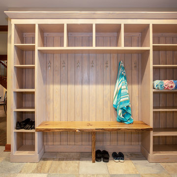
Our clients already had a cottage on Torch Lake that they loved to visit. It was a 1960s ranch that worked just fine for their needs. However, the lower level walkout became entirely unusable due to water issues. After purchasing the lot next door, they hired us to design a new cottage. Our first task was to situate the home in the center of the two parcels to maximize the view of the lake while also accommodating a yard area. Our second task was to take particular care to divert any future water issues. We took necessary precautions with design specifications to water proof properly, establish foundation and landscape drain tiles / stones, set the proper elevation of the home per ground water height and direct the water flow around the home from natural grade / drive. Our final task was to make appealing, comfortable, living spaces with future planning at the forefront. An example of this planning is placing a master suite on both the main level and the upper level. The ultimate goal of this home is for it to one day be at least a 3/4 of the year home and designed to be a multi-generational heirloom.
- Jacqueline Southby Photography
 TVL Creative Ltd.
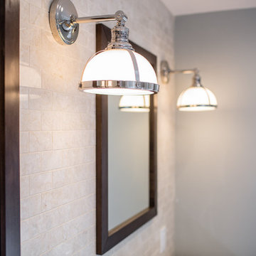
This project included a massive renovation to nearly all spaces in the home: the entry, living room, family room, dining room, kitchen, staircase, and master bathroom. Each space underwent a massive transformation in order to create the elegant & traditional aesthetic that our clients love. On the main level of the home, the original space layout was extremely compartmentalized and dark. Our clients wanted to open up and brighten the space as much as possible. In addition to this, a major goal was to increase function and to create a welcoming environment for guests and the clients alike. We started by opening up the space plan significantly. This allows for flowing space between the kitchen, front living room, and rear family room. Light is better carried through these spaces, and further emphasized with airy colors, light cabinetry, and a better lighting plan overall. We removed the old decorative ceiling beams and reworked closets and hallways to create a more open and functional main level. The kitchen offers a large amount of counter space and storage opportunity, but also welcomes guests at a sizable island and secondary peninsula. Beyond the kitchen, we designed a work nook where display storage and functional workspace are both present. We reworked both fireplaces in the home to create warm nooks for gathering: both fireplaces feature large format stone and are flanked with display shelving. The master bathroom upstairs was completely reworked as well. We eliminated the oversized drop-in tub and in-wall fireplace, and took away the steam shower that had been causing water and mildew issues for years. We relocated the toilet and developed a gorgeous vanity area in the space where the old bathtub and fireplace used to be. We then created a massive shower room in lieu of a tub/shower combination. The bathroom is adorned with warm tones and natural textures: marble subway tile runs up the entire wall behind the vanity, wood-look porcelain covers the floor and back wall of the shower, and simple artisan subway tiles in a creamy vanilla tone cover the shower walls. These spaces completely transformed the look and feel of the house, and we are so happy our amazing clients get to enjoy this home with their family for years to come!
 RAJ Kitchen and Bath, LLC
This family throws some mean parties where large crowds usually sit at the poolside. There’s an entire section of this walk out second level that is dedicated to entertaining which also gives access to the pool in the backyard. This place comes alive at night with built in surround sounds and LED lights. There was just one issue. The kitchen.
The kitchen did not fit in. It was old, outdated, out-styled and nonfunctional. They knew the kitchen had to be address eventually but they just didn’t want to redo the kitchen. They wanted to revamp the kitchen, so they asked us to come in and look at the space to see how we can design this second floor kitchen in their New Rochelle home.
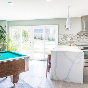
It was a small kitchen, strategically located where it could be the hub that the family wanted it to be. It held its own amongst everything that was in the open space like the big screen TV, fireplace and pool table. That is exactly what we did in the design and here is how we did it.
First, we got rid of the kitchen table and by doing so we created a peninsular. This eventually sets up the space for a couple of really cool pendant lights, some unique counter chairs and a wine cooler that was purchased before but never really had a home. We then turned our attention to the range and hood. This was not the main kitchen, so wall storage wasn’t the main goal here. We wanted to create a more open feel interaction while in the kitchen, hence we designed the free standing chimney hood alone to the left of the window.
We then looked at how we can make it more entertaining. We did that by adding a Wine rack on a buffet style type area. This wall was free and would have remained empty had we not find a way to add some more glitz.
Finally came the counter-top. Every detail was crucial because the view of the kitchen can be seen from when you enter the front door even if it was on the second floor walk out. The use of the space called for a waterfall edge counter-top and more importantly, the stone selection to further accentuate the effect. It was crucial that there was movement in the stone which connects to the 45 degree waterfall edge so it would be very dramatic.
Nothing was overlooked in this space. It had to be done this way if it was going to have a fighting chance to take command of its territory.
Have a look at some before and after photos on the left and see a brief video transformation of this lovely small kitchen.
See more photos and vidoe of this transformation on our website @ http://www.rajkitchenandbath.com/portfolio-items/kitchen-remodel-new-rochelle-ny-10801/
Find the right local pro for your project
 Alloy Architecture & Construction
Originally built in 1859 by Justice William J. Robertson and listed on the National Register of Historic Places in 1999, this home has elements of both the Italianate and Gothic Revival styles which were taken into consideration during the design process.
The project consisted of three main components: a basement renovation, a new screened in porch and a new two car garage.
For the basement renovation we removed the original brick floor which was causing moisture issues and replaced them with an insulated, colored concrete slab. The end result: a previously unusable space was transformed into a family room with a complete guest suite and an exercise room.
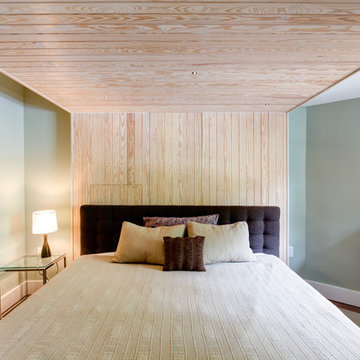
In the guest bedroom, low ceilings due to existing duct work were strategically wrapped with stained pine tongue and groove creating a cozy sleeping nook. In the bathroom, subway tiles and lightly stained wood are the background to a livelier tile accent in the shower and around the vanity.
The family room features floor to ceiling millwork piece that has several storage cubbies; some with doors to conceal and others open for display.
The screened porch is located at the back of the house overlooking a new stone patio at the lower level yard. The new porch takes cues from the existing sun room by matching materials, colors, and proportion. The new porch off the living room allows the clients to sit and relax while staying close to their children when inside or playing in the yard.
The garage was built using the same material palette and style of the house but set back so as to not to detract from the main house. With large sliding barn doors on the back, it opens up to a manicured lawn allowing the garage to double as a pavilion for outdoor entertaining and yard parties. Alloy worked with Water Street Studio, a local architectural landscaping firm, to create more inviting and usable spaces for the children and adults to enjoy.
Andrea Hubbel Photography
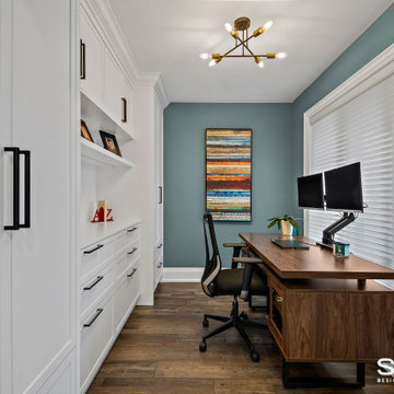
 Sosna Inc
Our clients approached us to renovate their home, as it was lacking function for their family’s changing needs. They were facing issues with insufficient storage, and underutilised areas.
The entry was cramped, which was especially noticeable when several people were coming in, or when carrying in groceries. The Shared Bathroom was too small, and lacked enough room for their teenage children to store their individual belongings. Additionally, since both clients work from home, a dedicated office space was essential.
On the Main Floor, we relocated the closet at the entry, making the entrance more spacious, and the Powder Room was given an update and new fixtures.
The wall between the Kitchen and Dining Room was removed, which opened up the Main Floor. Half of the space this created was used to create a much larger Kitchen with ample gathering space for our client’s large family. The new custom Kitchen boasts plenty of dark cabinetry with wood accents, and is complimented by a beautiful quartz countertop and matching black fixtures.
The other half of the newly created space was transformed into a quiet, functional home office. In the new office, a wall of built-in cabinetry offers useful storage for both work and hobby items, creating the perfect space for both work and crafting.
On the Second Floor, we expanded the Shared Bathroom by using space from the Guest Bedroom closet and the Second Floor Office. We replaced the bathtub shower combo with a spacious grand shower and added a large vanity and makeup area, giving each teenager their own dedicated personal storage space.
In the Master Ensuite, we altered the entryway location, allowing for a redesigned layout that includes a large vanity and double sink, enhancing both functionality and storage.
Our clients expressed their happiness with the renovation process with Sosna, specifically how clean the construction area was kept, and how respectful the Sosna team was of their home and neighbours. They were pleased that all deadlines were met, and the project was completed on time, and looked even better than they had dreamed.
Sosna Inc
416-888-7366 ext 1
email: contact@sosna.ca
website: sosna.ca
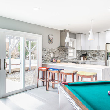 RAJ Kitchen and Bath, LLC
This family throws some mean parties where large crowds usually sit at the poolside. There’s an entire section of this walk out second level that is dedicated to entertaining which also gives access to the pool in the backyard. This place comes alive at night with built in surround sounds and LED lights. There was just one issue. The kitchen.
The kitchen did not fit in. It was old, outdated, out-styled and nonfunctional. They knew the kitchen had to be address eventually but they just didn’t want to redo the kitchen. They wanted to revamp the kitchen, so they asked us to come in and look at the space to see how we can design this second floor kitchen in their New Rochelle home.
It was a small kitchen, strategically located where it could be the hub that the family wanted it to be. It held its own amongst everything that was in the open space like the big screen TV, fireplace and pool table. That is exactly what we did in the design and here is how we did it.
First, we got rid of the kitchen table and by doing so we created a peninsular. This eventually sets up the space for a couple of really cool pendant lights, some unique counter chairs and a wine cooler that was purchased before but never really had a home. We then turned our attention to the range and hood. This was not the main kitchen, so wall storage wasn’t the main goal here. We wanted to create a more open feel interaction while in the kitchen, hence we designed the free standing chimney hood alone to the left of the window.
We then looked at how we can make it more entertaining. We did that by adding a Wine rack on a buffet style type area. This wall was free and would have remained empty had we not find a way to add some more glitz.
Finally came the counter-top. Every detail was crucial because the view of the kitchen can be seen from when you enter the front door even if it was on the second floor walk out. The use of the space called for a waterfall edge counter-top and more importantly, the stone selection to further accentuate the effect. It was crucial that there was movement in the stone which connects to the 45 degree waterfall edge so it would be very dramatic.
Nothing was overlooked in this space. It had to be done this way if it was going to have a fighting chance to take command of its territory.
Have a look at some before and after photos on the left and see a brief video transformation of this lovely small kitchen.
See more photos and vidoe of this transformation on our website @ http://www.rajkitchenandbath.com/portfolio-items/kitchen-remodel-new-rochelle-ny-10801/
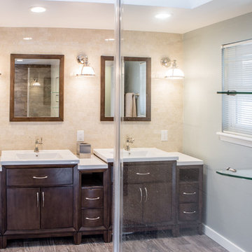 TVL Creative Ltd.
This project included a massive renovation to nearly all spaces in the home: the entry, living room, family room, dining room, kitchen, staircase, and master bathroom. Each space underwent a massive transformation in order to create the elegant & traditional aesthetic that our clients love. On the main level of the home, the original space layout was extremely compartmentalized and dark. Our clients wanted to open up and brighten the space as much as possible. In addition to this, a major goal was to increase function and to create a welcoming environment for guests and the clients alike. We started by opening up the space plan significantly. This allows for flowing space between the kitchen, front living room, and rear family room. Light is better carried through these spaces, and further emphasized with airy colors, light cabinetry, and a better lighting plan overall. We removed the old decorative ceiling beams and reworked closets and hallways to create a more open and functional main level. The kitchen offers a large amount of counter space and storage opportunity, but also welcomes guests at a sizable island and secondary peninsula. Beyond the kitchen, we designed a work nook where display storage and functional workspace are both present. We reworked both fireplaces in the home to create warm nooks for gathering: both fireplaces feature large format stone and are flanked with display shelving. The master bathroom upstairs was completely reworked as well. We eliminated the oversized drop-in tub and in-wall fireplace, and took away the steam shower that had been causing water and mildew issues for years. We relocated the toilet and developed a gorgeous vanity area in the space where the old bathtub and fireplace used to be. We then created a massive shower room in lieu of a tub/shower combination. The bathroom is adorned with warm tones and natural textures: marble subway tile runs up the entire wall behind the vanity, wood-look porcelain covers the floor and back wall of the shower, and simple artisan subway tiles in a creamy vanilla tone cover the shower walls. These spaces completely transformed the look and feel of the house, and we are so happy our amazing clients get to enjoy this home with their family for years to come!
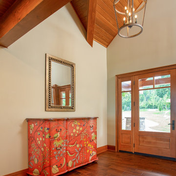 Edgewater Design Group
Our clients already had a cottage on Torch Lake that they loved to visit. It was a 1960s ranch that worked just fine for their needs. However, the lower level walkout became entirely unusable due to water issues. After purchasing the lot next door, they hired us to design a new cottage. Our first task was to situate the home in the center of the two parcels to maximize the view of the lake while also accommodating a yard area. Our second task was to take particular care to divert any future water issues. We took necessary precautions with design specifications to water proof properly, establish foundation and landscape drain tiles / stones, set the proper elevation of the home per ground water height and direct the water flow around the home from natural grade / drive. Our final task was to make appealing, comfortable, living spaces with future planning at the forefront. An example of this planning is placing a master suite on both the main level and the upper level. The ultimate goal of this home is for it to one day be at least a 3/4 of the year home and designed to be a multi-generational heirloom.
- Jacqueline Southby Photography
 TVL Creative Ltd.
This project included a massive renovation to nearly all spaces in the home: the entry, living room, family room, dining room, kitchen, staircase, and master bathroom. Each space underwent a massive transformation in order to create the elegant & traditional aesthetic that our clients love. On the main level of the home, the original space layout was extremely compartmentalized and dark. Our clients wanted to open up and brighten the space as much as possible. In addition to this, a major goal was to increase function and to create a welcoming environment for guests and the clients alike. We started by opening up the space plan significantly. This allows for flowing space between the kitchen, front living room, and rear family room. Light is better carried through these spaces, and further emphasized with airy colors, light cabinetry, and a better lighting plan overall. We removed the old decorative ceiling beams and reworked closets and hallways to create a more open and functional main level. The kitchen offers a large amount of counter space and storage opportunity, but also welcomes guests at a sizable island and secondary peninsula. Beyond the kitchen, we designed a work nook where display storage and functional workspace are both present. We reworked both fireplaces in the home to create warm nooks for gathering: both fireplaces feature large format stone and are flanked with display shelving. The master bathroom upstairs was completely reworked as well. We eliminated the oversized drop-in tub and in-wall fireplace, and took away the steam shower that had been causing water and mildew issues for years. We relocated the toilet and developed a gorgeous vanity area in the space where the old bathtub and fireplace used to be. We then created a massive shower room in lieu of a tub/shower combination. The bathroom is adorned with warm tones and natural textures: marble subway tile runs up the entire wall behind the vanity, wood-look porcelain covers the floor and back wall of the shower, and simple artisan subway tiles in a creamy vanilla tone cover the shower walls. These spaces completely transformed the look and feel of the house, and we are so happy our amazing clients get to enjoy this home with their family for years to come!
 Tile Doctor Ltd
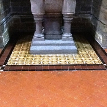
The following job was a bit different from the kitchen and hallway restorations we normally get asked to do, in fact this request came from the vicar of St. Mary’s Church in Far Cotton who wanted us to restore some beautiful old Quarry tiles which lead up to the main aisle. The church dates back to 1885 and given the wear on some of the tiles I can only assume they date back to the same Victorian period; the church is a really welcoming, community-focused place, so it was a pleasure for me to be asked to complete the work.
The vicar’s main concern was the large amount of melted candle wax around the font – so much so that this his normal cleaners had been unable to remove it. He also wanted to know if the floors could be sealed to make ongoing maintenance easier – and this was certainly something we would be able to provide. The following photos show the condition of the floor before we started.
The next photo shows the work in progress from halfway down the aisle. We started by breaking down any old sealer and the troublesome candle wax, using a black stripping pad in combination of Tile Doctor Pro Clean to deep clean the floor. Since Pro Clean, a high alkaline cleaner, is highly versatile and can be used on all kinds of natural stone and tile.
While the church has cleaners that come in regularly to keep the building tidy for the parishioners, the old tiles really benefitted from a deep clean which tackled the stubborn ingrained dirt and staining that had built up over many years.
Once I was satisfied that the tiles had been cleaned to the best of my abilities, they were then left for two weeks to fully dry as it is an old church and, understandably, there were some inherent damp issues. As aforementioned, the vicar was keen to have the tiles sealed to make them easier to keep clean and protect them against ingrained dirt and staining for the future. There are only a few situations in which we wouldn’t recommend sealing tiles, such as if they are patio tiles which will already be under constant exposure to the weather.
The best choice of sealer for this particular situation was Tile Doctor Colour Grow, which is an impregnating, breathable sealer that won’t trap moisture in the floor and will provide great protection against further staining. Additionally, as an impregnating sealer, Colour Grow penetrates into the pores of the tile protecting it from within and with the added benefit of enhancing the natural colours and restoring the life and character back in the old, dull tiles. I applied it using a paint pad, before polishing it off.
I’m pleased to report that the restoration was a great success. The vicar was very impressed with the work, and I’m sure the church community will also be very happy with the new, vibrant tiles.
Phil Vissian
Northamptonshire Tile Doctor
 Tate Studio Architects
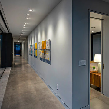
Gallery walkway and art wall that connects the garage of the home to the main body of the house. Builder - Build Inc, Interior Design - Tate Studio Architects, Photography - Thompson Photographic.
 Advance Design Studio, Ltd.
After six years of living in their Huntley IL home, Chris and Meghan were tired of their dark, dingy, outdated kitchen and it was finally time for a long-anticipated change. “The kitchen is the place where we live, it’s where we do everything,” Meghan said. “It was important that it be a space where we wanted to be.” Meghan loves cooking and enjoys including their girls in healthy meal prepping, this led them to want a brighter, more enjoyable kitchen with increased functionality and improved storage.
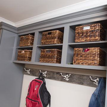
For Chris especially, the laundry room was an entirely dysfunctional eyesore. “We had a washer and a dryer, but it was all kind-of cobbled together!” Chris said. “There were always laundry piles everywhere, we weren’t really sure what we wanted to do in there, but it was time for us to make a change.” The mess of the space was stressful every time they walked in the door from the garage each day. Kids’ backpacks and shoes piled up haphazardly in the makeshift boot-bench closet left the family feeling disorganized and stressed. They needed space for folding clothes and locker cubbies to help keep the family organized.
Having known Christine and Todd in the Huntley community for years, Chris and Meghan were familiar with their work. “We already trusted them personally and having seen their projects for years we knew they did top notch work. After we reviewed the initial round of designs, we knew that hiring them was definitely the right choice,” Meghan and Chris said. Although Chris had done a lot of work in their home himself, the kitchen and laundry room renovation was such a large undertaking that he didn’t want to steal time away from his family to spend what would surely be many long weekends doing the job himself. “That would not have been a wise choice for us,” Chris laughed.
“Our designer, Michelle was very, very, easy to work with; anything we wanted to see or weren’t sure about, she went above and beyond to make this easy for us. She was easy to get hold of and always quick to respond,” the couple said. Michelle pulled ideas that mirrored the couple’s taste and style and was adept at directing the couple to limited choices that didn’t overwhelm them and kept the process moving. “I have a hard time making decisions. Michelle made the decision-making process so easy. I loved how she listened to what I liked and then presented three great options for me to choose from,” Meghan said.
The main objectives for the kitchen were better storage solutions, they wanted the space to reflect their lifestyle and taste, and they wanted it to last for years with low maintenance. One of the first steps in creating a more functional kitchen was relocating the refrigerator, creating an improved workflow for the busy family.
“We didn’t know that we could even move the refrigerator to a new location where it is now, that was something that we never would have thought of,” Chris said. “The new refrigerator location makes the kitchen feel so much bigger. We didn’t add any space, but our whole kitchen with the new design just seems like it’s so much larger than before!” Meghan said.
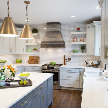
The perimeter mist colored cabinets helped warm and brighten the entire room, while the graphite colored cabinets on the island added contrast. Using this fresh, clean color palette satisfied the couple’s desire for a bright space that was the exact opposite of what they had before. Organization accessories were also added to the cabinets such as a spice drawer tray and roll outs to create hidden convenience.
“I absolutely love the hidden spices – it makes cooking so much more enjoyable!” Chris said. “And all the pull outs, and the double trash bin, who would think you could get so excited about organization!” the couple said in unison.
One thing they hated in their original kitchen was how dark the space felt. Added lighting on the ceiling with the new light fixtures combined with the lighter cabinetry colors throughout solved this problem. “Our new kitchen has this warm, almost cozy feeling that our old kitchen never had, it’s just a space that I love spending my time in now,” Meghan said. The light airy feeling was accentuated with the use of floating white shelves on either side of the decorative range hood. “We have so much cabinetry space, the new design is amazing we actually have more storage space than we will ever need,” Meghan said.
The island was extended to create more work surface and added space for stool seating. “The new island changes how we live. Now the kids can be in the kitchen with us, doing homework, eating breakfast, and the three of us have special dinners there when Chris is working late,” Meghan said.
The Carrara Marmi Quartz countertops were chosen because they are, not only beautiful, but are made from hard-working material that doesn’t require maintenance. The white subway tile backsplash that wraps to the ceiling behind the focal point cooktop range/hood compliments the crisp white countertops perfectly, while brushed brass hardware and light fixtures keep the design fresh and new.
The couple had a few fears at the beginning of the project, as most homeowners do. Their biggest fear was being out of their kitchen and laundry room for an extended time. The crew made it very easy for the family to work in a limited space keeping the washer and dryer hooked up the majority of the time, and also getting appliances working with minimal downtime.
“They above and beyond accommodated us to get us through the process,” Meghan said. “They did a great job making sure we were as comfortable as possible throughout the process,” Chris added.
“Our project manager DJ did a great job. He was very good at updating us on schedule changes, getting guys in as quickly as possible. Everyone that stepped in the house was nice and did great work,” said Chris. They thought Advance’s carpenter was phenomenal and were impressed when he took a conceptual idea from a photograph and worked with designer Michelle to create a one of a kind range/hood that has become the topic of conversation with friends and family who visit the new kitchen. “He was in our house literally every day for several weeks. He was easy to work with and good at what he did,” Meghan and Chris said.
The focal point of the kitchen; a hand-crafted, custom-built ventilation hood was clad with handpicked reclaimed barnwood. Advance Design’s carpenter built the framework and the cladding to create a one-of-a-kind design element that the couple loves.
“I think it was especially fun for him to create something unique from scratch, showcasing his talent in this area,” Meghan said. “I love that my kitchen is not like everyone else’s. I got to pick out the wood on my hood and watch it being built and was able to choose what pieces of wood went where on it. It’s totally unique.”
Red Oak flooring was toothed-in throughout the kitchen and the rest of the first floor anywhere changes were made. Then the whole floor was refinished to tone down the orange undertones in the existing floor stain, ultimately changing the color complexion of the entire first floor. The result is a completely new feeling to the entire home.
Renovating the laundry room was extremely important to Meghan and Chris, but they had trouble visualizing what the possibilities were for the seemingly small space. Michelle produced beautiful 3D illustrations that helped them envision the space in a whole new way.
“I must have told Michelle 100 times that I am a visual person, seeing the designs in 3D made it so easy to make decisions and see what we could really do with our space,” Meghan said.
A dividing wall and doorway were removed between the existing laundry room and hallway formerly containing a coat closet, providing space to design specialized graphite colored cabinetry matching the kitchen island to house custom storage cubbies for each family member. Adding the tall utility cabinetry in the new laundry area helped solve the storage issue, tucking away cleaning supplies, household items, and even the cat got its own cubby.
“I love how everything is now hidden in its own space. I can’t tell you how much I hated coming home and seeing everything sitting around on counters,” Chris said.
Electrical outlets were planned for the inside of utility cabinets, so devices could charge in hidden locations. Stacking the washer and dryer allowed for wider countertop space to provide a folding area and a special space for clothes to hang. “The way I do laundry has been completely transformed! I can actually fold clothes and hang them now right out of the washer and dryer,” Meghan said.
“The end result in the kitchen and the laundry/mud room was an updated light and bright space, with a smarter work flow that better meets the needs of this family,” Michelle said.
“I would totally recommend Advance Design,” Meghan said. “Sometimes I sit and just look at my kitchen and laundry room and think ‘Wow, I can’t believe I get to live here!’ It’s an understatement to say we love our new space.”
 Interiors by Popov
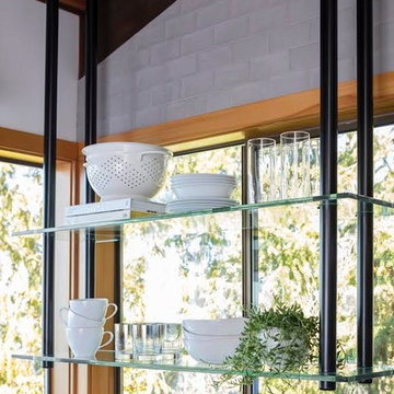
When we drove out to Mukilteo for our initial consultation, we immediately fell in love with this house. With its tall ceilings, eclectic mix of wood, glass and steel, and gorgeous view of the Puget Sound, we quickly nicknamed this project "The Mukilteo Gem". Our client, a cook and baker, did not like her existing kitchen. The main points of issue were short runs of available counter tops, lack of storage and shortage of light. So, we were called in to implement some big, bold ideas into a small footprint kitchen with big potential. We completely changed the layout of the room by creating a tall, built-in storage wall and a continuous u-shape counter top. Early in the project, we took inventory of every item our clients wanted to store in the kitchen and ensured that every spoon, gadget, or bowl would have a dedicated "home" in their new kitchen. The finishes were meticulously selected to ensure continuity throughout the house. We also played with the color scheme to achieve a bold yet natural feel.This kitchen is a prime example of how color can be used to both make a statement and project peace and balance simultaneously. While busy at work on our client's kitchen improvement, we also updated the entry and gave the homeowner a modern laundry room with triple the storage space they originally had.
End result: ecstatic clients and a very happy design team. That's what we call a big success!
John Granen.
 Drewett Works
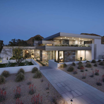
With adjacent neighbors within a fairly dense section of Paradise Valley, Arizona, C.P. Drewett sought to provide a tranquil retreat for a new-to-the-Valley surgeon and his family who were seeking the modernism they loved though had never lived in. With a goal of consuming all possible site lines and views while maintaining autonomy, a portion of the house — including the entry, office, and master bedroom wing — is subterranean. This subterranean nature of the home provides interior grandeur for guests but offers a welcoming and humble approach, fully satisfying the clients requests.
While the lot has an east-west orientation, the home was designed to capture mainly north and south light which is more desirable and soothing. The architecture’s interior loftiness is created with overlapping, undulating planes of plaster, glass, and steel. The woven nature of horizontal planes throughout the living spaces provides an uplifting sense, inviting a symphony of light to enter the space. The more voluminous public spaces are comprised of stone-clad massing elements which convert into a desert pavilion embracing the outdoor spaces. Every room opens to exterior spaces providing a dramatic embrace of home to natural environment.
Grand Award winner for Best Interior Design of a Custom Home
The material palette began with a rich, tonal, large-format Quartzite stone cladding. The stone’s tones gaveforth the rest of the material palette including a champagne-colored metal fascia, a tonal stucco system, and ceilings clad with hemlock, a tight-grained but softer wood that was tonally perfect with the rest of the materials. The interior case goods and wood-wrapped openings further contribute to the tonal harmony of architecture and materials.
Grand Award Winner for Best Indoor Outdoor Lifestyle for a Home This award-winning project was recognized at the 2020 Gold Nugget Awards with two Grand Awards, one for Best Indoor/Outdoor Lifestyle for a Home, and another for Best Interior Design of a One of a Kind or Custom Home.
At the 2020 Design Excellence Awards and Gala presented by ASID AZ North, Ownby Design received five awards for Tonal Harmony. The project was recognized for 1st place – Bathroom; 3rd place – Furniture; 1st place – Kitchen; 1st place – Outdoor Living; and 2nd place – Residence over 6,000 square ft. Congratulations to Claire Ownby, Kalysha Manzo, and the entire Ownby Design team.
Tonal Harmony was also featured on the cover of the July/August 2020 issue of Luxe Interiors + Design and received a 14-page editorial feature entitled “A Place in the Sun” within the magazine.
 CB Conlin Landscapes Inc.
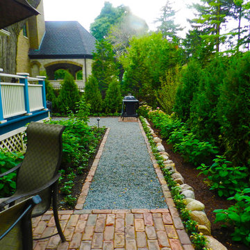
Crushed bluestone gravel pathway leading to grilling station. Grill was set away from main dining to avoid traffic pile up and excess smoke issues.
Inspiration for a mid-sized timeless backyard gravel patio remodel in Chicago
Inspiration for a mid-sized timeless backyard gravel patio remodel in Chicago
 Drewett Works
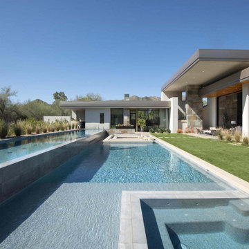
With adjacent neighbors within a fairly dense section of Paradise Valley, Arizona, C.P. Drewett sought to provide a tranquil retreat for a new-to-the-Valley surgeon and his family who were seeking the modernism they loved though had never lived in. With a goal of consuming all possible site lines and views while maintaining autonomy, a portion of the house — including the entry, office, and master bedroom wing — is subterranean. This subterranean nature of the home provides interior grandeur for guests but offers a welcoming and humble approach, fully satisfying the clients requests.
While the lot has an east-west orientation, the home was designed to capture mainly north and south light which is more desirable and soothing. The architecture’s interior loftiness is created with overlapping, undulating planes of plaster, glass, and steel. The woven nature of horizontal planes throughout the living spaces provides an uplifting sense, inviting a symphony of light to enter the space. The more voluminous public spaces are comprised of stone-clad massing elements which convert into a desert pavilion embracing the outdoor spaces. Every room opens to exterior spaces providing a dramatic embrace of home to natural environment.
Grand Award winner for Best Interior Design of a Custom Home
The material palette began with a rich, tonal, large-format Quartzite stone cladding. The stone’s tones gaveforth the rest of the material palette including a champagne-colored metal fascia, a tonal stucco system, and ceilings clad with hemlock, a tight-grained but softer wood that was tonally perfect with the rest of the materials. The interior case goods and wood-wrapped openings further contribute to the tonal harmony of architecture and materials.
Grand Award Winner for Best Indoor Outdoor Lifestyle for a Home This award-winning project was recognized at the 2020 Gold Nugget Awards with two Grand Awards, one for Best Indoor/Outdoor Lifestyle for a Home, and another for Best Interior Design of a One of a Kind or Custom Home.
At the 2020 Design Excellence Awards and Gala presented by ASID AZ North, Ownby Design received five awards for Tonal Harmony. The project was recognized for 1st place – Bathroom; 3rd place – Furniture; 1st place – Kitchen; 1st place – Outdoor Living; and 2nd place – Residence over 6,000 square ft. Congratulations to Claire Ownby, Kalysha Manzo, and the entire Ownby Design team.
Tonal Harmony was also featured on the cover of the July/August 2020 issue of Luxe Interiors + Design and received a 14-page editorial feature entitled “A Place in the Sun” within the magazine.
 Advance Design Studio, Ltd.
After six years of living in their Huntley IL home, Chris and Meghan were tired of their dark, dingy, outdated kitchen and it was finally time for a long-anticipated change. “The kitchen is the place where we live, it’s where we do everything,” Meghan said. “It was important that it be a space where we wanted to be.” Meghan loves cooking and enjoys including their girls in healthy meal prepping, this led them to want a brighter, more enjoyable kitchen with increased functionality and improved storage.
For Chris especially, the laundry room was an entirely dysfunctional eyesore. “We had a washer and a dryer, but it was all kind-of cobbled together!” Chris said. “There were always laundry piles everywhere, we weren’t really sure what we wanted to do in there, but it was time for us to make a change.” The mess of the space was stressful every time they walked in the door from the garage each day. Kids’ backpacks and shoes piled up haphazardly in the makeshift boot-bench closet left the family feeling disorganized and stressed. They needed space for folding clothes and locker cubbies to help keep the family organized.
Having known Christine and Todd in the Huntley community for years, Chris and Meghan were familiar with their work. “We already trusted them personally and having seen their projects for years we knew they did top notch work. After we reviewed the initial round of designs, we knew that hiring them was definitely the right choice,” Meghan and Chris said. Although Chris had done a lot of work in their home himself, the kitchen and laundry room renovation was such a large undertaking that he didn’t want to steal time away from his family to spend what would surely be many long weekends doing the job himself. “That would not have been a wise choice for us,” Chris laughed.
“Our designer, Michelle was very, very, easy to work with; anything we wanted to see or weren’t sure about, she went above and beyond to make this easy for us. She was easy to get hold of and always quick to respond,” the couple said. Michelle pulled ideas that mirrored the couple’s taste and style and was adept at directing the couple to limited choices that didn’t overwhelm them and kept the process moving. “I have a hard time making decisions. Michelle made the decision-making process so easy. I loved how she listened to what I liked and then presented three great options for me to choose from,” Meghan said.
The main objectives for the kitchen were better storage solutions, they wanted the space to reflect their lifestyle and taste, and they wanted it to last for years with low maintenance. One of the first steps in creating a more functional kitchen was relocating the refrigerator, creating an improved workflow for the busy family.
“We didn’t know that we could even move the refrigerator to a new location where it is now, that was something that we never would have thought of,” Chris said. “The new refrigerator location makes the kitchen feel so much bigger. We didn’t add any space, but our whole kitchen with the new design just seems like it’s so much larger than before!” Meghan said.
The perimeter mist colored cabinets helped warm and brighten the entire room, while the graphite colored cabinets on the island added contrast. Using this fresh, clean color palette satisfied the couple’s desire for a bright space that was the exact opposite of what they had before. Organization accessories were also added to the cabinets such as a spice drawer tray and roll outs to create hidden convenience.
“I absolutely love the hidden spices – it makes cooking so much more enjoyable!” Chris said. “And all the pull outs, and the double trash bin, who would think you could get so excited about organization!” the couple said in unison.
One thing they hated in their original kitchen was how dark the space felt. Added lighting on the ceiling with the new light fixtures combined with the lighter cabinetry colors throughout solved this problem. “Our new kitchen has this warm, almost cozy feeling that our old kitchen never had, it’s just a space that I love spending my time in now,” Meghan said. The light airy feeling was accentuated with the use of floating white shelves on either side of the decorative range hood. “We have so much cabinetry space, the new design is amazing we actually have more storage space than we will ever need,” Meghan said.
The island was extended to create more work surface and added space for stool seating. “The new island changes how we live. Now the kids can be in the kitchen with us, doing homework, eating breakfast, and the three of us have special dinners there when Chris is working late,” Meghan said.
The Carrara Marmi Quartz countertops were chosen because they are, not only beautiful, but are made from hard-working material that doesn’t require maintenance. The white subway tile backsplash that wraps to the ceiling behind the focal point cooktop range/hood compliments the crisp white countertops perfectly, while brushed brass hardware and light fixtures keep the design fresh and new.
The couple had a few fears at the beginning of the project, as most homeowners do. Their biggest fear was being out of their kitchen and laundry room for an extended time. The crew made it very easy for the family to work in a limited space keeping the washer and dryer hooked up the majority of the time, and also getting appliances working with minimal downtime.
“They above and beyond accommodated us to get us through the process,” Meghan said. “They did a great job making sure we were as comfortable as possible throughout the process,” Chris added.
“Our project manager DJ did a great job. He was very good at updating us on schedule changes, getting guys in as quickly as possible. Everyone that stepped in the house was nice and did great work,” said Chris. They thought Advance’s carpenter was phenomenal and were impressed when he took a conceptual idea from a photograph and worked with designer Michelle to create a one of a kind range/hood that has become the topic of conversation with friends and family who visit the new kitchen. “He was in our house literally every day for several weeks. He was easy to work with and good at what he did,” Meghan and Chris said.
The focal point of the kitchen; a hand-crafted, custom-built ventilation hood was clad with handpicked reclaimed barnwood. Advance Design’s carpenter built the framework and the cladding to create a one-of-a-kind design element that the couple loves.
“I think it was especially fun for him to create something unique from scratch, showcasing his talent in this area,” Meghan said. “I love that my kitchen is not like everyone else’s. I got to pick out the wood on my hood and watch it being built and was able to choose what pieces of wood went where on it. It’s totally unique.”
Red Oak flooring was toothed-in throughout the kitchen and the rest of the first floor anywhere changes were made. Then the whole floor was refinished to tone down the orange undertones in the existing floor stain, ultimately changing the color complexion of the entire first floor. The result is a completely new feeling to the entire home.
Renovating the laundry room was extremely important to Meghan and Chris, but they had trouble visualizing what the possibilities were for the seemingly small space. Michelle produced beautiful 3D illustrations that helped them envision the space in a whole new way.
“I must have told Michelle 100 times that I am a visual person, seeing the designs in 3D made it so easy to make decisions and see what we could really do with our space,” Meghan said.
A dividing wall and doorway were removed between the existing laundry room and hallway formerly containing a coat closet, providing space to design specialized graphite colored cabinetry matching the kitchen island to house custom storage cubbies for each family member. Adding the tall utility cabinetry in the new laundry area helped solve the storage issue, tucking away cleaning supplies, household items, and even the cat got its own cubby.
“I love how everything is now hidden in its own space. I can’t tell you how much I hated coming home and seeing everything sitting around on counters,” Chris said.
Electrical outlets were planned for the inside of utility cabinets, so devices could charge in hidden locations. Stacking the washer and dryer allowed for wider countertop space to provide a folding area and a special space for clothes to hang. “The way I do laundry has been completely transformed! I can actually fold clothes and hang them now right out of the washer and dryer,” Meghan said.
“The end result in the kitchen and the laundry/mud room was an updated light and bright space, with a smarter work flow that better meets the needs of this family,” Michelle said.
“I would totally recommend Advance Design,” Meghan said. “Sometimes I sit and just look at my kitchen and laundry room and think ‘Wow, I can’t believe I get to live here!’ It’s an understatement to say we love our new space.”
 ROAM Architecture
Updating a modern classic
These clients adore their home’s location, nestled within a 2-1/2 acre site largely wooded and abutting a creek and nature preserve. They contacted us with the intent of repairing some exterior and interior issues that were causing deterioration, and needed some assistance with the design and selection of new exterior materials which were in need of replacement.
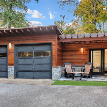
Our new proposed exterior includes new natural wood siding, a stone base, and corrugated metal. New entry doors and new cable rails completed this exterior renovation.
Additionally, we assisted these clients resurrect an existing pool cabana structure and detached 2-car garage which had fallen into disrepair. The garage / cabana building was renovated in the same aesthetic as the main house.
 Rudloff Custom Builders
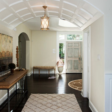
This grand 2 story open foyer welcomes one.
From the center hall we have a view of this magnificent arched coffered hallway with dark wood floors and raised patterned diamond carpet wide runner that draw the eye in.
A wood detailed top console table on a wrought iron frame, stretchers and paw feet support sculptures that enhance the architecture of the space.
On both sides of the front door there are demilune tufted benches in a louis XVI style
This home was featured in Philadelphia Magazine August 2014 issue to showcase its beauty and excellence.
Photo by Alicia's Art, LLC
RUDLOFF Custom Builders, is a residential construction company that connects with clients early in the design phase to ensure every detail of your project is captured just as you imagined. RUDLOFF Custom Builders will create the project of your dreams that is executed by on-site project managers and skilled craftsman, while creating lifetime client relationships that are build on trust and integrity.
We are a full service, certified remodeling company that covers all of the Philadelphia suburban area including West Chester, Gladwynne, Malvern, Wayne, Haverford and more.
As a 6 time Best of Houzz winner, we look forward to working with you on your next project.

 Austin Ganim Landscape Design, LLC
Clethra alnifolia 'Hummingbird' - Hummingbird Summersweet: These fragrant white spike flowers mix well with perennials and shrubs alike, there late summer blooms are followed by a fabulous yellow fall color display. A wonderful addition to any pollinator garden.
Zones 4-9
Austin Ganim Landscape Design, LLC
40