
Search results for "Maintainable method" in Home Design Ideas
 Tom Brzoskwinia
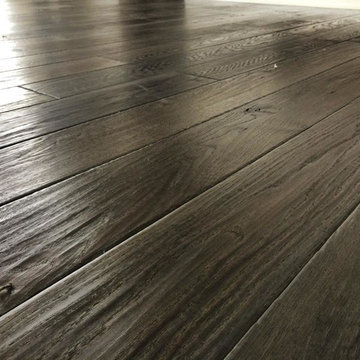
One of the most popular hardwood floor finishing which offers Tom & Peter Flooring is provided by WOCA. If you’ve decided that you want a natural looking wooden floor that is lacquer-free, then the likelihood is that you’ve chosen oil as your way of protecting your wood and making your floor look great at the same time. WOCA for wood flooring comes in various forms and is a great way of making sure that your wood is protected, but at the same time looks natural. A highly popular as well as effective way of treating wood floors, oils effectively penetrate into the wood and in some cases harden into the surface of the floor to stop damage and to maintain the wood in its optimum condition.
WOCA Oil finish hardwood flooring has taken the United States market by in 2014 and shows no signs of slowing down in 2016 and now. Here are some of the most common questions we have regarding this type of finish which we will I’m to answer in today’s my blog:
Is oil finish as durable as traditional factory urethane finishes with aluminum oxide?
When it comes to durability, oil finish flooring tackles the issue with a completely different method. The penetrating oil serves as protection from moisture and wear while allowing the user to feel the wood grains in their bare feet. If compared directly to factory finished aluminum oxide finish, the oil finish flooring will not perform as well to abrasion and impact. However, the beauty of this finish is the fact that it will camouflage any scratches which will inevitably accumulate over time.
Will this finish evaporate over time and will this be harmful for indoor air quality?
Another concern for oil finished floors its effect on indoor air quality. For on-site applications, some varieties suggest several coats which typically require the residents to be out of the home due to mild odors. However, there are factory finished UV-cured or single coat applications which lessen the downtime. Despite the odors produced during the drying process, oil finish floors rank amongst the lowest for VOC (volatile organic compound) emissions. Certain brands even boast true zero VOC. This fact alone makes oil finished floors one of the best options for green building solutions.
“WOCA products are certified by independent laboratories, the German Institute for Biological Building Materials, and are in accordance with DIN–Norm 53–160. WOCA WoodCare Denmark products meet or exceed the most stringent U.S. standards for volatile organic compounds.” –WOCA Oil Finish Manufacture
Does this type of finish require additional maintenance which I am not familiar with?
For weekly cleaning, oiled floors use a special cleaner which contains an oil and soap mixture. After a period of 12-18 months some oil may evaporate causing the wood grains to appear dry. An additional layer of oil can be reapplied to keep the floor looking fresh. Although oil finished floors require more involvement in periodic maintenance in high traffic areas, this maintenance can be done much easier than the equivalent of an onsite sand and refinish.
WOCA Master Color Oil contains pigment, which provides a single-step hardwood floor staining process. Laying down the stain and the finish in one step.
This product comes 14 different colors, from Black to Extra White, and you can mix them freely to create various color palettes that will meet the demands of any job.
Below are some pictures of the finished job…
 Maison Birmingham
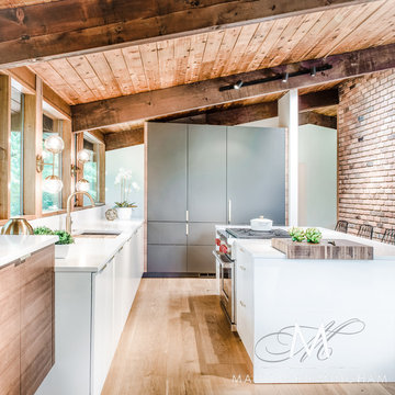
The main goal of this renovation was to update an authentic mid-century home to suit a modern lifestyle, while still maintaining the original character and aesthetic of the home.
To create a more open, family friendly space also suitable for entertaining, walls between the kitchen, dining room and living room were removed to create an open area to house the 360-sq.-ft. kitchen. Upon demolition, it was noted that some areas of the original tongue and groove ceiling had aged much differently than the rest of the ceiling. Rather than stain the areas and cause them to age differently, we opted to apply oil to darken the wood so that it will all continue to age at the same pace.
Balancing new materials and tones with the existing abundance of wood was challenging, but in the end the balance was achieved with custom cabinetry in both white and anthracite matte lacquer, which is complemented by a custom floating walnut buffet in the dining area. Keeping the island and perimeter base cabinet finishes the same made the space feel more open, and presented the opportunity to create a dark focal wall for the refrigerator and pantry. These custom anthracite matte lacquer cabinets provide a striking yet subtle contrast with the white and wood, while incorporating well concealed pantry storage with microwave, as well as a Sub-Zero refrigerator.
In lieu of a typical exhaust hood, downdraft ventilation was installed in the island, and pendants were omitted to keep the space open, but also more consistent with the original design of the home. Brass globe sconces were installed on either side of the sink to bring in warmth, and frame the view of the gorgeous greenery outside.
This Project was a fantastic collaboration with Lauren Combs of The Neat Method Michigan
Proudly Featured in Detroit Home October 2017
Photography by Boswell Hardwick
 Maison Birmingham
The main goal of this renovation was to update an authentic mid-century home to suit a modern lifestyle, while still maintaining the original character and aesthetic of the home.
To create a more open, family friendly space also suitable for entertaining, walls between the kitchen, dining room and living room were removed to create an open area to house the 360-sq.-ft. kitchen. Upon demolition, it was noted that some areas of the original tongue and groove ceiling had aged much differently than the rest of the ceiling. Rather than stain the areas and cause them to age differently, we opted to apply oil to darken the wood so that it will all continue to age at the same pace.
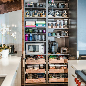
Balancing new materials and tones with the existing abundance of wood was challenging, but in the end the balance was achieved with custom cabinetry in both white and anthracite matte lacquer, which is complemented by a custom floating walnut buffet in the dining area. Keeping the island and perimeter base cabinet finishes the same made the space feel more open, and presented the opportunity to create a dark focal wall for the refrigerator and pantry. These custom anthracite matte lacquer cabinets provide a striking yet subtle contrast with the white and wood, while incorporating well concealed pantry storage with microwave, as well as a Sub-Zero refrigerator.
In lieu of a typical exhaust hood, downdraft ventilation was installed in the island, and pendants were omitted to keep the space open, but also more consistent with the original design of the home. Brass globe sconces were installed on either side of the sink to bring in warmth, and frame the view of the gorgeous greenery outside.
This Project was a fantastic collaboration with Lauren Combs of The Neat Method Michigan
Proudly Featured in Detroit Home October 2017
Photography by Boswell Hardwick
Find the right local pro for your project
 Thomas Roszak Architecture, LLC
Photo credit: Scott McDonald @ Hedrich Blessing
7RR-Ecohome:
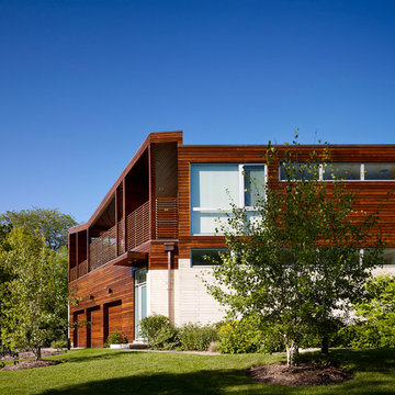
The design objective was to build a house for a couple recently married who both had kids from previous marriages. How to bridge two families together?
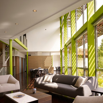
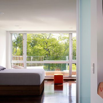
The design looks forward in terms of how people live today. The home is an experiment in transparency and solid form; removing borders and edges from outside to inside the house, and to really depict “flowing and endless space”. The house floor plan is derived by pushing and pulling the house’s form to maximize the backyard and minimize the public front yard while welcoming the sun in key rooms by rotating the house 45-degrees to true north. The angular form of the house is a result of the family’s program, the zoning rules, the lot’s attributes, and the sun’s path. We wanted to construct a house that is smart and efficient in terms of construction and energy, both in terms of the building and the user. We could tell a story of how the house is built in terms of the constructability, structure and enclosure, with a nod to Japanese wood construction in the method in which the siding is installed and the exposed interior beams are placed in the double height space. We engineered the house to be smart which not only looks modern but acts modern; every aspect of user control is simplified to a digital touch button, whether lights, shades, blinds, HVAC, communication, audio, video, or security. We developed a planning module based on a 6-foot square room size and a 6-foot wide connector called an interstitial space for hallways, bathrooms, stairs and mechanical, which keeps the rooms pure and uncluttered. The house is 6,200 SF of livable space, plus garage and basement gallery for a total of 9,200 SF. A large formal foyer celebrates the entry and opens up to the living, dining, kitchen and family rooms all focused on the rear garden. The east side of the second floor is the Master wing and a center bridge connects it to the kid’s wing on the west. Second floor terraces and sunscreens provide views and shade in this suburban setting. The playful mathematical grid of the house in the x, y and z axis also extends into the layout of the trees and hard-scapes, all centered on a suburban one-acre lot.
Many green attributes were designed into the home; Ipe wood sunscreens and window shades block out unwanted solar gain in summer, but allow winter sun in. Patio door and operable windows provide ample opportunity for natural ventilation throughout the open floor plan. Minimal windows on east and west sides to reduce heat loss in winter and unwanted gains in summer. Open floor plan and large window expanse reduces lighting demands and maximizes available daylight. Skylights provide natural light to the basement rooms. Durable, low-maintenance exterior materials include stone, ipe wood siding and decking, and concrete roof pavers. Design is based on a 2' planning grid to minimize construction waste. Basement foundation walls and slab are highly insulated. FSC-certified walnut wood flooring was used. Light colored concrete roof pavers to reduce cooling loads by as much as 15%. 2x6 framing allows for more insulation and energy savings. Super efficient windows have low-E argon gas filled units, and thermally insulated aluminum frames. Permeable brick and stone pavers reduce the site’s storm-water runoff. Countertops use recycled composite materials. Energy-Star rated furnaces and smart thermostats are located throughout the house to minimize duct runs and avoid energy loss. Energy-Star rated boiler that heats up both radiant floors and domestic hot water. Low-flow toilets and plumbing fixtures are used to conserve water usage. No VOC finish options and direct venting fireplaces maintain a high interior air quality. Smart home system controls lighting, HVAC, and shades to better manage energy use. Plumbing runs through interior walls reducing possibilities of heat loss and freezing problems. A large food pantry was placed next to kitchen to reduce trips to the grocery store. Home office reduces need for automobile transit and associated CO2 footprint. Plan allows for aging in place, with guest suite than can become the master suite, with no need to move as family members mature.
 Thomas Roszak Architecture, LLC
Photo credit: Scott McDonald @ Hedrich Blessing
7RR-Ecohome:
The design objective was to build a house for a couple recently married who both had kids from previous marriages. How to bridge two families together?
The design looks forward in terms of how people live today. The home is an experiment in transparency and solid form; removing borders and edges from outside to inside the house, and to really depict “flowing and endless space”. The house floor plan is derived by pushing and pulling the house’s form to maximize the backyard and minimize the public front yard while welcoming the sun in key rooms by rotating the house 45-degrees to true north. The angular form of the house is a result of the family’s program, the zoning rules, the lot’s attributes, and the sun’s path. We wanted to construct a house that is smart and efficient in terms of construction and energy, both in terms of the building and the user. We could tell a story of how the house is built in terms of the constructability, structure and enclosure, with a nod to Japanese wood construction in the method in which the siding is installed and the exposed interior beams are placed in the double height space. We engineered the house to be smart which not only looks modern but acts modern; every aspect of user control is simplified to a digital touch button, whether lights, shades, blinds, HVAC, communication, audio, video, or security. We developed a planning module based on a 6-foot square room size and a 6-foot wide connector called an interstitial space for hallways, bathrooms, stairs and mechanical, which keeps the rooms pure and uncluttered. The house is 6,200 SF of livable space, plus garage and basement gallery for a total of 9,200 SF. A large formal foyer celebrates the entry and opens up to the living, dining, kitchen and family rooms all focused on the rear garden. The east side of the second floor is the Master wing and a center bridge connects it to the kid’s wing on the west. Second floor terraces and sunscreens provide views and shade in this suburban setting. The playful mathematical grid of the house in the x, y and z axis also extends into the layout of the trees and hard-scapes, all centered on a suburban one-acre lot.
Many green attributes were designed into the home; Ipe wood sunscreens and window shades block out unwanted solar gain in summer, but allow winter sun in. Patio door and operable windows provide ample opportunity for natural ventilation throughout the open floor plan. Minimal windows on east and west sides to reduce heat loss in winter and unwanted gains in summer. Open floor plan and large window expanse reduces lighting demands and maximizes available daylight. Skylights provide natural light to the basement rooms. Durable, low-maintenance exterior materials include stone, ipe wood siding and decking, and concrete roof pavers. Design is based on a 2' planning grid to minimize construction waste. Basement foundation walls and slab are highly insulated. FSC-certified walnut wood flooring was used. Light colored concrete roof pavers to reduce cooling loads by as much as 15%. 2x6 framing allows for more insulation and energy savings. Super efficient windows have low-E argon gas filled units, and thermally insulated aluminum frames. Permeable brick and stone pavers reduce the site’s storm-water runoff. Countertops use recycled composite materials. Energy-Star rated furnaces and smart thermostats are located throughout the house to minimize duct runs and avoid energy loss. Energy-Star rated boiler that heats up both radiant floors and domestic hot water. Low-flow toilets and plumbing fixtures are used to conserve water usage. No VOC finish options and direct venting fireplaces maintain a high interior air quality. Smart home system controls lighting, HVAC, and shades to better manage energy use. Plumbing runs through interior walls reducing possibilities of heat loss and freezing problems. A large food pantry was placed next to kitchen to reduce trips to the grocery store. Home office reduces need for automobile transit and associated CO2 footprint. Plan allows for aging in place, with guest suite than can become the master suite, with no need to move as family members mature.
 Kitchen Design Concepts
We introduce to you one of our newer services we are providing here at Kitchen Design Concepts: spaces that just need a little reviving! As of recent, we are taking on projects that are in need of minimal updating, as in, spaces that don’t need a full-on remodel. Yes, you heard right! If your space has good bones, you like the layout of your kitchen, and you just need a few cosmetic changes, then today’s feature is for you! Recently, we updated a space where we did just this! The kitchen was in need of a little love, some fresh paint, and new finishes. And if we’re being honest here, the result looks almost as if the kitchen had a full-on remodel! To learn more about this space and how we did our magic, continue reading below:
The Before and After
First, see what an impact new finishes can make! The “before” image shows a kitchen with outdated finishes such as the tile countertops, backsplash, and cabinetry finish. The “after” image, is a kitchen that looks almost as if its brand new, the image speaks for itself!
Cabinetry
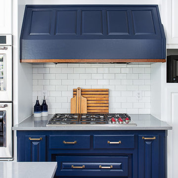
With the wooden cabinetry in this kitchen already having great bones, all we needed to do was our refinishing process that involved removing door and drawer fronts, sanding, priming, and painting. The main color of the cabinetry is white (Sherwin Williams Pure White 7005) and as an accent, we applied a deep navy blue that really pops in this space (Sherwin Willaims Naval 6244). As a special design element, we incorporated a natural wooden band across the hood which is subtle but adds an element of surprise.
Countertops
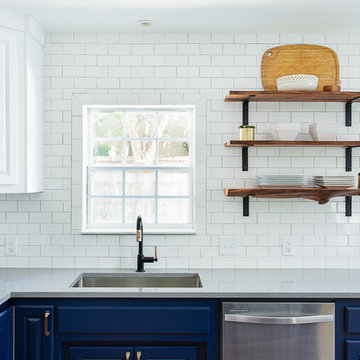
The original countertops in this space were a 12×12 tile with cracks and discolored grout from all the wear and tear. To replace the countertops, we installed a clean and crisp quartz that is not only durable but easy to maintain (no grout here!). The 3cm countertops are a Cambria quartz in a grey-tone color (Carrick).
Backsplash
Keeping things simple, yet classic, we installed a 3×6 subway tile from Interceramic. The crisp white pairs well with all the other finishes of the space and really brighten the space up! To spice things up, we paired the white tile with a contrasting grout color (Cape Grey) that matches the countertop. This is a simple method to add interest to your white backsplash!
Fixtures and Fittings
For the fixtures and fittings of the kitchen, we wanted pieces that made a statement. That’s why we selected this industrial style faucet from Brizo! The faucet is a Brizo LITZE™ PULL-DOWN FAUCET WITH ARC SPOUT AND INDUSTRIAL HANDLE (63044LF-BLGL). The matte black paired with the luxe gold elements really make a statement! To match the gold elements of the faucet, we installed cabinetry hardware from Topknobs in the same gold finish. The hardware is a Channing pull TK743HB. Lastly, the large single bowl sink (who doesn’t want a large sink?!) is a great functional touch to the kitchen. The sink is a Blanco Precision 16″ R10 super single with 16″ Drainer in stainless steel (516216).
 Thomas Roszak Architecture, LLC
Photo credit: Scott McDonald @ Hedrich Blessing
7RR-Ecohome:
The design objective was to build a house for a couple recently married who both had kids from previous marriages. How to bridge two families together?
The design looks forward in terms of how people live today. The home is an experiment in transparency and solid form; removing borders and edges from outside to inside the house, and to really depict “flowing and endless space”. The house floor plan is derived by pushing and pulling the house’s form to maximize the backyard and minimize the public front yard while welcoming the sun in key rooms by rotating the house 45-degrees to true north. The angular form of the house is a result of the family’s program, the zoning rules, the lot’s attributes, and the sun’s path. We wanted to construct a house that is smart and efficient in terms of construction and energy, both in terms of the building and the user. We could tell a story of how the house is built in terms of the constructability, structure and enclosure, with a nod to Japanese wood construction in the method in which the siding is installed and the exposed interior beams are placed in the double height space. We engineered the house to be smart which not only looks modern but acts modern; every aspect of user control is simplified to a digital touch button, whether lights, shades, blinds, HVAC, communication, audio, video, or security. We developed a planning module based on a 6-foot square room size and a 6-foot wide connector called an interstitial space for hallways, bathrooms, stairs and mechanical, which keeps the rooms pure and uncluttered. The house is 6,200 SF of livable space, plus garage and basement gallery for a total of 9,200 SF. A large formal foyer celebrates the entry and opens up to the living, dining, kitchen and family rooms all focused on the rear garden. The east side of the second floor is the Master wing and a center bridge connects it to the kid’s wing on the west. Second floor terraces and sunscreens provide views and shade in this suburban setting. The playful mathematical grid of the house in the x, y and z axis also extends into the layout of the trees and hard-scapes, all centered on a suburban one-acre lot.
Many green attributes were designed into the home; Ipe wood sunscreens and window shades block out unwanted solar gain in summer, but allow winter sun in. Patio door and operable windows provide ample opportunity for natural ventilation throughout the open floor plan. Minimal windows on east and west sides to reduce heat loss in winter and unwanted gains in summer. Open floor plan and large window expanse reduces lighting demands and maximizes available daylight. Skylights provide natural light to the basement rooms. Durable, low-maintenance exterior materials include stone, ipe wood siding and decking, and concrete roof pavers. Design is based on a 2' planning grid to minimize construction waste. Basement foundation walls and slab are highly insulated. FSC-certified walnut wood flooring was used. Light colored concrete roof pavers to reduce cooling loads by as much as 15%. 2x6 framing allows for more insulation and energy savings. Super efficient windows have low-E argon gas filled units, and thermally insulated aluminum frames. Permeable brick and stone pavers reduce the site’s storm-water runoff. Countertops use recycled composite materials. Energy-Star rated furnaces and smart thermostats are located throughout the house to minimize duct runs and avoid energy loss. Energy-Star rated boiler that heats up both radiant floors and domestic hot water. Low-flow toilets and plumbing fixtures are used to conserve water usage. No VOC finish options and direct venting fireplaces maintain a high interior air quality. Smart home system controls lighting, HVAC, and shades to better manage energy use. Plumbing runs through interior walls reducing possibilities of heat loss and freezing problems. A large food pantry was placed next to kitchen to reduce trips to the grocery store. Home office reduces need for automobile transit and associated CO2 footprint. Plan allows for aging in place, with guest suite than can become the master suite, with no need to move as family members mature.
Sponsored
Sunbury, OH

J.Holderby - Renovations
Franklin County's Leading General Contractors - 2X Best of Houzz!
 Kitchen Design Concepts
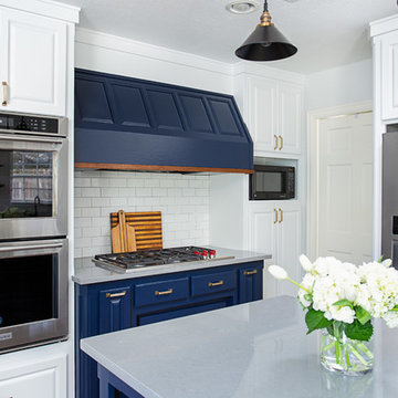
We introduce to you one of our newer services we are providing here at Kitchen Design Concepts: spaces that just need a little reviving! As of recent, we are taking on projects that are in need of minimal updating, as in, spaces that don’t need a full-on remodel. Yes, you heard right! If your space has good bones, you like the layout of your kitchen, and you just need a few cosmetic changes, then today’s feature is for you! Recently, we updated a space where we did just this! The kitchen was in need of a little love, some fresh paint, and new finishes. And if we’re being honest here, the result looks almost as if the kitchen had a full-on remodel! To learn more about this space and how we did our magic, continue reading below:
The Before and After
First, see what an impact new finishes can make! The “before” image shows a kitchen with outdated finishes such as the tile countertops, backsplash, and cabinetry finish. The “after” image, is a kitchen that looks almost as if its brand new, the image speaks for itself!
Cabinetry
With the wooden cabinetry in this kitchen already having great bones, all we needed to do was our refinishing process that involved removing door and drawer fronts, sanding, priming, and painting. The main color of the cabinetry is white (Sherwin Williams Pure White 7005) and as an accent, we applied a deep navy blue that really pops in this space (Sherwin Willaims Naval 6244). As a special design element, we incorporated a natural wooden band across the hood which is subtle but adds an element of surprise.
Countertops
The original countertops in this space were a 12×12 tile with cracks and discolored grout from all the wear and tear. To replace the countertops, we installed a clean and crisp quartz that is not only durable but easy to maintain (no grout here!). The 3cm countertops are a Cambria quartz in a grey-tone color (Carrick).
Backsplash
Keeping things simple, yet classic, we installed a 3×6 subway tile from Interceramic. The crisp white pairs well with all the other finishes of the space and really brighten the space up! To spice things up, we paired the white tile with a contrasting grout color (Cape Grey) that matches the countertop. This is a simple method to add interest to your white backsplash!
Fixtures and Fittings
For the fixtures and fittings of the kitchen, we wanted pieces that made a statement. That’s why we selected this industrial style faucet from Brizo! The faucet is a Brizo LITZE™ PULL-DOWN FAUCET WITH ARC SPOUT AND INDUSTRIAL HANDLE (63044LF-BLGL). The matte black paired with the luxe gold elements really make a statement! To match the gold elements of the faucet, we installed cabinetry hardware from Topknobs in the same gold finish. The hardware is a Channing pull TK743HB. Lastly, the large single bowl sink (who doesn’t want a large sink?!) is a great functional touch to the kitchen. The sink is a Blanco Precision 16″ R10 super single with 16″ Drainer in stainless steel (516216).

 Jordana Nicholson
Photo: Jordana Nicholson © 2016 Houzz
Photo of a farmhouse landscaping in Kansas City.
Photo of a farmhouse landscaping in Kansas City.
 OMZ architects
As a Flagstaff custom home architect, our approach to every project is to balance innovative solutions with bold design aesthetics. The Micro Mini, a compact and modern accessory dwelling unit (ADU) nestled in the heart of Flagstaff, is the perfect example of how thoughtful design can solve space constraints while offering a stylish, functional, and delightful living environment.
Our client came to us with a unique challenge: to create an additional living space on their property that was efficient, visually striking, and flexible in its function. They wanted to maximize a small footprint while incorporating pops of vibrant, monochrome color throughout the ADU to give it personality and make it feel like an extension of their larger home. The solution we provided, as your trusted Flagstaff custom home architect, was Micro Mini—a design that offers both efficiency and fun while making a big impact in a small space.
The first challenge we tackled was how to make the most of the limited square footage. Our approach, rooted in the principles of modern architecture, was to keep the floor plan as open and flexible as possible. By eliminating unnecessary walls and creating multifunctional spaces, we were able to design an interior that feels spacious and airy, despite the small footprint.
The living area, kitchen, and bedroom all flow seamlessly into each other, using strategic cabinetry, sliding doors, and built-in storage to keep the space uncluttered. The use of glass for windows and doors amplifies the sense of space, bringing in abundant natural light and connecting the interior to the outdoor landscape—a key consideration in any Flagstaff custom home architect project.
One of the most striking elements of the Micro Mini is its creative use of color. The client wanted each space to feel distinct, while still maintaining a cohesive design language. To achieve this, we incorporated monochrome color schemes in various sections of the ADU, starting with the kitchen.
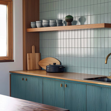
The kitchen is a bold statement in shades of blue, with blue-stained cabinets, blue backsplash tile, and even blue fixtures. This color immersion gives the kitchen a distinctive identity while still blending harmoniously with the rest of the space. In other areas of the ADU, we played with pops of other fun colors—each carefully chosen to complement the modern aesthetic of the home while adding a personalized touch.
As your Flagstaff custom home architect, we believe that color is an integral part of design, and Micro Mini is a testament to how thoughtful color application can elevate a space. The bold monochrome interiors are a fun, creative twist that make this ADU stand out while ensuring it remains functional and inviting.
Beyond the bold use of color, the interior of Micro Mini is designed with simplicity and function in mind. We utilized clean lines, minimal ornamentation, and carefully selected materials to keep the overall look sleek and modern. Light wood floors contrast with the bold color accents and add warmth to the otherwise minimalistic design.
Attention to detail is paramount in all of our projects, and as a Flagstaff custom home architect, we take pride in the craftsmanship and quality materials used throughout the Micro Mini. From the custom-built cabinetry to the thoughtfully designed storage solutions, every inch of the ADU was considered for both aesthetics and practicality.
A key problem we solved for the client was how to make the ADU feel spacious and functional despite its small footprint. As your trusted Flagstaff custom home architect, we used a range of design solutions to achieve this.
First, we incorporated high ceilings to enhance the sense of volume and space, creating an airy feel throughout the ADU. The placement of windows and the strategic use of sliding glass doors allow light to flood in, further opening up the interior and blurring the lines between inside and out. These elements not only make the ADU feel larger but also create a strong connection to the surrounding landscape.
Another key element was the use of built-in furniture and storage solutions to keep the space clutter-free. From hidden storage under the bed to custom cabinetry in the kitchen, every corner of the Micro Mini was designed with functionality in mind. This approach ensured that the ADU met the client’s needs for both comfort and practicality, while still adhering to the modern design aesthetic they desired.
Being based in Northern Arizona, we are acutely aware of how important it is for our designs to harmonize with the surrounding landscape. As a Flagstaff custom home architect, we carefully consider the site’s natural beauty and how our projects can integrate with it.
With Micro Mini, we focused on making sure that the ADU feels like a natural extension of the client’s existing property. The large windows and sliding glass doors bring in views of the surrounding landscape, while the outdoor deck extends the living space, creating a seamless indoor-outdoor experience. Whether you’re standing in the living room or on the deck, you are always connected to the beautiful Flagstaff setting.
In line with our commitment to responsible design, sustainability was a key consideration for Micro Mini. As your Flagstaff custom home architect, we prioritize energy-efficient building methods and materials. The ADU was designed to be energy-efficient, with high-performance windows and insulation that keep it cool in the summer and warm in the winter.
Additionally, the color choices and materials used in the interior were chosen not just for their aesthetic appeal, but also for their durability and sustainability. Low-VOC paints and finishes were used throughout the ADU to ensure good indoor air quality, while the energy-efficient lighting and appliances help minimize the ADU’s overall environmental impact.
At HEY! designs, we believe in a collaborative approach to architecture that puts the client’s needs and vision at the forefront. Whether designing a large custom home or a compact ADU like Micro Mini, we bring the same level of dedication, creativity, and attention to detail to every project.
Our work is rooted in modern design principles but always infused with personality and a sense of fun. Micro Mini exemplifies this approach—a bold, colorful, and efficient ADU that meets the client’s needs while also reflecting their unique style.
If you’re considering a custom home or ADU in Flagstaff, HEY! designs is here to help bring your vision to life. As a Flagstaff custom home architect, we specialize in creating spaces that are not only beautiful and functional but also responsive to the unique qualities of the site and the needs of the client.
Micro Mini is a testament to how small spaces can still be big on style and function. By incorporating bold color schemes, maximizing space efficiency, and maintaining a strong connection to the outdoors, this ADU achieves everything the client wanted—a modern, fun, and functional space.
As your Flagstaff custom home architect, we would be thrilled to help you create a unique and personalized space that meets your needs, no matter the size or scope of your project. Contact us today to learn more about how we can bring your vision to life.
 Garden Architecture, LLC
Kirsten Coffen
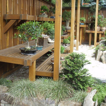
Photo of a small asian partial sun courtyard gravel landscaping in Baltimore.
Photo of a small asian partial sun courtyard gravel landscaping in Baltimore.
 AquaTerra Outdoors
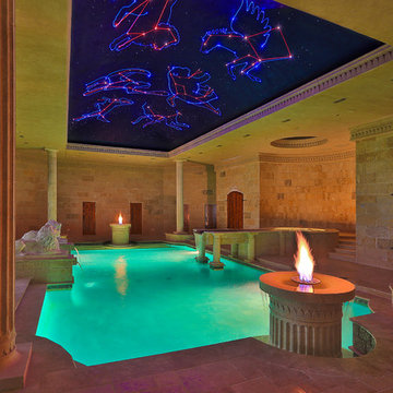
The remarkable Greek inspired indoor pool facility has a blend of contemporary rectilinear components with Greek-Roman architectural elements and finishes, such as the over-extending, ancient-style aqueduct that transitions from the spa into the pool, and the hand carved fire-water features at each end of the room. The aqueduct is a key relevance to the style which portrays an ancient cultural method of elutriating stagnant bath water with a continuous supply of fresh water. Each elaborately hand carved feature sets a mood of Greek architectural expression in this space. The two fire-water features at each end of the pool and all of the column structural support depict a ‘Doric’ style consisting of channeled columns. Also, to enhance this space with a full perspective of Greek-Roman style, the convex ceiling depicts a vision of an opened-ceiling that reveals a fully animated Greek-mythological star setting created by fiber optic lighting. Geothermal technology is the primary source for heating and cooling the pool and spa. Although they appear to be one body of water, they are independent so the spa can be maintained at 103degrees all year round.
Photography: Daniel Driensky
 Thomas Roszak Architecture, LLC
Photo credit: Scott McDonald @ Hedrich Blessing
7RR-Ecohome:
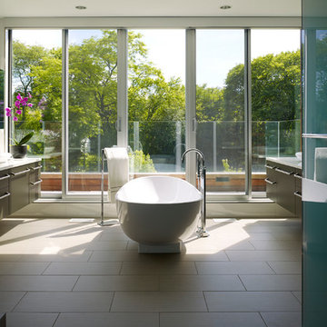
The design objective was to build a house for a couple recently married who both had kids from previous marriages. How to bridge two families together?
The design looks forward in terms of how people live today. The home is an experiment in transparency and solid form; removing borders and edges from outside to inside the house, and to really depict “flowing and endless space”. The house floor plan is derived by pushing and pulling the house’s form to maximize the backyard and minimize the public front yard while welcoming the sun in key rooms by rotating the house 45-degrees to true north. The angular form of the house is a result of the family’s program, the zoning rules, the lot’s attributes, and the sun’s path. We wanted to construct a house that is smart and efficient in terms of construction and energy, both in terms of the building and the user. We could tell a story of how the house is built in terms of the constructability, structure and enclosure, with a nod to Japanese wood construction in the method in which the siding is installed and the exposed interior beams are placed in the double height space. We engineered the house to be smart which not only looks modern but acts modern; every aspect of user control is simplified to a digital touch button, whether lights, shades, blinds, HVAC, communication, audio, video, or security. We developed a planning module based on a 6-foot square room size and a 6-foot wide connector called an interstitial space for hallways, bathrooms, stairs and mechanical, which keeps the rooms pure and uncluttered. The house is 6,200 SF of livable space, plus garage and basement gallery for a total of 9,200 SF. A large formal foyer celebrates the entry and opens up to the living, dining, kitchen and family rooms all focused on the rear garden. The east side of the second floor is the Master wing and a center bridge connects it to the kid’s wing on the west. Second floor terraces and sunscreens provide views and shade in this suburban setting. The playful mathematical grid of the house in the x, y and z axis also extends into the layout of the trees and hard-scapes, all centered on a suburban one-acre lot.
Many green attributes were designed into the home; Ipe wood sunscreens and window shades block out unwanted solar gain in summer, but allow winter sun in. Patio door and operable windows provide ample opportunity for natural ventilation throughout the open floor plan. Minimal windows on east and west sides to reduce heat loss in winter and unwanted gains in summer. Open floor plan and large window expanse reduces lighting demands and maximizes available daylight. Skylights provide natural light to the basement rooms. Durable, low-maintenance exterior materials include stone, ipe wood siding and decking, and concrete roof pavers. Design is based on a 2' planning grid to minimize construction waste. Basement foundation walls and slab are highly insulated. FSC-certified walnut wood flooring was used. Light colored concrete roof pavers to reduce cooling loads by as much as 15%. 2x6 framing allows for more insulation and energy savings. Super efficient windows have low-E argon gas filled units, and thermally insulated aluminum frames. Permeable brick and stone pavers reduce the site’s storm-water runoff. Countertops use recycled composite materials. Energy-Star rated furnaces and smart thermostats are located throughout the house to minimize duct runs and avoid energy loss. Energy-Star rated boiler that heats up both radiant floors and domestic hot water. Low-flow toilets and plumbing fixtures are used to conserve water usage. No VOC finish options and direct venting fireplaces maintain a high interior air quality. Smart home system controls lighting, HVAC, and shades to better manage energy use. Plumbing runs through interior walls reducing possibilities of heat loss and freezing problems. A large food pantry was placed next to kitchen to reduce trips to the grocery store. Home office reduces need for automobile transit and associated CO2 footprint. Plan allows for aging in place, with guest suite than can become the master suite, with no need to move as family members mature.
Sponsored
Sunbury, OH
J.Holderby - Renovations
Franklin County's Leading General Contractors - 2X Best of Houzz!
 Carpet Crafters Rug Co.
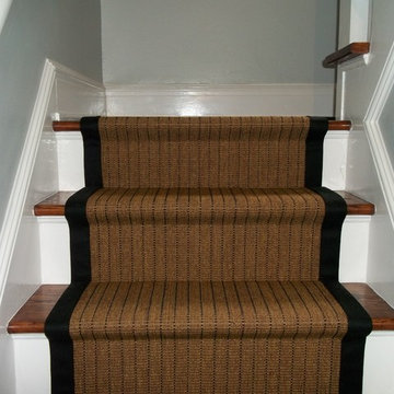
On this project the client was looking for a very durable and cleanable easy to maintain product. Because of the very high traffic and staining possibilities we selected a woven Wilton olefin yarnflat weave and added a custom wide binding made of microfiber which highlights the black lines in the carpeting. Not only did they get the clean ability and durability they wanted they also added a very fashionable natural woven look.
 Kitchen Design Concepts
We introduce to you one of our newer services we are providing here at Kitchen Design Concepts: spaces that just need a little reviving! As of recent, we are taking on projects that are in need of minimal updating, as in, spaces that don’t need a full-on remodel. Yes, you heard right! If your space has good bones, you like the layout of your kitchen, and you just need a few cosmetic changes, then today’s feature is for you! Recently, we updated a space where we did just this! The kitchen was in need of a little love, some fresh paint, and new finishes. And if we’re being honest here, the result looks almost as if the kitchen had a full-on remodel! To learn more about this space and how we did our magic, continue reading below:
The Before and After
First, see what an impact new finishes can make! The “before” image shows a kitchen with outdated finishes such as the tile countertops, backsplash, and cabinetry finish. The “after” image, is a kitchen that looks almost as if its brand new, the image speaks for itself!
Cabinetry
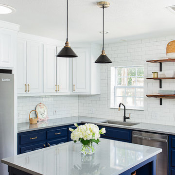
With the wooden cabinetry in this kitchen already having great bones, all we needed to do was our refinishing process that involved removing door and drawer fronts, sanding, priming, and painting. The main color of the cabinetry is white (Sherwin Williams Pure White 7005) and as an accent, we applied a deep navy blue that really pops in this space (Sherwin Willaims Naval 6244). As a special design element, we incorporated a natural wooden band across the hood which is subtle but adds an element of surprise.
Countertops
The original countertops in this space were a 12×12 tile with cracks and discolored grout from all the wear and tear. To replace the countertops, we installed a clean and crisp quartz that is not only durable but easy to maintain (no grout here!). The 3cm countertops are a Cambria quartz in a grey-tone color (Carrick).
Backsplash
Keeping things simple, yet classic, we installed a 3×6 subway tile from Interceramic. The crisp white pairs well with all the other finishes of the space and really brighten the space up! To spice things up, we paired the white tile with a contrasting grout color (Cape Grey) that matches the countertop. This is a simple method to add interest to your white backsplash!
Fixtures and Fittings
For the fixtures and fittings of the kitchen, we wanted pieces that made a statement. That’s why we selected this industrial style faucet from Brizo! The faucet is a Brizo LITZE™ PULL-DOWN FAUCET WITH ARC SPOUT AND INDUSTRIAL HANDLE (63044LF-BLGL). The matte black paired with the luxe gold elements really make a statement! To match the gold elements of the faucet, we installed cabinetry hardware from Topknobs in the same gold finish. The hardware is a Channing pull TK743HB. Lastly, the large single bowl sink (who doesn’t want a large sink?!) is a great functional touch to the kitchen. The sink is a Blanco Precision 16″ R10 super single with 16″ Drainer in stainless steel (516216).
 Kitchen Design Concepts
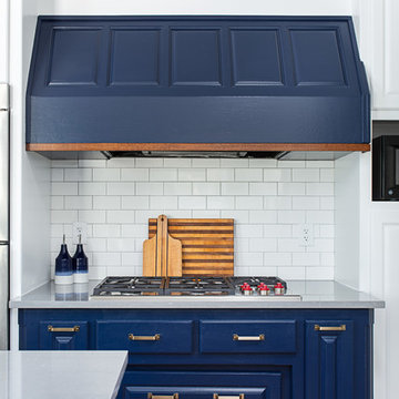
We introduce to you one of our newer services we are providing here at Kitchen Design Concepts: spaces that just need a little reviving! As of recent, we are taking on projects that are in need of minimal updating, as in, spaces that don’t need a full-on remodel. Yes, you heard right! If your space has good bones, you like the layout of your kitchen, and you just need a few cosmetic changes, then today’s feature is for you! Recently, we updated a space where we did just this! The kitchen was in need of a little love, some fresh paint, and new finishes. And if we’re being honest here, the result looks almost as if the kitchen had a full-on remodel! To learn more about this space and how we did our magic, continue reading below:
The Before and After
First, see what an impact new finishes can make! The “before” image shows a kitchen with outdated finishes such as the tile countertops, backsplash, and cabinetry finish. The “after” image, is a kitchen that looks almost as if its brand new, the image speaks for itself!
Cabinetry
With the wooden cabinetry in this kitchen already having great bones, all we needed to do was our refinishing process that involved removing door and drawer fronts, sanding, priming, and painting. The main color of the cabinetry is white (Sherwin Williams Pure White 7005) and as an accent, we applied a deep navy blue that really pops in this space (Sherwin Willaims Naval 6244). As a special design element, we incorporated a natural wooden band across the hood which is subtle but adds an element of surprise.
Countertops
The original countertops in this space were a 12×12 tile with cracks and discolored grout from all the wear and tear. To replace the countertops, we installed a clean and crisp quartz that is not only durable but easy to maintain (no grout here!). The 3cm countertops are a Cambria quartz in a grey-tone color (Carrick).
Backsplash
Keeping things simple, yet classic, we installed a 3×6 subway tile from Interceramic. The crisp white pairs well with all the other finishes of the space and really brighten the space up! To spice things up, we paired the white tile with a contrasting grout color (Cape Grey) that matches the countertop. This is a simple method to add interest to your white backsplash!
Fixtures and Fittings
For the fixtures and fittings of the kitchen, we wanted pieces that made a statement. That’s why we selected this industrial style faucet from Brizo! The faucet is a Brizo LITZE™ PULL-DOWN FAUCET WITH ARC SPOUT AND INDUSTRIAL HANDLE (63044LF-BLGL). The matte black paired with the luxe gold elements really make a statement! To match the gold elements of the faucet, we installed cabinetry hardware from Topknobs in the same gold finish. The hardware is a Channing pull TK743HB. Lastly, the large single bowl sink (who doesn’t want a large sink?!) is a great functional touch to the kitchen. The sink is a Blanco Precision 16″ R10 super single with 16″ Drainer in stainless steel (516216).
 Kitchen Design Concepts
We introduce to you one of our newer services we are providing here at Kitchen Design Concepts: spaces that just need a little reviving! As of recent, we are taking on projects that are in need of minimal updating, as in, spaces that don’t need a full-on remodel. Yes, you heard right! If your space has good bones, you like the layout of your kitchen, and you just need a few cosmetic changes, then today’s feature is for you! Recently, we updated a space where we did just this! The kitchen was in need of a little love, some fresh paint, and new finishes. And if we’re being honest here, the result looks almost as if the kitchen had a full-on remodel! To learn more about this space and how we did our magic, continue reading below:
The Before and After
First, see what an impact new finishes can make! The “before” image shows a kitchen with outdated finishes such as the tile countertops, backsplash, and cabinetry finish. The “after” image, is a kitchen that looks almost as if its brand new, the image speaks for itself!
Cabinetry
With the wooden cabinetry in this kitchen already having great bones, all we needed to do was our refinishing process that involved removing door and drawer fronts, sanding, priming, and painting. The main color of the cabinetry is white (Sherwin Williams Pure White 7005) and as an accent, we applied a deep navy blue that really pops in this space (Sherwin Willaims Naval 6244). As a special design element, we incorporated a natural wooden band across the hood which is subtle but adds an element of surprise.
Countertops
The original countertops in this space were a 12×12 tile with cracks and discolored grout from all the wear and tear. To replace the countertops, we installed a clean and crisp quartz that is not only durable but easy to maintain (no grout here!). The 3cm countertops are a Cambria quartz in a grey-tone color (Carrick).
Backsplash
Keeping things simple, yet classic, we installed a 3×6 subway tile from Interceramic. The crisp white pairs well with all the other finishes of the space and really brighten the space up! To spice things up, we paired the white tile with a contrasting grout color (Cape Grey) that matches the countertop. This is a simple method to add interest to your white backsplash!
Fixtures and Fittings
For the fixtures and fittings of the kitchen, we wanted pieces that made a statement. That’s why we selected this industrial style faucet from Brizo! The faucet is a Brizo LITZE™ PULL-DOWN FAUCET WITH ARC SPOUT AND INDUSTRIAL HANDLE (63044LF-BLGL). The matte black paired with the luxe gold elements really make a statement! To match the gold elements of the faucet, we installed cabinetry hardware from Topknobs in the same gold finish. The hardware is a Channing pull TK743HB. Lastly, the large single bowl sink (who doesn’t want a large sink?!) is a great functional touch to the kitchen. The sink is a Blanco Precision 16″ R10 super single with 16″ Drainer in stainless steel (516216).

 Lori Dennis, Inc.
Lori Dennis Interior Design
SoCal Contractor Construction
Erika Bierman Photography
Inspiration for a large timeless home design remodel in San Diego
Inspiration for a large timeless home design remodel in San Diego
 Maison Birmingham
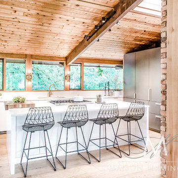
The main goal of this renovation was to update an authentic mid-century home to suit a modern lifestyle, while still maintaining the original character and aesthetic of the home.
To create a more open, family friendly space also suitable for entertaining, walls between the kitchen, dining room and living room were removed to create an open area to house the 360-sq.-ft. kitchen. Upon demolition, it was noted that some areas of the original tongue and groove ceiling had aged much differently than the rest of the ceiling. Rather than stain the areas and cause them to age differently, we opted to apply oil to darken the wood so that it will all continue to age at the same pace.
Balancing new materials and tones with the existing abundance of wood was challenging, but in the end the balance was achieved with custom cabinetry in both white and anthracite matte lacquer, which is complemented by a custom floating walnut buffet in the dining area. Keeping the island and perimeter base cabinet finishes the same made the space feel more open, and presented the opportunity to create a dark focal wall for the refrigerator and pantry. These custom anthracite matte lacquer cabinets provide a striking yet subtle contrast with the white and wood, while incorporating well concealed pantry storage with microwave, as well as a Sub-Zero refrigerator.
In lieu of a typical exhaust hood, downdraft ventilation was installed in the island, and pendants were omitted to keep the space open, but also more consistent with the original design of the home. Brass globe sconces were installed on either side of the sink to bring in warmth, and frame the view of the gorgeous greenery outside.
This Project was a fantastic collaboration with Lauren Combs of The Neat Method Michigan
Proudly Featured in Detroit Home October 2017
Photography by Boswell Hardwick
3