
Search results for "Major issues" in Home Design Ideas

 E_ Designs
This home is Castle’s first Save a Castle. It was purchased in early 2013 and completed by end of Spring. When Castle first purchased this home, it was in terrible shape. The copper pipes had been stolen, there were major structural issues, the porch ceiling had collapsed, and the house had been trashed but there was potential. On the main floor a wall between the dining room and kitchen was removed to create a more open floor plan. The kitchen was completely transformed with new custom cabinetry and updated stainless steel appliances in place, as well as recycled glass countertops and butcher block countertops. On the second floor the bathroom was updated with new tile and glass block window and the bedrooms were made over to match the charm of the home. This home received new Kolbe windows and the hardwood floors were re-sanded and stained dark to compliment the white woodwork. The existing porch felt outdated and did not fit with the rest of the home so it was opened up to create a more inviting porch. Finally the yard also received a makeover with new sod, bushes, and mulch. While the house originally looked as though it hadn’t been taken care of in years this Castle is now ready for another 100 years.
Photographer: Hannah Lloyd
 E_ Designs
This home is Castle’s first Save a Castle. It was purchased in early 2013 and completed by end of Spring. When Castle first purchased this home, it was in terrible shape. The copper pipes had been stolen, there were major structural issues, the porch ceiling had collapsed, and the house had been trashed but there was potential. On the main floor a wall between the dining room and kitchen was removed to create a more open floor plan. The kitchen was completely transformed with new custom cabinetry and updated stainless steel appliances in place, as well as recycled glass countertops and butcher block countertops. On the second floor the bathroom was updated with new tile and glass block window and the bedrooms were made over to match the charm of the home. This home received new Kolbe windows and the hardwood floors were re-sanded and stained dark to compliment the white woodwork. The existing porch felt outdated and did not fit with the rest of the home so it was opened up to create a more inviting porch. Finally the yard also received a makeover with new sod, bushes, and mulch. While the house originally looked as though it hadn’t been taken care of in years this Castle is now ready for another 100 years.
Photographer: Hannah Lloyd
 Liz Crivello
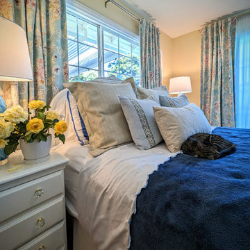
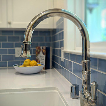
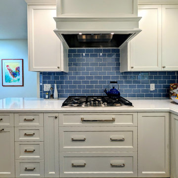
This suburban home was built back in the 1970s and still retained its original "charming" colored tile, petite shower, and a tiny 9x9 kitchen. The major issue? It was outdated and cramped! The owners desired additional space for their dining area, larger kitchen, bathrooms and updated finishes.
Our team managed to add square footage to the living room to accommodate a full sized dining table overlooking the garden. By moving the dining room out of the kitchen, this helped us almost double the kitchen's size where we added a bar, full pantry and plenty of storage.
We removed a hall closet to expand the bathroom area, enabling us to create two rectangular bathrooms instead of two intertwined bathrooms. In the primary bathroom, we added a full-sized shower with a bench, as well as plenty of cabinet storage.
Additionally, we gave the house a fresh look with new hardwood floors that matched the old ones (still visible in the bedrooms), as well as new solid core doors, hardware, and brand new paint throughout.
The exterior was revamped with new lighting, landscaping, cement patio, fresh paint, address numbers and an aluminum pergola to provide shade from the hot summer sun.
This remodel is the perfect example that you can still evoke luxury in smaller homes.
Find the right local pro for your project
 Liz Crivello
This suburban home was built back in the 1970s and still retained its original "charming" colored tile, petite shower, and a tiny 9x9 kitchen. The major issue? It was outdated and cramped! The owners desired additional space for their dining area, larger kitchen, bathrooms and updated finishes.
Our team managed to add square footage to the living room to accommodate a full sized dining table overlooking the garden. By moving the dining room out of the kitchen, this helped us almost double the kitchen's size where we added a bar, full pantry and plenty of storage.
We removed a hall closet to expand the bathroom area, enabling us to create two rectangular bathrooms instead of two intertwined bathrooms. In the primary bathroom, we added a full-sized shower with a bench, as well as plenty of cabinet storage.
Additionally, we gave the house a fresh look with new hardwood floors that matched the old ones (still visible in the bedrooms), as well as new solid core doors, hardware, and brand new paint throughout.
The exterior was revamped with new lighting, landscaping, cement patio, fresh paint, address numbers and an aluminum pergola to provide shade from the hot summer sun.
This remodel is the perfect example that you can still evoke luxury in smaller homes.
 E_ Designs
This home is Castle’s first Save a Castle. It was purchased in early 2013 and completed by end of Spring. When Castle first purchased this home, it was in terrible shape. The copper pipes had been stolen, there were major structural issues, the porch ceiling had collapsed, and the house had been trashed but there was potential. On the main floor a wall between the dining room and kitchen was removed to create a more open floor plan. The kitchen was completely transformed with new custom cabinetry and updated stainless steel appliances in place, as well as recycled glass countertops and butcher block countertops. On the second floor the bathroom was updated with new tile and glass block window and the bedrooms were made over to match the charm of the home. This home received new Kolbe windows and the hardwood floors were re-sanded and stained dark to compliment the white woodwork. The existing porch felt outdated and did not fit with the rest of the home so it was opened up to create a more inviting porch. Finally the yard also received a makeover with new sod, bushes, and mulch. While the house originally looked as though it hadn’t been taken care of in years this Castle is now ready for another 100 years.
Photographer: Hannah Lloyd
 Liz Crivello
This suburban home was built back in the 1970s and still retained its original "charming" colored tile, petite shower, and a tiny 9x9 kitchen. The major issue? It was outdated and cramped! The owners desired additional space for their dining area, larger kitchen, bathrooms and updated finishes.
Our team managed to add square footage to the living room to accommodate a full sized dining table overlooking the garden. By moving the dining room out of the kitchen, this helped us almost double the kitchen's size where we added a bar, full pantry and plenty of storage.
We removed a hall closet to expand the bathroom area, enabling us to create two rectangular bathrooms instead of two intertwined bathrooms. In the primary bathroom, we added a full-sized shower with a bench, as well as plenty of cabinet storage.
Additionally, we gave the house a fresh look with new hardwood floors that matched the old ones (still visible in the bedrooms), as well as new solid core doors, hardware, and brand new paint throughout.
The exterior was revamped with new lighting, landscaping, cement patio, fresh paint, address numbers and an aluminum pergola to provide shade from the hot summer sun.
This remodel is the perfect example that you can still evoke luxury in smaller homes.
 E_ Designs
This home is Castle’s first Save a Castle. It was purchased in early 2013 and completed by end of Spring. When Castle first purchased this home, it was in terrible shape. The copper pipes had been stolen, there were major structural issues, the porch ceiling had collapsed, and the house had been trashed but there was potential. On the main floor a wall between the dining room and kitchen was removed to create a more open floor plan. The kitchen was completely transformed with new custom cabinetry and updated stainless steel appliances in place, as well as recycled glass countertops and butcher block countertops. On the second floor the bathroom was updated with new tile and glass block window and the bedrooms were made over to match the charm of the home. This home received new Kolbe windows and the hardwood floors were re-sanded and stained dark to compliment the white woodwork. The existing porch felt outdated and did not fit with the rest of the home so it was opened up to create a more inviting porch. Finally the yard also received a makeover with new sod, bushes, and mulch. While the house originally looked as though it hadn’t been taken care of in years this Castle is now ready for another 100 years.
Photographer: Hannah Lloyd


 Anna O Design
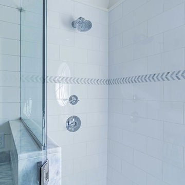
The homeowners of this Marblehead residence wished to remodel their master bathroom, which had been redone only a few years prior. The previous renovation, however, was not a pleasant experience and they were hesitant to dive-in again. After an initial conversation, the homeowners agreed to meet with me to discuss the project.
listened to their vision for the room, paid close attention to their concerns, and desire to create a tranquil environment, that would be functional and practical for their everyday lifestyle.
In my first walk-through of the existing bathroom, several major issues became apparent. First, the vanity, a wooden table with two vessel sinks, did not allow access to the medicine cabinets due to its depth. Second, an oversized window installed in the shower did not provide privacy and had visible signs of rot. Third, the wallpaper by the shower was peeling and contained mold due to moisture. Finally, the hardwood flooring selected was impractical for a master bathroom.
My suggestion was to incorporate timeless and classic materials that would provide longevity and create an elegant environment. I designed a standard depth custom vanity which contained plenty of storage. We chose lovely white and blue quartzite counter tops, white porcelain tile that mimic the look of Thasos marble, along with blue accents, polished chrome fixtures and coastal inspired lighting. Next, we replaced, relocated, and changed the window style and shape. We then fabricated a window frame out of the quartzite for protection which proved to give the shower a lovely focal point. Lastly, to keep with the coastal theme of the room, we installed shiplap for the walls.
The homeowners now look forward to starting and ending their day in their bright and relaxing master bath. It has become a sanctuary to escape the hustle and bustle of everyday life.

 Michael Nash Design, Build & Homes
2011 NARI CAPITAL COTY GRAND AWARD WINNER
Having a small 10’ x 12’ kitchen tucked in the back corner of their home wasn’t working for this this young and growing family. Its cramped layout didn’t allow for a breakfast area and storage space was non-existent, both major issues for their busy day-to-day lifestyle. After consulting with Michael Nash Design, Build & Homes, they decided to build a 300 square foot addition onto the back of this 1960’s vintage split level.
The planned addition expanded and updated the home’s kitchen via a contemporary design, added plenty of storage and provided a much needed breakfast seating area. More importantly, it created a great place for the family to gather.
The new kitchen contains a 48” professional-grade range and a large built-in refrigerator, as well as lots of cabinetry and counter space to meet client’s storage needs. Use of lighter shaker style custom painted cabinetry with honed black counter tops has lightened the space tremendously. A large island with distress black cherry cabinetry ans a mahogany countertop was installed and has become the focal point of the kitchen.
By removing a partition that previously separated the kitchen from the dining room, the new design has created a wide open floor plan. The casual dining room flows right into a casual seating area with a corner fireplace. French doors open onto a large new deck.
Best of all, the addition lets the family spend time together before, during and after mean preparation. It’s truly become the hearth of the home.
 E_ Designs
This home is Castle’s first Save a Castle. It was purchased in early 2013 and completed by end of Spring. When Castle first purchased this home, it was in terrible shape. The copper pipes had been stolen, there were major structural issues, the porch ceiling had collapsed, and the house had been trashed but there was potential. On the main floor a wall between the dining room and kitchen was removed to create a more open floor plan. The kitchen was completely transformed with new custom cabinetry and updated stainless steel appliances in place, as well as recycled glass countertops and butcher block countertops. On the second floor the bathroom was updated with new tile and glass block window and the bedrooms were made over to match the charm of the home. This home received new Kolbe windows and the hardwood floors were re-sanded and stained dark to compliment the white woodwork. The existing porch felt outdated and did not fit with the rest of the home so it was opened up to create a more inviting porch. Finally the yard also received a makeover with new sod, bushes, and mulch. While the house originally looked as though it hadn’t been taken care of in years this Castle is now ready for another 100 years.
Photographer: Hannah Lloyd
 Liz Crivello
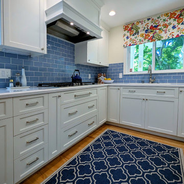
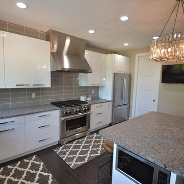
This suburban home was built back in the 1970s and still retained its original "charming" colored tile, petite shower, and a tiny 9x9 kitchen. The major issue? It was outdated and cramped! The owners desired additional space for their dining area, larger kitchen, bathrooms and updated finishes.
Our team managed to add square footage to the living room to accommodate a full sized dining table overlooking the garden. By moving the dining room out of the kitchen, this helped us almost double the kitchen's size where we added a bar, full pantry and plenty of storage.
We removed a hall closet to expand the bathroom area, enabling us to create two rectangular bathrooms instead of two intertwined bathrooms. In the primary bathroom, we added a full-sized shower with a bench, as well as plenty of cabinet storage.
Additionally, we gave the house a fresh look with new hardwood floors that matched the old ones (still visible in the bedrooms), as well as new solid core doors, hardware, and brand new paint throughout.
The exterior was revamped with new lighting, landscaping, cement patio, fresh paint, address numbers and an aluminum pergola to provide shade from the hot summer sun.
This remodel is the perfect example that you can still evoke luxury in smaller homes.
 E_ Designs
This home is Castle’s first Save a Castle. It was purchased in early 2013 and completed by end of Spring. When Castle first purchased this home, it was in terrible shape. The copper pipes had been stolen, there were major structural issues, the porch ceiling had collapsed, and the house had been trashed but there was potential. On the main floor a wall between the dining room and kitchen was removed to create a more open floor plan. The kitchen was completely transformed with new custom cabinetry and updated stainless steel appliances in place, as well as recycled glass countertops and butcher block countertops. On the second floor the bathroom was updated with new tile and glass block window and the bedrooms were made over to match the charm of the home. This home received new Kolbe windows and the hardwood floors were re-sanded and stained dark to compliment the white woodwork. The existing porch felt outdated and did not fit with the rest of the home so it was opened up to create a more inviting porch. Finally the yard also received a makeover with new sod, bushes, and mulch. While the house originally looked as though it hadn’t been taken care of in years this Castle is now ready for another 100 years.
Photographer: Hannah Lloyd
 Liz Crivello
This suburban home was built back in the 1970s and still retained its original "charming" colored tile, petite shower, and a tiny 9x9 kitchen. The major issue? It was outdated and cramped! The owners desired additional space for their dining area, larger kitchen, bathrooms and updated finishes.
Our team managed to add square footage to the living room to accommodate a full sized dining table overlooking the garden. By moving the dining room out of the kitchen, this helped us almost double the kitchen's size where we added a bar, full pantry and plenty of storage.
We removed a hall closet to expand the bathroom area, enabling us to create two rectangular bathrooms instead of two intertwined bathrooms. In the primary bathroom, we added a full-sized shower with a bench, as well as plenty of cabinet storage.
Additionally, we gave the house a fresh look with new hardwood floors that matched the old ones (still visible in the bedrooms), as well as new solid core doors, hardware, and brand new paint throughout.
The exterior was revamped with new lighting, landscaping, cement patio, fresh paint, address numbers and an aluminum pergola to provide shade from the hot summer sun.
This remodel is the perfect example that you can still evoke luxury in smaller homes.
 Liz Crivello
This suburban home was built back in the 1970s and still retained its original "charming" colored tile, petite shower, and a tiny 9x9 kitchen. The major issue? It was outdated and cramped! The owners desired additional space for their dining area, larger kitchen, bathrooms and updated finishes.
Our team managed to add square footage to the living room to accommodate a full sized dining table overlooking the garden. By moving the dining room out of the kitchen, this helped us almost double the kitchen's size where we added a bar, full pantry and plenty of storage.
We removed a hall closet to expand the bathroom area, enabling us to create two rectangular bathrooms instead of two intertwined bathrooms. In the primary bathroom, we added a full-sized shower with a bench, as well as plenty of cabinet storage.
Additionally, we gave the house a fresh look with new hardwood floors that matched the old ones (still visible in the bedrooms), as well as new solid core doors, hardware, and brand new paint throughout.
The exterior was revamped with new lighting, landscaping, cement patio, fresh paint, address numbers and an aluminum pergola to provide shade from the hot summer sun.
This remodel is the perfect example that you can still evoke luxury in smaller homes.
 Michael Nash Design, Build & Homes
2011 NARI CAPITAL COTY GRAND AWARD WINNER
Having a small 10’ x 12’ kitchen tucked in the back corner of their home wasn’t working for this this young and growing family. Its cramped layout didn’t allow for a breakfast area and storage space was non-existent, both major issues for their busy day-to-day lifestyle. After consulting with Michael Nash Design, Build & Homes, they decided to build a 300 square foot addition onto the back of this 1960’s vintage split level.
The planned addition expanded and updated the home’s kitchen via a contemporary design, added plenty of storage and provided a much needed breakfast seating area. More importantly, it created a great place for the family to gather.
The new kitchen contains a 48” professional-grade range and a large built-in refrigerator, as well as lots of cabinetry and counter space to meet client’s storage needs. Use of lighter shaker style custom painted cabinetry with honed black counter tops has lightened the space tremendously. A large island with distress black cherry cabinetry ans a mahogany countertop was installed and has become the focal point of the kitchen.
By removing a partition that previously separated the kitchen from the dining room, the new design has created a wide open floor plan. The casual dining room flows right into a casual seating area with a corner fireplace. French doors open onto a large new deck.
Best of all, the addition lets the family spend time together before, during and after mean preparation. It’s truly become the hearth of the home.

 Milgard Windows & Doors
The Kiguchi family moved into their Austin, Texas home in 1994. Built in the 1980’s as part of a neighborhood development, they happily raised their family here but longed for something more contemporary. Once they became empty nesters, they decided it was time for a major remodel. After spending many years visiting Austin AIA Home Tours that highlight contemporary residential architecture, they had a lot of ideas and in 2013 were ready to interview architects and get their renovation underway.
The project turned into a major remodel due to an unstable foundation. Architects Ben Arbib and Ed Hughey, of Arbib Hughey Design were hired to solve the structural issue and look for inspiration in the bones of the house, which sat on top of a hillside and was surrounded by great views.
Unfortunately, with the old floor plan, the beautiful views were hidden by small windows that were poorly placed. In order to bring more natural light into the house the window sizes and configurations had to be addressed, all while keeping in mind the homeowners desire for a modern look and feel.
To achieve a more contemporary and sophisticated front of house, a new entry was designed that included removing a two-story bay window and porch. The entrance of the home also became more integrated with the landscape creating a template for new foliage to be planted. Older exterior materials were updated to incorporate a more muted palette of colors with a metal roof, dark grey siding in the back and white stucco in the front. Deep eaves were added over many of the new large windows for clean lines and sun protection.
“Inside it was about opening up the floor plan, expanding the views throughout the house, and updating the material palette to get a modern look that was also warm and inviting,” said Ben from Arbib Hughey Design. “Prior to the remodel, the house had the typical separation of rooms. We removed the walls between them and changed all of the windows to Milgard Thermally Improved Aluminum to connect the inside with the outside. No matter where you are you get nice views and natural light.”
The architects wanted to create some drama, which they accomplished with the window placement and opening up the interior floor plan to an open concept approach. Cabinetry was used to help delineate intimate spaces. To add warmth to an all-white living room, white-washed oak wood floors were installed and pine planks were used around the fireplace. The large windows served as artwork bringing the color of nature into the space.
An octagon shaped, elevated dining room, (named “the turret”), had a big impact on the design of the house. They architects rounded the corners and added larger window openings overlooking a new sunken garden. The great room was also softened by rounding out the corners and that circular theme continued throughout the house, being picked up in skylight wells and kitchen cabinetry. A staircase leading to a catwalk was added and the result was a two-story window wall that flooded the home with natural light.
When asked why Milgard® Thermally Improved Aluminum windows were selected, the architectural team listed many reasons:
1) Aesthetics: “We liked the slim profiles and narrow sightlines. The window frames never get in the way of the view and that was important to us. They also have a very contemporary look that went well with our design.”
2) Options: “We liked that we could get large sliding doors that matched the windows, giving us a very cohesive look and feel throughout the project.”
3) Cost Effective: “Milgard windows are affordable. You get a good product at a good price.”
4) Custom Sizes: “Milgard windows are customizable, which allowed us to get the right window for each location.”
Ready to take on your own traditional to modern home remodeling project? Arbib Hughey Design advises, “Work with a good architect. That means picking a team that is creative, communicative, listens well and is responsive. We think it’s important for an architect to listen to their clients and give them something they want, not something the architect thinks they should have. At the same time you want an architect who is willing and able to think outside the box and offer up design options that you may not have considered. Design is about a lot of back and forth, trying out ideas, getting feedback and trying again.”
The home was completely transformed into a unique, contemporary house perfectly integrated with its site. Internally the home has a natural flow for the occupants and externally it is integrated with the surroundings taking advantage of great natural light. As a side note, it was highly praised as part of the Austin AIA homes tour.
 EMBASSY CONSTRUCTION, LLC
MAJOR REPAIRS AND EXTERIOR MAKEOVER
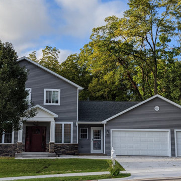
This classic colonial was constructed in 1990 and purchased by our customer in 2014. We were retained to restore, repair, and update the exterior of this property, with all parties anticipating that we were likely to uncover a variety of hidden issues. During the course of this undertaking, we replaced 17 windows. In a number of cases, we rebuilt sills and frames to the floor. All window replacements required new drywall and/or patching with new trim and painting.
Additional work was required to replace the sill across the front of the house and utilize jack studs to support the upper level while working.
The original plan included stripping off the old siding and installing new vinyl siding. We discovered that most exterior walls had never been sheathed with plywood. We sheathed all exterior walls and wrapped them with Tyvek.
As per the plan, we removed the door from the smaller upper deck above the primary deck, replaced rotted rim board and sill, and installed a new 48x48’ window to replace the doorway after resizing the former doorway. Insulating, patching of drywall, and the addition of new trim followed.
Reframed the opening from the kitchen to deck to receive a new 8’ x 6.75’ door and finished the jambs and casing to match existing trim in the rest of the house.
Removed and reconstructed front entry portico and replaced front entry door with sidelights and finished interior jambs and casing to match.
Removed garage door and framed in the opening with plywood and installed new siding over to match. Removed soffit and facia and replaced with new white vented panels and white facia—added stone to front portico with custom columns.
Removed old roof shingles and re-shingle all roofing on the garage and home with 30-year architectural shingles. Added ridge vent to allow the roof to breath better, replaced all flashing, and added lateral bracing to gable ends not previously tied in.
Installed new seamless gutters @ 6 inches (with covers over top) and 5 INCH downspouts to address water drainage. Extended all gable ends to standard 12-inch overhang.
The result is a beautifully restored and properly constructed 4 bedroom/4 bathroom home with an attached car garage.
 Anna O Design
The homeowners of this Marblehead residence wished to remodel their master bathroom, which had been redone only a few years prior. The previous renovation, however, was not a pleasant experience and they were hesitant to dive-in again. After an initial conversation, the homeowners agreed to meet with me to discuss the project.
listened to their vision for the room, paid close attention to their concerns, and desire to create a tranquil environment, that would be functional and practical for their everyday lifestyle.
In my first walk-through of the existing bathroom, several major issues became apparent. First, the vanity, a wooden table with two vessel sinks, did not allow access to the medicine cabinets due to its depth. Second, an oversized window installed in the shower did not provide privacy and had visible signs of rot. Third, the wallpaper by the shower was peeling and contained mold due to moisture. Finally, the hardwood flooring selected was impractical for a master bathroom.
My suggestion was to incorporate timeless and classic materials that would provide longevity and create an elegant environment. I designed a standard depth custom vanity which contained plenty of storage. We chose lovely white and blue quartzite counter tops, white porcelain tile that mimic the look of Thasos marble, along with blue accents, polished chrome fixtures and coastal inspired lighting. Next, we replaced, relocated, and changed the window style and shape. We then fabricated a window frame out of the quartzite for protection which proved to give the shower a lovely focal point. Lastly, to keep with the coastal theme of the room, we installed shiplap for the walls.
The homeowners now look forward to starting and ending their day in their bright and relaxing master bath. It has become a sanctuary to escape the hustle and bustle of everyday life.
 Anna O Design
The homeowners of this Marblehead residence wished to remodel their master bathroom, which had been redone only a few years prior. The previous renovation, however, was not a pleasant experience and they were hesitant to dive-in again. After an initial conversation, the homeowners agreed to meet with me to discuss the project.
listened to their vision for the room, paid close attention to their concerns, and desire to create a tranquil environment, that would be functional and practical for their everyday lifestyle.
In my first walk-through of the existing bathroom, several major issues became apparent. First, the vanity, a wooden table with two vessel sinks, did not allow access to the medicine cabinets due to its depth. Second, an oversized window installed in the shower did not provide privacy and had visible signs of rot. Third, the wallpaper by the shower was peeling and contained mold due to moisture. Finally, the hardwood flooring selected was impractical for a master bathroom.
My suggestion was to incorporate timeless and classic materials that would provide longevity and create an elegant environment. I designed a standard depth custom vanity which contained plenty of storage. We chose lovely white and blue quartzite counter tops, white porcelain tile that mimic the look of Thasos marble, along with blue accents, polished chrome fixtures and coastal inspired lighting. Next, we replaced, relocated, and changed the window style and shape. We then fabricated a window frame out of the quartzite for protection which proved to give the shower a lovely focal point. Lastly, to keep with the coastal theme of the room, we installed shiplap for the walls.
The homeowners now look forward to starting and ending their day in their bright and relaxing master bath. It has become a sanctuary to escape the hustle and bustle of everyday life.

 Bridgewater
The new owners were looking forward to living in their new home with an open floor plan, tall vaulted ceilings, and great views. It featured a large Great Room with two big French Doors separating the Dining Room from the Master Bedroom.
But after only a few months they identified a major design flaw: Each of the French Doors had ten glass windows with two large windows above each door. (Check out our before and after designs, traffic flow diagrams and photos of this project.) Glass windows and doors allowed sound and light from guests or the TV in the great room to easily sneak into the bedroom. With unique work and sleep schedules (he’s a pilot, she’s a registered nurse) this design wasn’t working.
Then there was a traffic flow design flaw: The Master Bedroom had a second entrance from a hallway. To get into the bedroom from the hallway you needed to walk down another claustrophobic hallway.
To get from the Master Bedroom to the Master Bath begin at the most remote corner of the bedroom and down a hallway between two closets. Once inside the bath, a huge triangular Jacuzzi dominating the space.
So, from a privacy and traffic flow perspective, this home had some major design issues.
When Craig Weber first met with the owners, he listened to their ideas and concerns. The owners trusted Craig to come up with the most efficient and most effective solution to this design dilemma. He offered a solution that resolved the bed-bath traffic flow problem, offered some bedroom room privacy, and updated the bath.
First, the two French Doors and windows were removed. A new wall was built with sound-absorbing materials, making the Great Room and Dining Room more comfortable spaces for entertaining while creating the bedroom privacy the owners craved.
Solving the Bedroom/Bath traffic flow problem began with removing the two existing closets. The bath door was relocated next to the hall entrance, and then a new walk-in closet was added adjacent to the hallway entrance. The solution offered easy access to and from the bath, closet and hallway without a hint of claustrophobia.
The Master Bath underwent a major transformation designed for convenience and comfort – especially during long, cold Minnesota winters.
Most everything from the former bath was torn out, beginning with the giant Jacuzzi.
A new bathtub that is wider and deeper than the standard size was installed with brushed Nickel fixtures. It’s the perfect place to relax with a glass of wine and candles.
Warm floors are a Minnesota “must have.” The bath’s new ceramic floor features in-floor electric heat. Getting in and out of the tub is easy and comfortable.
The new walk-in shower again features in-floor heating and a place to sit. The most interesting feature of this shower may the custom ceramic tile installed with unique patterns.
A new vanity Cambria Bradshaw countertops features two under-hung ceramic sinks with matching brushed Nickel fixtures.
Tall ceilings and three glass windows near the ceiling flood the room with natural light. A new energy-efficient window frames an ornamental stained glass window created by the owner’s father – a great personal touch.
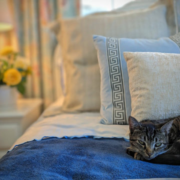
A quiet place to sleep. A private dining room for entertaining. A Master Bath to die for. And easy traffic flow. The owners couldn’t have been more delighted with the outcome. And Lilly, their cat, loves it too.
16