
Search results for "Major issues" in Home Design Ideas

 Beyond Efficiency
At an elevation of 8750' and winter design temperature of -16 degrees F, the historic mountain mining town of Telluride, Colorado can be cold! Beyond Efficiency was brought on board for its cold-climate expertise and provided buiding envelope advising and detailing, mechanical engineering, and guidance in surpassing Telluride's energy efficiency requirements for the new single-family home. The project was completed in the fall of 2016.
Our detailed plan review of preliminary building envelope details services identified thermal bridging issues at basement wall intersections with the slab and raised floor. Simple modifications significantly reduced heat loss and improved constructability. We also advised on the above-ground framed wall assemby, which resulted in a 2x6 wood-framed wall insulated with dense-pack cellulose, ZIP System sheathing (which doubles as the airtight weather-resistant barrier (WRB)), 2" continuous rigid mineral wool insulation, 1x4 furring, and fiber cement lap siding. The wall assembly reduces heat loss 20% compared to Telluride's minimum requirement, and the R-52 roof assembly is 35% better than code. Alpen high-solar gain fiberglass windows, which include a low-E film suspended between the two panes of glass, reduce window-related heat losses by 50% compared to code and round out the high-performance envelope package.
The final mechanical system design includes heat-recovery ventilation and in-floor radiant hydronic heating provided from a 95% AFUE high-efficiency condensing gas boiler. Utility bills from the first year of occupancy demonstrate the project's highly efficient design: the household's total site energy is about 20% less than that of the average Colorado residence, an impressive feat given that Telluride is in a significantly more extreme climate zone than a majority of Colorado's population.
Photo credit: Arkin Tilt Architects
 Drury Design
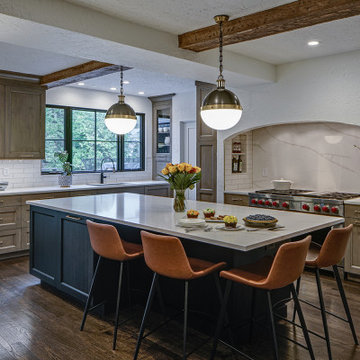
The original kitchen in this historic River Forest home was a hodgepodge of design elements created by additions to the space over the years. From a functional standpoint, the layout was overly complicated. The kitchen was an L shape with the work triangle in the small leg of the L. It was a fairly large space, but the layout made it feel like a very small kitchen. (See ‘before’ photo below.)
The traffic flow from other areas of the home entered at awkward locations, rendering some walls useless for storage or workspace.
In addition to solving functionality and flow issues, the homeowner wanted their new kitchen area to have an updated look that still tied into the home’s English Tudor style.
THE REMODEL
We took everything down to the studs and reestablished design elements like existing beams and a very particular texture on the walls and ceiling. The short leg of the L was closed off and a nice-sized walk-in pantry was put in its place. This functions as the major storage area now – just a few wall cabinets are visible for the everyday dishes.
Entries into the space were closed off and relocated to help the overall traffic flow of the home. The windows and exterior doors in the room were removed and relocated. The new ones were finished in a style to match those in some of the existing parts of the home.
THE RENEWED SPACE
This kitchen now has a nice, spacious feel for this growing family of five. A large arch was built to enclose the range and disguise some architectural details that could not be changed. This was carefully finished in the same textured surface as the original walls.
Pantries are now strategically located on both sides of the range area: a pull-out pantry on one side and a shallower pantry on the other side. The large island functions as a spacious work area and a central hub for the busy family’s many daily activities.
The transitional design elements and subdued, neutral color palette contribute to what is now a very calming and functional space for the entire family.

 Milgard Windows & Doors
The Kiguchi family moved into their Austin, Texas home in 1994. Built in the 1980’s as part of a neighborhood development, they happily raised their family here but longed for something more contemporary. Once they became empty nesters, they decided it was time for a major remodel. After spending many years visiting Austin AIA Home Tours that highlight contemporary residential architecture, they had a lot of ideas and in 2013 were ready to interview architects and get their renovation underway.
The project turned into a major remodel due to an unstable foundation. Architects Ben Arbib and Ed Hughey, of Arbib Hughey Design were hired to solve the structural issue and look for inspiration in the bones of the house, which sat on top of a hillside and was surrounded by great views.
Unfortunately, with the old floor plan, the beautiful views were hidden by small windows that were poorly placed. In order to bring more natural light into the house the window sizes and configurations had to be addressed, all while keeping in mind the homeowners desire for a modern look and feel.
To achieve a more contemporary and sophisticated front of house, a new entry was designed that included removing a two-story bay window and porch. The entrance of the home also became more integrated with the landscape creating a template for new foliage to be planted. Older exterior materials were updated to incorporate a more muted palette of colors with a metal roof, dark grey siding in the back and white stucco in the front. Deep eaves were added over many of the new large windows for clean lines and sun protection.
“Inside it was about opening up the floor plan, expanding the views throughout the house, and updating the material palette to get a modern look that was also warm and inviting,” said Ben from Arbib Hughey Design. “Prior to the remodel, the house had the typical separation of rooms. We removed the walls between them and changed all of the windows to Milgard Thermally Improved Aluminum to connect the inside with the outside. No matter where you are you get nice views and natural light.”
The architects wanted to create some drama, which they accomplished with the window placement and opening up the interior floor plan to an open concept approach. Cabinetry was used to help delineate intimate spaces. To add warmth to an all-white living room, white-washed oak wood floors were installed and pine planks were used around the fireplace. The large windows served as artwork bringing the color of nature into the space.
An octagon shaped, elevated dining room, (named “the turret”), had a big impact on the design of the house. They architects rounded the corners and added larger window openings overlooking a new sunken garden. The great room was also softened by rounding out the corners and that circular theme continued throughout the house, being picked up in skylight wells and kitchen cabinetry. A staircase leading to a catwalk was added and the result was a two-story window wall that flooded the home with natural light.
When asked why Milgard® Thermally Improved Aluminum windows were selected, the architectural team listed many reasons:
1) Aesthetics: “We liked the slim profiles and narrow sightlines. The window frames never get in the way of the view and that was important to us. They also have a very contemporary look that went well with our design.”
2) Options: “We liked that we could get large sliding doors that matched the windows, giving us a very cohesive look and feel throughout the project.”
3) Cost Effective: “Milgard windows are affordable. You get a good product at a good price.”
4) Custom Sizes: “Milgard windows are customizable, which allowed us to get the right window for each location.”
Ready to take on your own traditional to modern home remodeling project? Arbib Hughey Design advises, “Work with a good architect. That means picking a team that is creative, communicative, listens well and is responsive. We think it’s important for an architect to listen to their clients and give them something they want, not something the architect thinks they should have. At the same time you want an architect who is willing and able to think outside the box and offer up design options that you may not have considered. Design is about a lot of back and forth, trying out ideas, getting feedback and trying again.”
The home was completely transformed into a unique, contemporary house perfectly integrated with its site. Internally the home has a natural flow for the occupants and externally it is integrated with the surroundings taking advantage of great natural light. As a side note, it was highly praised as part of the Austin AIA homes tour.
Find the right local pro for your project
 Milgard Windows & Doors
The Kiguchi family moved into their Austin, Texas home in 1994. Built in the 1980’s as part of a neighborhood development, they happily raised their family here but longed for something more contemporary. Once they became empty nesters, they decided it was time for a major remodel. After spending many years visiting Austin AIA Home Tours that highlight contemporary residential architecture, they had a lot of ideas and in 2013 were ready to interview architects and get their renovation underway.
The project turned into a major remodel due to an unstable foundation. Architects Ben Arbib and Ed Hughey, of Arbib Hughey Design were hired to solve the structural issue and look for inspiration in the bones of the house, which sat on top of a hillside and was surrounded by great views.
Unfortunately, with the old floor plan, the beautiful views were hidden by small windows that were poorly placed. In order to bring more natural light into the house the window sizes and configurations had to be addressed, all while keeping in mind the homeowners desire for a modern look and feel.
To achieve a more contemporary and sophisticated front of house, a new entry was designed that included removing a two-story bay window and porch. The entrance of the home also became more integrated with the landscape creating a template for new foliage to be planted. Older exterior materials were updated to incorporate a more muted palette of colors with a metal roof, dark grey siding in the back and white stucco in the front. Deep eaves were added over many of the new large windows for clean lines and sun protection.
“Inside it was about opening up the floor plan, expanding the views throughout the house, and updating the material palette to get a modern look that was also warm and inviting,” said Ben from Arbib Hughey Design. “Prior to the remodel, the house had the typical separation of rooms. We removed the walls between them and changed all of the windows to Milgard Thermally Improved Aluminum to connect the inside with the outside. No matter where you are you get nice views and natural light.”
The architects wanted to create some drama, which they accomplished with the window placement and opening up the interior floor plan to an open concept approach. Cabinetry was used to help delineate intimate spaces. To add warmth to an all-white living room, white-washed oak wood floors were installed and pine planks were used around the fireplace. The large windows served as artwork bringing the color of nature into the space.
An octagon shaped, elevated dining room, (named “the turret”), had a big impact on the design of the house. They architects rounded the corners and added larger window openings overlooking a new sunken garden. The great room was also softened by rounding out the corners and that circular theme continued throughout the house, being picked up in skylight wells and kitchen cabinetry. A staircase leading to a catwalk was added and the result was a two-story window wall that flooded the home with natural light.
When asked why Milgard® Thermally Improved Aluminum windows were selected, the architectural team listed many reasons:
1) Aesthetics: “We liked the slim profiles and narrow sightlines. The window frames never get in the way of the view and that was important to us. They also have a very contemporary look that went well with our design.”
2) Options: “We liked that we could get large sliding doors that matched the windows, giving us a very cohesive look and feel throughout the project.”
3) Cost Effective: “Milgard windows are affordable. You get a good product at a good price.”
4) Custom Sizes: “Milgard windows are customizable, which allowed us to get the right window for each location.”
Ready to take on your own traditional to modern home remodeling project? Arbib Hughey Design advises, “Work with a good architect. That means picking a team that is creative, communicative, listens well and is responsive. We think it’s important for an architect to listen to their clients and give them something they want, not something the architect thinks they should have. At the same time you want an architect who is willing and able to think outside the box and offer up design options that you may not have considered. Design is about a lot of back and forth, trying out ideas, getting feedback and trying again.”
The home was completely transformed into a unique, contemporary house perfectly integrated with its site. Internally the home has a natural flow for the occupants and externally it is integrated with the surroundings taking advantage of great natural light. As a side note, it was highly praised as part of the Austin AIA homes tour.
 Drury Design
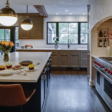
The original kitchen in this historic River Forest home was a hodgepodge of design elements created by additions to the space over the years. From a functional standpoint, the layout was overly complicated. The kitchen was an L shape with the work triangle in the small leg of the L. It was a fairly large space, but the layout made it feel like a very small kitchen. (See ‘before’ photo below.)
The traffic flow from other areas of the home entered at awkward locations, rendering some walls useless for storage or workspace.
In addition to solving functionality and flow issues, the homeowner wanted their new kitchen area to have an updated look that still tied into the home’s English Tudor style.
THE REMODEL
We took everything down to the studs and reestablished design elements like existing beams and a very particular texture on the walls and ceiling. The short leg of the L was closed off and a nice-sized walk-in pantry was put in its place. This functions as the major storage area now – just a few wall cabinets are visible for the everyday dishes.
Entries into the space were closed off and relocated to help the overall traffic flow of the home. The windows and exterior doors in the room were removed and relocated. The new ones were finished in a style to match those in some of the existing parts of the home.
THE RENEWED SPACE
This kitchen now has a nice, spacious feel for this growing family of five. A large arch was built to enclose the range and disguise some architectural details that could not be changed. This was carefully finished in the same textured surface as the original walls.
Pantries are now strategically located on both sides of the range area: a pull-out pantry on one side and a shallower pantry on the other side. The large island functions as a spacious work area and a central hub for the busy family’s many daily activities.
The transitional design elements and subdued, neutral color palette contribute to what is now a very calming and functional space for the entire family.
 Jordan Design Build Group
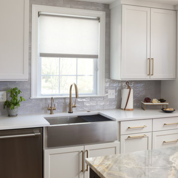
After more than a decade in their new Alexandria home, our clients decided their kitchen was ready for a major refresh, both in form and function. The original stained wood cabinets and granite countertops had served them well, but the traditional design no longer fit with their evolving style which had become less formal and more transitional. The homeowners liked the idea of two-toned kitchen cabinets, so we opted for a combination of pure white and charcoal gray for dramatic contrast. Brushed gold fixtures and statement brass pulls add warmth and sophistication. The distinctive marble counters are a showstopper, with unique veining and striking color variation, from blue to gray to ochre. The shimmering blue-gray backsplash unites the entire space.
The overall goal was to create an expansive entertaining kitchen that could accommodate our clients’ large gatherings of family and friends, and provide them with several zones for prepping, serving, seating, and socializing. Also high on the clients’ wish list: a more generous island, professional appliances, and better storage. We expanded the island in two directions to allow for comfortable seating at the counter with plenty of room for a table in the breakfast nook. An expandable bar height table in the adjacent dining area offers even more flexibility for eating and socializing.
We designed a custom hutch which has a multitude of storage options and functionality – open display shelves, roll-outs, drawers, extra counter/serving space, as well as a beverage fridge and appliance garage/coffee center. On the opposite side of the kitchen, we replaced a small pantry closet with a furniture style built-in that took advantage of underutilized space. Anticipating issues with supply chain, we opted to use a local cabinet maker on this project which allowed us to fully customize the cabinets for optimal functionality.
Other stand-out features include a Thermador appliance package, workstation farmhouse sink, ‘touch’ faucet, hot+cold water dispenser, and hidden toe-kick storage. Our clients now have a beautiful, cohesive space that reflects their personal style and fulfills their dream of a having an expansive kitchen where they can cook and entertain for years to come.

 Advance Design Studio, Ltd.
After six years of living in their Huntley IL home, Chris and Meghan were tired of their dark, dingy, outdated kitchen and it was finally time for a long-anticipated change. “The kitchen is the place where we live, it’s where we do everything,” Meghan said. “It was important that it be a space where we wanted to be.” Meghan loves cooking and enjoys including their girls in healthy meal prepping, this led them to want a brighter, more enjoyable kitchen with increased functionality and improved storage.
For Chris especially, the laundry room was an entirely dysfunctional eyesore. “We had a washer and a dryer, but it was all kind-of cobbled together!” Chris said. “There were always laundry piles everywhere, we weren’t really sure what we wanted to do in there, but it was time for us to make a change.” The mess of the space was stressful every time they walked in the door from the garage each day. Kids’ backpacks and shoes piled up haphazardly in the makeshift boot-bench closet left the family feeling disorganized and stressed. They needed space for folding clothes and locker cubbies to help keep the family organized.
Having known Christine and Todd in the Huntley community for years, Chris and Meghan were familiar with their work. “We already trusted them personally and having seen their projects for years we knew they did top notch work. After we reviewed the initial round of designs, we knew that hiring them was definitely the right choice,” Meghan and Chris said. Although Chris had done a lot of work in their home himself, the kitchen and laundry room renovation was such a large undertaking that he didn’t want to steal time away from his family to spend what would surely be many long weekends doing the job himself. “That would not have been a wise choice for us,” Chris laughed.
“Our designer, Michelle was very, very, easy to work with; anything we wanted to see or weren’t sure about, she went above and beyond to make this easy for us. She was easy to get hold of and always quick to respond,” the couple said. Michelle pulled ideas that mirrored the couple’s taste and style and was adept at directing the couple to limited choices that didn’t overwhelm them and kept the process moving. “I have a hard time making decisions. Michelle made the decision-making process so easy. I loved how she listened to what I liked and then presented three great options for me to choose from,” Meghan said.
The main objectives for the kitchen were better storage solutions, they wanted the space to reflect their lifestyle and taste, and they wanted it to last for years with low maintenance. One of the first steps in creating a more functional kitchen was relocating the refrigerator, creating an improved workflow for the busy family.
“We didn’t know that we could even move the refrigerator to a new location where it is now, that was something that we never would have thought of,” Chris said. “The new refrigerator location makes the kitchen feel so much bigger. We didn’t add any space, but our whole kitchen with the new design just seems like it’s so much larger than before!” Meghan said.
The perimeter mist colored cabinets helped warm and brighten the entire room, while the graphite colored cabinets on the island added contrast. Using this fresh, clean color palette satisfied the couple’s desire for a bright space that was the exact opposite of what they had before. Organization accessories were also added to the cabinets such as a spice drawer tray and roll outs to create hidden convenience.
“I absolutely love the hidden spices – it makes cooking so much more enjoyable!” Chris said. “And all the pull outs, and the double trash bin, who would think you could get so excited about organization!” the couple said in unison.
One thing they hated in their original kitchen was how dark the space felt. Added lighting on the ceiling with the new light fixtures combined with the lighter cabinetry colors throughout solved this problem. “Our new kitchen has this warm, almost cozy feeling that our old kitchen never had, it’s just a space that I love spending my time in now,” Meghan said. The light airy feeling was accentuated with the use of floating white shelves on either side of the decorative range hood. “We have so much cabinetry space, the new design is amazing we actually have more storage space than we will ever need,” Meghan said.
The island was extended to create more work surface and added space for stool seating. “The new island changes how we live. Now the kids can be in the kitchen with us, doing homework, eating breakfast, and the three of us have special dinners there when Chris is working late,” Meghan said.
The Carrara Marmi Quartz countertops were chosen because they are, not only beautiful, but are made from hard-working material that doesn’t require maintenance. The white subway tile backsplash that wraps to the ceiling behind the focal point cooktop range/hood compliments the crisp white countertops perfectly, while brushed brass hardware and light fixtures keep the design fresh and new.
The couple had a few fears at the beginning of the project, as most homeowners do. Their biggest fear was being out of their kitchen and laundry room for an extended time. The crew made it very easy for the family to work in a limited space keeping the washer and dryer hooked up the majority of the time, and also getting appliances working with minimal downtime.
“They above and beyond accommodated us to get us through the process,” Meghan said. “They did a great job making sure we were as comfortable as possible throughout the process,” Chris added.
“Our project manager DJ did a great job. He was very good at updating us on schedule changes, getting guys in as quickly as possible. Everyone that stepped in the house was nice and did great work,” said Chris. They thought Advance’s carpenter was phenomenal and were impressed when he took a conceptual idea from a photograph and worked with designer Michelle to create a one of a kind range/hood that has become the topic of conversation with friends and family who visit the new kitchen. “He was in our house literally every day for several weeks. He was easy to work with and good at what he did,” Meghan and Chris said.
The focal point of the kitchen; a hand-crafted, custom-built ventilation hood was clad with handpicked reclaimed barnwood. Advance Design’s carpenter built the framework and the cladding to create a one-of-a-kind design element that the couple loves.
“I think it was especially fun for him to create something unique from scratch, showcasing his talent in this area,” Meghan said. “I love that my kitchen is not like everyone else’s. I got to pick out the wood on my hood and watch it being built and was able to choose what pieces of wood went where on it. It’s totally unique.”
Red Oak flooring was toothed-in throughout the kitchen and the rest of the first floor anywhere changes were made. Then the whole floor was refinished to tone down the orange undertones in the existing floor stain, ultimately changing the color complexion of the entire first floor. The result is a completely new feeling to the entire home.
Renovating the laundry room was extremely important to Meghan and Chris, but they had trouble visualizing what the possibilities were for the seemingly small space. Michelle produced beautiful 3D illustrations that helped them envision the space in a whole new way.
“I must have told Michelle 100 times that I am a visual person, seeing the designs in 3D made it so easy to make decisions and see what we could really do with our space,” Meghan said.
A dividing wall and doorway were removed between the existing laundry room and hallway formerly containing a coat closet, providing space to design specialized graphite colored cabinetry matching the kitchen island to house custom storage cubbies for each family member. Adding the tall utility cabinetry in the new laundry area helped solve the storage issue, tucking away cleaning supplies, household items, and even the cat got its own cubby.
“I love how everything is now hidden in its own space. I can’t tell you how much I hated coming home and seeing everything sitting around on counters,” Chris said.
Electrical outlets were planned for the inside of utility cabinets, so devices could charge in hidden locations. Stacking the washer and dryer allowed for wider countertop space to provide a folding area and a special space for clothes to hang. “The way I do laundry has been completely transformed! I can actually fold clothes and hang them now right out of the washer and dryer,” Meghan said.
“The end result in the kitchen and the laundry/mud room was an updated light and bright space, with a smarter work flow that better meets the needs of this family,” Michelle said.
“I would totally recommend Advance Design,” Meghan said. “Sometimes I sit and just look at my kitchen and laundry room and think ‘Wow, I can’t believe I get to live here!’ It’s an understatement to say we love our new space.”

 Milgard Windows & Doors
The Kiguchi family moved into their Austin, Texas home in 1994. Built in the 1980’s as part of a neighborhood development, they happily raised their family here but longed for something more contemporary. Once they became empty nesters, they decided it was time for a major remodel. After spending many years visiting Austin AIA Home Tours that highlight contemporary residential architecture, they had a lot of ideas and in 2013 were ready to interview architects and get their renovation underway.
The project turned into a major remodel due to an unstable foundation. Architects Ben Arbib and Ed Hughey, of Arbib Hughey Design were hired to solve the structural issue and look for inspiration in the bones of the house, which sat on top of a hillside and was surrounded by great views.
Unfortunately, with the old floor plan, the beautiful views were hidden by small windows that were poorly placed. In order to bring more natural light into the house the window sizes and configurations had to be addressed, all while keeping in mind the homeowners desire for a modern look and feel.
To achieve a more contemporary and sophisticated front of house, a new entry was designed that included removing a two-story bay window and porch. The entrance of the home also became more integrated with the landscape creating a template for new foliage to be planted. Older exterior materials were updated to incorporate a more muted palette of colors with a metal roof, dark grey siding in the back and white stucco in the front. Deep eaves were added over many of the new large windows for clean lines and sun protection.
“Inside it was about opening up the floor plan, expanding the views throughout the house, and updating the material palette to get a modern look that was also warm and inviting,” said Ben from Arbib Hughey Design. “Prior to the remodel, the house had the typical separation of rooms. We removed the walls between them and changed all of the windows to Milgard Thermally Improved Aluminum to connect the inside with the outside. No matter where you are you get nice views and natural light.”
The architects wanted to create some drama, which they accomplished with the window placement and opening up the interior floor plan to an open concept approach. Cabinetry was used to help delineate intimate spaces. To add warmth to an all-white living room, white-washed oak wood floors were installed and pine planks were used around the fireplace. The large windows served as artwork bringing the color of nature into the space.
An octagon shaped, elevated dining room, (named “the turret”), had a big impact on the design of the house. They architects rounded the corners and added larger window openings overlooking a new sunken garden. The great room was also softened by rounding out the corners and that circular theme continued throughout the house, being picked up in skylight wells and kitchen cabinetry. A staircase leading to a catwalk was added and the result was a two-story window wall that flooded the home with natural light.
When asked why Milgard® Thermally Improved Aluminum windows were selected, the architectural team listed many reasons:
1) Aesthetics: “We liked the slim profiles and narrow sightlines. The window frames never get in the way of the view and that was important to us. They also have a very contemporary look that went well with our design.”
2) Options: “We liked that we could get large sliding doors that matched the windows, giving us a very cohesive look and feel throughout the project.”
3) Cost Effective: “Milgard windows are affordable. You get a good product at a good price.”
4) Custom Sizes: “Milgard windows are customizable, which allowed us to get the right window for each location.”
Ready to take on your own traditional to modern home remodeling project? Arbib Hughey Design advises, “Work with a good architect. That means picking a team that is creative, communicative, listens well and is responsive. We think it’s important for an architect to listen to their clients and give them something they want, not something the architect thinks they should have. At the same time you want an architect who is willing and able to think outside the box and offer up design options that you may not have considered. Design is about a lot of back and forth, trying out ideas, getting feedback and trying again.”
The home was completely transformed into a unique, contemporary house perfectly integrated with its site. Internally the home has a natural flow for the occupants and externally it is integrated with the surroundings taking advantage of great natural light. As a side note, it was highly praised as part of the Austin AIA homes tour.

 Michael Nash Design, Build & Homes
2011 NARI CAPITAL COTY GRAND AWARD WINNER
Having a small 10’ x 12’ kitchen tucked in the back corner of their home wasn’t working for this this young and growing family. Its cramped layout didn’t allow for a breakfast area and storage space was non-existent, both major issues for their busy day-to-day lifestyle. After consulting with Michael Nash Design, Build & Homes, they decided to build a 300 square foot addition onto the back of this 1960’s vintage split level.
The planned addition expanded and updated the home’s kitchen via a contemporary design, added plenty of storage and provided a much needed breakfast seating area. More importantly, it created a great place for the family to gather.
The new kitchen contains a 48” professional-grade range and a large built-in refrigerator, as well as lots of cabinetry and counter space to meet client’s storage needs. Use of lighter shaker style custom painted cabinetry with honed black counter tops has lightened the space tremendously. A large island with distress black cherry cabinetry ans a mahogany countertop was installed and has become the focal point of the kitchen.
By removing a partition that previously separated the kitchen from the dining room, the new design has created a wide open floor plan. The casual dining room flows right into a casual seating area with a corner fireplace. French doors open onto a large new deck.
Best of all, the addition lets the family spend time together before, during and after mean preparation. It’s truly become the hearth of the home.



 C. Boesch Design
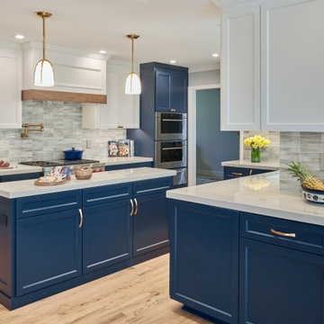
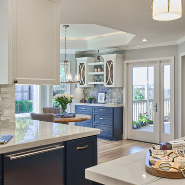
This kitchen was designed for a couple who have lived in their home for more than 30 years and have no plans to move. They LOVE the color blue.
In terms of design, the challenges were about striking the right balance between the family’s desire to have ‘everything’ blue and the existing 1980’s yellowed oak, prevalent throughout the home.
When we started out on the design journey, the existing style was very traditional with a lot of oak trim, walls, floors and doors, but as the project moved along it was evident that the family wanted to update the style, leaning towards a more Transitional style.
The existing kitchen was very dated with oak cabinets and floors and fell short in several areas: it was too small, without ample storage, had a tiny, angled island and was inefficient in terms of layout. In addition, the refrigerator was full depth and sat within a major walkway.
The kitchen and nook area are open to the adjacent family room, also filled with oak; floors, formal ceiling molding, cabinetry, fireplace wall and mantle. This was another challenge; to blend the existing oak with the new, creating a distinctive, harmonious, and very inter-connected space.
To address these issues, we framed in the existing wet bar in the family room, and opened that space into the kitchen. This was perfect for a counter-depth, built-in fridge and pantry and increased their storage capacity.
We removed the tiny angled island and replaced with a longer narrow island which now serves as a prep space and landing area for the cooking space.
We removed the existing dated hexagonal window in the nook, changed out the exterior door and created a new bar, complete with a more formal area within the nook to accommodate the glassware and dishware that was originally stored in the family room wet bar area.
The new kitchen design incorporates painted shaker cabinets, Pro-Style Sub Zero, Wolf and Cove appliances, multiple workspaces, and, of course the use of ‘Blue’.
To provide maximum ergonomic function, roll out trays were strategically planned at heights specific for convenient cooking apparatus and cutlery dividers included in drawers.
 C. Boesch Design
This kitchen was designed for a couple who have lived in their home for more than 30 years and have no plans to move. They LOVE the color blue.
In terms of design, the challenges were about striking the right balance between the family’s desire to have ‘everything’ blue and the existing 1980’s yellowed oak, prevalent throughout the home.
When we started out on the design journey, the existing style was very traditional with a lot of oak trim, walls, floors and doors, but as the project moved along it was evident that the family wanted to update the style, leaning towards a more Transitional style.
The existing kitchen was very dated with oak cabinets and floors and fell short in several areas: it was too small, without ample storage, had a tiny, angled island and was inefficient in terms of layout. In addition, the refrigerator was full depth and sat within a major walkway.
The kitchen and nook area are open to the adjacent family room, also filled with oak; floors, formal ceiling molding, cabinetry, fireplace wall and mantle. This was another challenge; to blend the existing oak with the new, creating a distinctive, harmonious, and very inter-connected space.
To address these issues, we framed in the existing wet bar in the family room, and opened that space into the kitchen. This was perfect for a counter-depth, built-in fridge and pantry and increased their storage capacity.
We removed the tiny angled island and replaced with a longer narrow island which now serves as a prep space and landing area for the cooking space.
We removed the existing dated hexagonal window in the nook, changed out the exterior door and created a new bar, complete with a more formal area within the nook to accommodate the glassware and dishware that was originally stored in the family room wet bar area.
The new kitchen design incorporates painted shaker cabinets, Pro-Style Sub Zero, Wolf and Cove appliances, multiple workspaces, and, of course the use of ‘Blue’.
To provide maximum ergonomic function, roll out trays were strategically planned at heights specific for convenient cooking apparatus and cutlery dividers included in drawers.


 Debby Evans Garden Design
Photos by Debby Evans. This property slopes from the street to a seasonal creek in the back yard. Navigating the various spaces was troublesome so we created various, natural - as well as concrete steps, crushed granite pathways, stone steps, and flagstone - travel options throughout the landscape. Updated irrigation, efficient drainage, as well as dry creek beds to catch rain water that previously had simply gone directly at the residence were added. Many diseased, dangerous (hanging over the residence) oaks were assessed by several arborists. Sadly, more than 100 (mostly scrub oaks) required removal. This changed the natural lighting to the garden, how the sun impacted the residence, and offered opportunities to plant drought tolerant trees and shrubs of both visual interest, and fitting the space. Client had quite a few Japanese Maples that had originally been volunteers from a very large maple at another residence. All have been used and are doing beautifully. Olive trees and Little Ollie shrubs were used along with Carpet Roses, Lorapetalum, several varieties of Grevellia, Crape Myrtle Natchez and Red Rocket trees and shrubs, Maiden Hair grass, Blue Fescue, Redwoods, a specimen Limelight Hydrangea, Cistus, native Redbud, Vinca, Tree Hibiscus, Tree Roses, Birch, Dogwood, Penstemon, Pittosporum, Heavenly Bamboo, Miniature Roses, Succulents, Euphorbia, Bloodgood Maple, Redtwig Maple, Podocarpus and Oleander (screening), various groundcovers, evergreen shrubs and more were selected for their ease of care, color, seasonal color, and dynamic - but not busy - plant palette. The dated deck was redone with a relocation of the stairs to go directly to the pool. with a little effort, we saved the client hundreds of dollars on lighting by shopping for knock offs of higher priced lighting. A partial retractable awning, now provides an area of shade that was previously a non-issue over the deck with the oaks. The seasonal creek was completely cleaned out, made to be deeper and wider in anticipation of the heaving 2016 rains, with large native boulders from the property. Pistache trees were strategically planted for fall color. With one neighbor, on the West side of the property, vines were planted along their chain link fence for privacy for a private garden off the master bedroom. Wood fencing provides the majority of necessary enclosures.
 Milgard Windows & Doors
The Kiguchi family moved into their Austin, Texas home in 1994. Built in the 1980’s as part of a neighborhood development, they happily raised their family here but longed for something more contemporary. Once they became empty nesters, they decided it was time for a major remodel. After spending many years visiting Austin AIA Home Tours that highlight contemporary residential architecture, they had a lot of ideas and in 2013 were ready to interview architects and get their renovation underway.
The project turned into a major remodel due to an unstable foundation. Architects Ben Arbib and Ed Hughey, of Arbib Hughey Design were hired to solve the structural issue and look for inspiration in the bones of the house, which sat on top of a hillside and was surrounded by great views.
Unfortunately, with the old floor plan, the beautiful views were hidden by small windows that were poorly placed. In order to bring more natural light into the house the window sizes and configurations had to be addressed, all while keeping in mind the homeowners desire for a modern look and feel.
To achieve a more contemporary and sophisticated front of house, a new entry was designed that included removing a two-story bay window and porch. The entrance of the home also became more integrated with the landscape creating a template for new foliage to be planted. Older exterior materials were updated to incorporate a more muted palette of colors with a metal roof, dark grey siding in the back and white stucco in the front. Deep eaves were added over many of the new large windows for clean lines and sun protection.
“Inside it was about opening up the floor plan, expanding the views throughout the house, and updating the material palette to get a modern look that was also warm and inviting,” said Ben from Arbib Hughey Design. “Prior to the remodel, the house had the typical separation of rooms. We removed the walls between them and changed all of the windows to Milgard Thermally Improved Aluminum to connect the inside with the outside. No matter where you are you get nice views and natural light.”
The architects wanted to create some drama, which they accomplished with the window placement and opening up the interior floor plan to an open concept approach. Cabinetry was used to help delineate intimate spaces. To add warmth to an all-white living room, white-washed oak wood floors were installed and pine planks were used around the fireplace. The large windows served as artwork bringing the color of nature into the space.
An octagon shaped, elevated dining room, (named “the turret”), had a big impact on the design of the house. They architects rounded the corners and added larger window openings overlooking a new sunken garden. The great room was also softened by rounding out the corners and that circular theme continued throughout the house, being picked up in skylight wells and kitchen cabinetry. A staircase leading to a catwalk was added and the result was a two-story window wall that flooded the home with natural light.
When asked why Milgard® Thermally Improved Aluminum windows were selected, the architectural team listed many reasons:
1) Aesthetics: “We liked the slim profiles and narrow sightlines. The window frames never get in the way of the view and that was important to us. They also have a very contemporary look that went well with our design.”
2) Options: “We liked that we could get large sliding doors that matched the windows, giving us a very cohesive look and feel throughout the project.”
3) Cost Effective: “Milgard windows are affordable. You get a good product at a good price.”
4) Custom Sizes: “Milgard windows are customizable, which allowed us to get the right window for each location.”
Ready to take on your own traditional to modern home remodeling project? Arbib Hughey Design advises, “Work with a good architect. That means picking a team that is creative, communicative, listens well and is responsive. We think it’s important for an architect to listen to their clients and give them something they want, not something the architect thinks they should have. At the same time you want an architect who is willing and able to think outside the box and offer up design options that you may not have considered. Design is about a lot of back and forth, trying out ideas, getting feedback and trying again.”
The home was completely transformed into a unique, contemporary house perfectly integrated with its site. Internally the home has a natural flow for the occupants and externally it is integrated with the surroundings taking advantage of great natural light. As a side note, it was highly praised as part of the Austin AIA homes tour.
 Milgard Windows & Doors
The Kiguchi family moved into their Austin, Texas home in 1994. Built in the 1980’s as part of a neighborhood development, they happily raised their family here but longed for something more contemporary. Once they became empty nesters, they decided it was time for a major remodel. After spending many years visiting Austin AIA Home Tours that highlight contemporary residential architecture, they had a lot of ideas and in 2013 were ready to interview architects and get their renovation underway.
The project turned into a major remodel due to an unstable foundation. Architects Ben Arbib and Ed Hughey, of Arbib Hughey Design were hired to solve the structural issue and look for inspiration in the bones of the house, which sat on top of a hillside and was surrounded by great views.
Unfortunately, with the old floor plan, the beautiful views were hidden by small windows that were poorly placed. In order to bring more natural light into the house the window sizes and configurations had to be addressed, all while keeping in mind the homeowners desire for a modern look and feel.
To achieve a more contemporary and sophisticated front of house, a new entry was designed that included removing a two-story bay window and porch. The entrance of the home also became more integrated with the landscape creating a template for new foliage to be planted. Older exterior materials were updated to incorporate a more muted palette of colors with a metal roof, dark grey siding in the back and white stucco in the front. Deep eaves were added over many of the new large windows for clean lines and sun protection.
“Inside it was about opening up the floor plan, expanding the views throughout the house, and updating the material palette to get a modern look that was also warm and inviting,” said Ben from Arbib Hughey Design. “Prior to the remodel, the house had the typical separation of rooms. We removed the walls between them and changed all of the windows to Milgard Thermally Improved Aluminum to connect the inside with the outside. No matter where you are you get nice views and natural light.”
The architects wanted to create some drama, which they accomplished with the window placement and opening up the interior floor plan to an open concept approach. Cabinetry was used to help delineate intimate spaces. To add warmth to an all-white living room, white-washed oak wood floors were installed and pine planks were used around the fireplace. The large windows served as artwork bringing the color of nature into the space.
An octagon shaped, elevated dining room, (named “the turret”), had a big impact on the design of the house. They architects rounded the corners and added larger window openings overlooking a new sunken garden. The great room was also softened by rounding out the corners and that circular theme continued throughout the house, being picked up in skylight wells and kitchen cabinetry. A staircase leading to a catwalk was added and the result was a two-story window wall that flooded the home with natural light.
When asked why Milgard® Thermally Improved Aluminum windows were selected, the architectural team listed many reasons:
1) Aesthetics: “We liked the slim profiles and narrow sightlines. The window frames never get in the way of the view and that was important to us. They also have a very contemporary look that went well with our design.”
2) Options: “We liked that we could get large sliding doors that matched the windows, giving us a very cohesive look and feel throughout the project.”
3) Cost Effective: “Milgard windows are affordable. You get a good product at a good price.”
4) Custom Sizes: “Milgard windows are customizable, which allowed us to get the right window for each location.”
Ready to take on your own traditional to modern home remodeling project? Arbib Hughey Design advises, “Work with a good architect. That means picking a team that is creative, communicative, listens well and is responsive. We think it’s important for an architect to listen to their clients and give them something they want, not something the architect thinks they should have. At the same time you want an architect who is willing and able to think outside the box and offer up design options that you may not have considered. Design is about a lot of back and forth, trying out ideas, getting feedback and trying again.”
The home was completely transformed into a unique, contemporary house perfectly integrated with its site. Internally the home has a natural flow for the occupants and externally it is integrated with the surroundings taking advantage of great natural light. As a side note, it was highly praised as part of the Austin AIA homes tour.
 Tile Doctor Ltd
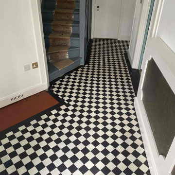
This client from North London had recently bought a property in Highgate N6 and during renovation had discovered an original Victorian tiled floor in the hallway. The floor was laid in a classic black and white diamond pattern but unfortunately a large section was missing and had been filled with concrete. Furthermore, most of the remaining floor had been covered in cement and glue.
I carried out a survey of the floor to determine the main issues and was then able to email over a quote later that day that included rebuilding the missing section of flooring. I suspect the floor had been excavated at some point in the past to install central heating and then rather than have the excavated section restored it was simply back filled and then levelled with a cement screed before finally gluing down a carpet on top.
Once the quote was accepted, I sourced replacement tiles from the Vintage Floor Tile company. Situated in Kent they are a reclamation yard that specialises in supplying original geometric and encaustic tiles including the major historical makers such as Minton and Craven Dunnill.
Armed with replacement tiles I started by removing the concrete that had been used to backfill the missing section and prepare a new surface for tiling with quick drying cement. When ready I was able to carefully build back the original pattern using the replacements. The tiles were secured with tile adhesive and once that had gone off, they were grouted.
The floor was left to set fully overnight and then the next day I was able to return and clean the whole floor using a strong dilution of Tile Doctor Remove and Go. As usual this was left to soak into the tiles for a good ten minutes before being scrubbed into the tiles using a black scrubbing pad. The Tile Doctor Remove and Go did a good job of cleaning the floor and the cleaning solution soon turned black with dirt during the scrubbing. The floor was rinsed with water and the soil extracted with a wet vacuum. After inspecting the floor any areas that needed further work were hand scrubbed and rinsed again until I was happy the floor was clean.
The last part of the cleaning process was to give the tiles an acid wash using Tile Doctor Acid Gel which further cleans the floor by removing old cement residue and grout haze. It also neutralises efflorescent salts in the tiles which are a common issue with floors of this age with no damp proof membrane. After another rinse and extraction, the floor was given a final rinse and then dried as much as possible using the wet vacuum.
I left the floor to dry out for a couple of days before returning to apply a protective sealer. Tile and Stone should be dry before sealing so I use a damp meter first to double check. All was well so to seal the tiles I proceeded to apply the first of what would be three coats of sealer. I used Tile Doctor Colour Grow for this, it works by impregnating the tile occupying the pores and thereby preventing dirt from becoming ingrained there. This product also enhances the black and white colour of the tiles and makes the floor much easier to clean.
Once done the floor was transformed and needless to say my customer was very pleased with the result. For the aftercare of Victorian Tiled floors, I recommend the use of a ph neural tile cleaner such as Tile Doctor Neutral Cleaner; most supermarket tile cleaners are simply too strong for use on sealed floors and can strip off the sealer prematurely.
Andrew Newstead
North London Tile Doctor

 Aljalabiya
Buy Online Hijab Dress For Women
Abayas Islamic Clothing
There is no uniform way to deal with phrasing for Islamic dress. HIJAB is an Arabic word, initially alluding to a drapery or parcel, which later came to allude to Islamic dress as a rule, however, is presently usually metonymically diminished to the headscarf.
In the late years, Islamic dress has risen as tolerating locales of the dispute in the relationship between Muslim people group and the State. In particular, the wearing of Islamic headscarves by ladies in broad daylight places has brought up issues about secularism, ladies' rights, and national character. It has dependably been seen by the Western women's activist as onerous and as an image of a Muslim lady's subservience to men.
Accordingly, it frequently comes as a shock to Western women's activists that the shroud has turned out to be progressively basic in the Muslim world and is regularly worn gladly by school young ladies as an image of an Islamic character, liberating them typically from neo-pioneer Western social colonialism and mastery. For well more than two decades, Muslim ladies have been situated in the Australian prominent media contrary to the estimations of liberal majority rules system and the women's activist motivation. Muslim ladies, as though the demonstration of "disclosing" will some way or another offer the "balance" and "flexibilities" that Western ladies appreciate.
There are diverse styles of hijab. Contrasts essentially are because of the distinctions of area and culture. Muslim ladies in the subcontinent, India, and Pakistan, wear Burqa which is a two piece shroud comprising a head covering and an outfit.
Present-day patterns have changed the approach of numerous men and ladies towards Hijab. Men spruce up unassumingly and a dominant part of them cease from covering their heads with the exception of supplication times. Numerous ladies have taken up more popular methods for watching hijab.
Uniting the finest in Arabian dress, Aljalabiya is glad to serve a differing exhibit of clients with its wide assortment of Islamic garments for ladies.
For More Islamic clothing :à
What Al-Jalabiya,
King Khalid Street
P.O.BOX 32530 Jeddah,
21438 Saudi Arabia
Call us now: +966-12-6323222
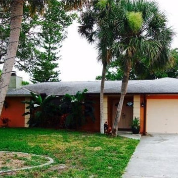
 Shayla Twit, Realtor at Coldwell Banker
JUST SOLD: $600,000 short sale within walking distance of Siesta Key Beach
This 5 bedroom, 3 bath home within minutes from the beautiful Siesta Key Beach just closed at the price of $600,000. This was a short sale transaction, which presented some typical challenges along the way, but closed with the satisfaction of all parties involved.
A Short Sale transaction means that this is a sale for less than what is owed on the home. The bank must approve the seller to sell this way, as they have to provide evidence that they cannot pay off the note and not all of these transactions are approved. Once a contract is submitted, it typically takes an average of 3-6 months from contract to closing but they vary greatly. The majority of short-sales that Shayla has handled have fallen into the 3-6 month category with many these days closing in 90 days!
Both Buyers and Sellers face difficult and unique problems when dealing with a short-sale. As long as each party is educated by their agents and know what pitfalls and hurdles could come their way, the process isn't as painful as it could be. Unfortunately there are no set guidelines that fit every transaction. You should always expect delays with a short sale and having a professional agent to guide you is crucial. There are different reasons why the transaction may be delayed. Some of the most common are: the buyer not wanting to wait for a reply from the lienholder; the seller not wanting to move out or in denial that the have to sell their home this way; paperwork issues; loan delays; etc.
If you are considering entering a short sale transaction as a buyer, you should know that just because you offer full price does not ensure acceptance by the bank. They can counter any of the terms presented in the initial contract that is signed by both the buyer and seller. With the changes in the local market, lenders are looking at prices closer to market value whereas during the Recession, they were willing to accept lower offers. These are changes an experienced realtor is aware of and will consider when advising you on a short sale transaction!
In close, despite it's name, a "short sale" is NEVER short. They should deem them the "long sale." So working with a seasoned Realtor who is an expert in the distressed property transactions will save you a lot of grey hairs and stress along the way!

 Mike Farley Pool Designer, SWD, ASLA
Sunsets provide daily enjoyment from this natural cliffside stunning oasis in Possum Kingdom Lake designed by Mike Farley. The desire to sit and enjoy the lake view from the pool required the spa and barstools to be pushed to the point on the cliff edge. The granite swim up bar top blends with new materials and provides a great place to enjoy a drink while watching the jet skis and boats go by. The spa was nestled into the natural waterfall. The new flagstone patio and beach entry match the existing patio. The dry stack flagstone bridge was built across the major drainage from the front roadway to the lake by a natural looking stream bed. We desired a natural waterfall that kept the view open to the primary focal point, the lake. For that reason we kept the boulders low and wide. All the boulders are stone from the lot in order to blend in with the natural cliffside. The pool creates the oasis between the new casita and the beautiful lake. Photos by Mike Farley
18