
Search results for "Make or break topics" in Home Design Ideas
 Rockledge Design + Architecture
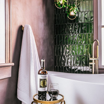
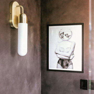
From the plum-brown limewashed walls to the curated mix of antique and contemporary elements, this en suite primary bath exudes quiet luxury. The inspiration for this space began with the early 20th century English washstand. The warm wood, Carrara marble top, and striking backsplash featuring original Racing Green pool glazed tiles set the tone for the rest of the room’s materials palette. To help transform the piece into a functioning modern day vanity, we added custom brass feet, new cabinet and drawer hardware, and an offset matte stone sink paired with a brushed brass single handle faucet.
We kept the space feeling relaxed and not too formal by incorporating fun, current silhouettes for the rest of our selections. A repeating pill-shaped motif shows up in the statement-making light fixtures, tub filler, hanging planters, and tub-side mirrored table. Similarly, reeded/fluted patterns can be found on the pocket door glass, bathroom accessories, artwork, and louvered linen closet door.
On the walls, natural limewash in the moody shade “Anise” from Bauwerk Color has been treated with a hand-burnished wax coating, making the textured surface safe for use in wet spaces. The suede-like finish adds rich character to the space, changing with the varying sunlight throughout the day. We’ve used a two-tone hexagon mosaic floor tile in both classic Carrara and dramatic Nero Marquina to help delineate the wet and dry halves of the bathroom. The soaking tub is placed on a 4” angled platform, breaking up the floor plan and making the space more dynamic.
Radiant heat floors, a hidden medicine cabinet, extra wide tiled shower niche, and new privacy glass windows are a few more features balancing form and function.
 Rockledge Design + Architecture
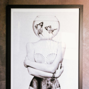
From the plum-brown limewashed walls to the curated mix of antique and contemporary elements, this en suite primary bath exudes quiet luxury. The inspiration for this space began with the early 20th century English washstand. The warm wood, Carrara marble top, and striking backsplash featuring original Racing Green pool glazed tiles set the tone for the rest of the room’s materials palette. To help transform the piece into a functioning modern day vanity, we added custom brass feet, new cabinet and drawer hardware, and an offset matte stone sink paired with a brushed brass single handle faucet.
We kept the space feeling relaxed and not too formal by incorporating fun, current silhouettes for the rest of our selections. A repeating pill-shaped motif shows up in the statement-making light fixtures, tub filler, hanging planters, and tub-side mirrored table. Similarly, reeded/fluted patterns can be found on the pocket door glass, bathroom accessories, artwork, and louvered linen closet door.
On the walls, natural limewash in the moody shade “Anise” from Bauwerk Color has been treated with a hand-burnished wax coating, making the textured surface safe for use in wet spaces. The suede-like finish adds rich character to the space, changing with the varying sunlight throughout the day. We’ve used a two-tone hexagon mosaic floor tile in both classic Carrara and dramatic Nero Marquina to help delineate the wet and dry halves of the bathroom. The soaking tub is placed on a 4” angled platform, breaking up the floor plan and making the space more dynamic.
Radiant heat floors, a hidden medicine cabinet, extra wide tiled shower niche, and new privacy glass windows are a few more features balancing form and function.
 Linhan Design & Interiors Co.
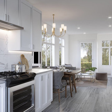
White is popular in interior design, often used to create a look of elegance and refinement. White can make your room seem larger and in the case of kitchens, reflect light where windows are not available to provide natural lighting. The white crown molding makes the cabinetry blend right into the wall and make the already tall cabinets appear even taller. The backsplash in grey and white marble with the grey ceramic countertop breaks up the look, adding a touch of color.
Find the right local pro for your project
 In Detail Interiors
Small coastal condo gets a new life!
This project started as a consultation that really focused on whether or not it was feasible to maximize functionality out of a tight kitchen area in a condo on the beach. The cabinetry was sort of dated but not terrible terrible.
Refresh or total gut of this small kitchen
The client wanted to give it a refresh worked but we had worked with her before…so she could not quite decide how far to go. Maybe just repaint the existing cabinets? She needed some furniture. She wanted a little more ambiance and pizazz. And she wanted the Cheryl magic.
Ok finally, decision made. Kitchen had to go@!
Decision made- a new kitchen to go with the new living!
After further review on site with her during the consult meeting, and pitching a few inquiries around for bids on cabinetry and countertops – she ultimately decided to gut and re-do the whole layout. And man-oh-man what a difference some well executed design makes!!
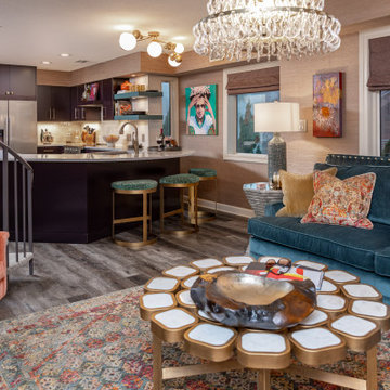
This layout was unique and truly optimized every inch we could muster from the kitchen. (Working around that spiral staircase and navigating the soffit that wrapped the entire kitchen and adjacent living room!!) Colors needed to be bold while still feeling fresh so we paired a deep aubergine and a sort of “matte” Caribbean blue which laid the groundwork for a stunning living area palette.
Tough layout to enlarge much
There were a lot of other “givens” in this space that made the execution of the design a highly strategized process. We knew we had to work around the large wall space that starts the kitchen because it had the laundry room hiding on the other side… the awkward nook with windows on all sides that was a small breakfast area before the remodel… oh, and did we mention that dang spiral staircase?! Multiple site visits to plot the cabinetry and countertop curve paid off all said and done, though!
Living space that work with the open floor plan kitchen
Designing the furnishings then became the fun part! With a smaller living space flanked by windows and sliders – but one that needed to balance the kitchen in substance – we had to break a few preferred design rules to make up the amount of seating desired.
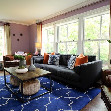
The deep grape-y purple barrel swivels were the perfect “transition” piece by the slider offering access to the views while being versatile enough to still afford safe use of the slider and passage outside. Adding some graphic punch with the droplet shaped, stone and brass cocktail table and bold multicolored rug we love the balance of these weightier aesthetic choices with the adjacent kitchen.
Signature pieces make all the difference
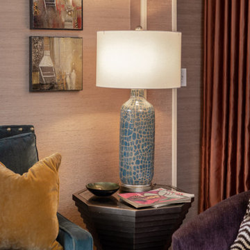
Carrying through little pops of that blue green between the counter stools (I die! Seriously! SO GORGEOUS) and the sofa (with those brass nails!) — these colors really created a sturdy but eclectic tonal feel that the client was just over the moon for. The art and grasscloth on the walls throughout developed the architecture of the space in an overall structure that was really lacking – it feels warm, inviting, comfortable – BEAUTIFUL – but not too priss and pomp.
Now if we could just keep the pup off the sofa!
 TKS Design Group
Free ebook, Creating the Ideal Kitchen. DOWNLOAD NOW
The Klimala’s and their three kids are no strangers to moving, this being their fifth house in the same town over the 20-year period they have lived there. “It must be the 7-year itch, because every seven years, we seem to find ourselves antsy for a new project or a new environment. I think part of it is being a designer, I see my own taste evolve and I want my environment to reflect that. Having easy access to wonderful tradesmen and a knowledge of the process makes it that much easier”.
This time, Klimala’s fell in love with a somewhat unlikely candidate. The 1950’s ranch turned cape cod was a bit of a mutt, but it’s location 5 minutes from their design studio and backing up to the high school where their kids can roll out of bed and walk to school, coupled with the charm of its location on a private road and lush landscaping made it an appealing choice for them.
“The bones of the house were really charming. It was typical 1,500 square foot ranch that at some point someone added a second floor to. Its sloped roofline and dormered bedrooms gave it some charm.” With the help of architect Maureen McHugh, Klimala’s gutted and reworked the layout to make the house work for them. An open concept kitchen and dining room allows for more frequent casual family dinners and dinner parties that linger. A dingy 3-season room off the back of the original house was insulated, given a vaulted ceiling with skylights and now opens up to the kitchen. This room now houses an 8’ raw edge white oak dining table and functions as an informal dining room. “One of the challenges with these mid-century homes is the 8’ ceilings. I had to have at least one room that had a higher ceiling so that’s how we did it” states Klimala.
The kitchen features a 10’ island which houses a 5’0” Galley Sink. The Galley features two faucets, and double tiered rail system to which accessories such as cutting boards and stainless steel bowls can be added for ease of cooking. Across from the large sink is an induction cooktop. “My two teen daughters and I enjoy cooking, and the Galley and induction cooktop make it so easy.” A wall of tall cabinets features a full size refrigerator, freezer, double oven and built in coffeemaker. The area on the opposite end of the kitchen features a pantry with mirrored glass doors and a beverage center below.
The rest of the first floor features an entry way, a living room with views to the front yard’s lush landscaping, a family room where the family hangs out to watch TV, a back entry from the garage with a laundry room and mudroom area, one of the home’s four bedrooms and a full bath. There is a double sided fireplace between the family room and living room. The home features pops of color from the living room’s peach grass cloth to purple painted wall in the family room. “I’m definitely a traditionalist at heart but because of the home’s Midcentury roots, I wanted to incorporate some of those elements into the furniture, lighting and accessories which also ended up being really fun. We are not formal people so I wanted a house that my kids would enjoy, have their friends over and feel comfortable.”
The second floor houses the master bedroom suite, two of the kids’ bedrooms and a back room nicknamed “the library” because it has turned into a quiet get away area where the girls can study or take a break from the rest of the family. The area was originally unfinished attic, and because the home was short on closet space, this Jack and Jill area off the girls’ bedrooms houses two large walk-in closets and a small sitting area with a makeup vanity. “The girls really wanted to keep the exposed brick of the fireplace that runs up the through the space, so that’s what we did, and I think they feel like they are in their own little loft space in the city when they are up there” says Klimala.
Designed by: Susan Klimala, CKD, CBD
Photography by: Carlos Vergara
For more information on kitchen and bath design ideas go to: www.kitchenstudio-ge.com
 Rockledge Design + Architecture
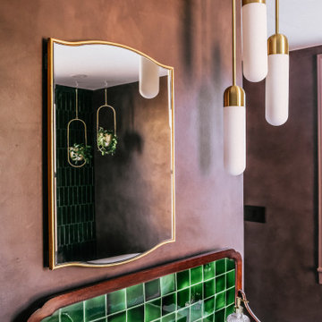
From the plum-brown limewashed walls to the curated mix of antique and contemporary elements, this en suite primary bath exudes quiet luxury. The inspiration for this space began with the early 20th century English washstand. The warm wood, Carrara marble top, and striking backsplash featuring original Racing Green pool glazed tiles set the tone for the rest of the room’s materials palette. To help transform the piece into a functioning modern day vanity, we added custom brass feet, new cabinet and drawer hardware, and an offset matte stone sink paired with a brushed brass single handle faucet.
We kept the space feeling relaxed and not too formal by incorporating fun, current silhouettes for the rest of our selections. A repeating pill-shaped motif shows up in the statement-making light fixtures, tub filler, hanging planters, and tub-side mirrored table. Similarly, reeded/fluted patterns can be found on the pocket door glass, bathroom accessories, artwork, and louvered linen closet door.
On the walls, natural limewash in the moody shade “Anise” from Bauwerk Color has been treated with a hand-burnished wax coating, making the textured surface safe for use in wet spaces. The suede-like finish adds rich character to the space, changing with the varying sunlight throughout the day. We’ve used a two-tone hexagon mosaic floor tile in both classic Carrara and dramatic Nero Marquina to help delineate the wet and dry halves of the bathroom. The soaking tub is placed on a 4” angled platform, breaking up the floor plan and making the space more dynamic.
Radiant heat floors, a hidden medicine cabinet, extra wide tiled shower niche, and new privacy glass windows are a few more features balancing form and function.
 TKS Design Group
Free ebook, Creating the Ideal Kitchen. DOWNLOAD NOW
The Klimala’s and their three kids are no strangers to moving, this being their fifth house in the same town over the 20-year period they have lived there. “It must be the 7-year itch, because every seven years, we seem to find ourselves antsy for a new project or a new environment. I think part of it is being a designer, I see my own taste evolve and I want my environment to reflect that. Having easy access to wonderful tradesmen and a knowledge of the process makes it that much easier”.
This time, Klimala’s fell in love with a somewhat unlikely candidate. The 1950’s ranch turned cape cod was a bit of a mutt, but it’s location 5 minutes from their design studio and backing up to the high school where their kids can roll out of bed and walk to school, coupled with the charm of its location on a private road and lush landscaping made it an appealing choice for them.
“The bones of the house were really charming. It was typical 1,500 square foot ranch that at some point someone added a second floor to. Its sloped roofline and dormered bedrooms gave it some charm.” With the help of architect Maureen McHugh, Klimala’s gutted and reworked the layout to make the house work for them. An open concept kitchen and dining room allows for more frequent casual family dinners and dinner parties that linger. A dingy 3-season room off the back of the original house was insulated, given a vaulted ceiling with skylights and now opens up to the kitchen. This room now houses an 8’ raw edge white oak dining table and functions as an informal dining room. “One of the challenges with these mid-century homes is the 8’ ceilings. I had to have at least one room that had a higher ceiling so that’s how we did it” states Klimala.
The kitchen features a 10’ island which houses a 5’0” Galley Sink. The Galley features two faucets, and double tiered rail system to which accessories such as cutting boards and stainless steel bowls can be added for ease of cooking. Across from the large sink is an induction cooktop. “My two teen daughters and I enjoy cooking, and the Galley and induction cooktop make it so easy.” A wall of tall cabinets features a full size refrigerator, freezer, double oven and built in coffeemaker. The area on the opposite end of the kitchen features a pantry with mirrored glass doors and a beverage center below.
The rest of the first floor features an entry way, a living room with views to the front yard’s lush landscaping, a family room where the family hangs out to watch TV, a back entry from the garage with a laundry room and mudroom area, one of the home’s four bedrooms and a full bath. There is a double sided fireplace between the family room and living room. The home features pops of color from the living room’s peach grass cloth to purple painted wall in the family room. “I’m definitely a traditionalist at heart but because of the home’s Midcentury roots, I wanted to incorporate some of those elements into the furniture, lighting and accessories which also ended up being really fun. We are not formal people so I wanted a house that my kids would enjoy, have their friends over and feel comfortable.”
The second floor houses the master bedroom suite, two of the kids’ bedrooms and a back room nicknamed “the library” because it has turned into a quiet get away area where the girls can study or take a break from the rest of the family. The area was originally unfinished attic, and because the home was short on closet space, this Jack and Jill area off the girls’ bedrooms houses two large walk-in closets and a small sitting area with a makeup vanity. “The girls really wanted to keep the exposed brick of the fireplace that runs up the through the space, so that’s what we did, and I think they feel like they are in their own little loft space in the city when they are up there” says Klimala.
Designed by: Susan Klimala, CKD, CBD
Photography by: Carlos Vergara
For more information on kitchen and bath design ideas go to: www.kitchenstudio-ge.com

 In Detail Interiors
Small coastal condo gets a new life!
This project started as a consultation that really focused on whether or not it was feasible to maximize functionality out of a tight kitchen area in a condo on the beach. The cabinetry was sort of dated but not terrible terrible.
Refresh or total gut of this small kitchen
The client wanted to give it a refresh worked but we had worked with her before…so she could not quite decide how far to go. Maybe just repaint the existing cabinets? She needed some furniture. She wanted a little more ambiance and pizazz. And she wanted the Cheryl magic.
Ok finally, decision made. Kitchen had to go@!
Decision made- a new kitchen to go with the new living!
After further review on site with her during the consult meeting, and pitching a few inquiries around for bids on cabinetry and countertops – she ultimately decided to gut and re-do the whole layout. And man-oh-man what a difference some well executed design makes!!
This layout was unique and truly optimized every inch we could muster from the kitchen. (Working around that spiral staircase and navigating the soffit that wrapped the entire kitchen and adjacent living room!!) Colors needed to be bold while still feeling fresh so we paired a deep aubergine and a sort of “matte” Caribbean blue which laid the groundwork for a stunning living area palette.
Tough layout to enlarge much
There were a lot of other “givens” in this space that made the execution of the design a highly strategized process. We knew we had to work around the large wall space that starts the kitchen because it had the laundry room hiding on the other side… the awkward nook with windows on all sides that was a small breakfast area before the remodel… oh, and did we mention that dang spiral staircase?! Multiple site visits to plot the cabinetry and countertop curve paid off all said and done, though!
Living space that work with the open floor plan kitchen
Designing the furnishings then became the fun part! With a smaller living space flanked by windows and sliders – but one that needed to balance the kitchen in substance – we had to break a few preferred design rules to make up the amount of seating desired.
The deep grape-y purple barrel swivels were the perfect “transition” piece by the slider offering access to the views while being versatile enough to still afford safe use of the slider and passage outside. Adding some graphic punch with the droplet shaped, stone and brass cocktail table and bold multicolored rug we love the balance of these weightier aesthetic choices with the adjacent kitchen.
Signature pieces make all the difference
Carrying through little pops of that blue green between the counter stools (I die! Seriously! SO GORGEOUS) and the sofa (with those brass nails!) — these colors really created a sturdy but eclectic tonal feel that the client was just over the moon for. The art and grasscloth on the walls throughout developed the architecture of the space in an overall structure that was really lacking – it feels warm, inviting, comfortable – BEAUTIFUL – but not too priss and pomp.
Now if we could just keep the pup off the sofa!

 AirField Systems, LLC
Robert Trent Jones Golf Club installs AirField Systems AirDrain.
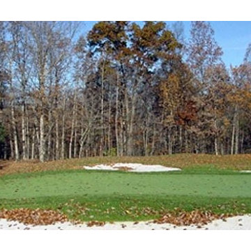
The AirField Systems AirDrain for Golf Greens installed at Robert Trent Jones, home of The President’s Cup, continues to perform since 2004. Stronger roots, healthier turf, superior drainage and the ability to make it’s own nearly perfect perched water table without organics make AirDrain Golf Greens by AirField the choice of the most discriminating golf course architects, designers, owners and superintendents – and the savings in time, installation and maintenance make it the choice for everyone. View AirDrain Golf Greens in action after years of use at one of the most prestigious courses on the east coast.
Thru a research project conducted at Texas A&M, it was concluded that you can reduce your irrigation needs using AirField Systems AirDrain. The five year research project was jointly funded by the United States Golf Association and AirField Systems and was a collaborative effort between Texas A&M, AirField Systems and the United States Golf Association. The data from the research showed that the AirField Systems drainage profile provided between one to three more days of plant available water than a United States Golf Association recommended gravel and sand profile.
In addition, AirDrain by AirField Systems can significantly save on installation time because much less excavation is required compared to the traditional gravel drainage layers that have a much deeper profile. AirDrain arrives on site in 53” trailers, palletized and ready for install. Unlike gravel drainage, with AirDrain there is no need for heavy dump trucks that can compact your golf course.
Benefits of an AirField System Design for Golf Greens include:
1 to 3 more days of plant available water stored in the root zone (depending on climate)
Significantly reduces daily irrigation needs (as told to us by our customers)
Healthier turf / Stronger root system (as told to us by our customers)
100% Vertical Drainage under the entire playing surface
AirDrain is a 100% recycled copolymer with the impact modifier “metallocene” qualifying it as a “No Break” plastic
Helps eliminate standing water / Simplifies maintenance (as told to us by our customers)
Minimal site disturbance / Far less excavation and disposal
Several Installation days are saved over a gravel installation
Compact shipping that reduces overall storage and transportation costs
An AirDrain System sand profile creates its own perched water table without peat moss or clay
AirDrain’s sand profile and minimal organics puts it at very little risk for issues of mold or disease
http://www.rtjgc.com/Club/Scripts/Home/home.asp
 Rockledge Design + Architecture
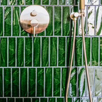
From the plum-brown limewashed walls to the curated mix of antique and contemporary elements, this en suite primary bath exudes quiet luxury. The inspiration for this space began with the early 20th century English washstand. The warm wood, Carrara marble top, and striking backsplash featuring original Racing Green pool glazed tiles set the tone for the rest of the room’s materials palette. To help transform the piece into a functioning modern day vanity, we added custom brass feet, new cabinet and drawer hardware, and an offset matte stone sink paired with a brushed brass single handle faucet.
We kept the space feeling relaxed and not too formal by incorporating fun, current silhouettes for the rest of our selections. A repeating pill-shaped motif shows up in the statement-making light fixtures, tub filler, hanging planters, and tub-side mirrored table. Similarly, reeded/fluted patterns can be found on the pocket door glass, bathroom accessories, artwork, and louvered linen closet door.
On the walls, natural limewash in the moody shade “Anise” from Bauwerk Color has been treated with a hand-burnished wax coating, making the textured surface safe for use in wet spaces. The suede-like finish adds rich character to the space, changing with the varying sunlight throughout the day. We’ve used a two-tone hexagon mosaic floor tile in both classic Carrara and dramatic Nero Marquina to help delineate the wet and dry halves of the bathroom. The soaking tub is placed on a 4” angled platform, breaking up the floor plan and making the space more dynamic.
Radiant heat floors, a hidden medicine cabinet, extra wide tiled shower niche, and new privacy glass windows are a few more features balancing form and function.
 Roeser Home Remodeling
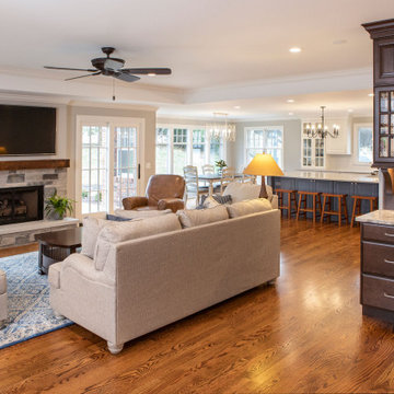
The couple wanted a kitchen remodel and a fireplace added to the family room. The 8-foot extension on the house expanded the living space and led to a more expansive feel to the gorgeous kitchen and family room.
Kitchen
The new 13-foot island with Aura Quartz countertop allows the family to sit and chat while making meals and provides seating for casual meals and snacks. And with so much added counter space, the island is perfect for entertaining.
Wellborn Premier cabinets in Glacier finish provide plenty of storage space, including under the island. The island also features these cabinets, with a custom color match.
Most of the kitchen’s appliances are stainless steel. Stainless steel appliances last longer, making them an investment and are easier to keep clean.
The 36” range top has six burners and its red knobs add a pop of color to the stretch of white counter fronts and tops. The backsplash behind the range is Barossa Valley Arabesque tile. The rest of the backsplash along the counter is white subway tile, giving the area a simple but clean look. The GE Café double electric convection ovens make cooking large holiday meals a breeze.
The French door GE Café refrigerator has a full-width electronic temp-controlled drawer. A dual zone wine refrigerator has glass with stainless steel frame.
Although the homeowners could have had a stainless steel dishwasher, they opted instead to install an Asko. The dishwasher’s front panel blends so seamlessly into the kitchen’s décor, it’s hiding it in plain sight while it works.
The butler pantry has a suede finish that breaks up the space with LG Minuet countertop.
Family Room Update
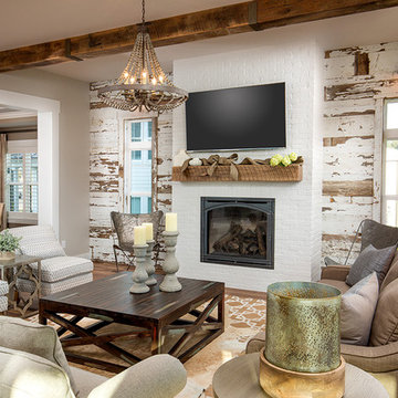
The family room was updated with the addition of a fireplace. A 42” Heatilator icon fireplace with herringbone refractory, black Grand Vista mesh cabinet doors and an 18.5-foot flue pipe was installed. RH Peterson 24″ split oak vented gas logs can be seen here.
The fireplace hearth is cultured stone from Eagle Stone & Brick, a St. Louis company. The style is Country Ledgestone Echo Ridge. The barnwood mantel of reclaimed timber is Montecito’s Irish Castle.
 Rockledge Design + Architecture
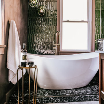
From the plum-brown limewashed walls to the curated mix of antique and contemporary elements, this en suite primary bath exudes quiet luxury. The inspiration for this space began with the early 20th century English washstand. The warm wood, Carrara marble top, and striking backsplash featuring original Racing Green pool glazed tiles set the tone for the rest of the room’s materials palette. To help transform the piece into a functioning modern day vanity, we added custom brass feet, new cabinet and drawer hardware, and an offset matte stone sink paired with a brushed brass single handle faucet.
We kept the space feeling relaxed and not too formal by incorporating fun, current silhouettes for the rest of our selections. A repeating pill-shaped motif shows up in the statement-making light fixtures, tub filler, hanging planters, and tub-side mirrored table. Similarly, reeded/fluted patterns can be found on the pocket door glass, bathroom accessories, artwork, and louvered linen closet door.
On the walls, natural limewash in the moody shade “Anise” from Bauwerk Color has been treated with a hand-burnished wax coating, making the textured surface safe for use in wet spaces. The suede-like finish adds rich character to the space, changing with the varying sunlight throughout the day. We’ve used a two-tone hexagon mosaic floor tile in both classic Carrara and dramatic Nero Marquina to help delineate the wet and dry halves of the bathroom. The soaking tub is placed on a 4” angled platform, breaking up the floor plan and making the space more dynamic.
Radiant heat floors, a hidden medicine cabinet, extra wide tiled shower niche, and new privacy glass windows are a few more features balancing form and function.
 Rockledge Design + Architecture
From the plum-brown limewashed walls to the curated mix of antique and contemporary elements, this en suite primary bath exudes quiet luxury. The inspiration for this space began with the early 20th century English washstand. The warm wood, Carrara marble top, and striking backsplash featuring original Racing Green pool glazed tiles set the tone for the rest of the room’s materials palette. To help transform the piece into a functioning modern day vanity, we added custom brass feet, new cabinet and drawer hardware, and an offset matte stone sink paired with a brushed brass single handle faucet.
We kept the space feeling relaxed and not too formal by incorporating fun, current silhouettes for the rest of our selections. A repeating pill-shaped motif shows up in the statement-making light fixtures, tub filler, hanging planters, and tub-side mirrored table. Similarly, reeded/fluted patterns can be found on the pocket door glass, bathroom accessories, artwork, and louvered linen closet door.
On the walls, natural limewash in the moody shade “Anise” from Bauwerk Color has been treated with a hand-burnished wax coating, making the textured surface safe for use in wet spaces. The suede-like finish adds rich character to the space, changing with the varying sunlight throughout the day. We’ve used a two-tone hexagon mosaic floor tile in both classic Carrara and dramatic Nero Marquina to help delineate the wet and dry halves of the bathroom. The soaking tub is placed on a 4” angled platform, breaking up the floor plan and making the space more dynamic.
Radiant heat floors, a hidden medicine cabinet, extra wide tiled shower niche, and new privacy glass windows are a few more features balancing form and function.

Sponsored
Columbus, OH

Hope Restoration & General Contracting
Columbus Design-Build, Kitchen & Bath Remodeling, Historic Renovations
 In Detail Interiors
Small coastal condo gets a new life!
This project started as a consultation that really focused on whether or not it was feasible to maximize functionality out of a tight kitchen area in a condo on the beach. The cabinetry was sort of dated but not terrible terrible.
Refresh or total gut of this small kitchen
The client wanted to give it a refresh worked but we had worked with her before…so she could not quite decide how far to go. Maybe just repaint the existing cabinets? She needed some furniture. She wanted a little more ambiance and pizazz. And she wanted the Cheryl magic.
Ok finally, decision made. Kitchen had to go@!
Decision made- a new kitchen to go with the new living!
After further review on site with her during the consult meeting, and pitching a few inquiries around for bids on cabinetry and countertops – she ultimately decided to gut and re-do the whole layout. And man-oh-man what a difference some well executed design makes!!
This layout was unique and truly optimized every inch we could muster from the kitchen. (Working around that spiral staircase and navigating the soffit that wrapped the entire kitchen and adjacent living room!!) Colors needed to be bold while still feeling fresh so we paired a deep aubergine and a sort of “matte” Caribbean blue which laid the groundwork for a stunning living area palette.
Tough layout to enlarge much
There were a lot of other “givens” in this space that made the execution of the design a highly strategized process. We knew we had to work around the large wall space that starts the kitchen because it had the laundry room hiding on the other side… the awkward nook with windows on all sides that was a small breakfast area before the remodel… oh, and did we mention that dang spiral staircase?! Multiple site visits to plot the cabinetry and countertop curve paid off all said and done, though!
Living space that work with the open floor plan kitchen
Designing the furnishings then became the fun part! With a smaller living space flanked by windows and sliders – but one that needed to balance the kitchen in substance – we had to break a few preferred design rules to make up the amount of seating desired.
The deep grape-y purple barrel swivels were the perfect “transition” piece by the slider offering access to the views while being versatile enough to still afford safe use of the slider and passage outside. Adding some graphic punch with the droplet shaped, stone and brass cocktail table and bold multicolored rug we love the balance of these weightier aesthetic choices with the adjacent kitchen.
Signature pieces make all the difference
Carrying through little pops of that blue green between the counter stools (I die! Seriously! SO GORGEOUS) and the sofa (with those brass nails!) — these colors really created a sturdy but eclectic tonal feel that the client was just over the moon for. The art and grasscloth on the walls throughout developed the architecture of the space in an overall structure that was really lacking – it feels warm, inviting, comfortable – BEAUTIFUL – but not too priss and pomp.
Now if we could just keep the pup off the sofa!
 Corvus Construction
At Corvus Construction, quality kitchen and bathroom remodels are our specialty. And while it’s great to go and pick out some nice tool for your kitchen backsplash or bathroom, what’s even better is when it can be configured uniquely to give you a custom-made design that will be one-of-a-kind and the envy of all who see it.
If you’re considering a bathroom remodel and need your shower replaced or upgraded, tile is a great way to go.
We’ve tiled hundreds of showers and most homeowners go for the standard look you see in home décor magazines or online. What you’ve likely seen, and may have now, is tile underfoot in the shower pan, field tile on the walls and perhaps an accent row of different pattern, color, or textured tile running horizontally around the walls of the shower stall.
Some higher-end showers may feature accent rows of tile running vertically from floor to ceiling. This is nice but still pretty vanilla.
The reality is there’s nothing that says you have to limit yourself to what you’ve seen before or what you see on idea walls at big box home improvement stores. Almost anything you can imagine is feasible when it comes to tile work.
Today we’ll talk about a recent project where we thought way outside the tile box and created a bespoke shower that wasn’t limited to the same old horizontal and vertical runs of tile.
after tile bathroom remodelbefore bathroom tile remodel
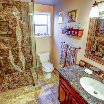
What we’ve found is that irregularly shaped tile accents on a larger scale make an amazing focal point and turn your shower into a tailor-made work of art. Many homeowners never even consider a custom feature like this because they think of them as a luxury that’s outside of their price range.
But nothing can be farther from the truth. In fact, a stunning shower design like this can be quite affordable. The photos featured in this blog are from a recent remodel we did and you can see just how incredible and opulent this custom tile work makes even this modest-sized bathroom look.
If you hire a knowledgeable and experienced contractor for your bathroom remodel, a tile feature should only cost you about six more hours of labor – depending of the complexity of the design. The more complex, the more costly, but even a simpler design can make a huge difference in the look of your bathroom and can improve the look and value of your home.
bathroom tile accents
Done properly, the result is a totally unique, fantastic focal point. Having personally tiled hundreds of showers and bathrooms, I can tell you that crafting a custom design like this is an enjoyable change of pace.
If you’re not sure what you want, we can work with you to come up with a layout that will express your style and ramp up the visual appeal of your bathroom. Collaborating with you to create a unique piece of tile work for your home would be a privilege.
If you’re planning a bathroom remodel, why not break away from the norm and indulge yourself in an affordable tile feature that you’ll enjoy time and again? One piece of advice I’ll offer is that if you want to keep the price of your custom tile work modest, be sure to select accent tiles in the same gauge (i.e. thickness) as your primary tile (also called field tile).
If they have different depths, it will be more work to achieve a flush surface and more work equals higher cost.
 AirField Systems, LLC
Robert Trent Jones Golf Club installs AirField Systems AirDrain.
The AirField Systems AirDrain for Golf Greens installed at Robert Trent Jones, home of The President’s Cup, continues to perform since 2004. Stronger roots, healthier turf, superior drainage and the ability to make it’s own nearly perfect perched water table without organics make AirDrain Golf Greens by AirField the choice of the most discriminating golf course architects, designers, owners and superintendents – and the savings in time, installation and maintenance make it the choice for everyone. View AirDrain Golf Greens in action after years of use at one of the most prestigious courses on the east coast.
Thru a research project conducted at Texas A&M, it was concluded that you can reduce your irrigation needs using AirField Systems AirDrain. The five year research project was jointly funded by the United States Golf Association and AirField Systems and was a collaborative effort between Texas A&M, AirField Systems and the United States Golf Association. The data from the research showed that the AirField Systems drainage profile provided between one to three more days of plant available water than a United States Golf Association recommended gravel and sand profile.
In addition, AirDrain by AirField Systems can significantly save on installation time because much less excavation is required compared to the traditional gravel drainage layers that have a much deeper profile. AirDrain arrives on site in 53” trailers, palletized and ready for install. Unlike gravel drainage, with AirDrain there is no need for heavy dump trucks that can compact your golf course.
Benefits of an AirField System Design for Golf Greens include:
1 to 3 more days of plant available water stored in the root zone (depending on climate)
Significantly reduces daily irrigation needs (as told to us by our customers)
Healthier turf / Stronger root system (as told to us by our customers)
100% Vertical Drainage under the entire playing surface
AirDrain is a 100% recycled copolymer with the impact modifier “metallocene” qualifying it as a “No Break” plastic
Helps eliminate standing water / Simplifies maintenance (as told to us by our customers)
Minimal site disturbance / Far less excavation and disposal
Several Installation days are saved over a gravel installation
Compact shipping that reduces overall storage and transportation costs
An AirDrain System sand profile creates its own perched water table without peat moss or clay
AirDrain’s sand profile and minimal organics puts it at very little risk for issues of mold or disease
http://www.rtjgc.com/Club/Scripts/Home/home.asp
 Tile Club
Made in Spain
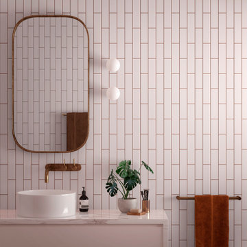
Turn your space into a blush-colored dreamscape with our Groove Pink Matte subway tiles! These pink tiles bring a cheery and exuberant feel to any space - be it your kitchen backsplash, vanity surround, accent wall, or niche tile. The beauty of their matte finish will add a contemporary twist to your design, breaking away from the classic subway tile look and granting your surfaces a modern sophistication.
Not limited to residential spaces, our pink matte subway tiles are equally at home in commercial applications. Whether it's a trendy café, a boutique hotel, or a chic salon, these rectangular tiles can infuse any environment with an undeniable charm. Additionally, their ceramic finish ensures their practicality, as it resists stains, making maintenance effortless! For those who adore the nostalgic allure of retro design, these pink tiles make the perfect decor choice, as they channel a delightful nod to the past while remaining utterly contemporary!
Will you opt for the timeless elegance of a horizontal layout or dare to make a bold statement with a captivating chevron arrangement? With these slim subway tiles, you have the power to create a stunning masterpiece that will leave a lasting impression on any surface! Picture a mesmerizing basketweave on your shower walls or a playfully dynamic combination of vertical and horizontal lines for a stunning living room wall. With our pink subway tiles, you can turn your walls and floors into a personalized artistic canvas!
Sponsored
Columbus, OH
Hope Restoration & General Contracting
Columbus Design-Build, Kitchen & Bath Remodeling, Historic Renovations
 Rockledge Design + Architecture
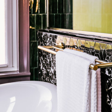
From the plum-brown limewashed walls to the curated mix of antique and contemporary elements, this en suite primary bath exudes quiet luxury. The inspiration for this space began with the early 20th century English washstand. The warm wood, Carrara marble top, and striking backsplash featuring original Racing Green pool glazed tiles set the tone for the rest of the room’s materials palette. To help transform the piece into a functioning modern day vanity, we added custom brass feet, new cabinet and drawer hardware, and an offset matte stone sink paired with a brushed brass single handle faucet.
We kept the space feeling relaxed and not too formal by incorporating fun, current silhouettes for the rest of our selections. A repeating pill-shaped motif shows up in the statement-making light fixtures, tub filler, hanging planters, and tub-side mirrored table. Similarly, reeded/fluted patterns can be found on the pocket door glass, bathroom accessories, artwork, and louvered linen closet door.
On the walls, natural limewash in the moody shade “Anise” from Bauwerk Color has been treated with a hand-burnished wax coating, making the textured surface safe for use in wet spaces. The suede-like finish adds rich character to the space, changing with the varying sunlight throughout the day. We’ve used a two-tone hexagon mosaic floor tile in both classic Carrara and dramatic Nero Marquina to help delineate the wet and dry halves of the bathroom. The soaking tub is placed on a 4” angled platform, breaking up the floor plan and making the space more dynamic.
Radiant heat floors, a hidden medicine cabinet, extra wide tiled shower niche, and new privacy glass windows are a few more features balancing form and function.
 TKS Design Group
Free ebook, Creating the Ideal Kitchen. DOWNLOAD NOW
The Klimala’s and their three kids are no strangers to moving, this being their fifth house in the same town over the 20-year period they have lived there. “It must be the 7-year itch, because every seven years, we seem to find ourselves antsy for a new project or a new environment. I think part of it is being a designer, I see my own taste evolve and I want my environment to reflect that. Having easy access to wonderful tradesmen and a knowledge of the process makes it that much easier”.
This time, Klimala’s fell in love with a somewhat unlikely candidate. The 1950’s ranch turned cape cod was a bit of a mutt, but it’s location 5 minutes from their design studio and backing up to the high school where their kids can roll out of bed and walk to school, coupled with the charm of its location on a private road and lush landscaping made it an appealing choice for them.
“The bones of the house were really charming. It was typical 1,500 square foot ranch that at some point someone added a second floor to. Its sloped roofline and dormered bedrooms gave it some charm.” With the help of architect Maureen McHugh, Klimala’s gutted and reworked the layout to make the house work for them. An open concept kitchen and dining room allows for more frequent casual family dinners and dinner parties that linger. A dingy 3-season room off the back of the original house was insulated, given a vaulted ceiling with skylights and now opens up to the kitchen. This room now houses an 8’ raw edge white oak dining table and functions as an informal dining room. “One of the challenges with these mid-century homes is the 8’ ceilings. I had to have at least one room that had a higher ceiling so that’s how we did it” states Klimala.
The kitchen features a 10’ island which houses a 5’0” Galley Sink. The Galley features two faucets, and double tiered rail system to which accessories such as cutting boards and stainless steel bowls can be added for ease of cooking. Across from the large sink is an induction cooktop. “My two teen daughters and I enjoy cooking, and the Galley and induction cooktop make it so easy.” A wall of tall cabinets features a full size refrigerator, freezer, double oven and built in coffeemaker. The area on the opposite end of the kitchen features a pantry with mirrored glass doors and a beverage center below.
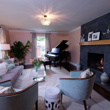
The rest of the first floor features an entry way, a living room with views to the front yard’s lush landscaping, a family room where the family hangs out to watch TV, a back entry from the garage with a laundry room and mudroom area, one of the home’s four bedrooms and a full bath. There is a double sided fireplace between the family room and living room. The home features pops of color from the living room’s peach grass cloth to purple painted wall in the family room. “I’m definitely a traditionalist at heart but because of the home’s Midcentury roots, I wanted to incorporate some of those elements into the furniture, lighting and accessories which also ended up being really fun. We are not formal people so I wanted a house that my kids would enjoy, have their friends over and feel comfortable.”
The second floor houses the master bedroom suite, two of the kids’ bedrooms and a back room nicknamed “the library” because it has turned into a quiet get away area where the girls can study or take a break from the rest of the family. The area was originally unfinished attic, and because the home was short on closet space, this Jack and Jill area off the girls’ bedrooms houses two large walk-in closets and a small sitting area with a makeup vanity. “The girls really wanted to keep the exposed brick of the fireplace that runs up the through the space, so that’s what we did, and I think they feel like they are in their own little loft space in the city when they are up there” says Klimala.
Designed by: Susan Klimala, CKD, CBD
Photography by: Carlos Vergara
For more information on kitchen and bath design ideas go to: www.kitchenstudio-ge.com
 Tile Doctor Ltd
Having an effective sealer in place is essential for ensuring the long term condition of tiled floors in fact a lack of sealer can make cleaning the tiles exceptionally difficult as the sealer prevents dirt becoming ingrained in the tile.
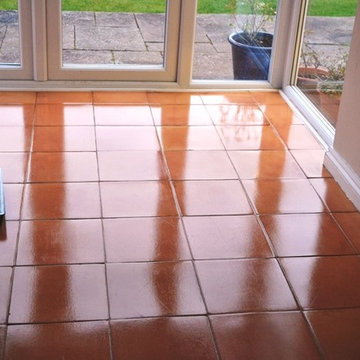
This property owner, living in the former spa town of Matlock in Derbyshire, was experiencing problems with their Terracotta tiled kitchen floor since they had applied some kind of wax to act as a sealer, and this had worn off within a few weeks. After this happened the tiles were not sealed again, making cleaning a big problem. Terracotta is a highly porous stone and thus easily soaks in spillages and stains, and allows dirt to become very easily trapped.
In this situation, the property owner resolved to contact me about some professional maintenance. I suggested that the tiles would need a deep clean followed by the application of a fresh, high quality sealer. The work was agreed on and I made my way down to the property the following week.
When I arrived at the property and saw the tiles first hand it became clear that a professional clean had been in need for a long time: greasy looking stains were particularly prevalent and covered large areas of the kitchen floor.
To remove I mixed a strong solution of Tile Doctor Pro Clean, which is a multi-purpose, high-alkaline cleaner, stripper and degreaser, and, working in small areas, applied it to the floor. Working in small sections was important because the stone is very porous and quickly soaked in any product laid down. I scrubbed the cleaner into the stone using a rotary machine fitted with a black scrubbing pad, with the dirt and stains coming away nicely. Pro Clean is highly versatile and can be used for similar cleaning purposes on most types of natural stone floor.
After cleaning each section, I quickly removed the excess dirty water and chemicals with my wet vax machine. Once the whole floor had been cleaned I rinsed it several times with fresh water just to make sure all cleaning chemicals were gone. I then left the floor to dry completely for 36 hours.
When I returned to the property, I conducted several damp tests to check for any areas of the floor that needed further drying. As is almost always the case, there were a few areas that remained slightly damp, and I set about speeding the drying process along using my heat gun. In fact, it actually took me more than three hours to get the floor completely dry, but this was worth the effort as even the slightest excess moisture can damage the performance of the sealer.
Once the floor was finally dried I began sealing the floor with one coat of Tile a Doctor Colour Grow sealer. Colour Grow is an impregnating sealer that penetrates deep into the pores of the stone, thus acting as a shield against ingrained dirt, and also raises the colour of the tiles to provide an aesthetically appealing appearance. sealer. After sealing with Colour Grow, I left the floor to dry for couple of hours and then applied six coats of Tile Doctor Seal & Go, which is a topical sealer that builds up durable protection on the surface of the tiles.
The combination of through cleaning and the application of not one, but two high quality sealers really did wonders for the appearance of these Terracotta tiles. Looking at the final results you wouldn’t have believed they had been without a proper clean and seal for so long! Needless to say the customer was exceptionally pleased and will surely be able to keep her floor looking great for a long time to come.
Tony Olmet
Derbyshire Tile Doctor
37