
Search results for "Master codes" in Home Design Ideas

 TKS Design Group
Download our free ebook, Creating the Ideal Kitchen. DOWNLOAD NOW
This charming little attic bath was an infrequently used guest bath located on the 3rd floor right above the master bath that we were also remodeling. The beautiful original leaded glass windows open to a view of the park and small lake across the street. A vintage claw foot tub sat directly below the window. This is where the charm ended though as everything was sorely in need of updating. From the pieced-together wall cladding to the exposed electrical wiring and old galvanized plumbing, it was in definite need of a gut job. Plus the hardwood flooring leaked into the bathroom below which was priority one to fix. Once we gutted the space, we got to rebuilding the room. We wanted to keep the cottage-y charm, so we started with simple white herringbone marble tile on the floor and clad all the walls with soft white shiplap paneling. A new clawfoot tub/shower under the original window was added. Next, to allow for a larger vanity with more storage, we moved the toilet over and eliminated a mish mash of storage pieces. We discovered that with separate hot/cold supplies that were the only thing available for a claw foot tub with a shower kit, building codes require a pressure balance valve to prevent scalding, so we had to install a remote valve. We learn something new on every job! There is a view to the park across the street through the home’s original custom shuttered windows. Can’t you just smell the fresh air? We found a vintage dresser and had it lacquered in high gloss black and converted it into a vanity. The clawfoot tub was also painted black. Brass lighting, plumbing and hardware details add warmth to the room, which feels right at home in the attic of this traditional home. We love how the combination of traditional and charming come together in this sweet attic guest bath. Truly a room with a view!
Designed by: Susan Klimala, CKD, CBD
Photography by: Michael Kaskel
For more information on kitchen and bath design ideas go to: www.kitchenstudio-ge.com

 CairnsCraft Design & Remodel
Great spacious bathroom with lot of amenities.
Photographer: Jon Upson
Large elegant master beige tile and porcelain tile drop-in bathtub photo in San Diego with an undermount sink, raised-panel cabinets, medium tone wood cabinets, granite countertops, beige walls and a two-piece toilet
Large elegant master beige tile and porcelain tile drop-in bathtub photo in San Diego with an undermount sink, raised-panel cabinets, medium tone wood cabinets, granite countertops, beige walls and a two-piece toilet

 LoneStar Design Build
Sonja Quintero
Drop-in bathtub - large transitional master beige tile and stone slab limestone floor drop-in bathtub idea in Dallas with an integrated sink, recessed-panel cabinets, white cabinets, marble countertops, a one-piece toilet and beige walls
Drop-in bathtub - large transitional master beige tile and stone slab limestone floor drop-in bathtub idea in Dallas with an integrated sink, recessed-panel cabinets, white cabinets, marble countertops, a one-piece toilet and beige walls
Find the right local pro for your project
 TKS Design Group
Download our free ebook, Creating the Ideal Kitchen. DOWNLOAD NOW
This homeowner’s daughter originally contacted us on behalf of her parents who were reluctant to begin the remodeling process in their home due to the inconvenience and dust. Once we met and they dipped their toes into the process, we were off to the races. The existing bathroom in this beautiful historical 1920’s home, had not been updated since the 70’/80’s as evidenced by the blue carpeting, mirrored walls and dropped ceilings. In addition, there was very little storage, and some health setbacks had made the bathroom difficult to maneuver with its tub shower.
Once we demoed, we discovered everything we expected to find in a home that had not been updated for many years. We got to work bringing all the electrical and plumbing up to code, and it was just as dusty and dirty as the homeowner’s anticipated! Once the space was demoed, we got to work building our new plan. We eliminated the existing tub and created a large walk-in curb-less shower.
An existing closet was eliminated and in its place, we planned a custom built in with spots for linens, jewelry and general storage. Because of the small space, we had to be very creative with the shower footprint, so we clipped one of the walls for more clearance behind the sink. The bathroom features a beautiful custom mosaic floor tile as well as tiled walls throughout the space. This required lots of coordination between the carpenter and tile setter to make sure that the framing and tile design were all properly aligned. We worked around an existing radiator and a unique original leaded window that was architecturally significant to the façade of the home. We had a lot of extra depth behind the original toilet location, so we built the wall out a bit, moved the toilet forward and then created some extra storage space behind the commode. We settled on mirrored mullioned doors to bounce lots of light around the smaller space.
We also went back and forth on deciding between a single and double vanity, and in the end decided the single vanity allowed for more counter space, more storage below and for the design to breath a bit in the smaller space. I’m so happy with this decision! To build on the luxurious feel of the space, we added a heated towel bar and heated flooring.
One of the concerns the homeowners had was having a comfortable floor to walk on. They realized that carpet was not a very practical solution but liked the comfort it had provided. Heated floors are the perfect solution. The room is decidedly traditional from its intricate mosaic marble floor to the calacutta marble clad walls. Elegant gold chandelier style fixtures, marble countertops and Morris & Co. beaded wallpaper provide an opulent feel to the space.
The gray monochromatic pallet keeps it feeling fresh and up-to-date. The beautiful leaded glass window is an important architectural feature at the front of the house. In the summertime, the homeowners love having the window open for fresh air and ventilation. We love it too!
The curb-less shower features a small fold down bench that can be used if needed and folded up when not. The shower also features a custom niche for storing shampoo and other hair products. The linear drain is built into the tilework and is barely visible. A frameless glass door that swings both in and out completes the luxurious feel.
Designed by: Susan Klimala, CKD, CBD
Photography by: Michael Kaskel
For more information on kitchen and bath design ideas go to: www.kitchenstudio-ge.com

 The Galante Architecture Studio, Inc.
Originally built in 1972, these eight interlocked residential units and the accompanying House Master’s Residence won an AIA award for their unique spatial complexity, balancing standard units of construction with volumetric interplay, all while bringing natural light into living spaces. However, nearly 40 years later
These 1970’s era, interlocked faculty housing units won an AIA award when first completed. They were unique in spatial complexity, By early 2,000’s they were showing signs of age, and had become outdated on many levels. Working with project management for the Faculty of Arts & Sciences, we prepared one prototype design to bring the buildings into the 21st century. New insulated skylights, standing seam metal siding, cedar decks and trellises, exchanging black roofs for well insulated white roofs, were all part of a larger planning program to renovate all nine units. The prototype was implemented in 2012, to great approval and result. In 2013 a few more units were done. In 2014 the “House Masters” unit was done, with the remaining four units planned for future budgets.
Sustainable features include re-use of most materials on site, (former siding was able to become sheathing below metal panels), implementing the Stretch Energy Code for insulation, and putting new white roof membranes in place. Using FSC certified wood for decks and trellises, and using Rheinzink siding, a “200 year material” according to the manufacturer.
After nearly 40 years, Ronald Gourley’s AIA award winning Faculty Housing (1972) was beginning to show its age – plywood siding was delaminating, wooden decks splintering, and custom windows failing. Therefore, the opportunity to reinvent a piece of Mid-Century Modernism presented itself when two of the building’s eight alternating rooftop designs were to be rebuilt as prototypes for the remainder of the structure.
The strength of the original design was its rectilinear and symmetrical arrangement of internal and external spaces, but the difference between the two had become blurred over the decades. New zinc siding, mahogany decking, and stainless steel railings accentuate the defining elements and more clearly articulate the living spaces, breathing new life into the building and reinvigorating the surrounding campus.
Furthermore, the renovation also provided a chance to bring the structure up to modern energy standards and help meet Harvard’s lofty environmental goals. Insulation within the ceilings was more than tripled, white TPO roofing reduces the heat island effect, construction waste was minimized by recasting the siding as sheathing, and materials were selected not only for aesthetics, but for their longevity and ability to be recycled as well.
Harvard’s energy standards brought an uncharacteristic level of environmental care to this building. Roof structures are triple insulated, allowing separating interior from exterior in the most thermally efficient manner. North facing triple insulated skylights and white TPO roofing reduces the heat gain, but allows natural light to pour in. Materials were selected not only for aesthetics, but for their longevity. Zinc, for example, is made of 100% recycled material, and has duration of 200 years. Uncharacteristic levels of environmental care were common on this project.
 The Galante Architecture Studio, Inc.
Originally built in 1972, these eight interlocked residential units and the accompanying House Master’s Residence won an AIA award for their unique spatial complexity, balancing standard units of construction with volumetric interplay, all while bringing natural light into living spaces. However, nearly 40 years later
These 1970’s era, interlocked faculty housing units won an AIA award when first completed. They were unique in spatial complexity, By early 2,000’s they were showing signs of age, and had become outdated on many levels. Working with project management for the Faculty of Arts & Sciences, we prepared one prototype design to bring the buildings into the 21st century. New insulated skylights, standing seam metal siding, cedar decks and trellises, exchanging black roofs for well insulated white roofs, were all part of a larger planning program to renovate all nine units. The prototype was implemented in 2012, to great approval and result. In 2013 a few more units were done. In 2014 the “House Masters” unit was done, with the remaining four units planned for future budgets.
Sustainable features include re-use of most materials on site, (former siding was able to become sheathing below metal panels), implementing the Stretch Energy Code for insulation, and putting new white roof membranes in place. Using FSC certified wood for decks and trellises, and using Rheinzink siding, a “200 year material” according to the manufacturer.
After nearly 40 years, Ronald Gourley’s AIA award winning Faculty Housing (1972) was beginning to show its age – plywood siding was delaminating, wooden decks splintering, and custom windows failing. Therefore, the opportunity to reinvent a piece of Mid-Century Modernism presented itself when two of the building’s eight alternating rooftop designs were to be rebuilt as prototypes for the remainder of the structure.
The strength of the original design was its rectilinear and symmetrical arrangement of internal and external spaces, but the difference between the two had become blurred over the decades. New zinc siding, mahogany decking, and stainless steel railings accentuate the defining elements and more clearly articulate the living spaces, breathing new life into the building and reinvigorating the surrounding campus.
Furthermore, the renovation also provided a chance to bring the structure up to modern energy standards and help meet Harvard’s lofty environmental goals. Insulation within the ceilings was more than tripled, white TPO roofing reduces the heat island effect, construction waste was minimized by recasting the siding as sheathing, and materials were selected not only for aesthetics, but for their longevity and ability to be recycled as well.
Harvard’s energy standards brought an uncharacteristic level of environmental care to this building. Roof structures are triple insulated, allowing separating interior from exterior in the most thermally efficient manner. North facing triple insulated skylights and white TPO roofing reduces the heat gain, but allows natural light to pour in. Materials were selected not only for aesthetics, but for their longevity. Zinc, for example, is made of 100% recycled material, and has duration of 200 years. Uncharacteristic levels of environmental care were common on this project.
 The Galante Architecture Studio, Inc.
Originally built in 1972, these eight interlocked residential units and the accompanying House Master’s Residence won an AIA award for their unique spatial complexity, balancing standard units of construction with volumetric interplay, all while bringing natural light into living spaces. However, nearly 40 years later
These 1970’s era, interlocked faculty housing units won an AIA award when first completed. They were unique in spatial complexity, By early 2,000’s they were showing signs of age, and had become outdated on many levels. Working with project management for the Faculty of Arts & Sciences, we prepared one prototype design to bring the buildings into the 21st century. New insulated skylights, standing seam metal siding, cedar decks and trellises, exchanging black roofs for well insulated white roofs, were all part of a larger planning program to renovate all nine units. The prototype was implemented in 2012, to great approval and result. In 2013 a few more units were done. In 2014 the “House Masters” unit was done, with the remaining four units planned for future budgets.
Sustainable features include re-use of most materials on site, (former siding was able to become sheathing below metal panels), implementing the Stretch Energy Code for insulation, and putting new white roof membranes in place. Using FSC certified wood for decks and trellises, and using Rheinzink siding, a “200 year material” according to the manufacturer.
After nearly 40 years, Ronald Gourley’s AIA award winning Faculty Housing (1972) was beginning to show its age – plywood siding was delaminating, wooden decks splintering, and custom windows failing. Therefore, the opportunity to reinvent a piece of Mid-Century Modernism presented itself when two of the building’s eight alternating rooftop designs were to be rebuilt as prototypes for the remainder of the structure.
The strength of the original design was its rectilinear and symmetrical arrangement of internal and external spaces, but the difference between the two had become blurred over the decades. New zinc siding, mahogany decking, and stainless steel railings accentuate the defining elements and more clearly articulate the living spaces, breathing new life into the building and reinvigorating the surrounding campus.
Furthermore, the renovation also provided a chance to bring the structure up to modern energy standards and help meet Harvard’s lofty environmental goals. Insulation within the ceilings was more than tripled, white TPO roofing reduces the heat island effect, construction waste was minimized by recasting the siding as sheathing, and materials were selected not only for aesthetics, but for their longevity and ability to be recycled as well.
Harvard’s energy standards brought an uncharacteristic level of environmental care to this building. Roof structures are triple insulated, allowing separating interior from exterior in the most thermally efficient manner. North facing triple insulated skylights and white TPO roofing reduces the heat gain, but allows natural light to pour in. Materials were selected not only for aesthetics, but for their longevity. Zinc, for example, is made of 100% recycled material, and has duration of 200 years. Uncharacteristic levels of environmental care were common on this project.

 The Galante Architecture Studio, Inc.
Originally built in 1972, these eight interlocked residential units and the accompanying House Master’s Residence won an AIA award for their unique spatial complexity, balancing standard units of construction with volumetric interplay, all while bringing natural light into living spaces. However, nearly 40 years later
These 1970’s era, interlocked faculty housing units won an AIA award when first completed. They were unique in spatial complexity, By early 2,000’s they were showing signs of age, and had become outdated on many levels. Working with project management for the Faculty of Arts & Sciences, we prepared one prototype design to bring the buildings into the 21st century. New insulated skylights, standing seam metal siding, cedar decks and trellises, exchanging black roofs for well insulated white roofs, were all part of a larger planning program to renovate all nine units. The prototype was implemented in 2012, to great approval and result. In 2013 a few more units were done. In 2014 the “House Masters” unit was done, with the remaining four units planned for future budgets.
Sustainable features include re-use of most materials on site, (former siding was able to become sheathing below metal panels), implementing the Stretch Energy Code for insulation, and putting new white roof membranes in place. Using FSC certified wood for decks and trellises, and using Rheinzink siding, a “200 year material” according to the manufacturer.
After nearly 40 years, Ronald Gourley’s AIA award winning Faculty Housing (1972) was beginning to show its age – plywood siding was delaminating, wooden decks splintering, and custom windows failing. Therefore, the opportunity to reinvent a piece of Mid-Century Modernism presented itself when two of the building’s eight alternating rooftop designs were to be rebuilt as prototypes for the remainder of the structure.
The strength of the original design was its rectilinear and symmetrical arrangement of internal and external spaces, but the difference between the two had become blurred over the decades. New zinc siding, mahogany decking, and stainless steel railings accentuate the defining elements and more clearly articulate the living spaces, breathing new life into the building and reinvigorating the surrounding campus.
Furthermore, the renovation also provided a chance to bring the structure up to modern energy standards and help meet Harvard’s lofty environmental goals. Insulation within the ceilings was more than tripled, white TPO roofing reduces the heat island effect, construction waste was minimized by recasting the siding as sheathing, and materials were selected not only for aesthetics, but for their longevity and ability to be recycled as well.
Harvard’s energy standards brought an uncharacteristic level of environmental care to this building. Roof structures are triple insulated, allowing separating interior from exterior in the most thermally efficient manner. North facing triple insulated skylights and white TPO roofing reduces the heat gain, but allows natural light to pour in. Materials were selected not only for aesthetics, but for their longevity. Zinc, for example, is made of 100% recycled material, and has duration of 200 years. Uncharacteristic levels of environmental care were common on this project.

 Vintage Cellars & Saunas
This gorgeous custom wine cellar acts as a dramatic entrypiece as you walk into this beautiful home in San Juan Capistrano, Orange County, California. San Juan Capistrano is a lovely community located slightly inland, tucked within Orange County near cities like Newport Beach, Lake Forest, Huntington Beach, Costa Mesa, Dana Point, Laguna Niguel, Laguna Hills, and Irvine.
This fantastically designed wine cellar, courtesy of the master wine cellar builders at Vintage Cellars, is a unique representation of fun and bespoke features that can be incorporated into a traditional redwood, yet modern and bright wine cellar like this. The wine room draws you in from across the house, with its warm redwood tones and interesting wrought iron and glass door. Wine Cellar doors are often overlooked, but proper knowledge of door materials, glass specifications, threshold placement and hanging procedures are key to creating that perfect airtight room. Additionally, based on the location of your room within your home, the amount of glass in your wine cellar, and your location in the world, levels of cooling capacity need to be seriously considered.
Glass is a naturally poor insulator. Because there has been a very heavy push for "wine cellar art," "wine cellars as art," and wine cellars as a main design component within high end homes, glass wine cellars are often incorporated in high trafficked areas or spaces where each homeowner can show off their prized wines to friends in an almost showcase like display.
When you first enter this large custom wine cellar in Orange County, Southern California, standing out first immediately on your left is a unique work station with a scanner, label-maker, and table top - perfect for inventorying the 3,500 bottles that this rustic wine cellar holds. The e-Sommelier system integrated allows this homeowner to catalog each and every wine within his collection, first letting the program know he owns it, how many bottles, which vintages, and with the click of a button - custom wine labels each with a bar code. Accompanied with the bar code scanner, the e-sommelier system has become a great companion for wine cellars and wine collectors alike, allowing a somewhat seamless and straightforward process in inventorying wines.
Directly past the wine inventory station is a vertical row of large format bottle coved trays, displaying some of the owner's favorite wines in the most coveted vintages.
This large walk in custom wine cellar in all heart redwood wine racking fills most of its capacity utilizing double deep, individual bottle storage. At waist height spanning the entire circumference of the wine room is a high reveal display row, highlighted with LED lighting and more single deep storage behind.
The back wall, in addition to the high reveal display row and double deep individual bottle storage, incorporates a rectangular wine work center with glass rack above - perfect for decanting, storing uniquely shaped bottles, and opening your favorite bottles with friends. Directly below this countertop are two drawers. A unique feature throughout this wooden traditional large walk in wine cellar in San Juan Capistrano, Orange County, California is the incorporation of wine barrel into the room's corner walls, work stations, countertops, and center custom table.
This custom wine cellar near Newport Beach, Dana Point, Laguna Beach, Laguna Hills, Coto De Caza, Laguna Niguel, Huntington Beach, and other gorgeous beach communities in Orange County, also incorporates wine case storage throughout the bottom, and a small area above the wine inventory system for split bottles.
Vintage Cellars, as well as the homeowner, are very happy with the way this beautiful project turned out, and we would love the opportunity to help you with you wine cellar projects!
Please contact us today to speak with one of our wine cellar specialists and begin building your wine cellar dreams today!
 The Galante Architecture Studio, Inc.
Originally built in 1972, these eight interlocked residential units and the accompanying House Master’s Residence won an AIA award for their unique spatial complexity, balancing standard units of construction with volumetric interplay, all while bringing natural light into living spaces. However, nearly 40 years later
These 1970’s era, interlocked faculty housing units won an AIA award when first completed. They were unique in spatial complexity, By early 2,000’s they were showing signs of age, and had become outdated on many levels. Working with project management for the Faculty of Arts & Sciences, we prepared one prototype design to bring the buildings into the 21st century. New insulated skylights, standing seam metal siding, cedar decks and trellises, exchanging black roofs for well insulated white roofs, were all part of a larger planning program to renovate all nine units. The prototype was implemented in 2012, to great approval and result. In 2013 a few more units were done. In 2014 the “House Masters” unit was done, with the remaining four units planned for future budgets.
Sustainable features include re-use of most materials on site, (former siding was able to become sheathing below metal panels), implementing the Stretch Energy Code for insulation, and putting new white roof membranes in place. Using FSC certified wood for decks and trellises, and using Rheinzink siding, a “200 year material” according to the manufacturer.
After nearly 40 years, Ronald Gourley’s AIA award winning Faculty Housing (1972) was beginning to show its age – plywood siding was delaminating, wooden decks splintering, and custom windows failing. Therefore, the opportunity to reinvent a piece of Mid-Century Modernism presented itself when two of the building’s eight alternating rooftop designs were to be rebuilt as prototypes for the remainder of the structure.
The strength of the original design was its rectilinear and symmetrical arrangement of internal and external spaces, but the difference between the two had become blurred over the decades. New zinc siding, mahogany decking, and stainless steel railings accentuate the defining elements and more clearly articulate the living spaces, breathing new life into the building and reinvigorating the surrounding campus.
Furthermore, the renovation also provided a chance to bring the structure up to modern energy standards and help meet Harvard’s lofty environmental goals. Insulation within the ceilings was more than tripled, white TPO roofing reduces the heat island effect, construction waste was minimized by recasting the siding as sheathing, and materials were selected not only for aesthetics, but for their longevity and ability to be recycled as well.
Harvard’s energy standards brought an uncharacteristic level of environmental care to this building. Roof structures are triple insulated, allowing separating interior from exterior in the most thermally efficient manner. North facing triple insulated skylights and white TPO roofing reduces the heat gain, but allows natural light to pour in. Materials were selected not only for aesthetics, but for their longevity. Zinc, for example, is made of 100% recycled material, and has duration of 200 years. Uncharacteristic levels of environmental care were common on this project.
 The Galante Architecture Studio, Inc.
Originally built in 1972, these eight interlocked residential units and the accompanying House Master’s Residence won an AIA award for their unique spatial complexity, balancing standard units of construction with volumetric interplay, all while bringing natural light into living spaces. However, nearly 40 years later
These 1970’s era, interlocked faculty housing units won an AIA award when first completed. They were unique in spatial complexity, By early 2,000’s they were showing signs of age, and had become outdated on many levels. Working with project management for the Faculty of Arts & Sciences, we prepared one prototype design to bring the buildings into the 21st century. New insulated skylights, standing seam metal siding, cedar decks and trellises, exchanging black roofs for well insulated white roofs, were all part of a larger planning program to renovate all nine units. The prototype was implemented in 2012, to great approval and result. In 2013 a few more units were done. In 2014 the “House Masters” unit was done, with the remaining four units planned for future budgets.
Sustainable features include re-use of most materials on site, (former siding was able to become sheathing below metal panels), implementing the Stretch Energy Code for insulation, and putting new white roof membranes in place. Using FSC certified wood for decks and trellises, and using Rheinzink siding, a “200 year material” according to the manufacturer.
After nearly 40 years, Ronald Gourley’s AIA award winning Faculty Housing (1972) was beginning to show its age – plywood siding was delaminating, wooden decks splintering, and custom windows failing. Therefore, the opportunity to reinvent a piece of Mid-Century Modernism presented itself when two of the building’s eight alternating rooftop designs were to be rebuilt as prototypes for the remainder of the structure.
The strength of the original design was its rectilinear and symmetrical arrangement of internal and external spaces, but the difference between the two had become blurred over the decades. New zinc siding, mahogany decking, and stainless steel railings accentuate the defining elements and more clearly articulate the living spaces, breathing new life into the building and reinvigorating the surrounding campus.
Furthermore, the renovation also provided a chance to bring the structure up to modern energy standards and help meet Harvard’s lofty environmental goals. Insulation within the ceilings was more than tripled, white TPO roofing reduces the heat island effect, construction waste was minimized by recasting the siding as sheathing, and materials were selected not only for aesthetics, but for their longevity and ability to be recycled as well.
Harvard’s energy standards brought an uncharacteristic level of environmental care to this building. Roof structures are triple insulated, allowing separating interior from exterior in the most thermally efficient manner. North facing triple insulated skylights and white TPO roofing reduces the heat gain, but allows natural light to pour in. Materials were selected not only for aesthetics, but for their longevity. Zinc, for example, is made of 100% recycled material, and has duration of 200 years. Uncharacteristic levels of environmental care were common on this project.

 MIG Furniture Design, Inc.
SPECIAL ORDER. Usually leaves our warehouse within 3-6 weeks.
Free shipping and assembly within New York City. Enter Coupon code 'NYC' on checkout.
Made in Canada by Huppe.
Modern Bedroom Dusk by Huppe. The Dusk modern bedroom suite is manufactured of solid black walnut as well as walnut veneer, known for its magnificent structure. The bed features a simple base with an attractive headboard pattern. Optionally, the set also offers a dresser, chest and nightstands to give the bed a comfortable storage system. The drawers close softly and quietly thanks to hidden self-clothing slow motion slides. The backs of the headboard and night stands are completely finished, allowing for furniture placement in the center of a room. The platform bed only requires a mattress that sits on a European-style wooden frame and metal slats.
Available in a variety of 6 up walnut finishes according to our color samples. Presented in Natural Walnut# 204 finish.
Starting price is for the Queen size bed with non-upholstered headboard.
Contact our office to get Silk Bed for even better price! Limited Time Offer!
P: 718-676-1977 (MIG Furniture, Brooklyn NY)
Dimensions:
Queen Size Bed: W66.2" x D86.5" x H347".
King Size Bed: W83.7" x D86.5" x H34".
Night Stand: W24" x D19" x H18".
6 Drawer Dresser (A-version): W63" x D19" x H31".
6 Drawer Dresser (B-version): W72" x D19" x H31".
Guest Chest: W46" x D20.7" x H46".
Lingerie Chest: W24" x D19" x H56".
Horizontal Mirror: W48" x D1.5" x H23".
Floor Mirror: W25" x D1.5" x H77".
 Vintage Cellars & Saunas
This gorgeous custom wine cellar acts as a dramatic entrypiece as you walk into this beautiful home in San Juan Capistrano, Orange County, California. San Juan Capistrano is a lovely community located slightly inland, tucked within Orange County near cities like Newport Beach, Lake Forest, Huntington Beach, Costa Mesa, Dana Point, Laguna Niguel, Laguna Hills, and Irvine.
This fantastically designed wine cellar, courtesy of the master wine cellar builders at Vintage Cellars, is a unique representation of fun and bespoke features that can be incorporated into a traditional redwood, yet modern and bright wine cellar like this. The wine room draws you in from across the house, with its warm redwood tones and interesting wrought iron and glass door. Wine Cellar doors are often overlooked, but proper knowledge of door materials, glass specifications, threshold placement and hanging procedures are key to creating that perfect airtight room. Additionally, based on the location of your room within your home, the amount of glass in your wine cellar, and your location in the world, levels of cooling capacity need to be seriously considered.
Glass is a naturally poor insulator. Because there has been a very heavy push for "wine cellar art," "wine cellars as art," and wine cellars as a main design component within high end homes, glass wine cellars are often incorporated in high trafficked areas or spaces where each homeowner can show off their prized wines to friends in an almost showcase like display.
When you first enter this large custom wine cellar in Orange County, Southern California, standing out first immediately on your left is a unique work station with a scanner, label-maker, and table top - perfect for inventorying the 3,500 bottles that this rustic wine cellar holds. The e-Sommelier system integrated allows this homeowner to catalog each and every wine within his collection, first letting the program know he owns it, how many bottles, which vintages, and with the click of a button - custom wine labels each with a bar code. Accompanied with the bar code scanner, the e-sommelier system has become a great companion for wine cellars and wine collectors alike, allowing a somewhat seamless and straightforward process in inventorying wines.
Directly past the wine inventory station is a vertical row of large format bottle coved trays, displaying some of the owner's favorite wines in the most coveted vintages.
This large walk in custom wine cellar in all heart redwood wine racking fills most of its capacity utilizing double deep, individual bottle storage. At waist height spanning the entire circumference of the wine room is a high reveal display row, highlighted with LED lighting and more single deep storage behind.
The back wall, in addition to the high reveal display row and double deep individual bottle storage, incorporates a rectangular wine work center with glass rack above - perfect for decanting, storing uniquely shaped bottles, and opening your favorite bottles with friends. Directly below this countertop are two drawers. A unique feature throughout this wooden traditional large walk in wine cellar in San Juan Capistrano, Orange County, California is the incorporation of wine barrel into the room's corner walls, work stations, countertops, and center custom table.
This custom wine cellar near Newport Beach, Dana Point, Laguna Beach, Laguna Hills, Coto De Caza, Laguna Niguel, Huntington Beach, and other gorgeous beach communities in Orange County, also incorporates wine case storage throughout the bottom, and a small area above the wine inventory system for split bottles.
Vintage Cellars, as well as the homeowner, are very happy with the way this beautiful project turned out, and we would love the opportunity to help you with you wine cellar projects!
Please contact us today to speak with one of our wine cellar specialists and begin building your wine cellar dreams today!
Sponsored
Sunbury, OH

J.Holderby - Renovations
Franklin County's Leading General Contractors - 2X Best of Houzz!
 TKS Design Group
Download our free ebook, Creating the Ideal Kitchen. DOWNLOAD NOW
This homeowner’s daughter originally contacted us on behalf of her parents who were reluctant to begin the remodeling process in their home due to the inconvenience and dust. Once we met and they dipped their toes into the process, we were off to the races. The existing bathroom in this beautiful historical 1920’s home, had not been updated since the 70’/80’s as evidenced by the blue carpeting, mirrored walls and dropped ceilings. In addition, there was very little storage, and some health setbacks had made the bathroom difficult to maneuver with its tub shower.
Once we demoed, we discovered everything we expected to find in a home that had not been updated for many years. We got to work bringing all the electrical and plumbing up to code, and it was just as dusty and dirty as the homeowner’s anticipated! Once the space was demoed, we got to work building our new plan. We eliminated the existing tub and created a large walk-in curb-less shower.
An existing closet was eliminated and in its place, we planned a custom built in with spots for linens, jewelry and general storage. Because of the small space, we had to be very creative with the shower footprint, so we clipped one of the walls for more clearance behind the sink. The bathroom features a beautiful custom mosaic floor tile as well as tiled walls throughout the space. This required lots of coordination between the carpenter and tile setter to make sure that the framing and tile design were all properly aligned. We worked around an existing radiator and a unique original leaded window that was architecturally significant to the façade of the home. We had a lot of extra depth behind the original toilet location, so we built the wall out a bit, moved the toilet forward and then created some extra storage space behind the commode. We settled on mirrored mullioned doors to bounce lots of light around the smaller space.
We also went back and forth on deciding between a single and double vanity, and in the end decided the single vanity allowed for more counter space, more storage below and for the design to breath a bit in the smaller space. I’m so happy with this decision! To build on the luxurious feel of the space, we added a heated towel bar and heated flooring.
One of the concerns the homeowners had was having a comfortable floor to walk on. They realized that carpet was not a very practical solution but liked the comfort it had provided. Heated floors are the perfect solution. The room is decidedly traditional from its intricate mosaic marble floor to the calacutta marble clad walls. Elegant gold chandelier style fixtures, marble countertops and Morris & Co. beaded wallpaper provide an opulent feel to the space.
The gray monochromatic pallet keeps it feeling fresh and up-to-date. The beautiful leaded glass window is an important architectural feature at the front of the house. In the summertime, the homeowners love having the window open for fresh air and ventilation. We love it too!
The curb-less shower features a small fold down bench that can be used if needed and folded up when not. The shower also features a custom niche for storing shampoo and other hair products. The linear drain is built into the tilework and is barely visible. A frameless glass door that swings both in and out completes the luxurious feel.
Designed by: Susan Klimala, CKD, CBD
Photography by: Michael Kaskel
For more information on kitchen and bath design ideas go to: www.kitchenstudio-ge.com
 User
Photographs may show modified designs. All images are copyrighted.
Plan 124-464
3085 sq ft
6 beds
4.5 baths
103' wide
50' deep
View more home designs like this
Floor Plans
Main Floor Plan
Reverse
Upper Floor Plan
Reverse
Plan Description
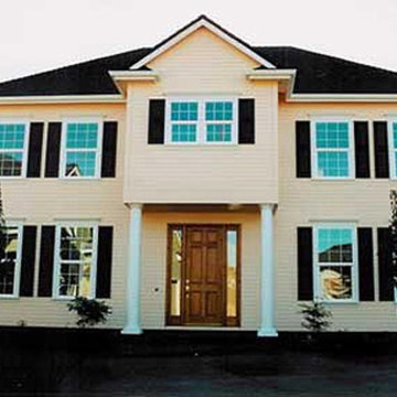
This colonial home plan blends love of tradition with a contemporary
floor plan. Family living areas are open to kitchen and span most of the
richly windowed rear. Luxury master suite amenities include spa tub,
oversized shower, and walk-in closet.
Specifications
Kitchen Features
Kitchen Island
Peninsula Eating Bar
Nook Breakfast Area Dining
Walk In Pantry Cabinet Pantry
Garage
Front Entry Garage
Outdoor Spaces
Grill Deck Sundeck
Covered Front Porch
Area
Total Sq Ft
3085 sq ft
Garage Sq Ft
824 sq ft
Main Floor Sq Ft
1882 sq ft
Upper Floor Sq Ft
1203 sq ft
Bonus Sq Ft
651 sq ft
Ceiling
Main Ceiling Ft
9'
Code
Irc 2006
Dimension
Height
32'
Width
103'
Depth
50'
Bedroom Features
Split Bedrooms
Upstairs Bedrooms Bath
Walk In Closet
Main Floor Master Bed Bath
Additional Rooms
Family Room Keeping Room
Den Office Study Computer
Great Room Living Room
Main Floor Laundry
Bonus Play Flex Room
Media Room
Entryway
Mud Room
Friend S Entry
Basic Features
Potential Bedrooms
0
Bedrooms
6
Stories
2
Garage Stalls
2
Baths
4.5
Roof
Primary Pitch
10:12
Roof Load
25
Roof Framing
Truss
Exterior Wall Framing
Exterior Wall Finish
Siding
Framing
2"x6"
Structural
Structural 2nd Floor Framing
Foundation Drawing
Structural 1st Floor Framing
Structural Roof Framing
Pricing
Plan Set
Price
5 Copy Set
$975.00
8 Copy Set
$1125.00
PDF Set
$1500.00
Reproducible Set
$1500.00
CAD Set
$2250.00
Single Set
$800.00
Foundation
Price
Crawlspace
+$0.00
Additional Construction Sets
$65.00/each
Right-Reading Reverse
$300.00
The Single Set and PDF Study Set are typically stamped "Not for Construction" and are to be used for studying / obtaining bids only. We do offer a 90% credit when you upgrade from a Single Set to a 5-Copy set (or greater).
Additional copies can be ordered
 Robert M. Cain, Architect
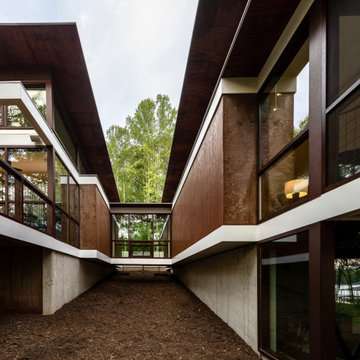
Holly Hill, a retirement home, whose owner's hobbies are gardening and restoration of classic cars, is nestled into the site contours to maximize views of the lake and minimize impact on the site.
Holly Hill is comprised of three wings joined by bridges: A wing facing a master garden to the east, another wing with workshop and a central activity, living, dining wing. Similar to a radiator the design increases the amount of exterior wall maximizing opportunities for natural ventilation during temperate months.
Other passive solar design features will include extensive eaves, sheltering porches and high-albedo roofs, as strategies for considerably reducing solar heat gain.
Daylighting with clerestories and solar tubes reduce daytime lighting requirements. Ground source geothermal heat pumps and superior to code insulation ensure minimal space conditioning costs. Corten steel siding and concrete foundation walls satisfy client requirements for low maintenance and durability. All light fixtures are LEDs.
Open and screened porches are strategically located to allow pleasant outdoor use at any time of day, particular season or, if necessary, insect challenge. Dramatic cantilevers allow the porches to project into the site’s beautiful mixed hardwood tree canopy without damaging root systems.
Guest arrive by vehicle with glimpses of the house and grounds through penetrations in the concrete wall enclosing the garden. One parked they are led through a garden composed of pavers, a fountain, benches, sculpture and plants. Views of the lake can be seen through and below the bridges.
Primary client goals were a sustainable low-maintenance house, primarily single floor living, orientation to views, natural light to interiors, maximization of individual privacy, creation of a formal outdoor space for gardening, incorporation of a full workshop for cars, generous indoor and outdoor social space for guests and parties.

 ESI Builders & Remodelers
3,800sf, 4 bdrm, 3.5 bath with oversized 4 car garage and over 270sf Loggia; climate controlled wine room and bar, Tech Room, landscaping and pool. Solar, high efficiency HVAC and insulation was used which resulted in huge rebates from utility companies, enhancing the ROI. The challenge with this property was the downslope lot, sewer system was lower than main line at the street thus requiring a special pump system. Retaining walls to create a flat usable back yard.
ESI Builders is a subsidiary of EnergyWise Solutions, Inc. and was formed by Allan, Bob and Dave to fulfill an important need for quality home builders and remodeling services in the Sacramento region. With a strong and growing referral base, we decided to provide a convenient one-stop option for our clients and focus on combining our key services: quality custom homes and remodels, turnkey client partnering and communication, and energy efficient and environmentally sustainable measures in all we do. Through energy efficient appliances and fixtures, solar power, high efficiency heating and cooling systems, enhanced insulation and sealing, and other construction elements – we go beyond simple code compliance and give you immediate savings and greater sustainability for your new or remodeled home.
All of the design work and construction tasks for our clients are done by or supervised by our highly trained, professional staff. This not only saves you money, it provides a peace of mind that all of the details are taken care of and the job is being done right – to Perfection. Our service does not stop after we clean up and drive off. We continue to provide support for any warranty issues that arise and give you administrative support as needed in order to assure you obtain any energy-related tax incentives or rebates. This ‘One call does it all’ philosophy assures that your experience in remodeling or upgrading your home is an enjoyable one.
ESI Builders was formed by professionals with varying backgrounds and a common interest to provide you, our clients, with options to live more comfortably, save money, and enjoy quality homes for many years to come. As our company continues to grow and evolve, the expertise has been quickly growing to include several job foreman, tradesmen, and support staff. In response to our growth, we will continue to hire well-qualified staff and we will remain committed to maintaining a level of quality, attention to detail, and pursuit of perfection.


 Michael Nash Design, Build & Homes
Built in the early 1950s, this small urban townhouse is located in North Old Town Alexandria in an area currently undergoing major redevelopment. The neighborhood is popular with, and affordable for, young people and families, and very convenient to Washington, DC.
In its heyday, the townhouse touted a stately brick exterior, plaster walls, tongue and groove wood flooring and beautiful wooden staircase. Sixty years later, however, the homeowners were faced with crumbling masonry, sagging floors, a double layer of wallpaper over the plaster walls, a crumbling staircase, a dysfunctional kitchen and small, dark second floor rooms. Additionally, the basement had a low ceiling, moldy and cinder block walls, no plumbing and a large boiler taking up most of the space.
The homeowners’ goal was to restore the exterior’s historic look while creating an interior up-to-date for the 21st Century. To turn their vision into reality, they turned to Michael Nash Design, Build & Homes.
Design Solutions
To maintain the townhome’s historic exterior, the Michael Nash team carefully removed, salvaged, restored and reused existing brick masonry. Matching fascia boards and windows were combined with existing windows to complete the exterior renovation.
All interior walls were gutted and reframed. New electrical work, new insulation and new drywall were installed. Much of the home’s original trim was salvaged and reused, as was a piece of art glass, all to keep a bit of the past in the renovation.
The sagging subfloors were fixed, new hard wood floors were installed and a new staircase and railing were designed in a style similar to the original.
The solid wall between the kitchen and the dining room was removed, plumbing was relocated for a new sink location and the kitchen got expanded with an island into the dining room. Closet and plumbing stacks were relocated to allow a new space for fridge. Stainless steel appliances, granite countertops and custom cabinetry highlight the new modern kitchen.
The plan called for redesigning the three bedrooms on the second floor to allow a larger bathroom, walk-in closet and wider hallways. In addition to new roofing, a large skylight was installed to allow natural light into the bathroom and the upper hallway.
The basement was totally revamped. New plumbing was put in place for a full bathroom, laundry room and a den. New e-grass window was installed in the basement to bring this basement up to current building codes.
This homeowners love the neighborhood and now their home gives them the opportunity to stay in the same location.
 Michael Nash Design, Build & Homes
Built in the early 1950s, this small urban townhouse is located in North Old Town Alexandria in an area currently undergoing major redevelopment. The neighborhood is popular with, and affordable for, young people and families, and very convenient to Washington, DC.
In its heyday, the townhouse touted a stately brick exterior, plaster walls, tongue and groove wood flooring and beautiful wooden staircase. Sixty years later, however, the homeowners were faced with crumbling masonry, sagging floors, a double layer of wallpaper over the plaster walls, a crumbling staircase, a dysfunctional kitchen and small, dark second floor rooms. Additionally, the basement had a low ceiling, moldy and cinder block walls, no plumbing and a large boiler taking up most of the space.
The homeowners’ goal was to restore the exterior’s historic look while creating an interior up-to-date for the 21st Century. To turn their vision into reality, they turned to Michael Nash Design, Build & Homes.
Design Solutions
To maintain the townhome’s historic exterior, the Michael Nash team carefully removed, salvaged, restored and reused existing brick masonry. Matching fascia boards and windows were combined with existing windows to complete the exterior renovation.
All interior walls were gutted and reframed. New electrical work, new insulation and new drywall were installed. Much of the home’s original trim was salvaged and reused, as was a piece of art glass, all to keep a bit of the past in the renovation.
The sagging subfloors were fixed, new hard wood floors were installed and a new staircase and railing were designed in a style similar to the original.
The solid wall between the kitchen and the dining room was removed, plumbing was relocated for a new sink location and the kitchen got expanded with an island into the dining room. Closet and plumbing stacks were relocated to allow a new space for fridge. Stainless steel appliances, granite countertops and custom cabinetry highlight the new modern kitchen.
The plan called for redesigning the three bedrooms on the second floor to allow a larger bathroom, walk-in closet and wider hallways. In addition to new roofing, a large skylight was installed to allow natural light into the bathroom and the upper hallway.
The basement was totally revamped. New plumbing was put in place for a full bathroom, laundry room and a den. New e-grass window was installed in the basement to bring this basement up to current building codes.
This homeowners love the neighborhood and now their home gives them the opportunity to stay in the same location.
 TKS Design Group
Download our free ebook, Creating the Ideal Kitchen. DOWNLOAD NOW
This homeowner’s daughter originally contacted us on behalf of her parents who were reluctant to begin the remodeling process in their home due to the inconvenience and dust. Once we met and they dipped their toes into the process, we were off to the races. The existing bathroom in this beautiful historical 1920’s home, had not been updated since the 70’/80’s as evidenced by the blue carpeting, mirrored walls and dropped ceilings. In addition, there was very little storage, and some health setbacks had made the bathroom difficult to maneuver with its tub shower.
Once we demoed, we discovered everything we expected to find in a home that had not been updated for many years. We got to work bringing all the electrical and plumbing up to code, and it was just as dusty and dirty as the homeowner’s anticipated! Once the space was demoed, we got to work building our new plan. We eliminated the existing tub and created a large walk-in curb-less shower.
An existing closet was eliminated and in its place, we planned a custom built in with spots for linens, jewelry and general storage. Because of the small space, we had to be very creative with the shower footprint, so we clipped one of the walls for more clearance behind the sink. The bathroom features a beautiful custom mosaic floor tile as well as tiled walls throughout the space. This required lots of coordination between the carpenter and tile setter to make sure that the framing and tile design were all properly aligned. We worked around an existing radiator and a unique original leaded window that was architecturally significant to the façade of the home. We had a lot of extra depth behind the original toilet location, so we built the wall out a bit, moved the toilet forward and then created some extra storage space behind the commode. We settled on mirrored mullioned doors to bounce lots of light around the smaller space.
We also went back and forth on deciding between a single and double vanity, and in the end decided the single vanity allowed for more counter space, more storage below and for the design to breath a bit in the smaller space. I’m so happy with this decision! To build on the luxurious feel of the space, we added a heated towel bar and heated flooring.
One of the concerns the homeowners had was having a comfortable floor to walk on. They realized that carpet was not a very practical solution but liked the comfort it had provided. Heated floors are the perfect solution. The room is decidedly traditional from its intricate mosaic marble floor to the calacutta marble clad walls. Elegant gold chandelier style fixtures, marble countertops and Morris & Co. beaded wallpaper provide an opulent feel to the space.
The gray monochromatic pallet keeps it feeling fresh and up-to-date. The beautiful leaded glass window is an important architectural feature at the front of the house. In the summertime, the homeowners love having the window open for fresh air and ventilation. We love it too!
The curb-less shower features a small fold down bench that can be used if needed and folded up when not. The shower also features a custom niche for storing shampoo and other hair products. The linear drain is built into the tilework and is barely visible. A frameless glass door that swings both in and out completes the luxurious feel.
Designed by: Susan Klimala, CKD, CBD
Photography by: Michael Kaskel
For more information on kitchen and bath design ideas go to: www.kitchenstudio-ge.com
57