
Search results for "Master defining" in Home Design Ideas

 Defined by Design
Inspiration for a mid-sized transitional master gray tile and porcelain tile porcelain tile, gray floor and single-sink alcove bathtub remodel in Denver with flat-panel cabinets, medium tone wood cabinets, a one-piece toilet, gray walls, a vessel sink, quartz countertops, a hinged shower door, white countertops, a niche and a freestanding vanity

 Skill Construction & Design, LLC
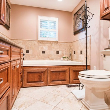
Vienna Addition Skill Construction & Design, LLC, Design/Build a two-story addition to include remodeling the kitchen and connecting to the adjoining rooms, creating a great room for this family of four. After removing the side office and back patio, it was replaced with a great room connected to the newly renovated kitchen with an eating area that doubles as a homework area for the children. There was plenty of space left over for a walk-in pantry, powder room, and office/craft room. The second story design was for an Adult’s Only oasis; this was designed for the parents to have a permitted Staycation. This space includes a Grand Master bedroom with three walk-in closets, and a sitting area, with plenty of room for a king size bed. This room was not been completed until we brought the outdoors in; this was created with the three big picture windows allowing the parents to look out at their Zen Patio. The Master Bathroom includes a double size jet tub, his & her walk-in shower, and his & her double vanity with plenty of storage and two hideaway hampers. The exterior was created to bring a modern craftsman style feel, these rich architectural details are displayed around the windows with simple geometric lines and symmetry throughout. Craftsman style is an extension of its natural surroundings. This addition is a reflection of indigenous wood and stone sturdy, defined structure with clean yet prominent lines and exterior details, while utilizing low-maintenance, high-performance materials. We love the artisan style of intricate details and the use of natural materials of this Vienna, VA addition. We especially loved working with the family to Design & Build a space that meets their family’s needs as they grow.

 TVL Creative Ltd.
Our clients had just recently closed on their new house in Stapleton and were excited to transform it into their perfect forever home. They wanted to remodel the entire first floor to create a more open floor plan and develop a smoother flow through the house that better fit the needs of their family. The original layout consisted of several small rooms that just weren’t very functional, so we decided to remove the walls that were breaking up the space and restructure the first floor to create a wonderfully open feel.
After removing the existing walls, we rearranged their spaces to give them an office at the front of the house, a large living room, and a large dining room that connects seamlessly with the kitchen. We also wanted to center the foyer in the home and allow more light to travel through the first floor, so we replaced their existing doors with beautiful custom sliding doors to the back yard and a gorgeous walnut door with side lights to greet guests at the front of their home.
Living Room
Our clients wanted a living room that could accommodate an inviting sectional, a baby grand piano, and plenty of space for family game nights. So, we transformed what had been a small office and sitting room into a large open living room with custom wood columns. We wanted to avoid making the home feel too vast and monumental, so we designed custom beams and columns to define spaces and to make the house feel like a home. Aesthetically we wanted their home to be soft and inviting, so we utilized a neutral color palette with occasional accents of muted blues and greens.
Dining Room
Our clients were also looking for a large dining room that was open to the rest of the home and perfect for big family gatherings. So, we removed what had been a small family room and eat-in dining area to create a spacious dining room with a fireplace and bar. We added custom cabinetry to the bar area with open shelving for displaying and designed a custom surround for their fireplace that ties in with the wood work we designed for their living room. We brought in the tones and materiality from the kitchen to unite the spaces and added a mixed metal light fixture to bring the space together
Kitchen
We wanted the kitchen to be a real show stopper and carry through the calm muted tones we were utilizing throughout their home. We reoriented the kitchen to allow for a big beautiful custom island and to give us the opportunity for a focal wall with cooktop and range hood. Their custom island was perfectly complimented with a dramatic quartz counter top and oversized pendants making it the real center of their home. Since they enter the kitchen first when coming from their detached garage, we included a small mud-room area right by the back door to catch everyone’s coats and shoes as they come in. We also created a new walk-in pantry with plenty of open storage and a fun chalkboard door for writing notes, recipes, and grocery lists.
Office
We transformed the original dining room into a handsome office at the front of the house. We designed custom walnut built-ins to house all of their books, and added glass french doors to give them a bit of privacy without making the space too closed off. We painted the room a deep muted blue to create a glimpse of rich color through the french doors
Powder Room
The powder room is a wonderful play on textures. We used a neutral palette with contrasting tones to create dramatic moments in this little space with accents of brushed gold.
Master Bathroom
The existing master bathroom had an awkward layout and outdated finishes, so we redesigned the space to create a clean layout with a dream worthy shower. We continued to use neutral tones that tie in with the rest of the home, but had fun playing with tile textures and patterns to create an eye-catching vanity. The wood-look tile planks along the floor provide a soft backdrop for their new free-standing bathtub and contrast beautifully with the deep ash finish on the cabinetry.
Find the right local pro for your project

 User
This 7,500 square feet home, situated on a waterfront site in Sag Harbor, New York, was designed as a shared vacation home for four brothers and their families. A collaborative effort between the clients and Cecil Baker + Partners yielded a contemporary home that pays homage to the Eastern Long Island vernacular.
The home is composed of three distinct volumes that step back from one another to optimize both the water view and privacy. The two outer wings take on familiar cedar-clad, pitched roof geometry while the central three-story glass box links them together and anchors the home. The two car garage, with a private living space above, projects from the main house via a breezeway, defining a private garden.
The interior of the home integrates warm, tactile materials and clean modern lines. The use of full-height windows, floor-to-ceiling glass curtain wall, and an operable overhead glass door creates an indoor-outdoor living experience and floods the home with natural light. The subtle choreography of the interior space lends flexibility to the Client for both social and private uses of the home.
The first floor contains an open plan for the kitchen, living room, dining area and sunroom, and the second floor includes two full master suites facing the bay, a guest room with spectacular water views, and a children's room that overlooks the garden. The fully finished basement holds a large playroom, a gym, a full spa bath and a wine cellar. In addition, views in all directions are unobstructed from a third floor roof terrace.
Michael Grimm Photography

 Katie Hutchison Studio
The new owners of this house in Harvard, Massachusetts loved its location and authentic Shaker characteristics, but weren’t fans of its curious layout. A dated first-floor full bathroom could only be accessed by going up a few steps to a landing, opening the bathroom door and then going down the same number of steps to enter the room. The dark kitchen faced the driveway to the north, rather than the bucolic backyard fields to the south. The dining space felt more like an enlarged hall and could only comfortably seat four. Upstairs, a den/office had a woefully low ceiling; the master bedroom had limited storage, and a sad full bathroom featured a cramped shower.
KHS proposed a number of changes to create an updated home where the owners could enjoy cooking, entertaining, and being connected to the outdoors from the first-floor living spaces, while also experiencing more inviting and more functional private spaces upstairs.
On the first floor, the primary change was to capture space that had been part of an upper-level screen porch and convert it to interior space. To make the interior expansion seamless, we raised the floor of the area that had been the upper-level porch, so it aligns with the main living level, and made sure there would be no soffits in the planes of the walls we removed. We also raised the floor of the remaining lower-level porch to reduce the number of steps required to circulate from it to the newly expanded interior. New patio door systems now fill the arched openings that used to be infilled with screen. The exterior interventions (which also included some new casement windows in the dining area) were designed to be subtle, while affording significant improvements on the interior. Additionally, the first-floor bathroom was reconfigured, shifting one of its walls to widen the dining space, and moving the entrance to the bathroom from the stair landing to the kitchen instead.
These changes (which involved significant structural interventions) resulted in a much more open space to accommodate a new kitchen with a view of the lush backyard and a new dining space defined by a new built-in banquette that comfortably seats six, and -- with the addition of a table extension -- up to eight people.
Upstairs in the den/office, replacing the low, board ceiling with a raised, plaster, tray ceiling that springs from above the original board-finish walls – newly painted a light color -- created a much more inviting, bright, and expansive space. Re-configuring the master bath to accommodate a larger shower and adding built-in storage cabinets in the master bedroom improved comfort and function. A new whole-house color palette rounds out the improvements.
Photos by Katie Hutchison
 Katie Hutchison Studio
Constructed in two phases, this renovation, with a few small additions, touched nearly every room in this late ‘50’s ranch house. The owners raised their family within the original walls and love the house’s location, which is not far from town and also borders conservation land. But they didn’t love how chopped up the house was and the lack of exposure to natural daylight and views of the lush rear woods. Plus, they were ready to de-clutter for a more stream-lined look. As a result, KHS collaborated with them to create a quiet, clean design to support the lifestyle they aspire to in retirement.
To transform the original ranch house, KHS proposed several significant changes that would make way for a number of related improvements. Proposed changes included the removal of the attached enclosed breezeway (which had included a stair to the basement living space) and the two-car garage it partially wrapped, which had blocked vital eastern daylight from accessing the interior. Together the breezeway and garage had also contributed to a long, flush front façade. In its stead, KHS proposed a new two-car carport, attached storage shed, and exterior basement stair in a new location. The carport is bumped closer to the street to relieve the flush front facade and to allow access behind it to eastern daylight in a relocated rear kitchen. KHS also proposed a new, single, more prominent front entry, closer to the driveway to replace the former secondary entrance into the dark breezeway and a more formal main entrance that had been located much farther down the facade and curiously bordered the bedroom wing.
Inside, low ceilings and soffits in the primary family common areas were removed to create a cathedral ceiling (with rod ties) over a reconfigured semi-open living, dining, and kitchen space. A new gas fireplace serving the relocated dining area -- defined by a new built-in banquette in a new bay window -- was designed to back up on the existing wood-burning fireplace that continues to serve the living area. A shared full bath, serving two guest bedrooms on the main level, was reconfigured, and additional square footage was captured for a reconfigured master bathroom off the existing master bedroom. A new whole-house color palette, including new finishes and new cabinetry, complete the transformation. Today, the owners enjoy a fresh and airy re-imagining of their familiar ranch house.
Photos by Katie Hutchison

 Zola European Windows
Nestled in a wooded area in the Pacific Northwest, the 1800 sf Passive Cedar Haus was built as a retirement home. The Artisans Group designed the layout of the home, mindful of aging in place, and working to ensure that the home blended in with the surrounding natural beauty. The project meets a complex program, with an unheated sleeping porch for a master bedroom, a screened porch, a 600 sf caretakers apartment/mother in law unit, large wood shop, plus a two car carport. The home seamlessly integrates a floating cedar tongue and groove roof with large sheltering overhangs, clerestory windows, and language of cedar slats for privacy screens and doors inside and out. The warm, natural materials of wood and cork for the interior palette are punctuated by lively accents and stunning fixtures.
This ultra energy efficient home relies on extremely high levels of insulation, air-tight detailing and construction, and the implementation of high performance, custom made European windows and doors by Zola Windows. Zola’s ThermoPlus Clad line, which boasts R-11 triple glazing and is thermally broken with a layer of patented German Purenit®, was selected for the project. Floor-to-ceiling windows in the main living area, gives an expansive view of the surrounding Northwest forest. The tops of these windows reveal the interior cedar clad and the up-swept soffits on the home’s exterior, creating a floating ceiling effect. Slatted spruce wood fly-overs break up the vertical areas of the great room and define separate areas that would otherwise feel like an overwhelmingly expansive space.
Photography by: Cheryl Ramsay of Ramsay Photography


 Renovisions
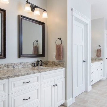
This South Shore of Boston couple reached out to Renovisions to design and build a beautiful, maintenance free and easy to use ‘his and hers’ master bathroom with plenty of storage. The former bath which had a single sink, one mirror, a vanity cabinet with not enough storage and a tired fiberglass shower stall was the last room in their home to be remodeled. They envisioned a more spa-like feel with a brighter walk-in shower and stylish cabinetry with double sinks and more storage.
Renovisions re-designed this bath with a fresh approach to a classic style; boasting two sinks and framed mirrors that match the custom oak cabinetry with a grey stain and cherused finish (a process that allows raising of the wood grain, creating a beautiful texture).
Choosing a white and grey palette with Carrara-look tiles in the shower opened up the space, tied in nicely with the weathered grey vanity and exemplified the feeling of casual luxury. The bright and airy walk-in shower with double recessed niches and dual shower heads affords both his and hers showering needs. Stunning and dramatic chevron patterned mosaic glass tile defines the niche spaces and lends a pretty, decorative touch to the overall look. The soft blue-green hue on the walls match perfectly with this tile and continue the serene and spa-like appeal throughout the bath.
Replacing the existing double-hung window with a smaller, decorative cut glass casement window not only provided a stunning focal point to the bathroom, but also allowed for additional cabinetry that includes a pull-out hamper and two deep drawers. Silestone’s stunning ‘white diamond’ quartz looks great with the color scheme and provides more countertop space for make-up and cosmetics.
The clients were thrilled with their ‘Renovision’ that imparts clean aesthetic and beautifully appointed classic details.
"Just wanted to say thank you for a job well done. We absolutely love our bathroom. From start to finish you were all so pleasant and professional. The fact that Ed is determined to come up with a solution for our bathroom door shows your commitment to your clients and the pride you take in your work. I can say from experience that not all contractors would care to or be as determined as Ed to say “I will come up with a solution just give me some time” especially after being paid in full. So thank you again. I would highly recommend your company to anyone looking for a bathroom ‘Renovision’! All the best!"
- Dan & Deb S. (Hanover)
 Katie Hutchison Studio
The new owners of this house in Harvard, Massachusetts loved its location and authentic Shaker characteristics, but weren’t fans of its curious layout. A dated first-floor full bathroom could only be accessed by going up a few steps to a landing, opening the bathroom door and then going down the same number of steps to enter the room. The dark kitchen faced the driveway to the north, rather than the bucolic backyard fields to the south. The dining space felt more like an enlarged hall and could only comfortably seat four. Upstairs, a den/office had a woefully low ceiling; the master bedroom had limited storage, and a sad full bathroom featured a cramped shower.
KHS proposed a number of changes to create an updated home where the owners could enjoy cooking, entertaining, and being connected to the outdoors from the first-floor living spaces, while also experiencing more inviting and more functional private spaces upstairs.
On the first floor, the primary change was to capture space that had been part of an upper-level screen porch and convert it to interior space. To make the interior expansion seamless, we raised the floor of the area that had been the upper-level porch, so it aligns with the main living level, and made sure there would be no soffits in the planes of the walls we removed. We also raised the floor of the remaining lower-level porch to reduce the number of steps required to circulate from it to the newly expanded interior. New patio door systems now fill the arched openings that used to be infilled with screen. The exterior interventions (which also included some new casement windows in the dining area) were designed to be subtle, while affording significant improvements on the interior. Additionally, the first-floor bathroom was reconfigured, shifting one of its walls to widen the dining space, and moving the entrance to the bathroom from the stair landing to the kitchen instead.
These changes (which involved significant structural interventions) resulted in a much more open space to accommodate a new kitchen with a view of the lush backyard and a new dining space defined by a new built-in banquette that comfortably seats six, and -- with the addition of a table extension -- up to eight people.
Upstairs in the den/office, replacing the low, board ceiling with a raised, plaster, tray ceiling that springs from above the original board-finish walls – newly painted a light color -- created a much more inviting, bright, and expansive space. Re-configuring the master bath to accommodate a larger shower and adding built-in storage cabinets in the master bedroom improved comfort and function. A new whole-house color palette rounds out the improvements.
Photos by Katie Hutchison
 Katie Hutchison Studio
Constructed in two phases, this renovation, with a few small additions, touched nearly every room in this late ‘50’s ranch house. The owners raised their family within the original walls and love the house’s location, which is not far from town and also borders conservation land. But they didn’t love how chopped up the house was and the lack of exposure to natural daylight and views of the lush rear woods. Plus, they were ready to de-clutter for a more stream-lined look. As a result, KHS collaborated with them to create a quiet, clean design to support the lifestyle they aspire to in retirement.
To transform the original ranch house, KHS proposed several significant changes that would make way for a number of related improvements. Proposed changes included the removal of the attached enclosed breezeway (which had included a stair to the basement living space) and the two-car garage it partially wrapped, which had blocked vital eastern daylight from accessing the interior. Together the breezeway and garage had also contributed to a long, flush front façade. In its stead, KHS proposed a new two-car carport, attached storage shed, and exterior basement stair in a new location. The carport is bumped closer to the street to relieve the flush front facade and to allow access behind it to eastern daylight in a relocated rear kitchen. KHS also proposed a new, single, more prominent front entry, closer to the driveway to replace the former secondary entrance into the dark breezeway and a more formal main entrance that had been located much farther down the facade and curiously bordered the bedroom wing.
Inside, low ceilings and soffits in the primary family common areas were removed to create a cathedral ceiling (with rod ties) over a reconfigured semi-open living, dining, and kitchen space. A new gas fireplace serving the relocated dining area -- defined by a new built-in banquette in a new bay window -- was designed to back up on the existing wood-burning fireplace that continues to serve the living area. A shared full bath, serving two guest bedrooms on the main level, was reconfigured, and additional square footage was captured for a reconfigured master bathroom off the existing master bedroom. A new whole-house color palette, including new finishes and new cabinetry, complete the transformation. Today, the owners enjoy a fresh and airy re-imagining of their familiar ranch house.
Photos by Katie Hutchison
 Katie Hutchison Studio
Constructed in two phases, this renovation, with a few small additions, touched nearly every room in this late ‘50’s ranch house. The owners raised their family within the original walls and love the house’s location, which is not far from town and also borders conservation land. But they didn’t love how chopped up the house was and the lack of exposure to natural daylight and views of the lush rear woods. Plus, they were ready to de-clutter for a more stream-lined look. As a result, KHS collaborated with them to create a quiet, clean design to support the lifestyle they aspire to in retirement.
To transform the original ranch house, KHS proposed several significant changes that would make way for a number of related improvements. Proposed changes included the removal of the attached enclosed breezeway (which had included a stair to the basement living space) and the two-car garage it partially wrapped, which had blocked vital eastern daylight from accessing the interior. Together the breezeway and garage had also contributed to a long, flush front façade. In its stead, KHS proposed a new two-car carport, attached storage shed, and exterior basement stair in a new location. The carport is bumped closer to the street to relieve the flush front facade and to allow access behind it to eastern daylight in a relocated rear kitchen. KHS also proposed a new, single, more prominent front entry, closer to the driveway to replace the former secondary entrance into the dark breezeway and a more formal main entrance that had been located much farther down the facade and curiously bordered the bedroom wing.
Inside, low ceilings and soffits in the primary family common areas were removed to create a cathedral ceiling (with rod ties) over a reconfigured semi-open living, dining, and kitchen space. A new gas fireplace serving the relocated dining area -- defined by a new built-in banquette in a new bay window -- was designed to back up on the existing wood-burning fireplace that continues to serve the living area. A shared full bath, serving two guest bedrooms on the main level, was reconfigured, and additional square footage was captured for a reconfigured master bathroom off the existing master bedroom. A new whole-house color palette, including new finishes and new cabinetry, complete the transformation. Today, the owners enjoy a fresh and airy re-imagining of their familiar ranch house.
Photos by Katie Hutchison
 Rodwin Architecture & Skycastle Construction
Rodwin Architecture & Skycastle Homes
Location: Louisville, Colorado, USA
This 3,800 sf. modern farmhouse on Roosevelt Ave. in Louisville is lovingly called "Teddy Homesevelt" (AKA “The Ted”) by its owners. The ground floor is a simple, sunny open concept plan revolving around a gourmet kitchen, featuring a large island with a waterfall edge counter. The dining room is anchored by a bespoke Walnut, stone and raw steel dining room storage and display wall. The Great room is perfect for indoor/outdoor entertaining, and flows out to a large covered porch and firepit.
The homeowner’s love their photogenic pooch and the custom dog wash station in the mudroom makes it a delight to take care of her. In the basement there’s a state-of-the art media room, starring a uniquely stunning celestial ceiling and perfectly tuned acoustics. The rest of the basement includes a modern glass wine room, a large family room and a giant stepped window well to bring the daylight in.
The Ted includes two home offices: one sunny study by the foyer and a second larger one that doubles as a guest suite in the ADU above the detached garage.
The home is filled with custom touches: the wide plank White Oak floors merge artfully with the octagonal slate tile in the mudroom; the fireplace mantel and the Great Room’s center support column are both raw steel I-beams; beautiful Doug Fir solid timbers define the welcoming traditional front porch and delineate the main social spaces; and a cozy built-in Walnut breakfast booth is the perfect spot for a Sunday morning cup of coffee.
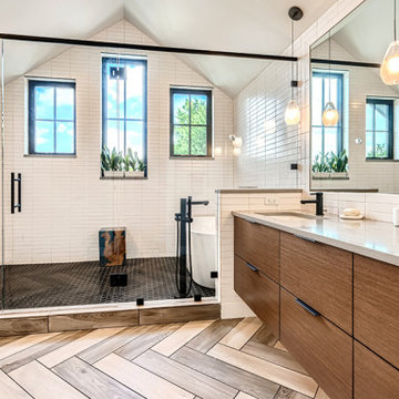
The two-story custom floating tread stair wraps sinuously around a signature chandelier, and is flooded with light from the giant windows. It arrives on the second floor at a covered front balcony overlooking a beautiful public park. The master bedroom features a fireplace, coffered ceilings, and its own private balcony. Each of the 3-1/2 bathrooms feature gorgeous finishes, but none shines like the master bathroom. With a vaulted ceiling, a stunningly tiled floor, a clean modern floating double vanity, and a glass enclosed “wet room” for the tub and shower, this room is a private spa paradise.
This near Net-Zero home also features a robust energy-efficiency package with a large solar PV array on the roof, a tight envelope, Energy Star windows, electric heat-pump HVAC and EV car chargers.
 Skill Construction & Design, LLC
Vienna Addition Skill Construction & Design, LLC, Design/Build a two-story addition to include remodeling the kitchen and connecting to the adjoining rooms, creating a great room for this family of four. After removing the side office and back patio, it was replaced with a great room connected to the newly renovated kitchen with an eating area that doubles as a homework area for the children. There was plenty of space left over for a walk-in pantry, powder room, and office/craft room. The second story design was for an Adult’s Only oasis; this was designed for the parents to have a permitted Staycation. This space includes a Grand Master bedroom with three walk-in closets, and a sitting area, with plenty of room for a king size bed. This room was not been completed until we brought the outdoors in; this was created with the three big picture windows allowing the parents to look out at their Zen Patio. The Master Bathroom includes a double size jet tub, his & her walk-in shower, and his & her double vanity with plenty of storage and two hideaway hampers. The exterior was created to bring a modern craftsman style feel, these rich architectural details are displayed around the windows with simple geometric lines and symmetry throughout. Craftsman style is an extension of its natural surroundings. This addition is a reflection of indigenous wood and stone sturdy, defined structure with clean yet prominent lines and exterior details, while utilizing low-maintenance, high-performance materials. We love the artisan style of intricate details and the use of natural materials of this Vienna, VA addition. We especially loved working with the family to Design & Build a space that meets their family’s needs as they grow.
 Skill Construction & Design, LLC
Vienna Addition Skill Construction & Design, LLC, Design/Build a two-story addition to include remodeling the kitchen and connecting to the adjoining rooms, creating a great room for this family of four. After removing the side office and back patio, it was replaced with a great room connected to the newly renovated kitchen with an eating area that doubles as a homework area for the children. There was plenty of space left over for a walk-in pantry, powder room, and office/craft room. The second story design was for an Adult’s Only oasis; this was designed for the parents to have a permitted Staycation. This space includes a Grand Master bedroom with three walk-in closets, and a sitting area, with plenty of room for a king size bed. This room was not been completed until we brought the outdoors in; this was created with the three big picture windows allowing the parents to look out at their Zen Patio. The Master Bathroom includes a double size jet tub, his & her walk-in shower, and his & her double vanity with plenty of storage and two hideaway hampers. The exterior was created to bring a modern craftsman style feel, these rich architectural details are displayed around the windows with simple geometric lines and symmetry throughout. Craftsman style is an extension of its natural surroundings. This addition is a reflection of indigenous wood and stone sturdy, defined structure with clean yet prominent lines and exterior details, while utilizing low-maintenance, high-performance materials. We love the artisan style of intricate details and the use of natural materials of this Vienna, VA addition. We especially loved working with the family to Design & Build a space that meets their family’s needs as they grow.
 User
This 7,500 square feet home, situated on a waterfront site in Sag Harbor, New York, was designed as a shared vacation home for four brothers and their families. A collaborative effort between the clients and Cecil Baker + Partners yielded a contemporary home that pays homage to the Eastern Long Island vernacular.
The home is composed of three distinct volumes that step back from one another to optimize both the water view and privacy. The two outer wings take on familiar cedar-clad, pitched roof geometry while the central three-story glass box links them together and anchors the home. The two car garage, with a private living space above, projects from the main house via a breezeway, defining a private garden.
The interior of the home integrates warm, tactile materials and clean modern lines. The use of full-height windows, floor-to-ceiling glass curtain wall, and an operable overhead glass door creates an indoor-outdoor living experience and floods the home with natural light. The subtle choreography of the interior space lends flexibility to the Client for both social and private uses of the home.
The first floor contains an open plan for the kitchen, living room, dining area and sunroom, and the second floor includes two full master suites facing the bay, a guest room with spectacular water views, and a children's room that overlooks the garden. The fully finished basement holds a large playroom, a gym, a full spa bath and a wine cellar. In addition, views in all directions are unobstructed from a third floor roof terrace.
Michael Grimm Photography
 Katie Hutchison Studio
The new owners of this house in Harvard, Massachusetts loved its location and authentic Shaker characteristics, but weren’t fans of its curious layout. A dated first-floor full bathroom could only be accessed by going up a few steps to a landing, opening the bathroom door and then going down the same number of steps to enter the room. The dark kitchen faced the driveway to the north, rather than the bucolic backyard fields to the south. The dining space felt more like an enlarged hall and could only comfortably seat four. Upstairs, a den/office had a woefully low ceiling; the master bedroom had limited storage, and a sad full bathroom featured a cramped shower.
KHS proposed a number of changes to create an updated home where the owners could enjoy cooking, entertaining, and being connected to the outdoors from the first-floor living spaces, while also experiencing more inviting and more functional private spaces upstairs.
On the first floor, the primary change was to capture space that had been part of an upper-level screen porch and convert it to interior space. To make the interior expansion seamless, we raised the floor of the area that had been the upper-level porch, so it aligns with the main living level, and made sure there would be no soffits in the planes of the walls we removed. We also raised the floor of the remaining lower-level porch to reduce the number of steps required to circulate from it to the newly expanded interior. New patio door systems now fill the arched openings that used to be infilled with screen. The exterior interventions (which also included some new casement windows in the dining area) were designed to be subtle, while affording significant improvements on the interior. Additionally, the first-floor bathroom was reconfigured, shifting one of its walls to widen the dining space, and moving the entrance to the bathroom from the stair landing to the kitchen instead.
These changes (which involved significant structural interventions) resulted in a much more open space to accommodate a new kitchen with a view of the lush backyard and a new dining space defined by a new built-in banquette that comfortably seats six, and -- with the addition of a table extension -- up to eight people.
Upstairs in the den/office, replacing the low, board ceiling with a raised, plaster, tray ceiling that springs from above the original board-finish walls – newly painted a light color -- created a much more inviting, bright, and expansive space. Re-configuring the master bath to accommodate a larger shower and adding built-in storage cabinets in the master bedroom improved comfort and function. A new whole-house color palette rounds out the improvements.
Photos by Katie Hutchison
 Skill Construction & Design, LLC
Vienna Addition Skill Construction & Design, LLC, Design/Build a two-story addition to include remodeling the kitchen and connecting to the adjoining rooms, creating a great room for this family of four. After removing the side office and back patio, it was replaced with a great room connected to the newly renovated kitchen with an eating area that doubles as a homework area for the children. There was plenty of space left over for a walk-in pantry, powder room, and office/craft room. The second story design was for an Adult’s Only oasis; this was designed for the parents to have a permitted Staycation. This space includes a Grand Master bedroom with three walk-in closets, and a sitting area, with plenty of room for a king size bed. This room was not been completed until we brought the outdoors in; this was created with the three big picture windows allowing the parents to look out at their Zen Patio. The Master Bathroom includes a double size jet tub, his & her walk-in shower, and his & her double vanity with plenty of storage and two hideaway hampers. The exterior was created to bring a modern craftsman style feel, these rich architectural details are displayed around the windows with simple geometric lines and symmetry throughout. Craftsman style is an extension of its natural surroundings. This addition is a reflection of indigenous wood and stone sturdy, defined structure with clean yet prominent lines and exterior details, while utilizing low-maintenance, high-performance materials. We love the artisan style of intricate details and the use of natural materials of this Vienna, VA addition. We especially loved working with the family to Design & Build a space that meets their family’s needs as they grow.

Sponsored
Sunbury, OH

J.Holderby - Renovations
Franklin County's Leading General Contractors - 2X Best of Houzz!


 Katie Hutchison Studio
The new owners of this house in Harvard, Massachusetts loved its location and authentic Shaker characteristics, but weren’t fans of its curious layout. A dated first-floor full bathroom could only be accessed by going up a few steps to a landing, opening the bathroom door and then going down the same number of steps to enter the room. The dark kitchen faced the driveway to the north, rather than the bucolic backyard fields to the south. The dining space felt more like an enlarged hall and could only comfortably seat four. Upstairs, a den/office had a woefully low ceiling; the master bedroom had limited storage, and a sad full bathroom featured a cramped shower.
KHS proposed a number of changes to create an updated home where the owners could enjoy cooking, entertaining, and being connected to the outdoors from the first-floor living spaces, while also experiencing more inviting and more functional private spaces upstairs.
On the first floor, the primary change was to capture space that had been part of an upper-level screen porch and convert it to interior space. To make the interior expansion seamless, we raised the floor of the area that had been the upper-level porch, so it aligns with the main living level, and made sure there would be no soffits in the planes of the walls we removed. We also raised the floor of the remaining lower-level porch to reduce the number of steps required to circulate from it to the newly expanded interior. New patio door systems now fill the arched openings that used to be infilled with screen. The exterior interventions (which also included some new casement windows in the dining area) were designed to be subtle, while affording significant improvements on the interior. Additionally, the first-floor bathroom was reconfigured, shifting one of its walls to widen the dining space, and moving the entrance to the bathroom from the stair landing to the kitchen instead.
These changes (which involved significant structural interventions) resulted in a much more open space to accommodate a new kitchen with a view of the lush backyard and a new dining space defined by a new built-in banquette that comfortably seats six, and -- with the addition of a table extension -- up to eight people.
Upstairs in the den/office, replacing the low, board ceiling with a raised, plaster, tray ceiling that springs from above the original board-finish walls – newly painted a light color -- created a much more inviting, bright, and expansive space. Re-configuring the master bath to accommodate a larger shower and adding built-in storage cabinets in the master bedroom improved comfort and function. A new whole-house color palette rounds out the improvements.
Photos by Katie Hutchison
 Katie Hutchison Studio
Constructed in two phases, this renovation, with a few small additions, touched nearly every room in this late ‘50’s ranch house. The owners raised their family within the original walls and love the house’s location, which is not far from town and also borders conservation land. But they didn’t love how chopped up the house was and the lack of exposure to natural daylight and views of the lush rear woods. Plus, they were ready to de-clutter for a more stream-lined look. As a result, KHS collaborated with them to create a quiet, clean design to support the lifestyle they aspire to in retirement.
To transform the original ranch house, KHS proposed several significant changes that would make way for a number of related improvements. Proposed changes included the removal of the attached enclosed breezeway (which had included a stair to the basement living space) and the two-car garage it partially wrapped, which had blocked vital eastern daylight from accessing the interior. Together the breezeway and garage had also contributed to a long, flush front façade. In its stead, KHS proposed a new two-car carport, attached storage shed, and exterior basement stair in a new location. The carport is bumped closer to the street to relieve the flush front facade and to allow access behind it to eastern daylight in a relocated rear kitchen. KHS also proposed a new, single, more prominent front entry, closer to the driveway to replace the former secondary entrance into the dark breezeway and a more formal main entrance that had been located much farther down the facade and curiously bordered the bedroom wing.
Inside, low ceilings and soffits in the primary family common areas were removed to create a cathedral ceiling (with rod ties) over a reconfigured semi-open living, dining, and kitchen space. A new gas fireplace serving the relocated dining area -- defined by a new built-in banquette in a new bay window -- was designed to back up on the existing wood-burning fireplace that continues to serve the living area. A shared full bath, serving two guest bedrooms on the main level, was reconfigured, and additional square footage was captured for a reconfigured master bathroom off the existing master bedroom. A new whole-house color palette, including new finishes and new cabinetry, complete the transformation. Today, the owners enjoy a fresh and airy re-imagining of their familiar ranch house.
Photos by Katie Hutchison
147