
Search results for "Master defining" in Home Design Ideas

 Schumacher Homes
Built by Schumacher Homes, America's Largest Custom Home Builder, this stunning West Point Craftsman in Akron, Ohio, effortlessly balances classic architectural details with modern elements. Combining the latest residential design trends with a sophisticated touch, the home’s striking craftsman-style exterior is defined by a unique angled garage that adds immense curb appeal and visual interest to the roof lines of this custom house plan. Upon entering, the residence opens into a soaring two-story great room filled with an abundance of natural light from large feature windows. This expansive main living space is further elevated by a specialized reverse cove ceiling integrated with custom LED lighting, casting a warm glow that accentuates the bright, spacious, and open-concept feeling of the interior.
The culinary center of the home is a luxurious kitchen designed for seamless entertaining and effortless organization. It features a hidden "messy kitchen" secondary prep zone and pantry that provides abundant additional storage, serving as the perfect discrete space to prepare meals while keeping the main kitchen island completely pristine. For main-level luxury, the primary owner's retreat serves as a private oasis complete with separate walk-in closets and a spa-inspired primary bathroom. Upstairs, the thoughtful floor plan accommodates the family quarters, where each of the three additional spacious bedrooms is meticulously outfitted with its own dedicated walk-in closet and convenient access to a full bathroom.
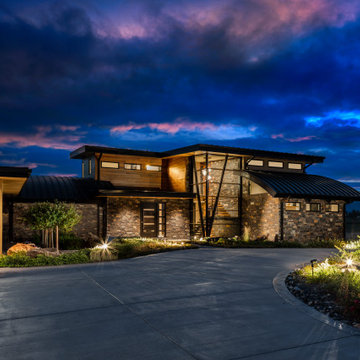
 Cheri Belz, Architect
In July 2017, Belz was contacted by the property owner to create a home that met their specific requirements. This included the following items:
An open concept/loft design that takes advantage of the views to the south and west. Separate areas within this open plan are defined by furnishings.
Master Suite on the main level. Bathroom with views. Large shower with rain head and wall shower system. Large walk-in closet with built-ins.
Study/office area with an abundance of built-in bookshelves. Study to be “separate” but somehow connected to main living area.
2 additional bedrooms, each with their own bath.
Extra wide garage that can fit 2 cars side x side with the doors open and extra deep with room for a workbench.
Mud room/laundry room that could include a shower.
Radiant in-floor heat system and air conditioning.
Outdoor living space/courtyard with firepit, water feature, pizza oven, and sunken jetted tub.
Environmentally responsible design alternatives, such as material choices and building orientation, together with other considerations based on requirements and aesthetics were used to develop a design that was consistent with the owner’s vision.
Belz and the owner worked together to choose all materials and finishes and colors. The green stucco picked up on the native grasses on the property. The stone was chosen to contrast with the green stucco and “plant” the house to the ground.
The owner wanted to take advantage of the views as much as possible. Instead of siting the house along north/south/east/west axes, Belz canted the floorplan to a southwest axis for better “head-on” views from the home.
The owner requested an interesting roof/ceiling. Thus, Belz chose an arched ceiling which she found more embracing than an angled vaulted or shed roof.

 Axis Mundi Design
When the Gimbels department store chain closed in 1986, many of its selling floors were converted into luxury apartments, including those of this branch at 86th Street and Lexington Avenue. The retailer’s soaring ceilings allowed Axis Mundi to create bedroom mezzanine spaces overlooking the living and dining rooms. Defining them with translucent glass welcomed natural light while retaining privacy. Downstairs, spaces bleed one into another, their basic monochromatic black-and-white palette acting as a unifying leitmotif. Yet each space feels distinct, with its own programmatic purpose, a feat largely achieved by varying floor and wall treatments—a graphic tile pattern in the entry, a red wall in the hall leading to the master suite, a colorful area rug in the living room. In the retailer’s heyday, the then-common saying, “Would Macy’s tell Gimbels?” implied the strategies the competitors kept from each other to gain the upper hand. Here, a structure iconic in its day also conceals something: a handsome, wholly contemporary repurposing that represents just the sort of innovation that made Gimbels the celebrated name that it was.
Project Team: John Beckmann, Nick Messerlian and Richard Rosenbloom
Kitchen by Minimal USA
Photography: Federica Carlet
© Axis Mundi Design LLC
Find the right local pro for your project
 Schumacher Homes
Built by Schumacher Homes, America's Largest Custom Home Builder, this stunning West Point Craftsman in Akron, Ohio, effortlessly balances classic architectural details with modern elements. Combining the latest residential design trends with a sophisticated touch, the home’s striking craftsman-style exterior is defined by a unique angled garage that adds immense curb appeal and visual interest to the roof lines of this custom house plan. Upon entering, the residence opens into a soaring two-story great room filled with an abundance of natural light from large feature windows. This expansive main living space is further elevated by a specialized reverse cove ceiling integrated with custom LED lighting, casting a warm glow that accentuates the bright, spacious, and open-concept feeling of the interior.
The culinary center of the home is a luxurious kitchen designed for seamless entertaining and effortless organization. It features a hidden "messy kitchen" secondary prep zone and pantry that provides abundant additional storage, serving as the perfect discrete space to prepare meals while keeping the main kitchen island completely pristine. For main-level luxury, the primary owner's retreat serves as a private oasis complete with separate walk-in closets and a spa-inspired primary bathroom. Upstairs, the thoughtful floor plan accommodates the family quarters, where each of the three additional spacious bedrooms is meticulously outfitted with its own dedicated walk-in closet and convenient access to a full bathroom.
 Matt Fajkus Architecture
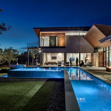
The Control/Shift House is perched on the high side of the site which takes advantage of the view to the southeast. A gradual descending path navigates the change in terrain from the street to the entry of the house. A series of low retaining walls/planter beds gather and release the earth upon the descent resulting in a fairly flat level for the house to sit on the top one third of the site. The entry axis is aligned with the celebrated stair volume and then re-centers on the actual entry axis once you approach the forecourt of the house.
The initial desire was for an “H” scheme house with common entertaining spaces bridging the gap between the more private spaces. After an investigation considering the site, program, and view, a key move was made: unfold the east wing of the “H” scheme to open all rooms to the southeast view resulting in a “T” scheme. The new derivation allows for both a swim pool which is on axis with the entry and main gathering space and a lap pool which occurs on the cross axis extending along the lengthy edge of the master suite, providing direct access for morning exercise and a view of the water throughout the day.
The Control/Shift House was derived from a clever way of following the “rules.” Strict HOA guidelines required very specific exterior massing restrictions which limits the lengths of unbroken elevations and promotes varying sizes of masses. The solution most often used in this neighborhood is one of addition - an aggregation of masses and program randomly attached to the inner core of the house which often results in a parasitic plan. The approach taken with the Control/Shift House was to push and pull program/massing to delineate and define the layout of the house. Massing is intentional and reiterated by the careful selection of materiality that tracks through the house. Voids and relief in the plan are a natural result of this method and allow for light and air to circulate throughout every space of the house, even into the most inner core.
Photography: Charles Davis Smith

 Katie Hutchison Studio
Constructed in two phases, this renovation, with a few small additions, touched nearly every room in this late ‘50’s ranch house. The owners raised their family within the original walls and love the house’s location, which is not far from town and also borders conservation land. But they didn’t love how chopped up the house was and the lack of exposure to natural daylight and views of the lush rear woods. Plus, they were ready to de-clutter for a more stream-lined look. As a result, KHS collaborated with them to create a quiet, clean design to support the lifestyle they aspire to in retirement.
To transform the original ranch house, KHS proposed several significant changes that would make way for a number of related improvements. Proposed changes included the removal of the attached enclosed breezeway (which had included a stair to the basement living space) and the two-car garage it partially wrapped, which had blocked vital eastern daylight from accessing the interior. Together the breezeway and garage had also contributed to a long, flush front façade. In its stead, KHS proposed a new two-car carport, attached storage shed, and exterior basement stair in a new location. The carport is bumped closer to the street to relieve the flush front facade and to allow access behind it to eastern daylight in a relocated rear kitchen. KHS also proposed a new, single, more prominent front entry, closer to the driveway to replace the former secondary entrance into the dark breezeway and a more formal main entrance that had been located much farther down the facade and curiously bordered the bedroom wing.
Inside, low ceilings and soffits in the primary family common areas were removed to create a cathedral ceiling (with rod ties) over a reconfigured semi-open living, dining, and kitchen space. A new gas fireplace serving the relocated dining area -- defined by a new built-in banquette in a new bay window -- was designed to back up on the existing wood-burning fireplace that continues to serve the living area. A shared full bath, serving two guest bedrooms on the main level, was reconfigured, and additional square footage was captured for a reconfigured master bathroom off the existing master bedroom. A new whole-house color palette, including new finishes and new cabinetry, complete the transformation. Today, the owners enjoy a fresh and airy re-imagining of their familiar ranch house.
Photos by Katie Hutchison
 Katie Hutchison Studio
The new owners of this house in Harvard, Massachusetts loved its location and authentic Shaker characteristics, but weren’t fans of its curious layout. A dated first-floor full bathroom could only be accessed by going up a few steps to a landing, opening the bathroom door and then going down the same number of steps to enter the room. The dark kitchen faced the driveway to the north, rather than the bucolic backyard fields to the south. The dining space felt more like an enlarged hall and could only comfortably seat four. Upstairs, a den/office had a woefully low ceiling; the master bedroom had limited storage, and a sad full bathroom featured a cramped shower.
KHS proposed a number of changes to create an updated home where the owners could enjoy cooking, entertaining, and being connected to the outdoors from the first-floor living spaces, while also experiencing more inviting and more functional private spaces upstairs.
On the first floor, the primary change was to capture space that had been part of an upper-level screen porch and convert it to interior space. To make the interior expansion seamless, we raised the floor of the area that had been the upper-level porch, so it aligns with the main living level, and made sure there would be no soffits in the planes of the walls we removed. We also raised the floor of the remaining lower-level porch to reduce the number of steps required to circulate from it to the newly expanded interior. New patio door systems now fill the arched openings that used to be infilled with screen. The exterior interventions (which also included some new casement windows in the dining area) were designed to be subtle, while affording significant improvements on the interior. Additionally, the first-floor bathroom was reconfigured, shifting one of its walls to widen the dining space, and moving the entrance to the bathroom from the stair landing to the kitchen instead.
These changes (which involved significant structural interventions) resulted in a much more open space to accommodate a new kitchen with a view of the lush backyard and a new dining space defined by a new built-in banquette that comfortably seats six, and -- with the addition of a table extension -- up to eight people.
Upstairs in the den/office, replacing the low, board ceiling with a raised, plaster, tray ceiling that springs from above the original board-finish walls – newly painted a light color -- created a much more inviting, bright, and expansive space. Re-configuring the master bath to accommodate a larger shower and adding built-in storage cabinets in the master bedroom improved comfort and function. A new whole-house color palette rounds out the improvements.
Photos by Katie Hutchison
Sponsored
Fredericksburg, OH

High Point Cabinets
Columbus' Experienced Custom Cabinet Builder | 4x Best of Houzz Winner
 Katie Hutchison Studio
The new owners of this house in Harvard, Massachusetts loved its location and authentic Shaker characteristics, but weren’t fans of its curious layout. A dated first-floor full bathroom could only be accessed by going up a few steps to a landing, opening the bathroom door and then going down the same number of steps to enter the room. The dark kitchen faced the driveway to the north, rather than the bucolic backyard fields to the south. The dining space felt more like an enlarged hall and could only comfortably seat four. Upstairs, a den/office had a woefully low ceiling; the master bedroom had limited storage, and a sad full bathroom featured a cramped shower.
KHS proposed a number of changes to create an updated home where the owners could enjoy cooking, entertaining, and being connected to the outdoors from the first-floor living spaces, while also experiencing more inviting and more functional private spaces upstairs.
On the first floor, the primary change was to capture space that had been part of an upper-level screen porch and convert it to interior space. To make the interior expansion seamless, we raised the floor of the area that had been the upper-level porch, so it aligns with the main living level, and made sure there would be no soffits in the planes of the walls we removed. We also raised the floor of the remaining lower-level porch to reduce the number of steps required to circulate from it to the newly expanded interior. New patio door systems now fill the arched openings that used to be infilled with screen. The exterior interventions (which also included some new casement windows in the dining area) were designed to be subtle, while affording significant improvements on the interior. Additionally, the first-floor bathroom was reconfigured, shifting one of its walls to widen the dining space, and moving the entrance to the bathroom from the stair landing to the kitchen instead.
These changes (which involved significant structural interventions) resulted in a much more open space to accommodate a new kitchen with a view of the lush backyard and a new dining space defined by a new built-in banquette that comfortably seats six, and -- with the addition of a table extension -- up to eight people.
Upstairs in the den/office, replacing the low, board ceiling with a raised, plaster, tray ceiling that springs from above the original board-finish walls – newly painted a light color -- created a much more inviting, bright, and expansive space. Re-configuring the master bath to accommodate a larger shower and adding built-in storage cabinets in the master bedroom improved comfort and function. A new whole-house color palette rounds out the improvements.
Photos by Katie Hutchison
 Kimberlee Marie Interiors
Our Seattle studio designed this stunning 5,000+ square foot Snohomish home to make it comfortable and fun for a wonderful family of six.
On the main level, our clients wanted a mudroom. So we removed an unused hall closet and converted the large full bathroom into a powder room. This allowed for a nice landing space off the garage entrance. We also decided to close off the formal dining room and convert it into a hidden butler's pantry. In the beautiful kitchen, we created a bright, airy, lively vibe with beautiful tones of blue, white, and wood. Elegant backsplash tiles, stunning lighting, and sleek countertops complete the lively atmosphere in this kitchen.
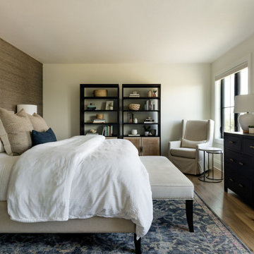
On the second level, we created stunning bedrooms for each member of the family. In the primary bedroom, we used neutral grasscloth wallpaper that adds texture, warmth, and a bit of sophistication to the space creating a relaxing retreat for the couple. We used rustic wood shiplap and deep navy tones to define the boys' rooms, while soft pinks, peaches, and purples were used to make a pretty, idyllic little girls' room.
In the basement, we added a large entertainment area with a show-stopping wet bar, a large plush sectional, and beautifully painted built-ins. We also managed to squeeze in an additional bedroom and a full bathroom to create the perfect retreat for overnight guests.
For the decor, we blended in some farmhouse elements to feel connected to the beautiful Snohomish landscape. We achieved this by using a muted earth-tone color palette, warm wood tones, and modern elements. The home is reminiscent of its spectacular views – tones of blue in the kitchen, primary bathroom, boys' rooms, and basement; eucalyptus green in the kids' flex space; and accents of browns and rust throughout.
 Katie Hutchison Studio
The new owners of this house in Harvard, Massachusetts loved its location and authentic Shaker characteristics, but weren’t fans of its curious layout. A dated first-floor full bathroom could only be accessed by going up a few steps to a landing, opening the bathroom door and then going down the same number of steps to enter the room. The dark kitchen faced the driveway to the north, rather than the bucolic backyard fields to the south. The dining space felt more like an enlarged hall and could only comfortably seat four. Upstairs, a den/office had a woefully low ceiling; the master bedroom had limited storage, and a sad full bathroom featured a cramped shower.
KHS proposed a number of changes to create an updated home where the owners could enjoy cooking, entertaining, and being connected to the outdoors from the first-floor living spaces, while also experiencing more inviting and more functional private spaces upstairs.
On the first floor, the primary change was to capture space that had been part of an upper-level screen porch and convert it to interior space. To make the interior expansion seamless, we raised the floor of the area that had been the upper-level porch, so it aligns with the main living level, and made sure there would be no soffits in the planes of the walls we removed. We also raised the floor of the remaining lower-level porch to reduce the number of steps required to circulate from it to the newly expanded interior. New patio door systems now fill the arched openings that used to be infilled with screen. The exterior interventions (which also included some new casement windows in the dining area) were designed to be subtle, while affording significant improvements on the interior. Additionally, the first-floor bathroom was reconfigured, shifting one of its walls to widen the dining space, and moving the entrance to the bathroom from the stair landing to the kitchen instead.
These changes (which involved significant structural interventions) resulted in a much more open space to accommodate a new kitchen with a view of the lush backyard and a new dining space defined by a new built-in banquette that comfortably seats six, and -- with the addition of a table extension -- up to eight people.
Upstairs in the den/office, replacing the low, board ceiling with a raised, plaster, tray ceiling that springs from above the original board-finish walls – newly painted a light color -- created a much more inviting, bright, and expansive space. Re-configuring the master bath to accommodate a larger shower and adding built-in storage cabinets in the master bedroom improved comfort and function. A new whole-house color palette rounds out the improvements.
Photos by Katie Hutchison
 My Bali Living
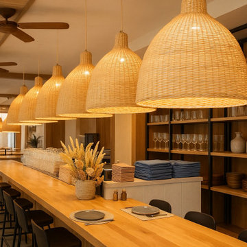
This restaurant counter bar exemplifies a masterful application of coastal interior design, blending natural textures and calming earth tones to create a welcoming and relaxed dining experience. The focal point of the space is a series of oversized rattan pendant lights suspended over a long, solid wood bar. These handcrafted light fixtures introduce both visual warmth and a tactile element that complements the overall organic aesthetic.
The lights cast a soft, golden glow that enhances the ambiance, making the bar area feel intimate yet open. Their generous scale anchors the space and draws the eye upward, adding depth and architectural interest without overpowering the clean lines and minimal decor. Paired with light wood finishes, woven textures, and subtle botanical accents, the pendants contribute to a serene, beach-inspired atmosphere that is both stylish and approachable.
For restaurant designers, this space demonstrates how lighting can define and elevate the mood of a dining environment. The integration of natural materials like rattan, when scaled thoughtfully and paired with neutral finishes, offers a timeless yet on-trend solution that supports a laid-back coastal identity while maintaining high design integrity.


 nancekivell home planning & design
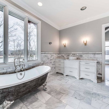
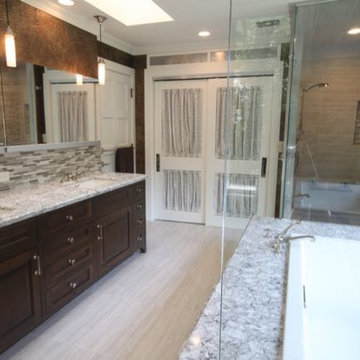
Keeping the existing footprint of this North Oaks master bath we gave it a much-needed upgrade to improve the function of the shower, upgrade plumbing fixtures and increase the rooms storage.
We took part of the room down to the studs to improve insulation and rewire parts of the room. Because this room was always cold we expanded an existing multi-aqua heat exchange system to provide in-floor heat and an additional thermostatic controlled unit to provide supplementary heat when needed.
I used 12” X 24” porcelain tiles for the floor and shower walls, a stone veneer feature wall behind the tub, shower and toilet wall with a glass/stone/metal mixed mosaic for the backsplash and shower accent. Cambria Bellingham was used on the vanity and tub deck tops and large glass panels were used to create the shower enclosure and define the tub and toilet areas giving the room a bright and open feel. The client chose fabric inserts for the closet doors instead of the louver style doors originally specified for the project.
I switched the locations of the shower and toilet to double the shower size. I also designed custom cherry cabinets and installed two 48” x 27” Roburn uplift cabinets more than doubling the room’s storage space. The make-up area at the far end of the room includes a lift-top in the center section that includes a large mirror on the underside of the top and abundant organized storage for beauty supplies and jewelry.
J.Nancekivell

 christopher jeffrey architects pllc
Old Main Residence: Quogue, New York
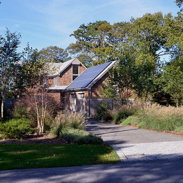
Situated on the Quantuck Creek, the long thin site provides a quite setting with beautiful views to the water. The program for the house was to combine a “shingle style” vernacular building form with a contemporary floor plan and energy systems. The house is organized by creating an Entry Court on the street side of the property where the main Entry is situated on a raised porch nestled between the House and Garage and surrounded by gardens. On the waterside we created an open Living, Dining & Kitchen space that is surrounded by a deck and pool all at the same level. The Master Bedroom suite also opens onto this space with views of the water and provides a visual separation from the Entry Courtyard. On the second floor are three additional Bedrooms with suited Bathrooms and exterior balconies, all with views of the water.
The long house volume runs east to west with an 8kw Photovoltaic system on the south facing gabled roof. It provides all the electricity required to run the 2 zoned geo-thermal forced air HVAC system. At the top of the centrally located 2-story stair space an ERV will be installed to redistribute the conditioned air and exchange with fresh exterior air. The ground level Living, Dining, Kitchen space will have a radiant heated poured concrete slab. The large continuous south & west facing double hung windows provide passive heating during the winter months.
The exterior of the house will be clad in natural white cedar shingles and stained red cedar trim. A standing seam metal roof will cover the lower shed roof while light grey asphalt shingles will cover the upper gabled roofs and allow for an easier application of the PV system. IPE decking will clad the deck surfaces and be surrounded by colorful gardens of indigenous plant species. Dark stained red cedar fencing and gates will provide privacy and define the outside spaces.
 Axis Mundi Design
When the Gimbels department store chain closed in 1986, many of its selling floors were converted into luxury apartments, including those of this branch at 86th Street and Lexington Avenue. The retailer’s soaring ceilings allowed Axis Mundi to create bedroom mezzanine spaces overlooking the living and dining rooms. Defining them with translucent glass welcomed natural light while retaining privacy. Downstairs, spaces bleed one into another, their basic monochromatic black-and-white palette acting as a unifying leitmotif. Yet each space feels distinct, with its own programmatic purpose, a feat largely achieved by varying floor and wall treatments—a graphic tile pattern in the entry, a red wall in the hall leading to the master suite, a colorful area rug in the living room. In the retailer’s heyday, the then-common saying, “Would Macy’s tell Gimbels?” implied the strategies the competitors kept from each other to gain the upper hand. Here, a structure iconic in its day also conceals something: a handsome, wholly contemporary repurposing that represents just the sort of innovation that made Gimbels the celebrated name that it was.
Project Team: John Beckmann, Nick Messerlian and Richard Rosenbloom
Kitchen by Minimal USA
Photography: Federica Carlet
© Axis Mundi Design LLC
 User
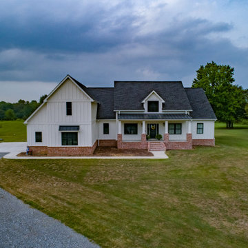
About This Project: The modern farmhouse is a popular choice for many homeowners. With its clean lines and simple design, it can provide a stylish yet comfortable place to call home. One of the most distinguishing features of the modern farmhouse is its exterior. White clapboard siding and red brick are often used to create a striking contrast. The large eat-in kitchen is another key feature of this style of home. It is typically equipped with ample counter space and storage, making it ideal for entertaining. The cozy great room is often the heart of the home, featuring a fireplace and plenty of seating. The light and bright master bath is another defining characteristic of the modern farmhouse. It often features custom marble, giving it a luxurious feel. Whether you are looking for a new home or simply want to update your existing one, the modern farmhouse is sure to be a style that you will love.
MMD Construction is a member of the Certified Luxury Builders Network.
Certified Luxury Builders is a network of leading custom home builders and luxury home and condo remodelers who create 5-Star experiences for luxury home and condo owners from New York to Los Angeles and Boston to Naples.
As a Certified Luxury Builder, MMD Construction is proud to feature photos of select projects from our members around the country to inspire you with design ideas. Please feel free to contact the specific Certified Luxury Builder with any questions or inquiries you may have about their projects. Please visit www.CLBNetwork.com for a directory of CLB members featured on Houzz and their contact information.
 User
About This Project: The modern farmhouse is a popular choice for many homeowners. With its clean lines and simple design, it can provide a stylish yet comfortable place to call home. One of the most distinguishing features of the modern farmhouse is its exterior. White clapboard siding and red brick are often used to create a striking contrast. The large eat-in kitchen is another key feature of this style of home. It is typically equipped with ample counter space and storage, making it ideal for entertaining. The cozy great room is often the heart of the home, featuring a fireplace and plenty of seating. The light and bright master bath is another defining characteristic of the modern farmhouse. It often features custom marble, giving it a luxurious feel. Whether you are looking for a new home or simply want to update your existing one, the modern farmhouse is sure to be a style that you will love.
MMD Construction is a member of the Certified Luxury Builders Network.
Certified Luxury Builders is a network of leading custom home builders and luxury home and condo remodelers who create 5-Star experiences for luxury home and condo owners from New York to Los Angeles and Boston to Naples.
As a Certified Luxury Builder, MMD Construction is proud to feature photos of select projects from our members around the country to inspire you with design ideas. Please feel free to contact the specific Certified Luxury Builder with any questions or inquiries you may have about their projects. Please visit www.CLBNetwork.com for a directory of CLB members featured on Houzz and their contact information.
Sponsored
Columbus, OH

Wannemacher Interiors
Customized Award-Winning Interior Design Solutions in Franklin Cnty OH
 Axis Mundi Design
When the Gimbels department store chain closed in 1986, many of its selling floors were converted into luxury apartments, including those of this branch at 86th Street and Lexington Avenue. The retailer’s soaring ceilings allowed Axis Mundi to create bedroom mezzanine spaces overlooking the living and dining rooms. Defining them with translucent glass welcomed natural light while retaining privacy. Downstairs, spaces bleed one into another, their basic monochromatic black-and-white palette acting as a unifying leitmotif. Yet each space feels distinct, with its own programmatic purpose, a feat largely achieved by varying floor and wall treatments—a graphic tile pattern in the entry, a red wall in the hall leading to the master suite, a colorful area rug in the living room. In the retailer’s heyday, the then-common saying, “Would Macy’s tell Gimbels?” implied the strategies the competitors kept from each other to gain the upper hand. Here, a structure iconic in its day also conceals something: a handsome, wholly contemporary repurposing that represents just the sort of innovation that made Gimbels the celebrated name that it was.
Project Team: John Beckmann, Nick Messerlian and Richard Rosenbloom
Kitchen by Minimal USA
Photography: Federica Carlet
© Axis Mundi Design LLC
 Axis Mundi Design
When the Gimbels department store chain closed in 1986, many of its selling floors were converted into luxury apartments, including those of this branch at 86th Street and Lexington Avenue. The retailer’s soaring ceilings allowed Axis Mundi to create bedroom mezzanine spaces overlooking the living and dining rooms. Defining them with translucent glass welcomed natural light while retaining privacy. Downstairs, spaces bleed one into another, their basic monochromatic black-and-white palette acting as a unifying leitmotif. Yet each space feels distinct, with its own programmatic purpose, a feat largely achieved by varying floor and wall treatments—a graphic tile pattern in the entry, a red wall in the hall leading to the master suite, a colorful area rug in the living room. In the retailer’s heyday, the then-common saying, “Would Macy’s tell Gimbels?” implied the strategies the competitors kept from each other to gain the upper hand. Here, a structure iconic in its day also conceals something: a handsome, wholly contemporary repurposing that represents just the sort of innovation that made Gimbels the celebrated name that it was.
Project Team: John Beckmann, Nick Messerlian and Richard Rosenbloom
Kitchen by Minimal USA
Photography: Federica Carlet
© Axis Mundi Design LLC
 KC Interior Design Inc.
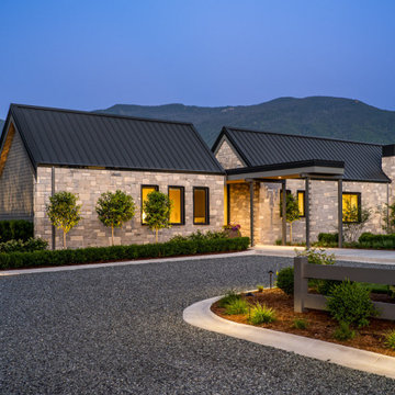
This full front elevation view at dusk highlights the home's impressive structural massing, architectural symmetry, and premium material layering. The design is anchored by two prominent, intersecting gabled wings wrapped in dark charcoal standing seam metal roofing. The exterior walls are constructed from a light-toned, stacked limestone veneer veneer that brings rich organic texture to the facade. A low-profile, cantilevered entry portico with a minimalist charcoal steel frame defines the central front entrance, leading toward a concrete walkway and a glowing white oak front door.
The architectural composition masterfully balances solid masonry surfaces with geometric glass voids. A row of vertical windows encased in deep matte black box frames cuts cleanly into the left stone facade, while matching windows illuminate the right wing. On the far right, a large stone chimney stack with a black metal shroud accents the roofline, adding a powerful vertical focal point. The home is framed by a sweeping gravel parking court with a curved concrete curb and a rustic post-and-rail wooden fence, set against a majestic mountain backdrop.
153