
Search results for "Master encroach" in Home Design Ideas
 Aardvark Architecture
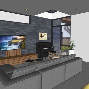
This proposal is for a new two-story home on the vacant heavily wooded lot with an existing 150-foot-long driveway lined by several beautiful oak trees culminating in a behemoth 43-inch oak tree where the driveway meets the main lot. The far end of the driveway terminates in a grove of three 43/40/43-inch redwoods and at the very center of the vacant lot stands a gargantuan V-twin 59-inch redwood tree paired with a “small” 29-inch redwood tree. The owners want to build a beautiful contemporary-styled home for their family that fully enjoys and embraces the mature trees on their cozy 65-foot by 100-foot lot.
As with all small, constrained lots, this project’s site design started first with meeting the relatively large parking and car maneuvering requirements. Menlo Park’s Department of Transportation typically requires side-facing garages to have 24-feet of backup space. So that they could give the largest feature redwood tree on site an added four feet (50%) of clearance outside of its critical root zone, the owners agreed to install a vehicle turntable at the end of their driveway to eliminate the extra four feet of space needed to back up and turnaround. This allowed them to pull their garage forward an additional four feet towards the front property line on the panhandle side, drastically reducing the rest of the home’s impact on the gargantuan V-Twin paired redwood tree at the center of the lot.
One of the owners has mobility issues, and accordingly, they first sought to design a one-story floor plan that incorporated all their family’s needs including plenty of covered patio and deck space to enjoy our fantastic California weather. But that single-story footprint spread too far into the critical root zones of several of the redwood trees on site, even despite the use of the vehicle turntable. During my interview process with the owners, they made it clear to me that one of their primary concerns is ensuring that the largest trees on site would thrive and become features of their new home after construction is complete. The single-story designs that removed the grove of three huge redwood trees were non-starters, as was the skimpy 5x10 master bath I designed when trying to squeeze the whole house program into an overly compromised single-story design. It was therefore deemed necessary to go with a two-story design despite the owner’s mobility issues. This two-story design has a much more compact ground floor footprint and has no bedrooms downstairs, other than the detached ADU. The owners must give up the floor area and incur the costs to install a residential elevator to access their upstairs master suite.
Our ground floor footprint is smaller due to the two-story design decision, and our foundation is pulled away from the trees thanks to the vehicle turntable. Yet, a tiny portion of the home’s ground floor footprint still encroaches into the critical root zones of the largest 59” redwood tree. Therefore, as outlined in the Arborist Report prepared by Aesculus Arboricultural Consulting, the structural engineers are incorporating an array of drilled piers and shallow-grade beams for the main home’s foundation and deck area nearest the redwood’s critical root zone. This drilled piers and grade beam foundation is a type of “bridging” foundation as outlined in Aesculus’ report to preserve the health of these trees that the property was designed around. The rest of the foundation will be constructed as an insulated slab-on-grade foundation to minimize the number of steps and ramps needed for the owners to enjoy their home and patio areas.
Despite the owner’s desire to keep as many trees as possible on site, and despite the smaller ground floor footprint and the advantage of the vehicle turntable, the need for a 20x20-foot garage and 20x20/25-foot guest parking space on our panhandle lot requires the removal of two heritage trees in the required driveway, a 16” coast redwood, and a 17” coast redwood. An alternate design, such as swapping the garage and guest parking locations north-to-south, still requires the removal of these two trees for vehicle maneuvering but has the added disadvantage of cutting off the home’s sightlines to the behemoth 43” oak tree just outside the currently proposed front patio space and living room. Jim Redman of Elements Landscape is proposing 13 new trees be planted on site to replace the lost value of these two heritage coast redwood trees.
This contemporary architectural design features clean lines, and an abundance of full-height windows and large skylights to best take in the immense trees on site. To blend in with the forest-like setting, the home boasts a mix of rich textures and features a color palette of natural wood tones contrasted with dark blue and black. Once through the new steel gate at the street and down the 150-foot tree-lined driveway, a large covered front patio becomes visible past the neighbor’s detached accessory structure. The covered patio is just across the driveway from the beautiful 43” behemoth coast live oak. The single plane of the covered patio roof is delicately supported by a pair of steel posts in a “V-twin” configuration much like the largest redwood trees that tower over the center of the lot and will still be visible above the new two-story home, even from the front yard. The patio is covered in a dark-colored standing seam roof, with steel C-channel fascias, and tongue-and-groove wood ceiling planks on the underside. Generously sized skylights on the patio roof and inside the living area allow for impressive views of the amazing oak canopy as well as precious natural light.
Supporting the sloped covered patio on the other side is the two-car garage with a secondary bedroom suite stacked above the garage. This two-story volume is to be clad in vertical clear-coated redwood siding, to tie in with the grove of three 43-inch redwood trees just beyond. The garage door, and the bank of windows for Bedroom#2 above feature a steel fascia eyebrow header feature to provide shade and overhang protection, as we are not proposing a large overhang at this “redwood trunk”. The garage and bedroom volume are pulled 16 feet away from the side property line, instead of the minimum required setback of 6’-6”, thus leaving plenty of room for the redwood grove and existing mature pear tree to continue to thrive. This existing mature green screen in this 16-foot-wide side yard is a feature worth soaking in, which is why tall windows with low sill heights are proposed for both the stairs and the upstairs hallway. Though it may be infrequent to approve side-facing 2nd floor windows with sill heights as low as what we’re proposing, we are confident that the mature green screen and the over 16-foot-wide side yard are sufficient to provide for the continued privacy of our neighbor’s rear yard space, especially considering theses windows are in walkway zones.
The covered patio at the front entry is also bound by the 10-foot-tall living room. The great room is clad in a dark blue brick veneer, which wraps around all three sides of the living room. Upon entering the home from the covered patio, you are immediately greeted with one of the most impressive features of the home’s design: a 10-foot-tall by 24-foot-wide set of sliding glass doors. From the entry, this huge opening gives merely an initial glimpse of the massive trunks of the gargantuan V-twin redwoods sitting at the center of the lot. All three sliding glass panels open directly out into the smaller partially covered deck in the rear. This roof overhang element matches the design of the front patio with a steel C-channel fascia and a large skylight. But the rear deck’s roof element is set flat at a ten-foot ceiling height so that the living room’s ceiling seems to float above and out beyond the expanse of full-height sliding doors, thus creating an indoor-outdoor living space that will feel much larger than the home’s actual footprint. This rear covered deck is smaller than the patio in the front and also has a mix of solid and open-slatted roofing to allow for more solar access for the relatively small amount of open sky available.
The downstairs living room is open to the dining and kitchen areas, as well as the stair-and-elevator tower beyond. The stair tower is very open and glassy, and the stairs wind up and around the redwood-clad elevator tower. From certain perspectives in the 16-foot-wide side yard, it will almost seem as if the grove of three redwoods has a fourth tree that the house and the stairs were carefully built around. Other than the 3-foot-wide windows, the exterior walls of the stair tower, downstairs utility spaces, and Bedroom#3 above are finished in cement plaster, painted dark blue and black. The sloped roof over the stair-and-elevator tower continues cleanly over the area of upstairs Bedroom#3. This roof level is set by the side daylight plane and only yields an inside wall height of just under 6 feet in height. The owners are satisfied that the rest of this upstairs room has a nice vaulted ceiling to make up for the one short wall under the daylight plane.
The rest of the ground floor adjacent to the stair tower consists of a small utility wing containing a half-bath, laundry, storage area, and an exterior alcove for the electric heat pump HVAC unit. This short wing also gives more accessible access to the rear yard deck, as well as a backdrop for an outdoor kitchen. The bright white stone backsplash for the outdoor kitchen provides contrast to the otherwise consistent use of cement plaster painted dark blue and black for the two-story wing closest to the detached ADU. Though Bedroom#3 is stacked directly above this small wing, it is relatively short to comply with the side daylight plane of this narrow lot. Still, to further help break up the scale of this wall, another steel fascia eyebrow element is set about 8 feet above the rear deck.
The master suite sits centered above the ten-foot-tall great room. The master bedroom and its balcony, as well as the master bathtub area, have a commanding view of the central redwood trees and their impressive canopy, though the balcony is mostly recessed and should pose no privacy concerns to the neighbor’s rear yards. The master balcony parapet is clad in the same brick veneer continuing up from the living room below. A dark-painted metal rail makes up the rest of the open guardrail height. The entire length of the master balcony is comprised of 9-foot-tall sliding glass doors, but the area above the doors, as well as the area below the master bathroom windows, is accented with more redwood siding. The remainder of the master suite bathroom and walk-in closet is finished in cement plaster painted dark blue. The master bathroom has one side yard-facing window but will be frosted glass for both the owner’s and the neighbor’s privacy.
The 2nd floor is capped under a simple gable roof design with one roof ridge and varying eave and rake overhangs depending on the 2nd-floor layout and solar orientation. Since these roof planes are quite difficult to see in the middle of the heavily wooded panhandle lot, we are proposing a white TPO roofing for these two upper roof planes as a more sustainable choice compared to more dark-colored roofing like the covered patios and detached ADU.
The owners also wish to build a detached 292-square-foot Accessory Dwelling Unit (ADU) as an office and guest suite. For the ADU foundation to be situated outside the central redwood tree’s critical root zone, this relatively tiny structure takes advantage of the narrower 4-foot side and rear setbacks allowed for ADUs smaller than 800 square feet. The small L-shaped detached ADU frames a wonderful quasi-courtyard around the gargantuan V-twin redwoods at the center of the lot. The ADU shares a matching material palette consisting of cement plaster painted blue and black, vertical redwood siding and soffits, and thin brick veneer. The ADU also features large full-height windows. The only difference between the main home and the ADU material palette is that the roofing will be a dark composition shingle roofing since it will be quite visible from the master balcony.
 DK Studio
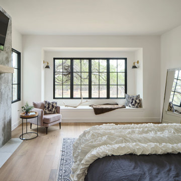
The Ranch Pass Project consisted of architectural design services for a new home of around 3,400 square feet. The design of the new house includes four bedrooms, one office, a living room, dining room, kitchen, scullery, laundry/mud room, upstairs children’s playroom and a three-car garage, including the design of built-in cabinets throughout. The design style is traditional with Northeast turn-of-the-century architectural elements and a white brick exterior. Design challenges encountered with this project included working with a flood plain encroachment in the property as well as situating the house appropriately in relation to the street and everyday use of the site. The design solution was to site the home to the east of the property, to allow easy vehicle access, views of the site and minimal tree disturbance while accommodating the flood plain accordingly.
 DK Studio
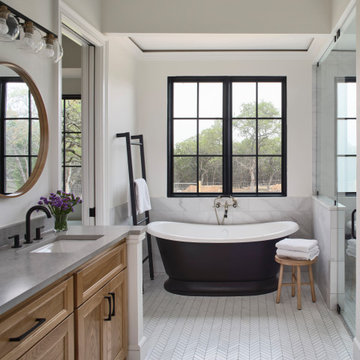
The Ranch Pass Project consisted of architectural design services for a new home of around 3,400 square feet. The design of the new house includes four bedrooms, one office, a living room, dining room, kitchen, scullery, laundry/mud room, upstairs children’s playroom and a three-car garage, including the design of built-in cabinets throughout. The design style is traditional with Northeast turn-of-the-century architectural elements and a white brick exterior. Design challenges encountered with this project included working with a flood plain encroachment in the property as well as situating the house appropriately in relation to the street and everyday use of the site. The design solution was to site the home to the east of the property, to allow easy vehicle access, views of the site and minimal tree disturbance while accommodating the flood plain accordingly.
Find the right local pro for your project
 Laney LA, Inc.
Interior Designer: Rini Kundu
Contractor: RJ Smith
Collaborating Architect: Doug Leach
Landscape: Jones Landscape LA
Photos: Ryan Garvin
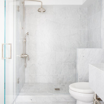
Inspiration for a contemporary bathroom remodel in Los Angeles
Inspiration for a contemporary bathroom remodel in Los Angeles
 Heiser Designs
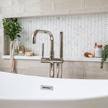
Example of a mid-sized transitional master gray tile and ceramic tile porcelain tile and double-sink freestanding bathtub design in Seattle with shaker cabinets, gray cabinets, an undermount sink, quartz countertops, a hinged shower door, white countertops, a niche and a built-in vanity
 MainStreet Design Build
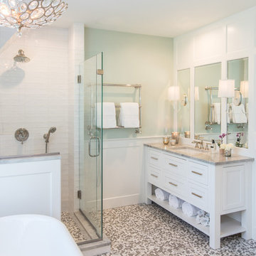
This relatively new home in Quarton Lake Estates had an existing large master bathroom. However, the room was cut up with partitions for toilet, shower, and tub, making it feel small and outdated. Our clients wanted a light bright welcoming bathroom to match the rest of their gorgeous home.
The bathroom was gutted back to the studs. Both outside corners of the bathroom have eaves that encroach on the interior of the bathroom ceiling height. Working around the eaves and maintaining headroom with fluid design was a key element for this bathroom remodel.
 Jeff Pimentel
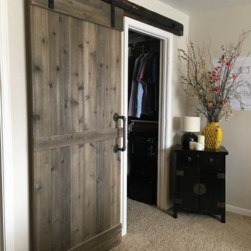
This homeowner wanted to eliminate a master closet door that encroached into their space and opted to have this custom sliding barn door constructed and installed in order to upscale the space as well as increase functionality.
Sponsored
Fredericksburg, OH

High Point Cabinets
Columbus' Experienced Custom Cabinet Builder | 4x Best of Houzz Winner
 Randy Angell Designs
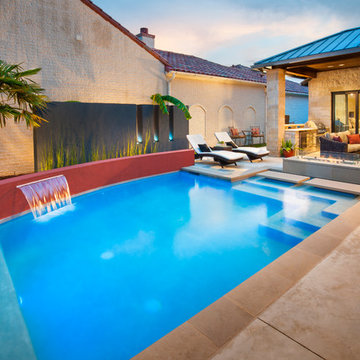
This project is proof that the challenges posed by limited space and accessibility can always be overcome in order to deliver stunning results. The space itself was rather small and also very close to the neighboring residence. Not only was the neighboring wall imposing, it was also of a completely different design style.
The goal here was to create a layering effect with numerous features of varying heights. Not only would this add depth and dimension to the overall design, but it would cause the viewer to shift their focus from the encroaching wall to the beauty of the pool space.
Instead of trying to maximize the water area by squaring off the pool, I decided to instead maximize the visual interest by gracefully rounding off the back wall of the pool. This was accomplished by implementing a raised stucco wall, and also a shorter, matching curved wall, featuring a "Sheer Descent" waterfall.
Inside the taller, deep-plum stucco wall, I created three vertical windows which are all highlighted by LED uplighting. To give depth, dimension and some natural beauty, I implemented a simple bed of Horse Tail Reeds behind the short wall, and chose to place Banana Trees behind the taller wall.
The main seating area is just outside the home's master suite, and is separated by a "Leuder" limestone fire pit. Aside from being a striking design feature, the floating stepper pads accomplish a number of things; they serve triple-duty as a walkway, a seating area adjacent to the fire pit, and also as a poolside rest for beverages.
After discovering that the narrow courtyard acted as a sort of wind tunnel between the two houses, we opted to install tempered glass in order to better control the behavior of the flames. This solved the problem while remaining visually pleasing to the client as well.
You'll notice in some of the leading photos for this project that I had originally intended to implement stepper pads on both sides of the pool closest to the house. And despite a thorough understanding of what would be necessary on an engineering and structural-design basis, we were eventually forced to turn this into a solid deck due to unrelenting city-required setbacks. However the client remained very understanding due to encountering a number of similar issues in their home-build process.
In the end, they were delivered an outstanding pool design that had come to fruition only after coming up with numerous solutions to a number of challenges that only a unique space like this could provide.
 User
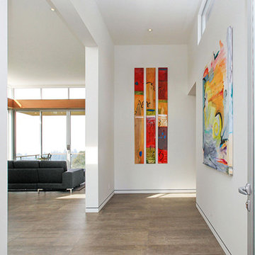
UserThis hillside home in Piedmont, CA was remodeled to change the style from a 1940's rancher with eight foot ceilings and dark interiors, into a modern geometric composition with vast white interiors for casual living and generous daylighting for displaying the artist-owner's works.
In a city known for rigorous and difficult design review, an addition, two variances, and a full stylistic change were unanimously approved on the first round. All sloped roofs and attics were eliminated and replaced by a series of stacked and overlapping flat roofs. This made the house taller on the inside and shorter on the outside, which helped earn design review cooperation in the community. Windows were concentrated toward the rear yard views or moved up high on the side walls for daylight and privacy, benefitting the owners as well as the neighbors.
At the start, the owner husband was so enthusiastic and engaged in transforming his house into something modern that he presented the architect with a scaled foamcore model, rather than the usual magazine clippings and wish list. He participated in the design decisions throughout the process. The owner wife is the artist who did all the artwork in the house. She had been craving a display space with large walls and good natural light. Both of them loved the location and great views.
The project was an opportunity to transform the style of an older traditional home into a modern one, while solving numerous problems. By rebuilding the 1800 ft2 top of the 3-story home it was possible to change the style of the whole building, since the lower floors were a neutral base, and also to change the lifestyle of the owners, who wanted to move their master suite upstairs and live primarily on the top floor as empty nesters.
Going into the project, the architect knew there were multiple encroachments into the setbacks and potential privacy issues with close by neighbors. He approached this as a complex puzzle made up of architectural and political pieces which all had to fit together elegantly. It took many careful moves, small and large, to arrive at a serene and cohesive result that tied old and new together seamlessly.
The design-build contractor worked closely with the owners and handled all of the construction phase documents and design adjustments, adding ideas of their own to make the project really sing.
The project was a collaboration in three acts. The owner had a strong design concept from the start. The architect developed it into a realistic project and garnered the design approvals. Then the contractor executed brilliantly.
 Daniel Krienbuehl Contractors Inc.
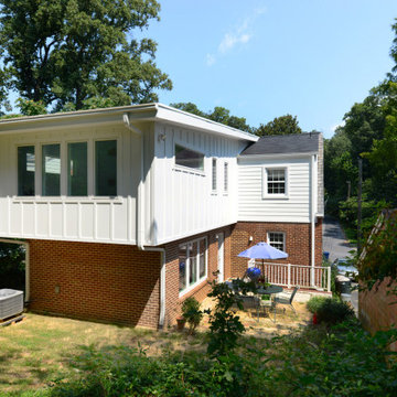
This project began with a sketch from our client that they'd received from a friend. It gave us a general idea of what they wanted but adjustments needed to be made for us to keep the renovation within budget. There were plenty of challenges in the designing and building stages. Early on, we learned the main structure of this 1940s house was encroaching the building restriction line. To remain within zoning limits, we needed to have two corners of the new addition slightly out of square. The new structure, cantilevered on both sides, required a heavy 45-degree angle beam to carry the load of the second floor and the roof. We equipped the house with central AC and expanded the existing hydronic heating system into the new space. The completed addition resulted in a shared music room and in-law suite with a bathroom on the first floor, and a master bedroom, bath, and hall bath on the second floor.
 TKS Design Group
Free ebook, Creating the Ideal Kitchen. DOWNLOAD NOW
This was a fun and special project for me to work on – it’s my parent’s new (to them) townhome. Downsizing from their previous home, and I collaborated with my architect father on redesigning their kitchen and master bathroom.
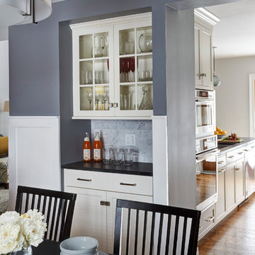
Opening up the layout on the 1st floor was on the top of their list. They hoped to make it possible for whoever was cooking in the kitchen was still able to interact with people in family room and the dining room easily. An existing wall between the family room and the kitchen, made the kitchen feel cut off from the rest of the house.
By removing the wall, we were able to turn the kitchen layout from the standard "U" shape kitchen to a galley which allowed for more storage and countertop space. White Dove frameless cabinetry from Woodharbor was used to give the space a light and fresh feel, while maximizing space within for easy storage. A built in-hutch in the dining room was added for additional storage without encroaching in the room itself.
The master bathroom was completely remodeled as well from head-to-toe. The existing layout was not conducive to my parent’s daily lifestyle. It had one vanity, an awkward corner tub with a just as awkward corner shower which seemed more like a dungeon than a shower. We gutted the existing bathroom, relocated a wall to create a large walk-in closet, omitted the tub, and created a nice spa like shower. The new layout also allowed them to have a double vanity with a small make-up area in between.
Some features we added into the bathroom were heated floors, which are especially nice during the cold Chicago winters, custom marble tile as an accent in the shower, and a custom shower enclosure which really kept the room open.
Designed by: Keri Pryde
Photography by: Mike Kaskal
For more information on kitchen and bath design ideas go to: www.kitchenstudio-ge.com
 Rachel Mathai Interior Design
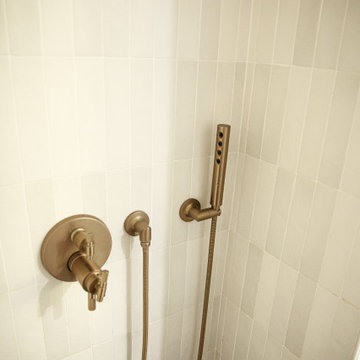
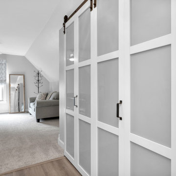
Primary Bedroom remodel with an adjoining Primary Bath addition. A space-saving track door separates the elegantly minimalist bedroom, where a Samsung Frame TV offers modern entertainment without encroaching on the room’s aesthetic. The en suite bath features a thermostatic brass rain shower and handheld spray, complemented by a toiletry ledge designed to accommodate items of any size. The deep, wide soaking tub, framed with a wooden apron, offers a serene view of the outdoors, creating a sense of closeness to nature.
A freestanding white oak double vanity with a Carrara marble top, wall-mounted faucets, and mirrored medicine cabinets maintain a sleek, minimalist look while keeping essentials within easy reach. The adjoining walk-in closet is outfitted with custom shelving that not only meets all storage needs but also enhances the room’s overall appeal.
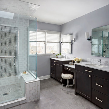 TKS Design Group
Free ebook, Creating the Ideal Kitchen. DOWNLOAD NOW
This was a fun and special project for me to work on – it’s my parent’s new (to them) townhome. Downsizing from their previous home, and I collaborated with my architect father on redesigning their kitchen and master bathroom.
Opening up the layout on the 1st floor was on the top of their list. They hoped to make it possible for whoever was cooking in the kitchen was still able to interact with people in family room and the dining room easily. An existing wall between the family room and the kitchen, made the kitchen feel cut off from the rest of the house.
By removing the wall, we were able to turn the kitchen layout from the standard "U" shape kitchen to a galley which allowed for more storage and countertop space. White Dove frameless cabinetry from Woodharbor was used to give the space a light and fresh feel, while maximizing space within for easy storage. A built in-hutch in the dining room was added for additional storage without encroaching in the room itself.
The master bathroom was completely remodeled as well from head-to-toe. The existing layout was not conducive to my parent’s daily lifestyle. It had one vanity, an awkward corner tub with a just as awkward corner shower which seemed more like a dungeon than a shower. We gutted the existing bathroom, relocated a wall to create a large walk-in closet, omitted the tub, and created a nice spa like shower. The new layout also allowed them to have a double vanity with a small make-up area in between.
Some features we added into the bathroom were heated floors, which are especially nice during the cold Chicago winters, custom marble tile as an accent in the shower, and a custom shower enclosure which really kept the room open.
Designed by: Keri Pryde
Photography by: Mike Kaskal
For more information on kitchen and bath design ideas go to: www.kitchenstudio-ge.com
Sponsored
Columbus, OH

HomeCraft Remodeling
Custom Craftsmanship & Build Solutions in Franklin County, Ohio
 Randy Angell Designs
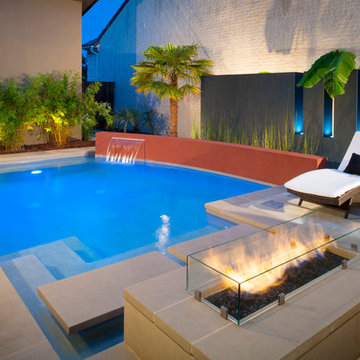
This project is proof that the challenges posed by limited space and accessibility can always be overcome in order to deliver stunning results. The space itself was rather small and also very close to the neighboring residence. Not only was the neighboring wall imposing, it was also of a completely different design style.
The goal here was to create a layering effect with numerous features of varying heights. Not only would this add depth and dimension to the overall design, but it would cause the viewer to shift their focus from the encroaching wall to the beauty of the pool space.
Instead of trying to maximize the water area by squaring off the pool, I decided to instead maximize the visual interest by gracefully rounding off the back wall of the pool. This was accomplished by implementing a raised stucco wall, and also a shorter, matching curved wall, featuring a "Sheer Descent" waterfall.
Inside the taller, deep-plum stucco wall, I created three vertical windows which are all highlighted by LED uplighting. To give depth, dimension and some natural beauty, I implemented a simple bed of Horse Tail Reeds behind the short wall, and chose to place Banana Trees behind the taller wall.
The main seating area is just outside the home's master suite, and is separated by a "Leuder" limestone fire pit. Aside from being a striking design feature, the floating stepper pads accomplish a number of things; they serve triple-duty as a walkway, a seating area adjacent to the fire pit, and also as a poolside rest for beverages.
After discovering that the narrow courtyard acted as a sort of wind tunnel between the two houses, we opted to install tempered glass in order to better control the behavior of the flames. This solved the problem while remaining visually pleasing to the client as well.
You'll notice in some of the leading photos for this project that I had originally intended to implement stepper pads on both sides of the pool closest to the house. And despite a thorough understanding of what would be necessary on an engineering and structural-design basis, we were eventually forced to turn this into a solid deck due to unrelenting city-required setbacks. However the client remained very understanding due to encountering a number of similar issues in their home-build process.
In the end, they were delivered an outstanding pool design that had come to fruition only after coming up with numerous solutions to a number of challenges that only a unique space like this could provide.
 HA Architecture
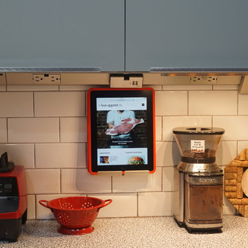
Within the confines of a strict budget, we assisted a South Austin client who desired an updated kitchen and dining area as well as a new private master bedroom with ensuite and laundry / mudroom area. The existing ranch style home was transformed with only a modest addition but a clever reorganization of space.
An under cabinet power and ipad docking strip from Legrand provided functional quality while not encroaching on needed kitchen counter space.
 Truitt and White Window and Door Showroom
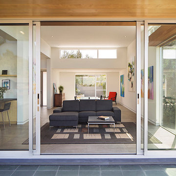
This hillside home in Piedmont, CA was remodeled to change the style from a 1940's rancher with eight foot ceilings and dark interiors, into a modern geometric composition with vast white interiors for casual living and generous daylighting for displaying the artist-owner's works.
In a city known for rigorous and difficult design review, an addition, two variances, and a full stylistic change were unanimously approved on the first round. All sloped roofs and attics were eliminated and replaced by a series of stacked and overlapping flat roofs. This made the house taller on the inside and shorter on the outside, which helped earn design review cooperation in the community. Windows were concentrated toward the rear yard views or moved up high on the side walls for daylight and privacy, benefitting the owners as well as the neighbors.
At the start, the owner husband was so enthusiastic and engaged in transforming his house into something modern that he presented the architect with a scaled foamcore model, rather than the usual magazine clippings and wish list. He participated in the design decisions throughout the process. The owner wife is the artist who did all the artwork in the house. She had been craving a display space with large walls and good natural light. Both of them loved the location and great views.
The project was an opportunity to transform the style of an older traditional home into a modern one, while solving numerous problems. By rebuilding the 1800 ft2 top of the 3-story home it was possible to change the style of the whole building, since the lower floors were a neutral base, and also to change the lifestyle of the owners, who wanted to move their master suite upstairs and live primarily on the top floor as empty nesters.
Going into the project, the architect knew there were multiple encroachments into the setbacks and potential privacy issues with close by neighbors. He approached this as a complex puzzle made up of architectural and political pieces which all had to fit together elegantly. It took many careful moves, small and large, to arrive at a serene and cohesive result that tied old and new together seamlessly.
The design-build contractor worked closely with the owners and handled all of the construction phase documents and design adjustments, adding ideas of their own to make the project really sing.
The project was a collaboration in three acts. The owner had a strong design concept from the start. The architect developed it into a realistic project and garnered the design approvals. Then the contractor executed brilliantly
 Rhonda Kieson Designs
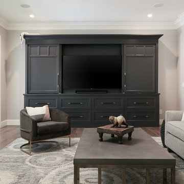
Here is custom-designed entertainment center that gets your attention but doesn't encroach on the room. Quiet elegance with a great deal of comfortable charm. The doors leading to the sunroom let in all kinds of natural light. Time to sit back, relax, and enjoy the show.
Photo: Voelker Photo LLC
Sponsored
Sunbury, OH

J.Holderby - Renovations
Franklin County's Leading General Contractors - 2X Best of Houzz!
 Truitt and White Window and Door Showroom
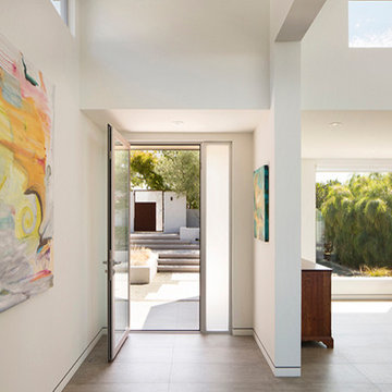
This hillside home in Piedmont, CA was remodeled to change the style from a 1940's rancher with eight foot ceilings and dark interiors, into a modern geometric composition with vast white interiors for casual living and generous daylighting for displaying the artist-owner's works.
In a city known for rigorous and difficult design review, an addition, two variances, and a full stylistic change were unanimously approved on the first round. All sloped roofs and attics were eliminated and replaced by a series of stacked and overlapping flat roofs. This made the house taller on the inside and shorter on the outside, which helped earn design review cooperation in the community. Windows were concentrated toward the rear yard views or moved up high on the side walls for daylight and privacy, benefitting the owners as well as the neighbors.
At the start, the owner husband was so enthusiastic and engaged in transforming his house into something modern that he presented the architect with a scaled foamcore model, rather than the usual magazine clippings and wish list. He participated in the design decisions throughout the process. The owner wife is the artist who did all the artwork in the house. She had been craving a display space with large walls and good natural light. Both of them loved the location and great views.
The project was an opportunity to transform the style of an older traditional home into a modern one, while solving numerous problems. By rebuilding the 1800 ft2 top of the 3-story home it was possible to change the style of the whole building, since the lower floors were a neutral base, and also to change the lifestyle of the owners, who wanted to move their master suite upstairs and live primarily on the top floor as empty nesters.
Going into the project, the architect knew there were multiple encroachments into the setbacks and potential privacy issues with close by neighbors. He approached this as a complex puzzle made up of architectural and political pieces which all had to fit together elegantly. It took many careful moves, small and large, to arrive at a serene and cohesive result that tied old and new together seamlessly.
The design-build contractor worked closely with the owners and handled all of the construction phase documents and design adjustments, adding ideas of their own to make the project really sing.
The project was a collaboration in three acts. The owner had a strong design concept from the start. The architect developed it into a realistic project and garnered the design approvals. Then the contractor executed brilliantly
 TKS Design Group
Free ebook, Creating the Ideal Kitchen. DOWNLOAD NOW
This was a fun and special project for me to work on – it’s my parent’s new (to them) townhome. Downsizing from their previous home, and I collaborated with my architect father on redesigning their kitchen and master bathroom.
Opening up the layout on the 1st floor was on the top of their list. They hoped to make it possible for whoever was cooking in the kitchen was still able to interact with people in family room and the dining room easily. An existing wall between the family room and the kitchen, made the kitchen feel cut off from the rest of the house.
By removing the wall, we were able to turn the kitchen layout from the standard "U" shape kitchen to a galley which allowed for more storage and countertop space. White Dove frameless cabinetry from Woodharbor was used to give the space a light and fresh feel, while maximizing space within for easy storage. A built in-hutch in the dining room was added for additional storage without encroaching in the room itself.
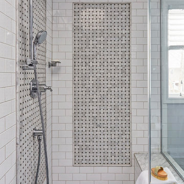
The master bathroom was completely remodeled as well from head-to-toe. The existing layout was not conducive to my parent’s daily lifestyle. It had one vanity, an awkward corner tub with a just as awkward corner shower which seemed more like a dungeon than a shower. We gutted the existing bathroom, relocated a wall to create a large walk-in closet, omitted the tub, and created a nice spa like shower. The new layout also allowed them to have a double vanity with a small make-up area in between.
Some features we added into the bathroom were heated floors, which are especially nice during the cold Chicago winters, custom marble tile as an accent in the shower, and a custom shower enclosure which really kept the room open.
Designed by: Keri Pryde
Photography by: Mike Kaskal
For more information on kitchen and bath design ideas go to: www.kitchenstudio-ge.com
 User
UserThis hillside home in Piedmont, CA was remodeled to change the style from a 1940's rancher with eight foot ceilings and dark interiors, into a modern geometric composition with vast white interiors for casual living and generous daylighting for displaying the artist-owner's works.
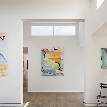
In a city known for rigorous and difficult design review, an addition, two variances, and a full stylistic change were unanimously approved on the first round. All sloped roofs and attics were eliminated and replaced by a series of stacked and overlapping flat roofs. This made the house taller on the inside and shorter on the outside, which helped earn design review cooperation in the community. Windows were concentrated toward the rear yard views or moved up high on the side walls for daylight and privacy, benefitting the owners as well as the neighbors.
At the start, the owner husband was so enthusiastic and engaged in transforming his house into something modern that he presented the architect with a scaled foamcore model, rather than the usual magazine clippings and wish list. He participated in the design decisions throughout the process. The owner wife is the artist who did all the artwork in the house. She had been craving a display space with large walls and good natural light. Both of them loved the location and great views.
The project was an opportunity to transform the style of an older traditional home into a modern one, while solving numerous problems. By rebuilding the 1800 ft2 top of the 3-story home it was possible to change the style of the whole building, since the lower floors were a neutral base, and also to change the lifestyle of the owners, who wanted to move their master suite upstairs and live primarily on the top floor as empty nesters.
Going into the project, the architect knew there were multiple encroachments into the setbacks and potential privacy issues with close by neighbors. He approached this as a complex puzzle made up of architectural and political pieces which all had to fit together elegantly. It took many careful moves, small and large, to arrive at a serene and cohesive result that tied old and new together seamlessly.
The design-build contractor worked closely with the owners and handled all of the construction phase documents and design adjustments, adding ideas of their own to make the project really sing.
The project was a collaboration in three acts. The owner had a strong design concept from the start. The architect developed it into a realistic project and garnered the design approvals. Then the contractor executed brilliantly.
4