
Search results for "Master issues" in Home Design Ideas
 Mottram Architecture
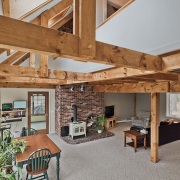
Timber frame homes offer unique challenges during a remodel. What often makes them beautiful and attractive to most homeowners, also makes them challenging for space requirements.
Context: The lovely couple that owned this home were struggling with some interesting floor plan challenges that just didn't work for their family. The loved the beautiful timbers and woodwork of their home, but the dramatically sloping ceilings on the second floor, particularly in the bathroom, just didn't work for this 1 1/2 bath home. Needing to use the skylight to approach the toilet was a less then ideal scenario. Although the bathroom footprint was more then adequate, the sloped ceiling only made half of the space useable. Check out the Before/After post on our blog to see the photos of the house pre-renovation. As much as they loved all the wood features in their home, another challenge they had was light. The wood ceiling made everything inside the house darker, even with a fantastic array of south facing windows, there were spaces in the home that felt dark and small. When they contacted us they wanted to know how could they make their brighter and more inviting, were there solutions to the 2nd floor sloped ceiling issues, and if they were going to do all of this work, how could they make their home more comfortable and efficient. A nagging water leak in the upstairs bathroom spurred them into action and here is how we solved their dilemma.
Conclusion: First, we added a little dormer to the rear of the house so we could get full headroom in nearly all of the upstairs bathroom! Then we decided to extend that dormer one more timber bay over to create a walk in closet with natural light and plenty of space. Since we were contemplating energy efficiency, we resolved a nagging issue that is present in a lot of timber frame construction, air tightness. Commonly found in timber frame construction, fiberglass insulation is installed in the rafter bays and board ceilings are installed over top. Unfortunately, board ceilings are anything but air tight, and fiberglass insulation needs to be in an airtight cavity for maximum effectiveness. So we were able to solve two issues at the same time for this homeowner. We removed the board ceiling and fiberglass insulation, we dense packed the rafter bays with cellulose insulation, and installed sheetrock in place of the boards. The boards were salvaged for re-use by the homeowner, and the space and light quality was dramatically improved. Some may think that losing the board ceiling took something away from the space, but what you'll see in the pictures is that it highly accentuates the heavy timbers and really makes them stand out in a beautiful way. Now with this added airtightness, better insulation, and brighter space, the homeowner hardly runs their wood stove, and it's so quiet in the space, an added bonus from changing the insulation. It became necessary to also add a sheetrock ceiling to the living room to hide the plumbing from the new bathroom layout above. Changing this ceiling gave the homeowner some real quality lighting that was lacking in the living room before. The brighter ceiling and new lighting layout completely transforms the living room into a space you want to hang out, even though the layout didn't change at all. When the homeowner saw the finished spaces she said "I can't believe this is my house, I want to live in this house"
Energy Efficiency: I touched a little on the efficiency above, but like all projects done with Mottram Architecture, we always want to leave you with a little extra. Timber frame construction with board ceilings and fiberglass insulation are notoriously leaky! If you want to know what we think about fiberglass insulation, check our our blog post on Why Fiberglass Insulation Sucks. By installing cellulose insulation and covering it with sheetrock we were able to greatly reduce the heat flowing out of this home. It not only improves cashflow it improves the comfort level in the space. Who wants to sit in their living room and feel a draft? Let us remind you, we are not saying cellulose insulation is an air barrier, we use the sheetrock to help with that, but it does significantly reduce the air flow over fiberglass insulation. And when we reduce the airflow, we reduce the heat flow. And when we reduce the heat flow, we reduce the need to re-heat that drafty air from outside. When it comes to energy efficiency the first and best place to start is air infiltration. We greatly reduced the air infiltration with the new insulation, but we also added a hat and warm boots. What I mean by that is, we improved the insulation in the roof, and we installed insulation in the basement. Maybe it's a silly analogy, but when you think about keeping warm, we always start with the hat and boots! With sustainability in mind, the next project will be to add a deck to the front of this house with rain catchment barrels from the metal roof. They are planning to plant a garden in the spring and the rain catchment system will help to irrigate the new garden.
Builder: East Shore Builders
Photographer: Michael Eric Berube
 Mottram Architecture
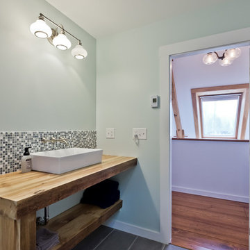
Timber frame homes offer unique challenges during a remodel. What often makes them beautiful and attractive to most homeowners, also makes them challenging for space requirements.
Context: The lovely couple that owned this home were struggling with some interesting floor plan challenges that just didn't work for their family. The loved the beautiful timbers and woodwork of their home, but the dramatically sloping ceilings on the second floor, particularly in the bathroom, just didn't work for this 1 1/2 bath home. Needing to use the skylight to approach the toilet was a less then ideal scenario. Although the bathroom footprint was more then adequate, the sloped ceiling only made half of the space useable. Check out the Before/After post on our blog to see the photos of the house pre-renovation. As much as they loved all the wood features in their home, another challenge they had was light. The wood ceiling made everything inside the house darker, even with a fantastic array of south facing windows, there were spaces in the home that felt dark and small. When they contacted us they wanted to know how could they make their brighter and more inviting, were there solutions to the 2nd floor sloped ceiling issues, and if they were going to do all of this work, how could they make their home more comfortable and efficient. A nagging water leak in the upstairs bathroom spurred them into action and here is how we solved their dilemma.
Conclusion: First, we added a little dormer to the rear of the house so we could get full headroom in nearly all of the upstairs bathroom! Then we decided to extend that dormer one more timber bay over to create a walk in closet with natural light and plenty of space. Since we were contemplating energy efficiency, we resolved a nagging issue that is present in a lot of timber frame construction, air tightness. Commonly found in timber frame construction, fiberglass insulation is installed in the rafter bays and board ceilings are installed over top. Unfortunately, board ceilings are anything but air tight, and fiberglass insulation needs to be in an airtight cavity for maximum effectiveness. So we were able to solve two issues at the same time for this homeowner. We removed the board ceiling and fiberglass insulation, we dense packed the rafter bays with cellulose insulation, and installed sheetrock in place of the boards. The boards were salvaged for re-use by the homeowner, and the space and light quality was dramatically improved. Some may think that losing the board ceiling took something away from the space, but what you'll see in the pictures is that it highly accentuates the heavy timbers and really makes them stand out in a beautiful way. Now with this added airtightness, better insulation, and brighter space, the homeowner hardly runs their wood stove, and it's so quiet in the space, an added bonus from changing the insulation. It became necessary to also add a sheetrock ceiling to the living room to hide the plumbing from the new bathroom layout above. Changing this ceiling gave the homeowner some real quality lighting that was lacking in the living room before. The brighter ceiling and new lighting layout completely transforms the living room into a space you want to hang out, even though the layout didn't change at all. When the homeowner saw the finished spaces she said "I can't believe this is my house, I want to live in this house"
Energy Efficiency: I touched a little on the efficiency above, but like all projects done with Mottram Architecture, we always want to leave you with a little extra. Timber frame construction with board ceilings and fiberglass insulation are notoriously leaky! If you want to know what we think about fiberglass insulation, check our our blog post on Why Fiberglass Insulation Sucks. By installing cellulose insulation and covering it with sheetrock we were able to greatly reduce the heat flowing out of this home. It not only improves cashflow it improves the comfort level in the space. Who wants to sit in their living room and feel a draft? Let us remind you, we are not saying cellulose insulation is an air barrier, we use the sheetrock to help with that, but it does significantly reduce the air flow over fiberglass insulation. And when we reduce the airflow, we reduce the heat flow. And when we reduce the heat flow, we reduce the need to re-heat that drafty air from outside. When it comes to energy efficiency the first and best place to start is air infiltration. We greatly reduced the air infiltration with the new insulation, but we also added a hat and warm boots. What I mean by that is, we improved the insulation in the roof, and we installed insulation in the basement. Maybe it's a silly analogy, but when you think about keeping warm, we always start with the hat and boots! With sustainability in mind, the next project will be to add a deck to the front of this house with rain catchment barrels from the metal roof. They are planning to plant a garden in the spring and the rain catchment system will help to irrigate the new garden.
Builder: East Shore Builders
Photographer: Michael Eric Berube
 Mottram Architecture
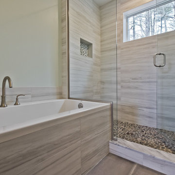
Timber frame homes offer unique challenges during a remodel. What often makes them beautiful and attractive to most homeowners, also makes them challenging for space requirements.
Context: The lovely couple that owned this home were struggling with some interesting floor plan challenges that just didn't work for their family. The loved the beautiful timbers and woodwork of their home, but the dramatically sloping ceilings on the second floor, particularly in the bathroom, just didn't work for this 1 1/2 bath home. Needing to use the skylight to approach the toilet was a less then ideal scenario. Although the bathroom footprint was more then adequate, the sloped ceiling only made half of the space useable. Check out the Before/After post on our blog to see the photos of the house pre-renovation. As much as they loved all the wood features in their home, another challenge they had was light. The wood ceiling made everything inside the house darker, even with a fantastic array of south facing windows, there were spaces in the home that felt dark and small. When they contacted us they wanted to know how could they make their brighter and more inviting, were there solutions to the 2nd floor sloped ceiling issues, and if they were going to do all of this work, how could they make their home more comfortable and efficient. A nagging water leak in the upstairs bathroom spurred them into action and here is how we solved their dilemma.
Conclusion: First, we added a little dormer to the rear of the house so we could get full headroom in nearly all of the upstairs bathroom! Then we decided to extend that dormer one more timber bay over to create a walk in closet with natural light and plenty of space. Since we were contemplating energy efficiency, we resolved a nagging issue that is present in a lot of timber frame construction, air tightness. Commonly found in timber frame construction, fiberglass insulation is installed in the rafter bays and board ceilings are installed over top. Unfortunately, board ceilings are anything but air tight, and fiberglass insulation needs to be in an airtight cavity for maximum effectiveness. So we were able to solve two issues at the same time for this homeowner. We removed the board ceiling and fiberglass insulation, we dense packed the rafter bays with cellulose insulation, and installed sheetrock in place of the boards. The boards were salvaged for re-use by the homeowner, and the space and light quality was dramatically improved. Some may think that losing the board ceiling took something away from the space, but what you'll see in the pictures is that it highly accentuates the heavy timbers and really makes them stand out in a beautiful way. Now with this added airtightness, better insulation, and brighter space, the homeowner hardly runs their wood stove, and it's so quiet in the space, an added bonus from changing the insulation. It became necessary to also add a sheetrock ceiling to the living room to hide the plumbing from the new bathroom layout above. Changing this ceiling gave the homeowner some real quality lighting that was lacking in the living room before. The brighter ceiling and new lighting layout completely transforms the living room into a space you want to hang out, even though the layout didn't change at all. When the homeowner saw the finished spaces she said "I can't believe this is my house, I want to live in this house"
Energy Efficiency: I touched a little on the efficiency above, but like all projects done with Mottram Architecture, we always want to leave you with a little extra. Timber frame construction with board ceilings and fiberglass insulation are notoriously leaky! If you want to know what we think about fiberglass insulation, check our our blog post on Why Fiberglass Insulation Sucks. By installing cellulose insulation and covering it with sheetrock we were able to greatly reduce the heat flowing out of this home. It not only improves cashflow it improves the comfort level in the space. Who wants to sit in their living room and feel a draft? Let us remind you, we are not saying cellulose insulation is an air barrier, we use the sheetrock to help with that, but it does significantly reduce the air flow over fiberglass insulation. And when we reduce the airflow, we reduce the heat flow. And when we reduce the heat flow, we reduce the need to re-heat that drafty air from outside. When it comes to energy efficiency the first and best place to start is air infiltration. We greatly reduced the air infiltration with the new insulation, but we also added a hat and warm boots. What I mean by that is, we improved the insulation in the roof, and we installed insulation in the basement. Maybe it's a silly analogy, but when you think about keeping warm, we always start with the hat and boots! With sustainability in mind, the next project will be to add a deck to the front of this house with rain catchment barrels from the metal roof. They are planning to plant a garden in the spring and the rain catchment system will help to irrigate the new garden.
Builder: East Shore Builders
Photographer: Michael Eric Berube
Find the right local pro for your project

 Interiors By Agostino's
Interior Design Naples, FL
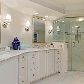
Corner shower - transitional corner shower idea in Miami with raised-panel cabinets and white cabinets
Corner shower - transitional corner shower idea in Miami with raised-panel cabinets and white cabinets
 BuilderElements
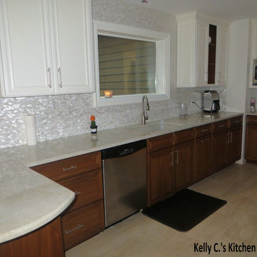
Collection: Light Weight Mother of Pearl Tile
Material: Seashell
Color: Natural White, majority chips are white, with small percentage of natural yellow and minimun natural grey; overall is white
Surface Finish: Glossy, easy for cleaning
Shape: Subway
Size: 12 x 12 In.305*305mm
Chip Size: 3/5 x 1-1/6 In.15*30mm
Thickness: 2mm
Detailed Description: Each sheet of this tile is approximately 1 sq ft per sheet and is mesh mounted on high quality fiber glass for easy installation of your mosaic tile projects.
Application: Mother of Pearl mosaic tiles are impervious to the elements, thus it is great for both interior and exterior use so moisture is not an issue. Mother of Pearl mosaic tiles are great on floors and walls and have been most popular in bathrooms, spas, kitchen backsplash, wall facades and pools as well as a variety of other applications.
Characteristics: The mother of pearl mosaic tile has a zero water absorption rate, and this tile exceeds ANSI standards for water absorption for mosaic tile. It is strong, durable, contamination free, and only the best quality tiles are selected as our tiles are inspected for blemishes before shipment.
Brand Name: Home Elements
Manufacturer: Home Elements,Inc. This manufacturer has the biggest selections of glass mosaic tiles.
Disclaimer: Mother of pearl tile, also called shell tile or shell mosaic tile, is 100% natural and green products made of natural shell, polished and processed by hands. The color variation and occasionally small size variation naturally exist from chip to chip, from sheet to sheet, from job to job. However, the overall sizes are consistent and will NOT have any negative impact on installation; on the contrary, some small variations on sizes reflect the nature of the products thus making your wall or floor tiling project a more natural one. Also, the color variation caused by different computer screen or browser exists from different pc screens. Therefore, the possible color/size variations between the mother of pearl tile sample and actual shipment or the product color shown on the screen and actual shipment should not be considered as quality issues.
 Reidy Creative
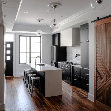
Complete kitchen renovation including creation of a tray ceiling, new window and door, lighting and storage components.
Eat-in kitchen - mid-sized contemporary galley medium tone wood floor, brown floor and tray ceiling eat-in kitchen idea in Baltimore with an undermount sink, flat-panel cabinets, black cabinets, quartz countertops, white backsplash, brick backsplash, stainless steel appliances, an island and white countertops
Eat-in kitchen - mid-sized contemporary galley medium tone wood floor, brown floor and tray ceiling eat-in kitchen idea in Baltimore with an undermount sink, flat-panel cabinets, black cabinets, quartz countertops, white backsplash, brick backsplash, stainless steel appliances, an island and white countertops

 Horizon Interior Design
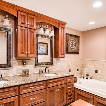
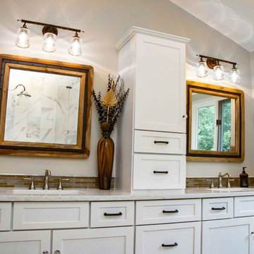
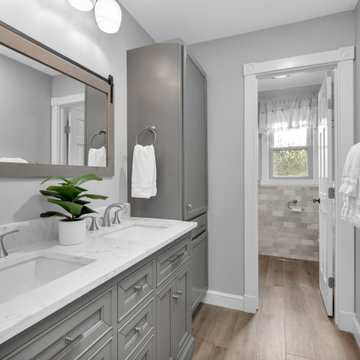
A family of four with two young girls and cats needed a brand new master bath to accommodate a family member with MS. They tasked us with creating a luxurious master bath in a modern rustic style that was ADA-accessible and could accommodate the client's walker and wheelchair in the future.
Their key issues were that the shower was relatively small, with a curb the client had to step over. They also had a large jacuzzi tub with a tub deck built around it, but the couple never used it. The main bathroom only had one vanity with minimal counter space available, and the dated finishes and materials looked tired - so they were more than ready for a beautiful transformation.
To create an ADA-accessible main bath, we relocated the shower to an interior corner, allowing for the addition of a larger ADA-accessible shower with zero entry and a bench the client could easily transfer onto for bathing. The arrangement of this space would also allow for a walker and wheelchair to easily move through the walkways for access to the shower.
We moved the toilet to where the shower had been located originally with ADA accessibility features and installed luxurious double vanities along the entire vanity wall, with a modern linen tower cabinet for added storage. Since the client loved the modern rustic aesthetic, we incorporated their chosen style with elements like the Calacatta porcelain tile, cabinet hardware, mason jar lights, and wood-framed mirrors.
 Tiffany Brooks, HGTV Host & Interior Designer
Inquire About Our Design Services
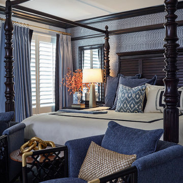
When we first started talking in the spring of 2015, I was impressed. She was witty, realistic, and understood that as much as she loves my shows on HGTV, design does not does not happen in 43 minutes! She told me about her space, and how she felt that her bedroom seemed “blah” to her. She had no retreat. Molly desperately longed for a place that she could spend time in, read in, play in and above all, relax in.
What we did:
Many people are terrified of hiring a designer. Rightfully so, they are investing a pretty penny in their homes. They want to make sure that everything, down to the last floral arrangement, is to their liking, because they will have to live it (and pay for it). Unfortunately, a client can unintentionally stifle a designer’s creativity through micro-management. This can produce lackluster results and ultimately cause more time (and money) to be spent on a project than is really necessary.
With Molly, that was never an issue. Before she even showed me the room in question, she said that I could have full creative license to do what I needed to do to her bedroom. SAY WHAAH!?
With Molly giving me complete creative freedom, I planned everything out and got down to business. The result: Bite-your-bottom-lip sexy. I don’t get jealous of too many of my clients’ spaces, but this one still takes my breath away every time I look at the pics!
The craziest part was that by adding more furniture, it actually made the space feel larger.
Molly and her husband Patrick loved the finished space, and promised me I will be back to finish the rest of the house!
Here’s the highlights of the rest of the project:
I came up with a space plan with three options.
Next, we reviewed mood boards and fabric schemes that would work for both Molly and her hubby Patrick.
We started with the bed. My goal was to add edge to its otherwise traditional style.
We decided to spice things up by painting the trim work in the room black.
We built in layers of lighting with dimmers. In a bedroom everything should be on dimmers, right? Right.
We designed and customized bedding, chairs and window treatments.
Together with Molly, we selected the most perfect wallpaper. This geometric “grasscloth” adds so much depth and dimension that was just missing before.
What I love:
That light fixture. I mean it is really, really amazing in person.
The porcupine mirror. This thing came packaged like it was the hope diamond, and everyone was terrified to handle it. But it really became a highlight of the room.
 Marcelle Guilbeau Interior Design
Steven Long Photography
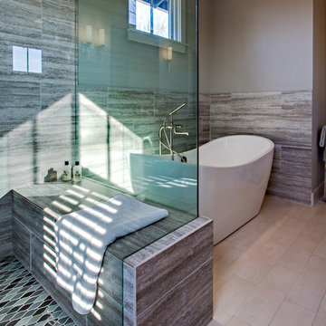
Example of a trendy master gray tile ceramic tile bathroom design in Nashville with an undermount sink, flat-panel cabinets, gray cabinets and gray walls
Example of a trendy master gray tile ceramic tile bathroom design in Nashville with an undermount sink, flat-panel cabinets, gray cabinets and gray walls
 Jordan Design Build Group
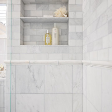
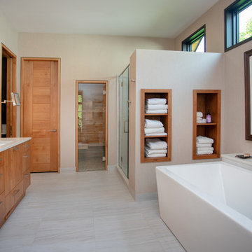
An old stone mansion built in 1924 had seen a number of renovations over the decades and the time had finally come to address a growing list of issues. All of the home’s bathrooms needed to be fully gutted and completely redone. In the master bathroom, we took this opportunity to rearrange the layout to incorporate a double vanity and relocate the toilet (the former bathroom had only a small single vanity with the toilet awkwardly located directly in front of the door). The bathtub was replaced with a generous walk-in shower complete with frameless glass and digital controls. We located a towel warmer immediately outside the shower to provide toasty towels within easy reach. A beautiful Calacatta and Bardigiglio Gray basketweave tile was used in combination with various sizes of Calacatta marble field tile and trim for a look that is both elegant and timeless.
 Edgewater Design Group
As written in Northern Home & Cottage by Elizabeth Edwards
Sara and Paul Matthews call their head-turning home, located in a sweet neighborhood just up the hill from downtown Petoskey, “a very human story.” Indeed it is. Sara and her husband, Paul, have a special-needs son as well as an energetic middle-school daughter. This home has an answer for everyone. Located down the street from the school, it is ideally situated for their daughter and a self-contained apartment off the great room accommodates all their son’s needs while giving his caretakers privacy—and the family theirs. The Matthews began the building process by taking their thoughts and
needs to Stephanie Baldwin and her team at Edgewater Design Group. Beyond the above considerations, they wanted their new home to be low maintenance and to stand out architecturally, “But not so much that anyone would complain that it didn’t work in our neighborhood,” says Sara. “We
were thrilled that Edgewater listened to us and were able to give us a unique-looking house that is meeting all our needs.” Lombardy LLC built this handsome home with Paul working alongside the construction crew throughout the project. The low maintenance exterior is a cutting-edge blend of stacked stone, black corrugated steel, black framed windows and Douglas fir soffits—elements that add up to an organic contemporary look. The use of black steel, including interior beams and the staircase system, lend an industrial vibe that is courtesy of the Matthews’ friend Dan Mello of Trimet Industries in Traverse City. The couple first met Dan, a metal fabricator, a number of years ago, right around the time they found out that their then two-year-old son would never be able to walk. After the couple explained to Dan that they couldn’t find a solution for a child who wasn’t big enough for a wheelchair, he designed a comfortable, rolling chair that was just perfect. They still use it. The couple’s gratitude for the chair resulted in a trusting relationship with Dan, so it was natural for them to welcome his talents into their home-building process. A maple floor finished to bring out all of its color-tones envelops the room in warmth. Alder doors and trim and a Doug fir ceiling reflect that warmth. Clearstory windows and floor-to-ceiling window banks fill the space with light—and with views of the spacious grounds that will
become a canvas for Paul, a retired landscaper. The couple’s vibrant art pieces play off against modernist furniture and lighting that is due to an inspired collaboration between Sara and interior designer Kelly Paulsen. “She was absolutely instrumental to the project,” Sara says. “I went through
two designers before I finally found Kelly.” The open clean-lined kitchen, butler’s pantry outfitted with a beverage center and Miele coffee machine (that allows guests to wait on themselves when Sara is cooking), and an outdoor room that centers around a wood-burning fireplace, all make for easy,
fabulous entertaining. A den just off the great room houses the big-screen television and Sara’s loom—
making for relaxing evenings of weaving, game watching and togetherness. Tourgoers will leave understanding that this house is everything great design should be. Form following function—and solving very human issues with soul-soothing style.
 Zieba Builders, Inc.
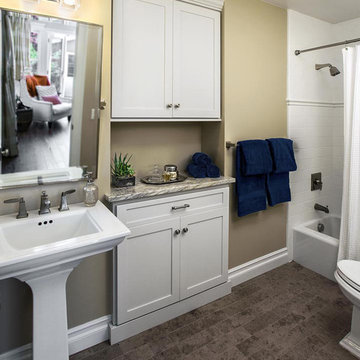
If mobility becomes an issue, the bathroom has space for a wheel chair or walker to navigate between the sink, toilet and shower. The shower walls have been reinforced to handle grab bars if needed.
Bath Design: Zieba Builders
Sponsored
Columbus, OH

HomeCraft Remodeling
Custom Craftsmanship & Build Solutions in Franklin County, Ohio
 B Designs Interior's
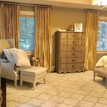
We had so much fun decorating this space. No detail was too small for Nicole and she understood it would not be completed with every detail for a couple of years, but also that taking her time to fill her home with items of quality that reflected her taste and her families needs were the most important issues. As you can see, her family has settled in.
 Anna O Design
The homeowners of this Marblehead residence wished to remodel their master bathroom, which had been redone only a few years prior. The previous renovation, however, was not a pleasant experience and they were hesitant to dive-in again. After an initial conversation, the homeowners agreed to meet with me to discuss the project.
listened to their vision for the room, paid close attention to their concerns, and desire to create a tranquil environment, that would be functional and practical for their everyday lifestyle.
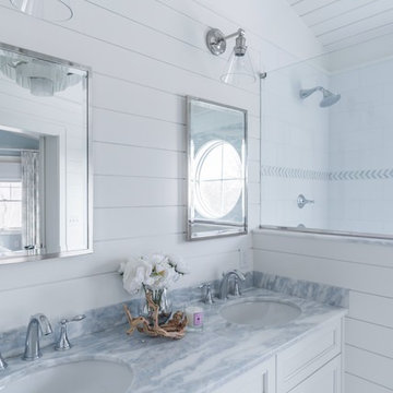
In my first walk-through of the existing bathroom, several major issues became apparent. First, the vanity, a wooden table with two vessel sinks, did not allow access to the medicine cabinets due to its depth. Second, an oversized window installed in the shower did not provide privacy and had visible signs of rot. Third, the wallpaper by the shower was peeling and contained mold due to moisture. Finally, the hardwood flooring selected was impractical for a master bathroom.
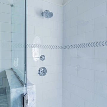
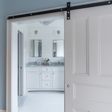
My suggestion was to incorporate timeless and classic materials that would provide longevity and create an elegant environment. I designed a standard depth custom vanity which contained plenty of storage. We chose lovely white and blue quartzite counter tops, white porcelain tile that mimic the look of Thasos marble, along with blue accents, polished chrome fixtures and coastal inspired lighting. Next, we replaced, relocated, and changed the window style and shape. We then fabricated a window frame out of the quartzite for protection which proved to give the shower a lovely focal point. Lastly, to keep with the coastal theme of the room, we installed shiplap for the walls.
The homeowners now look forward to starting and ending their day in their bright and relaxing master bath. It has become a sanctuary to escape the hustle and bustle of everyday life.
 Anna O Design
The homeowners of this Marblehead residence wished to remodel their master bathroom, which had been redone only a few years prior. The previous renovation, however, was not a pleasant experience and they were hesitant to dive-in again. After an initial conversation, the homeowners agreed to meet with me to discuss the project.
listened to their vision for the room, paid close attention to their concerns, and desire to create a tranquil environment, that would be functional and practical for their everyday lifestyle.
In my first walk-through of the existing bathroom, several major issues became apparent. First, the vanity, a wooden table with two vessel sinks, did not allow access to the medicine cabinets due to its depth. Second, an oversized window installed in the shower did not provide privacy and had visible signs of rot. Third, the wallpaper by the shower was peeling and contained mold due to moisture. Finally, the hardwood flooring selected was impractical for a master bathroom.
My suggestion was to incorporate timeless and classic materials that would provide longevity and create an elegant environment. I designed a standard depth custom vanity which contained plenty of storage. We chose lovely white and blue quartzite counter tops, white porcelain tile that mimic the look of Thasos marble, along with blue accents, polished chrome fixtures and coastal inspired lighting. Next, we replaced, relocated, and changed the window style and shape. We then fabricated a window frame out of the quartzite for protection which proved to give the shower a lovely focal point. Lastly, to keep with the coastal theme of the room, we installed shiplap for the walls.
The homeowners now look forward to starting and ending their day in their bright and relaxing master bath. It has become a sanctuary to escape the hustle and bustle of everyday life.
 Anna O Design
The homeowners of this Marblehead residence wished to remodel their master bathroom, which had been redone only a few years prior. The previous renovation, however, was not a pleasant experience and they were hesitant to dive-in again. After an initial conversation, the homeowners agreed to meet with me to discuss the project.
listened to their vision for the room, paid close attention to their concerns, and desire to create a tranquil environment, that would be functional and practical for their everyday lifestyle.
In my first walk-through of the existing bathroom, several major issues became apparent. First, the vanity, a wooden table with two vessel sinks, did not allow access to the medicine cabinets due to its depth. Second, an oversized window installed in the shower did not provide privacy and had visible signs of rot. Third, the wallpaper by the shower was peeling and contained mold due to moisture. Finally, the hardwood flooring selected was impractical for a master bathroom.
My suggestion was to incorporate timeless and classic materials that would provide longevity and create an elegant environment. I designed a standard depth custom vanity which contained plenty of storage. We chose lovely white and blue quartzite counter tops, white porcelain tile that mimic the look of Thasos marble, along with blue accents, polished chrome fixtures and coastal inspired lighting. Next, we replaced, relocated, and changed the window style and shape. We then fabricated a window frame out of the quartzite for protection which proved to give the shower a lovely focal point. Lastly, to keep with the coastal theme of the room, we installed shiplap for the walls.
The homeowners now look forward to starting and ending their day in their bright and relaxing master bath. It has become a sanctuary to escape the hustle and bustle of everyday life.

Sponsored
Sunbury, OH

J.Holderby - Renovations
Franklin County's Leading General Contractors - 2X Best of Houzz!
 Apartment 46 for the Home
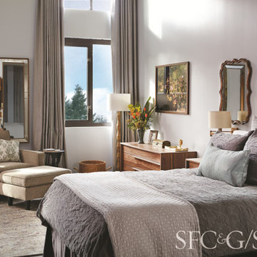
This wide shot was done for San Francisco Cottages & Gardens by photographers Keith Scott Morton and Eric Richards.
I am honored to be included alongside so many other fantastic designers in the March 2016 issue!
 Anna O Design
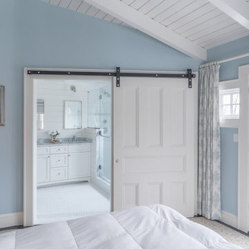
The homeowners of this Marblehead residence wished to remodel their master bathroom, which had been redone only a few years prior. The previous renovation, however, was not a pleasant experience and they were hesitant to dive-in again. After an initial conversation, the homeowners agreed to meet with me to discuss the project.
listened to their vision for the room, paid close attention to their concerns, and desire to create a tranquil environment, that would be functional and practical for their everyday lifestyle.
In my first walk-through of the existing bathroom, several major issues became apparent. First, the vanity, a wooden table with two vessel sinks, did not allow access to the medicine cabinets due to its depth. Second, an oversized window installed in the shower did not provide privacy and had visible signs of rot. Third, the wallpaper by the shower was peeling and contained mold due to moisture. Finally, the hardwood flooring selected was impractical for a master bathroom.
My suggestion was to incorporate timeless and classic materials that would provide longevity and create an elegant environment. I designed a standard depth custom vanity which contained plenty of storage. We chose lovely white and blue quartzite counter tops, white porcelain tile that mimic the look of Thasos marble, along with blue accents, polished chrome fixtures and coastal inspired lighting. Next, we replaced, relocated, and changed the window style and shape. We then fabricated a window frame out of the quartzite for protection which proved to give the shower a lovely focal point. Lastly, to keep with the coastal theme of the room, we installed shiplap for the walls.
The homeowners now look forward to starting and ending their day in their bright and relaxing master bath. It has become a sanctuary to escape the hustle and bustle of everyday life.
 Anna O Design
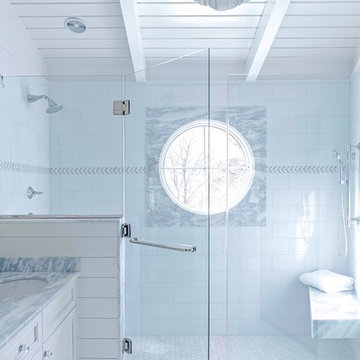
The homeowners of this Marblehead residence wished to remodel their master bathroom, which had been redone only a few years prior. The previous renovation, however, was not a pleasant experience and they were hesitant to dive-in again. After an initial conversation, the homeowners agreed to meet with me to discuss the project.
listened to their vision for the room, paid close attention to their concerns, and desire to create a tranquil environment, that would be functional and practical for their everyday lifestyle.
In my first walk-through of the existing bathroom, several major issues became apparent. First, the vanity, a wooden table with two vessel sinks, did not allow access to the medicine cabinets due to its depth. Second, an oversized window installed in the shower did not provide privacy and had visible signs of rot. Third, the wallpaper by the shower was peeling and contained mold due to moisture. Finally, the hardwood flooring selected was impractical for a master bathroom.
My suggestion was to incorporate timeless and classic materials that would provide longevity and create an elegant environment. I designed a standard depth custom vanity which contained plenty of storage. We chose lovely white and blue quartzite counter tops, white porcelain tile that mimic the look of Thasos marble, along with blue accents, polished chrome fixtures and coastal inspired lighting. Next, we replaced, relocated, and changed the window style and shape. We then fabricated a window frame out of the quartzite for protection which proved to give the shower a lovely focal point. Lastly, to keep with the coastal theme of the room, we installed shiplap for the walls.
The homeowners now look forward to starting and ending their day in their bright and relaxing master bath. It has become a sanctuary to escape the hustle and bustle of everyday life.
35