
Search results for "Master principles" in Home Design Ideas
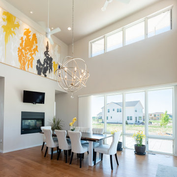

 Chapman Design Group, Inc.
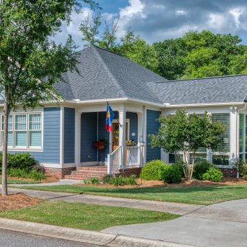
Established in 2005, Stonebridge at Rankin’s Lake is proud to be Duke Energy’s “First All-Electric Energy Star Certified Community” in South Carolina. Each home has been constructed with strict guidelines to insure each individual home will receive it’s own Energy Star certificate which in turn results in a reduced rate from Duke Energy on the energy bill for the life of the home.
Through a partnership between the architecture firm, Chapman Design Group, Inc. and it’s construction arm, Icon Construction of South Carolina, Inc., special emphasis is placed on quality construction, methods and design details a well as a stringent construction quality control standard. The total efforts, skills, resources provide unyielding commitment directed toward building superior homes that will bring our homeowners many years of comfortable and carefree living.
This 107 home community was created on a 43 acre property that was planned into two phases. Approximately 17 of these acres are to be left natural, providing the feel of an established neighborhood from the very beginning. The featured attraction is Rankin’s Lake. It is approximately 4 acres in size and was once a well-known fishing lake in Anderson in the 1940s and 50s. A stone bridge will adorn its spillway and will be constructed during the second phase of the project.
The traditional style streetscape is enhanced with grass medians separating curb lines and sidewalks. This feature is accentuated in intermittent Alee Elm Trees and decorative post streetlights throughout the neighborhood. Every front and side lawn as well as all common areas continue to be maintained on a weekly basis by a private landscape maintenance company. This perpetual maintenance provided through the Homeowner’s Association insures a constant harmonious look throughout the entire community.
From day one, several development principles were established and achieved:
• The development’s concept was designed with all water front lots facing into Rankin’s Lake to have the street running between the homes and the lake. With this concept, it allows all of the neighborhood residents and their guest to take advantage of the pathways as well as enjoy to natural scenery of the lake each time the upon entering and exiting the neighborhood. This became a positive selling point as it encouraged the selection of building sites deeper into the development once you passed the lake.
• The design concept of the development was to create a variation of the traditional home neighborhood where the homes, all with front porches are intentionally built closer to the sidewalk lined streets to encourage neighborly interaction.
• Plans were designed with the garages at the rear of the lot as to make the neighborhood less about cars and more about the home and it’s residents. This was prioritized due to many subdivisions today are designed in such a way the home’s primary feature is a front facing garage which often have two cars in the driveway… hence, Stonebridge at Rankin’s Lake want to provide an alternative.
• Each home design includes a spacious front porch, a screened porch and or a sunroom to encourage neighborly interaction and casual living.
• The floor plans include both 2 and 3 bedroom plans with 2 to 3.5 baths with all master suites remaining on the main level.
The entire development would have only Energy Star Certified homes.
 KED Interiors
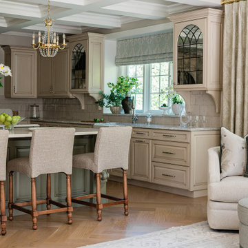
The recent redesign of the kitchen and dining nook skillfully fuses timeless French country aesthetics with modern design principles, tailored for a young couple who cherish both art and architecture. This transformation emphasizes an inviting, comfortable atmosphere without compromising on sophistication. The space uses a palette of muted colors and aged materials to achieve a subtle elegance that integrates seamlessly with the home’s intrinsic architectural charm.
Central to the kitchen are two islands, designed to facilitate both everyday living and grand entertaining. These islands not only offer extensive preparation surfaces but also serve as social hubs, making the kitchen the heart of the home. Adjacent to this area, a well-equipped scullery and a butler’s pantry enhance functionality, providing ample space for storage and meal prep without cluttering the main kitchen area.
The dining area is designed to host intimate dinners or family gatherings, while views of the stunning chandelier, sculpted ceilings and detailed millwork float above, echoing the home’s French influences. Similarly, the sitting area adjacent to the kitchen features comfortable seating and abundant natural light, creating a perfect spot for relaxation or casual conversation.
Attention to detail is evident in the decorative grates on the pantry doors, and the arched glass elements in cabinetry, all nodding to classic French design. This project masterfully balances historical reverence with modern functionality, making it an ideal setting for both lively social gatherings and serene everyday living.
Find the right local pro for your project
 Studio Zung
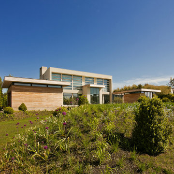
A ground up design and build of a modern seven bedroom primary residence incorporating sustainable design principles built for an international family of four. The concept revolved around the need for environmental sustainability while having plentiful communal spaces to create ease for a vibrant family and their guests. Equally important was that the private spaces functioned as a retreat.
Natural light creates shifting patterns on the opposing wall of the glass paned hallway leading from the main house past the guest bedrooms and to the master suite. Subtle color palette and interior design use contrasting tactile elements to create an environment of luxury and accessibility. The views of the pool and garden through the large and continuous windows enable an ever-present connection to nature.
 Srote & Co Architects | Planners | Interiors
This architecture and interior design project was introduced to us by the client’s contractor after their villa had been damaged extensively by a fire. The entire main level was destroyed with exception of the front study.
Srote & Co reimagined the interior layout of this St. Albans villa to give it an "open concept" and applied universal design principles to make sure it would function for our clients as they aged in place. The universal approach is seen in the flush flooring transitions, low pile rugs and carpets, wide walkways, layers of lighting and in the seated height countertop and vanity. For convenience, the laundry room was relocated to the master walk-in closet. This allowed us to create a dedicated pantry and additional storage off the kitchen where the laundry was previously housed.
All interior selections and furnishings shown were specified or procured by Srote & Co Architects.
 Studio Zung
A ground up design and build of a modern seven bedroom primary residence incorporating sustainable design principles built for an international family of four. The concept revolved around the need for environmental sustainability while having plentiful communal spaces to create ease for a vibrant family and their guests. Equally important was that the private spaces functioned as a retreat.
Natural light creates shifting patterns on the opposing wall of the glass paned hallway leading from the main house past the guest bedrooms and to the master suite. Subtle color palette and interior design use contrasting tactile elements to create an environment of luxury and accessibility. The views of the pool and garden through the large and continuous windows enable an ever-present connection to nature.
 MAR JENNINGS/S&J Multimedia LLC
America's Top Lifestyle Expert MAR Jennings hosts this fun, informative series, a top-to-bottom, inside-and-out makeover of Green Isle, a historic home in Westport, CT. You won't believe how Mar's 6 core Casual Luxury design principles guide each room's renovation and how easily they can be used in your home--they're the cure for every design dilemma.
Watch before & after transformations at marjennings.com/martv
Sponsored
Sunbury, OH

J.Holderby - Renovations
Franklin County's Leading General Contractors - 2X Best of Houzz!
 Haifa Architects
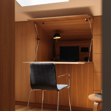
Duplex Y is located in a multi apartment building, typical to the Carmel mountain neighborhoods. The building has several entrances due to the slope it sits on.
Duplex Y has its own separate entrance and a beautiful view towards Haifa bay and the Golan Heights that can be seen on a clear weather day.
The client - a computer high-tech couple, with their two small daughters asked us for a simple and functional design that could remind them of their frequent visits to central and northern Europe. Their request has been accepted.
Our planning approach was simple indeed, maybe even simple in a radical way:
We followed the principle of clean and ultra minimal spaces, that serve their direct mission only.
Complicated geometry of the rooms has been simplified by implementing built-in wood furniture into numerous niches.
The most 'complicated' room (due to its broken geometry, narrow proportions and sloped ceiling) has been turned into a kid's room shaped as a clean 'wood box' for fun, games and 'edutainment'.
The storage room has been refurbished to maximize it's purpose by creating enough space to store 90% of the entire family's demand.
We've tried to avoid unnecessary decoration. 97% of the design has its functional use in addition to its atmospheric qualities.
Several elements like the structural cylindrical column were exposed to show their original material - concrete.
Photos: Julia Berezina
 KED Interiors
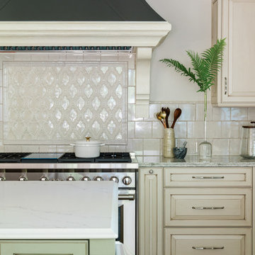
The recent redesign of the kitchen and dining nook skillfully fuses timeless French country aesthetics with modern design principles, tailored for a young couple who cherish both art and architecture. This transformation emphasizes an inviting, comfortable atmosphere without compromising on sophistication. The space uses a palette of muted colors and aged materials to achieve a subtle elegance that integrates seamlessly with the home’s intrinsic architectural charm.
Central to the kitchen are two islands, designed to facilitate both everyday living and grand entertaining. These islands not only offer extensive preparation surfaces but also serve as social hubs, making the kitchen the heart of the home. Adjacent to this area, a well-equipped scullery and a butler’s pantry enhance functionality, providing ample space for storage and meal prep without cluttering the main kitchen area.
The dining area is designed to host intimate dinners or family gatherings, while views of the stunning chandelier, sculpted ceilings and detailed millwork float above, echoing the home’s French influences. Similarly, the sitting area adjacent to the kitchen features comfortable seating and abundant natural light, creating a perfect spot for relaxation or casual conversation.
Attention to detail is evident in the decorative grates on the pantry doors, and the arched glass elements in cabinetry, all nodding to classic French design. This project masterfully balances historical reverence with modern functionality, making it an ideal setting for both lively social gatherings and serene everyday living.
 KED Interiors
The recent redesign of the kitchen and dining nook skillfully fuses timeless French country aesthetics with modern design principles, tailored for a young couple who cherish both art and architecture. This transformation emphasizes an inviting, comfortable atmosphere without compromising on sophistication. The space uses a palette of muted colors and aged materials to achieve a subtle elegance that integrates seamlessly with the home’s intrinsic architectural charm.
Central to the kitchen are two islands, designed to facilitate both everyday living and grand entertaining. These islands not only offer extensive preparation surfaces but also serve as social hubs, making the kitchen the heart of the home. Adjacent to this area, a well-equipped scullery and a butler’s pantry enhance functionality, providing ample space for storage and meal prep without cluttering the main kitchen area.
The dining area is designed to host intimate dinners or family gatherings, while views of the stunning chandelier, sculpted ceilings and detailed millwork float above, echoing the home’s French influences. Similarly, the sitting area adjacent to the kitchen features comfortable seating and abundant natural light, creating a perfect spot for relaxation or casual conversation.
Attention to detail is evident in the decorative grates on the pantry doors, and the arched glass elements in cabinetry, all nodding to classic French design. This project masterfully balances historical reverence with modern functionality, making it an ideal setting for both lively social gatherings and serene everyday living.
 Srote & Co Architects | Planners | Interiors
This architecture and interior design project was introduced to us by the client’s contractor after their villa had been damaged extensively by a fire. The entire main level was destroyed with exception of the front study.
Srote & Co reimagined the interior layout of this St. Albans villa to give it an "open concept" and applied universal design principles to make sure it would function for our clients as they aged in place. The universal approach is seen in the flush flooring transitions, low pile rugs and carpets, wide walkways, layers of lighting and in the seated height countertop and vanity. For convenience, the laundry room was relocated to the master walk-in closet. This allowed us to create a dedicated pantry and additional storage off the kitchen where the laundry was previously housed.
All interior selections and furnishings shown were specified or procured by Srote & Co Architects.
 Troico
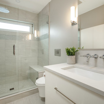
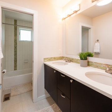
Bathroom - mid-sized transitional 3/4 gray tile and porcelain tile porcelain tile, gray floor and single-sink bathroom idea in Vancouver with flat-panel cabinets, white cabinets, a wall-mount toilet, white walls, an undermount sink, quartz countertops, a hinged shower door, white countertops and a floating vanity
 Simply Perfect
With Pinterest, Houzz and HGTV, homeowners have more sources for inspiration than ever before. You may have found, however, that replicating what you see online or on TV isn’t always that simple. Mastering proportion and scale can be especially challenging.
Let’s say you fall in love with an oversized vase which looks like it will fit with the colors and textures in your living room. But once it’s there, the vase doesn’t look the way you expected and you don’t know now to make it work.
Fortunately, designers are experienced not only in dealing with proportion and scale, but in handling multiple elements at once.
In the meantime, here are a few tips to help you understand some of the considerations regarding size.
Proportion Tips
1. Less is more
In the home shown here, the rooms are on the smaller side, where it would seem counterintuitive to use oversized pieces. But using smaller pieces can look busy—and can actually make the rooms feel smaller, especially when you add personal belongings to the space.
2. Keep it simple
Several oversized pieces can create clean, simple lines. We put this principle to work using oversized items as anchors on both sides of the fireplace in the living room.
On one side, we have two oversized blown-glass vases with amber, silver and purple tones. The irregular shapes in these beautiful pieces create interest and contrast; you can see through them and you can see the room reflected in them.
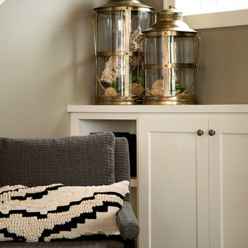
On the other side of the fireplace sit two oversized brass lanterns filled with driftwood and greenery; the contents can be switched out seasonally, as well.
The vases on one side and lanterns on the other side establish pattern (two of each, in descending order), balance and simplicity.
3. Embrace the unexpected
On the mantle above the fireplace rests another oversized piece—a painting of a barn. Its neutral colors pick up the tones in the stone behind it and again, it works to bring simplicity to the space, rather than overly fussy detail.
Nearby, just up the stairs, is an unusually spacious landing. A bench and pillows transform it into a special reading or conversation spot. The pair of hammered nickel vases on the window sill repeats the pattern established on either side of the fireplace. Using oversized vases in lieu of a window treatment is unexpected—as is incorporating sleek, modern-shaped vases like these in a farmhouse-style home. Yet because of the other oversized objects nearby, the vases feel distinctive and delightful.
4. Coordinate pattern and rhythm
Another oversized item is the table lamp in the living room. It’s a powerful light; aside from the overhead can lights, it’s the room’s only light source. The ridges on its ceramic base echo the pieces of wicker in the stunning basket behind the sofa.
This oversized wicker basket, which we’re a bit in love with, features a very large weave along with elegant leather straps. It’s ideal for storing throws, cushions, board games or anything else you want out of sight.
5. Proximity matters
This home’s dining room is just to the right of the entry. An immense floor mirror—double-framed in weathered wood—is placed opposite the front windows. Measuring seven feet high, it’s a bold piece. And it works perfectly in this space to reflect light and make the room feel larger.
An oversized ceramic vase, with a porous, matte-stone finish, sits atop a table next to the mirror. Other regular-sized items share the small table, including a bottle of wine and a glass vase. But because of the enormous mirror, it was important to have one oversized item on that table, for balance.

Sponsored
Sunbury, OH
J.Holderby - Renovations
Franklin County's Leading General Contractors - 2X Best of Houzz!
 Simply Perfect
With Pinterest, Houzz and HGTV, homeowners have more sources for inspiration than ever before. You may have found, however, that replicating what you see online or on TV isn’t always that simple. Mastering proportion and scale can be especially challenging.
Let’s say you fall in love with an oversized vase which looks like it will fit with the colors and textures in your living room. But once it’s there, the vase doesn’t look the way you expected and you don’t know now to make it work.
Fortunately, designers are experienced not only in dealing with proportion and scale, but in handling multiple elements at once.
In the meantime, here are a few tips to help you understand some of the considerations regarding size.
Proportion Tips
1. Less is more
In the home shown here, the rooms are on the smaller side, where it would seem counterintuitive to use oversized pieces. But using smaller pieces can look busy—and can actually make the rooms feel smaller, especially when you add personal belongings to the space.
2. Keep it simple
Several oversized pieces can create clean, simple lines. We put this principle to work using oversized items as anchors on both sides of the fireplace in the living room.
On one side, we have two oversized blown-glass vases with amber, silver and purple tones. The irregular shapes in these beautiful pieces create interest and contrast; you can see through them and you can see the room reflected in them.
On the other side of the fireplace sit two oversized brass lanterns filled with driftwood and greenery; the contents can be switched out seasonally, as well.
The vases on one side and lanterns on the other side establish pattern (two of each, in descending order), balance and simplicity.
3. Embrace the unexpected
On the mantle above the fireplace rests another oversized piece—a painting of a barn. Its neutral colors pick up the tones in the stone behind it and again, it works to bring simplicity to the space, rather than overly fussy detail.
Nearby, just up the stairs, is an unusually spacious landing. A bench and pillows transform it into a special reading or conversation spot. The pair of hammered nickel vases on the window sill repeats the pattern established on either side of the fireplace. Using oversized vases in lieu of a window treatment is unexpected—as is incorporating sleek, modern-shaped vases like these in a farmhouse-style home. Yet because of the other oversized objects nearby, the vases feel distinctive and delightful.
4. Coordinate pattern and rhythm
Another oversized item is the table lamp in the living room. It’s a powerful light; aside from the overhead can lights, it’s the room’s only light source. The ridges on its ceramic base echo the pieces of wicker in the stunning basket behind the sofa.
This oversized wicker basket, which we’re a bit in love with, features a very large weave along with elegant leather straps. It’s ideal for storing throws, cushions, board games or anything else you want out of sight.
5. Proximity matters
This home’s dining room is just to the right of the entry. An immense floor mirror—double-framed in weathered wood—is placed opposite the front windows. Measuring seven feet high, it’s a bold piece. And it works perfectly in this space to reflect light and make the room feel larger.
An oversized ceramic vase, with a porous, matte-stone finish, sits atop a table next to the mirror. Other regular-sized items share the small table, including a bottle of wine and a glass vase. But because of the enormous mirror, it was important to have one oversized item on that table, for balance.
 Architectural Workshop
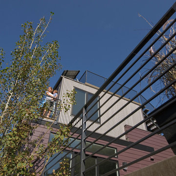
The Green Cube is a single family infill project located in the Highlands Neighborhood in Denver, Colorado. The designwas founded on sustainable principles and affordable building techniques to become an example of green living. The home will be one of Denver's first LEED Platinum certified homes.
The eco friendly architectural design will save 60% of the energy compared to a standard home. Sustainable features include recycled flooring, low VOC paints, LED lighting, low-e argon filled windows and evaporative cooling. Green elements include a live, edible green wall, high efficiency appliances and an active solar panel system.
To reflect the sustainable nature of the home, a "green" recycled metal panel "cube" is the main feature. The small nonconforming site called for a compact footprint that includes a two car garage which also serves as a rooftop patio for the main living space. The main level is designed as an open floor plan and provides views of the downtown skyline. The upper level has a master suite and open loft. An exterior stair leads up to a rooftop deck that offers breathtaking views of the City and Mountains.
LaCasses Photography
 Simply Perfect
With Pinterest, Houzz and HGTV, homeowners have more sources for inspiration than ever before. You may have found, however, that replicating what you see online or on TV isn’t always that simple. Mastering proportion and scale can be especially challenging.
Let’s say you fall in love with an oversized vase which looks like it will fit with the colors and textures in your living room. But once it’s there, the vase doesn’t look the way you expected and you don’t know now to make it work.
Fortunately, designers are experienced not only in dealing with proportion and scale, but in handling multiple elements at once.
In the meantime, here are a few tips to help you understand some of the considerations regarding size.
Proportion Tips
1. Less is more
In the home shown here, the rooms are on the smaller side, where it would seem counterintuitive to use oversized pieces. But using smaller pieces can look busy—and can actually make the rooms feel smaller, especially when you add personal belongings to the space.
2. Keep it simple
Several oversized pieces can create clean, simple lines. We put this principle to work using oversized items as anchors on both sides of the fireplace in the living room.
On one side, we have two oversized blown-glass vases with amber, silver and purple tones. The irregular shapes in these beautiful pieces create interest and contrast; you can see through them and you can see the room reflected in them.
On the other side of the fireplace sit two oversized brass lanterns filled with driftwood and greenery; the contents can be switched out seasonally, as well.
The vases on one side and lanterns on the other side establish pattern (two of each, in descending order), balance and simplicity.
3. Embrace the unexpected
On the mantle above the fireplace rests another oversized piece—a painting of a barn. Its neutral colors pick up the tones in the stone behind it and again, it works to bring simplicity to the space, rather than overly fussy detail.
Nearby, just up the stairs, is an unusually spacious landing. A bench and pillows transform it into a special reading or conversation spot. The pair of hammered nickel vases on the window sill repeats the pattern established on either side of the fireplace. Using oversized vases in lieu of a window treatment is unexpected—as is incorporating sleek, modern-shaped vases like these in a farmhouse-style home. Yet because of the other oversized objects nearby, the vases feel distinctive and delightful.
4. Coordinate pattern and rhythm
Another oversized item is the table lamp in the living room. It’s a powerful light; aside from the overhead can lights, it’s the room’s only light source. The ridges on its ceramic base echo the pieces of wicker in the stunning basket behind the sofa.
This oversized wicker basket, which we’re a bit in love with, features a very large weave along with elegant leather straps. It’s ideal for storing throws, cushions, board games or anything else you want out of sight.
5. Proximity matters
This home’s dining room is just to the right of the entry. An immense floor mirror—double-framed in weathered wood—is placed opposite the front windows. Measuring seven feet high, it’s a bold piece. And it works perfectly in this space to reflect light and make the room feel larger.
An oversized ceramic vase, with a porous, matte-stone finish, sits atop a table next to the mirror. Other regular-sized items share the small table, including a bottle of wine and a glass vase. But because of the enormous mirror, it was important to have one oversized item on that table, for balance.
 Paul Langston Interiors
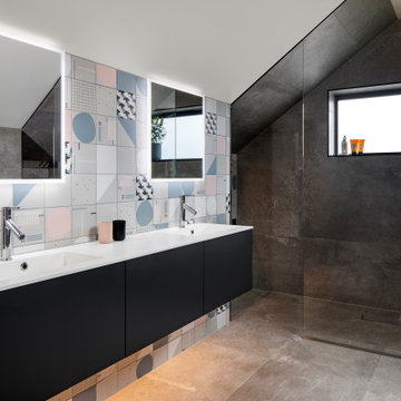
Our latest project, an elegant modernisation of a 1920s seafront detached Essex property, features in the February 2024 edition of 25 beautiful Homes. This enterprise grew from an initial entrance hall cabinetry commission into a much larger project, encompassing many aspects of interior design, including decorative schemes for colours and finishes, spatial planning and lighting design. We also produced a wide range of cabinetry designs throughout the property, including the wine wall, principle bed and headboard, his and hers dressing room wardrobes and bespoke 5m drop staircase lighting feature, which runs through the whole house. We were fortunate to be part of a great project team, working alongside talented builders Intelligent Building, joinery masters Nord Build and home automation wizards P&R Service.

 Studio Zung
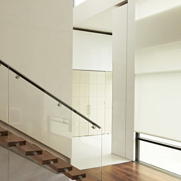
A ground up design and build of a modern seven bedroom primary residence incorporating sustainable design principles built for an international family of four. The concept revolved around the need for environmental sustainability while having plentiful communal spaces to create ease for a vibrant family and their guests. Equally important was that the private spaces functioned as a retreat.
Natural light creates shifting patterns on the opposing wall of the glass paned hallway leading from the main house past the guest bedrooms and to the master suite. Subtle color palette and interior design use contrasting tactile elements to create an environment of luxury and accessibility. The views of the pool and garden through the large and continuous windows enable an ever-present connection to nature.
 Troico
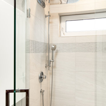
Mid-sized transitional 3/4 gray tile and porcelain tile porcelain tile and gray floor double shower photo in Vancouver with white walls and a hinged shower door
41