
Search results for "Master relation" in Home Design Ideas

 Lindy Design Build
Primary Suite
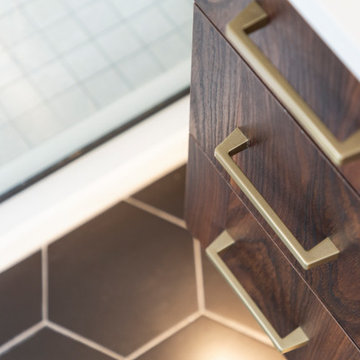
This home didn’t originally have a primary suite, so we decided to convert one of the bedrooms and create a charming suite that you’d never want to leave. The primary bathroom aesthetic quickly became all about the textures. With a sultry black hex on the floor and a dimensional geometric tile on the walls we set the stage for a calm space. The warm walnut vanity and touches of brass cozy up the space and relate with the feel of the rest of the home. We continued the warm wood touches into the master bedroom, but went for a rich accent wall that elevated the sophistication level and sets this space apart.

 McCabe Design & Interiors
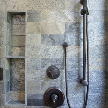
RUSTIC ELEGANCE & OLD WORLD CHARM — the perfect mix of old and new. This serene, spa-like master ensuite was designed with old-world charm in mind. In a relatively new home that has all the nostalgic appeal of a country manor, this master ensuite retreat compliments the exterior facade as well as the combination of antiques and traditional furnishings throughout the rest of the interior.
A barn door with rugged hardware, an antique chandelier, a rustic vanity and old world plumbing fixtures, together with school house sconces, were paired with much newer elements: crisp white wainscotting and modern grey paint, marble-like porcelain tile, shower glass, a modern toilet and an elegant free-standing tub. All of these are showcased by a wash of light from a picturesque window.

 Spaces Designed, Interior Design Studio, LLC
Modern, simple and with an element of pizzazz. That was the motto behind this Travel Heights project. In this bathroom, our challenge was to extend the relatively small space while keeping the integrity of the existing floor tiles.Our expertise in color combinations and experience with patterns and textures helped us overcome the hurdle. The result was a clutter-free bathroom without being full-on minimalist, and yet another happy costumer. As a first step, large lenin tiles were installed on all the bathroom from floor to ceiling to create the continuity and to make the bathroom seem larger than it is. Large accent black and white 13x40 porcelain tiles were selected which a "wow" effect to the bathroom and maintain the color palette flow with the existing patterned floor tiles. Moreover, to create a modern, creative aesthetic, these were installed on the entire shower wall. A frame less shower affords the viewer the full visual draw of the stunning accent wall. The waterfall counter top on the side creatively frames the cabinets and provides protection to the beautiful mahogany wood from water spills. The cabinet details also included a small full-out rod from the left front side of the vanity for toilet paper, so no holes have to drilled on the beautiful counter-top side. The sink faucet was installed in the wall to create a clean, no-frills appearance. Additionally, we included upscale amenities like a stainless steel rain shower head with hand shower, an energy-efficient LED light fixture, floating drawer pulls and shower door with aluminum framing to give more strength. The result is an interesting mix of "something old" and "something new."
Bee Creek Photography
Find the right local pro for your project

 ODS Architecture
Originally a nearly three-story tall 1920’s European-styled home was turned into a modern villa for work and home. A series of low concrete retaining wall planters and steps gradually takes you up to the second level entry, grounding or anchoring the house into the site, as does a new wrap around veranda and trellis. Large eave overhangs on the upper roof were designed to give the home presence and were accented with a Mid-century orange color. The new master bedroom addition white box creates a better sense of entry and opens to the wrap around veranda at the opposite side. Inside the owners live on the lower floor and work on the upper floor with the garage basement for storage, archives and a ceramics studio. New windows and open spaces were created for the graphic designer owners; displaying their mid-century modern furnishings collection.
A lot of effort went into attempting to lower the house visually by bringing the ground plane higher with the concrete retaining wall planters, steps, wrap around veranda and trellis, and the prominent roof with exaggerated overhangs. That the eaves were painted orange is a cool reflection of the owner’s Dutch heritage. Budget was a driver for the project and it was determined that the footprint of the home should have minimal extensions and that the new windows remain in the same relative locations as the old ones. Wall removal was utilized versus moving and building new walls where possible.
Photo Credit: John Sutton Photography.
 Lindy Design Build
Primary Suite
This home didn’t originally have a primary suite, so we decided to convert one of the bedrooms and create a charming suite that you’d never want to leave. The primary bathroom aesthetic quickly became all about the textures. With a sultry black hex on the floor and a dimensional geometric tile on the walls we set the stage for a calm space. The warm walnut vanity and touches of brass cozy up the space and relate with the feel of the rest of the home. We continued the warm wood touches into the master bedroom, but went for a rich accent wall that elevated the sophistication level and sets this space apart.

 Spazio LA
The bathroom features a new walk-in shower where the bathtub used to be, with Duomo Bianchi floor tiles and Zenith Orion subway wall tiles and custom shower doors.
The outdoor area features wooden deck floors and accent shower wall, combined with concrete look Bottega Acero tiles. The hanging planters with succulents complete the "urban jungle" look. All tiles can be found at Spazio LA Tile Gallery.

 Irene Designs
This Master Suite while being spacious, was poorly planned in the beginning. Master Bathroom and Walk-in Closet were small relative to the Bedroom size. Bathroom, being a maze of turns, offered a poor traffic flow. It only had basic fixtures and was never decorated to look like a living space. Geometry of the Bedroom (long and stretched) allowed to use some of its' space to build two Walk-in Closets while the original walk-in closet space was added to adjacent Bathroom. New Master Bathroom layout has changed dramatically (walls, door, and fixtures moved). The new space was carefully planned for two people using it at once with no sacrifice to the comfort. New shower is huge. It stretches wall-to-wall and has a full length bench with granite top. Frame-less glass enclosure partially sits on the tub platform (it is a drop-in tub). Tiles on the walls and on the floor are of the same collection. Elegant, time-less, neutral - something you would enjoy for years. This selection leaves no boundaries on the decor. Beautiful open shelf vanity cabinet was actually made by the Home Owners! They both were actively involved into the process of creating their new oasis. New Master Suite has two separate Walk-in Closets. Linen closet which used to be a part of the Bathroom, is now accessible from the hallway. Master Bedroom, still big, looks stunning. It reflects taste and life style of the Home Owners and blends in with the overall style of the House. Some of the furniture in the Bedroom was also made by the Home Owners.
Sponsored
Delaware, OH

Buckeye Basements, Inc.
Central Ohio's Basement Finishing ExpertsBest Of Houzz '13-'21

 OnPoint Design Group | NonStop Staging
Master Bedroom in Highlands Ridge Contemporary. Design by Doshia Wagner of NonStop Staging. Photography by Christina Cook Lee.
Large trendy master medium tone wood floor and brown floor bedroom photo in Tampa with beige walls
Large trendy master medium tone wood floor and brown floor bedroom photo in Tampa with beige walls
 McCabe Design & Interiors
RUSTIC ELEGANCE & OLD WORLD CHARM — the perfect mix of old and new. This serene, spa-like master ensuite was designed with old-world charm in mind. In a relatively new home that has all the nostalgic appeal of a country manor, this master ensuite retreat compliments the exterior facade as well as the combination of antiques and traditional furnishings throughout the rest of the interior.
A barn door with rugged hardware, an antique chandelier, a rustic vanity and old world plumbing fixtures, together with school house sconces, were paired with much newer elements: crisp white wainscotting and modern grey paint, marble-like porcelain tile, shower glass, a modern toilet and an elegant free-standing tub. All of these are showcased by a wash of light from a picturesque window.
 Alloy Architecture & Construction
This project was designed for a couple who lives in Florida but wanted to create a mountain getaway here in Virginia.
This was a dramatic, full home renovation project which converted a 1970’s vinyl siding covered, quasi-modern home into a cozy yet open, mountain lodge retreat with breathtaking views of the Blue Ridge mountains. A large wrap around porch was added as well as a beautiful screened in porch for the enjoyment and full appreciation of the surrounding landscapes.
While the overall interior layout remained relatively unchanged, new elements were introduced, such as a two-story stone fireplace, a residential elevator, a new master bedroom, updated kitchen and reclaimed wood paneling finishing the walls.
While you catch a glimpse of the stunning vista while approaching the house, the full view is best appreciated from the new screened in porch or cedar hot tub which sets you right out into nature.
Andrea Hubbel Photography

 Seattle Staged to Sell and Design LLC
HD Estates
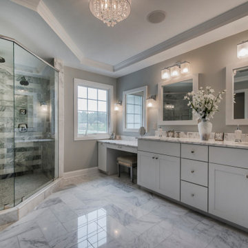
Inspiration for a large coastal master bathroom remodel in Seattle with gray cabinets, gray walls and quartz countertops
Inspiration for a large coastal master bathroom remodel in Seattle with gray cabinets, gray walls and quartz countertops
 ODS Architecture
Originally a nearly three-story tall 1920’s European-styled home was turned into a modern villa for work and home. A series of low concrete retaining wall planters and steps gradually takes you up to the second level entry, grounding or anchoring the house into the site, as does a new wrap around veranda and trellis. Large eave overhangs on the upper roof were designed to give the home presence and were accented with a Mid-century orange color. The new master bedroom addition white box creates a better sense of entry and opens to the wrap around veranda at the opposite side. Inside the owners live on the lower floor and work on the upper floor with the garage basement for storage, archives and a ceramics studio. New windows and open spaces were created for the graphic designer owners; displaying their mid-century modern furnishings collection.
A lot of effort went into attempting to lower the house visually by bringing the ground plane higher with the concrete retaining wall planters, steps, wrap around veranda and trellis, and the prominent roof with exaggerated overhangs. That the eaves were painted orange is a cool reflection of the owner’s Dutch heritage. Budget was a driver for the project and it was determined that the footprint of the home should have minimal extensions and that the new windows remain in the same relative locations as the old ones. Wall removal was utilized versus moving and building new walls where possible.
Photo Credit: John Sutton Photography.
 Irene Designs
This Master Suite while being spacious, was poorly planned in the beginning. Master Bathroom and Walk-in Closet were small relative to the Bedroom size. Bathroom, being a maze of turns, offered a poor traffic flow. It only had basic fixtures and was never decorated to look like a living space. Geometry of the Bedroom (long and stretched) allowed to use some of its' space to build two Walk-in Closets while the original walk-in closet space was added to adjacent Bathroom. New Master Bathroom layout has changed dramatically (walls, door, and fixtures moved). The new space was carefully planned for two people using it at once with no sacrifice to the comfort. New shower is huge. It stretches wall-to-wall and has a full length bench with granite top. Frame-less glass enclosure partially sits on the tub platform (it is a drop-in tub). Tiles on the walls and on the floor are of the same collection. Elegant, time-less, neutral - something you would enjoy for years. This selection leaves no boundaries on the decor. Beautiful open shelf vanity cabinet was actually made by the Home Owners! They both were actively involved into the process of creating their new oasis. New Master Suite has two separate Walk-in Closets. Linen closet which used to be a part of the Bathroom, is now accessible from the hallway. Master Bedroom, still big, looks stunning. It reflects taste and life style of the Home Owners and blends in with the overall style of the House. Some of the furniture in the Bedroom was also made by the Home Owners.


 Studio McGee
Shop the Look, See the Photo Tour here: https://www.studio-mcgee.com/studioblog/2017/4/24/promontory-project-great-room-kitchen?rq=Promontory%20Project%3A
Watch the Webisode: https://www.studio-mcgee.com/studioblog/2017/4/21/promontory-project-webisode?rq=Promontory%20Project%3A
 Lindy Design Build
Primary Suite
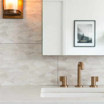
This home didn’t originally have a primary suite, so we decided to convert one of the bedrooms and create a charming suite that you’d never want to leave. The primary bathroom aesthetic quickly became all about the textures. With a sultry black hex on the floor and a dimensional geometric tile on the walls we set the stage for a calm space. The warm walnut vanity and touches of brass cozy up the space and relate with the feel of the rest of the home. We continued the warm wood touches into the master bedroom, but went for a rich accent wall that elevated the sophistication level and sets this space apart.

Elegant u-shaped kitchen photo in Seattle with a farmhouse sink, raised-panel cabinets, green cabinets, white backsplash, subway tile backsplash, paneled appliances and no island
Sponsored
Sunbury, OH

J.Holderby - Renovations
Franklin County's Leading General Contractors - 2X Best of Houzz!

 Architecture Stones
With over 4,500 stone slabs on site, we offer the greatest selection of stones to make your kitchen or bathroom vanity countertops outstanding along with stone-related products such as sinks, backsplashes, waterfalls, etc. We are the largest stone fabricator for residential and commercial properties serving Maryland, Washington D.C., and Virginia.
 Irene Designs
This Master Suite while being spacious, was poorly planned in the beginning. Master Bathroom and Walk-in Closet were small relative to the Bedroom size. Bathroom, being a maze of turns, offered a poor traffic flow. It only had basic fixtures and was never decorated to look like a living space. Geometry of the Bedroom (long and stretched) allowed to use some of its' space to build two Walk-in Closets while the original walk-in closet space was added to adjacent Bathroom. New Master Bathroom layout has changed dramatically (walls, door, and fixtures moved). The new space was carefully planned for two people using it at once with no sacrifice to the comfort. New shower is huge. It stretches wall-to-wall and has a full length bench with granite top. Frame-less glass enclosure partially sits on the tub platform (it is a drop-in tub). Tiles on the walls and on the floor are of the same collection. Elegant, time-less, neutral - something you would enjoy for years. This selection leaves no boundaries on the decor. Beautiful open shelf vanity cabinet was actually made by the Home Owners! They both were actively involved into the process of creating their new oasis. New Master Suite has two separate Walk-in Closets. Linen closet which used to be a part of the Bathroom, is now accessible from the hallway. Master Bedroom, still big, looks stunning. It reflects taste and life style of the Home Owners and blends in with the overall style of the House. Some of the furniture in the Bedroom was also made by the Home Owners.


82