
Search results for "Master reviews" in Home Design Ideas

 User
This hillside home in Piedmont, CA was remodeled to change the style from a 1940's rancher with eight foot ceilings and dark interiors, into a modern geometric composition with vast white interiors for casual living and generous daylighting for displaying the artist-owner's works.
In a city known for rigorous and difficult design review, an addition, two variances, and a full stylistic change were unanimously approved on the first round. All sloped roofs and attics were eliminated and replaced by a series of stacked and overlapping flat roofs. This made the house taller on the inside and shorter on the outside, which helped earn design review cooperation in the community. Windows were concentrated toward the rear yard views or moved up high on the side walls for daylight and privacy, benefitting the owners as well as the neighbors.
At the start, the owner husband was so enthusiastic and engaged in transforming his house into something modern that he presented the architect with a scaled foamcore model, rather than the usual magazine clippings and wish list. He participated in the design decisions throughout the process. The owner wife is the artist who did all the artwork in the house. She had been craving a display space with large walls and good natural light. Both of them loved the location and great views.
The project was an opportunity to transform the style of an older traditional home into a modern one, while solving numerous problems. By rebuilding the 1800 ft2 top of the 3-story home it was possible to change the style of the whole building, since the lower floors were a neutral base, and also to change the lifestyle of the owners, who wanted to move their master suite upstairs and live primarily on the top floor as empty nesters.
Going into the project, the architect knew there were multiple encroachments into the setbacks and potential privacy issues with close by neighbors. He approached this as a complex puzzle made up of architectural and political pieces which all had to fit together elegantly. It took many careful moves, small and large, to arrive at a serene and cohesive result that tied old and new together seamlessly.
The design-build contractor worked closely with the owners and handled all of the construction phase documents and design adjustments, adding ideas of their own to make the project really sing.
The project was a collaboration in three acts. The owner had a strong design concept from the start. The architect developed it into a realistic project and garnered the design approvals. Then the contractor executed brilliantly.
 User
This hillside home in Piedmont, CA was remodeled to change the style from a 1940's rancher with eight foot ceilings and dark interiors, into a modern geometric composition with vast white interiors for casual living and generous daylighting for displaying the artist-owner's works.
In a city known for rigorous and difficult design review, an addition, two variances, and a full stylistic change were unanimously approved on the first round. All sloped roofs and attics were eliminated and replaced by a series of stacked and overlapping flat roofs. This made the house taller on the inside and shorter on the outside, which helped earn design review cooperation in the community. Windows were concentrated toward the rear yard views or moved up high on the side walls for daylight and privacy, benefitting the owners as well as the neighbors.
At the start, the owner husband was so enthusiastic and engaged in transforming his house into something modern that he presented the architect with a scaled foamcore model, rather than the usual magazine clippings and wish list. He participated in the design decisions throughout the process. The owner wife is the artist who did all the artwork in the house. She had been craving a display space with large walls and good natural light. Both of them loved the location and great views.
The project was an opportunity to transform the style of an older traditional home into a modern one, while solving numerous problems. By rebuilding the 1800 ft2 top of the 3-story home it was possible to change the style of the whole building, since the lower floors were a neutral base, and also to change the lifestyle of the owners, who wanted to move their master suite upstairs and live primarily on the top floor as empty nesters.
Going into the project, the architect knew there were multiple encroachments into the setbacks and potential privacy issues with close by neighbors. He approached this as a complex puzzle made up of architectural and political pieces which all had to fit together elegantly. It took many careful moves, small and large, to arrive at a serene and cohesive result that tied old and new together seamlessly.
The design-build contractor worked closely with the owners and handled all of the construction phase documents and design adjustments, adding ideas of their own to make the project really sing.
The project was a collaboration in three acts. The owner had a strong design concept from the start. The architect developed it into a realistic project and garnered the design approvals. Then the contractor executed brilliantly.

 Jami Abbadessa
TEXTURAL VIBES
Time Frame: 2 Months // Design Fee: $1,875
Evan and his wife Karen were looking for professional help in designing/decorating their master bedroom in Rancho Cucamonga, CA. I was not referred to them, but they were impressed by my website, reviews and pictures of past projects. I’m always excited to work with new clients who were drawn to me by my style of past projects and online presence. When I first met with them, I immediately felt comfortable and knew this was going to be a great project. They were very open to suggestions and requested only a few things – TEXTURE, a seating area for TV viewing/gaming, a clean design without clutter and an overall well-put-together feeling. They told me not to hold back on my design vision, so we just went for it! I had a custom ceiling height headboard constructed in a velvet for drama. We splurged on luxurious bedding with tons of layers and texture. On that same wall I had shimmery, grey grass cloth installed for added texture. Custom, black out, silk Roman shades, layered with pleated sheers were hung. Grey-washed hardwood flooring was installed. I had a custom grey built-in installed in the niche to serve as a dresser and TV storage. Recessed lighting, reading lights and crystal pendants were added. A soft grey was painted on the walls with a contrasting darker slate on the ceiling. An over-sized wall mirror, wool rugs, metal-wrapped furniture, a custom sofa and ottoman with nailhead trim and professional photos of the couple framed in silver with linen mats tied everything together.
Find the right local pro for your project

 Truitt and White Window and Door Showroom
This hillside home in Piedmont, CA was remodeled to change the style from a 1940's rancher with eight foot ceilings and dark interiors, into a modern geometric composition with vast white interiors for casual living and generous daylighting for displaying the artist-owner's works.
In a city known for rigorous and difficult design review, an addition, two variances, and a full stylistic change were unanimously approved on the first round. All sloped roofs and attics were eliminated and replaced by a series of stacked and overlapping flat roofs. This made the house taller on the inside and shorter on the outside, which helped earn design review cooperation in the community. Windows were concentrated toward the rear yard views or moved up high on the side walls for daylight and privacy, benefitting the owners as well as the neighbors.
At the start, the owner husband was so enthusiastic and engaged in transforming his house into something modern that he presented the architect with a scaled foamcore model, rather than the usual magazine clippings and wish list. He participated in the design decisions throughout the process. The owner wife is the artist who did all the artwork in the house. She had been craving a display space with large walls and good natural light. Both of them loved the location and great views.
The project was an opportunity to transform the style of an older traditional home into a modern one, while solving numerous problems. By rebuilding the 1800 ft2 top of the 3-story home it was possible to change the style of the whole building, since the lower floors were a neutral base, and also to change the lifestyle of the owners, who wanted to move their master suite upstairs and live primarily on the top floor as empty nesters.
Going into the project, the architect knew there were multiple encroachments into the setbacks and potential privacy issues with close by neighbors. He approached this as a complex puzzle made up of architectural and political pieces which all had to fit together elegantly. It took many careful moves, small and large, to arrive at a serene and cohesive result that tied old and new together seamlessly.
The design-build contractor worked closely with the owners and handled all of the construction phase documents and design adjustments, adding ideas of their own to make the project really sing.
The project was a collaboration in three acts. The owner had a strong design concept from the start. The architect developed it into a realistic project and garnered the design approvals. Then the contractor executed brilliantly

 David Moulton AIA
Creating a bridge between buildings at The Sea Ranch is an unusual undertaking. Though several residential, elevated walkways and a couple of residential bridges do exist, in general, the design elements of The Sea Ranch favor smaller, separate buildings. However, to make all of these buildings work for the owners and their pets, they really needed a bridge. Early on David Moulton AIA consulted The Sea Ranch Design Review Committee on their receptiveness to this project. Many different ideas were discussed with the Design Committee but ultimately, given the strong need for the bridge, they asked that it be designed in a way that expressed the organic nature of the landscape. There was strong opposition to creating a straight, longitudinal structure. Soon it became apparent that a central tower sporting a small viewing deck and screened window seat provided the owners with key wildlife viewing spots and gave the bridge a central structural point from which the adjacent, angled arms could reach west between the trees to the main house and east between the trees to the new master suite. The result is a precise and carefully designed expression of the landscape: an enclosed bridge elevated above wildlife paths and woven within inches of towering redwood trees.
 User
This hillside home in Piedmont, CA was remodeled to change the style from a 1940's rancher with eight foot ceilings and dark interiors, into a modern geometric composition with vast white interiors for casual living and generous daylighting for displaying the artist-owner's works.
In a city known for rigorous and difficult design review, an addition, two variances, and a full stylistic change were unanimously approved on the first round. All sloped roofs and attics were eliminated and replaced by a series of stacked and overlapping flat roofs. This made the house taller on the inside and shorter on the outside, which helped earn design review cooperation in the community. Windows were concentrated toward the rear yard views or moved up high on the side walls for daylight and privacy, benefitting the owners as well as the neighbors.
At the start, the owner husband was so enthusiastic and engaged in transforming his house into something modern that he presented the architect with a scaled foamcore model, rather than the usual magazine clippings and wish list. He participated in the design decisions throughout the process. The owner wife is the artist who did all the artwork in the house. She had been craving a display space with large walls and good natural light. Both of them loved the location and great views.
The project was an opportunity to transform the style of an older traditional home into a modern one, while solving numerous problems. By rebuilding the 1800 ft2 top of the 3-story home it was possible to change the style of the whole building, since the lower floors were a neutral base, and also to change the lifestyle of the owners, who wanted to move their master suite upstairs and live primarily on the top floor as empty nesters.
Going into the project, the architect knew there were multiple encroachments into the setbacks and potential privacy issues with close by neighbors. He approached this as a complex puzzle made up of architectural and political pieces which all had to fit together elegantly. It took many careful moves, small and large, to arrive at a serene and cohesive result that tied old and new together seamlessly.
The design-build contractor worked closely with the owners and handled all of the construction phase documents and design adjustments, adding ideas of their own to make the project really sing.
The project was a collaboration in three acts. The owner had a strong design concept from the start. The architect developed it into a realistic project and garnered the design approvals. Then the contractor executed brilliantly.
 Truitt and White Window and Door Showroom
This hillside home in Piedmont, CA was remodeled to change the style from a 1940's rancher with eight foot ceilings and dark interiors, into a modern geometric composition with vast white interiors for casual living and generous daylighting for displaying the artist-owner's works.
In a city known for rigorous and difficult design review, an addition, two variances, and a full stylistic change were unanimously approved on the first round. All sloped roofs and attics were eliminated and replaced by a series of stacked and overlapping flat roofs. This made the house taller on the inside and shorter on the outside, which helped earn design review cooperation in the community. Windows were concentrated toward the rear yard views or moved up high on the side walls for daylight and privacy, benefitting the owners as well as the neighbors.
At the start, the owner husband was so enthusiastic and engaged in transforming his house into something modern that he presented the architect with a scaled foamcore model, rather than the usual magazine clippings and wish list. He participated in the design decisions throughout the process. The owner wife is the artist who did all the artwork in the house. She had been craving a display space with large walls and good natural light. Both of them loved the location and great views.
The project was an opportunity to transform the style of an older traditional home into a modern one, while solving numerous problems. By rebuilding the 1800 ft2 top of the 3-story home it was possible to change the style of the whole building, since the lower floors were a neutral base, and also to change the lifestyle of the owners, who wanted to move their master suite upstairs and live primarily on the top floor as empty nesters.
Going into the project, the architect knew there were multiple encroachments into the setbacks and potential privacy issues with close by neighbors. He approached this as a complex puzzle made up of architectural and political pieces which all had to fit together elegantly. It took many careful moves, small and large, to arrive at a serene and cohesive result that tied old and new together seamlessly.
The design-build contractor worked closely with the owners and handled all of the construction phase documents and design adjustments, adding ideas of their own to make the project really sing.
The project was a collaboration in three acts. The owner had a strong design concept from the start. The architect developed it into a realistic project and garnered the design approvals. Then the contractor executed brilliantly
Sponsored
Sunbury, OH

J.Holderby - Renovations
Franklin County's Leading General Contractors - 2X Best of Houzz!
 User
This hillside home in Piedmont, CA was remodeled to change the style from a 1940's rancher with eight foot ceilings and dark interiors, into a modern geometric composition with vast white interiors for casual living and generous daylighting for displaying the artist-owner's works.
In a city known for rigorous and difficult design review, an addition, two variances, and a full stylistic change were unanimously approved on the first round. All sloped roofs and attics were eliminated and replaced by a series of stacked and overlapping flat roofs. This made the house taller on the inside and shorter on the outside, which helped earn design review cooperation in the community. Windows were concentrated toward the rear yard views or moved up high on the side walls for daylight and privacy, benefitting the owners as well as the neighbors.
At the start, the owner husband was so enthusiastic and engaged in transforming his house into something modern that he presented the architect with a scaled foamcore model, rather than the usual magazine clippings and wish list. He participated in the design decisions throughout the process. The owner wife is the artist who did all the artwork in the house. She had been craving a display space with large walls and good natural light. Both of them loved the location and great views.
The project was an opportunity to transform the style of an older traditional home into a modern one, while solving numerous problems. By rebuilding the 1800 ft2 top of the 3-story home it was possible to change the style of the whole building, since the lower floors were a neutral base, and also to change the lifestyle of the owners, who wanted to move their master suite upstairs and live primarily on the top floor as empty nesters.
Going into the project, the architect knew there were multiple encroachments into the setbacks and potential privacy issues with close by neighbors. He approached this as a complex puzzle made up of architectural and political pieces which all had to fit together elegantly. It took many careful moves, small and large, to arrive at a serene and cohesive result that tied old and new together seamlessly.
The design-build contractor worked closely with the owners and handled all of the construction phase documents and design adjustments, adding ideas of their own to make the project really sing.
The project was a collaboration in three acts. The owner had a strong design concept from the start. The architect developed it into a realistic project and garnered the design approvals. Then the contractor executed brilliantly.
 User
This hillside home in Piedmont, CA was remodeled to change the style from a 1940's rancher with eight foot ceilings and dark interiors, into a modern geometric composition with vast white interiors for casual living and generous daylighting for displaying the artist-owner's works.
In a city known for rigorous and difficult design review, an addition, two variances, and a full stylistic change were unanimously approved on the first round. All sloped roofs and attics were eliminated and replaced by a series of stacked and overlapping flat roofs. This made the house taller on the inside and shorter on the outside, which helped earn design review cooperation in the community. Windows were concentrated toward the rear yard views or moved up high on the side walls for daylight and privacy, benefitting the owners as well as the neighbors.
At the start, the owner husband was so enthusiastic and engaged in transforming his house into something modern that he presented the architect with a scaled foamcore model, rather than the usual magazine clippings and wish list. He participated in the design decisions throughout the process. The owner wife is the artist who did all the artwork in the house. She had been craving a display space with large walls and good natural light. Both of them loved the location and great views.
The project was an opportunity to transform the style of an older traditional home into a modern one, while solving numerous problems. By rebuilding the 1800 ft2 top of the 3-story home it was possible to change the style of the whole building, since the lower floors were a neutral base, and also to change the lifestyle of the owners, who wanted to move their master suite upstairs and live primarily on the top floor as empty nesters.
Going into the project, the architect knew there were multiple encroachments into the setbacks and potential privacy issues with close by neighbors. He approached this as a complex puzzle made up of architectural and political pieces which all had to fit together elegantly. It took many careful moves, small and large, to arrive at a serene and cohesive result that tied old and new together seamlessly.
The design-build contractor worked closely with the owners and handled all of the construction phase documents and design adjustments, adding ideas of their own to make the project really sing.
The project was a collaboration in three acts. The owner had a strong design concept from the start. The architect developed it into a realistic project and garnered the design approvals. Then the contractor executed brilliantly.
 Truitt and White Window and Door Showroom
This hillside home in Piedmont, CA was remodeled to change the style from a 1940's rancher with eight foot ceilings and dark interiors, into a modern geometric composition with vast white interiors for casual living and generous daylighting for displaying the artist-owner's works.
In a city known for rigorous and difficult design review, an addition, two variances, and a full stylistic change were unanimously approved on the first round. All sloped roofs and attics were eliminated and replaced by a series of stacked and overlapping flat roofs. This made the house taller on the inside and shorter on the outside, which helped earn design review cooperation in the community. Windows were concentrated toward the rear yard views or moved up high on the side walls for daylight and privacy, benefitting the owners as well as the neighbors.
At the start, the owner husband was so enthusiastic and engaged in transforming his house into something modern that he presented the architect with a scaled foamcore model, rather than the usual magazine clippings and wish list. He participated in the design decisions throughout the process. The owner wife is the artist who did all the artwork in the house. She had been craving a display space with large walls and good natural light. Both of them loved the location and great views.
The project was an opportunity to transform the style of an older traditional home into a modern one, while solving numerous problems. By rebuilding the 1800 ft2 top of the 3-story home it was possible to change the style of the whole building, since the lower floors were a neutral base, and also to change the lifestyle of the owners, who wanted to move their master suite upstairs and live primarily on the top floor as empty nesters.
Going into the project, the architect knew there were multiple encroachments into the setbacks and potential privacy issues with close by neighbors. He approached this as a complex puzzle made up of architectural and political pieces which all had to fit together elegantly. It took many careful moves, small and large, to arrive at a serene and cohesive result that tied old and new together seamlessly.
The design-build contractor worked closely with the owners and handled all of the construction phase documents and design adjustments, adding ideas of their own to make the project really sing.
The project was a collaboration in three acts. The owner had a strong design concept from the start. The architect developed it into a realistic project and garnered the design approvals. Then the contractor executed brilliantly

 Advance Design Studio, Ltd.
The couple who embarked on this Lake Zurich Illinois home renovation spent years planning a move from Virginia to the rolling hills of Northern Illinois when their first grandchild was born. Wanting to be closer to their grown children so they could enjoy their new role, they first embarked upon finding the right realtor and the right home. They settled on the “perfect” home; perfect that is to transform.
The seriously outdated 1,800 square foot ranch had a closed outdated kitchen, 3 bedrooms, a living room with a fireplace, a full basement and 2 baths. Although it had “good bones”, it was straight out of a builder’s catalog with wall to wall carpet, standard tile and honey oak everywhere you looked. But this couple had big plans for this home.
In tandem with their home purchase, they began the search for the just the right renovation company. The team they chose needed to be cohesive, as the whole house renovation would be designed hundreds of miles from their home several states away. She found Advance Design Studio, Ltd. online, and was quickly enamored by the team and by Common Sense Remodeling, simply by studying the website. Her decision to choose Advance Design to partner on this complete ranch renovation was confirmed quickly upon her first face to face meeting with owner Todd Jurs, and later by Advance’s designer, Nicole Ryan.
Three bedrooms were converted into a one master suite with ample bath and walk in closet, laundry, and a 2nd multi-purpose room designed for movies and entertainment, a home office, and a guest room all in one. A doorway leading to the garage was reconfigured to create a foyer area, and allowed for a better flow to an open modern kitchen complete with a large island for cooking and entertaining, which included a wide bench seat overlooking the back yard and opening onto an eating area flanked with a fireplace and TV.
The piece de resistance culminated with 3 walls of full glass anchored by a striking fireplace in the new four season’s room where the homeowners enjoy coffee every morning while gazing at the current day’s mid-western landscape. The open floorplan encourages living in “one space” throughout the day.
Ryan worked with the couple remotely, exchanging 3D color renderings and floorplans with detailed budget updates until the project took on the very image they had envisioned. “Working with them was a change from our normal meeting process since they were literally in a different state. We conducted meetings by phone, while reviewing materials and drawings via computer. It was a fun process that necessitated lots of detail and careful coordination, but we made it happen and the process was as smooth as if they were right here like normal”, says Nicole. During a stressful time planning their move, the constant interaction with Nicole assured the couple that all was being addressed by the Advance team and they could relax and focus on other important things (like moving cross country).
The new master bath incorporated heated flooring, a walk in shower with seating and custom shower niches, and an elegant double sink vanity with ample space for two. “The layout of each of the rooms is exactly what I envisioned,” the client said. “Advance’s attention to details such as light switch placement, electrical outlets, and many other minute details you wouldn’t even think of was the icing on the cake. If I didn’t think of it first, they certainly did,” said the happy homeowner. Small details like the crown molding, the custom designed fireplace mantle, the under-cabinet lighting and etched door glass, and even subtle rhinestones shimmering like delicate jewelry in the tile backsplash brought the whole project together. The clients were extremely happy with the way the Advance team made sure these small things were executed perfectly.
“It’s just gorgeous,” they said at a celebratory event in their home hosted shortly after completion for the entire Advance Design team that made it happen. “The entire crew at Advance Design was a pleasure to work with. We couldn’t have done this with a lesser team,” they concluded.

 Holiday Kitchens
Don't forget to view the beautiful entryway that compliments this kitchen space and provides storage for shoes and coats. Custom design offers the opportunity to compliment adjoining rooms!
The Cabinetry - MA | Photographer: Colleen Dolan
Holiday Kitchens Cabinetry
Petersburg Square Paint Grade Door in Nordic with Pewter Wash Matte
See The Cabinetry today for more information on this amazing project. http://thecabinetry.net/
Find a showroom near you: http://holidaykitchens.com/index.php/about/locator
View more kitchen designs online to find your style: http://holidaykitchens.com/index.php/quality-designed/gallery/kitchens
Review more Door Styles online: http://holidaykitchens.com/index.php/quality-designed/products
 DSA Architects
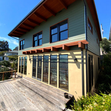
After half a century of exposure to wind and weather, this unique home at the Point Richmond shoreline was in dire need of complete renovation. The original mansard was removed and the new exterior takes its cues from the Craftsman interior of the home, featuring a new façade with lap siding, an accent gable facing the street, and a deep overhang facing San Francisco Bay. This reconfiguration makes the most out of the interior vistas, and it also opens up the bay view from the street. The project passed the Point Richmond Neighborhood Council, the city design review, as well as the SF Bay Conservation and Development Council with flying colors.
The owners set ambitious environmental goals and allowed us to follow through with a design for net-zero energy performance, meaning that the home could produce the annual power consumption from the rooftop solar system; the gas line was disconnected. Improved insulation and window upgrades go hand in hand with highly efficient heat pumps for space heating and domestic hot water. The bath fans recycle heat from the exhaust air, and the incoming air goes through a filter for improved indoor air quality, notably during wildfire season. The home also received substantial seismic upgrades.
Interior remodeling focused on the kitchen and master bath, while for most other rooms the challenge was to preserve and refresh the original character. Kasten Builders was the general contractor and got this home ready for the next 50+ years with a tremendously reduced carbon footprint.
Sponsored
Delaware, OH

Buckeye Basements, Inc.
Central Ohio's Basement Finishing ExpertsBest Of Houzz '13-'21
 DSA Architects
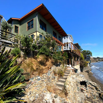
After half a century of exposure to wind and weather, this unique home at the Point Richmond shoreline was in dire need of complete renovation. The original mansard was removed and the new exterior takes its cues from the Craftsman interior of the home, featuring a new façade with lap siding, an accent gable facing the street, and a deep overhang facing San Francisco Bay. This reconfiguration makes the most out of the interior vistas, and it also opens up the bay view from the street. The project passed the Point Richmond Neighborhood Council, the city design review, as well as the SF Bay Conservation and Development Council with flying colors.
The owners set ambitious environmental goals and allowed us to follow through with a design for net-zero energy performance, meaning that the home could produce the annual power consumption from the rooftop solar system; the gas line was disconnected. Improved insulation and window upgrades go hand in hand with highly efficient heat pumps for space heating and domestic hot water. The bath fans recycle heat from the exhaust air, and the incoming air goes through a filter for improved indoor air quality, notably during wildfire season. The home also received substantial seismic upgrades.
Interior remodeling focused on the kitchen and master bath, while for most other rooms the challenge was to preserve and refresh the original character. Kasten Builders was the general contractor and got this home ready for the next 50+ years with a tremendously reduced carbon footprint.
 Jami Abbadessa
TEXTURAL VIBES
Time Frame: 2 Months // Design Fee: $1,875
Evan and his wife Karen were looking for professional help in designing/decorating their master bedroom in Rancho Cucamonga, CA. I was not referred to them, but they were impressed by my website, reviews and pictures of past projects. I’m always excited to work with new clients who were drawn to me by my style of past projects and online presence. When I first met with them, I immediately felt comfortable and knew this was going to be a great project. They were very open to suggestions and requested only a few things – TEXTURE, a seating area for TV viewing/gaming, a clean design without clutter and an overall well-put-together feeling. They told me not to hold back on my design vision, so we just went for it! I had a custom ceiling height headboard constructed in a velvet for drama. We splurged on luxurious bedding with tons of layers and texture. On that same wall I had shimmery, grey grass cloth installed for added texture. Custom, black out, silk Roman shades, layered with pleated sheers were hung. Grey-washed hardwood flooring was installed. I had a custom grey built-in installed in the niche to serve as a dresser and TV storage. Recessed lighting, reading lights and crystal pendants were added. A soft grey was painted on the walls with a contrasting darker slate on the ceiling. An over-sized wall mirror, wool rugs, metal-wrapped furniture, a custom sofa and ottoman with nailhead trim and professional photos of the couple framed in silver with linen mats tied everything together.

 Progressive Design Build
The Challenge
When we first met with our clients, they had a number of dislikes about the master bathroom in their seasonal Bonita Springs home. While the space was palatial, it just didn’t function well for them. Furthermore, it didn’t reflect their sense of style. They wanted to update fixtures and finishes with a splash of color and redesign the large, cave-like shower to include additional drainage and ventilation.
Our Solution
Our design team concluded that a complete reconfiguration of the entire master bathroom was the best way to give our clients the functionality and open feel they envisioned.
We removed the cumbersome center island and the built-in Jacuzzi in favor of a new focal point – a freestanding soaker tub – and created a new footprint for the shower. The new curbless double-headed shower design with floor-to-ceiling glass on three sides was guaranteed to provide the openness our clients were looking for. We raised the shower floor to match the main level and ran a large linear drain to move water quickly out of the shower. For the final touch, we installed floating quartz shower seats and his-and-hers niches for extra storage.
In the toilet room, we installed a large double storage cabinet for linens and extra storage. We also installed separate his-and-hers vanities with floating dark wood cabinetry and quartz countertops, accented with stacked stone mosaic tile. We also added floating medicine cabinet mirrors and painted the bathroom walls in the striking blue color our clients selected to compliment the lively hues throughout their home.
The Result
Ultimately, the new layout brought our clients’ vision to life. With vibrant, updated finishes, the updated space was much more suited to their style. Since our clients only reside in Bonita Springs part of the year, we were also able to complete the project while they were away from home. Upon their return, our clients were so thrilled with the results that they sent us this review:
“Their integrity, quality, friendliness, and excellent communication added up to completely satisfied clients …we would definitely – and without question – use Progressive Builders again!”
 David Moulton AIA
Creating a bridge between buildings at The Sea Ranch is an unusual undertaking. Though several residential, elevated walkways and a couple of residential bridges do exist, in general, the design elements of The Sea Ranch favor smaller, separate buildings. However, to make all of these buildings work for the owners and their pets, they really needed a bridge. Early on David Moulton AIA consulted The Sea Ranch Design Review Committee on their receptiveness to this project. Many different ideas were discussed with the Design Committee but ultimately, given the strong need for the bridge, they asked that it be designed in a way that expressed the organic nature of the landscape. There was strong opposition to creating a straight, longitudinal structure. Soon it became apparent that a central tower sporting a small viewing deck and screened window seat provided the owners with key wildlife viewing spots and gave the bridge a central structural point from which the adjacent, angled arms could reach west between the trees to the main house and east between the trees to the new master suite. The result is a precise and carefully designed expression of the landscape: an enclosed bridge elevated above wildlife paths and woven within inches of towering redwood trees.
Sponsored
Sunbury, OH
J.Holderby - Renovations
Franklin County's Leading General Contractors - 2X Best of Houzz!
 Jami Abbadessa
TEXTURAL VIBES
Time Frame: 2 Months // Design Fee: $1,875
Evan and his wife Karen were looking for professional help in designing/decorating their master bedroom in Rancho Cucamonga, CA. I was not referred to them, but they were impressed by my website, reviews and pictures of past projects. I’m always excited to work with new clients who were drawn to me by my style of past projects and online presence. When I first met with them, I immediately felt comfortable and knew this was going to be a great project. They were very open to suggestions and requested only a few things – TEXTURE, a seating area for TV viewing/gaming, a clean design without clutter and an overall well-put-together feeling. They told me not to hold back on my design vision, so we just went for it! I had a custom ceiling height headboard constructed in a velvet for drama. We splurged on luxurious bedding with tons of layers and texture. On that same wall I had shimmery, grey grass cloth installed for added texture. Custom, black out, silk Roman shades, layered with pleated sheers were hung. Grey-washed hardwood flooring was installed. I had a custom grey built-in installed in the niche to serve as a dresser and TV storage. Recessed lighting, reading lights and crystal pendants were added. A soft grey was painted on the walls with a contrasting darker slate on the ceiling. An over-sized wall mirror, wool rugs, metal-wrapped furniture, a custom sofa and ottoman with nailhead trim and professional photos of the couple framed in silver with linen mats tied everything together.

 Tiffany Brooks, HGTV Host & Interior Designer
Inquire About Our Design Services
When we first started talking in the spring of 2015, I was impressed. She was witty, realistic, and understood that as much as she loves my shows on HGTV, design does not does not happen in 43 minutes! She told me about her space, and how she felt that her bedroom seemed “blah” to her. She had no retreat. Molly desperately longed for a place that she could spend time in, read in, play in and above all, relax in.
What we did:
Many people are terrified of hiring a designer. Rightfully so, they are investing a pretty penny in their homes. They want to make sure that everything, down to the last floral arrangement, is to their liking, because they will have to live it (and pay for it). Unfortunately, a client can unintentionally stifle a designer’s creativity through micro-management. This can produce lackluster results and ultimately cause more time (and money) to be spent on a project than is really necessary.
With Molly, that was never an issue. Before she even showed me the room in question, she said that I could have full creative license to do what I needed to do to her bedroom. SAY WHAAH!?
With Molly giving me complete creative freedom, I planned everything out and got down to business. The result: Bite-your-bottom-lip sexy. I don’t get jealous of too many of my clients’ spaces, but this one still takes my breath away every time I look at the pics!
The craziest part was that by adding more furniture, it actually made the space feel larger.
Molly and her husband Patrick loved the finished space, and promised me I will be back to finish the rest of the house!
Here’s the highlights of the rest of the project:
I came up with a space plan with three options.
Next, we reviewed mood boards and fabric schemes that would work for both Molly and her hubby Patrick.
We started with the bed. My goal was to add edge to its otherwise traditional style.
We decided to spice things up by painting the trim work in the room black.
We built in layers of lighting with dimmers. In a bedroom everything should be on dimmers, right? Right.
We designed and customized bedding, chairs and window treatments.
Together with Molly, we selected the most perfect wallpaper. This geometric “grasscloth” adds so much depth and dimension that was just missing before.
What I love:
That light fixture. I mean it is really, really amazing in person.
The porcupine mirror. This thing came packaged like it was the hope diamond, and everyone was terrified to handle it. But it really became a highlight of the room.
 Holiday Kitchens
Clean lines, soft traditional finish on the perimeter with a custom painted island, mixed with subtle stainless steel appliances coupled with a light colored tile backsplash, completes this custom designed kitchen.
The Cabinetry - MA | Photographer: Colleen Dolan
Holiday Kitchens Cabinetry
Perimeter: Petersburg Square Cherry Door in Fireside with Onyx Glaze Matte
Island: Petersburg Square Paint Grade Door in Breeze with Graphite Wash Matte
See The Cabinetry today for more information on this amazing project. http://thecabinetry.net/
Find a showroom near you:
http://holidaykitchens.com/index.php/about/locator
View more kitchen designs online to find your style:
http://holidaykitchens.com/index.php/quality-designed/gallery/kitchens
Review more Door Styles online:
http://holidaykitchens.com/index.php/quality-designed/products
34