
Search results for "Master typically" in Home Design Ideas
 TKS Design Group
Download our free ebook, Creating the Ideal Kitchen. DOWNLOAD NOW
Lakefront property in the northwest suburbs of Chicago is hard to come by, so when we were hired by this young family with exactly that, we were immediately inspired by not just the unusually large footprint of this 1950’s colonial revival but also the lovely views of the manmade lake it was sited on. The large 5-bedroom home was solidly stuck in the 1980’s, but we saw tons of potential. We started out by updating the existing staircase with a fresh coat of paint and adding new herringbone slate to the entry hall.
The powder room off the entryway also got a refresh - new flooring, new cabinets and fixtures. We ran the new slate right through into this space for some consistency. A fun wallpaper and shiplap trim add a welcoming feel and set the tone for the home.
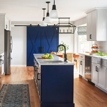
Next, we tackled the kitchen. Located away from the rest of the first floor, the kitchen felt a little isolated, so we immediately began planning for how to better connect it to the rest of the first floor. We landed on removing the wall between the kitchen and dining room and designed a modified galley style space with separate cooking and clean up zones. The cooking zone consists of the refrigerator, prep sink and cooktop, along with a nice long run of prep space at the island. The cleanup side of the kitchen consists of the main sink and dishwasher. Both areas are situated so that the user can view the lake during prep work and cleanup!
One of the home’s main puzzles was how to incorporate the mudroom and area in front of the patio doors at the back of the house. We already had a breakfast table area, so the space by the patio doors was a bit of a no man’s land. We decided to separate the kitchen proper from what became the new mudroom with a large set of barn doors. That way you can quickly hide any mudroom messes but have easy access to the light coming in through the patio doors as well as the outdoor grilling station. We also love the impact the barn doors add to the overall space.
The homeowners’ first words to us were “it’s time to ditch the brown,” so we did! We chose a lovely blue pallet that reflects the home’s location on the lake which is also vibrant yet easy on the eye. Countertops are white quartz, and the natural oak floor works well with the other honey accents. The breakfast table was given a refresh with new chairs, chandelier and window treatments that frame the gorgeous views of the lake out the back.
We coordinated the slate mudroom flooring with that used in the home’s main entrance for a consistent feel. The storage area consists of open and closed storage to allow for some clutter control as needed.
Next on our “to do” list was revamping the dated brown bar area in the neighboring dining room. We eliminated the clutter by adding some closed cabinets and did some easy updates to help the space feel more current. One snag we ran into here was the discovery of a beam above the existing open shelving that had to be modified with a smaller structural beam to allow for our new design to work. This was an unexpected surprise, but in the end we think it was well worth it!
We kept the colors here a bit more muted to blend with the homeowner’s existing furnishings. Open shelving and polished nickel hardware add some simple detail to the new entertainment zone which also looks out onto the lake!
Next we tackled the upstairs starting with the homeowner’s son’s bath. The bath originally had both a tub shower and a separate shower, so we decided to swap out the shower for a new laundry area. This freed up some space downstairs in what used to be the mudroom/laundry room and is much more convenient for daily laundry needs.
We continued the blue palette here with navy cabinetry and the navy tile in the shower. Porcelain floor tile and chrome fixtures keep maintenance to a minimum while matte black mirrors and lighting add some depth the design. A low maintenance runner adds some warmth underfoot and ties the whole space together.
We added a pocket door to the bathroom to minimize interference with the door swings. The left door of the laundry closet is on a 180 degree hinge to allow for easy full access to the machines. Next we tackled the master bath which is an en suite arrangement. The original was typical of the 1980’s with the vanity outside of the bathroom, situated near the master closet. And the brown theme continued here with multiple shades of brown.
Our first move was to segment off the bath and the closet from the master bedroom. We created a short hall from the bedroom to the bathroom with his and hers walk-in closets on the left and right as well as a separate toilet closet outside of the main bathroom for privacy and flexibility.
The original bathroom had a giant soaking tub with steps (dangerous!) as well as a small shower that did not work well for our homeowner who is 6’3”. With other bathtubs in the home, they decided to eliminate the tub and create an oversized shower which takes up the space where the old tub was located. The double vanity is on the opposite wall and a bench is located under the window for morning conversations and a place to set a couple of towels.
The pallet in here is light and airy with a mix of blond wood, creamy porcelain and marble tile, and brass accents. A simple roman shade adds some texture and it’s top-down mechanism allows for light and privacy.
This large whole house remodel gave our homeowners not only the ability to maximize the potential of their home but also created a lovely new frame from which to view their fabulous lake views.
Designed by: Susan Klimala, CKD, CBD
Photography by: Michael Kaskel
For more information on kitchen and bath design ideas go to: www.kitchenstudio-ge.com


 Phoenix Home Remodeling
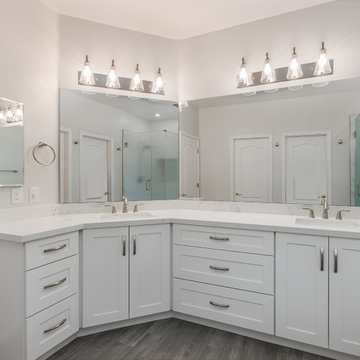
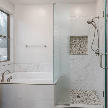
After meeting with Mark, we determined that the goal of his remodel was that he wanted to convert his typical 2000s master bath into a transitional and functional area and get more storage. The standard cultured marble walls and soaking tub wasn’t exactly what he wanted any longer.
After learning about his style, we determined a large format tile and larger base cabinets would do the trick. From the white cabinetry, and striking vein large format tile and deep soaking tub.
The white shaker cabinets are for Sollid Cabinetry. We minimized the sink bases so that Mark could control what is under those cabinets, however do you see those drawer bases? They are large enough to hold anything you desire.
The two-toned shower and tub deck tile feature a striking vein that appears to go on for days. The wall tiles size is a large format tile measuring at 24X48.
This size allows for two great design elements. The first, allowing the vein to be continuous. Second, less wall grout. A total of 9 tiles used on the walls. To accentuate this vein we installed an oversized niche allows for a spotlight for the pebble mosaic to be a feature on the wall and the shower pan.
The tub deck and curb tiles are from Arizona Tile as well. It is the Cemento Rasato – Bianco 12X24. By pairing these tiles together, it supports the wall tile and allows that to be the star of the show.
The bathroom floor is Frassino, from the collection of Porta Nouva from Arizona Tile. Laid in a horizontal random offset. This selection pops the whites and grounds the elements.
This bathroom features a Calcatta quartz countertops that showcase a slight vein that supports the wall tile. The bathroom accessories, lighting fixtures and faucets are all brushed nickel.
Find the right local pro for your project
 Phoenix Home Remodeling
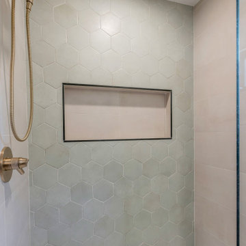
Sarah & Warren desperately needed a master bathroom update. Their existing tub shower combo was dark and drab.
The room struggled to meet their needs. The areas meant for storage were not designed properly that created a lot of wasted space.
The vanity was bulky and was not functioning properly for them. The oversized mirror was dated. The room also had a very large clear window that was covered up by blinds that just attracted dust.
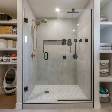
By stripping back, the layers, the tub was not a feature this couple needed, the vanity became floating, and the window was downsized to fit more with their desires. The wasted space to the right of the shower became usable to them by allowing storage for extra bath towel and showering accessories. The panty to the left because a dedicated storage tucked away out of sight.
Lighting improved because of the additional light above the shower and the toilet. We also removed the traditional light above the sinks and installed recessed can lighting throughout the bathroom.
The round storage mirrors side open to reveal hidden storage for all the small items you typically have in a bathroom. Their modern double vanity called Aron was installed floating with 3 functional drawers and a storage opening featuring a mint green and walnut finish and the top is quartz featuring rectangular sinks.
The shower wall tile paired together is a brushed concrete pattern tile called Reside beige from Arizona Tile and the back wall is a light green hexagon tile called Springtime Green from the Tile Shop. The mini hex mosaic floor is white and green mini glass hexagons called Geo from Arizona Tile.
The Delta Trinsic collection is featured in this bathroom with the matte black finish in the bath accessories and the faucets in the Champagne Bronze finish. A light-colored floor brings all elements together and allows the eyes to bounce around the room.

 Matt Fajkus Architecture
The Main Stay House exists as a straightforward proposal on an urban infill lot, paring down the components of a house to a minimal amount of planes and openings. The scheme is anchored by a modern entry sequence and a staircase volume, both clad in iron spot masonry externally and internally, creating thresholds between the respective realms of public, common and private, by minimal means. The masonry contrasts with an otherwise muted interior atmosphere of smooth, desaturated surfaces.
The entry sequence is a twist upon the conventional domestic front door, front facade, and fence. The front masonry wall replaces the typical residential fence and frames an indirect access to the front door, functioning as a privacy barrier while revealing slices of the interior to the public street.
The staircase bifurcates the layout to provide a clear division between the common and private zones of the house, while clearly reading as a mass from all outside view. Brick and glass become portals between common and private zones.
The design consolidates the service core along the west façade, allowing the structure to fully open the living zone to the pool court and existing trees. This directly connects interior and exterior, as well as human and nature. Freedom to vary the program or functional use of the area is enabled and strongly encouraged.
Photography: Twist Tours
 TKS Design Group
Free ebook, Creating the Ideal Kitchen. DOWNLOAD NOW
The Klimala’s and their three kids are no strangers to moving, this being their fifth house in the same town over the 20-year period they have lived there. “It must be the 7-year itch, because every seven years, we seem to find ourselves antsy for a new project or a new environment. I think part of it is being a designer, I see my own taste evolve and I want my environment to reflect that. Having easy access to wonderful tradesmen and a knowledge of the process makes it that much easier”.
This time, Klimala’s fell in love with a somewhat unlikely candidate. The 1950’s ranch turned cape cod was a bit of a mutt, but it’s location 5 minutes from their design studio and backing up to the high school where their kids can roll out of bed and walk to school, coupled with the charm of its location on a private road and lush landscaping made it an appealing choice for them.
“The bones of the house were really charming. It was typical 1,500 square foot ranch that at some point someone added a second floor to. Its sloped roofline and dormered bedrooms gave it some charm.” With the help of architect Maureen McHugh, Klimala’s gutted and reworked the layout to make the house work for them. An open concept kitchen and dining room allows for more frequent casual family dinners and dinner parties that linger. A dingy 3-season room off the back of the original house was insulated, given a vaulted ceiling with skylights and now opens up to the kitchen. This room now houses an 8’ raw edge white oak dining table and functions as an informal dining room. “One of the challenges with these mid-century homes is the 8’ ceilings. I had to have at least one room that had a higher ceiling so that’s how we did it” states Klimala.
The kitchen features a 10’ island which houses a 5’0” Galley Sink. The Galley features two faucets, and double tiered rail system to which accessories such as cutting boards and stainless steel bowls can be added for ease of cooking. Across from the large sink is an induction cooktop. “My two teen daughters and I enjoy cooking, and the Galley and induction cooktop make it so easy.” A wall of tall cabinets features a full size refrigerator, freezer, double oven and built in coffeemaker. The area on the opposite end of the kitchen features a pantry with mirrored glass doors and a beverage center below.
The rest of the first floor features an entry way, a living room with views to the front yard’s lush landscaping, a family room where the family hangs out to watch TV, a back entry from the garage with a laundry room and mudroom area, one of the home’s four bedrooms and a full bath. There is a double sided fireplace between the family room and living room. The home features pops of color from the living room’s peach grass cloth to purple painted wall in the family room. “I’m definitely a traditionalist at heart but because of the home’s Midcentury roots, I wanted to incorporate some of those elements into the furniture, lighting and accessories which also ended up being really fun. We are not formal people so I wanted a house that my kids would enjoy, have their friends over and feel comfortable.”
The second floor houses the master bedroom suite, two of the kids’ bedrooms and a back room nicknamed “the library” because it has turned into a quiet get away area where the girls can study or take a break from the rest of the family. The area was originally unfinished attic, and because the home was short on closet space, this Jack and Jill area off the girls’ bedrooms houses two large walk-in closets and a small sitting area with a makeup vanity. “The girls really wanted to keep the exposed brick of the fireplace that runs up the through the space, so that’s what we did, and I think they feel like they are in their own little loft space in the city when they are up there” says Klimala.
Designed by: Susan Klimala, CKD, CBD
Photography by: Carlos Vergara
For more information on kitchen and bath design ideas go to: www.kitchenstudio-ge.com

 Mantell-Hecathorn Builders
3,320 sqft, 4 bedroom, 3 1/2 bathroom high performance custom home at Durango Mountain Resort.
Expansive Two Car Garage
Additional Heated Storage
Mountain Views, Large Windows
Spacious Master Suite
Custom Finishes: Hickory Floors, Alder Cabinets and Doors,
Granite and Silestone Counters
Tremendous Long-Term Value
Smart and Useable Design
Approximately 600 people visited this award winning home during the 3-day Durango Parade of Homes Parade.
57% more efficient than a standard home.
Triple pane Kolbe clad windows = high end quality and efficiency. Other builders use mid-grade double pane.
Distinctly higher insulation value = no uncomfortable drafts.
Insulation values follow advanced building science principles.
Foundation Walls - R22 to R32 (not the usual R2 or R10).
Exterior Walls - R32 to R40 (building code only requires R19 batt-style).
Attic Insulation - R60 blown fiberglass (building code only requires R38 batt-style which is inadequate for our climate and allows for problematic ice dams).
Air tight construction techniques typically ignored by conventional builders.
Garage closed-cell spray foam seals carbon monoxide from living space. Panasonic fan carries exhaust fumes outside.
In-Floor Heat with high efficiency boiler
Greater Durability & Comfort

 Phoenix Home Remodeling
Sarah & Warren desperately needed a master bathroom update. Their existing tub shower combo was dark and drab.
The room struggled to meet their needs. The areas meant for storage were not designed properly that created a lot of wasted space.
The vanity was bulky and was not functioning properly for them. The oversized mirror was dated. The room also had a very large clear window that was covered up by blinds that just attracted dust.
By stripping back, the layers, the tub was not a feature this couple needed, the vanity became floating, and the window was downsized to fit more with their desires. The wasted space to the right of the shower became usable to them by allowing storage for extra bath towel and showering accessories. The panty to the left because a dedicated storage tucked away out of sight.
Lighting improved because of the additional light above the shower and the toilet. We also removed the traditional light above the sinks and installed recessed can lighting throughout the bathroom.
The round storage mirrors side open to reveal hidden storage for all the small items you typically have in a bathroom. Their modern double vanity called Aron was installed floating with 3 functional drawers and a storage opening featuring a mint green and walnut finish and the top is quartz featuring rectangular sinks.
The shower wall tile paired together is a brushed concrete pattern tile called Reside beige from Arizona Tile and the back wall is a light green hexagon tile called Springtime Green from the Tile Shop. The mini hex mosaic floor is white and green mini glass hexagons called Geo from Arizona Tile.
The Delta Trinsic collection is featured in this bathroom with the matte black finish in the bath accessories and the faucets in the Champagne Bronze finish. A light-colored floor brings all elements together and allows the eyes to bounce around the room.
 Phoenix Home Remodeling
After meeting with Mark, we determined that the goal of his remodel was that he wanted to convert his typical 2000s master bath into a transitional and functional area and get more storage. The standard cultured marble walls and soaking tub wasn’t exactly what he wanted any longer.
After learning about his style, we determined a large format tile and larger base cabinets would do the trick. From the white cabinetry, and striking vein large format tile and deep soaking tub.
The white shaker cabinets are for Sollid Cabinetry. We minimized the sink bases so that Mark could control what is under those cabinets, however do you see those drawer bases? They are large enough to hold anything you desire.
The two-toned shower and tub deck tile feature a striking vein that appears to go on for days. The wall tiles size is a large format tile measuring at 24X48.
This size allows for two great design elements. The first, allowing the vein to be continuous. Second, less wall grout. A total of 9 tiles used on the walls. To accentuate this vein we installed an oversized niche allows for a spotlight for the pebble mosaic to be a feature on the wall and the shower pan.
The tub deck and curb tiles are from Arizona Tile as well. It is the Cemento Rasato – Bianco 12X24. By pairing these tiles together, it supports the wall tile and allows that to be the star of the show.
The bathroom floor is Frassino, from the collection of Porta Nouva from Arizona Tile. Laid in a horizontal random offset. This selection pops the whites and grounds the elements.
This bathroom features a Calcatta quartz countertops that showcase a slight vein that supports the wall tile. The bathroom accessories, lighting fixtures and faucets are all brushed nickel.

 Sullivan Building & Design Group
As part of an overall renovation of an old farmhouse the bathrooms are always a little more di cult to plan. In this case our client wanted to create a real “masculine” overall feel but with enough class to make it comfortable for a woman. Bold forms and solid lines needed to be o set by subtle softness in the design.
THE RESULTS
The overall bathroom is both handsome and bold. We custom built the walnut vanity from wall to wall of the existing space. We used wall mounted faucets with just a bit of a rounded profile to soften the square edges of the soapstone tops and walnut mirror.
The shower is a combination of very bold blackened steel framed glass around a clean white subway tile background. The black and white theme is quite typical in this period home. Our client was an active participant in the overall design process and was thrilled with the result.
This bathroom is a total remake of a small bathroom that existed in an old stone farmhouse in which the whole house was totally renovated. As this was a bachelor pad of sorts there was a real desire to blend bold forms and dark colors with a touch of class and sophistication. Bold walnut vanity with soft baskets for storage blended perfectly with black metal shower frame and clean white subway tile. A very cozy modern bath with a charming old world feel.
 A\ TYPICAL DESIGN STUDIO
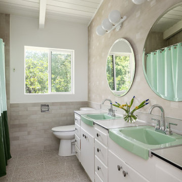
Drop-in bathtub - mid-sized 1960s master gray tile and ceramic tile terrazzo floor, gray floor and double-sink drop-in bathtub idea in Salt Lake City with flat-panel cabinets, white cabinets, white walls, laminate countertops, white countertops and a built-in vanity
 Phoenix Home Remodeling
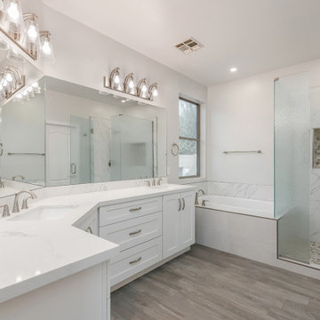
After meeting with Mark, we determined that the goal of his remodel was that he wanted to convert his typical 2000s master bath into a transitional and functional area and get more storage. The standard cultured marble walls and soaking tub wasn’t exactly what he wanted any longer.
After learning about his style, we determined a large format tile and larger base cabinets would do the trick. From the white cabinetry, and striking vein large format tile and deep soaking tub.
The white shaker cabinets are for Sollid Cabinetry. We minimized the sink bases so that Mark could control what is under those cabinets, however do you see those drawer bases? They are large enough to hold anything you desire.
The two-toned shower and tub deck tile feature a striking vein that appears to go on for days. The wall tiles size is a large format tile measuring at 24X48.
This size allows for two great design elements. The first, allowing the vein to be continuous. Second, less wall grout. A total of 9 tiles used on the walls. To accentuate this vein we installed an oversized niche allows for a spotlight for the pebble mosaic to be a feature on the wall and the shower pan.
The tub deck and curb tiles are from Arizona Tile as well. It is the Cemento Rasato – Bianco 12X24. By pairing these tiles together, it supports the wall tile and allows that to be the star of the show.
The bathroom floor is Frassino, from the collection of Porta Nouva from Arizona Tile. Laid in a horizontal random offset. This selection pops the whites and grounds the elements.
This bathroom features a Calcatta quartz countertops that showcase a slight vein that supports the wall tile. The bathroom accessories, lighting fixtures and faucets are all brushed nickel.

 ZeroEnergy Design
This modern green home offers both a vacation destination on Cape Cod near local family members and an opportunity for rental income.
FAMILY ROOTS. A West Coast couple living in the San Francisco Bay Area sought a permanent East Coast vacation home near family members living on Cape Cod. As academic professionals focused on sustainability, they sought a green, energy efficient home that was well-aligned with their values. With no green homes available for sale on Cape Cod, they decided to purchase land near their family and build their own.
SLOPED SITE. Comprised of a 3/4 acre lot nestled in the pines, the steeply sloping terrain called for a plan that embraced and took advantage of the slope. Of equal priority was optimizing solar exposure, preserving privacy from abutters, and creating outdoor living space. The design accomplished these goals with a simple, rectilinear form, offering living space on the both entry and lower/basement levels. The stepped foundation allows for a walk-out basement level with light-filled living space on the down-hill side of the home. The traditional basement on the eastern, up-hill side houses mechanical equipment and a home gym. The house welcomes natural light throughout, captures views of the forest, and delivers entertainment space that connects indoor living space to outdoor deck and dining patio.
MODERN VISION. The clean building form and uncomplicated finishes pay homage to the modern architectural legacy on the outer Cape. Durable and economical fiber cement panels, fixed with aluminum channels, clad the primary form. Cedar clapboards provide a visual accent at the south-facing living room, which extends a single roof plane to cover the entry porch.
SMART USE OF SPACE. On the entry level, the “L”-shaped living, dining, and kitchen space connects to the exterior living, dining, and grilling spaces to effectively double the home’s summertime entertainment area. Placed at the western end of the entry level (where it can retain privacy but still claim expansive downhill views) is the master suite with a built-in study. The lower level has two guest bedrooms, a second full bathroom, and laundry. The flexibility of the space—crucial in a house with a modest footprint—emerges in one of the guest bedrooms, which doubles as home office by opening the barn-style double doors to connect it to the bright, airy open stair leading up to the entry level. Thoughtful design, generous ceiling heights and large windows transform the modest 1,100 sf* footprint into a well-lit, spacious home. *(total finished space is 1800 sf)
RENTAL INCOME. The property works for its owners by netting rental income when the owners are home in San Francisco. The house especially caters to vacationers bound for nearby Mayo Beach and includes an outdoor shower adjacent to the lower level entry door. In contrast to the bare bones cottages that are typically available on the Cape, this home offers prospective tenants a modern aesthetic, paired with luxurious and green features. Durable finishes inside and out will ensure longevity with the heavier use that comes with a rental property.
COMFORT YEAR-ROUND. The home is super-insulated and air-tight, with mechanical ventilation to provide continuous fresh air from the outside. High performance triple-paned windows complement the building enclosure and maximize passive solar gain while ensuring a warm, draft-free winter, even when sitting close to the glass. A properly sized air source heat pump offers efficient heating & cooling, and includes a carefully designed the duct distribution system to provide even comfort throughout the house. The super-insulated envelope allows us to significantly reduce the equipment capacity, duct size, and airflow quantities, while maintaining unparalleled thermal comfort.
ENERGY EFFICIENT. The building’s shell and mechanical systems play instrumental roles in the home’s exceptional performance. The building enclosure reduces the most significant energy glutton: heating. Continuous super-insulation, thorough air sealing, triple-pane windows, and passive solar gain work together to yield a miniscule heating load. All active energy consumers are extremely efficient: an air source heat pump for heating and cooling, a heat pump hot water heater, LED lighting, energy recovery ventilation (ERV), and high efficiency appliances. The result is a home that uses 70% less energy than a similar new home built to code requirements.
OVERALL. The home embodies the owners’ goals and values while comprehensively enabling thermal comfort, energy efficiency, a vacation respite, and supplementary income.
PROJECT TEAM
ZeroEnergy Design - Architect & Mechanical Designer
A.F. Hultin & Co. - Contractor
Pamet Valley Landscape Design - Landscape & Masonry
Lisa Finch - Original Artwork
European Architectural Supply - Windows
Eric Roth Photography - Photography


 Baba Bolli
This remodel was for a young, busy family of five. They had purchased the home initially because it was very spacious and included a large garden. After several years, however, it was clear they would have to make some changes as they spent most of their family time together in the too small, galley-style kitchen. We agreed that in order to achieve the open kitchen/ family room they would need to add about 500 square feet. The project was quite involved because, like many typical Mill Valley homes, the house was built on the side of hill and the foundations had to be quite deep. The main idea for the space was inspired by the Bulhaup Kitchen and the need for two ovens and two sinks. The two islands helped create a totally accessible kitchen work area.
Dealing with a large house built in 1978, it was challenging to come up with a style that would work with some of the original windows in other areas that were not in the budget for replacement. The new windows and doors were specifically chosen to let in the light and take in the secluded garden and lush surroundings. The rounded decks softened the rather severe boxy exterior of the residence. The slate floor and steel baseboards were both practical and aesthetically pleasing; their durability and easy upkeep would come in handy for a large family.
The remodel further included a rework of the master bathroom/ closet area as well as all the windows and doors. The bathroom shower was tiled with small stone tiles imported from Sienna, Italy. Throughout the remodel, the taps were from the famous German Durnbroch, the sinks were by Philippe Stark, and the lighting was predominately from Artemide, an Italian lighting manufacturer. The tub and washstands, from Kholer the Bold Look, helped complete the design.

 Gallery KBNY
This brownstone renovation was a full gut project in every sense of the word. On top of installing new floors, a kitchen and bath renovation, and all the typical restoration and refinishing involved in a brownstone built in 1899, we also completely updated the exterior, constructed a balcony that was not originally there, and converted the space from a single-family home into an an owner’s triplex. A newly separated studio rental on the garden level offers the opportunity for supplemental income, an uncommon and welcome addition to a New York brownstone.
A TRANSITIONAL GEM
The result is a two-family brownstone that perfectly combines classic townhouse living with today’s modern needs, including SmartHome technology that we installed to control Bluetooth speakers, Nest thermostats, and the security system.
The overall aesthetic goal was to pay homage to the historical periods the brownstone has lived through in a cohesive way that is the hallmark of modern transitional style.
In the kitchen, white Shaker-style cabinetry, a subway tile backsplash, and marble rather than quartz countertops bring a classically upscale sensibility. To modernize the space further, we opened up the back wall to create floor-to-ceiling windows that are also doors, opening up into the newly built balcony.
TIMELY TOUCHES
This brownstone renovation included many quintessential elements, such as millwork like the ceiling medallions. We restored some and custom built others, perfectly recreating their original appearance.
The heated master bathroom is now serene, with a walk-in shower featuring a subtly modern linear drain. A herringbone Carrera marble tiled floor and marble slab sink complete the scene. In the powder room, we embraced a contemporary look by pairing dark hexagonal floors with light chevron tiles, accented with dramatic navy blue wallpaper. With its clear-cut 1920s-style, we selected the wall sconce to reference one of the brownstone’s earlier eras.
DESIGN DETAILS
Natural oak herringbone floors we installed throughout the entire home bring a modern yet warm touch. We restored the wood-burning marble fireplace, which is fully functioning. An elegant staircase with a custom-crafted black wooden banister and white balusters winds up and down alongside a real brick interior wall that we restored and refinished.
In this brownstone renovation, we were also able to create ceiling height, an unexpected yet aesthetically pleasing side benefit. When working on the joists and beams to level out the floors (a common issue in pre-war renovations) we added ceiling height in the main parlor floor by taking the second floor and raising the ceiling an entire foot. The end result is a main floor with stunning 9-foot ceilings.
SOME HIGHLIGHTS
- Solid natural oak herringbone floors throughout
- A fully restored, refinished, and functioning wood burning fireplace with a marble mantle
- Complete exterior renovation of the facade, cornices, windows, mouldings, and even the ironwork, including the railings leading up to the stoop and those facing the street
- A brand new central air and heating system with uniquely modern vents – look above the couch in the living room with the fuzzy rug and large painting
Considering a brownstone renovation? Contact us today! We specialize in brownstone renovations in New York as well as all pre-war apartments. When you work with a design-and-build firm like Gallery to renovate your brownstone, you get the full range of our expertise in working with all the finest details and pre-war architectural elements of these classic New York spaces. We also handle every step of the process, from filing permits and organizing schedules to sourcing custom pieces and building entirely new rooms (or even balconies). Call us for a free initial consultation when you’re ready.

 DCI Home Improvements
With the influx of construction in west Pasco during the late 60’s and 70’s, we saw a plethora of 2 and 3 bedroom homes being constructed with little or no attention paid to the existing bathrooms and kitchens in the homes. Homes on the water were no exception. Typically they were built to just be a functional space, but rarely did they ever accomplish this. We had the opportunity to renovate a gentleman’s master bathroom in the Westport area of Port Richey. It was a story that started off with the client having a tale of an unscrupulous contractor that he hired to perform his renovation project and things took a turn and lets just say they didn’t pan out. The client approached us to see what we could do. We never had the opportunity to see the bathroom in its original state as the tear out had already been taken care of, somewhat, by the previous contractor. We listened to what the client wanted to do with the space and devised a plan. We enlarged the shower area, adding specialty items like a wall niche, heated mirror, rain head shower, and of course a custom glass enclosure. To the main portion of the bathroom we were able to add a larger vanity with waterfall faucet, large framed mirror, and new lighting. New floor tile, wall tile, and accessories rounded out this build.

Sponsored
Columbus, OH

Wannemacher Interiors
Customized Award-Winning Interior Design Solutions in Franklin Cnty OH
 Baba Bolli
This remodel was for a young, busy family of five. They had purchased the home initially because it was very spacious and included a large garden. After several years, however, it was clear they would have to make some changes as they spent most of their family time together in the too small, galley-style kitchen. We agreed that in order to achieve the open kitchen/ family room they would need to add about 500 square feet. The project was quite involved because, like many typical Mill Valley homes, the house was built on the side of hill and the foundations had to be quite deep. The main idea for the space was inspired by the Bulhaup Kitchen and the need for two ovens and two sinks. The two islands helped create a totally accessible kitchen work area.
Dealing with a large house built in 1978, it was challenging to come up with a style that would work with some of the original windows in other areas that were not in the budget for replacement. The new windows and doors were specifically chosen to let in the light and take in the secluded garden and lush surroundings. The rounded decks softened the rather severe boxy exterior of the residence. The slate floor and steel baseboards were both practical and aesthetically pleasing; their durability and easy upkeep would come in handy for a large family.
The remodel further included a rework of the master bathroom/ closet area as well as all the windows and doors. The bathroom shower was tiled with small stone tiles imported from Sienna, Italy. Throughout the remodel, the taps were from the famous German Durnbroch, the sinks were by Philippe Stark, and the lighting was predominately from Artemide, an Italian lighting manufacturer. The tub and washstands, from Kholer the Bold Look, helped complete the design.
 TATYANA DENISENKO INTERIOR DESIGN
Since 2010, our studio has been designing interiors for investors, developers, and commercial property owners, focused on elevating market appeal, asset valuation, and competitive edge.
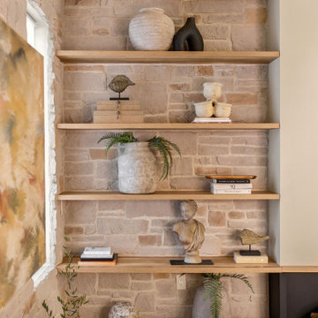
Inspired by their global travels, the clients envisioned constructing four short-term luxury rental villas within their private estate in Greenville, South Carolina. The interiors were meant to capture a distinct regional flavor without relying on literal historicism, defining four directional concepts: Japan, Persia, the Nordic, and the Mediterranean.
The Mediterranean-styled project, presented for your consideration, was born under severe structural constraints—much like the other villas in this complex whose interiors our studio designed as part of this commission. To work on the indoor spaces, the clients provided a traditional residential architectural template typical of South Carolina, featuring multiple pitched roofs alongside a rigid, unalterable floor plan that was identical for all four planned villas on the estate. While this approach ensured overall exterior cohesion across the property, in this particular instance, it least conflicted with the interior design goals, as both the architecture and the Mediterranean interior organically synchronize into a singular Southern narrative.
As a designer, I wanted to capture the aesthetic of a sun-drenched coastline, raw textures, and absolute Southern comfort, creating a sensory oasis carved from limestone, wrapped in vines, and kissed by the sun. Although the home's architectural form dictates the rules of South Carolina, our studio boldly breaks them—masterfully weaving in the distinct moods of Ibiza and Sicily to once again rewire the connection between the architectural envelope and the interior soul.
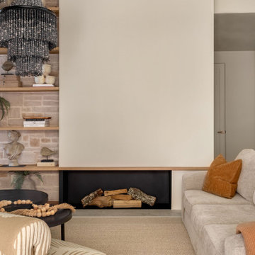 TATYANA DENISENKO INTERIOR DESIGN
Since 2010, our studio has been designing interiors for investors, developers, and commercial property owners, focused on elevating market appeal, asset valuation, and competitive edge.
Inspired by their global travels, the clients envisioned constructing four short-term luxury rental villas within their private estate in Greenville, South Carolina. The interiors were meant to capture a distinct regional flavor without relying on literal historicism, defining four directional concepts: Japan, Persia, the Nordic, and the Mediterranean.
The Mediterranean-styled project, presented for your consideration, was born under severe structural constraints—much like the other villas in this complex whose interiors our studio designed as part of this commission. To work on the indoor spaces, the clients provided a traditional residential architectural template typical of South Carolina, featuring multiple pitched roofs alongside a rigid, unalterable floor plan that was identical for all four planned villas on the estate. While this approach ensured overall exterior cohesion across the property, in this particular instance, it least conflicted with the interior design goals, as both the architecture and the Mediterranean interior organically synchronize into a singular Southern narrative.
As a designer, I wanted to capture the aesthetic of a sun-drenched coastline, raw textures, and absolute Southern comfort, creating a sensory oasis carved from limestone, wrapped in vines, and kissed by the sun. Although the home's architectural form dictates the rules of South Carolina, our studio boldly breaks them—masterfully weaving in the distinct moods of Ibiza and Sicily to once again rewire the connection between the architectural envelope and the interior soul.
95