
Search results for "Master typically" in Home Design Ideas
 TKS Design Group
Download our free ebook, Creating the Ideal Kitchen. DOWNLOAD NOW
Lakefront property in the northwest suburbs of Chicago is hard to come by, so when we were hired by this young family with exactly that, we were immediately inspired by not just the unusually large footprint of this 1950’s colonial revival but also the lovely views of the manmade lake it was sited on. The large 5-bedroom home was solidly stuck in the 1980’s, but we saw tons of potential. We started out by updating the existing staircase with a fresh coat of paint and adding new herringbone slate to the entry hall.
The powder room off the entryway also got a refresh - new flooring, new cabinets and fixtures. We ran the new slate right through into this space for some consistency. A fun wallpaper and shiplap trim add a welcoming feel and set the tone for the home.
Next, we tackled the kitchen. Located away from the rest of the first floor, the kitchen felt a little isolated, so we immediately began planning for how to better connect it to the rest of the first floor. We landed on removing the wall between the kitchen and dining room and designed a modified galley style space with separate cooking and clean up zones. The cooking zone consists of the refrigerator, prep sink and cooktop, along with a nice long run of prep space at the island. The cleanup side of the kitchen consists of the main sink and dishwasher. Both areas are situated so that the user can view the lake during prep work and cleanup!
One of the home’s main puzzles was how to incorporate the mudroom and area in front of the patio doors at the back of the house. We already had a breakfast table area, so the space by the patio doors was a bit of a no man’s land. We decided to separate the kitchen proper from what became the new mudroom with a large set of barn doors. That way you can quickly hide any mudroom messes but have easy access to the light coming in through the patio doors as well as the outdoor grilling station. We also love the impact the barn doors add to the overall space.
The homeowners’ first words to us were “it’s time to ditch the brown,” so we did! We chose a lovely blue pallet that reflects the home’s location on the lake which is also vibrant yet easy on the eye. Countertops are white quartz, and the natural oak floor works well with the other honey accents. The breakfast table was given a refresh with new chairs, chandelier and window treatments that frame the gorgeous views of the lake out the back.
We coordinated the slate mudroom flooring with that used in the home’s main entrance for a consistent feel. The storage area consists of open and closed storage to allow for some clutter control as needed.
Next on our “to do” list was revamping the dated brown bar area in the neighboring dining room. We eliminated the clutter by adding some closed cabinets and did some easy updates to help the space feel more current. One snag we ran into here was the discovery of a beam above the existing open shelving that had to be modified with a smaller structural beam to allow for our new design to work. This was an unexpected surprise, but in the end we think it was well worth it!
We kept the colors here a bit more muted to blend with the homeowner’s existing furnishings. Open shelving and polished nickel hardware add some simple detail to the new entertainment zone which also looks out onto the lake!
Next we tackled the upstairs starting with the homeowner’s son’s bath. The bath originally had both a tub shower and a separate shower, so we decided to swap out the shower for a new laundry area. This freed up some space downstairs in what used to be the mudroom/laundry room and is much more convenient for daily laundry needs.
We continued the blue palette here with navy cabinetry and the navy tile in the shower. Porcelain floor tile and chrome fixtures keep maintenance to a minimum while matte black mirrors and lighting add some depth the design. A low maintenance runner adds some warmth underfoot and ties the whole space together.
We added a pocket door to the bathroom to minimize interference with the door swings. The left door of the laundry closet is on a 180 degree hinge to allow for easy full access to the machines. Next we tackled the master bath which is an en suite arrangement. The original was typical of the 1980’s with the vanity outside of the bathroom, situated near the master closet. And the brown theme continued here with multiple shades of brown.
Our first move was to segment off the bath and the closet from the master bedroom. We created a short hall from the bedroom to the bathroom with his and hers walk-in closets on the left and right as well as a separate toilet closet outside of the main bathroom for privacy and flexibility.
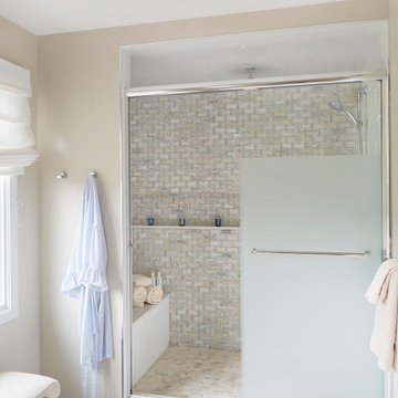
The original bathroom had a giant soaking tub with steps (dangerous!) as well as a small shower that did not work well for our homeowner who is 6’3”. With other bathtubs in the home, they decided to eliminate the tub and create an oversized shower which takes up the space where the old tub was located. The double vanity is on the opposite wall and a bench is located under the window for morning conversations and a place to set a couple of towels.
The pallet in here is light and airy with a mix of blond wood, creamy porcelain and marble tile, and brass accents. A simple roman shade adds some texture and it’s top-down mechanism allows for light and privacy.
This large whole house remodel gave our homeowners not only the ability to maximize the potential of their home but also created a lovely new frame from which to view their fabulous lake views.
Designed by: Susan Klimala, CKD, CBD
Photography by: Michael Kaskel
For more information on kitchen and bath design ideas go to: www.kitchenstudio-ge.com
 So Cal Builders & Design
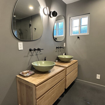
The existing master bathroom was enlarged, and the tub was converted into a spacious walk-in shower with a seating bench. A second vanity was also added, and a new cement floor was installed to achieve an industrial look.

 ZeroEnergy Design
This LEED Platinum certified house reflects the homeowner's desire for an exceptionally healthy and comfortable living environment, within a traditional neighborhood.
INFILL SITE. The family, who moved from another area of Wellesley, sought out this property to be within walking distance of the high school and downtown area. An existing structure on the tight lot was removed to make way for the new home. 84% of the construction waste, from both the previous structure and the new home, was diverted from a landfill. ZED designed to preserve the existing mature trees on the perimeter of the property to minimize site impacts, and to maintain the character of the neighborhood as well as privacy on the site.
EXTERIOR EXPRESSION. The street facade of the home relates to the local New England vernacular. The rear uses contemporary language, a nod to the family’s Californian roots, to incorporate a roof deck, solar panels, outdoor living space, and the backyard swimming pool. ZED’s careful planning avoided to the need to face the garage doors towards the street, a common syndrome of a narrow lot.
THOUGHTFUL SPACE. Homes with dual entries can often result in duplicate and unused spaces. In this home, the everyday and formal entry areas are one and the same; the front and garage doors share the entry program of coat closets, mudroom storage with bench for removing your shoes, and a laundry room with generous closets for the children's sporting equipment. The entry area leads directly to the living space, encompassing the kitchen, dining and sitting area areas in an L-shaped open plan arrangement. The kitchen is placed at the south-west corner of the space to allow for a strong connection to the dining, sitting and outdoor living spaces. A fire pit on the deck satisfies the family’s desire for an open flame while a sealed gas fireplace is used indoors - ZED’s preference after omitting gas burning appliances completely from an airtight home. A small study, with a window seat, is conveniently located just off of the living space. A first floor guest bedroom includes an accessible bathroom for aging visitors and can be used as a master suite to accommodate aging in place.
HEALTHY LIVING. The client requested a home that was easy to clean and would provide a respite from seasonal allergies and common contaminants that are found in many indoor spaces. ZED selected easy to clean solid surface flooring throughout, provided ample space for cleaning supplies on each floor, and designed a mechanical system with ventilation that provides a constant supply of fresh outdoor air. ZED selected durable materials, finishes, cabinetry, and casework with low or no volatile organic compounds (VOCs) and no added urea formaldehyde.
YEAR-ROUND COMFORT. The home is super insulated and air-tight, paired with high performance triple-paned windows, to ensure it is draft-free throughout the winter (even when in front of the large windows and doors). ZED designed a right-sized heating and cooling system to pair with the thermally improved building enclosure to ensure year-round comfort. The glazing on the home maximizes passive solar gains, and facilitates cross ventilation and daylighting.
ENERGY EFFICIENT. As one of the most energy efficient houses built to date in Wellesley, the home highlights a practical solution for Massachusetts. First, the building enclosure reduces the largest energy requirement for typical houses (heating). Super-insulation, exceptional air sealing, a thermally broken wall assembly, triple pane windows, and passive solar gain combine for a sizable heating load reduction. Second, within the house only efficient systems consume energy. These include an air source heat pump for heating & cooling, a heat pump hot water heater, LED lighting, energy recovery ventilation, and high efficiency appliances. Lastly, photovoltaics provide renewable energy help offset energy consumption. The result is an 89% reduction in energy use compared to a similar brand new home built to code requirements.
RESILIENT. The home will fare well in extreme weather events. During a winter power outage, heat loss will be very slow due to the super-insulated and airtight envelope– taking multiple days to drop to 60 degrees even with no heat source. An engineered drainage system, paired with careful the detailing of the foundation, will help to keep the finished basement dry. A generator will provide full operation of the all-electric house during a power outage.
OVERALL. The home is a reflection of the family goals and an expression of their values, beautifully enabling health, comfort, safety, resilience, and utility, all while respecting the planet.
ZED - Architect & Mechanical Designer
Bevilacqua Builders Inc - Contractor
Creative Land & Water Engineering - Civil Engineering
Barbara Peterson Landscape - Landscape Design
Nest & Company - Interior Furnishings
Eric Roth Photography - Photography
Find the right local pro for your project
 USI Design & Remodeling
This master bathroom renovation in Frisco was completed for a repeat USI Design & Remodeling client as part of a larger first-floor transformation of the home. The original bathroom reflected a very typical North Texas layout of its era — dark stained cabinetry, granite countertops, compartmentalized vanities, a built-in tub adjoining a framed shower, and separated spaces that no longer aligned with how the homeowners wanted to live. As their aesthetic evolved toward a more transitional and contemporary direction, the goal became less about replacing finishes and more about redefining the experience of the room itself. The project needed to feel calmer, more architectural, and far more intentional in how the space functioned visually and emotionally.
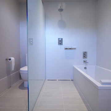
One of the most important changes was removing the original shower curb and pony wall in favor of a fully open curbless shower with ultra-clear ½-inch heavy glass. Achieving that look required recessing the slab, re-floating the shower floor toward a linear drain, and engineering the space so the room would read as visually uninterrupted from end to end. Throughout the project, many of the design decisions were rooted in restraint rather than excess. The oversized 24x48 Porcelanosa flooring carries very little shade variation, creating a quieter visual field, while the cabinetry was executed in rift-sawn white oak specifically because it produces a far more controlled and consistent finish outcome than more common cuts of wood. In luxury projects, consistency itself becomes part of the refinement.
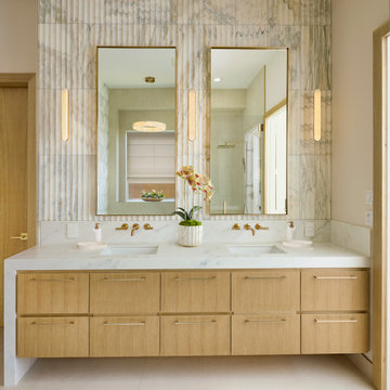
The floating vanity was designed more like custom furniture than traditional cabinetry, utilizing waterfall mitered edges and fully reworked plumbing locations so both homeowners could share in having generous functional countertop space. The original makeup station was repurposed into integrated storage with powered drawers and concealed organization for everyday items such as blow dryers and flat irons. Along the vanity wall, wall-mounted plumbing fixtures were paired with ribbed natural marble surfaces — a detail that required intentional planning long before construction began. Rather than allowing the ribbed material to terminate awkwardly behind the fixtures, the backsplash and stone transitions were specifically designed to resolve those conditions cleanly. Those are the types of details that distinguish highly coordinated design-build work from projects that simply assemble materials together.
While the room contains a significant amount of luxury detailing — from the freestanding tub and geoprism marble focal wall to the custom rift-sawn white oak closet doors and elongated mirrors that leverage the 11-foot ceiling heights — the project was always guided by quiet luxury rather than visual competition. Even the water closet enclosure was handled with restraint through the use of a satin-etched glass door rather than another heavy solid opening. The intent throughout was to create a bathroom that feels restorative and serene rather than overdesigned. In our view, the best luxury spaces are the ones that feel composed long after the initial impression wears off.

 Gallery KBNY
This brownstone renovation was a full gut project in every sense of the word. On top of installing new floors, a kitchen and bath renovation, and all the typical restoration and refinishing involved in a brownstone built in 1899, we also completely updated the exterior, constructed a balcony that was not originally there, and converted the space from a single-family home into an an owner’s triplex. A newly separated studio rental on the garden level offers the opportunity for supplemental income, an uncommon and welcome addition to a New York brownstone.
A TRANSITIONAL GEM
The result is a two-family brownstone that perfectly combines classic townhouse living with today’s modern needs, including SmartHome technology that we installed to control Bluetooth speakers, Nest thermostats, and the security system.
The overall aesthetic goal was to pay homage to the historical periods the brownstone has lived through in a cohesive way that is the hallmark of modern transitional style.
In the kitchen, white Shaker-style cabinetry, a subway tile backsplash, and marble rather than quartz countertops bring a classically upscale sensibility. To modernize the space further, we opened up the back wall to create floor-to-ceiling windows that are also doors, opening up into the newly built balcony.
TIMELY TOUCHES
This brownstone renovation included many quintessential elements, such as millwork like the ceiling medallions. We restored some and custom built others, perfectly recreating their original appearance.
The heated master bathroom is now serene, with a walk-in shower featuring a subtly modern linear drain. A herringbone Carrera marble tiled floor and marble slab sink complete the scene. In the powder room, we embraced a contemporary look by pairing dark hexagonal floors with light chevron tiles, accented with dramatic navy blue wallpaper. With its clear-cut 1920s-style, we selected the wall sconce to reference one of the brownstone’s earlier eras.
DESIGN DETAILS
Natural oak herringbone floors we installed throughout the entire home bring a modern yet warm touch. We restored the wood-burning marble fireplace, which is fully functioning. An elegant staircase with a custom-crafted black wooden banister and white balusters winds up and down alongside a real brick interior wall that we restored and refinished.
In this brownstone renovation, we were also able to create ceiling height, an unexpected yet aesthetically pleasing side benefit. When working on the joists and beams to level out the floors (a common issue in pre-war renovations) we added ceiling height in the main parlor floor by taking the second floor and raising the ceiling an entire foot. The end result is a main floor with stunning 9-foot ceilings.
SOME HIGHLIGHTS
- Solid natural oak herringbone floors throughout
- A fully restored, refinished, and functioning wood burning fireplace with a marble mantle
- Complete exterior renovation of the facade, cornices, windows, mouldings, and even the ironwork, including the railings leading up to the stoop and those facing the street
- A brand new central air and heating system with uniquely modern vents – look above the couch in the living room with the fuzzy rug and large painting
Considering a brownstone renovation? Contact us today! We specialize in brownstone renovations in New York as well as all pre-war apartments. When you work with a design-and-build firm like Gallery to renovate your brownstone, you get the full range of our expertise in working with all the finest details and pre-war architectural elements of these classic New York spaces. We also handle every step of the process, from filing permits and organizing schedules to sourcing custom pieces and building entirely new rooms (or even balconies). Call us for a free initial consultation when you’re ready.

 Dillman & Upton, Inc.
Dura Supreme Cabinetry. Kate Benjamin Photographer, Lindsey Markel Kitchen & Bath Designer, Shana Smith Interior Designer, Don Henderson Custom Installer

 Sierra Living Concepts Inc
Dimension:
40" L X 18" D X 64" H
Effuse your home hallways and foyers with a classy rustic ambiance by furnishing with our Redvale Solid Mahogany Wood Grey Hall Tree Bench with Storage!
The simple looks of this piece are complemented by a sleek design and a stylish visual grace that can make any entryway, foyer, or hallway look absolutely stunning. The rustic accents and hand-rubbed finish give the solid mahogany wood hand craftsmanship a lot more nuance and couple well with its great heirloom quality.
The design of this hall tree itself is elegantly plain, with only the necessary functional elements acting as an embellishment. With its cornice-like top frame and a stylishly tall middle, it’s perfectly suitable to become the centerpiece of any mudroom. The five 3 prong hooks have been strategically installed at an adequate height so you can easily hang your hats, coats, etc.
The bottom half is connected to this back-frame with simple corbel-style extensions. It’s actually pretty unique – instead of featuring the typical drawer-style look, it has an extended top-frame that opens like a trunk, has a beveled wainscot-like embellishment at the front, and is supported by a platform base.
The beautiful natural finish of this solid mahogany wood hall tree bench is complemented by a great visual versatility. You can easily pair it up with all sorts of interior design ambiances, including but not limited to rustic, contemporary, transitional and more.
Special Features:
• 100% Handcrafted
• Solid Mahogany wood craftsmanship
• Cornice-like top
• Wainscot-style framing and hanging hooks on the tall back-panel
• Simple corbel-like connectors between the bottom and top halves
• Unconventional trunk-style storage at the bottom
• Five 3 prong hooks
• Platform base
• Sleek designing
• Stunning hand-rubbed finish
• Heirloom quality
• Visually versatile
• Easy maintenance
Note: Our furniture is made of solid wood (not wood veneer over plywood). It is handcrafted by Master Artisans. Real wood is a product of nature, and as such, no two pieces are alike. Variations in solid wood grain patterns are to be expected and make each furniture uniquely beautiful, just like us humans.
Sponsored
Columbus, OH

Wannemacher Interiors
Customized Award-Winning Interior Design Solutions in Franklin Cnty OH

 TKS Design Group
Download our free ebook, Creating the Ideal Kitchen. DOWNLOAD NOW
Lakefront property in the northwest suburbs of Chicago is hard to come by, so when we were hired by this young family with exactly that, we were immediately inspired by not just the unusually large footprint of this 1950’s colonial revival but also the lovely views of the manmade lake it was sited on. The large 5-bedroom home was solidly stuck in the 1980’s, but we saw tons of potential. We started out by updating the existing staircase with a fresh coat of paint and adding new herringbone slate to the entry hall.
The powder room off the entryway also got a refresh - new flooring, new cabinets and fixtures. We ran the new slate right through into this space for some consistency. A fun wallpaper and shiplap trim add a welcoming feel and set the tone for the home.
Next, we tackled the kitchen. Located away from the rest of the first floor, the kitchen felt a little isolated, so we immediately began planning for how to better connect it to the rest of the first floor. We landed on removing the wall between the kitchen and dining room and designed a modified galley style space with separate cooking and clean up zones. The cooking zone consists of the refrigerator, prep sink and cooktop, along with a nice long run of prep space at the island. The cleanup side of the kitchen consists of the main sink and dishwasher. Both areas are situated so that the user can view the lake during prep work and cleanup!
One of the home’s main puzzles was how to incorporate the mudroom and area in front of the patio doors at the back of the house. We already had a breakfast table area, so the space by the patio doors was a bit of a no man’s land. We decided to separate the kitchen proper from what became the new mudroom with a large set of barn doors. That way you can quickly hide any mudroom messes but have easy access to the light coming in through the patio doors as well as the outdoor grilling station. We also love the impact the barn doors add to the overall space.
The homeowners’ first words to us were “it’s time to ditch the brown,” so we did! We chose a lovely blue pallet that reflects the home’s location on the lake which is also vibrant yet easy on the eye. Countertops are white quartz, and the natural oak floor works well with the other honey accents. The breakfast table was given a refresh with new chairs, chandelier and window treatments that frame the gorgeous views of the lake out the back.
We coordinated the slate mudroom flooring with that used in the home’s main entrance for a consistent feel. The storage area consists of open and closed storage to allow for some clutter control as needed.
Next on our “to do” list was revamping the dated brown bar area in the neighboring dining room. We eliminated the clutter by adding some closed cabinets and did some easy updates to help the space feel more current. One snag we ran into here was the discovery of a beam above the existing open shelving that had to be modified with a smaller structural beam to allow for our new design to work. This was an unexpected surprise, but in the end we think it was well worth it!
We kept the colors here a bit more muted to blend with the homeowner’s existing furnishings. Open shelving and polished nickel hardware add some simple detail to the new entertainment zone which also looks out onto the lake!
Next we tackled the upstairs starting with the homeowner’s son’s bath. The bath originally had both a tub shower and a separate shower, so we decided to swap out the shower for a new laundry area. This freed up some space downstairs in what used to be the mudroom/laundry room and is much more convenient for daily laundry needs.
We continued the blue palette here with navy cabinetry and the navy tile in the shower. Porcelain floor tile and chrome fixtures keep maintenance to a minimum while matte black mirrors and lighting add some depth the design. A low maintenance runner adds some warmth underfoot and ties the whole space together.
We added a pocket door to the bathroom to minimize interference with the door swings. The left door of the laundry closet is on a 180 degree hinge to allow for easy full access to the machines. Next we tackled the master bath which is an en suite arrangement. The original was typical of the 1980’s with the vanity outside of the bathroom, situated near the master closet. And the brown theme continued here with multiple shades of brown.
Our first move was to segment off the bath and the closet from the master bedroom. We created a short hall from the bedroom to the bathroom with his and hers walk-in closets on the left and right as well as a separate toilet closet outside of the main bathroom for privacy and flexibility.
The original bathroom had a giant soaking tub with steps (dangerous!) as well as a small shower that did not work well for our homeowner who is 6’3”. With other bathtubs in the home, they decided to eliminate the tub and create an oversized shower which takes up the space where the old tub was located. The double vanity is on the opposite wall and a bench is located under the window for morning conversations and a place to set a couple of towels.
The pallet in here is light and airy with a mix of blond wood, creamy porcelain and marble tile, and brass accents. A simple roman shade adds some texture and it’s top-down mechanism allows for light and privacy.
This large whole house remodel gave our homeowners not only the ability to maximize the potential of their home but also created a lovely new frame from which to view their fabulous lake views.
Designed by: Susan Klimala, CKD, CBD
Photography by: Michael Kaskel
For more information on kitchen and bath design ideas go to: www.kitchenstudio-ge.com

 Kitchen Design Concepts
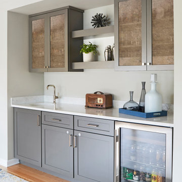
Inside the man cave is a hidden gem of colorful finishes and patterns. Marimekko Pieni Tiara Blue wallpaper blends seamlessly with the Amazonite quartzite drop edge countertop from the Stone Collection. The floating peppercorn stained maple Ultra Craft cabinets with exposed Jalco chrome plumbing allows a more spacious feeling than a typical vanity. Top Knobs Kingsbridge pulls in an Ash Gray finish bring a masculine yet tailored style to this bath. The oak hardwood floors continue from the den to create warmth and continuity. In the shower we used Crossville Tender Gray 4”x10” in a brcklay pattern on the walls, Uptown Glass Frost Moka 1” hex mosaic tile on the floor and shampoo niche, and for the vanity sink, we installed a low vessel Kohler Inia Wading Pool in the Ice finish, and paired it with the Brizo Rook single handle faucet in chrome. The shower fixtures are also from the Brizo Rook collection.

 User
With their children growing up, Mr & Mrs Hills in Southend-On-Sea decided it was time to give their much loved family kitchen a well deserved renovation, creating a space for all the family to use and enjoy.
They wanted a kitchen that had plenty of storage and was user friendly for all the family, so commissioned Burlanes to transform their cramped and dated kitchen into a spacious and open-plan room. Walking into Burlanes Chelmsford, the couple took an instant like to our Wellsdown kitchen; our take on the classic Georgian country kitchen; built on the notions of good proportions and symmetry, combining traditional charm with all the benefits of modern living.
 Dillman & Upton, Inc.
3rd Place Winner of Signature Kitchens & Baths 18th Annual Bath Design Awards 2016, Kate Benjamin Photographer, Lindsey Markel Kitchen & Bath Designer, Shana Smith Interior Designer and Don Henderson Custom Installer
 Dale Cohen Designstudio
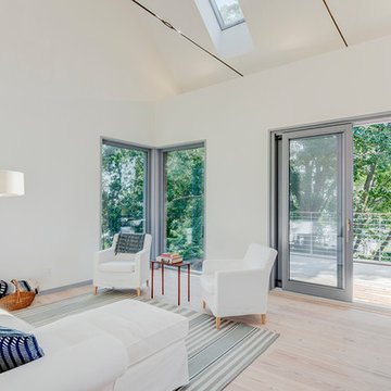
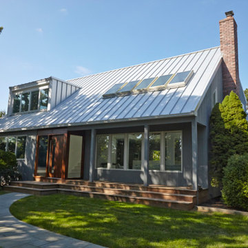
Asked by her client to review a typically mundane South Hampton ‘50s saltbox because “the last designer they talked to said they would have to add on to make the house anything,” Ms. Cohen approached the renovation in exactly the opposite manner. To refine the small building footprint, precise architectural gestures were used with a series of finely calibrated moments make the space more gracious and welcoming. Architectural acts were bold in concept but not in actual construction work; such as capturing the car garage to add a hyper modern sunroom/den along with a powder room and laundry. Reconfiguring one side of the house’s roofline to manipulate the space into a sensational master suite saved the north side of the house from remaining an un-useful attic space. This inner sanctum of bedroom and master bath is reminiscent of a Hampton’s beachscape in all its elegance and minimalism. The only square footage actually added was a tiny 4X4 corner as an addition to the front entry, oddly an essential piece of real estate to make an actual vestibule. All these refinements make for a crafted, articulate result rather than bowing to the bigger is better theme, which is more prevalent in the Hamptons.
The function of the plan and the accompanying finishes are impressive. The Jack and Jill bathroom, an invention of the American post-war housing boom, was outfitted in handsome walnut Duravit vanity cabinets and neutral finishes. The master bath, with its expansive skylights, might be mistaken for a conceptual art installation due to its evocative marble countertop in striped ethereal hues. Finally, Ms. Cohen uses wallpaper like a museum curator, hanging an iconic Knoll pattern to punctuate the dining/media space.
Each room in the house was sculpted via a palette of watercolor blue of varying saturations. Fabrics were culled from the greats of modernist textiles, Maharam’s Quatrefoil pattern in blue and Knoll classic Sway pattern in sea shades. The blue on white “beach” scheme runs from a soft cotton candy sky in the girl’s room to an immersive David Sutherland Park Bark wallpaper in the powder room. This intellectual inquiry as to what are the true colors at the beach belays the sophistication that surpasses the usual nautical curse of the average beach house. Out of the corner of your eye, in almost every quadrant of the house, is a burst of colorful expression and delight; this serves as Ms. Cohen’s painterly gift to the client.
Ms. Cohen’s hidden strength is her ability to choreograph a seating area. Whether it is a formal living room or the ultimate hang out spot, each space has the right amount of distance, intimacy and dare I say intrigue to make the arrangements inviting. Each conversation, because it really looks like a fine chat can be had, has an elegant side table ready for duty and all tête-à-têtes are regulated to a sumptuous area rugs. Habitants in Ms. Cohen’s world only work through deep discourse.
Sponsored
Delaware, OH

Buckeye Basements, Inc.
Central Ohio's Basement Finishing ExpertsBest Of Houzz '13-'21

 ROAM Architecture
Needing more space for their growing family, these young homeowners approached us to help them create an updated, larger home from their existing 1953 split-level.
On the first floor, walls were removed to create an open concept kitchen and living room. A new dining room addition was constructed in the back, as well as a new tandem 2-car garage.
A new second floor addition was created to include 2 bedrooms, a hall bathroom, a master bedroom suite, and a laundry room.
On the exterior, a completely new, refreshed and updated look was achieved through the use of new siding, windows and roofing. By more than doubling the size of the existing home, the family is now ready to enjoy all of the space that they need.
 Dale Cohen Designstudio
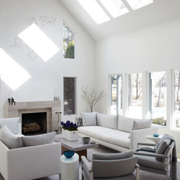
Asked by her client to review a typically mundane South Hampton ‘50s saltbox because “the last designer they talked to said they would have to add on to make the house anything,” Ms. Cohen approached the renovation in exactly the opposite manner. To refine the small building footprint, precise architectural gestures were used with a series of finely calibrated moments make the space more gracious and welcoming. Architectural acts were bold in concept but not in actual construction work; such as capturing the car garage to add a hyper modern sunroom/den along with a powder room and laundry. Reconfiguring one side of the house’s roofline to manipulate the space into a sensational master suite saved the north side of the house from remaining an un-useful attic space. This inner sanctum of bedroom and master bath is reminiscent of a Hampton’s beachscape in all its elegance and minimalism. The only square footage actually added was a tiny 4X4 corner as an addition to the front entry, oddly an essential piece of real estate to make an actual vestibule. All these refinements make for a crafted, articulate result rather than bowing to the bigger is better theme, which is more prevalent in the Hamptons.
The function of the plan and the accompanying finishes are impressive. The Jack and Jill bathroom, an invention of the American post-war housing boom, was outfitted in handsome walnut Duravit vanity cabinets and neutral finishes. The master bath, with its expansive skylights, might be mistaken for a conceptual art installation due to its evocative marble countertop in striped ethereal hues. Finally, Ms. Cohen uses wallpaper like a museum curator, hanging an iconic Knoll pattern to punctuate the dining/media space.
Each room in the house was sculpted via a palette of watercolor blue of varying saturations. Fabrics were culled from the greats of modernist textiles, Maharam’s Quatrefoil pattern in blue and Knoll classic Sway pattern in sea shades. The blue on white “beach” scheme runs from a soft cotton candy sky in the girl’s room to an immersive David Sutherland Park Bark wallpaper in the powder room. This intellectual inquiry as to what are the true colors at the beach belays the sophistication that surpasses the usual nautical curse of the average beach house. Out of the corner of your eye, in almost every quadrant of the house, is a burst of colorful expression and delight; this serves as Ms. Cohen’s painterly gift to the client.
Ms. Cohen’s hidden strength is her ability to choreograph a seating area. Whether it is a formal living room or the ultimate hang out spot, each space has the right amount of distance, intimacy and dare I say intrigue to make the arrangements inviting. Each conversation, because it really looks like a fine chat can be had, has an elegant side table ready for duty and all tête-à-têtes are regulated to a sumptuous area rugs. Habitants in Ms. Cohen’s world only work through deep discourse.
 Dale Cohen Designstudio
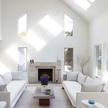
Asked by her client to review a typically mundane South Hampton ‘50s saltbox because “the last designer they talked to said they would have to add on to make the house anything,” Ms. Cohen approached the renovation in exactly the opposite manner. To refine the small building footprint, precise architectural gestures were used with a series of finely calibrated moments make the space more gracious and welcoming. Architectural acts were bold in concept but not in actual construction work; such as capturing the car garage to add a hyper modern sunroom/den along with a powder room and laundry. Reconfiguring one side of the house’s roofline to manipulate the space into a sensational master suite saved the north side of the house from remaining an un-useful attic space. This inner sanctum of bedroom and master bath is reminiscent of a Hampton’s beachscape in all its elegance and minimalism. The only square footage actually added was a tiny 4X4 corner as an addition to the front entry, oddly an essential piece of real estate to make an actual vestibule. All these refinements make for a crafted, articulate result rather than bowing to the bigger is better theme, which is more prevalent in the Hamptons.
The function of the plan and the accompanying finishes are impressive. The Jack and Jill bathroom, an invention of the American post-war housing boom, was outfitted in handsome walnut Duravit vanity cabinets and neutral finishes. The master bath, with its expansive skylights, might be mistaken for a conceptual art installation due to its evocative marble countertop in striped ethereal hues. Finally, Ms. Cohen uses wallpaper like a museum curator, hanging an iconic Knoll pattern to punctuate the dining/media space.
Each room in the house was sculpted via a palette of watercolor blue of varying saturations. Fabrics were culled from the greats of modernist textiles, Maharam’s Quatrefoil pattern in blue and Knoll classic Sway pattern in sea shades. The blue on white “beach” scheme runs from a soft cotton candy sky in the girl’s room to an immersive David Sutherland Park Bark wallpaper in the powder room. This intellectual inquiry as to what are the true colors at the beach belays the sophistication that surpasses the usual nautical curse of the average beach house. Out of the corner of your eye, in almost every quadrant of the house, is a burst of colorful expression and delight; this serves as Ms. Cohen’s painterly gift to the client.
Ms. Cohen’s hidden strength is her ability to choreograph a seating area. Whether it is a formal living room or the ultimate hang out spot, each space has the right amount of distance, intimacy and dare I say intrigue to make the arrangements inviting. Each conversation, because it really looks like a fine chat can be had, has an elegant side table ready for duty and all tête-à-têtes are regulated to a sumptuous area rugs. Habitants in Ms. Cohen’s world only work through deep discourse.
 Dale Cohen Designstudio
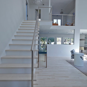
Asked by her client to review a typically mundane South Hampton ‘50s saltbox because “the last designer they talked to said they would have to add on to make the house anything,” Ms. Cohen approached the renovation in exactly the opposite manner. To refine the small building footprint, precise architectural gestures were used with a series of finely calibrated moments make the space more gracious and welcoming. Architectural acts were bold in concept but not in actual construction work; such as capturing the car garage to add a hyper modern sunroom/den along with a powder room and laundry. Reconfiguring one side of the house’s roofline to manipulate the space into a sensational master suite saved the north side of the house from remaining an un-useful attic space. This inner sanctum of bedroom and master bath is reminiscent of a Hampton’s beachscape in all its elegance and minimalism. The only square footage actually added was a tiny 4X4 corner as an addition to the front entry, oddly an essential piece of real estate to make an actual vestibule. All these refinements make for a crafted, articulate result rather than bowing to the bigger is better theme, which is more prevalent in the Hamptons.
The function of the plan and the accompanying finishes are impressive. The Jack and Jill bathroom, an invention of the American post-war housing boom, was outfitted in handsome walnut Duravit vanity cabinets and neutral finishes. The master bath, with its expansive skylights, might be mistaken for a conceptual art installation due to its evocative marble countertop in striped ethereal hues. Finally, Ms. Cohen uses wallpaper like a museum curator, hanging an iconic Knoll pattern to punctuate the dining/media space.
Each room in the house was sculpted via a palette of watercolor blue of varying saturations. Fabrics were culled from the greats of modernist textiles, Maharam’s Quatrefoil pattern in blue and Knoll classic Sway pattern in sea shades. The blue on white “beach” scheme runs from a soft cotton candy sky in the girl’s room to an immersive David Sutherland Park Bark wallpaper in the powder room. This intellectual inquiry as to what are the true colors at the beach belays the sophistication that surpasses the usual nautical curse of the average beach house. Out of the corner of your eye, in almost every quadrant of the house, is a burst of colorful expression and delight; this serves as Ms. Cohen’s painterly gift to the client.
Ms. Cohen’s hidden strength is her ability to choreograph a seating area. Whether it is a formal living room or the ultimate hang out spot, each space has the right amount of distance, intimacy and dare I say intrigue to make the arrangements inviting. Each conversation, because it really looks like a fine chat can be had, has an elegant side table ready for duty and all tête-à-têtes are regulated to a sumptuous area rugs. Habitants in Ms. Cohen’s world only work through deep discourse.

 Dale Cohen Designstudio
Asked by her client to review a typically mundane South Hampton ‘50s saltbox because “the last designer they talked to said they would have to add on to make the house anything,” Ms. Cohen approached the renovation in exactly the opposite manner. To refine the small building footprint, precise architectural gestures were used with a series of finely calibrated moments make the space more gracious and welcoming. Architectural acts were bold in concept but not in actual construction work; such as capturing the car garage to add a hyper modern sunroom/den along with a powder room and laundry. Reconfiguring one side of the house’s roofline to manipulate the space into a sensational master suite saved the north side of the house from remaining an un-useful attic space. This inner sanctum of bedroom and master bath is reminiscent of a Hampton’s beachscape in all its elegance and minimalism. The only square footage actually added was a tiny 4X4 corner as an addition to the front entry, oddly an essential piece of real estate to make an actual vestibule. All these refinements make for a crafted, articulate result rather than bowing to the bigger is better theme, which is more prevalent in the Hamptons.
The function of the plan and the accompanying finishes are impressive. The Jack and Jill bathroom, an invention of the American post-war housing boom, was outfitted in handsome walnut Duravit vanity cabinets and neutral finishes. The master bath, with its expansive skylights, might be mistaken for a conceptual art installation due to its evocative marble countertop in striped ethereal hues. Finally, Ms. Cohen uses wallpaper like a museum curator, hanging an iconic Knoll pattern to punctuate the dining/media space.
Each room in the house was sculpted via a palette of watercolor blue of varying saturations. Fabrics were culled from the greats of modernist textiles, Maharam’s Quatrefoil pattern in blue and Knoll classic Sway pattern in sea shades. The blue on white “beach” scheme runs from a soft cotton candy sky in the girl’s room to an immersive David Sutherland Park Bark wallpaper in the powder room. This intellectual inquiry as to what are the true colors at the beach belays the sophistication that surpasses the usual nautical curse of the average beach house. Out of the corner of your eye, in almost every quadrant of the house, is a burst of colorful expression and delight; this serves as Ms. Cohen’s painterly gift to the client.
Ms. Cohen’s hidden strength is her ability to choreograph a seating area. Whether it is a formal living room or the ultimate hang out spot, each space has the right amount of distance, intimacy and dare I say intrigue to make the arrangements inviting. Each conversation, because it really looks like a fine chat can be had, has an elegant side table ready for duty and all tête-à-têtes are regulated to a sumptuous area rugs. Habitants in Ms. Cohen’s world only work through deep discourse.

 Capozzi Design Build
Originally built in the 1950's this Cape Cod style home needed a space more useful in the upstairs attic. Our mission was to create an appealing master bathroom from an unfinished attic space that is 6’ x 14’ long. The newly renovated bathroom features Dura Supreme cabinetry, double bowl sink, back lit LED mirrors, a built-in linen cabinet, and additional storage for laundry baskets. The angled ceiling draws your eye down to the glass shower creating a seamlessly transition into the shower area. With the shower not having a threshold it creates visual interest exposing the window and the floor and wall tile. Not only is the space now functional for the homeowners but it offers a classic yet sophisticated design style!!
Interested in speaking with a Capozzi designer today? Visit our website today to request a consultation!!!
https://capozzidesigngroup.com
 Kestrel Shutters & Doors
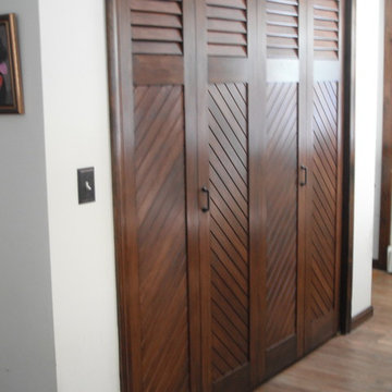
This is one of our most popular designs of closet doors. Solid wood, true tongue and groove boards help to block out the sound of the washer and dryer while 12" of fixed Plantation louvers provide ventilation at the top.
These doors are custom sized and can be installed as bi-folds, hinged, sliders and pocket doors. You can order the doors unfinished, primed only, clear coat, or in your choice of paint or stain color.
99