
Search results for "Master videos" in Home Design Ideas

 BRC Remodeling Group
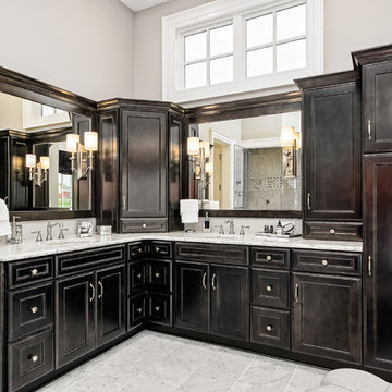
This contemporary/modern bathroom uses a combination of grey and beige to make a beautiful blend of Greige. The Charcoal stain on the cabinets is also a great blend of the 2 colors giving just enough warmth to the room. We used Marazzi Lounge 14 Spritzer 12x24 porcelain tile on the ground and the decorative inlay on the shower. New Caledonia Granite and BEHR- Studio Taupe on the walls.

 RAJ Kitchen and Bath, LLC
“Full apartment design”.
IF you have not yet seen this apartment conversion before, we strongly urge you to go to the bottom left of this page and click on the short 2-minutes video. It would put a lot of things into perspective when you come back and continue reading this.
It is true we were literally handed the keys and told a list of things that they wanted to have happen and we were to go into the apartment, look at the space and come up with a design that would satisfy all of that need. UNTIL we showed up! The unit had really seen some better days but we knew we had to look past that and come up with a concept that would work for them.
The immediate challenges were centered around 3 big ideas:
1. Adding a second bedroom to the already small footprint
2. Figuring out a way to make the kitchen bigger, better and brighter
3. Creating a master room walk in closet
It’s always difficult to add new rooms into existing footprint without expanding out or up and not incurring any opportunity cost. In this case, that was exactly what we had to do. Item one and two above had to be tackled as one. We went ahead and switched out the location of the dining room and eliminating an area where there was a “nook” type eat-in area. By doing so, we were able to cut right into that footprint and change the layout of the kitchen.
That one move allowed us to dig into the kitchen design because it was now the main focal point in the apartment. It was no longer an option to keep it in that tiny hole where it was, so we had to ensure that this design was functional and aesthetically pleasing at the same time. By adding the table into the space where an Island typically would go, we were able to both cut cost and still provide a dining experience. The Table serves as an Island as well when cooking.
We then proceeded to block in the existing doorway to the dining room. By doing this, we were able to create a full room which allowed us to put a door on the other side and called that room Bedroom #2. This was easier to do because all of the mechanicals were already in that space (light, heater and windows). By shifting things around, we also achieved a huge wall to wall closet from inside. PERFECT!
Then we moved into the Single bedroom. We thought it was a big room with a small closet, so by creatively adding an L shaped wall and steal some footprint into the bedroom side, we were able to put a door on that new room and design it for the walk-in closet. Even after this, the bedroom still holds a queen size bed with 2 night stands, a TV on the wall, a sitting chair and plenty of room to walk around. This was done by rethinking the location for the bed and night stands.
The bathroom was gutted to make sure there was no leaks and rebuild from the ground up. We kept all of the plumbing where it was, added a new vanity, medicine cabinet, tiles and lighting and it was done.
From there, the rest of the unit had new flooring all throughout, paint, and lighting. After completion and walk through, this project was handed over back to the clients.
Execution and collaboration between all the trades were: Reggie and his team from Premier Interiors and Rohan from RD Mechanical Services.
p.s. Please see our website to see the video.
 RAJ Kitchen and Bath, LLC
“Full apartment design”.
IF you have not yet seen this apartment conversion before, we strongly urge you to go to the bottom left of this page and click on the short 2-minutes video. It would put a lot of things into perspective when you come back and continue reading this.
It is true we were literally handed the keys and told a list of things that they wanted to have happen and we were to go into the apartment, look at the space and come up with a design that would satisfy all of that need. UNTIL we showed up! The unit had really seen some better days but we knew we had to look past that and come up with a concept that would work for them.
The immediate challenges were centered around 3 big ideas:
1. Adding a second bedroom to the already small footprint
2. Figuring out a way to make the kitchen bigger, better and brighter
3. Creating a master room walk in closet
It’s always difficult to add new rooms into existing footprint without expanding out or up and not incurring any opportunity cost. In this case, that was exactly what we had to do. Item one and two above had to be tackled as one. We went ahead and switched out the location of the dining room and eliminating an area where there was a “nook” type eat-in area. By doing so, we were able to cut right into that footprint and change the layout of the kitchen.
That one move allowed us to dig into the kitchen design because it was now the main focal point in the apartment. It was no longer an option to keep it in that tiny hole where it was, so we had to ensure that this design was functional and aesthetically pleasing at the same time. By adding the table into the space where an Island typically would go, we were able to both cut cost and still provide a dining experience. The Table serves as an Island as well when cooking.
We then proceeded to block in the existing doorway to the dining room. By doing this, we were able to create a full room which allowed us to put a door on the other side and called that room Bedroom #2. This was easier to do because all of the mechanicals were already in that space (light, heater and windows). By shifting things around, we also achieved a huge wall to wall closet from inside. PERFECT!
Then we moved into the Single bedroom. We thought it was a big room with a small closet, so by creatively adding an L shaped wall and steal some footprint into the bedroom side, we were able to put a door on that new room and design it for the walk-in closet. Even after this, the bedroom still holds a queen size bed with 2 night stands, a TV on the wall, a sitting chair and plenty of room to walk around. This was done by rethinking the location for the bed and night stands.
The bathroom was gutted to make sure there was no leaks and rebuild from the ground up. We kept all of the plumbing where it was, added a new vanity, medicine cabinet, tiles and lighting and it was done.
From there, the rest of the unit had new flooring all throughout, paint, and lighting. After completion and walk through, this project was handed over back to the clients.
Execution and collaboration between all the trades were: Reggie and his team from Premier Interiors and Rohan from RD Mechanical Services.
p.s. Please see our website to see the video.
Find the right local pro for your project
 RAJ Kitchen and Bath, LLC
“Full apartment design”.
IF you have not yet seen this apartment conversion before, we strongly urge you to go to the bottom left of this page and click on the short 2-minutes video. It would put a lot of things into perspective when you come back and continue reading this.
It is true we were literally handed the keys and told a list of things that they wanted to have happen and we were to go into the apartment, look at the space and come up with a design that would satisfy all of that need. UNTIL we showed up! The unit had really seen some better days but we knew we had to look past that and come up with a concept that would work for them.
The immediate challenges were centered around 3 big ideas:
1. Adding a second bedroom to the already small footprint
2. Figuring out a way to make the kitchen bigger, better and brighter
3. Creating a master room walk in closet
It’s always difficult to add new rooms into existing footprint without expanding out or up and not incurring any opportunity cost. In this case, that was exactly what we had to do. Item one and two above had to be tackled as one. We went ahead and switched out the location of the dining room and eliminating an area where there was a “nook” type eat-in area. By doing so, we were able to cut right into that footprint and change the layout of the kitchen.
That one move allowed us to dig into the kitchen design because it was now the main focal point in the apartment. It was no longer an option to keep it in that tiny hole where it was, so we had to ensure that this design was functional and aesthetically pleasing at the same time. By adding the table into the space where an Island typically would go, we were able to both cut cost and still provide a dining experience. The Table serves as an Island as well when cooking.
We then proceeded to block in the existing doorway to the dining room. By doing this, we were able to create a full room which allowed us to put a door on the other side and called that room Bedroom #2. This was easier to do because all of the mechanicals were already in that space (light, heater and windows). By shifting things around, we also achieved a huge wall to wall closet from inside. PERFECT!
Then we moved into the Single bedroom. We thought it was a big room with a small closet, so by creatively adding an L shaped wall and steal some footprint into the bedroom side, we were able to put a door on that new room and design it for the walk-in closet. Even after this, the bedroom still holds a queen size bed with 2 night stands, a TV on the wall, a sitting chair and plenty of room to walk around. This was done by rethinking the location for the bed and night stands.
The bathroom was gutted to make sure there was no leaks and rebuild from the ground up. We kept all of the plumbing where it was, added a new vanity, medicine cabinet, tiles and lighting and it was done.
From there, the rest of the unit had new flooring all throughout, paint, and lighting. After completion and walk through, this project was handed over back to the clients.
Execution and collaboration between all the trades were: Reggie and his team from Premier Interiors and Rohan from RD Mechanical Services.
p.s. Please see our website to see the video.

 Cantoni Los Angeles
An American family with three young children, living in Geneva Switzerland wanted a vacation property in Los Angeles and were thrilled to find a brand new contemporary home 2 blocks from the beach in Redondo Beach. This 3,200 square foot home with four bedrooms and 4 1/2 baths was designed by Los Angeles architect Patrick John Killen, founder and Managing Principal of Studio 9 one 2.
Both the husband and the wife in this family have built careers in the fashion industry and wanted their home to reflect their international sense of style while still being a comfortable and playful environment for their children - and to honor the fact that this is - after all - a beach house.
Surf's Up!
The house is close enough to the beach to receive lots of ocean air and breezes; the property is also designed with an abundance of glass in large sweeping windows that flood this very open floor plan with natural light. The extra large patio that is revealed by sliding back several large glass panel doors expands the primary living area to include this outdoor space. The rooftop deck offers an additional private lounge area for daytime sunning or sunset cocktails with a teasing glimpse of the ocean and a panoramic view of the Palos Verdes Peninsula. Each bedroom has its own private bath and there is a fireplace in one of the two living rooms and in the Master suite, to warm those South Bay evenings. All of this within a five minute stroll to the beach!
Surf's Up!
The interior designed by Studio 9 one 2 utilized an assortment of “green-friendly” materials, including cherry stained bamboo flooring. The colors of granite used in the chef-friendly kitchen accenting the stainless steel appliances are dark greens and rich browns .. all bathed in lots of natural light.
In keeping with Cantoni’s motto of ”Great Design is a Way of Life” Bernadette designed a playroom for the children where they could have their own space to just hang out, play video games and watch movies. Each bedroom reflects the personalities of the children and the Master Bedroom is a soothing and relaxing retreat for the parents.
On the main level the large open floor plan the Mercer sectional just beckons you to kick back and relax especially after spending the day at the beach. The dark oak Ritz dining table is perfect for entertaining the many friends and family who Surf's Up!get together for bar-b-ques and gourmet dining. The artwork has a wonderful punch of color to underscore the playfulness and Southern California beach vibe.
What better way to enjoy a vacation with family and friends! This is a great home away from home with plenty of space and light and only two blocks to the ocean. That’s why Jake says “Surf’s Up!”

 Gallery KBNY
In this Manhattan pied-à-terre renovation, Gallery tackled the entire apartment. A true full renovation, we updated the kitchen, master bathroom, and powder room, installed new flooring throughout the entire space, and built the entertainment center in the living room.
DESIGN DETAILS
The clients wanted their pied-à-terre to have some modern touches, but not too sleek or contemporary. Since it combines a number of styles and elements, transitional turned out to be their ideal aesthetic. Whites, grays, and earthy tones carried this color theme throughout the apartment.
One of the clients is an artist and wanted wall space to display their original work, visible in the dining area and powder room in the photos below. The entertainment center is another highlight, with its white mosaic brick tile accent wall and glass open shelves to display family photos on both sides.
Instead of tiles, the new powder room walls received a textured concrete application, resulting in an almost industrial vibe. In the master bathroom renovation, glass mosaic tile accent walls bring a touch of personality to both the shower and a storage nook opposite the vanity.
UNIQUELY-SHAPED ROOMS
We specialize in adapting to every potential challenge, including uniquely-shaped rooms like the nearly-triangular kitchen in this Manhattan pied-à-terre renovation.
It’s important to design an uncommonly-shaped space as practically as possible, including specs seemingly as small as sink positioning. Every little detail counts tenfold in a room that’s not rectangular!
Other design details in the kitchen renovation include the classic combination of Shaker-style cabinets and quartz countertops, with a glass mosaic backsplash that matches the one used in the bathroom.
VISIBILITY = TRUST
Communication is always a core value at Gallery, but it’s even more vital when working with bi-coastal clients who were in another state throughout almost the entire process. We met with them once; everything else was done virtually thanks to JobTracker, our project management system.
The client had complete visibility into the renovation, including all design renderings, scheduled installations, and daily progress videos and photos. Even though they were 3000 miles away, they had a direct line to everyone on the team at all times.
SOME HIGHLIGHTS
- Entertainment center designed and built to serve as focal point, with white brick mosaic accent wall and open shelves made of glass
- Track lighting for ease of displaying art and to preserve ceiling height instead of the dropped ceiling that recessed lighting would necessitate
- Deliberate consideration of space in the unusually-shaped, nearly triangular kitchen
- Glass mosaic tile accent walls in the master bathroom with matching tile for the backsplash in the kitchen
Thinking about renovating your bathroom? Contact us today to find out how you can benefit from our expertise in remodeling New York City bathrooms. As a design-and-build firm with a full-scale approach, we handle every single aspect of your home renovation from start to finish.
 Cantoni Los Angeles
An American family with three young children, living in Geneva Switzerland wanted a vacation property in Los Angeles and were thrilled to find a brand new contemporary home 2 blocks from the beach in Redondo Beach. This 3,200 square foot home with four bedrooms and 4 1/2 baths was designed by Los Angeles architect Patrick John Killen, founder and Managing Principal of Studio 9 one 2.
Both the husband and the wife in this family have built careers in the fashion industry and wanted their home to reflect their international sense of style while still being a comfortable and playful environment for their children - and to honor the fact that this is - after all - a beach house.
Surf's Up!
The house is close enough to the beach to receive lots of ocean air and breezes; the property is also designed with an abundance of glass in large sweeping windows that flood this very open floor plan with natural light. The extra large patio that is revealed by sliding back several large glass panel doors expands the primary living area to include this outdoor space. The rooftop deck offers an additional private lounge area for daytime sunning or sunset cocktails with a teasing glimpse of the ocean and a panoramic view of the Palos Verdes Peninsula. Each bedroom has its own private bath and there is a fireplace in one of the two living rooms and in the Master suite, to warm those South Bay evenings. All of this within a five minute stroll to the beach!
Surf's Up!
The interior designed by Studio 9 one 2 utilized an assortment of “green-friendly” materials, including cherry stained bamboo flooring. The colors of granite used in the chef-friendly kitchen accenting the stainless steel appliances are dark greens and rich browns .. all bathed in lots of natural light.
In keeping with Cantoni’s motto of ”Great Design is a Way of Life” Bernadette designed a playroom for the children where they could have their own space to just hang out, play video games and watch movies. Each bedroom reflects the personalities of the children and the Master Bedroom is a soothing and relaxing retreat for the parents.
On the main level the large open floor plan the Mercer sectional just beckons you to kick back and relax especially after spending the day at the beach. The dark oak Ritz dining table is perfect for entertaining the many friends and family who Surf's Up!get together for bar-b-ques and gourmet dining. The artwork has a wonderful punch of color to underscore the playfulness and Southern California beach vibe.
What better way to enjoy a vacation with family and friends! This is a great home away from home with plenty of space and light and only two blocks to the ocean. That’s why Jake says “Surf’s Up!”
Sponsored
Delaware, OH

Buckeye Basements, Inc.
Central Ohio's Basement Finishing ExpertsBest Of Houzz '13-'21
 RAJ Kitchen and Bath, LLC
“Full apartment design”.
IF you have not yet seen this apartment conversion before, we strongly urge you to go to the bottom left of this page and click on the short 2-minutes video. It would put a lot of things into perspective when you come back and continue reading this.
It is true we were literally handed the keys and told a list of things that they wanted to have happen and we were to go into the apartment, look at the space and come up with a design that would satisfy all of that need. UNTIL we showed up! The unit had really seen some better days but we knew we had to look past that and come up with a concept that would work for them.
The immediate challenges were centered around 3 big ideas:
1. Adding a second bedroom to the already small footprint
2. Figuring out a way to make the kitchen bigger, better and brighter
3. Creating a master room walk in closet
It’s always difficult to add new rooms into existing footprint without expanding out or up and not incurring any opportunity cost. In this case, that was exactly what we had to do. Item one and two above had to be tackled as one. We went ahead and switched out the location of the dining room and eliminating an area where there was a “nook” type eat-in area. By doing so, we were able to cut right into that footprint and change the layout of the kitchen.
That one move allowed us to dig into the kitchen design because it was now the main focal point in the apartment. It was no longer an option to keep it in that tiny hole where it was, so we had to ensure that this design was functional and aesthetically pleasing at the same time. By adding the table into the space where an Island typically would go, we were able to both cut cost and still provide a dining experience. The Table serves as an Island as well when cooking.
We then proceeded to block in the existing doorway to the dining room. By doing this, we were able to create a full room which allowed us to put a door on the other side and called that room Bedroom #2. This was easier to do because all of the mechanicals were already in that space (light, heater and windows). By shifting things around, we also achieved a huge wall to wall closet from inside. PERFECT!
Then we moved into the Single bedroom. We thought it was a big room with a small closet, so by creatively adding an L shaped wall and steal some footprint into the bedroom side, we were able to put a door on that new room and design it for the walk-in closet. Even after this, the bedroom still holds a queen size bed with 2 night stands, a TV on the wall, a sitting chair and plenty of room to walk around. This was done by rethinking the location for the bed and night stands.
The bathroom was gutted to make sure there was no leaks and rebuild from the ground up. We kept all of the plumbing where it was, added a new vanity, medicine cabinet, tiles and lighting and it was done.
From there, the rest of the unit had new flooring all throughout, paint, and lighting. After completion and walk through, this project was handed over back to the clients.
Execution and collaboration between all the trades were: Reggie and his team from Premier Interiors and Rohan from RD Mechanical Services.
p.s. Please see our website to see the video.
 Cantoni Los Angeles
An American family with three young children, living in Geneva Switzerland wanted a vacation property in Los Angeles and were thrilled to find a brand new contemporary home 2 blocks from the beach in Redondo Beach. This 3,200 square foot home with four bedrooms and 4 1/2 baths was designed by Los Angeles architect Patrick John Killen, founder and Managing Principal of Studio 9 one 2.
Both the husband and the wife in this family have built careers in the fashion industry and wanted their home to reflect their international sense of style while still being a comfortable and playful environment for their children - and to honor the fact that this is - after all - a beach house.
Surf's Up!
The house is close enough to the beach to receive lots of ocean air and breezes; the property is also designed with an abundance of glass in large sweeping windows that flood this very open floor plan with natural light. The extra large patio that is revealed by sliding back several large glass panel doors expands the primary living area to include this outdoor space. The rooftop deck offers an additional private lounge area for daytime sunning or sunset cocktails with a teasing glimpse of the ocean and a panoramic view of the Palos Verdes Peninsula. Each bedroom has its own private bath and there is a fireplace in one of the two living rooms and in the Master suite, to warm those South Bay evenings. All of this within a five minute stroll to the beach!
Surf's Up!
The interior designed by Studio 9 one 2 utilized an assortment of “green-friendly” materials, including cherry stained bamboo flooring. The colors of granite used in the chef-friendly kitchen accenting the stainless steel appliances are dark greens and rich browns .. all bathed in lots of natural light.
In keeping with Cantoni’s motto of ”Great Design is a Way of Life” Bernadette designed a playroom for the children where they could have their own space to just hang out, play video games and watch movies. Each bedroom reflects the personalities of the children and the Master Bedroom is a soothing and relaxing retreat for the parents.
On the main level the large open floor plan the Mercer sectional just beckons you to kick back and relax especially after spending the day at the beach. The dark oak Ritz dining table is perfect for entertaining the many friends and family who Surf's Up!get together for bar-b-ques and gourmet dining. The artwork has a wonderful punch of color to underscore the playfulness and Southern California beach vibe.
What better way to enjoy a vacation with family and friends! This is a great home away from home with plenty of space and light and only two blocks to the ocean. That’s why Jake says “Surf’s Up!”
 RAJ Kitchen and Bath, LLC
“Full apartment design”.
IF you have not yet seen this apartment conversion before, we strongly urge you to go to the bottom left of this page and click on the short 2-minutes video. It would put a lot of things into perspective when you come back and continue reading this.
It is true we were literally handed the keys and told a list of things that they wanted to have happen and we were to go into the apartment, look at the space and come up with a design that would satisfy all of that need. UNTIL we showed up! The unit had really seen some better days but we knew we had to look past that and come up with a concept that would work for them.
The immediate challenges were centered around 3 big ideas:
1. Adding a second bedroom to the already small footprint
2. Figuring out a way to make the kitchen bigger, better and brighter
3. Creating a master room walk in closet
It’s always difficult to add new rooms into existing footprint without expanding out or up and not incurring any opportunity cost. In this case, that was exactly what we had to do. Item one and two above had to be tackled as one. We went ahead and switched out the location of the dining room and eliminating an area where there was a “nook” type eat-in area. By doing so, we were able to cut right into that footprint and change the layout of the kitchen.
That one move allowed us to dig into the kitchen design because it was now the main focal point in the apartment. It was no longer an option to keep it in that tiny hole where it was, so we had to ensure that this design was functional and aesthetically pleasing at the same time. By adding the table into the space where an Island typically would go, we were able to both cut cost and still provide a dining experience. The Table serves as an Island as well when cooking.
We then proceeded to block in the existing doorway to the dining room. By doing this, we were able to create a full room which allowed us to put a door on the other side and called that room Bedroom #2. This was easier to do because all of the mechanicals were already in that space (light, heater and windows). By shifting things around, we also achieved a huge wall to wall closet from inside. PERFECT!
Then we moved into the Single bedroom. We thought it was a big room with a small closet, so by creatively adding an L shaped wall and steal some footprint into the bedroom side, we were able to put a door on that new room and design it for the walk-in closet. Even after this, the bedroom still holds a queen size bed with 2 night stands, a TV on the wall, a sitting chair and plenty of room to walk around. This was done by rethinking the location for the bed and night stands.
The bathroom was gutted to make sure there was no leaks and rebuild from the ground up. We kept all of the plumbing where it was, added a new vanity, medicine cabinet, tiles and lighting and it was done.
From there, the rest of the unit had new flooring all throughout, paint, and lighting. After completion and walk through, this project was handed over back to the clients.
Execution and collaboration between all the trades were: Reggie and his team from Premier Interiors and Rohan from RD Mechanical Services.
p.s. Please see our website to see the video.
 RAJ Kitchen and Bath, LLC
“Full apartment design”.
IF you have not yet seen this apartment conversion before, we strongly urge you to go to the bottom left of this page and click on the short 2-minutes video. It would put a lot of things into perspective when you come back and continue reading this.
It is true we were literally handed the keys and told a list of things that they wanted to have happen and we were to go into the apartment, look at the space and come up with a design that would satisfy all of that need. UNTIL we showed up! The unit had really seen some better days but we knew we had to look past that and come up with a concept that would work for them.
The immediate challenges were centered around 3 big ideas:
1. Adding a second bedroom to the already small footprint
2. Figuring out a way to make the kitchen bigger, better and brighter
3. Creating a master room walk in closet
It’s always difficult to add new rooms into existing footprint without expanding out or up and not incurring any opportunity cost. In this case, that was exactly what we had to do. Item one and two above had to be tackled as one. We went ahead and switched out the location of the dining room and eliminating an area where there was a “nook” type eat-in area. By doing so, we were able to cut right into that footprint and change the layout of the kitchen.
That one move allowed us to dig into the kitchen design because it was now the main focal point in the apartment. It was no longer an option to keep it in that tiny hole where it was, so we had to ensure that this design was functional and aesthetically pleasing at the same time. By adding the table into the space where an Island typically would go, we were able to both cut cost and still provide a dining experience. The Table serves as an Island as well when cooking.
We then proceeded to block in the existing doorway to the dining room. By doing this, we were able to create a full room which allowed us to put a door on the other side and called that room Bedroom #2. This was easier to do because all of the mechanicals were already in that space (light, heater and windows). By shifting things around, we also achieved a huge wall to wall closet from inside. PERFECT!
Then we moved into the Single bedroom. We thought it was a big room with a small closet, so by creatively adding an L shaped wall and steal some footprint into the bedroom side, we were able to put a door on that new room and design it for the walk-in closet. Even after this, the bedroom still holds a queen size bed with 2 night stands, a TV on the wall, a sitting chair and plenty of room to walk around. This was done by rethinking the location for the bed and night stands.
The bathroom was gutted to make sure there was no leaks and rebuild from the ground up. We kept all of the plumbing where it was, added a new vanity, medicine cabinet, tiles and lighting and it was done.
From there, the rest of the unit had new flooring all throughout, paint, and lighting. After completion and walk through, this project was handed over back to the clients.
Execution and collaboration between all the trades were: Reggie and his team from Premier Interiors and Rohan from RD Mechanical Services.
p.s. Please see our website to see the video.
 Gallery KBNY
In this Manhattan pied-à-terre renovation, Gallery tackled the entire apartment. A true full renovation, we updated the kitchen, master bathroom, and powder room, installed new flooring throughout the entire space, and built the entertainment center in the living room.
DESIGN DETAILS
The clients wanted their pied-à-terre to have some modern touches, but not too sleek or contemporary. Since it combines a number of styles and elements, transitional turned out to be their ideal aesthetic. Whites, grays, and earthy tones carried this color theme throughout the apartment.
One of the clients is an artist and wanted wall space to display their original work, visible in the dining area and powder room in the photos below. The entertainment center is another highlight, with its white mosaic brick tile accent wall and glass open shelves to display family photos on both sides.
Instead of tiles, the new powder room walls received a textured concrete application, resulting in an almost industrial vibe. In the master bathroom renovation, glass mosaic tile accent walls bring a touch of personality to both the shower and a storage nook opposite the vanity.
UNIQUELY-SHAPED ROOMS
We specialize in adapting to every potential challenge, including uniquely-shaped rooms like the nearly-triangular kitchen in this Manhattan pied-à-terre renovation.
It’s important to design an uncommonly-shaped space as practically as possible, including specs seemingly as small as sink positioning. Every little detail counts tenfold in a room that’s not rectangular!
Other design details in the kitchen renovation include the classic combination of Shaker-style cabinets and quartz countertops, with a glass mosaic backsplash that matches the one used in the bathroom.
VISIBILITY = TRUST
Communication is always a core value at Gallery, but it’s even more vital when working with bi-coastal clients who were in another state throughout almost the entire process. We met with them once; everything else was done virtually thanks to JobTracker, our project management system.
The client had complete visibility into the renovation, including all design renderings, scheduled installations, and daily progress videos and photos. Even though they were 3000 miles away, they had a direct line to everyone on the team at all times.
SOME HIGHLIGHTS
- Entertainment center designed and built to serve as focal point, with white brick mosaic accent wall and open shelves made of glass
- Track lighting for ease of displaying art and to preserve ceiling height instead of the dropped ceiling that recessed lighting would necessitate
- Deliberate consideration of space in the unusually-shaped, nearly triangular kitchen
- Glass mosaic tile accent walls in the master bathroom with matching tile for the backsplash in the kitchen
Thinking about renovating your bathroom? Contact us today to find out how you can benefit from our expertise in remodeling New York City bathrooms. As a design-and-build firm with a full-scale approach, we handle every single aspect of your home renovation from start to finish.

 Thomas Roszak Architecture, LLC
Photo credit: Scott McDonald @ Hedrich Blessing
7RR-Ecohome:
The design objective was to build a house for a couple recently married who both had kids from previous marriages. How to bridge two families together?
The design looks forward in terms of how people live today. The home is an experiment in transparency and solid form; removing borders and edges from outside to inside the house, and to really depict “flowing and endless space”. The house floor plan is derived by pushing and pulling the house’s form to maximize the backyard and minimize the public front yard while welcoming the sun in key rooms by rotating the house 45-degrees to true north. The angular form of the house is a result of the family’s program, the zoning rules, the lot’s attributes, and the sun’s path. We wanted to construct a house that is smart and efficient in terms of construction and energy, both in terms of the building and the user. We could tell a story of how the house is built in terms of the constructability, structure and enclosure, with a nod to Japanese wood construction in the method in which the siding is installed and the exposed interior beams are placed in the double height space. We engineered the house to be smart which not only looks modern but acts modern; every aspect of user control is simplified to a digital touch button, whether lights, shades, blinds, HVAC, communication, audio, video, or security. We developed a planning module based on a 6-foot square room size and a 6-foot wide connector called an interstitial space for hallways, bathrooms, stairs and mechanical, which keeps the rooms pure and uncluttered. The house is 6,200 SF of livable space, plus garage and basement gallery for a total of 9,200 SF. A large formal foyer celebrates the entry and opens up to the living, dining, kitchen and family rooms all focused on the rear garden. The east side of the second floor is the Master wing and a center bridge connects it to the kid’s wing on the west. Second floor terraces and sunscreens provide views and shade in this suburban setting. The playful mathematical grid of the house in the x, y and z axis also extends into the layout of the trees and hard-scapes, all centered on a suburban one-acre lot.
Many green attributes were designed into the home; Ipe wood sunscreens and window shades block out unwanted solar gain in summer, but allow winter sun in. Patio door and operable windows provide ample opportunity for natural ventilation throughout the open floor plan. Minimal windows on east and west sides to reduce heat loss in winter and unwanted gains in summer. Open floor plan and large window expanse reduces lighting demands and maximizes available daylight. Skylights provide natural light to the basement rooms. Durable, low-maintenance exterior materials include stone, ipe wood siding and decking, and concrete roof pavers. Design is based on a 2' planning grid to minimize construction waste. Basement foundation walls and slab are highly insulated. FSC-certified walnut wood flooring was used. Light colored concrete roof pavers to reduce cooling loads by as much as 15%. 2x6 framing allows for more insulation and energy savings. Super efficient windows have low-E argon gas filled units, and thermally insulated aluminum frames. Permeable brick and stone pavers reduce the site’s storm-water runoff. Countertops use recycled composite materials. Energy-Star rated furnaces and smart thermostats are located throughout the house to minimize duct runs and avoid energy loss. Energy-Star rated boiler that heats up both radiant floors and domestic hot water. Low-flow toilets and plumbing fixtures are used to conserve water usage. No VOC finish options and direct venting fireplaces maintain a high interior air quality. Smart home system controls lighting, HVAC, and shades to better manage energy use. Plumbing runs through interior walls reducing possibilities of heat loss and freezing problems. A large food pantry was placed next to kitchen to reduce trips to the grocery store. Home office reduces need for automobile transit and associated CO2 footprint. Plan allows for aging in place, with guest suite than can become the master suite, with no need to move as family members mature.
Sponsored
Columbus, OH

Wannemacher Interiors
Customized Award-Winning Interior Design Solutions in Franklin Cnty OH
 Gallery KBNY
In this Manhattan pied-à-terre renovation, Gallery tackled the entire apartment. A true full renovation, we updated the kitchen, master bathroom, and powder room, installed new flooring throughout the entire space, and built the entertainment center in the living room.
DESIGN DETAILS
The clients wanted their pied-à-terre to have some modern touches, but not too sleek or contemporary. Since it combines a number of styles and elements, transitional turned out to be their ideal aesthetic. Whites, grays, and earthy tones carried this color theme throughout the apartment.
One of the clients is an artist and wanted wall space to display their original work, visible in the dining area and powder room in the photos below. The entertainment center is another highlight, with its white mosaic brick tile accent wall and glass open shelves to display family photos on both sides.
Instead of tiles, the new powder room walls received a textured concrete application, resulting in an almost industrial vibe. In the master bathroom renovation, glass mosaic tile accent walls bring a touch of personality to both the shower and a storage nook opposite the vanity.
UNIQUELY-SHAPED ROOMS
We specialize in adapting to every potential challenge, including uniquely-shaped rooms like the nearly-triangular kitchen in this Manhattan pied-à-terre renovation.
It’s important to design an uncommonly-shaped space as practically as possible, including specs seemingly as small as sink positioning. Every little detail counts tenfold in a room that’s not rectangular!
Other design details in the kitchen renovation include the classic combination of Shaker-style cabinets and quartz countertops, with a glass mosaic backsplash that matches the one used in the bathroom.
VISIBILITY = TRUST
Communication is always a core value at Gallery, but it’s even more vital when working with bi-coastal clients who were in another state throughout almost the entire process. We met with them once; everything else was done virtually thanks to JobTracker, our project management system.
The client had complete visibility into the renovation, including all design renderings, scheduled installations, and daily progress videos and photos. Even though they were 3000 miles away, they had a direct line to everyone on the team at all times.
SOME HIGHLIGHTS
- Entertainment center designed and built to serve as focal point, with white brick mosaic accent wall and open shelves made of glass
- Track lighting for ease of displaying art and to preserve ceiling height instead of the dropped ceiling that recessed lighting would necessitate
- Deliberate consideration of space in the unusually-shaped, nearly triangular kitchen
- Glass mosaic tile accent walls in the master bathroom with matching tile for the backsplash in the kitchen
Thinking about renovating your bathroom? Contact us today to find out how you can benefit from our expertise in remodeling New York City bathrooms. As a design-and-build firm with a full-scale approach, we handle every single aspect of your home renovation from start to finish.
 RAJ Kitchen and Bath, LLC
“Full apartment design”.
IF you have not yet seen this apartment conversion before, we strongly urge you to go to the bottom left of this page and click on the short 2-minutes video. It would put a lot of things into perspective when you come back and continue reading this.
It is true we were literally handed the keys and told a list of things that they wanted to have happen and we were to go into the apartment, look at the space and come up with a design that would satisfy all of that need. UNTIL we showed up! The unit had really seen some better days but we knew we had to look past that and come up with a concept that would work for them.
The immediate challenges were centered around 3 big ideas:
1. Adding a second bedroom to the already small footprint
2. Figuring out a way to make the kitchen bigger, better and brighter
3. Creating a master room walk in closet
It’s always difficult to add new rooms into existing footprint without expanding out or up and not incurring any opportunity cost. In this case, that was exactly what we had to do. Item one and two above had to be tackled as one. We went ahead and switched out the location of the dining room and eliminating an area where there was a “nook” type eat-in area. By doing so, we were able to cut right into that footprint and change the layout of the kitchen.
That one move allowed us to dig into the kitchen design because it was now the main focal point in the apartment. It was no longer an option to keep it in that tiny hole where it was, so we had to ensure that this design was functional and aesthetically pleasing at the same time. By adding the table into the space where an Island typically would go, we were able to both cut cost and still provide a dining experience. The Table serves as an Island as well when cooking.
We then proceeded to block in the existing doorway to the dining room. By doing this, we were able to create a full room which allowed us to put a door on the other side and called that room Bedroom #2. This was easier to do because all of the mechanicals were already in that space (light, heater and windows). By shifting things around, we also achieved a huge wall to wall closet from inside. PERFECT!
Then we moved into the Single bedroom. We thought it was a big room with a small closet, so by creatively adding an L shaped wall and steal some footprint into the bedroom side, we were able to put a door on that new room and design it for the walk-in closet. Even after this, the bedroom still holds a queen size bed with 2 night stands, a TV on the wall, a sitting chair and plenty of room to walk around. This was done by rethinking the location for the bed and night stands.
The bathroom was gutted to make sure there was no leaks and rebuild from the ground up. We kept all of the plumbing where it was, added a new vanity, medicine cabinet, tiles and lighting and it was done.
From there, the rest of the unit had new flooring all throughout, paint, and lighting. After completion and walk through, this project was handed over back to the clients.
Execution and collaboration between all the trades were: Reggie and his team from Premier Interiors and Rohan from RD Mechanical Services.
p.s. Please see our website to see the video.
 RAJ Kitchen and Bath, LLC
“Full apartment design”.
IF you have not yet seen this apartment conversion before, we strongly urge you to go to the bottom left of this page and click on the short 2-minutes video. It would put a lot of things into perspective when you come back and continue reading this.
It is true we were literally handed the keys and told a list of things that they wanted to have happen and we were to go into the apartment, look at the space and come up with a design that would satisfy all of that need. UNTIL we showed up! The unit had really seen some better days but we knew we had to look past that and come up with a concept that would work for them.
The immediate challenges were centered around 3 big ideas:
1. Adding a second bedroom to the already small footprint
2. Figuring out a way to make the kitchen bigger, better and brighter
3. Creating a master room walk in closet
It’s always difficult to add new rooms into existing footprint without expanding out or up and not incurring any opportunity cost. In this case, that was exactly what we had to do. Item one and two above had to be tackled as one. We went ahead and switched out the location of the dining room and eliminating an area where there was a “nook” type eat-in area. By doing so, we were able to cut right into that footprint and change the layout of the kitchen.
That one move allowed us to dig into the kitchen design because it was now the main focal point in the apartment. It was no longer an option to keep it in that tiny hole where it was, so we had to ensure that this design was functional and aesthetically pleasing at the same time. By adding the table into the space where an Island typically would go, we were able to both cut cost and still provide a dining experience. The Table serves as an Island as well when cooking.
We then proceeded to block in the existing doorway to the dining room. By doing this, we were able to create a full room which allowed us to put a door on the other side and called that room Bedroom #2. This was easier to do because all of the mechanicals were already in that space (light, heater and windows). By shifting things around, we also achieved a huge wall to wall closet from inside. PERFECT!
Then we moved into the Single bedroom. We thought it was a big room with a small closet, so by creatively adding an L shaped wall and steal some footprint into the bedroom side, we were able to put a door on that new room and design it for the walk-in closet. Even after this, the bedroom still holds a queen size bed with 2 night stands, a TV on the wall, a sitting chair and plenty of room to walk around. This was done by rethinking the location for the bed and night stands.
The bathroom was gutted to make sure there was no leaks and rebuild from the ground up. We kept all of the plumbing where it was, added a new vanity, medicine cabinet, tiles and lighting and it was done.
From there, the rest of the unit had new flooring all throughout, paint, and lighting. After completion and walk through, this project was handed over back to the clients.
Execution and collaboration between all the trades were: Reggie and his team from Premier Interiors and Rohan from RD Mechanical Services.
p.s. Please see our website to see the video.

 threshold interiors
Location: New York, NY, United States
This Loft was tastefully renovated back in the '90s, but was due for an update and an expansion of the kitchen and dining areas to accommodate the client's cooking skills and entertaining needs. EnlargIing the island and adding cabinetry to delineate the office, bar and dining areas was a priority. The bathroom was updated to feel like a tranquil spa with beautiful new tile, plumbing fixtures and cabinets. Our biggest challenge was coordinating the entire renovation while our client was out of town for the Summer!
Photographed by: James Salomon
Sponsored
Sunbury, OH

J.Holderby - Renovations
Franklin County's Leading General Contractors - 2X Best of Houzz!

 Audio Video Synergy
Example of a large trendy open concept and master medium tone wood floor bedroom design in New York with beige walls and a wall-mounted tv

 A-Team Audio Video
Example of a mid-sized classic master carpeted bedroom design in Oklahoma City with beige walls and no fireplace
 Gallery KBNY
In this Manhattan pied-à-terre renovation, Gallery tackled the entire apartment. A true full renovation, we updated the kitchen, master bathroom, and powder room, installed new flooring throughout the entire space, and built the entertainment center in the living room.
DESIGN DETAILS
The clients wanted their pied-à-terre to have some modern touches, but not too sleek or contemporary. Since it combines a number of styles and elements, transitional turned out to be their ideal aesthetic. Whites, grays, and earthy tones carried this color theme throughout the apartment.
One of the clients is an artist and wanted wall space to display their original work, visible in the dining area and powder room in the photos below. The entertainment center is another highlight, with its white mosaic brick tile accent wall and glass open shelves to display family photos on both sides.
Instead of tiles, the new powder room walls received a textured concrete application, resulting in an almost industrial vibe. In the master bathroom renovation, glass mosaic tile accent walls bring a touch of personality to both the shower and a storage nook opposite the vanity.
UNIQUELY-SHAPED ROOMS
We specialize in adapting to every potential challenge, including uniquely-shaped rooms like the nearly-triangular kitchen in this Manhattan pied-à-terre renovation.
It’s important to design an uncommonly-shaped space as practically as possible, including specs seemingly as small as sink positioning. Every little detail counts tenfold in a room that’s not rectangular!
Other design details in the kitchen renovation include the classic combination of Shaker-style cabinets and quartz countertops, with a glass mosaic backsplash that matches the one used in the bathroom.
VISIBILITY = TRUST
Communication is always a core value at Gallery, but it’s even more vital when working with bi-coastal clients who were in another state throughout almost the entire process. We met with them once; everything else was done virtually thanks to JobTracker, our project management system.
The client had complete visibility into the renovation, including all design renderings, scheduled installations, and daily progress videos and photos. Even though they were 3000 miles away, they had a direct line to everyone on the team at all times.
SOME HIGHLIGHTS
- Entertainment center designed and built to serve as focal point, with white brick mosaic accent wall and open shelves made of glass
- Track lighting for ease of displaying art and to preserve ceiling height instead of the dropped ceiling that recessed lighting would necessitate
- Deliberate consideration of space in the unusually-shaped, nearly triangular kitchen
- Glass mosaic tile accent walls in the master bathroom with matching tile for the backsplash in the kitchen
Thinking about renovating your bathroom? Contact us today to find out how you can benefit from our expertise in remodeling New York City bathrooms. As a design-and-build firm with a full-scale approach, we handle every single aspect of your home renovation from start to finish.
65