
Search results for "Mimic stand" in Home Design Ideas
 Studio Industrielle
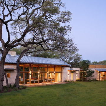
The program consists of a detached Guest House with full Kitchen, Living and Dining amenities, Carport and Office Building with attached Main house and Master Bedroom wing. The arrangement of buildings was dictated by the numerous majestic oaks and organized as a procession of spaces leading from the Entry arbor up to the front door. Large covered terraces and arbors were used to extend the interior living spaces out onto the site.
All the buildings are clad in Texas limestone with accent bands of Leuders limestone to mimic the local limestone cliffs in the area. Steel was used on the arbors and fences and left to rust. Vertical grain Douglas fir was used on the interior while flagstone and stained concrete floors were used throughout. The flagstone floors extend from the exterior entry arbors into the interior of the Main Living space and out onto the Main house terraces.
 Favreau Design
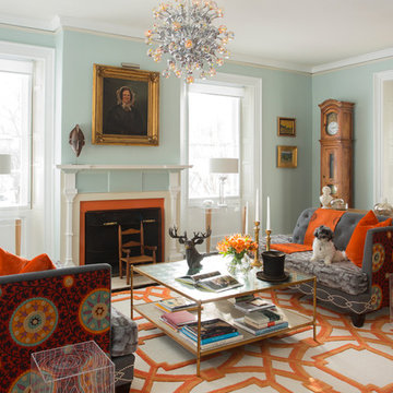
Inspiration for a victorian formal living room remodel in San Francisco with blue walls and a standard fireplace
 Normandy Remodeling
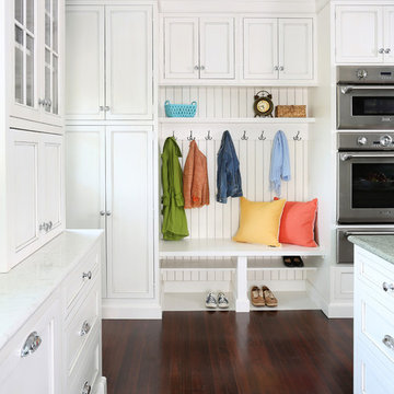
Storage never looked so attractive with this customized mudroom. The space incorporates a broom cabinet, coat and shoe storage and seating.
Because this kitchen entrance is a high-traffic area, tile that mimics the color of the cabinetry was used underneath the bench area - a more practical option than wood.
Heart pine floors were also sourced to match the original flooring throughout the house.
Find the right local pro for your project
 Cassoni Furniture & Accessories
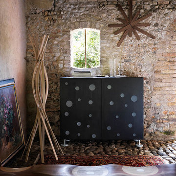
- POLKA DOTS CUPBOARD. In designing Polka Dots, Toyo Ito placed multiple methacrylate, circular inserts in apparent disarray on the doors, in stark contrast to the strict and minimalist structures of this piece of furniture. This graphic idea is reminiscent of Tokyo's Za-Koenji theatre, also designed by the great architect. The inserts represent, as the name itself indicates, a multitude of dots that seem to fly gently upwards and that, upon turning the interior lights on, create a magical play of lights and shadows.
75''5/8W x 19''1/4D x 41''3/4H.
http://bit.ly/2eT5pV2
- TWIST COAT STAND. The eight beech slats in its structure bend and twist as if they were dancing. Their elastic tension is essential to provide the hanger with excellent form and stability. Twist responds to a simple yet important observation: hangers usually vanish when you hang your coats or clothing. However, Twist does not disappear. Conversely, it is emphasized as only its central part is covered. Clothing can be hung on hooks stuck in the slats allowing the upper part of Twist, a beautiful wood flower, to emerge in all its elegance.
Ø23''5/8 x 65''3/4H.
http://bit.ly/2fyMRv0
- RIPPLES BENCH. Ripples, winner of the 2004 Compasso d'Oro, is made of a laminated composite of five different solid woods. Slide your hand along the surface to enjoy the seamless transitions between walnut, mahogany, cherry, oak, and ash. This enveloping seat, carved with mastery, is hand-finished to produce an elegant polychromatic effect arising from the ductility of the wood. A true icon of international design, Ripples is a bench suitable for home users, commercial environments, and public spaces.
78''3/4W x 19''5/8D x 15''3/4H.
http://bit.ly/2fNcqIZ
 Keuka Studios, Inc
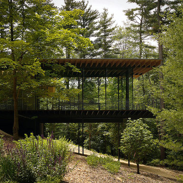
A home In harmony with nature.
Example of a minimalist one-story flat roof design in New York
Example of a minimalist one-story flat roof design in New York
 Housetrends Magazine
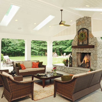
When you open the back doors of the home of Nancy and Jeremy Campbell in Granville, you don’t just step out onto a patio. You enter an extension of a modern living space that just happens to be outdoors. Their patio’s unique design and setting provides the comfort and style of indoors while enjoying the natural beauty and fresh air of outdoors.
It all started with a rather desolate back yard. “It was completely blank, there was nothing back there,” Nancy remembers of the patio space of this 1972 split-level house they bought five years ago. With a blank slate to work with, the Campbells knew the key elements of what they wanted for their new outdoor space when they sat down with Travis Ketron of Ketron Custom Builders to design it. “We knew we wanted something covered so we could use it in the rain, and in the winter, and we knew we wanted a stone fireplace,” Nancy recalls.
Travis translated the Campbells’ vision into a design to satisfy outdoor entertaining and relaxing desires in all seasons. The new outdoor space is reminiscent of a vast, rustic great room complete with a stone fireplace, a vaulted ceiling, skylights, and ceiling fans, yet no walls. The space is completely open to the elements without any glass or doors on any of the sides, except from the house. Furnished like a great room, with a built-in music system as well, it’s truly an extension of indoor living and entertaining space, and one that is unaffected by rain. Jeremy comments, “We haven’t had to cover the furniture yet. It would have to be a pretty strong wind to get wet.” Just outside the covered patio is a quartet of outdoor chairs adorned with plush cushions and colorful pillows, positioned perfectly for users to bask in the sun.
In the design process, the fireplace emerged as the anchor of the space and set the stage for the outdoor space both aesthetically and functionally. “We didn’t want it to block the view. Then designing the space with Travis, the fireplace became the center,” remembers Jeremy. Placed directly across from the two sets of French doors leading out from the house, a Rumford fireplace and extended hearth of stone in neutral earth tones is the focal point of this outdoor living room. Seating for entertaining and lounging falls easily into place around it providing optimal viewing of the private, wooded back yard. When temperatures cool off, the fireplace provides ample warmth and a cozy setting to experience the change of seasons. “It’s a great fireplace for the space,” Jeremy says of the unique design of a Rumford style fireplace. “The way you stack the wood in the fireplace is different so as to get more heat. It has a shallower box, burns hotter and puts off more heat. Wood is placed in it vertically, not stacked.” Just in case the fireplace doesn’t provide enough light for late-night soirees, there is additional outdoor lighting mounted from the ceiling to make sure the party always goes on.
Travis brought the idea of the Rumford outdoor fireplace to the Campbells. “I learned about it a few years back from some masons, and I was intrigued by the idea then,” he says. “We like to do stuff that’s out of the norm, and this fireplace fits the space and function very well.” Travis adds, “People want unique things that are designed for them. That’s our style to do that for them.”
The patio also extends out to an uncovered area set up with patio tables for grilling and dining. Gray pavers flow throughout from the covered space to the open-air area. Their continuous flow mimics the feel of flooring that extends from a living room into a dining room inside a home. Also, the earth tone colors throughout the space on the pavers, fireplace and furnishings help the entire space mesh nicely with its natural surroundings.
A little ways off from both the covered and uncovered patio area is a stone fire pit ring. Removed by just the right distance, it provides a separate place for young adults to gather and enjoy the night.
Adirondack chairs and matching tables surround the outdoor fire pit, offering seating for anyone who doesn’t wish to stand and a place to set down ingredients for yummy fireside treats like s’mores.
Padded chairs outside the reach of the pavilion and the nearby umbrella the perfect place to kick back and relax in the sun. The colorful throw pillows and outdoor furniture cushions add some needed color and a touch of personality.
Enjoying the comforts of indoors while being outdoors is exactly what the Campbells are doing now, particularly when lounging on the comfortable wicker furniture that dominate most of the area. “My favorite part of the whole thing is the fireplace,” Nancy says.
Jeremy concludes, “There is no television, it would destroy the ambiance out there. We just enjoy listening to music and watching the fire.”

Sponsored
Sunbury, OH

J.Holderby - Renovations
Franklin County's Leading General Contractors - 2X Best of Houzz!
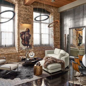
 MaRae Simone Interiors, LLC
In some ways, this room is so inviting it makes you think OMG I want to be in that room, and at the same time, it seems so perfect you almost don’t want to disturb it. So is this room for show or for function? “It’s both,” MaRae Simone says. Even though it’s so beautiful, sexy and perfect, it’s still designed to be livable and functional. The sofa comes with an extra dose of comfort. You’ll also notice from this room that MaRae loves to layer. Put rugs on top of rugs. Throws on top of throws. “I love the layering effect,” MaRae says.
MaRae Simone Interiors, Marc Mauldin Photography
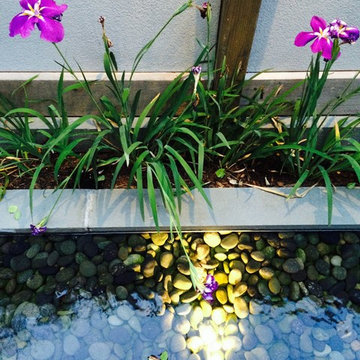
 Horn & Co. (Previously JHLA)
Our clients on this project were inspired by their travels to Asia and wanted to mimic this aesthetic at their DC property. We designed a water feature that effectively masks adjacent traffic noise and maintains a small footprint.

 FineLine Kitchens, Inc.
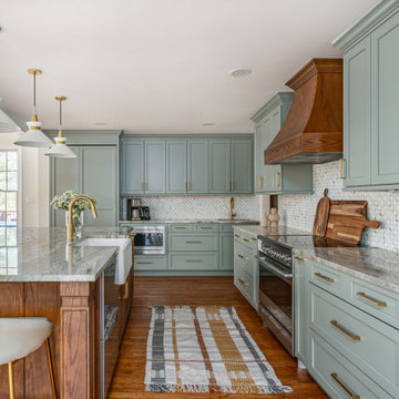
Hi everyone, I'm Sarah and Ogun we are here with fine line kitchens. So we are a couple working together. I do the interior design and remodeling of the space material selection meeting with the clients. And I handled operations outside, you know meaning all the construction work that is taking place the inside. The houses that we work in. I handle all the aspects of the construction, so today's project is very special. We're in Vienna and the client had a very big family. It's a family of seven that lives here. So we had a few aspects that we needed to keep in mind while designing this one. Having everybody be able to sit on the island. So we wanted plenty of seating all the way around. We didn't want anybody standing or anything like that. So what we did is we maximize the space. The center island is the biggest part of the kitchen. We use a natural stone to kind of give it a beautiful texture versus quartz. It's kind of standard white or kind of fabricated, so I wanted something very natural. We did this because I took my inspiration from the outside, so the inspiration if you look at the view right in front of me is there are so many greens there's a lot of brass accents and I wanted to bring this. Into this kitchen while designing it for my clients. She is very warm very. She wanted a very homey, comfy kind of look for the kitchen. So that's what we did today. As you can see, the cabinets are sage green, very light, so I still think it's a neutral, but it's a lighter color that again brings the outside in and we combine that with the oak right behind me so it's a slightly warm oak. It's not very dark. It's not very light. It's a medium brown and the same color went on the island. To kind of tie these two in and the backsplash, my favorite part is where you can see a little bit of design. It is, in my opinion still classic, but includes a pattern so the outside part is as we said in the beginning, is handled by my husband. I'd like him to speak a little bit about that. Thanks, Sarah, I want to talk to you guys a little bit about the construction part of this project. Originally this kitchen was located mostly in this area. They had their stove there sing. It was more of a peninsula layout in Sarah's and the customer vision they wanted. They wanted to get rid of the peninsula and they want to be able to have a huge island that can at least sit seven people because they're familiar with seven. So we wanted to make sure that we can achieve this design and bring it to life so that they can be happy with this layout. Some of the challenges we had, the house, the home being, you know, old home. There were a lot of you know the older electrical and plumbing that had to be replaced. We had to relocate the stove from here to this area. Over here we had put a nice foot fan that we had to relocate all the ductwork and the plumbing. Was being on the peninsula area. We had to relocate it to the center islands. So we achieved all this and kind of like bring it to bring in this kitchen up to date it looks beautiful. That's true, so yes, the old layout did not function for my clients because everything was kind of gathered on one side of the kitchen. So there was like a peninsula right there. So the end of this island kind of continued straight. And that was just the L shape. Kind of where everything was and there used to be another big table here, so they were using only kind of half of the space. So like I said at the beginning, our vision was to kind of feed everybody at the island, create some symmetry. 'cause I love that. So as you can see behind me, this is kind of the focal point symmetrical. Everything is kind of even we wanted to also panel the fridge here so it mimics the pantry and another size. So when you're looking at it, it is bringing again that symmetry back again. I hope you enjoyed this kitchen and this video and I'll see you soon. So how do you think this project turned out? It's nice. I like the color. I think it turned out nice. It's kind of like a little bit different color than what we always do. So I realize. Are you giving me a little bit of credit here that I did something different? Are you proud? I'm so proud of you. Other than that I like it. That they have kind of like a two sink. So if this was our kitchen, if we ever like you can have your own. I can have mine if we ever get into a fight then this can be like my own kitchen. Why are we gonna bring in a fight right now? So I'm cooking anyway. You're grilling most of the time, So what are you even talking about? My kitchen? That's my kitchen. You can just take the small sink. That's fine. It's always good to have your own space right there, so anyways. Thank you guys for watching. We hope to see you soon and if you have any questions please click the link below. It'll lead you to our website, house, YouTube and all of the social media is so nice to have you guys. We'll see you soon. Thanks bye bye-bye.
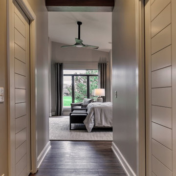
 Coffey & Co. House of Interiors
Lisza Coffey Photography
Example of a mid-sized 1960s master vinyl floor and beige floor bedroom design in Omaha with beige walls and no fireplace
Example of a mid-sized 1960s master vinyl floor and beige floor bedroom design in Omaha with beige walls and no fireplace
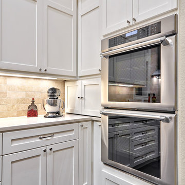
 Twelve Stones Designs, LLC
C.L. Fry Photography
Large transitional single-wall concrete floor open concept kitchen photo in Austin with a single-bowl sink, shaker cabinets, white cabinets, quartz countertops, beige backsplash, stone tile backsplash and stainless steel appliances
Large transitional single-wall concrete floor open concept kitchen photo in Austin with a single-bowl sink, shaker cabinets, white cabinets, quartz countertops, beige backsplash, stone tile backsplash and stainless steel appliances
 FineLine Kitchens, Inc.
Hi everyone, I'm Sarah and Ogun we are here with fine line kitchens. So we are a couple working together. I do the interior design and remodeling of the space material selection meeting with the clients. And I handled operations outside, you know meaning all the construction work that is taking place the inside. The houses that we work in. I handle all the aspects of the construction, so today's project is very special. We're in Vienna and the client had a very big family. It's a family of seven that lives here. So we had a few aspects that we needed to keep in mind while designing this one. Having everybody be able to sit on the island. So we wanted plenty of seating all the way around. We didn't want anybody standing or anything like that. So what we did is we maximize the space. The center island is the biggest part of the kitchen. We use a natural stone to kind of give it a beautiful texture versus quartz. It's kind of standard white or kind of fabricated, so I wanted something very natural. We did this because I took my inspiration from the outside, so the inspiration if you look at the view right in front of me is there are so many greens there's a lot of brass accents and I wanted to bring this. Into this kitchen while designing it for my clients. She is very warm very. She wanted a very homey, comfy kind of look for the kitchen. So that's what we did today. As you can see, the cabinets are sage green, very light, so I still think it's a neutral, but it's a lighter color that again brings the outside in and we combine that with the oak right behind me so it's a slightly warm oak. It's not very dark. It's not very light. It's a medium brown and the same color went on the island. To kind of tie these two in and the backsplash, my favorite part is where you can see a little bit of design. It is, in my opinion still classic, but includes a pattern so the outside part is as we said in the beginning, is handled by my husband. I'd like him to speak a little bit about that. Thanks, Sarah, I want to talk to you guys a little bit about the construction part of this project. Originally this kitchen was located mostly in this area. They had their stove there sing. It was more of a peninsula layout in Sarah's and the customer vision they wanted. They wanted to get rid of the peninsula and they want to be able to have a huge island that can at least sit seven people because they're familiar with seven. So we wanted to make sure that we can achieve this design and bring it to life so that they can be happy with this layout. Some of the challenges we had, the house, the home being, you know, old home. There were a lot of you know the older electrical and plumbing that had to be replaced. We had to relocate the stove from here to this area. Over here we had put a nice foot fan that we had to relocate all the ductwork and the plumbing. Was being on the peninsula area. We had to relocate it to the center islands. So we achieved all this and kind of like bring it to bring in this kitchen up to date it looks beautiful. That's true, so yes, the old layout did not function for my clients because everything was kind of gathered on one side of the kitchen. So there was like a peninsula right there. So the end of this island kind of continued straight. And that was just the L shape. Kind of where everything was and there used to be another big table here, so they were using only kind of half of the space. So like I said at the beginning, our vision was to kind of feed everybody at the island, create some symmetry. 'cause I love that. So as you can see behind me, this is kind of the focal point symmetrical. Everything is kind of even we wanted to also panel the fridge here so it mimics the pantry and another size. So when you're looking at it, it is bringing again that symmetry back again. I hope you enjoyed this kitchen and this video and I'll see you soon. So how do you think this project turned out? It's nice. I like the color. I think it turned out nice. It's kind of like a little bit different color than what we always do. So I realize. Are you giving me a little bit of credit here that I did something different? Are you proud? I'm so proud of you. Other than that I like it. That they have kind of like a two sink. So if this was our kitchen, if we ever like you can have your own. I can have mine if we ever get into a fight then this can be like my own kitchen. Why are we gonna bring in a fight right now? So I'm cooking anyway. You're grilling most of the time, So what are you even talking about? My kitchen? That's my kitchen. You can just take the small sink. That's fine. It's always good to have your own space right there, so anyways. Thank you guys for watching. We hope to see you soon and if you have any questions please click the link below. It'll lead you to our website, house, YouTube and all of the social media is so nice to have you guys. We'll see you soon. Thanks bye bye-bye.

Sponsored
Columbus, OH

Wannemacher Interiors
Customized Award-Winning Interior Design Solutions in Franklin Cnty OH
 FineLine Kitchens, Inc.
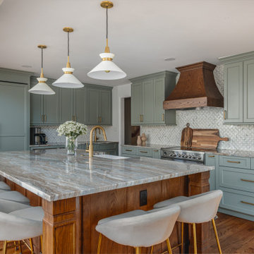
Hi everyone, I'm Sarah and Ogun we are here with fine line kitchens. So we are a couple working together. I do the interior design and remodeling of the space material selection meeting with the clients. And I handled operations outside, you know meaning all the construction work that is taking place the inside. The houses that we work in. I handle all the aspects of the construction, so today's project is very special. We're in Vienna and the client had a very big family. It's a family of seven that lives here. So we had a few aspects that we needed to keep in mind while designing this one. Having everybody be able to sit on the island. So we wanted plenty of seating all the way around. We didn't want anybody standing or anything like that. So what we did is we maximize the space. The center island is the biggest part of the kitchen. We use a natural stone to kind of give it a beautiful texture versus quartz. It's kind of standard white or kind of fabricated, so I wanted something very natural. We did this because I took my inspiration from the outside, so the inspiration if you look at the view right in front of me is there are so many greens there's a lot of brass accents and I wanted to bring this. Into this kitchen while designing it for my clients. She is very warm very. She wanted a very homey, comfy kind of look for the kitchen. So that's what we did today. As you can see, the cabinets are sage green, very light, so I still think it's a neutral, but it's a lighter color that again brings the outside in and we combine that with the oak right behind me so it's a slightly warm oak. It's not very dark. It's not very light. It's a medium brown and the same color went on the island. To kind of tie these two in and the backsplash, my favorite part is where you can see a little bit of design. It is, in my opinion still classic, but includes a pattern so the outside part is as we said in the beginning, is handled by my husband. I'd like him to speak a little bit about that. Thanks, Sarah, I want to talk to you guys a little bit about the construction part of this project. Originally this kitchen was located mostly in this area. They had their stove there sing. It was more of a peninsula layout in Sarah's and the customer vision they wanted. They wanted to get rid of the peninsula and they want to be able to have a huge island that can at least sit seven people because they're familiar with seven. So we wanted to make sure that we can achieve this design and bring it to life so that they can be happy with this layout. Some of the challenges we had, the house, the home being, you know, old home. There were a lot of you know the older electrical and plumbing that had to be replaced. We had to relocate the stove from here to this area. Over here we had put a nice foot fan that we had to relocate all the ductwork and the plumbing. Was being on the peninsula area. We had to relocate it to the center islands. So we achieved all this and kind of like bring it to bring in this kitchen up to date it looks beautiful. That's true, so yes, the old layout did not function for my clients because everything was kind of gathered on one side of the kitchen. So there was like a peninsula right there. So the end of this island kind of continued straight. And that was just the L shape. Kind of where everything was and there used to be another big table here, so they were using only kind of half of the space. So like I said at the beginning, our vision was to kind of feed everybody at the island, create some symmetry. 'cause I love that. So as you can see behind me, this is kind of the focal point symmetrical. Everything is kind of even we wanted to also panel the fridge here so it mimics the pantry and another size. So when you're looking at it, it is bringing again that symmetry back again. I hope you enjoyed this kitchen and this video and I'll see you soon. So how do you think this project turned out? It's nice. I like the color. I think it turned out nice. It's kind of like a little bit different color than what we always do. So I realize. Are you giving me a little bit of credit here that I did something different? Are you proud? I'm so proud of you. Other than that I like it. That they have kind of like a two sink. So if this was our kitchen, if we ever like you can have your own. I can have mine if we ever get into a fight then this can be like my own kitchen. Why are we gonna bring in a fight right now? So I'm cooking anyway. You're grilling most of the time, So what are you even talking about? My kitchen? That's my kitchen. You can just take the small sink. That's fine. It's always good to have your own space right there, so anyways. Thank you guys for watching. We hope to see you soon and if you have any questions please click the link below. It'll lead you to our website, house, YouTube and all of the social media is so nice to have you guys. We'll see you soon. Thanks bye bye-bye.
 Klopf Architecture
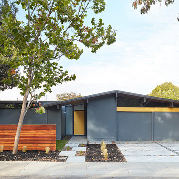
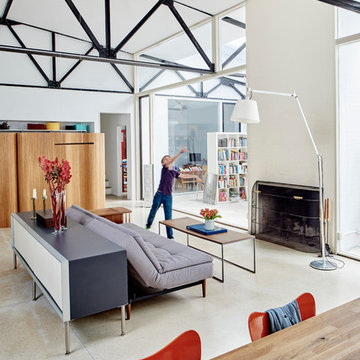
Klopf Architecture completely remodeled this once dark Eichler house in Palo Alto creating a more open, bright and functional family home. The reconfigured great room with new full height windows and sliding glass doors blends the indoors with the newly landscaped patio and seating areas outside. The former galley kitchen was relocated and was opened up to have clear sight lines through the great room and out to the patios and yard, including a large island and a beautiful walnut bar countertop with seating. An integrated small front addition was added allowing for a more spacious master bath and hall bath layouts. With the removal of the old brick fireplace, larger sliding glass doors and multiple skylights now flood the home with natural light.
The goals were to work within the Eichler style while creating a more open, indoor-outdoor flow and functional spaces, as well as a more efficient building envelope including a well insulated roof, providing solutions that many Eichler homeowners appreciate. The original entryway lacked unique details; the clients desired a more gracious front approach. The historic Eichler color palette was used to create a modern updated front facade.
Durable grey porcelain floor tiles unify the entire home, creating a continuous flow. They, along with white walls, provide a backdrop for the unique elements and materials to stand on their own, such as the brightly colored mosaic tiles, the walnut bar and furniture, and stained ceiling boards. A secondary living space was extended out to the patio with the addition of a bench and additional seating.
This Single family Eichler 4 bedroom 2 bath remodel is located in the heart of the Silicon Valley.
Klopf Architecture Project Team: John Klopf, Klara Kevane, and Ethan Taylor
Contractor: Coast to Coast Construction
Landscape Contractor: Discelli
Structural Engineer: Brian Dotson Consulting Engineer
Photography ©2018 Mariko Reed
Location: Palo Alto, CA
Year completed: 2017


Sponsored
Sunbury, OH
J.Holderby - Renovations
Franklin County's Leading General Contractors - 2X Best of Houzz!
 Centered By Design
Carolina Mariana
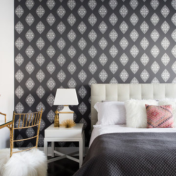
Transitional master bedroom photo in Chicago with multicolored walls
Transitional master bedroom photo in Chicago with multicolored walls
 Chaffey Building Group
Photo Credit: Matt Edington
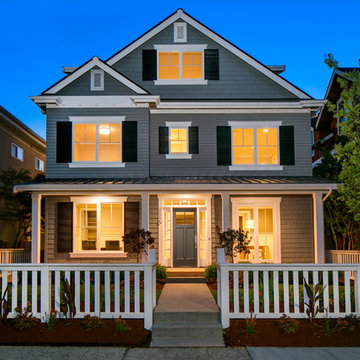
Large traditional gray three-story wood gable roof idea in Seattle
Large traditional gray three-story wood gable roof idea in Seattle
4