
Search results for "Mimicking" in Home Design Ideas
 Addhouse
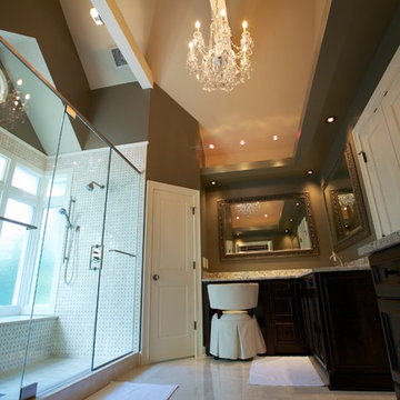
Design, color scheme, lighting, and installation by Addhouse.
My compliments to Monkeyboy Productions for capturing the essence of this space. Very difficult to photograph!
 Altura Architects
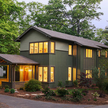
This home combines function, efficiency and style. The homeowners had a limited budget, so maximizing function while minimizing square footage was critical. We used a fully insulated slab on grade foundation of a conventionally framed air-tight building envelope that gives the house a good baseline for energy efficiency. High efficiency lighting, appliance and HVAC system, including a heat exchanger for fresh air, round out the energy saving measures. Rainwater was collected and retained on site.
Working within an older traditional neighborhood has several advantages including close proximity to community amenities and a mature landscape. Our challenge was to create a design that sits well with the early 20th century homes in the area. The resulting solution has a fresh attitude that interprets and reflects the neighborhood’s character rather than mimicking it. Traditional forms and elements merged with a more modern approach.
Photography by Todd Crawford
 Donald Lococo Architects
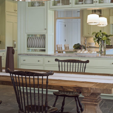
The owner said "any color but white" for her farmhouse kitchen country kitchen. Earthy and elemental materials are selected for the home that reference the barn without directly mimicking it. Wooden members found inside the barn and from other barns bridge ceilings and are used in floors along with rustic slate adding to a sense of simplicity to the farmhouse design.
Find the right local pro for your project
 Hagstrom Builder
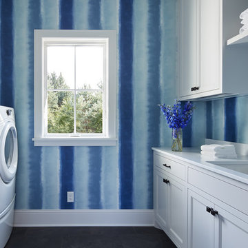
A Modern Farmhouse set in a prairie setting exudes charm and simplicity. Wrap around porches and copious windows make outdoor/indoor living seamless while the interior finishings are extremely high on detail. In floor heating under porcelain tile in the entire lower level, Fond du Lac stone mimicking an original foundation wall and rough hewn wood finishes contrast with the sleek finishes of carrera marble in the master and top of the line appliances and soapstone counters of the kitchen. This home is a study in contrasts, while still providing a completely harmonious aura.
 Custom Design & Construction
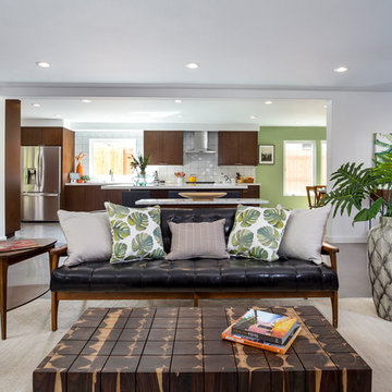
Our homeowners approached us for design help shortly after purchasing a fixer upper. They wanted to redesign the home into an open concept plan. Their goal was something that would serve multiple functions: allow them to entertain small groups while accommodating their two small children not only now but into the future as they grow up and have social lives of their own. They wanted the kitchen opened up to the living room to create a Great Room. The living room was also in need of an update including the bulky, existing brick fireplace. They were interested in an aesthetic that would have a mid-century flair with a modern layout. We added built-in cabinetry on either side of the fireplace mimicking the wood and stain color true to the era. The adjacent Family Room, needed minor updates to carry the mid-century flavor throughout.
 Custom Design & Construction
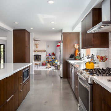
Our homeowners approached us for design help shortly after purchasing a fixer upper. They wanted to redesign the home into an open concept plan. Their goal was something that would serve multiple functions: allow them to entertain small groups while accommodating their two small children not only now but into the future as they grow up and have social lives of their own. They wanted the kitchen opened up to the living room to create a Great Room. The living room was also in need of an update including the bulky, existing brick fireplace. They were interested in an aesthetic that would have a mid-century flair with a modern layout. We added built-in cabinetry on either side of the fireplace mimicking the wood and stain color true to the era. The adjacent Family Room, needed minor updates to carry the mid-century flavor throughout.
 Jamee Parish Architects, LLC
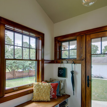
"A Kitchen for Architects" by Jamee Parish Architects, LLC. This project is within an old 1928 home. The kitchen was expanded and a small addition was added to provide a mudroom and powder room. It was important the the existing character in this home be complimented and mimicked in the new spaces.
 KabCo Kitchens
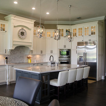
This gorgeous South Florida interior was embellished with stacked Showplace Wood Product Cabinets in Maple Soft Cream. In the center a 9' island provides expansive counter space and plenty of seating. The Quartz counters by Silestone mimick marble while providing the ultimate antimicrobial kitchen surface.
 FAB Architecture
Nick Johnson
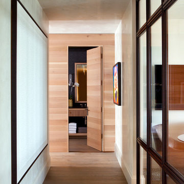
Hallway - mid-sized contemporary medium tone wood floor hallway idea in Austin with gray walls
Hallway - mid-sized contemporary medium tone wood floor hallway idea in Austin with gray walls
 Vetter Architects
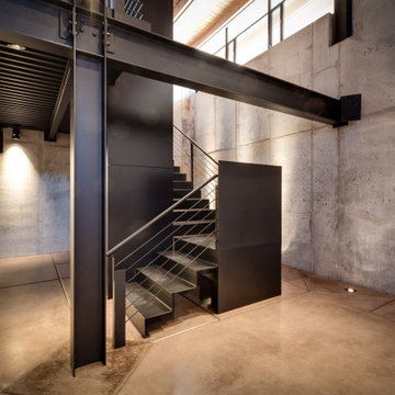
A minimal insertion into a densely wooded landscape, the Collector’s Pavilion provides the owners with an 8,000 sf private fitness space and vintage automobile gallery. On a gently sloping site in amongst a grove of trees, the pavilion slides into the topography - mimicking and contrasting the surrounding landscape with a folded roof plane that hovers over a board formed concrete base.
The clients’ requirement for a nearby room to display a growing car collection as well as provide a remote area for personal fitness carries with it a series of challenges related to privacy and security. The pavilion nestles into the wooded site - finding a home in a small clearing - and merges with the sloping landscape. The building has dual personalities, serving as a private and secure bunker from the exterior, while transforming into a warm and inviting space on the interior. The use of indirect light and the need to obscure direct views from the public right away provides the client with adequate day light for day-to-day use while ensuring that strict privacy is maintained. This shifting personality is also dramatically affected by the seasons - contrasting and merging with the surrounding environment depending on the time of year.
The Collector’s Pavilion employs meticulous detailing of its concrete to steel to wood connections, exploring the grounded nature of poured concrete in conjunction with a delicate wood roof system that floats above a grid of steel. Above all, the Pavilion harmonizes with it’s natural surroundings through it’s materiality, formal language, and siting.
Overview
Chenequa, WI
Size
8,000 sf
Completion Date
May 2013
Services
Architecture, Landscape Architecture, Interior Design
 Melton Design Build
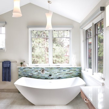
The bathtub in the master bathroom is a focal point due to the eccentric lines and the blue-toned backsplash. Over the bathtub, there are hanging lights which also contain clean, smooth lines. Additionally, the large windows let in plenty of natural light, adding to the nature vibe of this bathroom.
Photo Credit: StudioQPhoto.com
 Nemo Tile + Stone
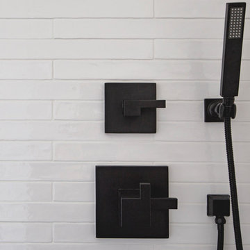
The bathroom floor is NEMO Tile’s Dune porcelain tile in color ‘deep’ with a natural finish in large format 12×24 tiles. The Dune collection brings the aesthetic of cement into the space by mimicking the textured look of poured concrete but in a durable porcelain format.
The shower floor was done in the same Dune material but in a chevron mosaic design to compliment the bathroom floor. The chevron mosaic design adds movement to the shower enclosure design while capturing an industrial essence.
The bathroom and shower walls were done in Ara ceramic in color ‘naturale’ white with a gloss finish in 2×20. A wonderful contrast to the poured concrete look, this white Ara tile adds a finishing touch to the space. The bathroom is rounded out with a natural, light colored custom vanity and clean, black accents.
Megan Lawrence
 Cuppett Kilpatrick Architecture + Interior Design
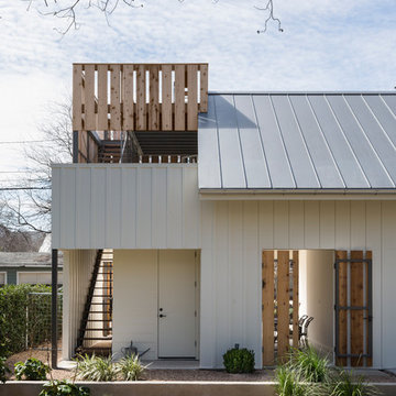
Board and Batten siding is mimicked in pattern of cedar fencing to create open screens and gates; photo Whit Preston
Example of a transitional home design design in Austin
Example of a transitional home design design in Austin
 InnovationLand
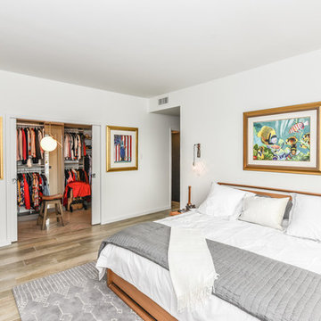
Houston Interior Designer Lisha Maxey took this Museum District condo from the dated, mirrored walls of the 1980s to Mid Century Modern with a gallery look featuring the client's art collection.
"The place was covered with glued-down, floor-to-ceiling mirrors," says Lisha Maxey, senior designer for Homescapes of Houston and principal at LGH Design Services in Houston. "When we took them off the walls, the walls came apart. We ended up taking them down to the studs."
The makeover took six months to complete, primarily because of strict condo association rules that only gave the Houston interior designers very limited access to the elevator - through which all materials and team members had to go.
"Monday through Friday, we could only be noisy from 10 a.m. to 2 p.m., and if we had to do something extra loud, like sawing or drilling, we had to schedule it with the management and they had to communicate that to the condo owners. So it was just a lot of coordination. But a lot of Inner City Loopers live in these kinds of buildings, so we're used to handling that kind of thing."
The client, a child psychiatrist in her 60s, recently moved to Houston from northeast Texas to be with friends. After being widowed three years ago, she decided it was time to let go of the traditionally styled estate that wasn't really her style anyway. An avid diver who has traveled around the world to pursue her passion, she has amassed a large collection of art from her travels. Downsizing to 1,600 feet and wanting to go more contemporary, she wanted the display - and the look - more streamlined.
"She wanted clean lines and muted colors, with the main focus being her artwork," says Maxey. "So we made the space a palette for that."
Enter the white, gallery-grade paint she chose for the walls: "It's halfway between satin and flat," explains Maxey. "It's not glossy and it's not chalky - just very smooth and clean."
Adding to the gallery theme is the satin nickel track lighting with lamps aimed to highlight pieces of art. "This lighting has no wires," notes Maxey. "It's powered by a positive and negative conduit."
The new flooring throughout is a blended-grey porcelain tile that looks like wood planks. "It's gorgeous, natural-looking and combines all the beauty of wood with the durability of tile," says Maxey. "We used it throughout the condo to unify the space."
After Maxey started looking at the client's bright, vibrant, colorful artwork, she felt the palette couldn't stay as muted anymore. Hence the Mid Century Modern orange leather sofas from West Elm and bright green chairs from Joybird, plus the throw pillows in different textures, patterns and shades of gold, orange and green.
The concave lines of the Danish-inspired chairs, she notes, help them look beautiful from all the way around - a key to designing spaces for loft living.
"The table in the living room is very interesting," notes Maxey. "It was handmade for the client in 1974 and has a signature on it from the artist. She was adamant about including the piece, which has all these hand-painted black-and-white art tiles on the top. I took one look at it and said 'It's not really going to go.'"
However, after cutting 6 inches off the bottom and making it look a little distressed, the table ended up being the perfect complement to the sofas.
The dining room table - from Design Within Reach - is a solid piece of mahogany, the chair upholstery a mix of grey velvet and leather and the legs a shiny brass. "The side chairs are leather and the end ones are velvet," says Maxey. "It's a nice textural mix that lends depth and texture."
The galley kitchen, meanwhile, has been lightened and brightened, with white quartz countertops and backsplashes mimicking the look of Carrara marble, stainless steel appliances and a velvet green bench seat for a punch of color. The cabinets are painted a cool grey color called "Silverplate."
The two bathrooms have been updated with contemporary white vanities and vessel sinks and the master bath now features a walk-in shower tiled in Dolomite white marble (the floor is Bianco Carrara marble mosaic, done in a herringbone pattern.
In the master bedroom, Homescapes of Houston knocked down a wall between two smaller closets with swing doors to make one large walk-in closet with pocket doors. The closet in the guest bedroom also came out 13 more inches.
The client's artwork throughout personalizes the space and tells the story of a life. There's a huge bowl of shells from the client's diving adventures, framed art from her child psychiatry patients and a 16th century wood carving from a monastery that's been in her family forever.
"Her collection is quite impressive," says Maxey. "There's even a framed piece of autographed songs written by John Lennon." (You can see this black-framed piece of art on the wall in the photo above of two green chairs).
"We're extremely happy with how the project turned out, and so is the client," says Maxey. "No expense was spared for her. It was a labor of love and we were excited to do it."

 Cuppett Kilpatrick Architecture + Interior Design
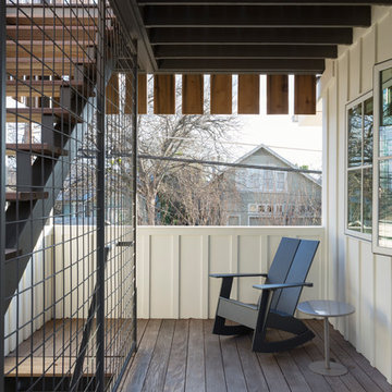
Board and Batten siding is mimicked in pattern of cedar fencing to create open screens; Ipe decking; photo by Whit Preston
Inspiration for a transitional home design remodel in Austin
Inspiration for a transitional home design remodel in Austin

 Nemo Tile + Stone
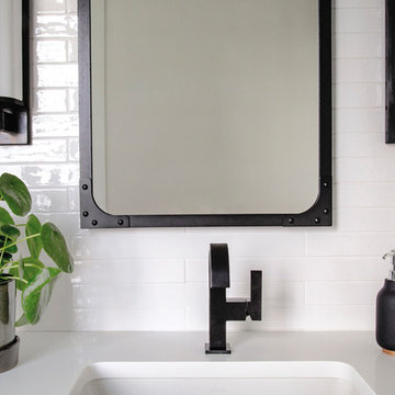
The bathroom floor is NEMO Tile’s Dune porcelain tile in color ‘deep’ with a natural finish in large format 12×24 tiles. The Dune collection brings the aesthetic of cement into the space by mimicking the textured look of poured concrete but in a durable porcelain format.
The shower floor was done in the same Dune material but in a chevron mosaic design to compliment the bathroom floor. The chevron mosaic design adds movement to the shower enclosure design while capturing an industrial essence.
The bathroom and shower walls were done in Ara ceramic in color ‘naturale’ white with a gloss finish in 2×20. A wonderful contrast to the poured concrete look, this white Ara tile adds a finishing touch to the space. The bathroom is rounded out with a natural, light colored custom vanity and clean, black accents.
Megan Lawrence
 Custom Design & Construction
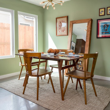
Our homeowners approached us for design help shortly after purchasing a fixer upper. They wanted to redesign the home into an open concept plan. Their goal was something that would serve multiple functions: allow them to entertain small groups while accommodating their two small children not only now but into the future as they grow up and have social lives of their own. They wanted the kitchen opened up to the living room to create a Great Room. The living room was also in need of an update including the bulky, existing brick fireplace. They were interested in an aesthetic that would have a mid-century flair with a modern layout. We added built-in cabinetry on either side of the fireplace mimicking the wood and stain color true to the era. The adjacent Family Room, needed minor updates to carry the mid-century flavor throughout.
 Milk:studio architects
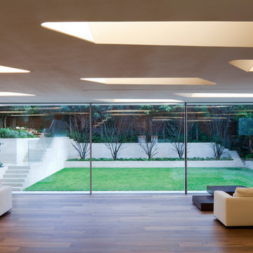
Family room linking garden with house. Large electrically operated sliding doors to create open relationship between inside and out. Roof lights below terrace give natural light, and ones below main house mimicks daylight artificially. Photographer: Tim Mitchell
18