
Search results for "Mimicking" in Home Design Ideas
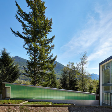
 David Coleman / Architecture
Terraced garden and translucent panels of the studio - photo: Ben Benschneider
Contemporary exterior home idea in Seattle
Contemporary exterior home idea in Seattle
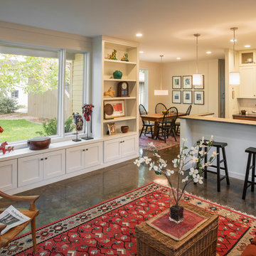
 Altura Architects
This home combines function, efficiency and style. The homeowners had a limited budget, so maximizing function while minimizing square footage was critical. We used a fully insulated slab on grade foundation of a conventionally framed air-tight building envelope that gives the house a good baseline for energy efficiency. High efficiency lighting, appliance and HVAC system, including a heat exchanger for fresh air, round out the energy saving measures. Rainwater was collected and retained on site.
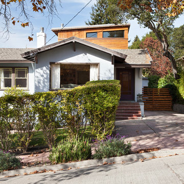
Working within an older traditional neighborhood has several advantages including close proximity to community amenities and a mature landscape. Our challenge was to create a design that sits well with the early 20th century homes in the area. The resulting solution has a fresh attitude that interprets and reflects the neighborhood’s character rather than mimicking it. Traditional forms and elements merged with a more modern approach.
Photography by Todd Crawford
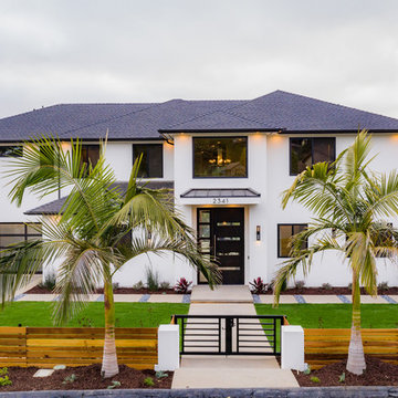
 Spaces Renewed
Exterior view of our custom home
Large beach style white two-story stucco house exterior photo in San Diego with a hip roof and a shingle roof
Large beach style white two-story stucco house exterior photo in San Diego with a hip roof and a shingle roof
Find the right local pro for your project
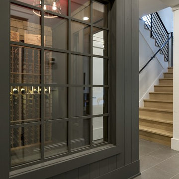
 Hagstrom Builder
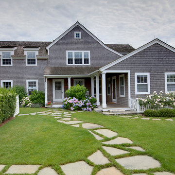
A Modern Farmhouse set in a prairie setting exudes charm and simplicity. Wrap around porches and copious windows make outdoor/indoor living seamless while the interior finishings are extremely high on detail. In floor heating under porcelain tile in the entire lower level, Fond du Lac stone mimicking an original foundation wall and rough hewn wood finishes contrast with the sleek finishes of carrera marble in the master and top of the line appliances and soapstone counters of the kitchen. This home is a study in contrasts, while still providing a completely harmonious aura.

 Parlay Interiors, llc
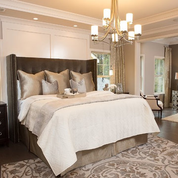
This romantic master suite is a collaboration of earth tones and neutrals with dark woods, and chrome and brushed nickel accents throughout. The pattern of the rug pairs well with the window treatment pattern and serves as a secondary focal point to this amazing, button tufted & nailhead trimmed bed. The sitting room canvas art does a wonderful job of transitioning the colors of the rug into the sitting area, with the darker accent wall mimicking the color of the bed.
 Ogawa Fisher Architects
Street view of our Marin Avenue Residence.
www.marikoreed.com
Example of a mid-sized eclectic gray two-story wood exterior home design in San Francisco with a shed roof
Example of a mid-sized eclectic gray two-story wood exterior home design in San Francisco with a shed roof
 Nar Design Group
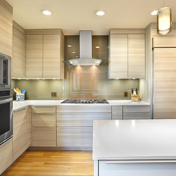
A clean contemporary kitchen by PoggenPohl US, Inc. with custom taupe glass backsplash by Nar Fine Carpentry, Inc. of Sacramento. Perimeter cabinets are in Teak Quartz Textured Melamine, and island is pebble grey finish. White quartz counter tops complete the contemporary look.
Photo Credit: PhotographerLink
 KabCo Kitchens
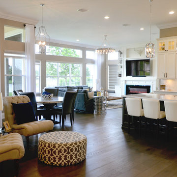
This gorgeous South Florida interior was embellished with stacked Showplace Wood Product Cabinets in Maple Soft Cream. In the center a 9' island provides expansive counter space and plenty of seating. The Quartz counters by Silestone mimick marble while providing the ultimate antimicrobial kitchen surface.
 Finesse Design Remodeling
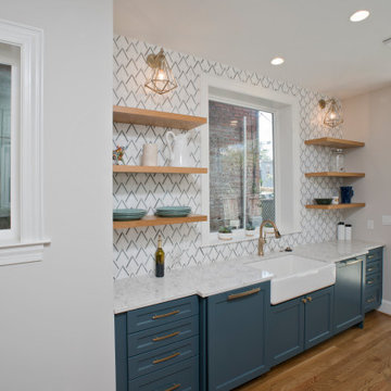
A beautiful and open kitchen mimicking the art deco period with sharp lines and triangle shapes in the backsplash and light fixtures. The repeated gold and white finishes allow for a cohesive design and the blue cabinets match perfectly with a shade of blue in the backsplash. The floating shelves provide point of view storage and were stained to match the floors. The french doors and large window provide natural light in the kitchen.
 InnovationLand
Houston Interior Designer Lisha Maxey took this Museum District condo from the dated, mirrored walls of the 1980s to Mid Century Modern with a gallery look featuring the client's art collection.
"The place was covered with glued-down, floor-to-ceiling mirrors," says Lisha Maxey, senior designer for Homescapes of Houston and principal at LGH Design Services in Houston. "When we took them off the walls, the walls came apart. We ended up taking them down to the studs."
The makeover took six months to complete, primarily because of strict condo association rules that only gave the Houston interior designers very limited access to the elevator - through which all materials and team members had to go.
"Monday through Friday, we could only be noisy from 10 a.m. to 2 p.m., and if we had to do something extra loud, like sawing or drilling, we had to schedule it with the management and they had to communicate that to the condo owners. So it was just a lot of coordination. But a lot of Inner City Loopers live in these kinds of buildings, so we're used to handling that kind of thing."
The client, a child psychiatrist in her 60s, recently moved to Houston from northeast Texas to be with friends. After being widowed three years ago, she decided it was time to let go of the traditionally styled estate that wasn't really her style anyway. An avid diver who has traveled around the world to pursue her passion, she has amassed a large collection of art from her travels. Downsizing to 1,600 feet and wanting to go more contemporary, she wanted the display - and the look - more streamlined.
"She wanted clean lines and muted colors, with the main focus being her artwork," says Maxey. "So we made the space a palette for that."
Enter the white, gallery-grade paint she chose for the walls: "It's halfway between satin and flat," explains Maxey. "It's not glossy and it's not chalky - just very smooth and clean."
Adding to the gallery theme is the satin nickel track lighting with lamps aimed to highlight pieces of art. "This lighting has no wires," notes Maxey. "It's powered by a positive and negative conduit."
The new flooring throughout is a blended-grey porcelain tile that looks like wood planks. "It's gorgeous, natural-looking and combines all the beauty of wood with the durability of tile," says Maxey. "We used it throughout the condo to unify the space."
After Maxey started looking at the client's bright, vibrant, colorful artwork, she felt the palette couldn't stay as muted anymore. Hence the Mid Century Modern orange leather sofas from West Elm and bright green chairs from Joybird, plus the throw pillows in different textures, patterns and shades of gold, orange and green.
The concave lines of the Danish-inspired chairs, she notes, help them look beautiful from all the way around - a key to designing spaces for loft living.
"The table in the living room is very interesting," notes Maxey. "It was handmade for the client in 1974 and has a signature on it from the artist. She was adamant about including the piece, which has all these hand-painted black-and-white art tiles on the top. I took one look at it and said 'It's not really going to go.'"
However, after cutting 6 inches off the bottom and making it look a little distressed, the table ended up being the perfect complement to the sofas.
The dining room table - from Design Within Reach - is a solid piece of mahogany, the chair upholstery a mix of grey velvet and leather and the legs a shiny brass. "The side chairs are leather and the end ones are velvet," says Maxey. "It's a nice textural mix that lends depth and texture."
The galley kitchen, meanwhile, has been lightened and brightened, with white quartz countertops and backsplashes mimicking the look of Carrara marble, stainless steel appliances and a velvet green bench seat for a punch of color. The cabinets are painted a cool grey color called "Silverplate."
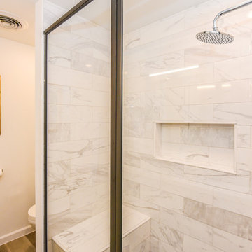
The two bathrooms have been updated with contemporary white vanities and vessel sinks and the master bath now features a walk-in shower tiled in Dolomite white marble (the floor is Bianco Carrara marble mosaic, done in a herringbone pattern.
In the master bedroom, Homescapes of Houston knocked down a wall between two smaller closets with swing doors to make one large walk-in closet with pocket doors. The closet in the guest bedroom also came out 13 more inches.
The client's artwork throughout personalizes the space and tells the story of a life. There's a huge bowl of shells from the client's diving adventures, framed art from her child psychiatry patients and a 16th century wood carving from a monastery that's been in her family forever.
"Her collection is quite impressive," says Maxey. "There's even a framed piece of autographed songs written by John Lennon." (You can see this black-framed piece of art on the wall in the photo above of two green chairs).
"We're extremely happy with how the project turned out, and so is the client," says Maxey. "No expense was spared for her. It was a labor of love and we were excited to do it."
 Metropolis Drafting and Construction Inc
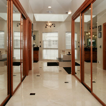
Every grand master bathroom needs a grand entrance, this hallway takes you from the master bedroom to the master bath with two vast walk in closets in both side with lard sliding mirrored doors. the floor of the bath and walk way are 24"x24" ceramic tile mimicking marble look and placed in a diamond pattern with 4"x4" black granite accent tiles.
all the wood work in this bath are original oak carpentry refinished and re-glazed.
Photography: ancel sitton
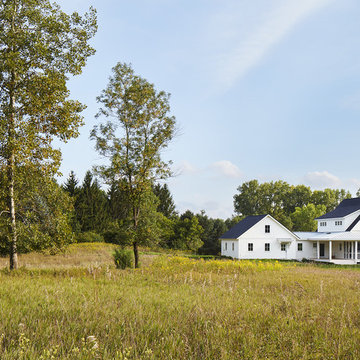 Hagstrom Builder
A Modern Farmhouse set in a prairie setting exudes charm and simplicity. Wrap around porches and copious windows make outdoor/indoor living seamless while the interior finishings are extremely high on detail. In floor heating under porcelain tile in the entire lower level, Fond du Lac stone mimicking an original foundation wall and rough hewn wood finishes contrast with the sleek finishes of carrera marble in the master and top of the line appliances and soapstone counters of the kitchen. This home is a study in contrasts, while still providing a completely harmonious aura.
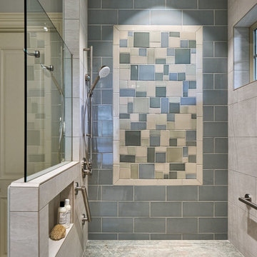
 Neil Kelly Company
A relaxed farmhouse feel was the goal for this bathroom. Silvery-blue painted cabinets, nature inspired granite countertop, and parquet tile flooring. In the walk-in curbless shower built for aging in place, the accent wall has a custom tile pattern mimicking a quilt, a heated bench, and a rain shower head.
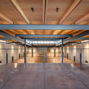
 Vetter Architects
A minimal insertion into a densely wooded landscape, the Collector’s Pavilion provides the owners with an 8,000 sf private fitness space and vintage automobile gallery. On a gently sloping site in amongst a grove of trees, the pavilion slides into the topography - mimicking and contrasting the surrounding landscape with a folded roof plane that hovers over a board formed concrete base.
The clients’ requirement for a nearby room to display a growing car collection as well as provide a remote area for personal fitness carries with it a series of challenges related to privacy and security. The pavilion nestles into the wooded site - finding a home in a small clearing - and merges with the sloping landscape. The building has dual personalities, serving as a private and secure bunker from the exterior, while transforming into a warm and inviting space on the interior. The use of indirect light and the need to obscure direct views from the public right away provides the client with adequate day light for day-to-day use while ensuring that strict privacy is maintained. This shifting personality is also dramatically affected by the seasons - contrasting and merging with the surrounding environment depending on the time of year.
The Collector’s Pavilion employs meticulous detailing of its concrete to steel to wood connections, exploring the grounded nature of poured concrete in conjunction with a delicate wood roof system that floats above a grid of steel. Above all, the Pavilion harmonizes with it’s natural surroundings through it’s materiality, formal language, and siting.
Overview
Chenequa, WI
Size
8,000 sf
Completion Date
May 2013
Services
Architecture, Landscape Architecture, Interior Design

 Custom Design & Construction
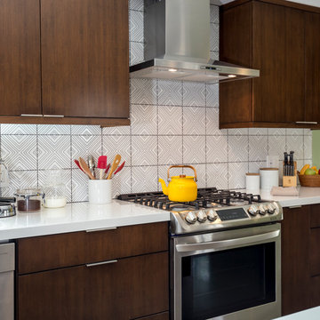
Our homeowners approached us for design help shortly after purchasing a fixer upper. They wanted to redesign the home into an open concept plan. Their goal was something that would serve multiple functions: allow them to entertain small groups while accommodating their two small children not only now but into the future as they grow up and have social lives of their own. They wanted the kitchen opened up to the living room to create a Great Room. The living room was also in need of an update including the bulky, existing brick fireplace. They were interested in an aesthetic that would have a mid-century flair with a modern layout. We added built-in cabinetry on either side of the fireplace mimicking the wood and stain color true to the era. The adjacent Family Room, needed minor updates to carry the mid-century flavor throughout.


 User
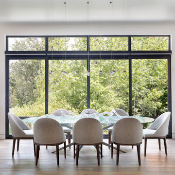
UserWindows reaching a grand 12’ in height fully capture the allurement of the area, bringing the outdoors into each space. Furthermore, the large 16’ multi-paneled doors provide the constant awareness of forest life just beyond. The unique roof lines are mimicked throughout the home with trapezoid transom windows, ensuring optimal daylighting and design interest. A standing-seam metal, clads the multi-tiered shed-roof line. The dark aesthetic of the roof anchors the home and brings a cohesion to the exterior design. The contemporary exterior is comprised of cedar shake, horizontal and vertical wood siding, and aluminum clad panels creating dimension while remaining true to the natural environment.
The Glo A5 double pane windows and doors were utilized for their cost-effective durability and efficiency. The A5 Series provides a thermally-broken aluminum frame with multiple air seals, low iron glass, argon filled glazing, and low-e coating. These features create an unparalleled double-pane product equipped for the variant northern temperatures of the region. With u-values as low as 0.280, these windows ensure year-round comfort.
 Advance Design Studio, Ltd.
The major kitchen renovation of this old country farmhouse was a task of love, one that had been planned for many years by these Barrington seasoned homeowners. After interviewing no less than five companies, the homeowners chose the design team at Advance Design Studio to make the transformation they had long planned for.
“They had an understanding of the right design for the space almost from the instant they walked in the room”, says Sharon Scott of the design team of Nicole Ryan at Todd Jurs at Advance Design Studio. “They were the only designers who laid out ideas in the first meeting at the house that we really loved”, she says. “It was obvious that they understood the house, and understood us - and from then on the decision to hire them literally made itself”.
The original kitchen had a dividing “wall” of cabinetry…that made the rather large space seem very small, and cut off the kitchen from the eating area that has a beautiful garden view completely hidden from the main kitchen. Circulation was poor, leaving family members on top of one another when entertaining family and friends.
The new kitchen design nearly doubles the kitchen size within the original space; opening it up completely and enjoying an expansive island containing a new Kohler Whitehaven Smart Divide farm sink, a dishwasher, and pull out double trash receptacle. The great new gathering space accommodates four pull out stools beckoning grandchildren and friends alike. Removing the range from the island and relocating it to create a dramatic “feature” wall, completely out of the way of guests; it is now crowned with a beautiful completely customized wood hood designed to ventilate much more efficiently than the original island range containing a limited downdraft system.
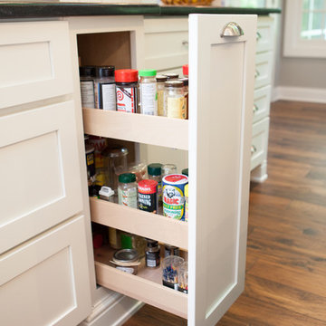
The much more efficient use of the space after removing a pantry closet made way for a fully functional “tall wall” housing a double oven and refrigerator, out of the way of guests. Removing the restrictive cabinetry wall now allowed for an expansive floor to ceiling pantry cabinet with full extension pull out shelving, and an elegant display area complete with a beautiful furniture detailed buffet.
Fitting perfectly into the farmhouse charm of the old estate, Medallion Silver Lancaster cabinetry was chosen in a soft white Maple Divinity paint finish lining the perimeter. The stunning island hints to this old home’s past with Medallion Gold’s Maple Devonshire style graced with a Carriage Black Heirloom painted finish. The rubbed off black paint finish reveals the soft wood tones beneath, mimicking furniture you’d see in your grandmother’s home that has lovingly been polished for years to reveal a soft, subtly rubbed-off sheen.
Counter tops reverse contrast with perimeter tops of black “Raven” granite possessing a subtle honed finish, and a shift to Quartz Difinity Viareggio - resembling white Carrera marble on the island. A simple herringbone detail completes the decorative range wall, and subtle porcelain subway tiles grace the backsplash throughout.
The design is finished off with crisp Thermador and Bosch stainless steel appliances, and bright brushed cup pull and handle combination hardware. A pull down Kohler Bellaria faucet makes cleanup a breeze, and soft under-cabinet LED lighting throughout makes every work surface shine softly, and highlights the cabinetry display area with grace.
One special detail was created to make the dramatic ceiling transition to a vaulted area above the breakfast nook extra special. A tongue and groove solid wood ceiling was hung above, and a subtle greenish-grey distressed paint finish was hand developed on site by the talented crew, complementing the new kitchen with a completely unique surface that appears as if it’s been there for many, many years. It’s just one standout feature in the amazing new space that is sure to be in every conversation as newcomers enjoy the newest best hangout in this old home renewed!
After 30 years of renovating homes, this now content homeowner sips a cup of tea enjoying her new garden view, and reminisces projects of past – and lastly reports their experience with Advance Design Studio culminating with their amazing new kitchen to be the most enjoyable and satisfying home experience yet.
Designer: Nicole Ryan
Photographer: Joe Nowak
15