
Search results for "Minor information" in Home Design Ideas

 Robert Miller FAIA Architects
Located on a wooded site, a single-story 1950s house with an awkward floor plan was strategically remodeled to provide living spaces that connect to the outdoors and respond to the needs of a young family.
This home had undergone successive alterations over the years, resulting in a fragmented, confusing layout. With only minor changes to the footprint, the architects redesigned this midcentury home to blur the boundary between indoor living and the landscape beyond. The new design effects a dramatic change by reorganizing the space into linear zones, raising the roof in key places, and making two small additions.
A concrete wall links a new music studio and detached garage to the main house, forming an entry court that welcomes visitors and screens the private bedroom spaces nearby. The entry is marked by a series of round skylights, while the living room has been opened up with taller ceilings, a new fireplace and walls of glass. A series of long colored boxes provides storage and utility spaces, while planar elements draw the eye through the house to the landscape beyond. Teak cabinets, blackened steel and Douglas fir contrast with more modest materials such as painted MDF panels, fiber-cement siding and painted gypsum wallboard. These spaces are designed to accommodate both intimate family gatherings and large parties.
Select Furnishings provided by INForm
Image by Nic LeHoux
 Robert Miller FAIA Architects
Located on a wooded site, a single-story 1950s house with an awkward floor plan was strategically remodeled to provide living spaces that connect to the outdoors and respond to the needs of a young family.
This home had undergone successive alterations over the years, resulting in a fragmented, confusing layout. With only minor changes to the footprint, the architects redesigned this midcentury home to blur the boundary between indoor living and the landscape beyond. The new design effects a dramatic change by reorganizing the space into linear zones, raising the roof in key places, and making two small additions.
A concrete wall links a new music studio and detached garage to the main house, forming an entry court that welcomes visitors and screens the private bedroom spaces nearby. The entry is marked by a series of round skylights, while the living room has been opened up with taller ceilings, a new fireplace and walls of glass. A series of long colored boxes provides storage and utility spaces, while planar elements draw the eye through the house to the landscape beyond. Teak cabinets, blackened steel and Douglas fir contrast with more modest materials such as painted MDF panels, fiber-cement siding and painted gypsum wallboard. These spaces are designed to accommodate both intimate family gatherings and large parties.
Select Furnishings provided by INForm
Images by Nic LeHoux Photography

 Zelaya Properties LLC
We used: Custom cherry cabinetry in Arts & Crafts Shaker style by Kabinart in Boulder and Espresso stains. Liberty Hardware Venetian bronze 1-1/2" cabinet knobs. KitchenAid Architect II Series 22 CF counter-depth French door refrigerator. KitchenAid Architect Series II 27" convection single wall oven. KitchenAid 36" 6-burner dual fuel freestanding commercial-style range. KitchenAid Architect II Series 24" dishwasher. Sharp Insight Pro Series 24" built-in microwave drawer (Model #KB6524PS). Crystorama Solaris 12" wide pendant lights in English bronze. Granite countertops in Brown Fantasy. 3"x6" polished marble backsplash.
Paint colors:
Walls: Glidden Silver Cloud 30YY 63/024
Ceilings/Trims/Doors: Glidden Swan White GLC23
Robert B. Narod Photography
Find the right local pro for your project

 Floor Coverings International of East Lake
Example of a large classic hallway design in Tampa with yellow walls

 Red House Design Build
Every culture has multiple ways of saying hello. Greetings are an essential, and important, human interaction. Smiles, handshakes, high fives, and hugs all convey welcome; but, as I tell our three boys, your choice of greeting, sends a greater message than just, “hi”. A firm handshake and eye contact says a lot about you and how you regard the other person.
Homes greet us, too. A home’s entrance sends a message, whether formal like a handshake or warm like a hug, it greets guests and owners with the same message. A mudroom entrance might invite a guest into the heart of the home like an old friend, or a formal entry may give a guest pause to look around and gauge the home’s owner by the impression left on the guest.
One of our Red House “clients for life” is a couple that bought a builder grade development home in RI. After taking care of some high priority functional & aesthetic remodeling (a new master bathroom and walk-in closet), the owners contacted Red House again to finally upgrade the front door & entry to the home.
The original, a low-end entry door from a big box store, had finally reached the end of its’ usable life. It was leaking air and starting to rust. It didn’t live up to the aesthetic improvements the owners had made in other areas of the home, and, it no longer served its purpose to shelter and protect or to welcome and greet.
After gauging the space, we realized that with a few minor adjustments to the entry area, we could add some paneling above the door and center a window feature in the foyer. These details created a elegant, yet warm, formality. A three-quarter glass door with a unique window patter provides warm light and an openness that creates the friendly invitation of a true home.
The newly remodeled space speaks to the quality standards of the owners of the home, and, in turn, it will continue to inform the identity of the family while they live there. But more than that, the new entry foreshadows the quality and aesthetics of the other rooms in the house, just like a firm handshake and eye contact is a preview of what to expect.
- Justin Zeller owns a design-build remodeling firm, Red House Custom Building, serving RI and MA. Besides being a Certified Remodeler, Justin has led the team at Red House to win multiple peer-reviewed awards for design and service achievements. Justin also sits on the Board of Directors and serves as Vice President of EM NARI.
Photos by Aaron Usher
Instagram: @redhousedesignbuild
 TKS Design Group
Download our free ebook, Creating the Ideal Kitchen. DOWNLOAD NOW
This client was referred to us from a past client. They are a busy 2-career household with young children and enjoy entertaining friends and family in their home. They have a beautiful open concept home but unfortunately the kitchen was not fitting for the rest of the home. They were not quite sure what to do with the space. We talked about trying to refresh it or do more of a minor remodel, but in the end they decided a full gut would get them to where they wanted to be.
One problem was there was no place for guests to hang out other than the large and awkward banquette area. The brick wall and tiled hood area were feeling a bit dated and tired. The space was just not functional for their lifestyle. There was no prep space near the cooktop and no landing area for items coming out of the ovens or refrigerator, plus a big dead zone in the center of the room.
Banquettes, like the one they previously had in the space, are great for small spaces, but when they get really large like this one, it makes getting in and out of the seating area awkward and uncomfortable. Plus, there was room for a large table, so we eliminated the awkward built in.
We started by removing the faux brick wall between the kitchen and back entry. We relocated the entry to the garage over a couple feet in order to get every last inch out of the new kitchen. We also made the decision to close up the primary window that faced the pretty ho hum brick wall of the neighbor’s house. There was plenty of light coming in from the seating area, so we just didn’t feel the window was adding much to the room.
Construction went smoothy. There was a bit of rework with electrical, flooring and HVAC, but in the end, we think it was well worth it.
The clients really wanted a sleek contemporary look, and we originally had planned for a full height slab backsplash, but due to it’s size, it was a budget buster. Instead, we got creative and settled on large format porcelain tiles that have a similar feel but were a fraction of the cost. We made sure the wall was plumb and level so that the fit and finish would mimic that of slab material.
The final space was quite a change. A large prep sink sits directly across from the new pro-style range with plenty additional prep space on the large island. The refrigerator and ovens now have miles of landing space, and a nice tight work triangle makes cooking a breeze.
Since we wanted a more contemporary feel, not many wall cabinets were included. Instead, we outfitted some of the drawers for dish storage with a peg system. Two large pantries flanking the refrigerator hold baking supplies and small appliances. Large drawers by the cooktop hold pots and pans, and an appliance garage tucked away to the left of the range hides away miscellaneous items. The large island also houses a microwave drawer and tons of storage, most of which is drawers offering maximum convenience.
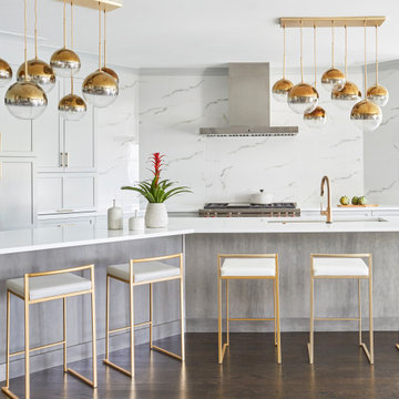
The island now seats 5-6 people comfortably along with the new table in the seating area which can seat up to 8. Entertaining will be a breeze in this space. With such a clean backdrop, we knew we would need some drama with the lighting, so we chose two sets of staggered pendants, which we adjusted for the right visual balance above the island.
We also included a small coffee station to the right of the main kitchen, which helps keep the coffee clutter out of the kitchen proper. Two tones of complimentary gray are featured in this kitchen. The perimeter is a light gray that reads almost white. The island is a gray stain that adds some depth and interest with the visible wood texture. The countertops are clean white quartz, and the hardware, barstools and light fixtures add warm brass tones. I see lots of cooking and entertaining with family and friends in the near future in this bright and airy new space.
Designed by: Susan Klimala, CKD, CBD
Photography by: Michael Kaskel
For more information on kitchen and bath design ideas go to: www.kitchenstudio-ge.com

 Christopher D. Marshall Architect, LLC
The project combined the Kitchen and Dining Rm into one space. The island is large enough to be a work space, breakfast area and bar area.
Photos: Chris Marshall


 Red House Design Build
Every culture has multiple ways of saying hello. Greetings are an essential, and important, human interaction. Smiles, handshakes, high fives, and hugs all convey welcome; but, as I tell our three boys, your choice of greeting, sends a greater message than just, “hi”. A firm handshake and eye contact says a lot about you and how you regard the other person.
Homes greet us, too. A home’s entrance sends a message, whether formal like a handshake or warm like a hug, it greets guests and owners with the same message. A mudroom entrance might invite a guest into the heart of the home like an old friend, or a formal entry may give a guest pause to look around and gauge the home’s owner by the impression left on the guest.
One of our Red House “clients for life” is a couple that bought a builder grade development home in RI. After taking care of some high priority functional & aesthetic remodeling (a new master bathroom and walk-in closet), the owners contacted Red House again to finally upgrade the front door & entry to the home.
The original, a low-end entry door from a big box store, had finally reached the end of its’ usable life. It was leaking air and starting to rust. It didn’t live up to the aesthetic improvements the owners had made in other areas of the home, and, it no longer served its purpose to shelter and protect or to welcome and greet.
After gauging the space, we realized that with a few minor adjustments to the entry area, we could add some paneling above the door and center a window feature in the foyer. These details created a elegant, yet warm, formality. A three-quarter glass door with a unique window patter provides warm light and an openness that creates the friendly invitation of a true home.
The newly remodeled space speaks to the quality standards of the owners of the home, and, in turn, it will continue to inform the identity of the family while they live there. But more than that, the new entry foreshadows the quality and aesthetics of the other rooms in the house, just like a firm handshake and eye contact is a preview of what to expect.
- Justin Zeller owns a design-build remodeling firm, Red House Custom Building, serving RI and MA. Besides being a Certified Remodeler, Justin has led the team at Red House to win multiple peer-reviewed awards for design and service achievements. Justin also sits on the Board of Directors and serves as Vice President of EM NARI.
Photos by Aaron Usher
Instagram: @redhousedesignbuild
 TKS Design Group
Download our free ebook, Creating the Ideal Kitchen. DOWNLOAD NOW
This client was referred to us from a past client. They are a busy 2-career household with young children and enjoy entertaining friends and family in their home. They have a beautiful open concept home but unfortunately the kitchen was not fitting for the rest of the home. They were not quite sure what to do with the space. We talked about trying to refresh it or do more of a minor remodel, but in the end they decided a full gut would get them to where they wanted to be.
One problem was there was no place for guests to hang out other than the large and awkward banquette area. The brick wall and tiled hood area were feeling a bit dated and tired. The space was just not functional for their lifestyle. There was no prep space near the cooktop and no landing area for items coming out of the ovens or refrigerator, plus a big dead zone in the center of the room.
Banquettes, like the one they previously had in the space, are great for small spaces, but when they get really large like this one, it makes getting in and out of the seating area awkward and uncomfortable. Plus, there was room for a large table, so we eliminated the awkward built in.
We started by removing the faux brick wall between the kitchen and back entry. We relocated the entry to the garage over a couple feet in order to get every last inch out of the new kitchen. We also made the decision to close up the primary window that faced the pretty ho hum brick wall of the neighbor’s house. There was plenty of light coming in from the seating area, so we just didn’t feel the window was adding much to the room.
Construction went smoothy. There was a bit of rework with electrical, flooring and HVAC, but in the end, we think it was well worth it.
The clients really wanted a sleek contemporary look, and we originally had planned for a full height slab backsplash, but due to it’s size, it was a budget buster. Instead, we got creative and settled on large format porcelain tiles that have a similar feel but were a fraction of the cost. We made sure the wall was plumb and level so that the fit and finish would mimic that of slab material.
The final space was quite a change. A large prep sink sits directly across from the new pro-style range with plenty additional prep space on the large island. The refrigerator and ovens now have miles of landing space, and a nice tight work triangle makes cooking a breeze.
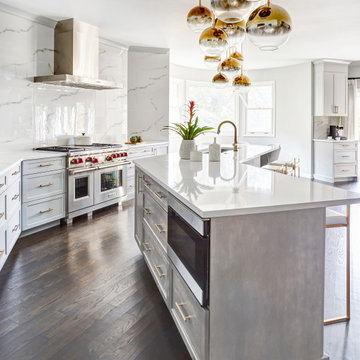
Since we wanted a more contemporary feel, not many wall cabinets were included. Instead, we outfitted some of the drawers for dish storage with a peg system. Two large pantries flanking the refrigerator hold baking supplies and small appliances. Large drawers by the cooktop hold pots and pans, and an appliance garage tucked away to the left of the range hides away miscellaneous items. The large island also houses a microwave drawer and tons of storage, most of which is drawers offering maximum convenience.
The island now seats 5-6 people comfortably along with the new table in the seating area which can seat up to 8. Entertaining will be a breeze in this space. With such a clean backdrop, we knew we would need some drama with the lighting, so we chose two sets of staggered pendants, which we adjusted for the right visual balance above the island.
We also included a small coffee station to the right of the main kitchen, which helps keep the coffee clutter out of the kitchen proper. Two tones of complimentary gray are featured in this kitchen. The perimeter is a light gray that reads almost white. The island is a gray stain that adds some depth and interest with the visible wood texture. The countertops are clean white quartz, and the hardware, barstools and light fixtures add warm brass tones. I see lots of cooking and entertaining with family and friends in the near future in this bright and airy new space.
Designed by: Susan Klimala, CKD, CBD
Photography by: Michael Kaskel
For more information on kitchen and bath design ideas go to: www.kitchenstudio-ge.com

 GS Construction
Example of a small classic 3/4 white tile and stone tile mosaic tile floor alcove shower design in Chicago with an undermount sink, recessed-panel cabinets, black cabinets, quartzite countertops, a two-piece toilet and gray walls

 TKSL Construction
Patio - small traditional backyard stamped concrete patio idea in Denver with no cover

 Amiano & Son Construction, LLC
Large minimalist ceramic tile open concept kitchen photo in Philadelphia with a farmhouse sink, shaker cabinets, white cabinets, quartz countertops, gray backsplash, glass tile backsplash, stainless steel appliances and an island
 TKS Design Group
Download our free ebook, Creating the Ideal Kitchen. DOWNLOAD NOW
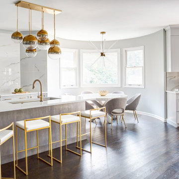
This client was referred to us from a past client. They are a busy 2-career household with young children and enjoy entertaining friends and family in their home. They have a beautiful open concept home but unfortunately the kitchen was not fitting for the rest of the home. They were not quite sure what to do with the space. We talked about trying to refresh it or do more of a minor remodel, but in the end they decided a full gut would get them to where they wanted to be.
One problem was there was no place for guests to hang out other than the large and awkward banquette area. The brick wall and tiled hood area were feeling a bit dated and tired. The space was just not functional for their lifestyle. There was no prep space near the cooktop and no landing area for items coming out of the ovens or refrigerator, plus a big dead zone in the center of the room.
Banquettes, like the one they previously had in the space, are great for small spaces, but when they get really large like this one, it makes getting in and out of the seating area awkward and uncomfortable. Plus, there was room for a large table, so we eliminated the awkward built in.
We started by removing the faux brick wall between the kitchen and back entry. We relocated the entry to the garage over a couple feet in order to get every last inch out of the new kitchen. We also made the decision to close up the primary window that faced the pretty ho hum brick wall of the neighbor’s house. There was plenty of light coming in from the seating area, so we just didn’t feel the window was adding much to the room.
Construction went smoothy. There was a bit of rework with electrical, flooring and HVAC, but in the end, we think it was well worth it.
The clients really wanted a sleek contemporary look, and we originally had planned for a full height slab backsplash, but due to it’s size, it was a budget buster. Instead, we got creative and settled on large format porcelain tiles that have a similar feel but were a fraction of the cost. We made sure the wall was plumb and level so that the fit and finish would mimic that of slab material.
The final space was quite a change. A large prep sink sits directly across from the new pro-style range with plenty additional prep space on the large island. The refrigerator and ovens now have miles of landing space, and a nice tight work triangle makes cooking a breeze.
Since we wanted a more contemporary feel, not many wall cabinets were included. Instead, we outfitted some of the drawers for dish storage with a peg system. Two large pantries flanking the refrigerator hold baking supplies and small appliances. Large drawers by the cooktop hold pots and pans, and an appliance garage tucked away to the left of the range hides away miscellaneous items. The large island also houses a microwave drawer and tons of storage, most of which is drawers offering maximum convenience.
The island now seats 5-6 people comfortably along with the new table in the seating area which can seat up to 8. Entertaining will be a breeze in this space. With such a clean backdrop, we knew we would need some drama with the lighting, so we chose two sets of staggered pendants, which we adjusted for the right visual balance above the island.
We also included a small coffee station to the right of the main kitchen, which helps keep the coffee clutter out of the kitchen proper. Two tones of complimentary gray are featured in this kitchen. The perimeter is a light gray that reads almost white. The island is a gray stain that adds some depth and interest with the visible wood texture. The countertops are clean white quartz, and the hardware, barstools and light fixtures add warm brass tones. I see lots of cooking and entertaining with family and friends in the near future in this bright and airy new space.
Designed by: Susan Klimala, CKD, CBD
Photography by: Michael Kaskel
For more information on kitchen and bath design ideas go to: www.kitchenstudio-ge.com

Sponsored
Columbus, OH
Free consultation for landscape design!

Peabody Landscape Group
Columbus' Reliable Landscape Design & Contracting


 Advance Design Studio, Ltd.
Quinn and Paige, residents of this tired 1960’s tri-level home hated their kitchen. As a matter of fact, prior to making plans to renovate the first floor - they considered selling the home, but were reluctant because of its enviable location near the heart of downtown Barrington which was within walking distance to local stores and all their favorite places. So instead they contacted Advance Design Studio after hearing about them from a neighbor, to rescue their tired home and give it new life.
The very first plan was to remove the constricting walls surrounding the original kitchen, and open the expansive first floor living room and dining area to the new heart of the space; a stunning state of the art coastal designed kitchen. Exposing attractive beams in the vaulted ceiling created an interesting structural detail that suits the open plan and salutes the original architecture of the home, further emphasizing the height of the new space enjoyed now by the family as a great room.
The stage was set for the seaside feel of this kitchen by pairing crisp white painted maple cabinets with Dura Supreme’s one of kind hand weathered finish on the island in soft blue-green finish. But the authentic feeling of being on your favorite beach was supremely achieved by the matching of unique Mt. Claire marble on the island and the specialty Wareham acid washed stone on the perimeter counter tops. Pictures don’t do justice to the feel of this stone under your hand; its water-washed texture reminds instantly of summer vacations collecting rocks softly etched by hundreds of waves.
Stainless steel appliances and satin nickel hardware shine brightly against the backdrop of bright white subway tiles accentuated by subtle grey grout lines contributing to the nautical feel of this comfortable kitchen. Seeded glass door cabinetry reminiscent of beach grasses dress up the space just enough, and a proud 6” stacked crown molding extends above 36” wall cabinets into the expanse of the now taller space; balancing this kitchen nicely within its newly integrated home.
Features in this kitchen include a built in standard depth refrigerator, pull out spice racks, tall tray dividers and wood super Susan with double pull out trash and recycling. A cutlery divider holds sharp knives, and an angled cabinet was customized to hold a secret USB charging station. The bright white Kohler farm sink is graced by an elegant bridge faucet in brushed nickel. This now airy and spacious kitchen has room for guest and family to congregate around the large island, complete with stools and attractive hidden storage for seldom used entertainment pieces.
“I was sold when I saw the drawings. My designer nailed it, down to every last storage idea and coastal detail I envisioned, it was all in there. It was unbelievable how accurate her interpretation was of what was in my head; working with her made my kitchen renovation so easy, it’s as if she literally read my mind”, said Paige enthusiastically.
The woman of the house expressed upon completion not only her love for her fantastic new cooking space, but how renovating her kitchen has given new life to the entire home. Talk of moving has been relegated to the recycling bin, and instead the family is discussing plans to renovate the master bath now that they’ve decided to stay for the long term. Friends who visit the home do a double-take as they recognize the new space’s dramatic transformation from original cramped and closed spaces - to the now amazingly fresh open kitchen that has become the center of every gathering and family meal.
Designer: Nicole Ryan
Photographer: Joe Nowak

 Stonelace Designs
Originally, the exterior of the Napa ranch residence was a standard knocked down stucco finish. We covered over the entire exterior of the house with a natural plaster product that has been made in Italy for centuries, known as Rialto or Vero. This product is a combination of slaked lime mixed with 60% reconstituted crushed marble dust. Quarried from the legendary Carrara marble mines. The finish itself is a vertically combed striated texture embedded into the plaster. While it cures, a transparent group of patinas are applied to the stone-like plaster substance to create a look of an aged villa.



 Shin-boku Nursery
This lovely little lantern gives scale and adds a bit of whimsy to the landscape that surrounds it.
Inspiration for an asian landscaping in Manchester.
Inspiration for an asian landscaping in Manchester.

 Home Platinum Services LLC
12x24 Crema Imperial Travertine on the floor
Diano Real Marble Counter
Crema Marfil Marble Mosaic Rhombus on shower floor & Deco tile
Drop-in bathtub - large modern master beige tile and stone tile travertine floor drop-in bathtub idea in Dallas with an undermount sink, shaker cabinets, dark wood cabinets, marble countertops, a two-piece toilet and beige walls
Drop-in bathtub - large modern master beige tile and stone tile travertine floor drop-in bathtub idea in Dallas with an undermount sink, shaker cabinets, dark wood cabinets, marble countertops, a two-piece toilet and beige walls
3