
Search results for "Mom start" in Home Design Ideas
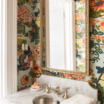
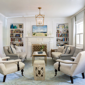
 Safferstone Interiors
Meet Meridith: a super-mom who’s as busy as she is badass — and easily my favorite overachiever. She slays her office job and comes home to an equally high-octane family life.
We share a love for city living with farmhouse aspirations. There’s a vegetable garden in the backyard, a black cat, and a floppy eared rabbit named Rocky. There has been a mobile chicken coop and a colony of bees in the backyard. At one point they even had a pregnant hedgehog on their hands!
Between gardening, entertaining, and helping with homework, Meridith has zero time for interior design. Spending several days a week in New York for work, she has limited amount of time at home with her family. My goal was to let her make the most of it by taking her design projects off her to do list and let her get back to her family (and rabbit).
I wanted her to spend her weekends at her son's baseball games, not shopping for sofas. That’s my cue!
Meridith is wonderful. She is one of the kindest people I know. We had so much fun, it doesn’t seem fair to call this “work”. She is loving, and smart, and funny. She’s one of those girlfriends everyone wants to call their own best friend. I wanted her house to reflect that: to feel cozy and inviting, and encourage guests to stay a while.
Meridith is not your average beige person, and she has excellent taste. Plus, she was totally hands-on with design choices. It was a true collaboration. We played up her quirky side and built usable, inspiring spaces one lightbulb moment at a time.
I took her love for color (sacré blue!) and immediately started creating a plan for her space and thinking about her design wish list. I set out hunting for vibrant hues and intriguing patterns that spoke to her color palette and taste for pattern.
I focused on creating the right vibe in each space: a bit of drama in the dining room, a bit more refined and quiet atmosphere for the living room, and a neutral zen tone in their master bedroom.
Her stuff. My eye.
Meridith’s impeccable taste comes through in her art collection. The perfect placement of her beautiful paintings served as the design model for color and mood.
We had a bit of a chair graveyard on our hands, but we worked with some key pieces of her existing furniture and incorporated other traditional pieces, which struck a pleasant balance. French chairs, Asian-influenced footstools, turned legs, gilded finishes, glass hurricanes – a wonderful mash-up of traditional and contemporary.
Some special touches were custom-made (the marble backsplash in the powder room, the kitchen banquette) and others were happy accidents (a wallpaper we spotted via Pinterest). They all came together in a design aesthetic that feels warm, inviting, and vibrant — just like Meridith!
We built her space based on function.
We asked ourselves, “how will her family use each room on any given day?” Meridith throws legendary dinner parties, so we needed curated seating arrangements that could easily switch from family meals to elegant entertaining. We sought a cozy eat-in kitchen and decongested entryways that still made a statement. Above all, we wanted Meredith’s style and panache to shine through every detail. From the pendant in the entryway, to a wild use of pattern in her dining room drapery, Meredith’s space was a total win. See more of our work at www.safferstone.com. Connect with us on Facebook, get inspired on Pinterest, and share modern musings on life & design on Instagram. Or, share what's on your plate with us at hello@safferstone.com.
Photo: Angie Seckinger
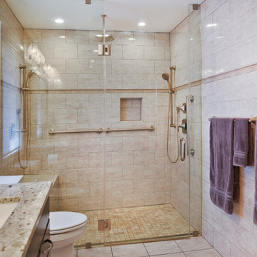
 Michael Nash Design, Build & Homes
For this couple, planning to move back to their rambler home in Arlington after living overseas for few years, they were ready to get rid of clutter, clean up their grown-up kids’ boxes, and transform their home into their dream home for their golden years.
The old home included a box-like 8 feet x 10 feet kitchen, no family room, three small bedrooms and two back to back small bathrooms. The laundry room was located in a small dark space of the unfinished basement.
This home is located in a cul-de-sac, on an uphill lot, of a very secluded neighborhood with lots of new homes just being built around them.
The couple consulted an architectural firm in past but never were satisfied with the final plans. They approached Michael Nash Custom Kitchens hoping for fresh ideas.
The backyard and side yard are wooded and the existing structure was too close to building restriction lines. We developed design plans and applied for special permits to achieve our client’s goals.
The remodel includes a family room, sunroom, breakfast area, home office, large master bedroom suite, large walk-in closet, main level laundry room, lots of windows, front porch, back deck, and most important than all an elevator from lower to upper level given them and their close relative a necessary easier access.
The new plan added extra dimensions to this rambler on all four sides. Starting from the front, we excavated to allow a first level entrance, storage, and elevator room. Building just above it, is a 12 feet x 30 feet covered porch with a leading brick staircase. A contemporary cedar rail with horizontal stainless steel cable rail system on both the front porch and the back deck sets off this project from any others in area. A new foyer with double frosted stainless-steel door was added which contains the elevator.
The garage door was widened and a solid cedar door was installed to compliment the cedar siding.
The left side of this rambler was excavated to allow a storage off the garage and extension of one of the old bedrooms to be converted to a large master bedroom suite, master bathroom suite and walk-in closet.
We installed matching brick for a seam-less exterior look.
The entire house was furnished with new Italian imported highly custom stainless-steel windows and doors. We removed several brick and block structure walls to put doors and floor to ceiling windows.
A full walk in shower with barn style frameless glass doors, double vanities covered with selective stone, floor to ceiling porcelain tile make the master bathroom highly accessible.
The other two bedrooms were reconfigured with new closets, wider doorways, new wood floors and wider windows. Just outside of the bedroom, a new laundry room closet was a major upgrade.
A second HVAC system was added in the attic for all new areas.
The back side of the master bedroom was covered with floor to ceiling windows and a door to step into a new deck covered in trex and cable railing. This addition provides a view to wooded area of the home.
By excavating and leveling the backyard, we constructed a two story 15’x 40’ addition that provided the tall ceiling for the family room just adjacent to new deck, a breakfast area a few steps away from the remodeled kitchen. Upscale stainless-steel appliances, floor to ceiling white custom cabinetry and quartz counter top, and fun lighting improved this back section of the house with its increased lighting and available work space. Just below this addition, there is extra space for exercise and storage room. This room has a pair of sliding doors allowing more light inside.
The right elevation has a trapezoid shape addition with floor to ceiling windows and space used as a sunroom/in-home office. Wide plank wood floors were installed throughout the main level for continuity.
The hall bathroom was gutted and expanded to allow a new soaking tub and large vanity. The basement half bathroom was converted to a full bathroom, new flooring and lighting in the entire basement changed the purpose of the basement for entertainment and spending time with grandkids.
Off white and soft tone were used inside and out as the color schemes to make this rambler spacious and illuminated.
Final grade and landscaping, by adding a few trees, trimming the old cherry and walnut trees in backyard, saddling the yard, and a new concrete driveway and walkway made this home a unique and charming gem in the neighborhood.
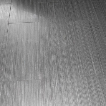
 McCullough's Flooring
Gorgeous master bath finished with Dal-Tile's Fabrique porcelain tile in the color Noir Linen polished. Tile size is 12"x24" installed in a brick joint pattern. The floor boasts underfloor heating on a timed thermostat.
Find the right local pro for your project
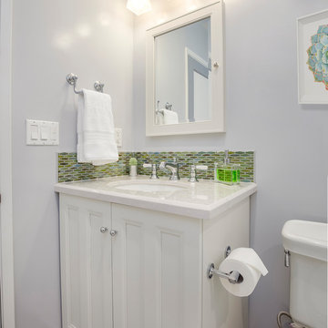
 Custom Design & Construction
This design / build project in Redondo Beach, CA. focused on a family’s hall bathroom. There were multiple reasons that the homeowners decided to start this project but the issue that was most pressing was water damage from the shower. The homeowners knew it needed to be addressed ASAP. As long as a remodel was going to be completed they felt that it was time to address the layout as well. It was not efficient in its original state. Since bathrooms work so hard it was important that the remodel resolve this issue as well. The homeowners were also interested in new finishes.
Desiring something more light and fresh with a coastal feel we began reimagining the layout. The before and after pictures explain it best but basically the new shower was placed against the wall where there previously was a toilet and window. The location and size of the window was changed as well. The shower is now a three wall alcove with grab bars to allow the homeowners to age in place. The white subway tile is accented by a mosaic tile in the homeowners’ favorite coastal shades. The light and beachy feel is reinforced with the grey ceramic tile floor. The vanity is a furniture-style with details like decorative feet. The space is tied together with a backsplash that matches the border in the shower.
 Safferstone Interiors
Meet Meridith: a super-mom who’s as busy as she is badass — and easily my favorite overachiever. She slays her office job and comes home to an equally high-octane family life.
We share a love for city living with farmhouse aspirations. There’s a vegetable garden in the backyard, a black cat, and a floppy eared rabbit named Rocky. There has been a mobile chicken coop and a colony of bees in the backyard. At one point they even had a pregnant hedgehog on their hands!
Between gardening, entertaining, and helping with homework, Meridith has zero time for interior design. Spending several days a week in New York for work, she has limited amount of time at home with her family. My goal was to let her make the most of it by taking her design projects off her to do list and let her get back to her family (and rabbit).
I wanted her to spend her weekends at her son's baseball games, not shopping for sofas. That’s my cue!
Meridith is wonderful. She is one of the kindest people I know. We had so much fun, it doesn’t seem fair to call this “work”. She is loving, and smart, and funny. She’s one of those girlfriends everyone wants to call their own best friend. I wanted her house to reflect that: to feel cozy and inviting, and encourage guests to stay a while.
Meridith is not your average beige person, and she has excellent taste. Plus, she was totally hands-on with design choices. It was a true collaboration. We played up her quirky side and built usable, inspiring spaces one lightbulb moment at a time.
I took her love for color (sacré blue!) and immediately started creating a plan for her space and thinking about her design wish list. I set out hunting for vibrant hues and intriguing patterns that spoke to her color palette and taste for pattern.
I focused on creating the right vibe in each space: a bit of drama in the dining room, a bit more refined and quiet atmosphere for the living room, and a neutral zen tone in their master bedroom.
Her stuff. My eye.
Meridith’s impeccable taste comes through in her art collection. The perfect placement of her beautiful paintings served as the design model for color and mood.
We had a bit of a chair graveyard on our hands, but we worked with some key pieces of her existing furniture and incorporated other traditional pieces, which struck a pleasant balance. French chairs, Asian-influenced footstools, turned legs, gilded finishes, glass hurricanes – a wonderful mash-up of traditional and contemporary.
Some special touches were custom-made (the marble backsplash in the powder room, the kitchen banquette) and others were happy accidents (a wallpaper we spotted via Pinterest). They all came together in a design aesthetic that feels warm, inviting, and vibrant — just like Meridith!
We built her space based on function.
We asked ourselves, “how will her family use each room on any given day?” Meridith throws legendary dinner parties, so we needed curated seating arrangements that could easily switch from family meals to elegant entertaining. We sought a cozy eat-in kitchen and decongested entryways that still made a statement. Above all, we wanted Meredith’s style and panache to shine through every detail. From the pendant in the entryway, to a wild use of pattern in her dining room drapery, Meredith’s space was a total win. See more of our work at www.safferstone.com. Connect with us on Facebook, get inspired on Pinterest, and share modern musings on life & design on Instagram. Or, share what's on your plate with us at hello@safferstone.com.
Photo: Angie Seckinger
 Woodling Landscape Design
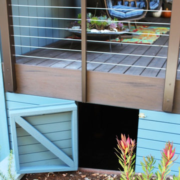
An attractive and functional way to access under-deck storage.
This active family needed to overhaul this large property but didn't know where to start. "It's like three acres of boring dirt and weeds", said my client. The steeply sloped property did indeed present unique challenges with ever-present voracious deer, the need for erosion control and bank stabilization, large areas that required planting while still considering water conservation, and the need for beautification and modernization to tie into the aesthetic of the newly renovated home. Concurrently, safety and access to all parts of the property were a consideration. Landscaping goals were accomplished through careful plant selection and judicious use of retaining walls in various styles throughout the property. Generous railroad tie steps were used on sloping side yards. The landscaped portions converge gracefully with the existing oak woodland. Children can play and hide in many fun spots, while my client's elderly grandmother can safely walk around.
 CairnsCraft Design & Remodel
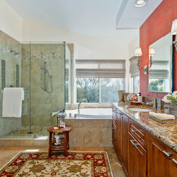
Great spacious bathroom with lot of amenities.
Photographer: Jon Upson
Large elegant master beige tile and porcelain tile drop-in bathtub photo in San Diego with an undermount sink, raised-panel cabinets, medium tone wood cabinets, granite countertops, beige walls and a two-piece toilet
Large elegant master beige tile and porcelain tile drop-in bathtub photo in San Diego with an undermount sink, raised-panel cabinets, medium tone wood cabinets, granite countertops, beige walls and a two-piece toilet

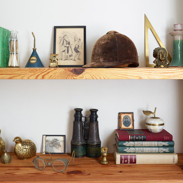
 Michelle Gage | Interior Designer
photos: Kyle Born
Example of a small built-in desk slate floor home office library design in Philadelphia with green walls
Example of a small built-in desk slate floor home office library design in Philadelphia with green walls

 User
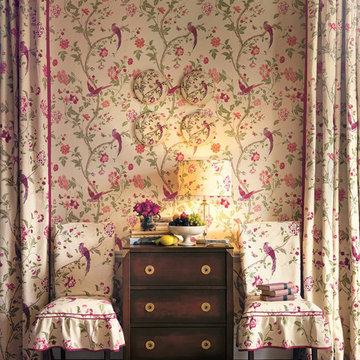
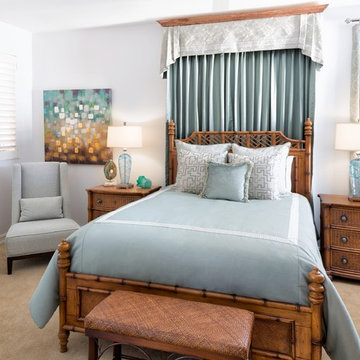
UserOur client and her sister own a condo in Florida and although her sister lives there full-time, our client only comes to Florida for the winter and utilizes the guest room and a separate bathroom as her own. At the time, enthusiastic to be in Florida she went all out in decorating in the old Florida style with a green and yellow tropical feel including a plethora of palm trees (see before picture). All the furniture had to be from Tommy Bahama and even the light fixtures had a tropical theme.
Fast forward to 2015 and our client was tired and bored in these surroundings and said to me, “what was I thinking!” She didn’t have the budget to change everything and I assured her that we could update her bedroom keeping the existing furniture. One of her previous decorating problems was the tiny window over the bed which she had covered by adding a faux canopy. Unfortunately, the fabric was thin and the window showed through. I tried to persuade her that a solution for the window issue could be a large painting over the bed but she wasn’t keen so we agreed to refresh the canopy with a more modern look.
We started with fresh silvery-grey paint and glossy white trim. Using subtle greeny-blue bedding from Eastern Accents we extracted a simple palette and mixed in several patterns including a classic Greek key. There are geometrics in the pillows and a floral in the custom cornice and draperies and we found a fabric from the same color palette for the drapery behind the bed from Kravet. It has a beautiful sheen which reflects light and is heavily lined to cover the window. Our project manager added the wood trim to the cornice board.
The modern chair is upholstered in a sea green herringbone while the table has an interesting story; my client loved the shape of the table but it was originally finished completely in gold leaf. Part of our update was to change everything metal such as door knobs and drapery hardware to chrome so our project manager offered to re-finish the table in silver leaf. Along the way we had a hiccup in the communication… she asked if the top was glass and was told it was but we didn’t realize that she hadn’t unpacked it so didn’t see the gold rim. On installation day we were surprised to see the gold rim against the silver legs! Happily, it was a really good error as the painting behind the chair has both gold and silver leaf and our error looks as though it were meant to be.
We finished with turquoise blown glass lamps, several pieces of art, and a large floor mirror (not in photo). The client asked if she could choose some pretty accessories at local art fairs and one painting is by her artist brother-in-law.
This project was very enjoyable as we were able to modernize the room with an updated coastal palette while at the same time utilizing existing furniture.
Photographer: Rolando Diaz
 VPWdesigns
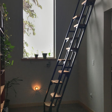
This was a fun build and a delightful family to work and design with. The ladder is aesthetically pleasing and functional for their space, and also much safer than the previous loft access. The custom welded steel frame and alternating step support system combined with light colored, solid alder wood treads provide an open feel for the tight space.
 Skill Construction & Design, LLC
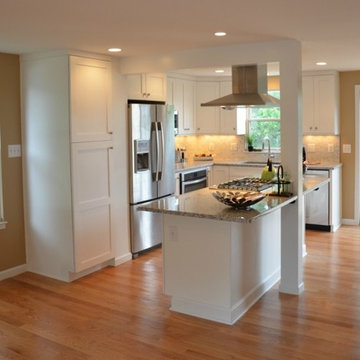
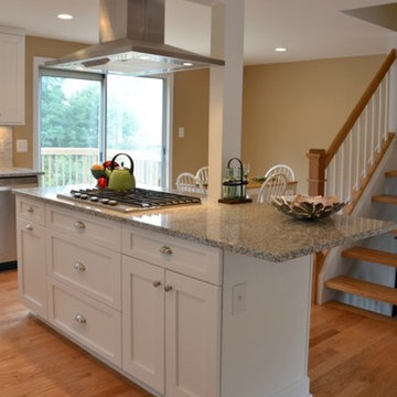
There are so many design elements to this kitchen, I almost don’t know where to start. Bright and airy with crisp clean white cabinets, the kitchen is open and welcoming. Still crisp but gently contrasting, the stainless steel appliance add depth amid the white. To keep this kitchen warm, natural oak covers the floors and a toasted wheat color washes the walls. And then there is the architectural elements. You know. That post and beam in the middle of the room. It’s the center of attention.
When you walk into a room your eyes roam around, establishing the size and shape of the room as your feet take you forward. From the front door of this home straight ahead you encountered this wall. The dining area to the right gives you a glimpse of things to come. Where there is a dining room you will usually find a kitchen.
The architecture of years gone by consistently hides the kitchen, the heart of the home, behind walls. I sympathize with my Mom, and all the other Moms, who have had to spend so much time tucked into a tight kitchen, away from the family. This wall had to go, but it was structural. We needed its support but not its bulk.
So we got rid of the bulk and only the bulk. Instead of a wall we have a post and beam, offering all of the structure we need. We could have installed a huge steel beam and reconfigure the joists to upset the beam, but why? The small beam and post add an incredible architectural element. It’s turning lemons into lemon, we simply made the most of what we had. It may be functional but it’s so fantastic. It looks like we created the effect just for the drama.
The original kitchen may have had a working triangle and some counter space, but it was fairly small, with each area only a step or two away. The dark cabinets made the space feel even smaller and the butcher block patterned laminate counter tops were very dated. The appliances were feeling their age as well, from a coil burner electric stove to a top freezer refrigerator. To keep this kitchen within its space, a half wall separated it from the dining area.
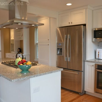
With the wall gone we borrowed some space from the living room and extended what was a U shaped kitchen into an L. At the living room window we start our new kitchen. We kept a small part of the wall to support the other end of our decorative beam. Sandwiched between a large pantry and our new French door refrigerator, the wall disappears. With our new open floor plan a sizable island was in order.
We split our cooking areas and installed a continuous grill gas cooktop into the island. A sleek island hood takes care of exhaust and adds an extra element to our architectural feature. Under the cooktop we added over-sized drawers for pots and pan storage. The frameless cabinets from New River Cabinetry are maple, painted white, with the Herndon door style. With the cooktop safely nestled into our island, we still had to add an oven.
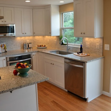
We used the space where the old range sat for a large single oven of stainless steel and glass. If it worked for one, why not two? We created a home for a microwave in the wall cabinets. It’s perfect for heating leftovers so close to the refrigerator.
An important consideration for hot spots in your kitchen is landing zones. Each of our cooking areas have generous landing zones, one on each side of the cooktop and an entire counter area above or below the ovens, depending on which one you’re using.
We wanted to give the sink area more room so the half wall had to come out. We moved the trash and recycle cans into a cabinet, removed the heavy soffits and kept the sink under the window.
With that little bit of extra space we were able to add a larger cabinet above the dishwasher and slide it all down. This used to be where the carpeting met the vinyl floor, but all of it is gone. Long oak planks eliminate that final divide between the kitchen and the dining area, while adding visual length to the area. White wall cabinets on each side of the window reflect the sunlight for a brighter view.
With all of the darker cabinetry the backsplash walls had been painted white. Even still, there was a darkness in the corners and it wasn’t very exciting. We wanted to add visual interest and reflect the new under-cabinet lighting, eliminating the shadows in this corner.
With 1″x 2″ Arabescato Honed marble mosaics and those under-cabinet lights, we achieved the perfect balance. The marble has subtle swirls in gray and beige on a clean white background, but with the honed finish the light is softly reflected instead of glaring. For granite, we chose the soft gray tones of Luna Pearl. The speckles of gray and beige are a gentle contrast to the white cabinets and emulate the color of the stainless steel.
Between the carpet, red half wall, dark railing and dated light fixture, the dining area felt tired. Since the kitchen lacked sufficient storage, a large utility cabinet crowded the table space without adding any decorate elements.
Although it didn’t get any bigger, our dining area feels fresher and more open too. With the oak flooring joining the area to the rest of our space and the toasted wheat on the walls, the white table and chairs compliment the cabinetry while contrasting the warmer colors. We replaced the chandelier with recessed lighting and changed that railing too.
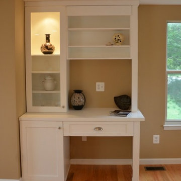
With our new open floor plan, we ended up with a fairly open area in between our foyer closet and the living room window. Not one to miss an opportunity, we filled the space with a multi-functional work space.
With the sunlight streaming in this bright corner works for anything this family needs.
There’s plenty of space for a chair under this large desk drawer. A closed cabinet below, glass doors above and lots of open shelving let you store and or showcase your belongings. We added a lite area at the top to keep away the darker corners.
The transformation is complete. This kitchen and all of its features are truly the center of attention in this home.
http://www.designsbyskill.com/
http://www.rjkconstructioninc.com/
 Spire North
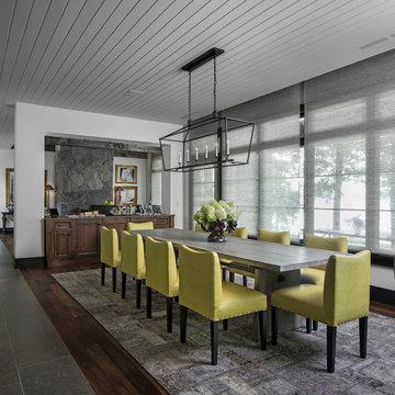
Tucked away in the backwoods of Torch Lake, this home marries “rustic” with the sleek elegance of modern. The combination of wood, stone and metal textures embrace the charm of a classic farmhouse. Although this is not your average farmhouse. The home is outfitted with a high performing system that seamlessly works with the design and architecture.
The tall ceilings and windows allow ample natural light into the main room. Spire Integrated Systems installed Lutron QS Wireless motorized shades paired with Hartmann & Forbes windowcovers to offer privacy and block harsh light. The custom 18′ windowcover’s woven natural fabric complements the organic esthetics of the room. The shades are artfully concealed in the millwork when not in use.
Spire installed B&W in-ceiling speakers and Sonance invisible in-wall speakers to deliver ambient music that emanates throughout the space with no visual footprint. Spire also installed a Sonance Landscape Audio System so the homeowner can enjoy music outside.
Each system is easily controlled using Savant. Spire personalized the settings to the homeowner’s preference making controlling the home efficient and convenient.
 Skill Construction & Design, LLC
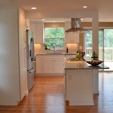
There are so many design elements to this kitchen, I almost don’t know where to start. Bright and airy with crisp clean white cabinets, the kitchen is open and welcoming. Still crisp but gently contrasting, the stainless steel appliance add depth amid the white. To keep this kitchen warm, natural oak covers the floors and a toasted wheat color washes the walls. And then there is the architectural elements. You know. That post and beam in the middle of the room. It’s the center of attention.
When you walk into a room your eyes roam around, establishing the size and shape of the room as your feet take you forward. From the front door of this home straight ahead you encountered this wall. The dining area to the right gives you a glimpse of things to come. Where there is a dining room you will usually find a kitchen.
The architecture of years gone by consistently hides the kitchen, the heart of the home, behind walls. I sympathize with my Mom, and all the other Moms, who have had to spend so much time tucked into a tight kitchen, away from the family. This wall had to go, but it was structural. We needed its support but not its bulk.
So we got rid of the bulk and only the bulk. Instead of a wall we have a post and beam, offering all of the structure we need. We could have installed a huge steel beam and reconfigure the joists to upset the beam, but why? The small beam and post add an incredible architectural element. It’s turning lemons into lemon, we simply made the most of what we had. It may be functional but it’s so fantastic. It looks like we created the effect just for the drama.
The original kitchen may have had a working triangle and some counter space, but it was fairly small, with each area only a step or two away. The dark cabinets made the space feel even smaller and the butcher block patterned laminate counter tops were very dated. The appliances were feeling their age as well, from a coil burner electric stove to a top freezer refrigerator. To keep this kitchen within its space, a half wall separated it from the dining area.
With the wall gone we borrowed some space from the living room and extended what was a U shaped kitchen into an L. At the living room window we start our new kitchen. We kept a small part of the wall to support the other end of our decorative beam. Sandwiched between a large pantry and our new French door refrigerator, the wall disappears. With our new open floor plan a sizable island was in order.
We split our cooking areas and installed a continuous grill gas cooktop into the island. A sleek island hood takes care of exhaust and adds an extra element to our architectural feature. Under the cooktop we added over-sized drawers for pots and pan storage. The frameless cabinets from New River Cabinetry are maple, painted white, with the Herndon door style. With the cooktop safely nestled into our island, we still had to add an oven.
We used the space where the old range sat for a large single oven of stainless steel and glass. If it worked for one, why not two? We created a home for a microwave in the wall cabinets. It’s perfect for heating leftovers so close to the refrigerator.
An important consideration for hot spots in your kitchen is landing zones. Each of our cooking areas have generous landing zones, one on each side of the cooktop and an entire counter area above or below the ovens, depending on which one you’re using.
We wanted to give the sink area more room so the half wall had to come out. We moved the trash and recycle cans into a cabinet, removed the heavy soffits and kept the sink under the window.
With that little bit of extra space we were able to add a larger cabinet above the dishwasher and slide it all down. This used to be where the carpeting met the vinyl floor, but all of it is gone. Long oak planks eliminate that final divide between the kitchen and the dining area, while adding visual length to the area. White wall cabinets on each side of the window reflect the sunlight for a brighter view.
With all of the darker cabinetry the backsplash walls had been painted white. Even still, there was a darkness in the corners and it wasn’t very exciting. We wanted to add visual interest and reflect the new under-cabinet lighting, eliminating the shadows in this corner.
With 1″x 2″ Arabescato Honed marble mosaics and those under-cabinet lights, we achieved the perfect balance. The marble has subtle swirls in gray and beige on a clean white background, but with the honed finish the light is softly reflected instead of glaring. For granite, we chose the soft gray tones of Luna Pearl. The speckles of gray and beige are a gentle contrast to the white cabinets and emulate the color of the stainless steel.
Between the carpet, red half wall, dark railing and dated light fixture, the dining area felt tired. Since the kitchen lacked sufficient storage, a large utility cabinet crowded the table space without adding any decorate elements.
Although it didn’t get any bigger, our dining area feels fresher and more open too. With the oak flooring joining the area to the rest of our space and the toasted wheat on the walls, the white table and chairs compliment the cabinetry while contrasting the warmer colors. We replaced the chandelier with recessed lighting and changed that railing too.
With our new open floor plan, we ended up with a fairly open area in between our foyer closet and the living room window. Not one to miss an opportunity, we filled the space with a multi-functional work space.
With the sunlight streaming in this bright corner works for anything this family needs.
There’s plenty of space for a chair under this large desk drawer. A closed cabinet below, glass doors above and lots of open shelving let you store and or showcase your belongings. We added a lite area at the top to keep away the darker corners.
The transformation is complete. This kitchen and all of its features are truly the center of attention in this home.
http://www.designsbyskill.com/
http://www.rjkconstructioninc.com/
 Skill Construction & Design, LLC
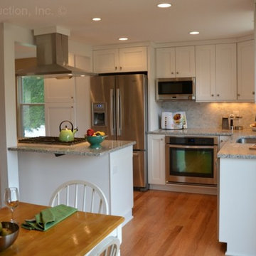
There are so many design elements to this kitchen, I almost don’t know where to start. Bright and airy with crisp clean white cabinets, the kitchen is open and welcoming. Still crisp but gently contrasting, the stainless steel appliance add depth amid the white. To keep this kitchen warm, natural oak covers the floors and a toasted wheat color washes the walls. And then there is the architectural elements. You know. That post and beam in the middle of the room. It’s the center of attention.
When you walk into a room your eyes roam around, establishing the size and shape of the room as your feet take you forward. From the front door of this home straight ahead you encountered this wall. The dining area to the right gives you a glimpse of things to come. Where there is a dining room you will usually find a kitchen.
The architecture of years gone by consistently hides the kitchen, the heart of the home, behind walls. I sympathize with my Mom, and all the other Moms, who have had to spend so much time tucked into a tight kitchen, away from the family. This wall had to go, but it was structural. We needed its support but not its bulk.
So we got rid of the bulk and only the bulk. Instead of a wall we have a post and beam, offering all of the structure we need. We could have installed a huge steel beam and reconfigure the joists to upset the beam, but why? The small beam and post add an incredible architectural element. It’s turning lemons into lemon, we simply made the most of what we had. It may be functional but it’s so fantastic. It looks like we created the effect just for the drama.
The original kitchen may have had a working triangle and some counter space, but it was fairly small, with each area only a step or two away. The dark cabinets made the space feel even smaller and the butcher block patterned laminate counter tops were very dated. The appliances were feeling their age as well, from a coil burner electric stove to a top freezer refrigerator. To keep this kitchen within its space, a half wall separated it from the dining area.
With the wall gone we borrowed some space from the living room and extended what was a U shaped kitchen into an L. At the living room window we start our new kitchen. We kept a small part of the wall to support the other end of our decorative beam. Sandwiched between a large pantry and our new French door refrigerator, the wall disappears. With our new open floor plan a sizable island was in order.
We split our cooking areas and installed a continuous grill gas cooktop into the island. A sleek island hood takes care of exhaust and adds an extra element to our architectural feature. Under the cooktop we added over-sized drawers for pots and pan storage. The frameless cabinets from New River Cabinetry are maple, painted white, with the Herndon door style. With the cooktop safely nestled into our island, we still had to add an oven.
We used the space where the old range sat for a large single oven of stainless steel and glass. If it worked for one, why not two? We created a home for a microwave in the wall cabinets. It’s perfect for heating leftovers so close to the refrigerator.
An important consideration for hot spots in your kitchen is landing zones. Each of our cooking areas have generous landing zones, one on each side of the cooktop and an entire counter area above or below the ovens, depending on which one you’re using.
We wanted to give the sink area more room so the half wall had to come out. We moved the trash and recycle cans into a cabinet, removed the heavy soffits and kept the sink under the window.
With that little bit of extra space we were able to add a larger cabinet above the dishwasher and slide it all down. This used to be where the carpeting met the vinyl floor, but all of it is gone. Long oak planks eliminate that final divide between the kitchen and the dining area, while adding visual length to the area. White wall cabinets on each side of the window reflect the sunlight for a brighter view.
With all of the darker cabinetry the backsplash walls had been painted white. Even still, there was a darkness in the corners and it wasn’t very exciting. We wanted to add visual interest and reflect the new under-cabinet lighting, eliminating the shadows in this corner.
With 1″x 2″ Arabescato Honed marble mosaics and those under-cabinet lights, we achieved the perfect balance. The marble has subtle swirls in gray and beige on a clean white background, but with the honed finish the light is softly reflected instead of glaring. For granite, we chose the soft gray tones of Luna Pearl. The speckles of gray and beige are a gentle contrast to the white cabinets and emulate the color of the stainless steel.
Between the carpet, red half wall, dark railing and dated light fixture, the dining area felt tired. Since the kitchen lacked sufficient storage, a large utility cabinet crowded the table space without adding any decorate elements.
Although it didn’t get any bigger, our dining area feels fresher and more open too. With the oak flooring joining the area to the rest of our space and the toasted wheat on the walls, the white table and chairs compliment the cabinetry while contrasting the warmer colors. We replaced the chandelier with recessed lighting and changed that railing too.
With our new open floor plan, we ended up with a fairly open area in between our foyer closet and the living room window. Not one to miss an opportunity, we filled the space with a multi-functional work space.
With the sunlight streaming in this bright corner works for anything this family needs.
There’s plenty of space for a chair under this large desk drawer. A closed cabinet below, glass doors above and lots of open shelving let you store and or showcase your belongings. We added a lite area at the top to keep away the darker corners.
The transformation is complete. This kitchen and all of its features are truly the center of attention in this home.
http://www.designsbyskill.com/
http://www.rjkconstructioninc.com/
 Skill Construction & Design, LLC
There are so many design elements to this kitchen, I almost don’t know where to start. Bright and airy with crisp clean white cabinets, the kitchen is open and welcoming. Still crisp but gently contrasting, the stainless steel appliance add depth amid the white. To keep this kitchen warm, natural oak covers the floors and a toasted wheat color washes the walls. And then there is the architectural elements. You know. That post and beam in the middle of the room. It’s the center of attention.
When you walk into a room your eyes roam around, establishing the size and shape of the room as your feet take you forward. From the front door of this home straight ahead you encountered this wall. The dining area to the right gives you a glimpse of things to come. Where there is a dining room you will usually find a kitchen.
The architecture of years gone by consistently hides the kitchen, the heart of the home, behind walls. I sympathize with my Mom, and all the other Moms, who have had to spend so much time tucked into a tight kitchen, away from the family. This wall had to go, but it was structural. We needed its support but not its bulk.
So we got rid of the bulk and only the bulk. Instead of a wall we have a post and beam, offering all of the structure we need. We could have installed a huge steel beam and reconfigure the joists to upset the beam, but why? The small beam and post add an incredible architectural element. It’s turning lemons into lemon, we simply made the most of what we had. It may be functional but it’s so fantastic. It looks like we created the effect just for the drama.
The original kitchen may have had a working triangle and some counter space, but it was fairly small, with each area only a step or two away. The dark cabinets made the space feel even smaller and the butcher block patterned laminate counter tops were very dated. The appliances were feeling their age as well, from a coil burner electric stove to a top freezer refrigerator. To keep this kitchen within its space, a half wall separated it from the dining area.
With the wall gone we borrowed some space from the living room and extended what was a U shaped kitchen into an L. At the living room window we start our new kitchen. We kept a small part of the wall to support the other end of our decorative beam. Sandwiched between a large pantry and our new French door refrigerator, the wall disappears. With our new open floor plan a sizable island was in order.
We split our cooking areas and installed a continuous grill gas cooktop into the island. A sleek island hood takes care of exhaust and adds an extra element to our architectural feature. Under the cooktop we added over-sized drawers for pots and pan storage. The frameless cabinets from New River Cabinetry are maple, painted white, with the Herndon door style. With the cooktop safely nestled into our island, we still had to add an oven.
We used the space where the old range sat for a large single oven of stainless steel and glass. If it worked for one, why not two? We created a home for a microwave in the wall cabinets. It’s perfect for heating leftovers so close to the refrigerator.
An important consideration for hot spots in your kitchen is landing zones. Each of our cooking areas have generous landing zones, one on each side of the cooktop and an entire counter area above or below the ovens, depending on which one you’re using.
We wanted to give the sink area more room so the half wall had to come out. We moved the trash and recycle cans into a cabinet, removed the heavy soffits and kept the sink under the window.
With that little bit of extra space we were able to add a larger cabinet above the dishwasher and slide it all down. This used to be where the carpeting met the vinyl floor, but all of it is gone. Long oak planks eliminate that final divide between the kitchen and the dining area, while adding visual length to the area. White wall cabinets on each side of the window reflect the sunlight for a brighter view.
With all of the darker cabinetry the backsplash walls had been painted white. Even still, there was a darkness in the corners and it wasn’t very exciting. We wanted to add visual interest and reflect the new under-cabinet lighting, eliminating the shadows in this corner.
With 1″x 2″ Arabescato Honed marble mosaics and those under-cabinet lights, we achieved the perfect balance. The marble has subtle swirls in gray and beige on a clean white background, but with the honed finish the light is softly reflected instead of glaring. For granite, we chose the soft gray tones of Luna Pearl. The speckles of gray and beige are a gentle contrast to the white cabinets and emulate the color of the stainless steel.
Between the carpet, red half wall, dark railing and dated light fixture, the dining area felt tired. Since the kitchen lacked sufficient storage, a large utility cabinet crowded the table space without adding any decorate elements.
Although it didn’t get any bigger, our dining area feels fresher and more open too. With the oak flooring joining the area to the rest of our space and the toasted wheat on the walls, the white table and chairs compliment the cabinetry while contrasting the warmer colors. We replaced the chandelier with recessed lighting and changed that railing too.
With our new open floor plan, we ended up with a fairly open area in between our foyer closet and the living room window. Not one to miss an opportunity, we filled the space with a multi-functional work space.
With the sunlight streaming in this bright corner works for anything this family needs.
There’s plenty of space for a chair under this large desk drawer. A closed cabinet below, glass doors above and lots of open shelving let you store and or showcase your belongings. We added a lite area at the top to keep away the darker corners.
The transformation is complete. This kitchen and all of its features are truly the center of attention in this home.
http://www.designsbyskill.com/
http://www.rjkconstructioninc.com/
 Skill Construction & Design, LLC
There are so many design elements to this kitchen, I almost don’t know where to start. Bright and airy with crisp clean white cabinets, the kitchen is open and welcoming. Still crisp but gently contrasting, the stainless steel appliance add depth amid the white. To keep this kitchen warm, natural oak covers the floors and a toasted wheat color washes the walls. And then there is the architectural elements. You know. That post and beam in the middle of the room. It’s the center of attention.
When you walk into a room your eyes roam around, establishing the size and shape of the room as your feet take you forward. From the front door of this home straight ahead you encountered this wall. The dining area to the right gives you a glimpse of things to come. Where there is a dining room you will usually find a kitchen.
The architecture of years gone by consistently hides the kitchen, the heart of the home, behind walls. I sympathize with my Mom, and all the other Moms, who have had to spend so much time tucked into a tight kitchen, away from the family. This wall had to go, but it was structural. We needed its support but not its bulk.
So we got rid of the bulk and only the bulk. Instead of a wall we have a post and beam, offering all of the structure we need. We could have installed a huge steel beam and reconfigure the joists to upset the beam, but why? The small beam and post add an incredible architectural element. It’s turning lemons into lemon, we simply made the most of what we had. It may be functional but it’s so fantastic. It looks like we created the effect just for the drama.
The original kitchen may have had a working triangle and some counter space, but it was fairly small, with each area only a step or two away. The dark cabinets made the space feel even smaller and the butcher block patterned laminate counter tops were very dated. The appliances were feeling their age as well, from a coil burner electric stove to a top freezer refrigerator. To keep this kitchen within its space, a half wall separated it from the dining area.
With the wall gone we borrowed some space from the living room and extended what was a U shaped kitchen into an L. At the living room window we start our new kitchen. We kept a small part of the wall to support the other end of our decorative beam. Sandwiched between a large pantry and our new French door refrigerator, the wall disappears. With our new open floor plan a sizable island was in order.
We split our cooking areas and installed a continuous grill gas cooktop into the island. A sleek island hood takes care of exhaust and adds an extra element to our architectural feature. Under the cooktop we added over-sized drawers for pots and pan storage. The frameless cabinets from New River Cabinetry are maple, painted white, with the Herndon door style. With the cooktop safely nestled into our island, we still had to add an oven.
We used the space where the old range sat for a large single oven of stainless steel and glass. If it worked for one, why not two? We created a home for a microwave in the wall cabinets. It’s perfect for heating leftovers so close to the refrigerator.
An important consideration for hot spots in your kitchen is landing zones. Each of our cooking areas have generous landing zones, one on each side of the cooktop and an entire counter area above or below the ovens, depending on which one you’re using.
We wanted to give the sink area more room so the half wall had to come out. We moved the trash and recycle cans into a cabinet, removed the heavy soffits and kept the sink under the window.
With that little bit of extra space we were able to add a larger cabinet above the dishwasher and slide it all down. This used to be where the carpeting met the vinyl floor, but all of it is gone. Long oak planks eliminate that final divide between the kitchen and the dining area, while adding visual length to the area. White wall cabinets on each side of the window reflect the sunlight for a brighter view.
With all of the darker cabinetry the backsplash walls had been painted white. Even still, there was a darkness in the corners and it wasn’t very exciting. We wanted to add visual interest and reflect the new under-cabinet lighting, eliminating the shadows in this corner.
With 1″x 2″ Arabescato Honed marble mosaics and those under-cabinet lights, we achieved the perfect balance. The marble has subtle swirls in gray and beige on a clean white background, but with the honed finish the light is softly reflected instead of glaring. For granite, we chose the soft gray tones of Luna Pearl. The speckles of gray and beige are a gentle contrast to the white cabinets and emulate the color of the stainless steel.
Between the carpet, red half wall, dark railing and dated light fixture, the dining area felt tired. Since the kitchen lacked sufficient storage, a large utility cabinet crowded the table space without adding any decorate elements.
Although it didn’t get any bigger, our dining area feels fresher and more open too. With the oak flooring joining the area to the rest of our space and the toasted wheat on the walls, the white table and chairs compliment the cabinetry while contrasting the warmer colors. We replaced the chandelier with recessed lighting and changed that railing too.
With our new open floor plan, we ended up with a fairly open area in between our foyer closet and the living room window. Not one to miss an opportunity, we filled the space with a multi-functional work space.
With the sunlight streaming in this bright corner works for anything this family needs.
There’s plenty of space for a chair under this large desk drawer. A closed cabinet below, glass doors above and lots of open shelving let you store and or showcase your belongings. We added a lite area at the top to keep away the darker corners.
The transformation is complete. This kitchen and all of its features are truly the center of attention in this home.
http://www.designsbyskill.com/
http://www.rjkconstructioninc.com/
 Skill Construction & Design, LLC
There are so many design elements to this kitchen, I almost don’t know where to start. Bright and airy with crisp clean white cabinets, the kitchen is open and welcoming. Still crisp but gently contrasting, the stainless steel appliance add depth amid the white. To keep this kitchen warm, natural oak covers the floors and a toasted wheat color washes the walls. And then there is the architectural elements. You know. That post and beam in the middle of the room. It’s the center of attention.
When you walk into a room your eyes roam around, establishing the size and shape of the room as your feet take you forward. From the front door of this home straight ahead you encountered this wall. The dining area to the right gives you a glimpse of things to come. Where there is a dining room you will usually find a kitchen.
The architecture of years gone by consistently hides the kitchen, the heart of the home, behind walls. I sympathize with my Mom, and all the other Moms, who have had to spend so much time tucked into a tight kitchen, away from the family. This wall had to go, but it was structural. We needed its support but not its bulk.
So we got rid of the bulk and only the bulk. Instead of a wall we have a post and beam, offering all of the structure we need. We could have installed a huge steel beam and reconfigure the joists to upset the beam, but why? The small beam and post add an incredible architectural element. It’s turning lemons into lemon, we simply made the most of what we had. It may be functional but it’s so fantastic. It looks like we created the effect just for the drama.
The original kitchen may have had a working triangle and some counter space, but it was fairly small, with each area only a step or two away. The dark cabinets made the space feel even smaller and the butcher block patterned laminate counter tops were very dated. The appliances were feeling their age as well, from a coil burner electric stove to a top freezer refrigerator. To keep this kitchen within its space, a half wall separated it from the dining area.
With the wall gone we borrowed some space from the living room and extended what was a U shaped kitchen into an L. At the living room window we start our new kitchen. We kept a small part of the wall to support the other end of our decorative beam. Sandwiched between a large pantry and our new French door refrigerator, the wall disappears. With our new open floor plan a sizable island was in order.
We split our cooking areas and installed a continuous grill gas cooktop into the island. A sleek island hood takes care of exhaust and adds an extra element to our architectural feature. Under the cooktop we added over-sized drawers for pots and pan storage. The frameless cabinets from New River Cabinetry are maple, painted white, with the Herndon door style. With the cooktop safely nestled into our island, we still had to add an oven.
We used the space where the old range sat for a large single oven of stainless steel and glass. If it worked for one, why not two? We created a home for a microwave in the wall cabinets. It’s perfect for heating leftovers so close to the refrigerator.
An important consideration for hot spots in your kitchen is landing zones. Each of our cooking areas have generous landing zones, one on each side of the cooktop and an entire counter area above or below the ovens, depending on which one you’re using.
We wanted to give the sink area more room so the half wall had to come out. We moved the trash and recycle cans into a cabinet, removed the heavy soffits and kept the sink under the window.
With that little bit of extra space we were able to add a larger cabinet above the dishwasher and slide it all down. This used to be where the carpeting met the vinyl floor, but all of it is gone. Long oak planks eliminate that final divide between the kitchen and the dining area, while adding visual length to the area. White wall cabinets on each side of the window reflect the sunlight for a brighter view.
With all of the darker cabinetry the backsplash walls had been painted white. Even still, there was a darkness in the corners and it wasn’t very exciting. We wanted to add visual interest and reflect the new under-cabinet lighting, eliminating the shadows in this corner.
With 1″x 2″ Arabescato Honed marble mosaics and those under-cabinet lights, we achieved the perfect balance. The marble has subtle swirls in gray and beige on a clean white background, but with the honed finish the light is softly reflected instead of glaring. For granite, we chose the soft gray tones of Luna Pearl. The speckles of gray and beige are a gentle contrast to the white cabinets and emulate the color of the stainless steel.
Between the carpet, red half wall, dark railing and dated light fixture, the dining area felt tired. Since the kitchen lacked sufficient storage, a large utility cabinet crowded the table space without adding any decorate elements.
Although it didn’t get any bigger, our dining area feels fresher and more open too. With the oak flooring joining the area to the rest of our space and the toasted wheat on the walls, the white table and chairs compliment the cabinetry while contrasting the warmer colors. We replaced the chandelier with recessed lighting and changed that railing too.
With our new open floor plan, we ended up with a fairly open area in between our foyer closet and the living room window. Not one to miss an opportunity, we filled the space with a multi-functional work space.
With the sunlight streaming in this bright corner works for anything this family needs.
There’s plenty of space for a chair under this large desk drawer. A closed cabinet below, glass doors above and lots of open shelving let you store and or showcase your belongings. We added a lite area at the top to keep away the darker corners.
The transformation is complete. This kitchen and all of its features are truly the center of attention in this home.
http://www.designsbyskill.com/
http://www.rjkconstructioninc.com/
 Skill Construction & Design, LLC
There are so many design elements to this kitchen, I almost don’t know where to start. Bright and airy with crisp clean white cabinets, the kitchen is open and welcoming. Still crisp but gently contrasting, the stainless steel appliance add depth amid the white. To keep this kitchen warm, natural oak covers the floors and a toasted wheat color washes the walls. And then there is the architectural elements. You know. That post and beam in the middle of the room. It’s the center of attention.
When you walk into a room your eyes roam around, establishing the size and shape of the room as your feet take you forward. From the front door of this home straight ahead you encountered this wall. The dining area to the right gives you a glimpse of things to come. Where there is a dining room you will usually find a kitchen.
The architecture of years gone by consistently hides the kitchen, the heart of the home, behind walls. I sympathize with my Mom, and all the other Moms, who have had to spend so much time tucked into a tight kitchen, away from the family. This wall had to go, but it was structural. We needed its support but not its bulk.
So we got rid of the bulk and only the bulk. Instead of a wall we have a post and beam, offering all of the structure we need. We could have installed a huge steel beam and reconfigure the joists to upset the beam, but why? The small beam and post add an incredible architectural element. It’s turning lemons into lemon, we simply made the most of what we had. It may be functional but it’s so fantastic. It looks like we created the effect just for the drama.
The original kitchen may have had a working triangle and some counter space, but it was fairly small, with each area only a step or two away. The dark cabinets made the space feel even smaller and the butcher block patterned laminate counter tops were very dated. The appliances were feeling their age as well, from a coil burner electric stove to a top freezer refrigerator. To keep this kitchen within its space, a half wall separated it from the dining area.
With the wall gone we borrowed some space from the living room and extended what was a U shaped kitchen into an L. At the living room window we start our new kitchen. We kept a small part of the wall to support the other end of our decorative beam. Sandwiched between a large pantry and our new French door refrigerator, the wall disappears. With our new open floor plan a sizable island was in order.
We split our cooking areas and installed a continuous grill gas cooktop into the island. A sleek island hood takes care of exhaust and adds an extra element to our architectural feature. Under the cooktop we added over-sized drawers for pots and pan storage. The frameless cabinets from New River Cabinetry are maple, painted white, with the Herndon door style. With the cooktop safely nestled into our island, we still had to add an oven.
We used the space where the old range sat for a large single oven of stainless steel and glass. If it worked for one, why not two? We created a home for a microwave in the wall cabinets. It’s perfect for heating leftovers so close to the refrigerator.
An important consideration for hot spots in your kitchen is landing zones. Each of our cooking areas have generous landing zones, one on each side of the cooktop and an entire counter area above or below the ovens, depending on which one you’re using.
We wanted to give the sink area more room so the half wall had to come out. We moved the trash and recycle cans into a cabinet, removed the heavy soffits and kept the sink under the window.
With that little bit of extra space we were able to add a larger cabinet above the dishwasher and slide it all down. This used to be where the carpeting met the vinyl floor, but all of it is gone. Long oak planks eliminate that final divide between the kitchen and the dining area, while adding visual length to the area. White wall cabinets on each side of the window reflect the sunlight for a brighter view.
With all of the darker cabinetry the backsplash walls had been painted white. Even still, there was a darkness in the corners and it wasn’t very exciting. We wanted to add visual interest and reflect the new under-cabinet lighting, eliminating the shadows in this corner.
With 1″x 2″ Arabescato Honed marble mosaics and those under-cabinet lights, we achieved the perfect balance. The marble has subtle swirls in gray and beige on a clean white background, but with the honed finish the light is softly reflected instead of glaring. For granite, we chose the soft gray tones of Luna Pearl. The speckles of gray and beige are a gentle contrast to the white cabinets and emulate the color of the stainless steel.
Between the carpet, red half wall, dark railing and dated light fixture, the dining area felt tired. Since the kitchen lacked sufficient storage, a large utility cabinet crowded the table space without adding any decorate elements.
Although it didn’t get any bigger, our dining area feels fresher and more open too. With the oak flooring joining the area to the rest of our space and the toasted wheat on the walls, the white table and chairs compliment the cabinetry while contrasting the warmer colors. We replaced the chandelier with recessed lighting and changed that railing too.
With our new open floor plan, we ended up with a fairly open area in between our foyer closet and the living room window. Not one to miss an opportunity, we filled the space with a multi-functional work space.
With the sunlight streaming in this bright corner works for anything this family needs.
There’s plenty of space for a chair under this large desk drawer. A closed cabinet below, glass doors above and lots of open shelving let you store and or showcase your belongings. We added a lite area at the top to keep away the darker corners.
The transformation is complete. This kitchen and all of its features are truly the center of attention in this home.
http://www.designsbyskill.com/
http://www.rjkconstructioninc.com/
25