
Search results for "Move in process" in Home Design Ideas
 Living with Lolo
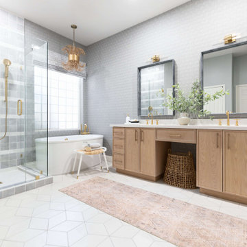
Bathroom in Lexington Ave | Room Type:
Primary Bathroom (Master Bath Remodel) |
Project Name:
Lexington Ave |
Key Feature:
A modern, luxury bathroom with a subtle boho influence, featuring unique tile placement, statement lighting, and layered materials that create visual interest in a compact footprint.
Challenge:
The client wanted a full bathroom transformation while keeping all plumbing in its existing locations to minimize renovation costs, requiring creative design solutions within structural limitations.
Solution:
The design team reimagined the space by introducing updated finishes, distinctive tile layouts, wallpaper, and statement lighting to elevate the bathroom while working within the existing layout. The project was executed entirely remotely, demonstrating a seamless virtual design process.
Materials:
Bedrosians tile, Thibaut wallpaper, Arteriors lighting, Kohler plumbing fixtures, Jaipur Living rugs, Made Goods bath mirrors, and Bungalow5 bath stool.
Budget:
Not specified
Timeline:
Completed April 2021.
 Janvrin & Co.
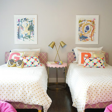
We transformed this plain Jane nursery into the a funky fresh and colorful toddler bedroom using DIY know-how, smarty shopping, kids art and current trends. We share our must-haves, steals & deals, and oh yeah see all the details of this super fresh and fun big girl bedroom on our on our blog, including this IKEA bed frame hack using Serena & Lily fabric.
 Marilee Bentz Designs, Inc.
Dan Cutrona Photography
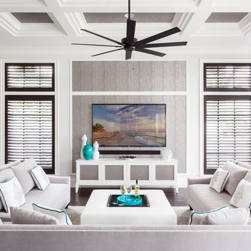
Family room - transitional open concept family room idea in Miami with gray walls, no fireplace and a wall-mounted tv
Family room - transitional open concept family room idea in Miami with gray walls, no fireplace and a wall-mounted tv
Find the right local pro for your project

 Twelve Stones Designs, LLC
The owners of this kitchen had spent the money to upgrade the finishes in their kitchen upon building the home 12 years ago, but after living in the space for several years they realized how nonfunctional the layout really was. The (then) two preschool aged children had grown into busy, hungry teenagers with many friends who also liked to hang out at the house. So the family needed a more functional kitchen with better traffic flow, space for daily activities revolving around the kitchen at different times of day, and a kitchen that could accommodate cooking for and serving large groups. Furthermore, the dark, traditional finishes no longer reflected the homeowners’ style. They requested a brighter, more relaxed, coastal style that reflected their love of the seaside cities they like to visit.
Originally, the kitchen was U-shaped with a narrow island in the middle. The island created narrow aisles that bottle-necked at the dishwasher, refrigerator, and cooktop areas. There was a pass-through from the foyer into the kitchen, but the owners never liked that the pass-through was also located so close to the powder room. The awkward proximity was unappealing and made guests feel uncomfortable.
The kitchen’s storage was made up of lots of narrow cabinets, apothecary drawers, clipped corner units, and very few drawers. It lacked useful storage for the larger items the family used on a daily basis. And the kitchen’s only pantry was small closet that had only builder-grade, narrow shelving with no illumination to be able to see the contents inside.
Overall, the kitchen’s lighting plan was poorly executed. Only six recessed cans illuminated the entire kitchen and nook areas. The under cabinet lighting was not evenly distributed either. In fact, the builder had mis-placed the under cabinet lighting around the decorative pilasters which made for choppy, dark cubbies. Further, the builder didn’t include any lighting over the sink or the bar area, which meant whoever was doing the dishes was always in their own shadow. That, coupled with the steep overhang of the game room above made the bar area feel like a dim, cavernous space that wasn’t inviting or task oriented. The kitchen looked out into the main living space, but the raised bar and a narrow wall (which held the only large cabinet in the kitchen) created more of a barrier than a relationship to the living room or breakfast nook. In fact, one couldn’t even see the breakfast nook from the cooktop or sink areas due to its orientation. The raised bar top was too narrow to comfortably sit to either dine at or chat from due to the lack of knee space. The the homeowners confided that the kitchen felt more like a dark, dirty prison than place where the family, or their guests, wanted to gather and commune.
The clients' needs and desires were:
➢ to create a kitchen that would be a space the family loved to be in; to relate to the adjacent spaces all around, and to have better flow for entertaining large groups
➢ to remove the walls between the breakfast nook and living area and to be able to utilize the natural light from the windows in both those areas
➢ to incorporate a functional chopping block for prepping fresh food for home cooked meals, an island with a large sink and drain board, 2 pull out trash cans, and seating for at least the 2 teens to eat or do homework
➢ to design a kitchen and breakfast nook with an airy, coastal, relaxed vibe that blended with the rest of the house's coastal theme
➢ to integrate a layered lighting plan which would include ample general illumination, specific task lighting, decorative lighting, and lots of illuminated storage
➢ to design a kitchen with not only more storage for all the husband’s kitchen gadgets and collection of oils and spices, but smart storage, including a coffee/breakfast bar and a place to store and conceal the toaster oven and microwave
➢ to find a way to utilize the large open space between the kitchen, pantry area, and breakfast nook
Twelve Stones Designs achieved the owner's goals by:
➢ removing the walls between the kitchen and living room to allow the natural light to filter in from the adjacent rooms and to create a connection between the kitchen, nook, and living spaces for a sense of unity and communion
➢ removing the existing pantry and designing 3 large pantry style cabinets with LED tape lights and rollout drawers to house lots of kitchen appliances, gadgets, and tons of groceries. We also took the cabinets all the way up to the 9’ ceiling for additional storage for seasonal items and bulk storage.
➢ designing 2 islands - 1 with a gorgeous black walnut chopping block that houses a drawer for chopping and carving knives and a custom double pull out trash unit for point of use utilization - and 1 that houses the dishwasher, a large Blanco Gourmet sink with integrated drain board, woven baskets for fresh root vegetables and kitchen towels, plenty of drawer storage for kitchen items, and bar seating for up to 4 diners.
➢ closing off the space between the kitchen and the powder room to create a beautiful new private alcove for the powder room as well as adding some decorative storage. This also gave us space to include more tall storage near the new range for precision placement of the husband’s extensive oil and spice collection as well as a location for a combo-steam oven the wife wanted for baking and cooking healthy meals.
The project is enhanced functionally by:
➢ incorporated USB and standard receptacles for the kids’ laptops and phone charging in the large island
➢ designing the small island to include additional open shelving for items used on a daily basis such as a variety of bowls, plates, and colanders. This set up also works well for the husband who prefers to “plate” his dinners in restaurant-style fashion before presenting them to the table.
➢ the integration of specific storage units, such as double stacked cutlery drawers, a custom spice pull-out, a Kuerig coffee and tea pod drawer, and custom double stacked utensil drawers
➢ moving the refrigerator to the old oven location - this eliminated the bottle neck as well as created a better relationship to the eating table. It also utilizes the floor space between the pantry, nook, and kitchen
➢ creating a banquet style breakfast nook - this banquette seating not only doubles the amount of seating for large gatherings but it better utilizes the odd space between the kitchen and the previous nook area. It also helps to create a distinct pathway from the mudroom room through the pantry area, kitchen, nook, and living room.
➢ the coffee/breakfast bar area which includes the perfect location for the concealed microwave and toaster oven, convenient storage for the coffee pods and tea accoutrements. Roll-out drawers below also house the smoothie maker, hot water kettle, and a plethora of smoothie-making ingredients such as protein powders, smoothie additives, etc. Furthermore, the drawers below the Keurig house measuring utensil, cutlery, baking supplies and tupperware storage.
➢ incorporating lots of wide drawers and pullouts to accommodate large cookware.
➢ utilizing as much vertical space as possible by building storage to the ceiling which accommodates the family’s abundant amount of serving platters, baking sheets, bakeware, casserole dishes, and additional cutting boards.
The project is enhanced aesthetically by:
➢ new 5-piece Versailles pattern porcelain tile that now seamlessly joins the entire down stairs area together creating a bright, cohesiveness feeling instead of choppy separated spaces - it also adds a coastal feeling
➢ designing a cabinet to conceal the microwave and toaster oven
➢ the coastal influenced light fixtures over the nook table and island
➢ the sandy colors of the Langdon Cambria countertops. The swirling pattern and sparkling quartz pieces remind the homeowner of black-and-tan sandy beaches
➢ the striped banquet seating whose creamy white background and blue-green stripes were the inspiration for the cabinet and wall colors.
➢ All the interior doors were painted black to coordinate with the blacks and grays in the backsplash tile and countertop. This also adds a hint of tailored formality to an otherwise casual space.
➢ the use of WAC's Oculux small aperture LED units for the overhead lighting complimented with Diode LED strips for task lighting under the cabinets and inside the pantry and glass wall cabinets. All of the lighting applications are on separate dimmer switches.
Innovative uses of materials or construction methods by Realty Restoration LLC:
➢ Each 1-1/2” x 3” block of reclaimed end-grain black walnut that makes up the center island chopping block was hand milled and built in the shop. It was designed to look substantial and proportional to the surrounding elements, executed by creating the 4 inch tall top with a solid wood chamfered edge band.
➢ The metal doors on either side of the vent hood were also custom designed for this project and built in the Realty Restoration LLC shop. They are made 1x2, 11-gauge mild steel with ribbed glass. Weighing 60 lbs a piece, heavy duty cabinet hinges were added to support the weight of the door and keep them from sagging.
➢ Under-cabinet receptacles were added along the range wall in order to have a clean, uninterrupted backsplash.
Design obstacles to overcome:
➢ Because we were removing the demising walls between the kitchen and living room, we had to find a way to plumb and vent the new island. We did this by tunneling through the slab (the slab had post tension cables which prevented us from just trenching) to run a new wet vent through a nearby structural wall. We pulled the existing hot and cold lines between upper floor joists and ran them down the structural wall as well and up through a conduit in the tunnel.
➢ Since we were converting from wall overs to a gas range it allowed us to utilize the 220 feed for the wall ovens to provide a new sub panel for all the new kitchen circuits
➢ Due to framing deficiencies inherited from the original build there was a 1-1/2” differential in the floor-to-ceiling height over a 20 foot span; by utilizing the process of cutting and furring coupled with the crown moulding details on the cabinet elevations we were able to mask the problem and provide seamless transitions between the cabinet components.
Evidence of superior craftsmanship:
➢ uniquely designed, one-of-a-kind metal “X” end panels on the large island. The end panels were custom made in the Realty Restoration LLC shop and fitted to the exact dimensions of the island. The welding seams are completely indistinguishable - the posts look like they are cut from a single sheet of metal
➢ square metal posts on the small island were also custom made and designed to compliment and carry through the metal element s throughout the kitchen
➢ the beautiful, oversized end panels on the pantry cabinets which give the breakfast nook a tailored look
➢ integrating a large format 5 piece Versailles tile pattern to seamlessly flow from the existing spaces into the new kitchen space
➢ By constructing a custom cabinet that jogged around a corner we could not remodel (housing the entry way coat closet) we were able to camouflage the adjacent wall offset within the upper and lower cabinets. By designing around the existing jog in the structural walls we accomplished a few things: we were able to find the space to house, and hide, the microwave and toaster oven yet still have a clean cohesive appearance from the kitchen side. Additionally, the owners were able to keep their much needed coat closet and we didn’t have to increase the budget with unnecessary structural work.
 Clutch Design Studio
Photography by Ron Ruscio
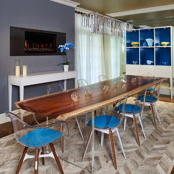
Trendy dark wood floor dining room photo in Denver with blue walls and a standard fireplace
Trendy dark wood floor dining room photo in Denver with blue walls and a standard fireplace
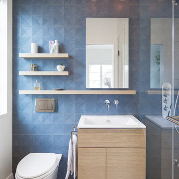
 Wanda Ely Architect Inc.
The choice of a geometric blue tile is decidedly modern, but its subtle texture is reminiscent of danish pottery. Wood shelves and a custom vanity bring some warmth to the room and provide plenty of storage space in a compact ensuite.
Photo by Scott Norsworthy


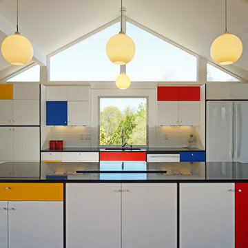
 Carole Hunter Home Design
Our client loves mid century modern and the art of Calder and Mondrian - a great inspiration!
Photographer Gil Jacobs
Cabinets by Lisa Steers at Vineyard Home Center
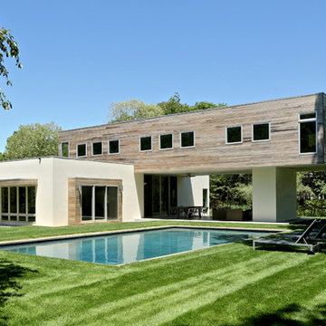


 Dragonfly Designs
Susie Brenner Photography
Mid-sized transitional dark wood floor living room photo in Denver with a music area, gray walls, a standard fireplace, a brick fireplace and no tv
Mid-sized transitional dark wood floor living room photo in Denver with a music area, gray walls, a standard fireplace, a brick fireplace and no tv
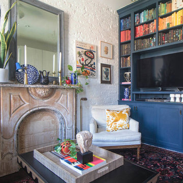
 Sarah Seung-McFarland
Photo: Sarah Seung McFarland © 2016 Houzz
Living room library - eclectic dark wood floor living room library idea in New York with white walls and a media wall
Living room library - eclectic dark wood floor living room library idea in New York with white walls and a media wall
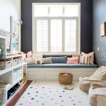
 designstiles
Photography by: Amy Bartlam
Designed by designstiles LLC
Inspiration for a mid-sized transitional gender-neutral dark wood floor and brown floor kids' room remodel in Los Angeles with black walls
Inspiration for a mid-sized transitional gender-neutral dark wood floor and brown floor kids' room remodel in Los Angeles with black walls
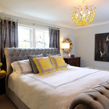
 TKS Design Group
Free ebook, Creating the Ideal Kitchen. DOWNLOAD NOW
The Klimala’s and their three kids are no strangers to moving, this being their fifth house in the same town over the 20-year period they have lived there. “It must be the 7-year itch, because every seven years, we seem to find ourselves antsy for a new project or a new environment. I think part of it is being a designer, I see my own taste evolve and I want my environment to reflect that. Having easy access to wonderful tradesmen and a knowledge of the process makes it that much easier”.
This time, Klimala’s fell in love with a somewhat unlikely candidate. The 1950’s ranch turned cape cod was a bit of a mutt, but it’s location 5 minutes from their design studio and backing up to the high school where their kids can roll out of bed and walk to school, coupled with the charm of its location on a private road and lush landscaping made it an appealing choice for them.
“The bones of the house were really charming. It was typical 1,500 square foot ranch that at some point someone added a second floor to. Its sloped roofline and dormered bedrooms gave it some charm.” With the help of architect Maureen McHugh, Klimala’s gutted and reworked the layout to make the house work for them. An open concept kitchen and dining room allows for more frequent casual family dinners and dinner parties that linger. A dingy 3-season room off the back of the original house was insulated, given a vaulted ceiling with skylights and now opens up to the kitchen. This room now houses an 8’ raw edge white oak dining table and functions as an informal dining room. “One of the challenges with these mid-century homes is the 8’ ceilings. I had to have at least one room that had a higher ceiling so that’s how we did it” states Klimala.
The kitchen features a 10’ island which houses a 5’0” Galley Sink. The Galley features two faucets, and double tiered rail system to which accessories such as cutting boards and stainless steel bowls can be added for ease of cooking. Across from the large sink is an induction cooktop. “My two teen daughters and I enjoy cooking, and the Galley and induction cooktop make it so easy.” A wall of tall cabinets features a full size refrigerator, freezer, double oven and built in coffeemaker. The area on the opposite end of the kitchen features a pantry with mirrored glass doors and a beverage center below.
The rest of the first floor features an entry way, a living room with views to the front yard’s lush landscaping, a family room where the family hangs out to watch TV, a back entry from the garage with a laundry room and mudroom area, one of the home’s four bedrooms and a full bath. There is a double sided fireplace between the family room and living room. The home features pops of color from the living room’s peach grass cloth to purple painted wall in the family room. “I’m definitely a traditionalist at heart but because of the home’s Midcentury roots, I wanted to incorporate some of those elements into the furniture, lighting and accessories which also ended up being really fun. We are not formal people so I wanted a house that my kids would enjoy, have their friends over and feel comfortable.”
The second floor houses the master bedroom suite, two of the kids’ bedrooms and a back room nicknamed “the library” because it has turned into a quiet get away area where the girls can study or take a break from the rest of the family. The area was originally unfinished attic, and because the home was short on closet space, this Jack and Jill area off the girls’ bedrooms houses two large walk-in closets and a small sitting area with a makeup vanity. “The girls really wanted to keep the exposed brick of the fireplace that runs up the through the space, so that’s what we did, and I think they feel like they are in their own little loft space in the city when they are up there” says Klimala.
Designed by: Susan Klimala, CKD, CBD
Photography by: Carlos Vergara
For more information on kitchen and bath design ideas go to: www.kitchenstudio-ge.com


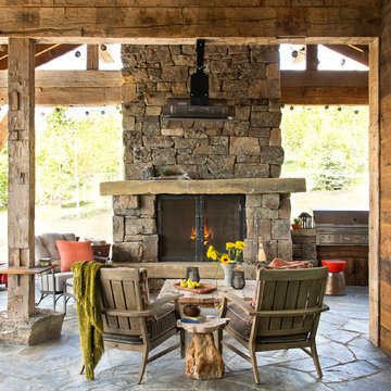
 North Fork Builders of Montana, Inc.
Photography - LongViews Studios
Example of a mountain style stone patio design in Other with a roof extension
Example of a mountain style stone patio design in Other with a roof extension
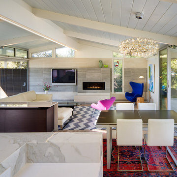
 Architect Heather Johnston
CASA 1O
Contemporary on a Mid-century Scaffold.
Largely unmodified since its design by Russell Forester and construction in 1957, the structure housed the original family until 2013. An intimate 1,910 square foot space, the house acquired a separate 600 square foot cottage in the 70’s designed by another architect. New owners purchased the house with the idea of keeping the original architect’s intent intact – the simple accommodation of everyday life with a focus on outdoor living only possible in Southern California. At the same time the house needed insulation, new electrical, plumbing, siding – everything but new studs and foundations.
A single roof beam travels south from the north fireplace wall all the way to the bedrooms in the back. Functions occur to either side, with private access to exterior courtyards. How do we accentuate the uncomplicated while enhancing the qualities of the chosen materials? Contemporary applied to a mid-century scaffold.
We focused on reduction, a few things performing many tasks. Each component, material or color performs more than one duty.
Lighting is paramount, enhancing the design’s procession from front to back, north to south, public to private. Strip LED’s reinforce the beam’s linear presence and spot LED’s make punctuation points of the roof purlins. Hidden up and down-lights in the cabinets and elsewhere provide the rooms with a quiet glow.
Exterior grass plantings give the only vertical dimension to the design, waving as the breeze moves them. All else is horizontal: caramelized bamboo siding, porcelain tile, roof line and ocean horizon.
Architect: Heather Johnston Architect
Landscaping: HJA
Photography: Brady Architectural Photography
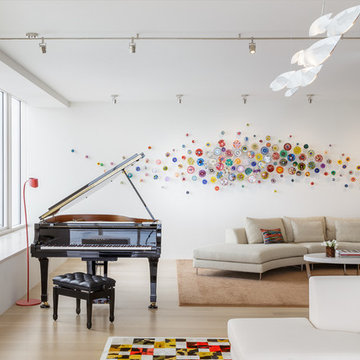
 Matthews Studio
David Duncan Livingston
Large trendy open concept medium tone wood floor and brown floor living room photo in San Francisco with white walls, no fireplace and no tv
Large trendy open concept medium tone wood floor and brown floor living room photo in San Francisco with white walls, no fireplace and no tv
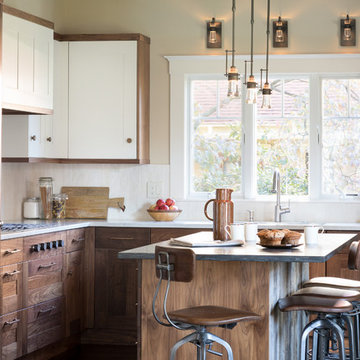
 Lee Kimball
General Contractor: Lee Kimball
Designers: Lee Kimball
Photo Credit: Emily O'Brien
Cottage l-shaped dark wood floor and brown floor kitchen photo in Boston with an undermount sink, shaker cabinets, dark wood cabinets, stainless steel appliances and an island
Cottage l-shaped dark wood floor and brown floor kitchen photo in Boston with an undermount sink, shaker cabinets, dark wood cabinets, stainless steel appliances and an island

Sponsored
Columbus, OH

Wannemacher Interiors
Customized Award-Winning Interior Design Solutions in Franklin Cnty OH
 Amy A. Alper, Architect
Eric Rorer Photographer
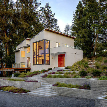
Inspiration for a mid-sized contemporary gray two-story concrete fiberboard house exterior remodel in San Francisco with a shed roof and a shingle roof
Inspiration for a mid-sized contemporary gray two-story concrete fiberboard house exterior remodel in San Francisco with a shed roof and a shingle roof
 Kingswood Custom Homes
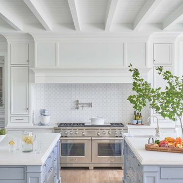
Kitchen pantry - coastal medium tone wood floor, brown floor and shiplap ceiling kitchen pantry idea in Charlotte with a farmhouse sink, beaded inset cabinets, white cabinets, marble countertops, white backsplash, marble backsplash, stainless steel appliances, two islands and white countertops
 Tile Doctor Ltd
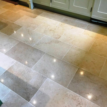
The owner of this recently purchased property in the Berkshire village of Twyford had inherited a Jerusalem limestone floor that had been installed throughout the ground floor including the Kitchen. The previous owner hadn’t maintained the stone floor very well and as a result it had become dull, patchy and the new owner was finding it impossible to keep clean. The floor was becoming a problem for them and they had been considering ripping it all up and getting it replaced. However due to the size of the floor and potential cost of replacing it they searched for other solutions and contacted Tile Doctor to see if it could be renovated.
I scheduled an appointment with the owners to survey the floor and it wasn’t long before I realised that we could achieve a great result by polishing the Limestone using a set of diamond burnishing pads. To prove how well I thought the floor would clean up I offered to complete a demo within the small utility room. This was arranged and completed a week later, as I expected once I had finished the demo the floor looked fantastic, more importantly the client was ecstatic with the results and couldn’t wait to book us in to complete the rest of the house.
It was a large floor so I estimated the process would take 4-5 days to complete and would need to work in sections starting with the kitchen then progressing into the study and cloakroom, dining room and finishing off with the entrance hall. Thankfully I had an empty house to work in which helped as I could start sealing the area I worked on the prior day.
The limestone had become quite pitted in the high traffic area, these pits had filled up with soil and become unsightly. My first task was to deep clean the dirt filled pits and grout, to do this I used a strong dilution of Tile Doctor Pro Clean and a stiff nylon brush making sure I could get into the pits releasing the dirt, then vacuuming up all the chemical slurry as I went along.
The next task was to fill these pits I used a two-part epoxy filler that matched the colour of the stone. Once the filler had dried, I worked through the hand burnishing blocks from 100 grit to 400 and I smoothed out the areas that had been filled.
Now the holes/pits had been filled I continued with the restoration of the floor by moving onto the burnishing process using diamond encrusted floor burnishing pads. This involves honing the Limestone with a set of burnishing pads starting at 400-grit. The pads are applied to the floor with a heavy floor buffing machine using water to lubricate the process. The pad is run over each tile around three times and the fine slurry this process generates is rinsed off afterwards with water and then extracted with a wet vacuum. You then move onto the 800-grit and then 1500-grit slowly building back the appearance of the stone.
As I had worked in sections/rooms at a time I was able to allow a full day drying time before sealing. Happy with the depth of colour from the pad system I opted to seal the floor with two coats of Tile Doctor Ultra-Seal. I had a range of sealers to choose from an in this case I felt Ultra-Seal would be most suited as it doesn’t change the natural appearance of the Limestone yet will provide years of protection and make it much easier to keep clean.
The owners were over the moon with how the limestone now looked and relieved that their problem floor had been restored. For aftercare cleaning I recommended Tile Doctor Stone Soap which is designed for maintaining the patina on polished stone floors.
Dennis Buckland
Berkshire Tile Doctor
10