
Search results for "Much needed" in Home Design Ideas
 User
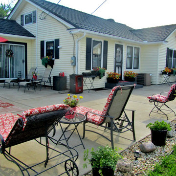
UserEvery home improvement project can feel like going into battle, but the sweet taste of victory is enough to make it worthwhile. If you ever feel intimidated by homes and gardens in magazines, don’t fret – you can turn your home into a beautiful beacon with easy curb appeal updates! Kevin and Annette Klingel are some of our favorite weekend warriors, and their latest project proves that anything is possible when it comes to dressing up your front garden. The Klingels recently gave their home and front garden a major renovation and entered their photos in the Window Box Contest. When we saw the gorgeous before and after pictures, we knew we had to get the inside scoop on their process and uncover their best curb appeal ideas.
Curb Appeal – Before and After
Before the renovation, the Klingels had a charming South Bend, Indiana rambler that was tidy and traditional, if a little unassuming. Deciding it was time for a much-needed update, the Klingels replaced their old green roof with a black barrel roof to match the style of their home. They also made a needed replacement and changed out the sidewalk and front stoop to a new version in classic black.
After those dramatic changes, the Klingels just couldn’t stop! Loving the contrast between the new black roof and stoop and their cream house, they painted their shutters black. And here’s where we come in – Annette wanted to incorporate her love of flowers into the new home design and found the perfect planters and window boxes to match the shutters. They purchased ten black window boxes in a classic and chic design to put around their outside windows. The Klingels also used tall black planters around the entrance to the house. The window boxes and planters each received the same plant treatment – red, yellow, and orange impatiens with flowing ferns for a bright punch of color. Paired with hanging baskets and a few other accents, the Klingels house is now a masterpiece.
From Drab to Fab
The Klingels love their warm and inviting new front entrance, and the neighbors do too. Instead of getting overlooked, their house now stands out and is the star of their busy street, where it is seen by lots of people everyday. They have received tons of compliments about their new look – a crisp and clean front garden that stays true to the style of the home and neighborhood.
The Klingels’ curb appeal update wasn’t without its challenges, but the end product is amazing, and as Annette says, definitely worth the time. The Klingels recommend starting with the necessary replacements and finding beautiful matching pieces to add curb appeal. With a little patience, elbow grease, and the help of a great garden supply store like Hooks & Lattice, you too can have the home of your dreams.
Photos: Kevin & Annette Klingel
 Howells Architecture + Design
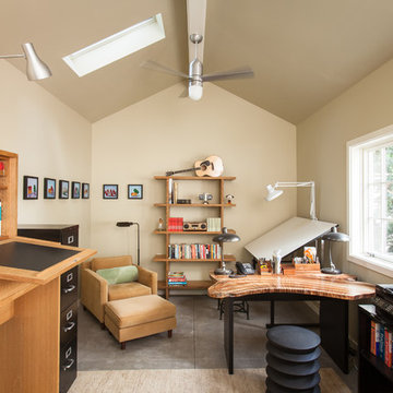
We designed this writer's studio in tandem with an urban backyard and hardscaping renovation. Originally this building was to be a new garage, but the owner liked it so much that halfway through the process, he decided to forgo a garage in favor of an office.
Photo: Anna M Campbell: annamcampbell.com
 Haven Design and Construction
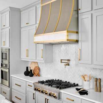
This black, gray and gold urban farmhouse kitchen is the hub of the home for this busy family. Our team changed out the existing plain kitchen hood for this showstopper custom stainless hood with gold strapping and rivets. This provided a much needed focal point for this lovely kitchen. In addition, we changed out the 36" refrigerator to a roomier 42" refrigerator and built-in a matching paneled refrigerator cabinet. We also added the antique gold linear hardware and black and gold lighting to give it a streamlined look. Touches of black tie the kitchen design into the rest of the home's mostly black and white color scheme. The woven counter stools give the space a touch of casual elegance. A new champagne gold kitchen faucet and potfiller add additional style, while greenery and wood accessories add a touch of warmth.
Find the right local pro for your project
 Stephanie Charest Interior Design
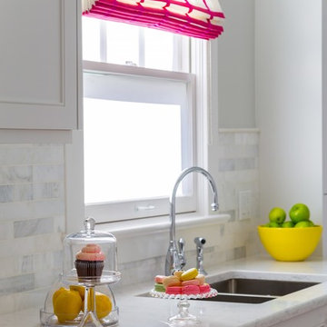
My client contacted me to update the kitchen and main bathroom of her 1912 home in Calgary, located in Elbow Park - one of the oldest communities in the city. The previous owners had done an addition on the back of the house and installed a kitchen that looked more suitable for a 1980’s garage than a home built in 1912. The challenge was to update the look and incorporate modern elements, yet retain the feel and character of a home from that era.
Timeless details were added like marble quartz countertops, Shaker style cabinets and a much more symmetrical layout that positioned the sink under the window, instead of the opposite wall. The 9’-0” ceilings allowed us to design the cabinets to the full ceiling height, giving the home owner much needed storage space. Even though the space has been modernized, it beautifully flows from the living spaces and no longer looks like an after thought, like the previous kitchen did. Check out that custom hood we designed! It’s so killer - I die!
Photography by Lori Andrews

 ROM architecture studio
Whole-house remodel of a hillside home in Seattle. The historically-significant ballroom was repurposed as a family/music room, and the once-small kitchen and adjacent spaces were combined to create an open area for cooking and gathering.
A compact master bath was reconfigured to maximize the use of space, and a new main floor powder room provides knee space for accessibility.
Built-in cabinets provide much-needed coat & shoe storage close to the front door.
©Kathryn Barnard, 2014
 Le Klein
Photo: Le Michelle Nguyen © 2015 Houzz
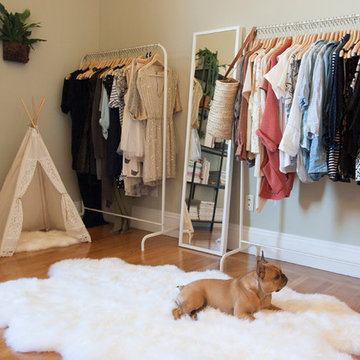
Inspiration for an eclectic bedroom remodel in San Francisco
Inspiration for an eclectic bedroom remodel in San Francisco
 MRF Construction, Inc.
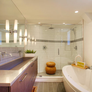
The owners of this 1958 mid-century modern home desired a refreshing new master bathroom that was open and bright. The previous bathroom felt dark and cramped, with dated fixtures. A new bathroom was designed, borrowing much needed space from the neighboring garage, and allowing for a larger shower, a generous vanity with integrated trough sink and a soaking tub.

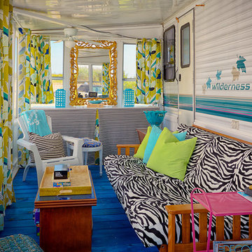
Example of an eclectic painted wood floor and blue floor sunroom design in Philadelphia with a standard ceiling
 Eisler Landscapes
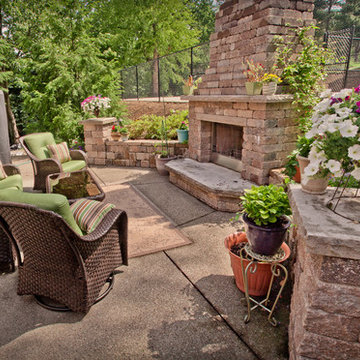
This outdoor patio and fireplace added much needed outdoor entertainment space to this South Hills residence. Unit masonry walls were used to carve out more space on this hillside lot. An exposed aggregate patio is now the location of a seating area, unit masonry fireplace and outdoor kitchen.
 Refined Renovations & Refined Home
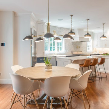
A family moved from the city to this home just north of Boston. The house was built in the early 2000s and needed some updating - a new kitchen, mudroom, and a laundry room that had to be relocated to the second floor. In addition to the renovations, the couple needed to furnish their home. This included furniture, decor, accessories, wallpaper, window treatments, paint colors etc. Every room was transformed to meet the family's needs and was a reflection of their personality. The end result was a bright, fun and livable home for the couple and their three small children. Max Holiver Photography

 TRUADDITIONS
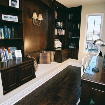
Small space over entry hall converted into a much needed home office / library. The existing loft (last photo) was converted to a nursery for a new baby. This left the need for a desk area. We found the space over the entry.
 Tiffany Brooks, HGTV Host & Interior Designer
Inquire About Our Design Services
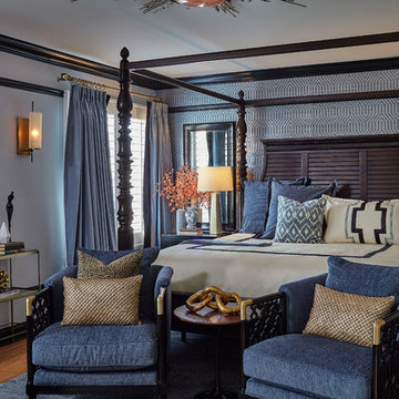
When we first started talking in the spring of 2015, I was impressed. She was witty, realistic, and understood that as much as she loves my shows on HGTV, design does not does not happen in 43 minutes! She told me about her space, and how she felt that her bedroom seemed “blah” to her. She had no retreat. Molly desperately longed for a place that she could spend time in, read in, play in and above all, relax in.
What we did:
Many people are terrified of hiring a designer. Rightfully so, they are investing a pretty penny in their homes. They want to make sure that everything, down to the last floral arrangement, is to their liking, because they will have to live it (and pay for it). Unfortunately, a client can unintentionally stifle a designer’s creativity through micro-management. This can produce lackluster results and ultimately cause more time (and money) to be spent on a project than is really necessary.
With Molly, that was never an issue. Before she even showed me the room in question, she said that I could have full creative license to do what I needed to do to her bedroom. SAY WHAAH!?
With Molly giving me complete creative freedom, I planned everything out and got down to business. The result: Bite-your-bottom-lip sexy. I don’t get jealous of too many of my clients’ spaces, but this one still takes my breath away every time I look at the pics!
The craziest part was that by adding more furniture, it actually made the space feel larger.
Molly and her husband Patrick loved the finished space, and promised me I will be back to finish the rest of the house!
Here’s the highlights of the rest of the project:
I came up with a space plan with three options.
Next, we reviewed mood boards and fabric schemes that would work for both Molly and her hubby Patrick.
We started with the bed. My goal was to add edge to its otherwise traditional style.
We decided to spice things up by painting the trim work in the room black.
We built in layers of lighting with dimmers. In a bedroom everything should be on dimmers, right? Right.
We designed and customized bedding, chairs and window treatments.
Together with Molly, we selected the most perfect wallpaper. This geometric “grasscloth” adds so much depth and dimension that was just missing before.
What I love:
That light fixture. I mean it is really, really amazing in person.
The porcupine mirror. This thing came packaged like it was the hope diamond, and everyone was terrified to handle it. But it really became a highlight of the room.

Sponsored
Sunbury, OH

J.Holderby - Renovations
Franklin County's Leading General Contractors - 2X Best of Houzz!
 MRF Construction, Inc.
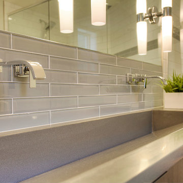
The owners of this 1958 mid-century modern home desired a refreshing new master bathroom that was open and bright. The previous bathroom felt dark and cramped, with dated fixtures. A new bathroom was designed, borrowing much needed space from the neighboring garage, and allowing for a larger shower, a generous vanity with integrated trough sink and a soaking tub.
 Coffman Morris Landscape
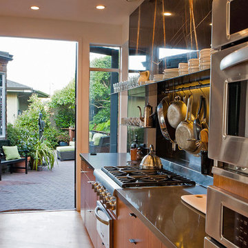
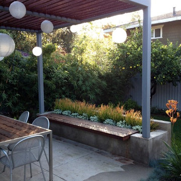
Mid century modern steel and wood pergola. Hardwood floating bench add much needed seating. Mass plantings of succulents further emphasize modern feel.
Sponsored
Columbus, OH

Hope Restoration & General Contracting
Columbus Design-Build, Kitchen & Bath Remodeling, Historic Renovations
 Roeser Home Remodeling
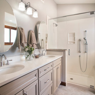
This Mid-Century home had been updated except for the kitchen and master bath. After a few years of being empty nesters, and with the neighborhood turning over drastically to infill property in the millions, this couple decided the time was right to update the last remaining rooms.
Starting in the Kitchen
Taking a dark, u-shaped kitchen out of the past and updating it for the future, was a dream come true for this family. They knew what they wanted in order to entertain their large extended family, which included their three kids; plus, his family, consisting of nine children, spouses, and now grandchildren. Requirements of an open space to hang out and help out, a banquet for food presentation without obstruction, bright and clean, easy storage, a place for her mother’s china decanters, and an instant hot for tea were all part of the “must haves” for this kitchen. We also needed to work around the homeowners’ existing appliances since many of them were practically new.
Vaulted ceilings, lots of high windows, and large openings to other spaces in the house, were challenges that only a galley style kitchen could address. Blending and lacing the hardwood floor with new flooring required both the new and existing to be sanded down and refinished. This provided a coherent look to the entire first floor of this home. Matching casings, baseboards and base shoe helped to make the updates look fresh, but original to the house.
In the kitchen, choosing the sandstone slate finish on our Wellborn Maple select series cabinets kept the space soft; but really opened it, making the space lighter and brighter. The Harmony style door choice blended with the décor in the rest of the house, while also giving straight clean lines the homeowner desired. Grounding the row of cabinets with their refrigerator and a pantry cabinet, gave symmetry to this side of the kitchen.
On the opposite side, a built-in pantry cabinet mirrors the refrigerator. A row of drawer cabinets expanded the storage and banquet space, to lay out food for entertaining. Also added were some much-needed wall cabinets with glass inserts to mirror the windows and keep the space open. This also allowed the taller canister to be displayed and admired. A few smaller shelves were added above the window space, to house the smaller canisters so loved by the homeowner.
An artist by trade, this homeowner added two narrow cabinets to the side of the pantry and the side of the refrigerator panel to house and create easy access to the various spices her husband loves to use while cooking. She painted them to blend with Wellborn’s Sandstone finish. The Caesarstone countertop with a 3cm eased edge in London Gray has a small pattern that is subtle and interesting. Cutting down the Caesarstone to 2 cm and carrying the same London Gray pattern up the backsplash area, lended to the clean lines and easy cleaning this homeowner requested.
Choosing chrome plumbing fixtures from Moen’s Brantford line is timeless choice. Chrome is always popular and yet in today’s market, also very trendy. The Brantford faucet has a pull-down spray and one side handle, leaving space for the all-important request of a Transcape hot water dispenser, also in chrome.
Scraping away the past included smoothing out the popcorn ceiling. Adding LED slope cans to the vaulted ceilings provided the necessary task lighting to elevate these homeowners’ joy of cooking. Removing the dated “popcorn look” enhanced the clean and spacious feel created by the architecture of the ceiling. Adding Top Knob chrome hardware was the final element that tied the kitchen all together.
Master Bathroom
The original dated Master Bathroom had dark cabinets, a huge Jacuzzi tub and a small shower stall that provided barely enough room for even a child to shower. Removing the Jacuzzi tub that was never used, opened this floor plan to a grand shower that is comfortable and spacious. For easy cleaning, these homeowners opted for a panel system in their shower. Onyx shower walls with a shower seat and recess wide shower caddy were installed in place of the old Jacuzzi style tub.
The large panels were quite a challenge for our team, with an eight foot door and vaulted ceilings; but they were determined not to have a seam. These seamless panels are beautiful and very easy to clean. Keeping with the original floor plan, a double sink vanity from Wellborn’s select line with the Harmony door style in a pebble finish was installed. New Kohler Caxton under mount sinks were installed, along with the Moen Kinsley 8” wide spread faucets in chrome. Matching Kingsley 18” grab bars were added to the shower area, along with the Kohler Brantford fixed shower head and handheld slide bar.
The countertop was a beautiful Caesarstone in Frosty Carrina with an eased edge and 4” back and side splash. Matching Kinsley towel hooks were added, along with mirrors the homeowner purchased and we installed for her. Top Knobs chrome cabinet hardware finished the look along with a beautiful tile floor AO Mira 1224-S Silver Maple laid in a broken joint pattern. Matching marble sills were added on top of the knee walls and threshold in the doorway. A 3/8” frameless custom shower door with fixed panels surrounded the shower creating an open airy feel to the space.
Not shown: Kohler’s Wellworth highline toilet with a slow-close seat replaces the original toilet. The original shower stall became a space used to house a stackable washer and dryer, a top a safety pan and drain to slop sink in the basement. There was even enough room for small shelving to provide storage for laundry essentials. Adding a louver door keeps the laundry area behind the scene and opens the master area to multiple tasks needed.
Master Bedroom Fireplace
This homeowner really missed a bedroom fireplace they had in a previous home. Since we were going to be working on their master bathroom anyway; was there a way to create a fireplace without making it feel too odd in their large bedroom area? They had purchased a ventless gas fireplace and they had their original television as well.
Challenged by windows, a vaulted ceiling and the natural light streaming from the back window; this divided wall was created, keeping the lighting from the other side of the room and providing a dressing area opposite the fireplace. This was a perfect idea since the closets are now in the dressing area and the creative wall houses the fireplace and TV for cold winter nights of snuggling to a movie. Better yet, the fireplace and TV are all on remote control!
 Boss Design Center
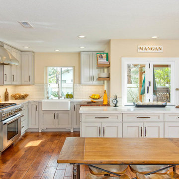
The homeowner is a part time Chef and outgrew the tiny, outdated kitchen from the 1980s. We opened up the wall between the kitchen and dining room, removed an awkward drop ceiling, replaced the exterior sliding door,and installed a new centered sink window, installed a new fixed window, and added a new exterior swing door. The new configuration allowed for more working area as well as much needed additional kitchen storage.
 Calming Spaces Interiors, Design & Remodeling
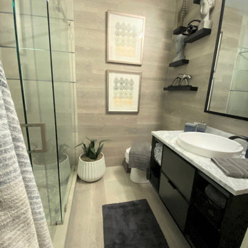
This was an update from a combination Tub/Shower Bath into a more modern walk -in Shower. We used a sliding barn door shower enclosure and a sleek large tile with a metallic pencil trim to give this outdated bathroom a much needed refresh. We also incorporated a laminate wood wall to coordinate with the tile. The floating shelves helped to add texture and a beautiful point of focus. The vanity is floating above the floor with a mix of drawers and open shelving for storage.
79