
Search results for "Much needed" in Home Design Ideas
 Eurodale Developments Inc
Andrew Snow Photography
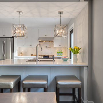
Opening the wall allowed for a peninsula and casual seating. To the left the fridge now resides where the powder room was once located. Pushing it into a tighter space allowed us to remove the entry from visibility, and provide much needed space for a counter depth fridge and more cabinetry and counter storage.
 Vladimir Radutny Architects
Mike Schwartz
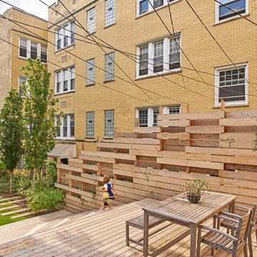
Patio - modern backyard patio idea in Chicago with decking and no cover
Patio - modern backyard patio idea in Chicago with decking and no cover
 Insignia Kitchen
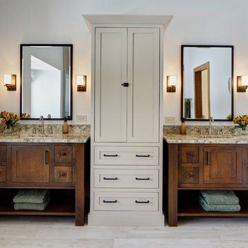
This Craftsman Styled home was in need of a makeover when it came to the master bathroom. Before the bathroom felt like a tunnel walking in with vanity on either side with an over sized tub that took up way too much space! Even the shower was tiny. We were able to open the space up to enlarge the shower and gain space by installing a freestanding tub. The vanities made sense to place on the same wall to give more visual space.
Find the right local pro for your project

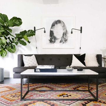
 Stafford Bensen
All photos courtesy of Havenly.
Full article here: http://blog.havenly.com/design-story-amys-600-square-feet-of-eclectic-modern-charm/
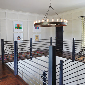
 Marvin
Architect: Blaine Bonadies, Bonadies Architect
Photography By: Jean Allsopp Photography
“Just as described, there is an edgy, irreverent vibe here, but the result has an appropriate stature and seriousness. Love the overscale windows. And the outdoor spaces are so great.”
Situated atop an old Civil War battle site, this new residence was conceived for a couple with southern values and a rock-and-roll attitude. The project consists of a house, a pool with a pool house and a renovated music studio. A marriage of modern and traditional design, this project used a combination of California redwood siding, stone and a slate roof with flat-seam lead overhangs. Intimate and well planned, there is no space wasted in this home. The execution of the detail work, such as handmade railings, metal awnings and custom windows jambs, made this project mesmerizing.
Cues from the client and how they use their space helped inspire and develop the initial floor plan, making it live at a human scale but with dramatic elements. Their varying taste then inspired the theme of traditional with an edge. The lines and rhythm of the house were simplified, and then complemented with some key details that made the house a juxtaposition of styles.
The wood Ultimate Casement windows were all standard sizes. However, there was a desire to make the windows have a “deep pocket” look to create a break in the facade and add a dramatic shadow line. Marvin was able to customize the jambs by extruding them to the exterior. They added a very thin exterior profile, which negated the need for exterior casing. The same detail was in the stone veneers and walls, as well as the horizontal siding walls, with no need for any modification. This resulted in a very sleek look.
MARVIN PRODUCTS USED:
Marvin Ultimate Casement Window
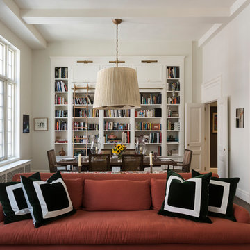
 Weil Friedman Architects
In this double height Living/Dining Room, Weil Friedman designed a tall built-in bookcase. The bookcase not only provides much needed storage space, but also serves to visually balance the tall windows with the low doors on the opposite wall. False transom panels were added above the low doors to make them appear taller in scale with the room.
Sponsored
Galena, OH

Buckeye Restoration & Remodeling Inc.
Central Ohio's Premier Home Remodelers Since 1996
 42 North | DESIGN…at your doorstep®
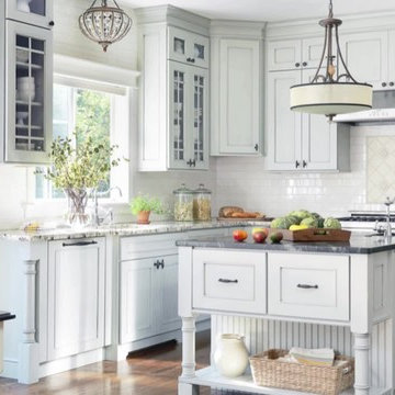
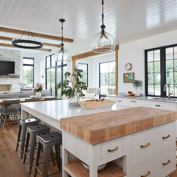
Country u-shaped brown floor, medium tone wood floor and shiplap ceiling open concept kitchen photo in Grand Rapids with an undermount sink, white cabinets, stainless steel appliances, an island, shaker cabinets and white countertops
 User
UserEvery home improvement project can feel like going into battle, but the sweet taste of victory is enough to make it worthwhile. If you ever feel intimidated by homes and gardens in magazines, don’t fret – you can turn your home into a beautiful beacon with easy curb appeal updates! Kevin and Annette Klingel are some of our favorite weekend warriors, and their latest project proves that anything is possible when it comes to dressing up your front garden. The Klingels recently gave their home and front garden a major renovation and entered their photos in the Window Box Contest. When we saw the gorgeous before and after pictures, we knew we had to get the inside scoop on their process and uncover their best curb appeal ideas.
Curb Appeal – Before and After
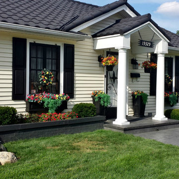
Before the renovation, the Klingels had a charming South Bend, Indiana rambler that was tidy and traditional, if a little unassuming. Deciding it was time for a much-needed update, the Klingels replaced their old green roof with a black barrel roof to match the style of their home. They also made a needed replacement and changed out the sidewalk and front stoop to a new version in classic black.
After those dramatic changes, the Klingels just couldn’t stop! Loving the contrast between the new black roof and stoop and their cream house, they painted their shutters black. And here’s where we come in – Annette wanted to incorporate her love of flowers into the new home design and found the perfect planters and window boxes to match the shutters. They purchased ten black window boxes in a classic and chic design to put around their outside windows. The Klingels also used tall black planters around the entrance to the house. The window boxes and planters each received the same plant treatment – red, yellow, and orange impatiens with flowing ferns for a bright punch of color. Paired with hanging baskets and a few other accents, the Klingels house is now a masterpiece.
From Drab to Fab
The Klingels love their warm and inviting new front entrance, and the neighbors do too. Instead of getting overlooked, their house now stands out and is the star of their busy street, where it is seen by lots of people everyday. They have received tons of compliments about their new look – a crisp and clean front garden that stays true to the style of the home and neighborhood.
The Klingels’ curb appeal update wasn’t without its challenges, but the end product is amazing, and as Annette says, definitely worth the time. The Klingels recommend starting with the necessary replacements and finding beautiful matching pieces to add curb appeal. With a little patience, elbow grease, and the help of a great garden supply store like Hooks & Lattice, you too can have the home of your dreams.
Photos: Kevin & Annette Klingel
 Simply Home Decorating
This beautiful North Vancouver home belongs to a nature-loving and health-conscious couple, Emma and Vince (names changed), their two young children, and their dog, Jasper. When they contacted us about renovating and furnishing their kitchen and family room, we walked in and saw a world of potential waiting to be uncovered.
Before: Larkhall Crescent Home:
Like many original North Vancouver homes, the interior was definitely dated. We encountered late ‘80s finishes in powder pink and teal green, old carpet, and a kitchen that wasn’t maximized to suit this family’s modern-day lifestyle. However, the size of the rooms offered us a ton of space with which to get creative.
Knowing our clients’ love of cooking, need for work spaces (Emma and Vince both work remotely), and growing family, we developed a design concept that would increase usable space, optimize storage, and create intimacy in this large area. As for the style, we were inspired by their European roots, inventing a new and modern take on “Belgian Farmhouse” style. Now, the home is truly one-of-a-kind.
After: Warm & Cozy Family Room:
Fresh, bright, and comfortable, this living area has been transformed! We started with the fireplace as a focal point, selecting aged brick tiles for added texture and a crisp wood mantle. The taupe-coloured sectional infuses the room with visual warmth and serves the added purpose of separating the family room from the kitchen.
Emma and Vince were also keen on using non-toxic materials in their home, and we were happy to oblige. To meet their needs, we sourced natural wood elements and sought out Canadian-made products - that adhere to high health standards - whenever possible.
Look closer at the elements of this space, and you will find this stunning, honeycomb-patterned rug in earthy gold, beige, and charcoal tones. It’s plush to the touch and full of visual texture that brings this room’s colour palette together. We sourced these two-tone chairs with caning, petrified wood side table, black sconces, and botanical prints in greyscale from local artist, Heather Johnston.
We topped off the space with this dark wood and rattan console that offers storage facing the kitchen and presents an opportunity to display cherished items. The result is a cozy lounging space brimming with comfort and functionality. It’s perfect for enjoying quality family time, or Emma can simply slide the coffee table away to make room for her morning yoga practice.
Now, let’s turn around and give some attention to the kitchen. Do you remember what the original kitchen looked like? If not, scroll back up, because the transformation is shocking…
Moody & Welcoming Kitchen for Healthy Living:
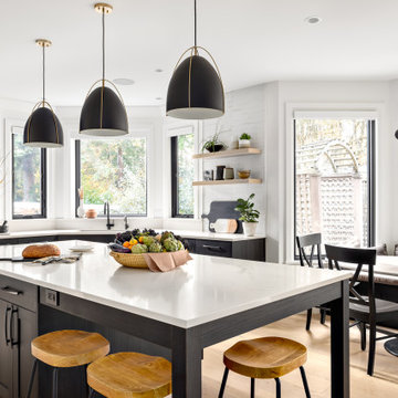
This kitchen looks very different from how it started, right? Though we didn’t touch any walls, the kitchen has almost doubled in usable space! We created a long, extended island with storage, an outlet for small appliances, and seating for comfortable prep, after-school snacking, or mingling among friends.
On the other side of the island, the family has even more storage and an integrated dishwasher within easy reach of the sink, perfect for quick clean-up. From this angle, you can also see the expansive custom Shaker cabinetry in white and the integrated double ovens. These facilitate their cooking experience and gave us the opportunity to add an additional surprise…
A coffee garage station and more hidden storage! Keeping these items located along the perimeter allows them to be accessed by the family or their guests without someone getting under the cook’s feet. These are the little details that make everyday life easier and more enjoyable.
Moving deeper into the kitchen, the seamless induction cooktop topped with a freestanding concealed hood fan commands attention in a soft yet prominent way. The natural wood accent mirrors the fireplace mantle, and the choice of off-black wood-grain cabinets not only continues our black-and-white colour palette but adds a sense of depth and contrast. The corner sink is located to the right and perfectly positioned with a view of their thriving backyard.
To invite more of this family’s character into the space, we mixed metals for interest — matte black, dark pewter, and warm brass — and created open shelves in white oak for their plants and decor. You can also glimpse the tumbled edge of the backsplash tile, which echoes the rustic brick of the fireplace. It adds that farmhouse charm while still feeling timeless and sophisticated.
Last but not least, we designed this dining banquette in the bay window (with integrated bench storage, of course), where the family can share a meal together, the kids can do homework, or Emma and Vince can work and enjoy a change of scenery from their offices. Like the other spaces in the home, it was designed to be beautiful, multi-functional, and long-lasting.
Praise from Our Clients:
It is clear that we love this home, but what did our clients have to say?
“Lori is a visionary and masters execution to the finest detail all at the same time. When she first met us to know more about who we are and how we live, she could right away envision how we could use the space in our kitchen and living room…The results exceeded our expectations.
Lori and her team were also a delight to work with — coordination with all the trades, fast problem-solving, regular updates, professional and friendly attitude of her entire team — made it the dream team. Thank you SHD for making our space so beautiful!”
In turn, we are so grateful for this family’s trust, their open communication, and for being wonderful people with whom to work. (So, thank you!)
 Case Design/Remodeling Halifax
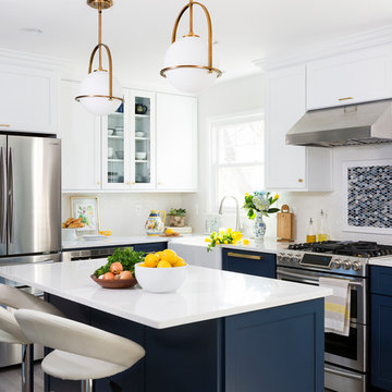
This couple wanted to update their tired, old space into a bright and beautiful dream kitchen. Working with our design team, they created an amazing new space that went above and beyond what they could have imagined.
The kitchen needed to flow seamlessly to their open living area and needed to incorporate the old with the new. We kept as many original details as possible, but gave everything a fresh new look. The sleek white cabinets and quartz counter-top mix effortlessly with the warm navy blue lower cabinets and detailed scalloped tile backsplash. The neutral floor anchors the room and keeps your eyes drawn to the upper-half of the light-filled space.
These days, what’s old is new again, and using brass accents really makes this kitchen on trend. The pendent lighting and drawer pulls add a touch of elegant, classic nostalgia to the space. All these details come together to give this kitchen a subtle nautical feel which brings the home owners much joy.
 Margaret Donaldson Interiors
Holger Obenaus
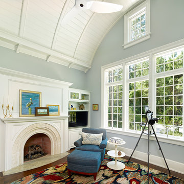
Inspiration for a transitional dark wood floor family room remodel in Charleston with blue walls, a standard fireplace and a wall-mounted tv
Inspiration for a transitional dark wood floor family room remodel in Charleston with blue walls, a standard fireplace and a wall-mounted tv
 User
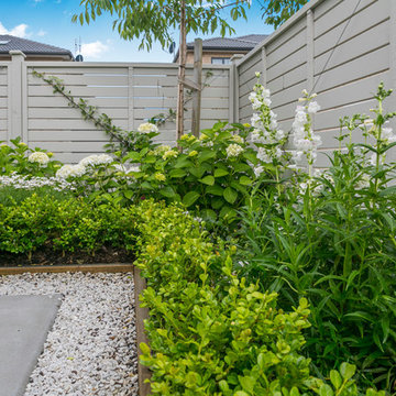
UserA tiny outdoor space was made to feel larger by replacing the lawn with paved paths and a courtyard. New steps replaced a sloping path to the front door. This home now has great street appeal and the courtyard provides a pretty flower filled living space throughout the year. There is even a small vegetable box squeezed in.

Sponsored
Columbus, OH
Free consultation for landscape design!

Peabody Landscape Group
Columbus' Reliable Landscape Design & Contracting
 Betty Wasserman Art & Interiors
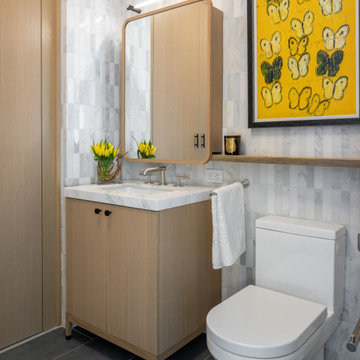
Our NYC studio designed this gorgeous condo for a family of four with the goal of maximizing space in a modest amount of square footage. A custom sectional in the living room was created to accommodate the family without feeling overcrowded, while the son's bedroom features a custom Murphy bed to optimize space during the day. To fulfill the daughter's wish for fairy lighting, an entire wall of them was installed behind her bed, casting a beautiful glow at night. In the kitchen, we added plenty of cabinets below the island for maximum efficiency. Storage units were incorporated in the bedroom and living room to house the TV and showcase decorative items. Additionally, the tub in the powder room was removed to create an additional closet for much-needed storage space.
 Lars Remodeling & Design
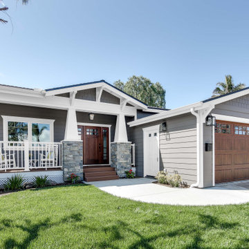
The goal for this Point Loma home was to transform it from the adorable beach bungalow it already was by expanding its footprint and giving it distinctive Craftsman characteristics while achieving a comfortable, modern aesthetic inside that perfectly caters to the active young family who lives here. By extending and reconfiguring the front portion of the home, we were able to not only add significant square footage, but create much needed usable space for a home office and comfortable family living room that flows directly into a large, open plan kitchen and dining area. A custom built-in entertainment center accented with shiplap is the focal point for the living room and the light color of the walls are perfect with the natural light that floods the space, courtesy of strategically placed windows and skylights. The kitchen was redone to feel modern and accommodate the homeowners busy lifestyle and love of entertaining. Beautiful white kitchen cabinetry sets the stage for a large island that packs a pop of color in a gorgeous teal hue. A Sub-Zero classic side by side refrigerator and Jenn-Air cooktop, steam oven, and wall oven provide the power in this kitchen while a white subway tile backsplash in a sophisticated herringbone pattern, gold pulls and stunning pendant lighting add the perfect design details. Another great addition to this project is the use of space to create separate wine and coffee bars on either side of the doorway. A large wine refrigerator is offset by beautiful natural wood floating shelves to store wine glasses and house a healthy Bourbon collection. The coffee bar is the perfect first top in the morning with a coffee maker and floating shelves to store coffee and cups. Luxury Vinyl Plank (LVP) flooring was selected for use throughout the home, offering the warm feel of hardwood, with the benefits of being waterproof and nearly indestructible - two key factors with young kids!
For the exterior of the home, it was important to capture classic Craftsman elements including the post and rock detail, wood siding, eves, and trimming around windows and doors. We think the porch is one of the cutest in San Diego and the custom wood door truly ties the look and feel of this beautiful home together.
 Glorious Gardens
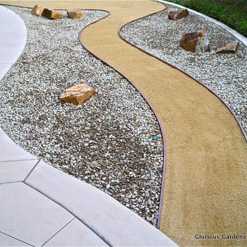
Decomposed granite winding through a gravel and boulder 'dryscape'. No water and almost no maintenance.
This is an example of a mid-sized full sun backyard gravel landscaping in San Diego.
This is an example of a mid-sized full sun backyard gravel landscaping in San Diego.
 Che Bella Interiors Design + Remodeling
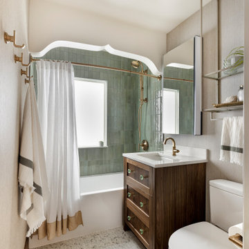
A small, charming bathroom remodel featuring a wood window in the shower, a misplaced sconce, and a cluttered vanity with a plea to add much needed function and storage while maintaining the room’s vintage charm.
Within the new design, the original arched detail, replicated in other places in the home, is preserved. Nearby, a newly added braided chevron recycled glass floor tile plays against the curves of the arch. Champagne brushed bronze fixtures contrast beautifully against wall tiles in varying shades of green laid vertically offering a handmade feel.
Giving a nod to the home’s treasured history, a custom walnut vanity with antique glass knobs ties into the bathroom’s original green glass doorknob, offering deeper storage while accommodating an elongated tub. Adding modern convenience, a new medicine cabinet with built in lighting and interior power hangs above the vanity. Adjacent to the cabinet, a custom designed hanging shelf and towel bar maximize space. As a final touch, woven wallpaper softens the room’s hard surfaces, and a sculptural alabaster stone ceiling light provides a touch of elegance, transforming the space with function while paying homage to the home’s historic origins.
Photo by Spacecrafting Photography
Sponsored
Sunbury, OH

J.Holderby - Renovations
Franklin County's Leading General Contractors - 2X Best of Houzz!
 Kustom Home Design
When Family comes first, you spend a lot of time surrounded by the family you were born into and the ones you “adopted” along the way. Some of your kids crawl, some walk on two legs and some on four. No matter how they get there, they always end up in the kitchen. This home needed a kitchen designed for an ever growing family.
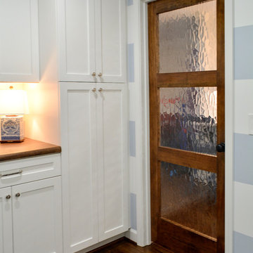
By borrowing unused space from a formal dining room, removing some walls while adding back others, we were able to expand the kitchen space, add a main level laundry room with home office center and provide much needed pantry storage. Sightlines were opened up and a peninsula with seating provides the perfect spot for gathering. A large bench seat provides additional storage and seating for an oversized family style table.
Crisp white finishes coupled with warm rich stains, balances out the space and makes is feel like home. Meals, laundry, homework and stories about your day come to life in this kitchen designed for family living and family loving.
Kustom Home Design specializes in creating unique home designs crafted for your life.
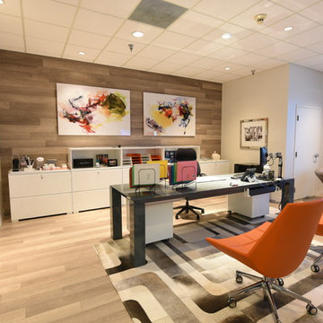
 Cantoni Dallas
While Cantoni’s Founder & CEO, Michael Wilkov (aka MW) was away at the fall 2014 High Point Market, Cantoni’s Dallas Visuals Team came out to play…spearheading the secret operation known as “MW’s Office Makeover,” Anne Mancuso gathered her troops to give the big boss’ office a serious and much needed facelift in just 4 days! To read the full story, visit the Cantoni Blog here: http://cantoni.com/blog/2014/11/office-makeover/
Photos by David DeLeon

97