
Search results for "Multiple grow" in Home Design Ideas
 Ball Homes
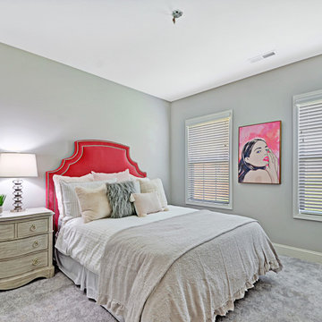
The Canterbury floor plan is a home with room to grow, with four bedrooms, a flex room on the main floor with a full bath, and a spacious loft area on the second floor. The main level offers a covered front entry, which leads into the dining room and open family room. The kitchen is open to the living spaces and features a breakfast island, butler's pantry, walk-in pantry, and separate breakfast area. An optional drop-zone can be placed off the garage entry. Upstairs, there are three spacious bedrooms surrounding the open loft area with additional storage closets. Bedrooms 2 and 3 also offer a Jack & Jill bath option, for a total of 4 full baths in the home. The Primary suite is a spacious retreat, with tray ceiling, dual vanity, commode closet, walk-in closet, and multiple tub and shower combinations.
 Susan Brook Interiors
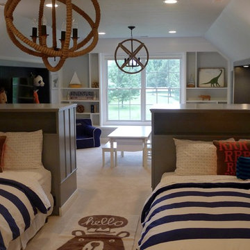
This once unused bonus room was transformed into a wonderful new bedroom for a boy with lots of room to grow, play and have sleepovers. We took advantage of the attic space either side of the room by recessing the TV / storage area and also on the opposite side with the double desk unit. The room was separated by the sets of drawers that have custom headboards at the back of them, this helping with the great length of this room. Custom bookcase shelving was made for the window wall to also create not only depth but display as well. The clients as well as their son are enjoying the room!
 Moss Building & Design
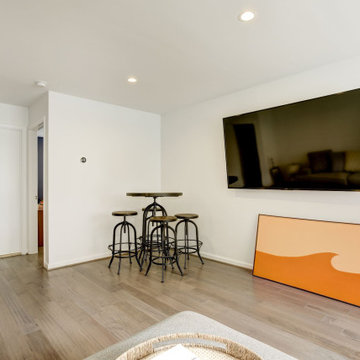
This beautiful whole home remodel in Herndon was exactly what the homeowners had hoped for! Wanting to stay in their beloved community near family and friends but longing for more space, our MOSS clients not only added on to their original structure but transformed multiple bathrooms and other interior spaces to suit their growing family's needs. With an added mudroom/laundry room as well, this whole home remodel truly provides this family the space and functionality they had been longing for but without sacrificing their geographical location.
Find the right local pro for your project
 Build Prestige Homes Pty Ltd
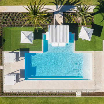
The Estate by Build Prestige Homes is a grand acreage property featuring a magnificent, impressively built main residence, pool house, guest house and tennis pavilion all custom designed and quality constructed by Build Prestige Homes, specifically for our wonderful client.
Set on 14 acres of private countryside, the result is an impressive, palatial, classic American style estate that is expansive in space, rich in detailing and features glamourous, traditional interior fittings. All of the finishes, selections, features and design detail was specified and carefully selected by Build Prestige Homes in consultation with our client to curate a timeless, relaxed elegance throughout this home and property.
Build Prestige Homes oriented and designed the home to ensure the main living area, kitchen, covered alfresco areas and master bedroom benefitted from the warm, beautiful morning sun and ideal aspects of the property. Build Prestige Homes detailed and specified expansive, high quality timber bi-fold doors and windows to take advantage of the property including the views across the manicured grass and gardens facing towards the resort sized pool, guest house and pool house. The guest and pool house are easily accessible by the main residence via a covered walkway, but far enough away to provide privacy.
All of the internal and external finishes were selected by Build Prestige Homes to compliment the classic American aesthetic of the home. Natural, granite stone walls was used throughout the landscape design and to external feature walls of the home, pool house fireplace and chimney, property boundary gates and outdoor living areas. Natural limestone floor tiles in a subtle caramel tone were laid in a modular pattern and professionally sealed for a durable, classic, timeless appeal. Clay roof tiles with a flat profile were selected for their simplicity and elegance in a modern slate colour. Linea fibre cement cladding weather board combined with fibre cement accent trims was used on the external walls and around the windows and doors as it provides distinctive charm from the deep shadow of the linea.
Custom designed and hand carved arbours with beautiful, classic curved rafters ends was installed off the formal living area and guest house. The quality timber windows and doors have all been painted white and feature traditional style glazing bars to suit the style of home.
The Estate has been planned and designed to meet the needs of a growing family across multiple generations who regularly host great family gatherings. As the overall design, liveability, orientation, accessibility, innovative technology and timeless appeal have been considered and maximised, the Estate will be a place for this family to call home for decades to come.
 Ball Homes
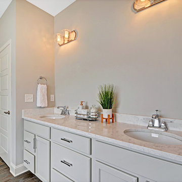
The Canterbury floor plan is a home with room to grow, with four bedrooms, a flex room on the main floor with a full bath, and a spacious loft area on the second floor. The main level offers a covered front entry, which leads into the dining room and open family room. The kitchen is open to the living spaces and features a breakfast island, butler's pantry, walk-in pantry, and separate breakfast area. An optional drop-zone can be placed off the garage entry. Upstairs, there are three spacious bedrooms surrounding the open loft area with additional storage closets. Bedrooms 2 and 3 also offer a Jack & Jill bath option, for a total of 4 full baths in the home. The Primary suite is a spacious retreat, with tray ceiling, dual vanity, commode closet, walk-in closet, and multiple tub and shower combinations.
 Infinite Home
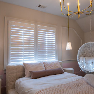
We reimagined multiple spaces, ensuring every room spoke to each other while maintaining its personality. Their daughters’ bedrooms feel more vibrant and personal, with thoughtful details like new lighting, fresh paint, and furniture that will transition with them as they grow. The nursery became a dreamy retreat featuring cloud-like textures and soft, celestial touches—an enchanting space designed for their newest addition.
 E_ Designs
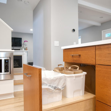
The home owner of this two-story south Minneapolis house, built in 1937, decided it was time to make some changes. One of the main wishes of the homeowners was to transform their boxed in multiple room layout into an open floor plan that would accommodate the needs of their growing family. To do this, structurally a lot of changes had to be made. The wall between the kitchen and dining room was torn out and an island took its place, creating a touch down zone to help define the space. The original tiny front entry was eliminated so that you immediately walked into open floor plan. The ½ bath became completely gutted and then relocated as a ¾ bath to where the original breakfast nook was, thus allowing for more kitchen cabinet space and then opening up the space of the heavily used back entry.
The aesthetic goal of the project was to create a minimal, clean look. White Oak hardwood to match existing oak floors were installed throughout the kitchen, back entry, and dining room. In the Kitchen, the countertop selected was a White Silestone’s Quartz and the upper cabinets continued the color white for a flawless look. To balance and warm up the space, a cherry was selected for the base cabinets and then incorporated in the floating shelves to tie the design together.
The upgraded ¾ bathroom’s aesthetics were similar to the kitchen to keep the cohesiveness of the project. Floors were done in Adura Flex tile. The shower was completed with large tile formatted in a horizontal straight set to give it a simple lines. The shower incorporates a Kohler Choreograph Shower barre.
Overall, the homeowners were able to achieve their minimal open floor plan and in turn, they plan to work with Castle again for their future project of tackling their upstairs.

 Design 1 Kitchen & Bath
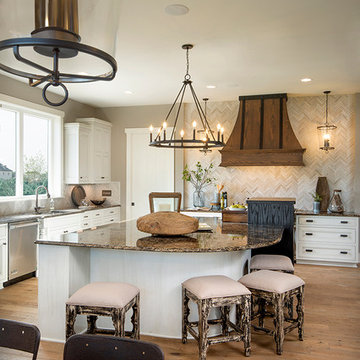
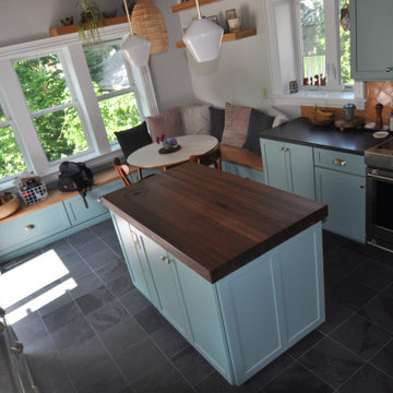
The existing white laminate cabinets, gray counter tops and stark tile flooring did not match the rich old-world trim, natural wood elements and traditional layout of this Victorian home. The new kitchen boasts custom painted cabinets in Blue Mill Springs by Benjamin Moore. We also popped color in their new half bath using Ravishing Coral by Sherwin Williams on the new custom vanity. The wood tones brought in with the walnut island top, alder floating shelves and bench seat as well as the reclaimed barn board ceiling not only contrast the intense hues of the cabinets but help to bring nature into their world. The natural slate floor, black hexagon bathroom tile and custom coral back splash tile by Fire Clay help to tie these two spaces together. Of course the new working triangle allows this growing family to congregate together with multiple tasks at hand without getting in the way of each other and the added storage allow this space to feel open and organized even though they still use the new entry door as their main access to the home. Beautiful transformation!!!!
 Donald A. Gardner Architects
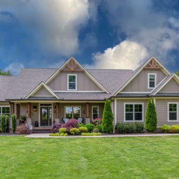
This economical ranch house plan gains character and curb appeal from its charming front porch and multiple gables with decorative wood brackets, and its simplified, squared off design makes it practical to build. A tray ceiling and columns offer definition to the open dining room, while the great room and kitchen are enhanced by a cathedral ceiling. Built-in shelves flank the fireplace, and a rear deck expands the great room further. The kitchen sports a convenient U-shape, and its open design keeps the cook in the heart of family activities. A popular split bedroom design places the master suite to one side of the house plan with its own bath and his and her walk-in closets. A bonus room over the garage provides options for growing families.
 Mariane Wheatley-Miller
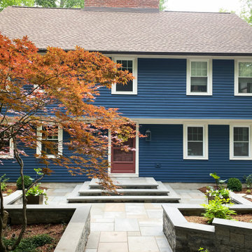
We have just completed the site design for a home that sits on a wooded lot near Syracuse New York. The homeowners purchased the property recently and needed to update the home and landscape for their growing family.
The existing gardens were very neglected and poorly constructed by the previous homeowner. The multiple-level changes and large existing trees made for a complex site design that needed to benefit the homeowners yet caused minimal disruption to the wooded site. The rear garden deck was unsafe and demolished. We replaced it with a IPE deck with a separate screened-in porch. New retaining walls, natural fieldstone walls, steps, and bluestone paved terraces were added throughout the property for ease of use and safety. New LED lighting and new planting complete the design.
 Bennett Design Co.
This young family purchased their first home in 2021, and let's say it was full of original 1970s charm - i.e., nothing had been done to this house in the past 50 years.
We had recently completed a project for a family member, so they called us in to help. During our initial consultation, they shared a modest project budget, and we explained that we wouldn't be able to accomplish much on such a limited budget. Several weeks passed, and they ultimately raised their funding, and we signed on for the job.
Even after doubling their budget, we still had our work cut out for us. The original kitchen was very small in comparison to the square footage of the home, and opening up the space meant we needed to add two structural beams between the first and second stories.
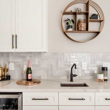
These homeowners already had one small child, and were expecting another in the coming months. They also have large families in the area, so creating an ample gathering space for multiple cooks was crucial to the final layout. Some of their wish list items included a bar and a large island with plenty of seating. They also wanted the kitchen open to the family room.
This home had a formal and informal dining area, so we opted to absorb the casual eating area into the newly expanded kitchen floorplan. We relocated their laundry room to create an extended family room, which included the new bar area. We were also able to use the under-stair space to create a kitchen pantry. The kitchen transformed from 115 sq. ft. to a spacious 260 sq. ft., all within existing poorly used space. We were able to create clear sightlines to the backyard and pool from the new kitchen and family room, perfect for a young family.
Aesthetically speaking, our clients wanted a neutral space that could grow and change with their family. We kept the expensive items like cabinets, countertops, and tile in classic finishes like whites and navy blues, while we had more fun with things like the faucet, hardware, and light fixtures that could easily be updated over the years. The finished product is a warm, clean, family-friendly space that invites you to come in and pull up a chair.
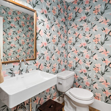
 Made To Last Custom Homes Ltd.
This modern farmhouse is a complete custom renovation to transform an existing rural Duncan house into a home that was suitable for our clients’ growing family and lifestyle. The original farmhouse was too small and dark. The layout for this house was also ineffective for a family with parents who work from home.
The new design was carefully done to meet the clients’ needs. As a result, the layout of the home was completely flipped. The kitchen was switched to the opposite corner of the house from its original location. In addition, Made to Last constructed multiple additions to increase the size.
An important feature to the design was to capture the surrounding views of the Cowichan Valley countryside with strategically placed windows.
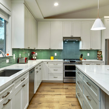
 Lean Lens Architects
A young growing family was looking for more space to house their needs and decided to add square footage to their home. They loved their neighborhood and location and wanted to add to their single story home with sensitivity to their neighborhood context and yet maintain the traditional style their home had. After multiple design iterations we landed on a design the clients loved. It required an additional planning review process since the house exceeded the maximum allowable square footage. The end result is a beautiful home that accommodates their needs and fits perfectly on their street.
 Woodling Landscape Design
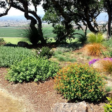
Similar to many of my projects, the main objectives for this Royal Oaks garden design were that it not use a lot of water or take a lot of time to maintain. This farming family is busy and wanted a beautiful garden to match their beautiful home. The result was a particularly stunning complementary color scheme with multiple shades of purple and lilac, along with orange, rust and yellow. Low-growing, mounding ground covers prevent weeds from recurring and are interspersed with fountain-like grasses, architectural cordylines, leucadendrons, and boulders. The back garden frames a view of the Watsonville farmlands and distant Santa Cruz Mountains. Couldn't be prettier!
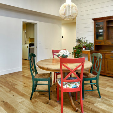 Lean Lens Architects
A young growing family was looking for more space to house their needs and decided to add square footage to their home. They loved their neighborhood and location and wanted to add to their single story home with sensitivity to their neighborhood context and yet maintain the traditional style their home had. After multiple design iterations we landed on a design the clients loved. It required an additional planning review process since the house exceeded the maximum allowable square footage. The end result is a beautiful home that accommodates their needs and fits perfectly on their street.
 ATA Architects Inc
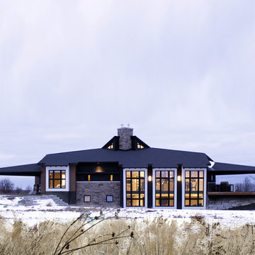
Function meets form in the Delta House, which incorporates innovative building solutions for our challenging rural Canadian climate. Perhaps more akin to aeronautics than architecture, biomimetic processes drove the problem-solving approach while seeking multiple functions for each component. A typical Canadian home grows up and out of the site, exposing more of the facade to the elements. Instead of building up, the focus here was to make better use of the lower level. A section of the house was dug out on the south side, making room for three main glazed boxes. The spaces and bedrooms of a typical second floor were transferred to the more protected basement, thus lowering the volume of conditioned air within the dwelling.
To minimize energy losses through the glazing, ATA centralized the windows on the south side of the building, while minimizing the glazing on other facades. The centralized windows became the “three sisters” allowing the winter sun into the main floor and lower level of the house. The aerodynamic delta shape of the building was tested in a wind tunnel and was designed to minimize energy loss due to contact with the turbulent winter wind. The sisters are tilted 10 degrees towards the sun, leveraging the properties of glass as a reflector, when the sun is at a high angle of incidence in the summer.
The house also contains an innovative thermal mass battery in the basement slab and a connected radiative masonry fireplace. Excess heat, gathered at the top of the tent-like roof is directed down and reheated through the chimney before being drawn into the basement slab for storage. Openings in the floor areas ensure the energy is equally distributed throughout the dwelling.
Read an article in the Globe and Mail about ATA’s Delta project here.
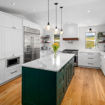 Made To Last Custom Homes Ltd.
This modern farmhouse is a complete custom renovation to transform an existing rural Duncan house into a home that was suitable for our clients’ growing family and lifestyle. The original farmhouse was too small and dark. The layout for this house was also ineffective for a family with parents who work from home.
The new design was carefully done to meet the clients’ needs. As a result, the layout of the home was completely flipped. The kitchen was switched to the opposite corner of the house from its original location. In addition, Made to Last constructed multiple additions to increase the size.
An important feature to the design was to capture the surrounding views of the Cowichan Valley countryside with strategically placed windows.
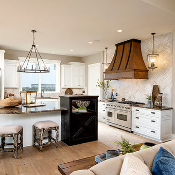
 Lean Lens Architects
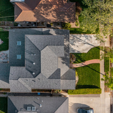
A young growing family was looking for more space to house their needs and decided to add square footage to their home. They loved their neighborhood and location and wanted to add to their single story home with sensitivity to their neighborhood context and yet maintain the traditional style their home had. After multiple design iterations we landed on a design the clients loved. It required an additional planning review process since the house exceeded the maximum allowable square footage. The end result is a beautiful home that accommodates their needs and fits perfectly on their street.
 Made To Last Custom Homes Ltd.
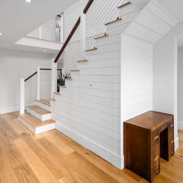
This modern farmhouse is a complete custom renovation to transform an existing rural Duncan house into a home that was suitable for our clients’ growing family and lifestyle. The original farmhouse was too small and dark. The layout for this house was also ineffective for a family with parents who work from home.
The new design was carefully done to meet the clients’ needs. As a result, the layout of the home was completely flipped. The kitchen was switched to the opposite corner of the house from its original location. In addition, Made to Last constructed multiple additions to increase the size.
An important feature to the design was to capture the surrounding views of the Cowichan Valley countryside with strategically placed windows.
 Aurora Maxey - Colorado Space Solutions
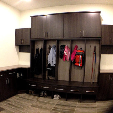
Used Gray and Espresso tones to play off of the tile flooring. Was accommodating this space for a growing family plus multiple pets. The customer and I created a functional space for every living that provided ample storage and style to their new home. This designs host soft close drawers and cabinets, upgraded edge banding and the contemporary Euro styling.
37