
Search results for "Non existent" in Home Design Ideas
 Architectural Resource LLC
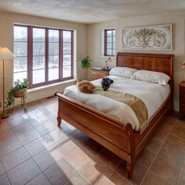
Burh Becc at Beacon Springs is the Midwest’s first, and the world’s second fully certified Living Building Challenge residence - the world’s most rigorous proven performance standard for sustainability.
This home is a 3,400 finished sq ft walk-out ranch which has been designed to emulate nature: Net Zero energy getting all of its energy from the sun; Net Zero water getting all of its water from the sky; Net Zero waste creating only ecological nutrient from its existence; and constructed entirely of materials that are non-toxic, healthy and ecologically sound.

 Susan Brook Interiors
The clients called me in to help with finishing details on their kitchen remodel. They had already decided to do a lot of the work themselves and also decided on a cabinet company. I came into the project early enough to see a better layout to the original kitchen, then i was able to give my clients better options to choose from on the flow and aesthetics of the space. They already had an existing island but no sink, the refrigerator was an awkward walk away from the work space. We panned with everything moving and a much better flow was created, more storage than needed..that's always a good problem to have! Multiple storage drawers under the range, roll out trash, appliance garage for the coffee maker and much more. This was my first time working with non custom cabinets, it turned out wonderful with all the bells and whistles a dream kitchen should have.
 Susan Brook Interiors
The clients called me in to help with finishing details on their kitchen remodel. They had already decided to do a lot of the work themselves and also decided on a cabinet company. I came into the project early enough to see a better layout to the original kitchen, then i was able to give my clients better options to choose from on the flow and aesthetics of the space. They already had an existing island but no sink, the refrigerator was an awkward walk away from the work space. We panned with everything moving and a much better flow was created, more storage than needed..that's always a good problem to have! Multiple storage drawers under the range, roll out trash, appliance garage for the coffee maker and much more. This was my first time working with non custom cabinets, it turned out wonderful with all the bells and whistles a dream kitchen should have.
Find the right local pro for your project

 Jami Abbadessa
This young couple was ready to make some changes to their master bedroom. They already laid a great foundation for me: beautiful wall color, carpet and trim. We just needed to update their furnishings and make this space feel more like them. They requested a bedroom that was more classic than trendy and a space that feels relaxing and spa-like. I started with the big pieces. I know they liked the light, upholstered bed look, which is awesome because I get so many clients who shy away from this option for fear of it getting dirty. Next up were the case pieces: dresser, night stands, high boy. I know a lot of designers who favor designing a bedroom with non-matching sets, but in this case, I thought opting for matching nightstands and dressers was the most classic choice and will stand the test of time best. They also a requested an area for the wive to do her make up and hair separate from the bathroom with ample light. I found a vanity, replaced the matching stool with an accent chair in a grey ikat print and used a pair of existing lamps. Extra seating is provided at the end of the bed on a tufted grey bench. The inverted pleat drapes are custom made with black out lining. Accessories and wall art were added to infuse personality and warm up the space.
 Susan Brook Interiors
The clients called me in to help with finishing details on their kitchen remodel. They had already decided to do a lot of the work themselves and also decided on a cabinet company. I came into the project early enough to see a better layout to the original kitchen, then i was able to give my clients better options to choose from on the flow and aesthetics of the space. They already had an existing island but no sink, the refrigerator was an awkward walk away from the work space. We panned with everything moving and a much better flow was created, more storage than needed..that's always a good problem to have! Multiple storage drawers under the range, roll out trash, appliance garage for the coffee maker and much more. This was my first time working with non custom cabinets, it turned out wonderful with all the bells and whistles a dream kitchen should have.
 Jami Abbadessa
This young couple was ready to make some changes to their master bedroom. They already laid a great foundation for me: beautiful wall color, carpet and trim. We just needed to update their furnishings and make this space feel more like them. They requested a bedroom that was more classic than trendy and a space that feels relaxing and spa-like. I started with the big pieces. I know they liked the light, upholstered bed look, which is awesome because I get so many clients who shy away from this option for fear of it getting dirty. Next up were the case pieces: dresser, night stands, high boy. I know a lot of designers who favor designing a bedroom with non-matching sets, but in this case, I thought opting for matching nightstands and dressers was the most classic choice and will stand the test of time best. They also a requested an area for the wive to do her make up and hair separate from the bathroom with ample light. I found a vanity, replaced the matching stool with an accent chair in a grey ikat print and used a pair of existing lamps. Extra seating is provided at the end of the bed on a tufted grey bench. The inverted pleat drapes are custom made with black out lining. Accessories and wall art were added to infuse personality and warm up the space.

 White Sands Coastal Development
In Southern California there are pockets of darling cottages built in the early 20th century that we like to call jewelry boxes. They are quaint, full of charm and usually a bit cramped. Our clients have a growing family and needed a modern, functional home. They opted for a renovation that directly addressed their concerns.
When we first saw this 2,170 square-foot 3-bedroom beach cottage, the front door opened directly into a staircase and a dead-end hallway. The kitchen was cramped, the living room was claustrophobic and everything felt dark and dated.
The big picture items included pitching the living room ceiling to create space and taking down a kitchen wall. We added a French oven and luxury range that the wife had always dreamed about, a custom vent hood, and custom-paneled appliances.
We added a downstairs half-bath for guests (entirely designed around its whimsical wallpaper) and converted one of the existing bathrooms into a Jack-and-Jill, connecting the kids’ bedrooms, with double sinks and a closed-off toilet and shower for privacy.
In the bathrooms, we added white marble floors and wainscoting. We created storage throughout the home with custom-cabinets, new closets and built-ins, such as bookcases, desks and shelving.
White Sands Design/Build furnished the entire cottage mostly with commissioned pieces, including a custom dining table and upholstered chairs. We updated light fixtures and added brass hardware throughout, to create a vintage, bo-ho vibe.
The best thing about this cottage is the charming backyard accessory dwelling unit (ADU), designed in the same style as the larger structure. In order to keep the ADU it was necessary to renovate less than 50% of the main home, which took some serious strategy, otherwise the non-conforming ADU would need to be torn out. We renovated the bathroom with white walls and pine flooring, transforming it into a get-away that will grow with the girls.
Sponsored
Columbus, OH

Structural Remodeling
Franklin County's Heavy Timber Specialists | Best of Houzz 2020!
 Susan Brook Interiors
The clients called me in to help with finishing details on their kitchen remodel. They had already decided to do a lot of the work themselves and also decided on a cabinet company. I came into the project early enough to see a better layout to the original kitchen, then i was able to give my clients better options to choose from on the flow and aesthetics of the space. They already had an existing island but no sink, the refrigerator was an awkward walk away from the work space. We panned with everything moving and a much better flow was created, more storage than needed..that's always a good problem to have! Multiple storage drawers under the range, roll out trash, appliance garage for the coffee maker and much more. This was my first time working with non custom cabinets, it turned out wonderful with all the bells and whistles a dream kitchen should have.
 Simply Home Decorating
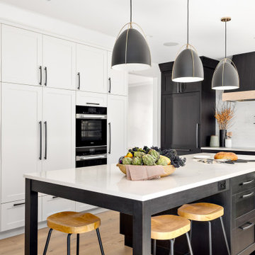
This beautiful North Vancouver home belongs to a nature-loving and health-conscious couple, Emma and Vince (names changed), their two young children, and their dog, Jasper. When they contacted us about renovating and furnishing their kitchen and family room, we walked in and saw a world of potential waiting to be uncovered.
Before: Larkhall Crescent Home:
Like many original North Vancouver homes, the interior was definitely dated. We encountered late ‘80s finishes in powder pink and teal green, old carpet, and a kitchen that wasn’t maximized to suit this family’s modern-day lifestyle. However, the size of the rooms offered us a ton of space with which to get creative.
Knowing our clients’ love of cooking, need for work spaces (Emma and Vince both work remotely), and growing family, we developed a design concept that would increase usable space, optimize storage, and create intimacy in this large area. As for the style, we were inspired by their European roots, inventing a new and modern take on “Belgian Farmhouse” style. Now, the home is truly one-of-a-kind.
After: Warm & Cozy Family Room:
Fresh, bright, and comfortable, this living area has been transformed! We started with the fireplace as a focal point, selecting aged brick tiles for added texture and a crisp wood mantle. The taupe-coloured sectional infuses the room with visual warmth and serves the added purpose of separating the family room from the kitchen.
Emma and Vince were also keen on using non-toxic materials in their home, and we were happy to oblige. To meet their needs, we sourced natural wood elements and sought out Canadian-made products - that adhere to high health standards - whenever possible.
Look closer at the elements of this space, and you will find this stunning, honeycomb-patterned rug in earthy gold, beige, and charcoal tones. It’s plush to the touch and full of visual texture that brings this room’s colour palette together. We sourced these two-tone chairs with caning, petrified wood side table, black sconces, and botanical prints in greyscale from local artist, Heather Johnston.
We topped off the space with this dark wood and rattan console that offers storage facing the kitchen and presents an opportunity to display cherished items. The result is a cozy lounging space brimming with comfort and functionality. It’s perfect for enjoying quality family time, or Emma can simply slide the coffee table away to make room for her morning yoga practice.
Now, let’s turn around and give some attention to the kitchen. Do you remember what the original kitchen looked like? If not, scroll back up, because the transformation is shocking…
Moody & Welcoming Kitchen for Healthy Living:
This kitchen looks very different from how it started, right? Though we didn’t touch any walls, the kitchen has almost doubled in usable space! We created a long, extended island with storage, an outlet for small appliances, and seating for comfortable prep, after-school snacking, or mingling among friends.
On the other side of the island, the family has even more storage and an integrated dishwasher within easy reach of the sink, perfect for quick clean-up. From this angle, you can also see the expansive custom Shaker cabinetry in white and the integrated double ovens. These facilitate their cooking experience and gave us the opportunity to add an additional surprise…
A coffee garage station and more hidden storage! Keeping these items located along the perimeter allows them to be accessed by the family or their guests without someone getting under the cook’s feet. These are the little details that make everyday life easier and more enjoyable.
Moving deeper into the kitchen, the seamless induction cooktop topped with a freestanding concealed hood fan commands attention in a soft yet prominent way. The natural wood accent mirrors the fireplace mantle, and the choice of off-black wood-grain cabinets not only continues our black-and-white colour palette but adds a sense of depth and contrast. The corner sink is located to the right and perfectly positioned with a view of their thriving backyard.
To invite more of this family’s character into the space, we mixed metals for interest — matte black, dark pewter, and warm brass — and created open shelves in white oak for their plants and decor. You can also glimpse the tumbled edge of the backsplash tile, which echoes the rustic brick of the fireplace. It adds that farmhouse charm while still feeling timeless and sophisticated.
Last but not least, we designed this dining banquette in the bay window (with integrated bench storage, of course), where the family can share a meal together, the kids can do homework, or Emma and Vince can work and enjoy a change of scenery from their offices. Like the other spaces in the home, it was designed to be beautiful, multi-functional, and long-lasting.
Praise from Our Clients:
It is clear that we love this home, but what did our clients have to say?
“Lori is a visionary and masters execution to the finest detail all at the same time. When she first met us to know more about who we are and how we live, she could right away envision how we could use the space in our kitchen and living room…The results exceeded our expectations.
Lori and her team were also a delight to work with — coordination with all the trades, fast problem-solving, regular updates, professional and friendly attitude of her entire team — made it the dream team. Thank you SHD for making our space so beautiful!”
In turn, we are so grateful for this family’s trust, their open communication, and for being wonderful people with whom to work. (So, thank you!)

 Michael Nash Design, Build & Homes
When the homeowners purchased this traditional colonial in Vienna, Virginia, they were already planning on making some serious changes. The home’s original floor plan was boxy and closed in, making traffic flow from one room to the next virtually non-existent. Additionally, the existing décor left a lot to be desired. Their vision was to open up the layout and create a more contemporary look using lots of light, soft colors and high end materials.
They decided to add a two-story addition to the back of the home’s existing breakfast room and the small upstairs bedroom above it. The old breakfast area was too small for their daily meals and their teenage son needed more space in his bedroom. They also decided to add a sunroom/family room to the left side of their old family room. This new room offers a vaulted ceiling with four skylights and lots of windows with a better view of the side and backyard.
To create a more open floor plan, the team at Michael Nash Design, Build & Homes removed the load bearing wall between the kitchen and family room and installed a large beam to handle the second floor load. Not only did this open up the space, but it allowed for the addition of a breakfast bar.
The right side bearing wall of the old family room was also removed and replaced with structural beams. This action created a continuous flow between the new sunroom and old family room. Separated by a double-sided stone fireplace, this new sunroom is connected to a new outside sun deck built using a maintenance-free decking material. The old family room with new lighting now serves as a casual seating area. It also features an eight-foot long built-in desk.
The newly updated kitchen features granite countertops with matching tile backsplash, professional-quality appliances, a porcelain tile floor and custom cabinets, including a large pantry. The new breakfast room is more spacious and gets daylight from three different angles.
Upstairs, a new 12’ x 20’ bedroom is a great place for this teenage football fan to hang out. It provides significantly more closet space than the old room and lets in more sunlight as well.
The old laundry room was converted to a new mudroom with locker style cabinetry and a place for kids to store their bag packs. New plumbing and electrical were implemented in a new closet in an upper hallway to facilitate the new washer and dryer.
In this remodel, form and function have come together in an open concept design that meets the needs of the entire family.

 Design Builders & Remodeling Inc.
Nina Pomeroy
Inspiration for a mid-sized transitional enclosed dark wood floor living room library remodel in New York with gray walls and no tv
Inspiration for a mid-sized transitional enclosed dark wood floor living room library remodel in New York with gray walls and no tv
 Jami Abbadessa
This young couple was ready to make some changes to their master bedroom. They already laid a great foundation for me: beautiful wall color, carpet and trim. We just needed to update their furnishings and make this space feel more like them. They requested a bedroom that was more classic than trendy and a space that feels relaxing and spa-like. I started with the big pieces. I know they liked the light, upholstered bed look, which is awesome because I get so many clients who shy away from this option for fear of it getting dirty. Next up were the case pieces: dresser, night stands, high boy. I know a lot of designers who favor designing a bedroom with non-matching sets, but in this case, I thought opting for matching nightstands and dressers was the most classic choice and will stand the test of time best. They also a requested an area for the wive to do her make up and hair separate from the bathroom with ample light. I found a vanity, replaced the matching stool with an accent chair in a grey ikat print and used a pair of existing lamps. Extra seating is provided at the end of the bed on a tufted grey bench. The inverted pleat drapes are custom made with black out lining. Accessories and wall art were added to infuse personality and warm up the space.

 MRF Construction, Inc.
The owners of this 1894 historic farmhouse wanted to restore the original character and charm to their home. To achieve this, the house received a new kitchen and bathrooms, as well as being rewired and replumbed, all with an eye to bringing back the details of this wonderful home.
The home’s large kitchen was underutilized and housed a non-functioning fireplace. The fireplace was removed and the kitchen received new white-painted wood custom cabinets with shaker style doors and beadboard details around the island. To achieve a similar look to soapstone, honed black granite countertops were used to accentuate the period of the home. New wood windows were installed in place of aluminum and a new entry to the kitchen was created using the existing pantry, complete with beadboard paneling and bench seat for shoe storage.
Our highest priority was preserving all of the unique features of the home, and incorporating some new features like the linen closet/pass-through between the Dining Room and Kitchen.
Sponsored
Columbus, OH

Trish Takacs Design
Award Winning & Highly Skilled Kitchen & Bath Designer in Columbus

 Progressive Design Build
Challenge:
When our clients decided to do a major renovation on their home, they were looking for a more modern, transitional design with additional cabinetry for storage, new appliances and hardwood flooring. They also wanted to create an open, more cohesive kitchen/dining/living area.
The existing kitchen had dated finishes, a non-functional layout and was closed off from the living area by a large partition wall.
Solution:
To ensure a smooth renovation process, a lot of time and effort went into the planning phase.
The existing hardwood floors throughout the home were removed in certain areas and laced in with new material. Once installed, all floors were sanded and multi-coated with tint and sealer to achieve a weathered look. All rooms were also repainted to complement the newly remodeled kitchen/dining/living area and the refinished wood floors.
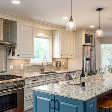
The kitchen was modernized and opened up to give the family a more functional living space. It was designed with white Dura Supreme cabinetry and Weathered Oak finished floors, creating a sophisticated contrast and an open, airy feel. By adding a large center kitchen island we created a comfortable sitting area for people to gather while the family entertained or cooked. The refrigerator was disguised using custom cabinet appliance panels, effectively integrating it with the cabinetry wall for a unified look.
In the master bathroom, Progressive Design Build added a curbless, walk-in shower with a half-inch clear glass partition, separating it from the new undermount tub and Quartz tub deck. White Dura Supreme cabinetry was paired with Quartz countertops, and two towers were added for additional storage. A honed marble accent band was used throughout the room to tie it all together.
Results:
The clients were very pleased with the new layout of the kitchen/dining/living area and the master bathroom, particularly all of the final finishes that completed the look and feel they were looking for.
 Pennsylvania Landscape & Nursery Association
u2014 ALE: Wayne Rain Garden
Pennsylvania Landscape & Nursery Association
u2014 ALE: Wayne Rain Garden
Terren Landscapes http://www.terrenlandscapes.com
2014 PLNA Awards for Landscape Excellence winner
Category: Residential Up to $15,000
Award Level: Gold
Project Description:
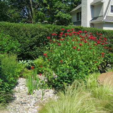
Our company was contracted by the client to provide a creative solution to an ongoing drainage problem. Their property is located within 30 feet of a local stream that collects storm water from the surrounding area. The nearby stream and high water table caused the lawn area at the side of their home to flood and to remain waterlogged for a few days after each storm. The client not only had difficulty growing plants in the existing conditions, but also had a problem with mosquitoes due to standing water.
Our goal was to design a self-contained, naturalistic rain garden that slowed storm water runoff, allowed for percolation, and promoted infiltration while permitting excess clean water to enter the nearby stream with diminished force. As designed, the rain garden allows the earth to slowly and more naturally
absorb excess storm water while filtering out toxins such as excess nitrogen and phosphorous which are frequently found in the landscape, therefore reducing the contaminants entering the stream.
A percolation test was conducted with criteria of absorbing a one-inch rainstorm within four hours without overflow. The one-inch storm calculation included an existing downspout from the home, which would be piped into the rain garden to reduce roof runoff. The first test failed due to a deep layer of high clay-content soil. Excavation continued until a layer of sandy loam was reached, the percolation test was repeated, and a successful test result was achieved. Next, the entire rain garden basin was excavated to the sandy loam layer and the soil amended with compost and sand to create a highly porous planting media.
Geotextile fabric was placed to help reduce migration of the surface stone into the soil and allow for minimal maintenance. Gravel, river stone and small boulders were carefully placed to achieve the look of a natural streambed.
A palette of mostly native plants with a few non-invasive ornamentals were chosen for their ability to survive in extreme conditions ranging from floods to drought and were placed according to their specific preferences.
Wetland plants were chosen for the lowest portion of the rain garden as that area remains saturated for longer periods of time, with a Chionanthus virginicus as a focal point surrounded by irises and ferns at the lowest depth.
Plants tolerant of drier conditions were chosen for the upper edges of the garden. The beautiful colors of Monarda, Ligularia, Eupatorium, Solidago, Chelone, and Rudbeckia were scattered within the upper edge, while movement and softness were incorporated by use of the graceful Nassella that lines the border. Finally, winter interest was provided with a backdrop of Cornus sericea.
As built, this small rain garden creates tremendous impact by decreasing the amount of storm water runoff not only on our client's property, but also in the neighboring stream. It serves as a means of slowing the water and providing an area for infiltration back into the earth. The plants provide a habitat for birds, butterflies, and insects, working in harmony with nature and providing beautiful visual interest year-round.
Photo Credit:
Lisa C. Falls

 Chi Renovation & Design
A bathroom remodel to give this space an open, light, and airy feel features a large walk-in shower complete with a stunning 72’ Dreamline 3-panel frameless glass door, two Kohler body sprayers, Hansgrohe Raindance shower head, ceiling light and Panasonic fan, and a shower niche outfitted with Carrara Tumbled Hexagon marble to contrast with the clean, white ceramic Carrara Matte Finish tiled walls.
The rest of the bathroom includes wall fixtures from the Kohler Forte Collection and a Kohler Damask vanity with polished Carrara marble countertops, roll out drawers, and built in bamboo organizers. The light color of the vanity along with the Sherwin Williams Icelandic Blue painted walls added to the light and airy feel of this space.
The goal was to make this space feel more light and airy, and due to lack of natural light was, we removed a jacuzzi tub and replaced with a large walk in shower.
Project designed by Skokie renovation firm, Chi Renovation & Design. They serve the Chicagoland area, and it's surrounding suburbs, with an emphasis on the North Side and North Shore. You'll find their work from the Loop through Lincoln Park, Skokie, Evanston, Wilmette, and all of the way up to Lake Forest.
For more about Chi Renovation & Design, click here: https://www.chirenovation.com/
 Story Homes
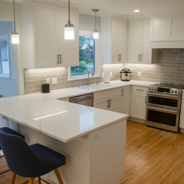
This St. Louis Park Minnesota home was built in 1938, with several remodeling updates and the addition of a four-season porch over the years. But the kitchen looked dated with its dark Oak cabinets, and the appliances were tired. So, the owners chose to transform a smaller kitchen and dining room into an amazing living/entertaining space.
To open up the space the non-supporting wall that separated the kitchen and the dining room was removed. The new open design features a peninsula with seating for three, just right for casual dining and conversation. Extra-wide drawers below provide storage for those larger kitchen utensils.
New 1 ½ inch Red Oak flooring was installed and stained to exactly match and connect the existing living room and dining room. White flat-panel upper and lower kitchen cabinets and drawers feature brushed nickel hardware. The white double bay undermount kitchen sink features Kohler faucets with detachable spray head.
New stainless-steel appliances are featured throughout, and the custom wood-paneled clad stove hood is vented outdoors.
But maybe the most interesting part of this kitchen’s appeal are the bright “Calacatta Plazo” Quartz countertops. This choice of this Quartz shows subtle gray veins.
Finding Subway tile in the color of that gray vein was challenging. But it was worth it. “Greige” colored Subway tile was chosen for the backsplash. White grout and the horizontal orientation of the tile makes the room feel larger, making this backsplash the perfect complement to this kitchen design.
With all this white the kitchen is already pretty bright. But the perfect lighting combination brings it all together. Pendant lights above the sink and peninsula offer just the right design touch. Bright, under-cabinet lights make meal preparation easy. The in-ceiling and pendant lights are on dimmers – something Rick suggests for all his remodeling projects. Lights and music for meal preparation are remotely controlled using Apple’s assistant, Siri.
The result: A bright white kitchen that opens up the room and blends perfectly with the existing design.

 Renovisions
This kitchen had not been renovated since the salt box colonial house was built in the 1960’s. The new owner felt it was time for a complete refresh with some traditional details and adding in the owner’s contemporary tastes.
At initial observation, we determined the house had good bones; including high ceilings and abundant natural light from a double-hung window and three skylights overhead recently installed by our client. Mixing the homeowners desires required the skillful eyes of Cathy and Ed from Renovisions. The original kitchen had dark stained, worn cabinets, in-adequate lighting and a non-functional coat closet off the kitchen space. In order to achieve a true transitional look, Renovisions incorporated classic details with subtle, simple and cleaner line touches. For example, the backsplash mix of honed and polished 2” x 3” stone-look subway tile is outlined in brushed stainless steel strips creating an edgy feel, especially at the niche above the range. Removing the existing wall that shared the coat closet opened up the kitchen to allow adding an island for seating and entertaining guests.
We chose natural maple, shaker style flat panel cabinetry with longer stainless steel pulls instead of knobs, keeping in line with the clients desire for a sleeker design. This kitchen had to be gutted to accommodate the new layout featuring an island with pull-out trash and recycling and deeper drawers for utensils. Spatial constraints were top of mind and incorporating a convection microwave above the slide-in range made the most sense. Our client was thrilled with the ability to bake, broil and microwave from GE’s advantium oven – how convenient! A custom pull-out cabinet was built for his extensive array of spices and oils. The sink base cabinet provides plenty of area for the large rectangular stainless steel sink, single-lever multi-sprayer faucet and matching filtered water dispenser faucet. The natural, yet sleek green soapstone countertop with distinct white veining created a dynamic visual and principal focal point for the now open space.
While oak wood flooring existed in the entire first floor, as an added element of color and interest we installed multi-color slate-look porcelain tiles in the kitchen area. We also installed a fully programmable floor heating system for those chilly New England days. Overall, out client was thrilled with his Mission Transition.
 Pennsylvania Landscape & Nursery Association
u2014 ALE: Wayne Rain Garden
Pennsylvania Landscape & Nursery Association
u2014 ALE: Wayne Rain Garden
Terren Landscapes http://www.terrenlandscapes.com
2014 PLNA Awards for Landscape Excellence winner
Category: Residential Up to $15,000
Award Level: Gold
Project Description:
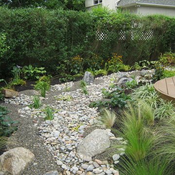
Our company was contracted by the client to provide a creative solution to an ongoing drainage problem. Their property is located within 30 feet of a local stream that collects storm water from the surrounding area. The nearby stream and high water table caused the lawn area at the side of their home to flood and to remain waterlogged for a few days after each storm. The client not only had difficulty growing plants in the existing conditions, but also had a problem with mosquitoes due to standing water.
Our goal was to design a self-contained, naturalistic rain garden that slowed storm water runoff, allowed for percolation, and promoted infiltration while permitting excess clean water to enter the nearby stream with diminished force. As designed, the rain garden allows the earth to slowly and more naturally
absorb excess storm water while filtering out toxins such as excess nitrogen and phosphorous which are frequently found in the landscape, therefore reducing the contaminants entering the stream.
A percolation test was conducted with criteria of absorbing a one-inch rainstorm within four hours without overflow. The one-inch storm calculation included an existing downspout from the home, which would be piped into the rain garden to reduce roof runoff. The first test failed due to a deep layer of high clay-content soil. Excavation continued until a layer of sandy loam was reached, the percolation test was repeated, and a successful test result was achieved. Next, the entire rain garden basin was excavated to the sandy loam layer and the soil amended with compost and sand to create a highly porous planting media.
Geotextile fabric was placed to help reduce migration of the surface stone into the soil and allow for minimal maintenance. Gravel, river stone and small boulders were carefully placed to achieve the look of a natural streambed.
A palette of mostly native plants with a few non-invasive ornamentals were chosen for their ability to survive in extreme conditions ranging from floods to drought and were placed according to their specific preferences.
Wetland plants were chosen for the lowest portion of the rain garden as that area remains saturated for longer periods of time, with a Chionanthus virginicus as a focal point surrounded by irises and ferns at the lowest depth.
Plants tolerant of drier conditions were chosen for the upper edges of the garden. The beautiful colors of Monarda, Ligularia, Eupatorium, Solidago, Chelone, and Rudbeckia were scattered within the upper edge, while movement and softness were incorporated by use of the graceful Nassella that lines the border. Finally, winter interest was provided with a backdrop of Cornus sericea.
As built, this small rain garden creates tremendous impact by decreasing the amount of storm water runoff not only on our client's property, but also in the neighboring stream. It serves as a means of slowing the water and providing an area for infiltration back into the earth. The plants provide a habitat for birds, butterflies, and insects, working in harmony with nature and providing beautiful visual interest year-round.
Photo Credit:
Lisa C. Falls
 Michael Nash Design, Build & Homes
When the homeowners purchased this traditional colonial in Vienna, Virginia, they were already planning on making some serious changes. The home’s original floor plan was boxy and closed in, making traffic flow from one room to the next virtually non-existent. Additionally, the existing décor left a lot to be desired. Their vision was to open up the layout and create a more contemporary look using lots of light, soft colors and high end materials.
They decided to add a two-story addition to the back of the home’s existing breakfast room and the small upstairs bedroom above it. The old breakfast area was too small for their daily meals and their teenage son needed more space in his bedroom. They also decided to add a sunroom/family room to the left side of their old family room. This new room offers a vaulted ceiling with four skylights and lots of windows with a better view of the side and backyard.
To create a more open floor plan, the team at Michael Nash Design, Build & Homes removed the load bearing wall between the kitchen and family room and installed a large beam to handle the second floor load. Not only did this open up the space, but it allowed for the addition of a breakfast bar.
The right side bearing wall of the old family room was also removed and replaced with structural beams. This action created a continuous flow between the new sunroom and old family room. Separated by a double-sided stone fireplace, this new sunroom is connected to a new outside sun deck built using a maintenance-free decking material. The old family room with new lighting now serves as a casual seating area. It also features an eight-foot long built-in desk.
The newly updated kitchen features granite countertops with matching tile backsplash, professional-quality appliances, a porcelain tile floor and custom cabinets, including a large pantry. The new breakfast room is more spacious and gets daylight from three different angles.
Upstairs, a new 12’ x 20’ bedroom is a great place for this teenage football fan to hang out. It provides significantly more closet space than the old room and lets in more sunlight as well.
The old laundry room was converted to a new mudroom with locker style cabinetry and a place for kids to store their bag packs. New plumbing and electrical were implemented in a new closet in an upper hallway to facilitate the new washer and dryer.
In this remodel, form and function have come together in an open concept design that meets the needs of the entire family.
56