
Search results for "Non existent" in Home Design Ideas

 Michael Nash Design, Build & Homes
When the homeowners purchased this traditional colonial in Vienna, Virginia, they were already planning on making some serious changes. The home’s original floor plan was boxy and closed in, making traffic flow from one room to the next virtually non-existent. Additionally, the existing décor left a lot to be desired. Their vision was to open up the layout and create a more contemporary look using lots of light, soft colors and high end materials.
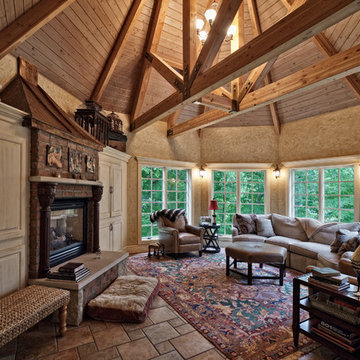
They decided to add a two-story addition to the back of the home’s existing breakfast room and the small upstairs bedroom above it. The old breakfast area was too small for their daily meals and their teenage son needed more space in his bedroom. They also decided to add a sunroom/family room to the left side of their old family room. This new room offers a vaulted ceiling with four skylights and lots of windows with a better view of the side and backyard.
To create a more open floor plan, the team at Michael Nash Design, Build & Homes removed the load bearing wall between the kitchen and family room and installed a large beam to handle the second floor load. Not only did this open up the space, but it allowed for the addition of a breakfast bar.
The right side bearing wall of the old family room was also removed and replaced with structural beams. This action created a continuous flow between the new sunroom and old family room. Separated by a double-sided stone fireplace, this new sunroom is connected to a new outside sun deck built using a maintenance-free decking material. The old family room with new lighting now serves as a casual seating area. It also features an eight-foot long built-in desk.
The newly updated kitchen features granite countertops with matching tile backsplash, professional-quality appliances, a porcelain tile floor and custom cabinets, including a large pantry. The new breakfast room is more spacious and gets daylight from three different angles.
Upstairs, a new 12’ x 20’ bedroom is a great place for this teenage football fan to hang out. It provides significantly more closet space than the old room and lets in more sunlight as well.
The old laundry room was converted to a new mudroom with locker style cabinetry and a place for kids to store their bag packs. New plumbing and electrical were implemented in a new closet in an upper hallway to facilitate the new washer and dryer.
In this remodel, form and function have come together in an open concept design that meets the needs of the entire family.

 Progressive Design Build
Challenge:
When our clients decided to do a major renovation on their home, they were looking for a more modern, transitional design with additional cabinetry for storage, new appliances and hardwood flooring. They also wanted to create an open, more cohesive kitchen/dining/living area.
The existing kitchen had dated finishes, a non-functional layout and was closed off from the living area by a large partition wall.
Solution:
To ensure a smooth renovation process, a lot of time and effort went into the planning phase.
The existing hardwood floors throughout the home were removed in certain areas and laced in with new material. Once installed, all floors were sanded and multi-coated with tint and sealer to achieve a weathered look. All rooms were also repainted to complement the newly remodeled kitchen/dining/living area and the refinished wood floors.
The kitchen was modernized and opened up to give the family a more functional living space. It was designed with white Dura Supreme cabinetry and Weathered Oak finished floors, creating a sophisticated contrast and an open, airy feel. By adding a large center kitchen island we created a comfortable sitting area for people to gather while the family entertained or cooked. The refrigerator was disguised using custom cabinet appliance panels, effectively integrating it with the cabinetry wall for a unified look.
In the master bathroom, Progressive Design Build added a curbless, walk-in shower with a half-inch clear glass partition, separating it from the new undermount tub and Quartz tub deck. White Dura Supreme cabinetry was paired with Quartz countertops, and two towers were added for additional storage. A honed marble accent band was used throughout the room to tie it all together.
Results:
The clients were very pleased with the new layout of the kitchen/dining/living area and the master bathroom, particularly all of the final finishes that completed the look and feel they were looking for.

 Barbara Wilson Landscape Architect, LLC
New pool patio set on the existing steep slope in the backyard. Custom cable railings surround the pool area set on top of the concrete block retaining wall. Patio space for dining and bbq with chairs arranged for optimum views to the adjacent dense woods.
Find the right local pro for your project
 Aleto Construction Group
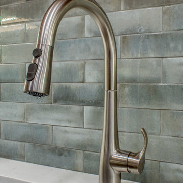
After building a home in North Carolina and using their smaller St. Louis Home when they were in town our clients decided to move to St. Louis permanently and contacted us to completely gut their existing non-functional kitchen into something that works for their storage and cooking needs. Functionality was top of mind as both homeowners are exquisite chefs. They needed room to store all their cooking essentials in easy to access locations, they wanted to open the kitchen up by removing a peninsula that shrunk the room and left space for only one cook at a time. They also wanted to brighten and lighten the finishes. The kitchen felt heavy with black countertops, dark floors and lighting that was subpar. We completely gutted the kitchen by moving the location of the sink and dishwasher from the peninsula, putting cabinetry along the two main walls in the kitchen. Cabinets were replaced with thoughtfully planned out drawers for easy access and convenient pantry cabinets with pull out shelves. The cabinets were taken to the ceiling to take advantage of extra space for storage as well as making the room feel taller. White countertops and well-placed lighting throughout the kitchen and under the cabinets brighten the room while the green handmade tiles bring dimension and interest that compliment the earth tones of the cabinetry.
 Aleto Construction Group
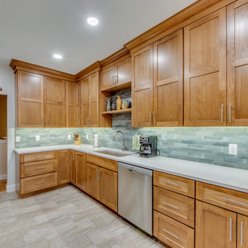
After building a home in North Carolina and using their smaller St. Louis Home when they were in town our clients decided to move to St. Louis permanently and contacted us to completely gut their existing non-functional kitchen into something that works for their storage and cooking needs. Functionality was top of mind as both homeowners are exquisite chefs. They needed room to store all their cooking essentials in easy to access locations, they wanted to open the kitchen up by removing a peninsula that shrunk the room and left space for only one cook at a time. They also wanted to brighten and lighten the finishes. The kitchen felt heavy with black countertops, dark floors and lighting that was subpar. We completely gutted the kitchen by moving the location of the sink and dishwasher from the peninsula, putting cabinetry along the two main walls in the kitchen. Cabinets were replaced with thoughtfully planned out drawers for easy access and convenient pantry cabinets with pull out shelves. The cabinets were taken to the ceiling to take advantage of extra space for storage as well as making the room feel taller. White countertops and well-placed lighting throughout the kitchen and under the cabinets brighten the room while the green handmade tiles bring dimension and interest that compliment the earth tones of the cabinetry.

 Woodling Landscape Design
This stunning home is located just above the beach in the desirable Rio Del Mar neighborhood in Aptos. My client poured her soul into the remodel which took the home down to studs. She has impeccable, contemporary taste and the home is a piece of art. We needed exquisite landscaping to tie the outside to the inside. Deeply contrasting and textural foliage-based design, copper gutters, and gorgeous light sconces now set off this contemporary gem. For the steep back hillside, we opted to do a hillside restoration and chose plants that existed in coastal terrace ecosystem prior to development. We removed tons of invasive iceplant and the whole hillside now buzzing with hummingbirds and pollinators, in addition to framing the ocean view with an undulating tapestry of plants. You can actually see spouting whales from the deck!

 In Detail Interiors
Colorful and rich style
When a repeat client shows up on your doorstep with his third home to furnish and wants to start from scratch and go really bold, you just embrace him, scoot him right up to the resource room, and don’t ask questions! I mean, who does not love a client that embraces velvet, leather, silk and wallcoverings?
This lush, vibrant lounge space was all created from the want to really deep dive into something different, eclectic and more traveled. The original small, narrow, dimly lit room totally delivered on helping accomplish that mood. Mixing a little of that Ming dynasty-inspired strawberry red with a deep chocolate mohair on the sectional and cladding the room in a soft, amethyst woven wallcovering. We loved the interplay and “non-matchiness” that this space embraced.
Lighting and art were both about telling a story in this room – accenting conversational opportunities and an almost gallery-esque feel. Designating a more dynamic and unusual, sculptural feel – from the harder lines of the statement floor lamp in the living room across to the sprawling, slightly modern bloom of the dining area fixture.
Jewel of a space
The area rug had to ground the already bold furniture and lend itself to the darker wood floors, and a dusky green wool proved the ticket. We loved the almost pixelated pattern the hand-knotted wool lent to the overall design. A little hint of oxblood, chocolate and blue picked up in accents elsewhere, but the tone of almost jade really caught us about this piece.
Not enough can be said about the accent of a dining space either (which in terms of space planning was the only way to balance this long, narrow “hallway” of a room off the kitchen). Citron velvet on the low-profile chairs left the space feeling open, but fun for games and cocktail parties. Plus, the cerused wood dining table was a great complement – offering depth without a conflict to the existing flooring or nearby sectional.
Being able to view this space as a whole was very important to us! From the selection of sconces carried throughout (that wonky placement was existing and with so little opportunity to add cans we had to play up the new fixtures in a way that make them feel purposeful and desirable.), to the balance of color and temperature in each furniture grouping. Sometimes working floor to ceiling in an existing space can pose a lot of unique challenges when it comes to furnishing projects. However, we loved that the client embraced our drive to really punch up the visual feel of this living/dining combo. Also, we know the enjoyment he gets from the finished product is a testament to hunting for the right pieces, designing with unusual and luxe fabric combinations, and managing the inclusion of budget-friendly surprises that always balance a job well done.
What the client says
“From the moment that Cheryl arrived, I felt that she was definitely the designer that I needed to help facilitate & execute my vision for the space. I’m not the “cookie cutter” type, and I immediately realized that Cheryl had a knack for envisioning ideas that were unique, yet tasteful, timeless, and sophisticated.”
From its beginnings as a plain Jane envelope, this combination living/dining space becomes a study in texture and color!
Sponsored
Columbus, OH

Structural Remodeling
Franklin County's Heavy Timber Specialists | Best of Houzz 2020!

 Renovisions
This kitchen had not been renovated since the salt box colonial house was built in the 1960’s. The new owner felt it was time for a complete refresh with some traditional details and adding in the owner’s contemporary tastes.
At initial observation, we determined the house had good bones; including high ceilings and abundant natural light from a double-hung window and three skylights overhead recently installed by our client. Mixing the homeowners desires required the skillful eyes of Cathy and Ed from Renovisions. The original kitchen had dark stained, worn cabinets, in-adequate lighting and a non-functional coat closet off the kitchen space. In order to achieve a true transitional look, Renovisions incorporated classic details with subtle, simple and cleaner line touches. For example, the backsplash mix of honed and polished 2” x 3” stone-look subway tile is outlined in brushed stainless steel strips creating an edgy feel, especially at the niche above the range. Removing the existing wall that shared the coat closet opened up the kitchen to allow adding an island for seating and entertaining guests.
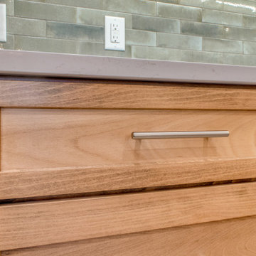
We chose natural maple, shaker style flat panel cabinetry with longer stainless steel pulls instead of knobs, keeping in line with the clients desire for a sleeker design. This kitchen had to be gutted to accommodate the new layout featuring an island with pull-out trash and recycling and deeper drawers for utensils. Spatial constraints were top of mind and incorporating a convection microwave above the slide-in range made the most sense. Our client was thrilled with the ability to bake, broil and microwave from GE’s advantium oven – how convenient! A custom pull-out cabinet was built for his extensive array of spices and oils. The sink base cabinet provides plenty of area for the large rectangular stainless steel sink, single-lever multi-sprayer faucet and matching filtered water dispenser faucet. The natural, yet sleek green soapstone countertop with distinct white veining created a dynamic visual and principal focal point for the now open space.
While oak wood flooring existed in the entire first floor, as an added element of color and interest we installed multi-color slate-look porcelain tiles in the kitchen area. We also installed a fully programmable floor heating system for those chilly New England days. Overall, out client was thrilled with his Mission Transition.
 Michael Nash Design, Build & Homes
When the homeowners purchased this traditional colonial in Vienna, Virginia, they were already planning on making some serious changes. The home’s original floor plan was boxy and closed in, making traffic flow from one room to the next virtually non-existent. Additionally, the existing décor left a lot to be desired. Their vision was to open up the layout and create a more contemporary look using lots of light, soft colors and high end materials.
They decided to add a two-story addition to the back of the home’s existing breakfast room and the small upstairs bedroom above it. The old breakfast area was too small for their daily meals and their teenage son needed more space in his bedroom. They also decided to add a sunroom/family room to the left side of their old family room. This new room offers a vaulted ceiling with four skylights and lots of windows with a better view of the side and backyard.
To create a more open floor plan, the team at Michael Nash Design, Build & Homes removed the load bearing wall between the kitchen and family room and installed a large beam to handle the second floor load. Not only did this open up the space, but it allowed for the addition of a breakfast bar.
The right side bearing wall of the old family room was also removed and replaced with structural beams. This action created a continuous flow between the new sunroom and old family room. Separated by a double-sided stone fireplace, this new sunroom is connected to a new outside sun deck built using a maintenance-free decking material. The old family room with new lighting now serves as a casual seating area. It also features an eight-foot long built-in desk.
The newly updated kitchen features granite countertops with matching tile backsplash, professional-quality appliances, a porcelain tile floor and custom cabinets, including a large pantry. The new breakfast room is more spacious and gets daylight from three different angles.
Upstairs, a new 12’ x 20’ bedroom is a great place for this teenage football fan to hang out. It provides significantly more closet space than the old room and lets in more sunlight as well.
The old laundry room was converted to a new mudroom with locker style cabinetry and a place for kids to store their bag packs. New plumbing and electrical were implemented in a new closet in an upper hallway to facilitate the new washer and dryer.
In this remodel, form and function have come together in an open concept design that meets the needs of the entire family.

 Susan Brook Interiors
The clients called me in to help with finishing details on their kitchen remodel. They had already decided to do a lot of the work themselves and also decided on a cabinet company. I came into the project early enough to see a better layout to the original kitchen, then i was able to give my clients better options to choose from on the flow and aesthetics of the space. They already had an existing island but no sink, the refrigerator was an awkward walk away from the work space. We panned with everything moving and a much better flow was created, more storage than needed..that's always a good problem to have! Multiple storage drawers under the range, roll out trash, appliance garage for the coffee maker and much more. This was my first time working with non custom cabinets, it turned out wonderful with all the bells and whistles a dream kitchen should have.
 AIA Pittsburgh
ARCHITECTURAL DETAIL + CRAFTSMANSHIP: Award of Excellence
PROJECT: Project RE_
CLIENT: Project RE_; Heinz Endowments; Colcom Foundation; Ford College Community Challenge; Autodesk
ARCHITECTURE FIRM: Urban Design Build Studio
ENGINEERS: Merit Electrical Group, Inc.; Iams Consulting, LLC; G.A. Mattern and Associates
CONTRACTORS: Urban Design Build Studio
PHOTOGRAPHER: Urban Design Build Studio
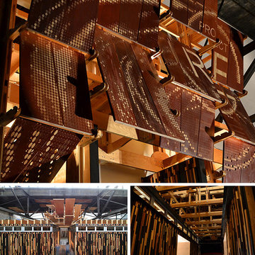
DESCRIPTION: Project RE_ is a collaborative education, job training, research, and pre-fabrication facility with a mission to reuse materials, rebuild communities, and restore lives, located in an existing warehouse currently home to several other non-profits focused on waste reduction. The building was designed for deconstruction and incorporates examples of material reuse, with each building element being a marketable product or strategy built by the partner organizations who use the space.
JURY COMMENTS: The jury was unclear as to how a building inside of another structure should be understood, but found many praiseworthy aspects including the attention to details, participation in the construction, and ability to disassemble and reassemble.
 Aleto Construction Group
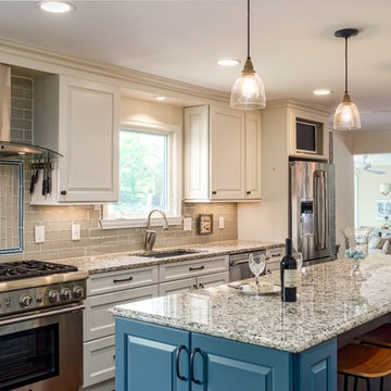
After building a home in North Carolina and using their smaller St. Louis Home when they were in town our clients decided to move to St. Louis permanently and contacted us to completely gut their existing non-functional kitchen into something that works for their storage and cooking needs. Functionality was top of mind as both homeowners are exquisite chefs. They needed room to store all their cooking essentials in easy to access locations, they wanted to open the kitchen up by removing a peninsula that shrunk the room and left space for only one cook at a time. They also wanted to brighten and lighten the finishes. The kitchen felt heavy with black countertops, dark floors and lighting that was subpar. We completely gutted the kitchen by moving the location of the sink and dishwasher from the peninsula, putting cabinetry along the two main walls in the kitchen. Cabinets were replaced with thoughtfully planned out drawers for easy access and convenient pantry cabinets with pull out shelves. The cabinets were taken to the ceiling to take advantage of extra space for storage as well as making the room feel taller. White countertops and well-placed lighting throughout the kitchen and under the cabinets brighten the room while the green handmade tiles bring dimension and interest that compliment the earth tones of the cabinetry.
 Michael Nash Design, Build & Homes
When the homeowners purchased this traditional colonial in Vienna, Virginia, they were already planning on making some serious changes. The home’s original floor plan was boxy and closed in, making traffic flow from one room to the next virtually non-existent. Additionally, the existing décor left a lot to be desired. Their vision was to open up the layout and create a more contemporary look using lots of light, soft colors and high end materials.
They decided to add a two-story addition to the back of the home’s existing breakfast room and the small upstairs bedroom above it. The old breakfast area was too small for their daily meals and their teenage son needed more space in his bedroom. They also decided to add a sunroom/family room to the left side of their old family room. This new room offers a vaulted ceiling with four skylights and lots of windows with a better view of the side and backyard.
To create a more open floor plan, the team at Michael Nash Design, Build & Homes removed the load bearing wall between the kitchen and family room and installed a large beam to handle the second floor load. Not only did this open up the space, but it allowed for the addition of a breakfast bar.
The right side bearing wall of the old family room was also removed and replaced with structural beams. This action created a continuous flow between the new sunroom and old family room. Separated by a double-sided stone fireplace, this new sunroom is connected to a new outside sun deck built using a maintenance-free decking material. The old family room with new lighting now serves as a casual seating area. It also features an eight-foot long built-in desk.
The newly updated kitchen features granite countertops with matching tile backsplash, professional-quality appliances, a porcelain tile floor and custom cabinets, including a large pantry. The new breakfast room is more spacious and gets daylight from three different angles.
Upstairs, a new 12’ x 20’ bedroom is a great place for this teenage football fan to hang out. It provides significantly more closet space than the old room and lets in more sunlight as well.
The old laundry room was converted to a new mudroom with locker style cabinetry and a place for kids to store their bag packs. New plumbing and electrical were implemented in a new closet in an upper hallway to facilitate the new washer and dryer.
In this remodel, form and function have come together in an open concept design that meets the needs of the entire family.
Sponsored
Columbus, OH

Trish Takacs Design
Award Winning & Highly Skilled Kitchen & Bath Designer in Columbus
 Susan Brook Interiors
The clients called me in to help with finishing details on their kitchen remodel. They had already decided to do a lot of the work themselves and also decided on a cabinet company. I came into the project early enough to see a better layout to the original kitchen, then i was able to give my clients better options to choose from on the flow and aesthetics of the space. They already had an existing island but no sink, the refrigerator was an awkward walk away from the work space. We panned with everything moving and a much better flow was created, more storage than needed..that's always a good problem to have! Multiple storage drawers under the range, roll out trash, appliance garage for the coffee maker and much more. This was my first time working with non custom cabinets, it turned out wonderful with all the bells and whistles a dream kitchen should have.
 Aleto Construction Group
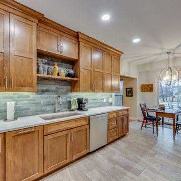
After building a home in North Carolina and using their smaller St. Louis Home when they were in town our clients decided to move to St. Louis permanently and contacted us to completely gut their existing non-functional kitchen into something that works for their storage and cooking needs. Functionality was top of mind as both homeowners are exquisite chefs. They needed room to store all their cooking essentials in easy to access locations, they wanted to open the kitchen up by removing a peninsula that shrunk the room and left space for only one cook at a time. They also wanted to brighten and lighten the finishes. The kitchen felt heavy with black countertops, dark floors and lighting that was subpar. We completely gutted the kitchen by moving the location of the sink and dishwasher from the peninsula, putting cabinetry along the two main walls in the kitchen. Cabinets were replaced with thoughtfully planned out drawers for easy access and convenient pantry cabinets with pull out shelves. The cabinets were taken to the ceiling to take advantage of extra space for storage as well as making the room feel taller. White countertops and well-placed lighting throughout the kitchen and under the cabinets brighten the room while the green handmade tiles bring dimension and interest that compliment the earth tones of the cabinetry.

 Jami Abbadessa
This young couple was ready to make some changes to their master bedroom. They already laid a great foundation for me: beautiful wall color, carpet and trim. We just needed to update their furnishings and make this space feel more like them. They requested a bedroom that was more classic than trendy and a space that feels relaxing and spa-like. I started with the big pieces. I know they liked the light, upholstered bed look, which is awesome because I get so many clients who shy away from this option for fear of it getting dirty. Next up were the case pieces: dresser, night stands, high boy. I know a lot of designers who favor designing a bedroom with non-matching sets, but in this case, I thought opting for matching nightstands and dressers was the most classic choice and will stand the test of time best. They also a requested an area for the wive to do her make up and hair separate from the bathroom with ample light. I found a vanity, replaced the matching stool with an accent chair in a grey ikat print and used a pair of existing lamps. Extra seating is provided at the end of the bed on a tufted grey bench. The inverted pleat drapes are custom made with black out lining. Accessories and wall art were added to infuse personality and warm up the space.
 Michael Nash Design, Build & Homes
When the homeowners purchased this traditional colonial in Vienna, Virginia, they were already planning on making some serious changes. The home’s original floor plan was boxy and closed in, making traffic flow from one room to the next virtually non-existent. Additionally, the existing décor left a lot to be desired. Their vision was to open up the layout and create a more contemporary look using lots of light, soft colors and high end materials.
They decided to add a two-story addition to the back of the home’s existing breakfast room and the small upstairs bedroom above it. The old breakfast area was too small for their daily meals and their teenage son needed more space in his bedroom. They also decided to add a sunroom/family room to the left side of their old family room. This new room offers a vaulted ceiling with four skylights and lots of windows with a better view of the side and backyard.
To create a more open floor plan, the team at Michael Nash Design, Build & Homes removed the load bearing wall between the kitchen and family room and installed a large beam to handle the second floor load. Not only did this open up the space, but it allowed for the addition of a breakfast bar.
The right side bearing wall of the old family room was also removed and replaced with structural beams. This action created a continuous flow between the new sunroom and old family room. Separated by a double-sided stone fireplace, this new sunroom is connected to a new outside sun deck built using a maintenance-free decking material. The old family room with new lighting now serves as a casual seating area. It also features an eight-foot long built-in desk.
The newly updated kitchen features granite countertops with matching tile backsplash, professional-quality appliances, a porcelain tile floor and custom cabinets, including a large pantry. The new breakfast room is more spacious and gets daylight from three different angles.
Upstairs, a new 12’ x 20’ bedroom is a great place for this teenage football fan to hang out. It provides significantly more closet space than the old room and lets in more sunlight as well.
The old laundry room was converted to a new mudroom with locker style cabinetry and a place for kids to store their bag packs. New plumbing and electrical were implemented in a new closet in an upper hallway to facilitate the new washer and dryer.
In this remodel, form and function have come together in an open concept design that meets the needs of the entire family.

 Cummings Architecture + Interiors
Eric Roth Photography
Eat-in kitchen - mid-sized farmhouse l-shaped light wood floor eat-in kitchen idea in Boston with white backsplash, a farmhouse sink, beaded inset cabinets, white cabinets, granite countertops, subway tile backsplash, stainless steel appliances, an island and black countertops
Eat-in kitchen - mid-sized farmhouse l-shaped light wood floor eat-in kitchen idea in Boston with white backsplash, a farmhouse sink, beaded inset cabinets, white cabinets, granite countertops, subway tile backsplash, stainless steel appliances, an island and black countertops
 Story Homes
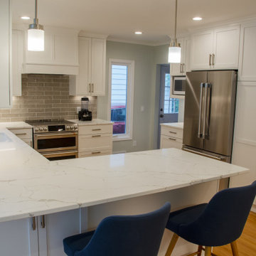
This St. Louis Park Minnesota home was built in 1938, with several remodeling updates and the addition of a four-season porch over the years. But the kitchen looked dated with its dark Oak cabinets, and the appliances were tired. So, the owners chose to transform a smaller kitchen and dining room into an amazing living/entertaining space.
To open up the space the non-supporting wall that separated the kitchen and the dining room was removed. The new open design features a peninsula with seating for three, just right for casual dining and conversation. Extra-wide drawers below provide storage for those larger kitchen utensils.
New 1 ½ inch Red Oak flooring was installed and stained to exactly match and connect the existing living room and dining room. White flat-panel upper and lower kitchen cabinets and drawers feature brushed nickel hardware. The white double bay undermount kitchen sink features Kohler faucets with detachable spray head.
New stainless-steel appliances are featured throughout, and the custom wood-paneled clad stove hood is vented outdoors.
But maybe the most interesting part of this kitchen’s appeal are the bright “Calacatta Plazo” Quartz countertops. This choice of this Quartz shows subtle gray veins.
Finding Subway tile in the color of that gray vein was challenging. But it was worth it. “Greige” colored Subway tile was chosen for the backsplash. White grout and the horizontal orientation of the tile makes the room feel larger, making this backsplash the perfect complement to this kitchen design.
With all this white the kitchen is already pretty bright. But the perfect lighting combination brings it all together. Pendant lights above the sink and peninsula offer just the right design touch. Bright, under-cabinet lights make meal preparation easy. The in-ceiling and pendant lights are on dimmers – something Rick suggests for all his remodeling projects. Lights and music for meal preparation are remotely controlled using Apple’s assistant, Siri.
The result: A bright white kitchen that opens up the room and blends perfectly with the existing design.
 Aleto Construction Group
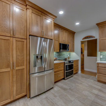
After building a home in North Carolina and using their smaller St. Louis Home when they were in town our clients decided to move to St. Louis permanently and contacted us to completely gut their existing non-functional kitchen into something that works for their storage and cooking needs. Functionality was top of mind as both homeowners are exquisite chefs. They needed room to store all their cooking essentials in easy to access locations, they wanted to open the kitchen up by removing a peninsula that shrunk the room and left space for only one cook at a time. They also wanted to brighten and lighten the finishes. The kitchen felt heavy with black countertops, dark floors and lighting that was subpar. We completely gutted the kitchen by moving the location of the sink and dishwasher from the peninsula, putting cabinetry along the two main walls in the kitchen. Cabinets were replaced with thoughtfully planned out drawers for easy access and convenient pantry cabinets with pull out shelves. The cabinets were taken to the ceiling to take advantage of extra space for storage as well as making the room feel taller. White countertops and well-placed lighting throughout the kitchen and under the cabinets brighten the room while the green handmade tiles bring dimension and interest that compliment the earth tones of the cabinetry.
57