
Search results for "Obstacles" in Home Design Ideas

 Edible Earth Resources
Our original client at this property (we now care for it on behalf of its second owner) desired a garden that would produce significant amounts of essential oils that he could process in his own copper still.
As significant amounts of herbs must be processed in order to produce essential oil, this site’s primary obstacle was its lack of space. We designed a dense and stacked landscape in order to produce as much as possible.
With sidewalk beds narrower than 3 feet and significant slope, it was critical that we build retaining walls and import large amounts of compost to the site. This site was completed in 14 working days.

 Gramophone
This project entailed updating a finished basement and boys' playroom that was underutilized and contained many design obstacles from lolly columns to mechanical equipment. The client wanted the space to blend with the eclectic old style of the rest of her home, and also wanted to incorporate a couple of existing custom millwork pieces. With three boys, all with varying interests from art to toy collections, the client needed this space to cater to their hobbies. Ultimately the clients received exactly what they wanted- a multifunctional space that all could enjoy that can only be defined as breathtaking.
Photography: Maryland Photography Inc.
 Edible Earth Resources
Our original client at this property (we now care for it on behalf of its second owner) desired a garden that would produce significant amounts of essential oils that he could process in his own copper still.
As significant amounts of herbs must be processed in order to produce essential oil, this site’s primary obstacle was its lack of space. We designed a dense and stacked landscape in order to produce as much as possible.
With sidewalk beds narrower than 3 feet and significant slope, it was critical that we build retaining walls and import large amounts of compost to the site. This site was completed in 14 working days.
Find the right local pro for your project
 Crickett Kinser
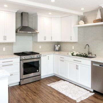
A small space that before, barely fit a single person cooking (let alone completely ineffective for entertaining) now transformed into a large, bright and open concept kitchen! This job was for a condo in Camarillo Springs and though it had its difficulty with hidden obstacles in the lowered ceiling and walls, ultimately my client got her dream kitchen and it really is so incredibly beautiful!
Design/Build: Kitchen Places, Ventura
PC: UpMarket Photo
 Gramophone
This project entailed updating a finished basement and boys' playroom that was underutilized and contained many design obstacles from lolly columns to mechanical equipment. The client wanted the space to blend with the eclectic old style of the rest of her home, and also wanted to incorporate a couple of existing custom millwork pieces. With three boys, all with varying interests from art to toy collections, the client needed this space to cater to their hobbies. Ultimately the clients received exactly what they wanted- a multifunctional space that all could enjoy that can only be defined as breathtaking.
Photography: Maryland Photography Inc.
 Gramophone
This project entailed updating a finished basement and boys' playroom that was underutilized and contained many design obstacles from lolly columns to mechanical equipment. The client wanted the space to blend with the eclectic old style of the rest of her home, and also wanted to incorporate a couple of existing custom millwork pieces. With three boys, all with varying interests from art to toy collections, the client needed this space to cater to their hobbies. Ultimately the clients received exactly what they wanted- a multifunctional space that all could enjoy that can only be defined as breathtaking.
Photography: Maryland Photography Inc.
 Gramophone
This project entailed updating a finished basement and boys' playroom that was underutilized and contained many design obstacles from lolly columns to mechanical equipment. The client wanted the space to blend with the eclectic old style of the rest of her home, and also wanted to incorporate a couple of existing custom millwork pieces. With three boys, all with varying interests from art to toy collections, the client needed this space to cater to their hobbies. Ultimately the clients received exactly what they wanted- a multifunctional space that all could enjoy that can only be defined as breathtaking.
Photography: Maryland Photography Inc.
 Great American Landscapes
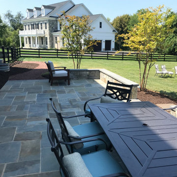
The owners of this Laytonsville, Maryland home wanted easy access to their backyard as well as a large outdoor entertaining area to host their friends and family.
To create a more natural and authentic look, we installed flagstone steps to match the patio's architecture. An entranceway was added with landings on basement levels so that it is easy for the owners to access without any obstacles in sight! Finally: An ornamental gravel patio and trees were installed as well as an ornamental gravel walkway leading to the fence gate. As far as challenges go we had to be mindful of the client's budget and design around various elevations.
All in all, the client was delighted when we delivered their backyard makeover. They can now let the dogs out from the back door and have a great space for entertaining guests!

 RAW Architecture + Design
The Williams Master Bathroom is one of our favorite bathroom renovations. We can’t get over how gorgeous this bathroom came out! How can you not walk into this bathroom and smile?! The bright teal subway tile totally transformed this space. Many obstacles on this project were avoided due to our well-experienced renovation team. We provided these clients with a custom vanity and linen closet, new shower, elevated tub platform with a freestanding tub, vertical running subway tile, and marble floor tile to brighten up this once peach builder’s grade bathroom.
 Water & Earth Landscape Design
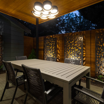
These are the outdeco panels that we use to cover obstacles. Here they cover the neighbors garage. With an outdoor lamp shining on them, it creates a nice shadow on the surface behind it.
 RAW Architecture + Design
The Williams Master Bathroom is one of our favorite bathroom renovations. We can’t get over how gorgeous this bathroom came out! How can you not walk into this bathroom and smile?! The bright teal subway tile totally transformed this space. Many obstacles on this project were avoided due to our well-experienced renovation team. We provided these clients with a custom vanity and linen closet, new shower, elevated tub platform with a freestanding tub, vertical running subway tile, and marble floor tile to brighten up this once peach builder’s grade bathroom.

 AquaTerra Outdoors
Elevation was the obstacle and motivation behind this grand pool setting. The multiple bodies of water at different elevations blend with the natural lake setting and appear to have always been present. Our design goal was to make it appear that the house was built around the pool. This was accomplished with massive engineering including over 60 piers, many beams, and a pump station all beneath the pool structure. The upper pool is a 9’ diving pool spilling over a 38’ long and 8’ tall water fall into the more shallow volleyball pool. More than 200 tons of stone were used on the pool alone. The pool and landscape design imitates the very best of nature’s environment, and is naturally inviting.
 Gramophone
This project entailed updating a finished basement and boys' playroom that was underutilized and contained many design obstacles from lolly columns to mechanical equipment. The client wanted the space to blend with the eclectic old style of the rest of her home, and also wanted to incorporate a couple of existing custom millwork pieces. With three boys, all with varying interests from art to toy collections, the client needed this space to cater to their hobbies. Ultimately the clients received exactly what they wanted- a multifunctional space that all could enjoy that can only be defined as breathtaking.
Photography: Maryland Photography Inc.

 Mobi Cabinets
With a large kitchen, the standard walk area around the kitchen is never hard to do. An easy flow around the island allows for the perfect function of the kitchen. The island no longer becomes an obstacle, but a piece of furniture in the perfect place.

 ForeverLawn, Inc.
The grand opening of Eagle Rock Dog Park in May of 2019 was long awaited by members of the Eagle Rock community. With so many members of the community being dog owners, they wanted a nice place where they could take their dogs for some exercise and play time. The city of Los Angeles appointed the talented Craig Raines as the architect on the project, and ForeverLawn Pacific Coast was called in to install K9Grass® synthetic turf. In just four days, the team installed 8,500 square feet of K9Grass Classic around several obstacles such as mounds, boulders, and a fallen tree. K9Grass Classic is a durable, low-maintenance product that’s ideal for a dog park. Now the city won’t have to worry about the park becoming smelly and unsightly or the dogs digging up holes.
 ForeverLawn, Inc.
The grand opening of Eagle Rock Dog Park in May of 2019 was long awaited by members of the Eagle Rock community. With so many members of the community being dog owners, they wanted a nice place where they could take their dogs for some exercise and play time. The city of Los Angeles appointed the talented Craig Raines as the architect on the project, and ForeverLawn Pacific Coast was called in to install K9Grass® synthetic turf. In just four days, the team installed 8,500 square feet of K9Grass Classic around several obstacles such as mounds, boulders, and a fallen tree. K9Grass Classic is a durable, low-maintenance product that’s ideal for a dog park. Now the city won’t have to worry about the park becoming smelly and unsightly or the dogs digging up holes.
 RAW Architecture + Design
The Williams Master Bathroom is one of our favorite bathroom renovations. We can’t get over how gorgeous this bathroom came out! How can you not walk into this bathroom and smile?! The bright teal subway tile totally transformed this space. Many obstacles on this project were avoided due to our well-experienced renovation team. We provided these clients with a custom vanity and linen closet, new shower, elevated tub platform with a freestanding tub, vertical running subway tile, and marble floor tile to brighten up this once peach builder’s grade bathroom.

 BasementByDesign
This guest's view from the ‘porch-style’ swing bench seating overlooks the distinct basement areas, seamlessly brought together by espresso stained wood, rustic lanterns, walnut flooring and comfortably carpeting. The soffits overcome beam and utility obstacles to maximize height, eliminating the claustrophobic feel of many basements.
 DIY Splashbacks
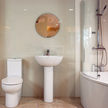
Glass is the perfect alternative to tiles. Modern, easy clean and completely customisable it has many advantages. It is possible to choose any colour or design, creating something completely unique.
The versatility of glass means that it can be shaped around any obstacle, including bathroom fittings. Note how the glass is shaped around the shower fittings!
At DIY Splashbacks we can create bespoke glass products in any size, shape, colour, pattern or image. It's even possible for clients to provide their own image, and we can digitally print on to it. Whatever your inspiration is, we can make it.
Visit our website to discover more.
© glasssplashbacks.com
 AquaTerra Outdoors
Elevation was the obstacle and motivation behind this grand pool setting. The multiple bodies of water at different elevations blend with the natural lake setting and appear to have always been present. Our design goal was to make it appear that the house was built around the pool. This was accomplished with massive engineering including over 60 piers, many beams, and a pump station all beneath the pool structure. The upper pool is a 9’ diving pool spilling over a 38’ long and 8’ tall water fall into the more shallow volleyball pool. More than 200 tons of stone were used on the pool alone. The pool and landscape design imitates the very best of nature’s environment, and is naturally inviting.
23