
Search results for "Old fashioned techniques" in Home Design Ideas
 KHB Interiors
We love the art of rePURPOSING and reLOVING antiques and vintage furniture.
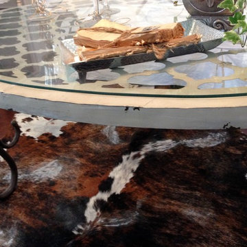
This vintage iron work was sitting in an estate sale, ugly and unloved. At KHB Interiors we painted and repurposed it into a top for a custom made coffee table.
We have used different techniques and finishes to create the perfect style and finish to enhance our clients' decor.
Techniques & Services Include:
Silver, Gold and Pewter Metallic Finishes,
Chalk Painting,
Adding Appliques,
Enhancing or Replacing Hardware,
Waxing/ Acrylic to add Depth and to Seal for a Long Life.
We can completely transform and enhance the beauty of your own furniture or we can search for that perfect project piece to rePURPOSE for you.
We have many ideas and techniques so hold onto that treasured family heirloom and let's reSTYLE it for you.
KHB Interiors -
Award Winning Luxury Interior Design Specializing in Creating UNIQUE Homes and Spaces for Clients in Old Metairie, Lakeview, Uptown and all of New Orleans.
We are one of the only interior design firms specializing in marrying the old historic elements with new transitional pieces. Blending your antiques with new pieces will give you a UNIQUE home that will make a lasting statement.
 Elegant Home Fashions
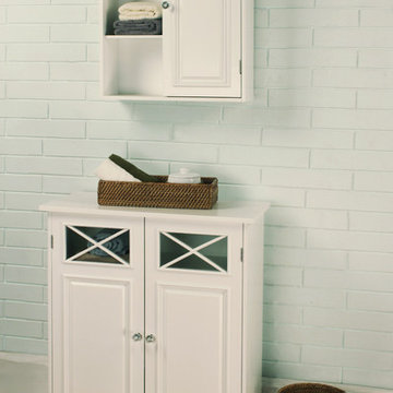
The Dawson Cabinet with One Door and Shelves from Elegant Home Fashions comes in in a white finish. This wall cabinet blends old-world and contemporary styling for a charming look that complements any bathroom. The cabinet design offers ample storage. The cabinet features one adjustable and two fixed open shelves that are ideal for storing items of different sizes. Pair with the Dawson Floor Cabinet. Featuring Two Doors from Elegant Home Fashions - comes in a white finish. This floor cabinet blends old-world and contemporary styling for a charming look that complements any bathroom. The cabinet design offers ample storage. The cabinet features one fixed and one adjustable shelf that are ideal for storing items of different sizes.
 AIBD - American Institute of Building Design
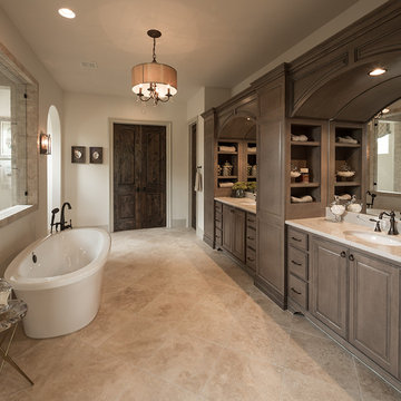
The appeal of this Spanish Colonial home starts at the front elevation with clean lines and elegant simplicity and continues to the interior with white-washed walls adorned in old world decor. In true hacienda form, the central focus of this home is the 2-story volume of the Kitchen-Dining-Living rooms. From the moment of arrival, we are treated with an expansive view past the catwalk to the large entertaining space with expansive full height windows at the rear. The wood ceiling beams, hardwood floors, and swooped fireplace walls are reminiscent of old world Spanish or Andalusian architecture.
An ARDA for Model Home Design goes to
Southwest Design Studio, Inc.
Designers: Stephen Shively with partners in building
From: Bee Cave, Texas
Find the right local pro for your project
 Staging Concepts & Designs, LLC
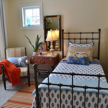
Nostalgic style bedroom, with old fashioned iron bed, and side table consisting of a vintage suitcase.
Mid-sized beach style guest carpeted and gray floor bedroom photo in Boston with beige walls and no fireplace
Mid-sized beach style guest carpeted and gray floor bedroom photo in Boston with beige walls and no fireplace
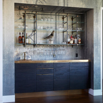
 Amuneal Manufacturing Corp.
Amuneal’s kitchens and bars bring unexpected materials and finishes to create truly special installations. This bar uses the old-world technique of hand-burning wood to create a dynamic finish that highlights the organic nature of the raw materials. The charred pine door and drawer faces are juxtaposed with crisp machined hardware and a hand-patinated bronze top to create a look that feels both contemporary and timeless. The 3-Bay Collector’s Shelving unit in gunmetal and bronze is the perfect match to the humble complexity of this unit.
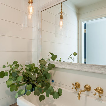
 Lori Dennis, ASID, LEED AP
Bathroom - small cottage white tile limestone floor bathroom idea in Los Angeles with open cabinets, medium tone wood cabinets, white walls, a vessel sink, wood countertops and brown countertops
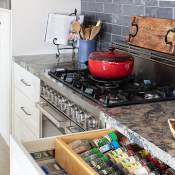
 Twelve Stones Designs, LLC
The owners of this kitchen had spent the money to upgrade the finishes in their kitchen upon building the home 12 years ago, but after living in the space for several years they realized how nonfunctional the layout really was. The (then) two preschool aged children had grown into busy, hungry teenagers with many friends who also liked to hang out at the house. So the family needed a more functional kitchen with better traffic flow, space for daily activities revolving around the kitchen at different times of day, and a kitchen that could accommodate cooking for and serving large groups. Furthermore, the dark, traditional finishes no longer reflected the homeowners’ style. They requested a brighter, more relaxed, coastal style that reflected their love of the seaside cities they like to visit.
Originally, the kitchen was U-shaped with a narrow island in the middle. The island created narrow aisles that bottle-necked at the dishwasher, refrigerator, and cooktop areas. There was a pass-through from the foyer into the kitchen, but the owners never liked that the pass-through was also located so close to the powder room. The awkward proximity was unappealing and made guests feel uncomfortable.
The kitchen’s storage was made up of lots of narrow cabinets, apothecary drawers, clipped corner units, and very few drawers. It lacked useful storage for the larger items the family used on a daily basis. And the kitchen’s only pantry was small closet that had only builder-grade, narrow shelving with no illumination to be able to see the contents inside.
Overall, the kitchen’s lighting plan was poorly executed. Only six recessed cans illuminated the entire kitchen and nook areas. The under cabinet lighting was not evenly distributed either. In fact, the builder had mis-placed the under cabinet lighting around the decorative pilasters which made for choppy, dark cubbies. Further, the builder didn’t include any lighting over the sink or the bar area, which meant whoever was doing the dishes was always in their own shadow. That, coupled with the steep overhang of the game room above made the bar area feel like a dim, cavernous space that wasn’t inviting or task oriented. The kitchen looked out into the main living space, but the raised bar and a narrow wall (which held the only large cabinet in the kitchen) created more of a barrier than a relationship to the living room or breakfast nook. In fact, one couldn’t even see the breakfast nook from the cooktop or sink areas due to its orientation. The raised bar top was too narrow to comfortably sit to either dine at or chat from due to the lack of knee space. The the homeowners confided that the kitchen felt more like a dark, dirty prison than place where the family, or their guests, wanted to gather and commune.
The clients' needs and desires were:
➢ to create a kitchen that would be a space the family loved to be in; to relate to the adjacent spaces all around, and to have better flow for entertaining large groups
➢ to remove the walls between the breakfast nook and living area and to be able to utilize the natural light from the windows in both those areas
➢ to incorporate a functional chopping block for prepping fresh food for home cooked meals, an island with a large sink and drain board, 2 pull out trash cans, and seating for at least the 2 teens to eat or do homework
➢ to design a kitchen and breakfast nook with an airy, coastal, relaxed vibe that blended with the rest of the house's coastal theme
➢ to integrate a layered lighting plan which would include ample general illumination, specific task lighting, decorative lighting, and lots of illuminated storage
➢ to design a kitchen with not only more storage for all the husband’s kitchen gadgets and collection of oils and spices, but smart storage, including a coffee/breakfast bar and a place to store and conceal the toaster oven and microwave
➢ to find a way to utilize the large open space between the kitchen, pantry area, and breakfast nook
Twelve Stones Designs achieved the owner's goals by:
➢ removing the walls between the kitchen and living room to allow the natural light to filter in from the adjacent rooms and to create a connection between the kitchen, nook, and living spaces for a sense of unity and communion
➢ removing the existing pantry and designing 3 large pantry style cabinets with LED tape lights and rollout drawers to house lots of kitchen appliances, gadgets, and tons of groceries. We also took the cabinets all the way up to the 9’ ceiling for additional storage for seasonal items and bulk storage.
➢ designing 2 islands - 1 with a gorgeous black walnut chopping block that houses a drawer for chopping and carving knives and a custom double pull out trash unit for point of use utilization - and 1 that houses the dishwasher, a large Blanco Gourmet sink with integrated drain board, woven baskets for fresh root vegetables and kitchen towels, plenty of drawer storage for kitchen items, and bar seating for up to 4 diners.
➢ closing off the space between the kitchen and the powder room to create a beautiful new private alcove for the powder room as well as adding some decorative storage. This also gave us space to include more tall storage near the new range for precision placement of the husband’s extensive oil and spice collection as well as a location for a combo-steam oven the wife wanted for baking and cooking healthy meals.
The project is enhanced functionally by:
➢ incorporated USB and standard receptacles for the kids’ laptops and phone charging in the large island
➢ designing the small island to include additional open shelving for items used on a daily basis such as a variety of bowls, plates, and colanders. This set up also works well for the husband who prefers to “plate” his dinners in restaurant-style fashion before presenting them to the table.
➢ the integration of specific storage units, such as double stacked cutlery drawers, a custom spice pull-out, a Kuerig coffee and tea pod drawer, and custom double stacked utensil drawers
➢ moving the refrigerator to the old oven location - this eliminated the bottle neck as well as created a better relationship to the eating table. It also utilizes the floor space between the pantry, nook, and kitchen
➢ creating a banquet style breakfast nook - this banquette seating not only doubles the amount of seating for large gatherings but it better utilizes the odd space between the kitchen and the previous nook area. It also helps to create a distinct pathway from the mudroom room through the pantry area, kitchen, nook, and living room.
➢ the coffee/breakfast bar area which includes the perfect location for the concealed microwave and toaster oven, convenient storage for the coffee pods and tea accoutrements. Roll-out drawers below also house the smoothie maker, hot water kettle, and a plethora of smoothie-making ingredients such as protein powders, smoothie additives, etc. Furthermore, the drawers below the Keurig house measuring utensil, cutlery, baking supplies and tupperware storage.
➢ incorporating lots of wide drawers and pullouts to accommodate large cookware.
➢ utilizing as much vertical space as possible by building storage to the ceiling which accommodates the family’s abundant amount of serving platters, baking sheets, bakeware, casserole dishes, and additional cutting boards.
The project is enhanced aesthetically by:
➢ new 5-piece Versailles pattern porcelain tile that now seamlessly joins the entire down stairs area together creating a bright, cohesiveness feeling instead of choppy separated spaces - it also adds a coastal feeling
➢ designing a cabinet to conceal the microwave and toaster oven
➢ the coastal influenced light fixtures over the nook table and island
➢ the sandy colors of the Langdon Cambria countertops. The swirling pattern and sparkling quartz pieces remind the homeowner of black-and-tan sandy beaches
➢ the striped banquet seating whose creamy white background and blue-green stripes were the inspiration for the cabinet and wall colors.
➢ All the interior doors were painted black to coordinate with the blacks and grays in the backsplash tile and countertop. This also adds a hint of tailored formality to an otherwise casual space.
➢ the use of WAC's Oculux small aperture LED units for the overhead lighting complimented with Diode LED strips for task lighting under the cabinets and inside the pantry and glass wall cabinets. All of the lighting applications are on separate dimmer switches.
Innovative uses of materials or construction methods by Realty Restoration LLC:
➢ Each 1-1/2” x 3” block of reclaimed end-grain black walnut that makes up the center island chopping block was hand milled and built in the shop. It was designed to look substantial and proportional to the surrounding elements, executed by creating the 4 inch tall top with a solid wood chamfered edge band.
➢ The metal doors on either side of the vent hood were also custom designed for this project and built in the Realty Restoration LLC shop. They are made 1x2, 11-gauge mild steel with ribbed glass. Weighing 60 lbs a piece, heavy duty cabinet hinges were added to support the weight of the door and keep them from sagging.
➢ Under-cabinet receptacles were added along the range wall in order to have a clean, uninterrupted backsplash.
Design obstacles to overcome:
➢ Because we were removing the demising walls between the kitchen and living room, we had to find a way to plumb and vent the new island. We did this by tunneling through the slab (the slab had post tension cables which prevented us from just trenching) to run a new wet vent through a nearby structural wall. We pulled the existing hot and cold lines between upper floor joists and ran them down the structural wall as well and up through a conduit in the tunnel.
➢ Since we were converting from wall overs to a gas range it allowed us to utilize the 220 feed for the wall ovens to provide a new sub panel for all the new kitchen circuits
➢ Due to framing deficiencies inherited from the original build there was a 1-1/2” differential in the floor-to-ceiling height over a 20 foot span; by utilizing the process of cutting and furring coupled with the crown moulding details on the cabinet elevations we were able to mask the problem and provide seamless transitions between the cabinet components.
Evidence of superior craftsmanship:
➢ uniquely designed, one-of-a-kind metal “X” end panels on the large island. The end panels were custom made in the Realty Restoration LLC shop and fitted to the exact dimensions of the island. The welding seams are completely indistinguishable - the posts look like they are cut from a single sheet of metal
➢ square metal posts on the small island were also custom made and designed to compliment and carry through the metal element s throughout the kitchen
➢ the beautiful, oversized end panels on the pantry cabinets which give the breakfast nook a tailored look
➢ integrating a large format 5 piece Versailles tile pattern to seamlessly flow from the existing spaces into the new kitchen space
➢ By constructing a custom cabinet that jogged around a corner we could not remodel (housing the entry way coat closet) we were able to camouflage the adjacent wall offset within the upper and lower cabinets. By designing around the existing jog in the structural walls we accomplished a few things: we were able to find the space to house, and hide, the microwave and toaster oven yet still have a clean cohesive appearance from the kitchen side. Additionally, the owners were able to keep their much needed coat closet and we didn’t have to increase the budget with unnecessary structural work.

Sponsored
Columbus, OH

Wannemacher Interiors
Customized Award-Winning Interior Design Solutions in Franklin Cnty OH
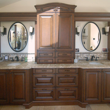
 San Luis Kitchen Co.
When the homeowners decided to move from San Francisco to the Central Coast, they were looking for a more relaxed lifestyle, a unique place to call their own, and an environment conducive to raising their young children. They found it all in San Luis Obispo. They had owned a house here in SLO for several years that they had used as a rental. As the homeowners own and run a contracting business and relocation was not impossible, they decided to move their business and make this SLO rental into their dream home.
As a rental, the house was in a bare-bones condition. The kitchen had old white cabinets, boring white tile counters, and a horrendous vinyl tile floor. Not only was the kitchen out-of-date and old-fashioned, it was also pretty worn out. The tiles were cracking and the grout was stained, the cabinet doors were sagging, and the appliances were conflicting (ie: you could not open the stove and dishwasher at the same time).
To top it all off, the kitchen was just too small for the custom home the homeowners wanted to create.
Thus enters San Luis Kitchen. At the beginning of their quest to remodel, the homeowners visited San Luis Kitchen’s showroom and fell in love with our Tuscan Grotto display. They sat down with our designers and together we worked out the scope of the project, the budget for cabinetry and how that fit into their overall budget, and then we worked on the new design for the home starting with the kitchen.
As the homeowners felt the kitchen was cramped, it was decided to expand by moving the window wall out onto the existing porch. Besides the extra space gained, moving the wall brought the kitchen window out from under the porch roof – increasing the natural light available in the space. (It really helps when the homeowner both understands building and can do his own contracting and construction.) A new arched window and stone clad wall now highlights the end of the kitchen. As we gained wall space, we were able to move the range and add a plaster hood, creating a focal nice focal point for the kitchen.
The other long wall now houses a Sub-Zero refrigerator and lots of counter workspace. Then we completed the kitchen by adding a wrap-around wet bar extending into the old dining space. We included a pull-out pantry unit with open shelves above it, wine cubbies, a cabinet for glassware recessed into the wall, under-counter refrigerator drawers, sink base and trash cabinet, along with a decorative bookcase cabinet and bar seating. Lots of function in this corner of the kitchen; a bar for entertaining and a snack station for the kids.
After the kitchen design was finalized and ordered, the homeowners turned their attention to the rest of the house. They asked San Luis Kitchen to help with their master suite, a guest bath, their home control center (essentially a deck tucked under the main staircase) and finally their laundry room. Here are the photos:
I wish I could show you the rest of the house. The homeowners took a poor rental house and turned it into a showpiece! They added custom concrete floors, unique fiber optic lighting, large picture windows, and much more. There is now an outdoor kitchen complete with pizza oven, an outdoor shower and exquisite garden. They added a dedicated dog run to the side yard for their pooches and a rooftop deck at the very peak. Such a fun house.
Wood-Mode Fine Custom Cabinetry, Barcelona
 Lori Dennis, ASID, LEED AP
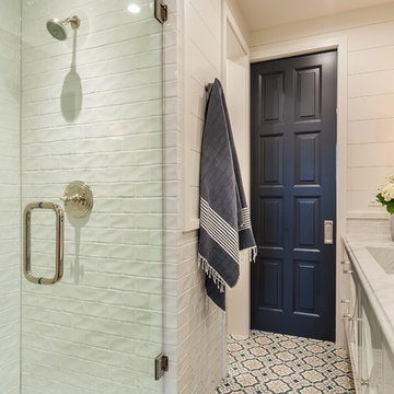
Alcove shower - mid-sized country 3/4 white tile and marble tile ceramic tile and white floor alcove shower idea in Los Angeles with furniture-like cabinets, white cabinets, white walls, an integrated sink, marble countertops, a hinged shower door and white countertops
 Robinson Hardwood & Homes LLC
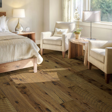
Hallmark Floors Real Reclaimed Look | ORGANIC 567 CHAMOMILE Engineered Hardwood remodeled bedroom
http://hallmarkfloors.com/hallmark-hardwoods/organic-567-engineered-collection/
Organic 567 Engineered Collection for floors, walls, and ceilings. A blending of natural, vintage materials into contemporary living environments, that complements the latest design trends. The Organic 567 Collection skillfully combines today’s fashions and colors with the naturally weathered visuals of reclaimed wood. Like our Organic Solid Collection, Organic 567 fuses modern production techniques with those of antiquity. Hallmark replicates authentic, real reclaimed visuals in Engineered Wood Floors with random widths and lengths. This unique reclaimed look took three years for our design team to develop and it has exceeded expectations! You will not find this look anywhere else. Exclusive to Hallmark Floors, the Organic Collections are paving the way with innovation and fashion.
Coated with our NuOil® finish to provide 21st century durability and simplicity of maintenance. The NuOil® finish adds one more layer to its contemporary style and provides a natural look that you will not find in any other flooring collection today. The Organic 567 Collection is the perfect choice for floors, walls and ceilings. This one of a kind style is exclusively available through Hallmark Floors.
 Voar Construction
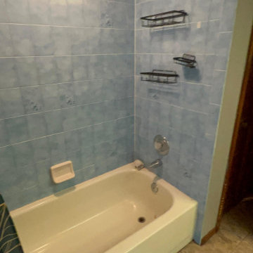
Before the Remodel – Guest / Pool Bathroom
This bathroom had a generous size, but its design made it feel much smaller than it really was. The slightly lowered ceiling with outdated lighting created a heavy atmosphere, while the dark tile and old bathtub made the space look even more dated. The fixtures were all old, and the dark cabinetry only added to the closed-in feel. Despite its potential, the bathroom looked tired, outdated, and far from welcoming.uncomfortably small and unpractical. The dark tile and color choices made the entire space feel heavy and closed-in, taking away any sense of comfort or luxury. Overall, it was an old-fashioned, poorly planned bathroom in need of a complete reimagining.
 Tile Doctor Ltd
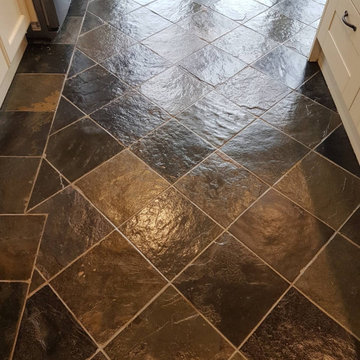
Pictured below is a Slate tiled kitchen floor that had been installed in the kitchen of a property in Harrogate around fifteen years prior. I discovered that the tiles had never been cleaned and resealed since installation and this explained why they were now looking dull and un-interesting. They had lost all character and it wasn’t until I started cleaning them that I realised the must be of the multicoloured Brazilian Slate variety.
As well as looking dull and unattractive, there was also some water damage to some tiles caused by a leak, this had resulted in some shaling and efflorescence staining. This had occurred some time ago and the floor had now dried out fully, so I was not expecting any further efflorescence issues going forward.
Brazil, I understand is the world’s 2nd biggest producer of Slate, it is also exceptionally durable and reasonably priced so its not surprising you see a lot of it over in the UK. Like any natural stone however it is porous and without a sealer to protect it and bring out those natural colours it soon ends up like the example on this pad.
I cleaned the floor with a strong dilution of Tile Doctor Pro-Clean using my usual method of spraying the cleaning solution onto the Slate and grout and then leaving it for a ten minutes to soak in and get to work breaking down the dirt and old sealers. Although I doubted there was much sealer left on the floor after all this time you need to be sure to remove all of it to get the best result. The floor was then scrubbed with a rotary floor buffer fitted with a black scrubbing pad, then after rinsing with water and extracting the soil I inspected the floor.
I detected there was still some sort of sealer present in some of less used parts of the floor, it was proving stubborn to remove so I suspect it may have been an old fashioned wax based product that was used. Not a problem though we Tile Doctors have a solution to every problem, so I spot treated the stubborn areas with Tile Doctor Wax Away to see if I was right. After scrubbing that in followed by another rinse and extraction with the wet vacuum I was pleased to see I was right and was happy all the old seal had now been removed. I gave the floor another rinse at the end of the day and dried it as much as possible with the wet vacuum, then left it to dry off fully overnight.
I came back the next day and checked the floor was dry with a damp meter. The readings were good, so I was able to crack on and seal the tiles using several coats of Tile Doctor Seal and Go. Each coat was applied leaving time to dry between each layer. This gave the floor a uniform appearance which disguised the damaged tiles. It will also help to stop more cracking and reduce the appearance of the efflorescence. The sealer really brought out the natural colours in the Brazilian Slate and the floor looked transformed.
I’m sure you will agree it was a vast improvement, certainly my client was very happy and couldn’t believe the difference I had managed to achieve. Before leaving I recommended, they should invest in some Tile Doctor Neutral Tile Cleaner which would ensure the newly applied seal was prematurely eroded away which is a problem with many of the stronger products you find in supermarkets.
Nigel Stoker
North West Yorkshire Tile Doctor
 San Luis Kitchen Co.
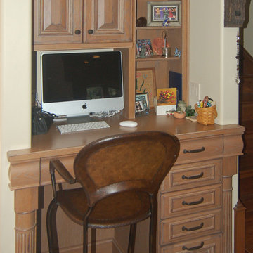
When the homeowners decided to move from San Francisco to the Central Coast, they were looking for a more relaxed lifestyle, a unique place to call their own, and an environment conducive to raising their young children. They found it all in San Luis Obispo. They had owned a house here in SLO for several years that they had used as a rental. As the homeowners own and run a contracting business and relocation was not impossible, they decided to move their business and make this SLO rental into their dream home.
As a rental, the house was in a bare-bones condition. The kitchen had old white cabinets, boring white tile counters, and a horrendous vinyl tile floor. Not only was the kitchen out-of-date and old-fashioned, it was also pretty worn out. The tiles were cracking and the grout was stained, the cabinet doors were sagging, and the appliances were conflicting (ie: you could not open the stove and dishwasher at the same time).
To top it all off, the kitchen was just too small for the custom home the homeowners wanted to create.
Thus enters San Luis Kitchen. At the beginning of their quest to remodel, the homeowners visited San Luis Kitchen’s showroom and fell in love with our Tuscan Grotto display. They sat down with our designers and together we worked out the scope of the project, the budget for cabinetry and how that fit into their overall budget, and then we worked on the new design for the home starting with the kitchen.
As the homeowners felt the kitchen was cramped, it was decided to expand by moving the window wall out onto the existing porch. Besides the extra space gained, moving the wall brought the kitchen window out from under the porch roof – increasing the natural light available in the space. (It really helps when the homeowner both understands building and can do his own contracting and construction.) A new arched window and stone clad wall now highlights the end of the kitchen. As we gained wall space, we were able to move the range and add a plaster hood, creating a focal nice focal point for the kitchen.
The other long wall now houses a Sub-Zero refrigerator and lots of counter workspace. Then we completed the kitchen by adding a wrap-around wet bar extending into the old dining space. We included a pull-out pantry unit with open shelves above it, wine cubbies, a cabinet for glassware recessed into the wall, under-counter refrigerator drawers, sink base and trash cabinet, along with a decorative bookcase cabinet and bar seating. Lots of function in this corner of the kitchen; a bar for entertaining and a snack station for the kids.
After the kitchen design was finalized and ordered, the homeowners turned their attention to the rest of the house. They asked San Luis Kitchen to help with their master suite, a guest bath, their home control center (essentially a deck tucked under the main staircase) and finally their laundry room. Here are the photos:
I wish I could show you the rest of the house. The homeowners took a poor rental house and turned it into a showpiece! They added custom concrete floors, unique fiber optic lighting, large picture windows, and much more. There is now an outdoor kitchen complete with pizza oven, an outdoor shower and exquisite garden. They added a dedicated dog run to the side yard for their pooches and a rooftop deck at the very peak. Such a fun house.
Wood-Mode Fine Custom Cabinetry, Barcelona

Sponsored
Columbus, OH
Wannemacher Interiors
Customized Award-Winning Interior Design Solutions in Franklin Cnty OH
 San Luis Kitchen Co.
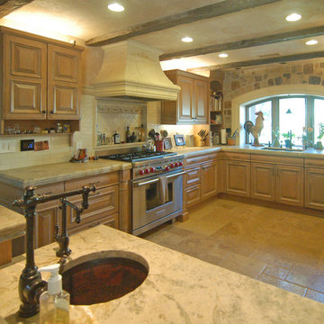
When the homeowners decided to move from San Francisco to the Central Coast, they were looking for a more relaxed lifestyle, a unique place to call their own, and an environment conducive to raising their young children. They found it all in San Luis Obispo. They had owned a house here in SLO for several years that they had used as a rental. As the homeowners own and run a contracting business and relocation was not impossible, they decided to move their business and make this SLO rental into their dream home.
As a rental, the house was in a bare-bones condition. The kitchen had old white cabinets, boring white tile counters, and a horrendous vinyl tile floor. Not only was the kitchen out-of-date and old-fashioned, it was also pretty worn out. The tiles were cracking and the grout was stained, the cabinet doors were sagging, and the appliances were conflicting (ie: you could not open the stove and dishwasher at the same time).
To top it all off, the kitchen was just too small for the custom home the homeowners wanted to create.
Thus enters San Luis Kitchen. At the beginning of their quest to remodel, the homeowners visited San Luis Kitchen’s showroom and fell in love with our Tuscan Grotto display. They sat down with our designers and together we worked out the scope of the project, the budget for cabinetry and how that fit into their overall budget, and then we worked on the new design for the home starting with the kitchen.
As the homeowners felt the kitchen was cramped, it was decided to expand by moving the window wall out onto the existing porch. Besides the extra space gained, moving the wall brought the kitchen window out from under the porch roof – increasing the natural light available in the space. (It really helps when the homeowner both understands building and can do his own contracting and construction.) A new arched window and stone clad wall now highlights the end of the kitchen. As we gained wall space, we were able to move the range and add a plaster hood, creating a focal nice focal point for the kitchen.
The other long wall now houses a Sub-Zero refrigerator and lots of counter workspace. Then we completed the kitchen by adding a wrap-around wet bar extending into the old dining space. We included a pull-out pantry unit with open shelves above it, wine cubbies, a cabinet for glassware recessed into the wall, under-counter refrigerator drawers, sink base and trash cabinet, along with a decorative bookcase cabinet and bar seating. Lots of function in this corner of the kitchen; a bar for entertaining and a snack station for the kids.
After the kitchen design was finalized and ordered, the homeowners turned their attention to the rest of the house. They asked San Luis Kitchen to help with their master suite, a guest bath, their home control center (essentially a deck tucked under the main staircase) and finally their laundry room. Here are the photos:
I wish I could show you the rest of the house. The homeowners took a poor rental house and turned it into a showpiece! They added custom concrete floors, unique fiber optic lighting, large picture windows, and much more. There is now an outdoor kitchen complete with pizza oven, an outdoor shower and exquisite garden. They added a dedicated dog run to the side yard for their pooches and a rooftop deck at the very peak. Such a fun house.
Wood-Mode Fine Custom Cabinetry, Barcelona

 Mogul Interior
 https://www.mogulinterior.com/collections/architecture-elements
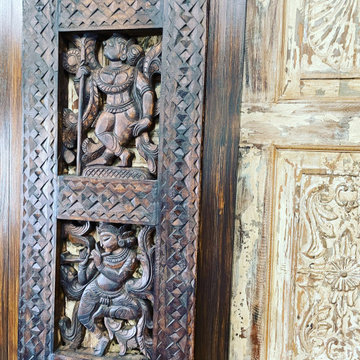
Vintage rustic old arches turn your kitchen mantel into a statement, the green foliage in brass planters draws attention to the hand carved detail and the natural washed patinas. Colorful textured tribal table runners will give your tables an elegant, vintage bohemian worldly panache that works well with a multitude of colors. Pick up an old planter and fill with gorgeous cottage garden plants or herbs.Vintage bowls and rustic brass urns used as a centerpiece overflowing with seasonal pumpkins, pines and flowering twigs bring in the old fashioned cottage charm
 San Luis Kitchen Co.
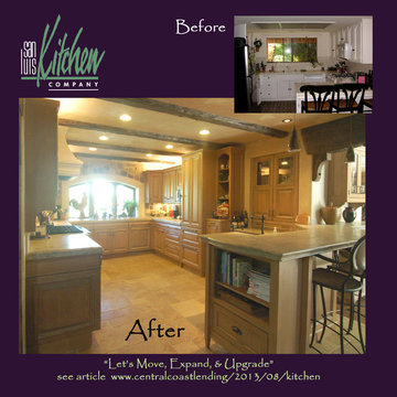
Tuscan design using a burnished & glazed finish on oak cabinets by Wood-Mode. The columns either side of the range pull out with spice and bottle storage behind. The curved profile of the top drawer-heads extends around the kitchen.
When the homeowners decided to move from San Francisco to the Central Coast, they were looking for a more relaxed lifestyle, a unique place to call their own, and an environment conducive to raising their young children. They found it all in San Luis Obispo. They had owned a house here in SLO for several years that they had used as a rental. As the homeowners own and run a contracting business and relocation was not impossible, they decided to move their business and make this SLO rental into their dream home.
As a rental, the house was in a bare-bones condition. The kitchen had old white cabinets, boring white tile counters, and a horrendous vinyl tile floor. Not only was the kitchen out-of-date and old-fashioned, it was also pretty worn out. The tiles were cracking and the grout was stained, the cabinet doors were sagging, and the appliances were conflicting (ie: you could not open the stove and dishwasher at the same time).
To top it all off, the kitchen was just too small for the custom home the homeowners wanted to create.
Thus enters San Luis Kitchen. At the beginning of their quest to remodel, the homeowners visited San Luis Kitchen’s showroom and fell in love with our Tuscan Grotto display. They sat down with our designers and together we worked out the scope of the project, the budget for cabinetry and how that fit into their overall budget, and then we worked on the new design for the home starting with the kitchen.
As the homeowners felt the kitchen was cramped, it was decided to expand by moving the window wall out onto the existing porch. Besides the extra space gained, moving the wall brought the kitchen window out from under the porch roof – increasing the natural light available in the space. (It really helps when the homeowner both understands building and can do his own contracting and construction.) A new arched window and stone clad wall now highlights the end of the kitchen. As we gained wall space, we were able to move the range and add a plaster hood, creating a focal nice focal point for the kitchen.
The other long wall now houses a Sub-Zero refrigerator and lots of counter workspace. Then we completed the kitchen by adding a wrap-around wet bar extending into the old dining space. We included a pull-out pantry unit with open shelves above it, wine cubbies, a cabinet for glassware recessed into the wall, under-counter refrigerator drawers, sink base and trash cabinet, along with a decorative bookcase cabinet and bar seating. Lots of function in this corner of the kitchen; a bar for entertaining and a snack station for the kids.
After the kitchen design was finalized and ordered, the homeowners turned their attention to the rest of the house. They asked San Luis Kitchen to help with their master suite, a guest bath, their home control center (essentially a deck tucked under the main staircase) and finally their laundry room. Here are the photos:
I wish I could show you the rest of the house. The homeowners took a poor rental house and turned it into a showpiece! They added custom concrete floors, unique fiber optic lighting, large picture windows, and much more. There is now an outdoor kitchen complete with pizza oven, an outdoor shower and exquisite garden. They added a dedicated dog run to the side yard for their pooches and a rooftop deck at the very peak. Such a fun house.

Sponsored
Columbus, OH

Hope Restoration & General Contracting
Columbus Design-Build, Kitchen & Bath Remodeling, Historic Renovations
 Putney Building Company
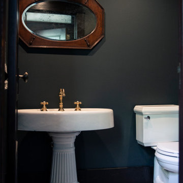
This vintage light in the powder bath ties back to the history of this beautiful old home.
Small transitional black tile ceramic tile and single-sink bathroom photo in Seattle with black walls and marble countertops
Small transitional black tile ceramic tile and single-sink bathroom photo in Seattle with black walls and marble countertops
 Dimensions in Design
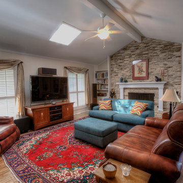
The living space of this home needed to be multi-functional. It acts as a home theater, photography studio, living room, and music room. We replaced the old, well-worn carpet with a high-end laminate to withstand the movable lighting equipment. We replaced the old, too-slender dark wood mantle with a more traditional, more-to-scale mantle and painted it white to match the woodwork and built-in cabinetry. The old-fashioned wood beam was also painted. All popcorn ceilings were scraped and repainted.
Greg Coleman, LensPortraits Photography
 Voar Construction
Before the Remodel – Guest / Pool Bathroom
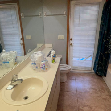
This bathroom had a generous size, but its design made it feel much smaller than it really was. The slightly lowered ceiling with outdated lighting created a heavy atmosphere, while the dark tile and old bathtub made the space look even more dated. The fixtures were all old, and the dark cabinetry only added to the closed-in feel. Despite its potential, the bathroom looked tired, outdated, and far from welcoming.uncomfortably small and unpractical. The dark tile and color choices made the entire space feel heavy and closed-in, taking away any sense of comfort or luxury. Overall, it was an old-fashioned, poorly planned bathroom in need of a complete reimagining.
35