
Search results for "Optimal angles" in Home Design Ideas
 Glow & Grow LLC
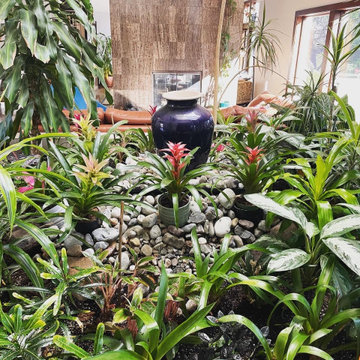
The client requested an extensive overhaul and renewal of this interior planter.
We redesigned the planter to optimize the lighting and architectural angles of the plants. We rearranged and removed old plants, treated for pests, and fixed the fountain.
 EA Home Design
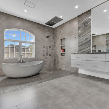
We are thrilled to unveil our latest bathroom remodeling project, a seamless blend of modern design and functional elegance. Here's a glimpse into the transformation:
1. Contemporary Palette: The choice of a grey color tile sets a sophisticated and neutral backdrop, allowing the features of the bathroom to shine. This hue not only exudes a sense of calm but also complements the contemporary design elements we've incorporated.
2. Warmth Underfoot: One of the standout features of this remodel is the heated flooring that runs under all the tiled areas. This luxurious addition ensures that even on the coldest mornings, your feet are greeted with a warm embrace, elevating the comfort level of the bathroom.
3. Enhanced Layout: Recognizing the need for more convenience, we repositioned the shower and introduced a second toilet room. This not only maximizes the use of space but also ensures that the bathroom can cater to multiple users without any hassle.
4. Dual Shower Spaces: By eliminating two angles in the bathroom's corner, we've carved out space for two distinct shower areas. This design choice not only adds a touch of luxury but also offers a versatile bathing experience tailored to individual preferences.
5. Wet Room Wonder: The shower and tub area now reside within a waterproof wet room. This innovative design ensures that water stays where it's supposed to, eliminating the need for a curb and offering a sleek, uninterrupted flow to the space.
6. Floating Vanities: Our floating vanities are more than just a design statement. They create an illusion of space, making the bathroom appear larger and more open. Paired with a stunning stone backsplash, they offer a perfect blend of style and functionality.
7. Illuminated Elegance: The mirrors, with their integrated lights, are the pièce de résistance. They not only enhance the aesthetic appeal of the bathroom but also ensure optimal lighting, making daily grooming tasks a breeze.
This bathroom remodel is a testament to our commitment to marrying design with functionality. Every element, from the choice of tiles to the heated floors, has been thoughtfully chosen to create a space that is not just visually appealing but also supremely functional and comfortable. We invite you to step in and experience this modern oasis for yourself.
 Irene Designs
Home Remodeling Project Overview
This extensive home remodeling project transformed a dated and inefficient layout into a functional, open, and aesthetically cohesive living space. The original layout had several challenges:
• A kitchen with limited storage, no cabinets on the window side, a sink facing the wall, and a range crammed into the corner. The pantry closet was too deep and impractical.
• A living room that couldn’t accommodate furniture without interfering with traffic flow.
• A front foyer with wasted space.
• A claustrophobic hallway toilet room without a sink, located near the laundry room.
The Remodeling Concept
The scope of this project extended well beyond the kitchen. We proposed several layout options to address issues in all adjacent spaces, ultimately implementing a plan that:
• Removed two walls and moved doorways.
• Replaced the kitchen window.
• Converted the hallway toilet room into a storage space.
• Installed pocket doors to separate the laundry hallway from the living room.
Kitchen Transformation
• Open Concept: By removing the wall between the kitchen and dining room, the two spaces became a seamless open area.
• New Layout: Cabinets were relocated to the window side for more storage and natural light. A central island with storage and seating was added, and a coffee bar was installed in the dining room.
• Updated Pantry: The deep pantry closet was converted into a pullout pantry with a cabinet front for better accessibility.
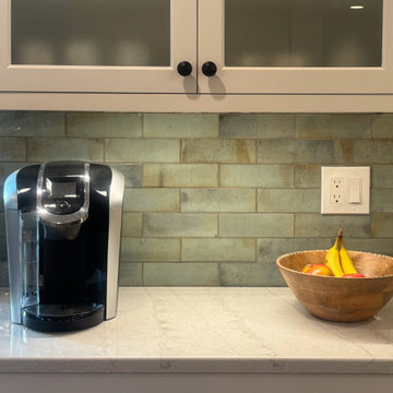
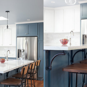
• Design Details: Off-white kitchen cabinets pair beautifully with a light green island. Warm white quartz counters and an artisan tile backsplash complete the look.
Dining Room
• Expanded Space: Most of the wall separating the dining room and foyer was removed, creating a more spacious area while still accommodating all furniture thanks to careful measurements.
Living Room Improvements
• Optimized Layout: Moving doorways and installing pocket doors allowed for better furniture placement, including a sofa that doesn’t interfere with traffic flow.
• Fireplace Upgrade: The brick fireplace was updated with a three-dimensional staggered stone veneer in a color matching the kitchen cabinets, creating a cohesive look. A TV was installed above the fireplace at a comfortable viewing angle.
Additional Updates
• New Flooring: All remodeled rooms now feature updated flooring.
• Ceilings: Popcorn ceilings were replaced with smooth, flat finishes, complemented by recessed lighting.
• Walls: Fresh paint throughout the space, with an accent wall in the living room matching the light green of the kitchen island.
• Lighting: Stylish sconces were added for a touch of elegance.
The Result
The homeowners are thrilled with the transformation, marveling at how their once cramped and inefficient home now feels spacious, functional, and beautifully cohesive. They can’t believe their house could ever look like this!
Find the right local pro for your project
 Saikley Architects
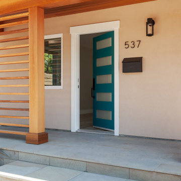
This house was a very small mid-century bungalow with previous additions that resulted in a large but chaotic layout. The owners wanted to convert the house to a super-efficient, and charming Craftsman-style, 6 bedroom home for their large family and work at home.
We achieved the space needs by moving a few walls for a more efficient, organized layout, setting up spaces for overlapping uses, and making a small upstairs addition. Every bit of square footage was optimized to meet the goals of the project without making the house huge or adding unnecessary cost.
Much thought was given to the entry sequence near the front door. A large flow-through mudroom with storage for each family member, and adjacent laundry, make it easy for children to be taught to keep their things organized and to contribute to household chores. A mail station and central home admin area at the mudroom help keep clutter down at other areas and minimize home management tasks. A garage door near the kitchen gives quick access to bulk items.
The existing house had too much view to the street from the living room through large corner windows, and too little entry transition, to the extent that the family did not feel comfortable using the living room much without shades drawn. We raised the window sills and brought the new windows in from the corner of the house, allowing plenty of light while protecting privacy and a sense of enclosure in the living room. We enlarged the front porch to create a more graceful transition from the public to private space. We located the front door so that the circulation from entry into the house would allow for furnishing the living room with a sitting circle that is not intruded upon by people walking through the room.
Sight lines through the living spaces were an important consideration in the design. The owners wanted discreet spaces for living room, kitchen, dining and family room, but also wanted the living spaces to feel connected and to be able to easily watch their children. Being able to see the children playing in the yard while getting things done inside the house was also important. While largely working with the existing structure, we opened walls and rearranged the use of spaces to make a series of connected living spaces with long views through them.
The character of the remodeled house is a contemporary Craftsman with classic materials and cool, consistent colors. A few arches echo through the house to frame spaces and soften the feeling of the rooms.
Photography: Kurt Manley
https://saikleyarchitects.com/portfolio/bungalow-expansion/
 Saikley Architects
The clients wanted to update their ranch house and make good use of their unusually large site next to downtown Mountain View. We sketched several options for design and scope of work to assess feasibility and value to the clients.
The chosen design retains an existing bedroom wing, while the layout of the living spaces is re-worked to an open plan flooded with light, with vaulted ceilings and strong indoor-outdoor connection to a yard optimized for outdoor living. Awkward angles and inefficient spaces of the former house have been replaced with a clear, simple floor plan designed for ease of everyday living.
One end of the site is used for a two-bedroom ADU (Accessory Dwelling Unit) with its own face to the street and its own back yard. Income from the ADU will go a long way toward financing the rebuild of the main house.
Photography: Kurt Manley
https://saikleyarchitects.com/portfolio/open-ranch-adu/
 Irene Designs
Home Remodeling Project Overview
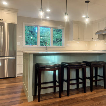
This extensive home remodeling project transformed a dated and inefficient layout into a functional, open, and aesthetically cohesive living space. The original layout had several challenges:
• A kitchen with limited storage, no cabinets on the window side, a sink facing the wall, and a range crammed into the corner. The pantry closet was too deep and impractical.
• A living room that couldn’t accommodate furniture without interfering with traffic flow.
• A front foyer with wasted space.
• A claustrophobic hallway toilet room without a sink, located near the laundry room.
The Remodeling Concept
The scope of this project extended well beyond the kitchen. We proposed several layout options to address issues in all adjacent spaces, ultimately implementing a plan that:
• Removed two walls and moved doorways.
• Replaced the kitchen window.
• Converted the hallway toilet room into a storage space.
• Installed pocket doors to separate the laundry hallway from the living room.
Kitchen Transformation
• Open Concept: By removing the wall between the kitchen and dining room, the two spaces became a seamless open area.
• New Layout: Cabinets were relocated to the window side for more storage and natural light. A central island with storage and seating was added, and a coffee bar was installed in the dining room.
• Updated Pantry: The deep pantry closet was converted into a pullout pantry with a cabinet front for better accessibility.
• Design Details: Off-white kitchen cabinets pair beautifully with a light green island. Warm white quartz counters and an artisan tile backsplash complete the look.
Dining Room
• Expanded Space: Most of the wall separating the dining room and foyer was removed, creating a more spacious area while still accommodating all furniture thanks to careful measurements.
Living Room Improvements
• Optimized Layout: Moving doorways and installing pocket doors allowed for better furniture placement, including a sofa that doesn’t interfere with traffic flow.
• Fireplace Upgrade: The brick fireplace was updated with a three-dimensional staggered stone veneer in a color matching the kitchen cabinets, creating a cohesive look. A TV was installed above the fireplace at a comfortable viewing angle.
Additional Updates
• New Flooring: All remodeled rooms now feature updated flooring.
• Ceilings: Popcorn ceilings were replaced with smooth, flat finishes, complemented by recessed lighting.
• Walls: Fresh paint throughout the space, with an accent wall in the living room matching the light green of the kitchen island.
• Lighting: Stylish sconces were added for a touch of elegance.
The Result
The homeowners are thrilled with the transformation, marveling at how their once cramped and inefficient home now feels spacious, functional, and beautifully cohesive. They can’t believe their house could ever look like this!
 Buildwright Construction Inc
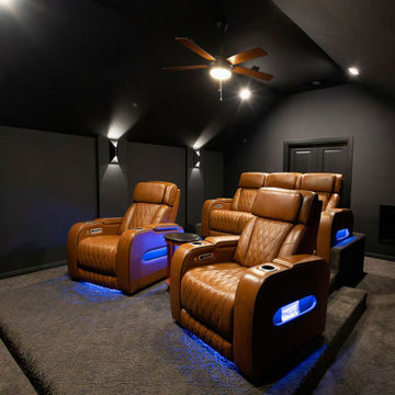
Wide-angle perspective of the finished Thousand Oaks home theater highlighting dark finishes, accent lighting, and optimized seating layout.
Example of a large minimalist carpeted and black floor home theater design in Los Angeles with black walls and a wall-mounted tv
Example of a large minimalist carpeted and black floor home theater design in Los Angeles with black walls and a wall-mounted tv

 Planeta Design Group
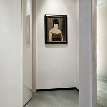
The owners wanted a space, which could house and showcase their substantial art collection. Boldly turning the floor plan’s wall angles out of parallel to the exterior building envelope and creating a sculptural rounded room allowed for interesting continuous flow through the space and an intriguing visual play from one room to the next. The lighting, shade control, and ceiling heights were all optimally designed to showcase the artwork. Likewise, the simple yet tasteful furnishings do not compete with the art. The finished residence creates a modern living space that showcases the owners' love for art.
Photography by AntonGrassl/Esto
 Thayer Hopkins Architects
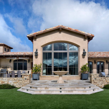
The Santa Lucia Estate is located on a private reserve in Upper Carmel Valley situated on a gentle grassland ridge with dramatic views of the surrounding valleys and coastal range. The house is not immediately visible and is approached from below by a winding drive and the initial view of the house is revealed through a masonry gateway surrounded by curvilinear walls made from local stone that enclose a protected forecourt.
The forms of the house are expressed in two materials, stucco and dry stack stone veneer to differentiate the elements, to reflect the vernacular of the Monterey regional style, and to give the house the appearance of having various elements that have been added over time.
The entry façade and the arched arcade of the entry court are symmetrical, and that formality gives way to asymmetrical enclosing wings. The building elements are placed to reflect both the Owner’s program and to fit in the topography of the site. A dominant gabled roof centers the composition of the front façade and creates space and light for the Entry Foyer and to the Dining and Living areas that open to the views on the opposite side. The Garage is located on the right of the forecourt, and the three arched openings reiterate the arches of the French doors in the main arcade. This wing contains a second story floor and traditional decorative timber balcony with views of the surrounding landscape. The main hallway that runs the length of the house is located at the entry court, forming and enfilade from which the formal living spaces and outdoor terraces are located on the opposite southeast side. The placement of these rooms allows a transition from indoor to outdoor terraces that takes advantage of protection from the prevailing wind, provides optimal solar exposure, and orients the living spaces toward the dramatic view corridor down the Potrero Valley.
Two roof towers at either end of the longitudinal ridge anchor the building and provide space, focal point and daylight to the interior. A stone Caretaker’s Cottage is located down slope from the main residence.
 Louis Poulsen USA
Design: Arne Jacobsen
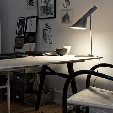
Concept: The fixture emits downward directed light. The angle of the shade can be adjusted to optimize light distribution. The shade is painted white on the inside to ensure a soft comfortable light.
Finish: Blue/Green, petroleum, red, sand, yellow/green, black, graphite grey or white, wet painted.
Material: Base: Die cast zinc. Shade: Spun steel. Stem: Steel.
Mounting: Cord type: Black except for white version: white. Cord length: 10’. Switch: On/off switch on the base.
Weight: Max. 6 lbs.
Label: cULus, Dry location. IBEW.
 Haus Of Tre Li
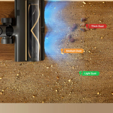
Powerful 190AW suction easily removes dirt and pet hair from floors and carpets. With a 90-minute runtime, you can tackle tough cleaning jobs effortlessly.
Enhanced LED dust detection illuminates hard-to-see areas, leaving no spot untouched.
Advanced dual brush head picks up dirt and debris from every angle, perfect for cleaning carpets and hardwood floors.
Intelligent dirt detection automatically adjusts suction power for optimal cleaning performance.
 B Street Design
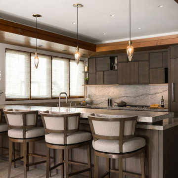
This home prized itself on unique architecture, with sharp angles and interesting geometric shapes incorporated throughout the design. We wanted to intermix this style in a softer fashion, while also maintaining functionality in the kitchen and bathrooms that were to be remodeled. The refreshed spaces now exude a highly contemporary allure, featuring integrated hardware, rich wood tones, and intriguing asymmetrical cabinetry, all anchored by a captivating silver roots marble.
In the bathrooms, integrated slab sinks took the spotlight, while the powder room countertop radiated a subtle glow. To address previous storage challenges, a full-height cabinet was introduced in the hall bath, optimizing space. Additional storage solutions were seamlessly integrated into the primary closet, adjacent to the primary bath. Despite the dark wood cabinetry, strategic lighting choices and lighter finishes were employed to enhance the perceived spaciousness of the rooms.
 EA Home Design
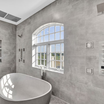
We are thrilled to unveil our latest bathroom remodeling project, a seamless blend of modern design and functional elegance. Here's a glimpse into the transformation:
1. Contemporary Palette: The choice of a grey color tile sets a sophisticated and neutral backdrop, allowing the features of the bathroom to shine. This hue not only exudes a sense of calm but also complements the contemporary design elements we've incorporated.
2. Warmth Underfoot: One of the standout features of this remodel is the heated flooring that runs under all the tiled areas. This luxurious addition ensures that even on the coldest mornings, your feet are greeted with a warm embrace, elevating the comfort level of the bathroom.
3. Enhanced Layout: Recognizing the need for more convenience, we repositioned the shower and introduced a second toilet room. This not only maximizes the use of space but also ensures that the bathroom can cater to multiple users without any hassle.
4. Dual Shower Spaces: By eliminating two angles in the bathroom's corner, we've carved out space for two distinct shower areas. This design choice not only adds a touch of luxury but also offers a versatile bathing experience tailored to individual preferences.
5. Wet Room Wonder: The shower and tub area now reside within a waterproof wet room. This innovative design ensures that water stays where it's supposed to, eliminating the need for a curb and offering a sleek, uninterrupted flow to the space.
6. Floating Vanities: Our floating vanities are more than just a design statement. They create an illusion of space, making the bathroom appear larger and more open. Paired with a stunning stone backsplash, they offer a perfect blend of style and functionality.
7. Illuminated Elegance: The mirrors, with their integrated lights, are the pièce de résistance. They not only enhance the aesthetic appeal of the bathroom but also ensure optimal lighting, making daily grooming tasks a breeze.
This bathroom remodel is a testament to our commitment to marrying design with functionality. Every element, from the choice of tiles to the heated floors, has been thoughtfully chosen to create a space that is not just visually appealing but also supremely functional and comfortable. We invite you to step in and experience this modern oasis for yourself.
Sponsored
Columbus, OH

Trish Takacs Design
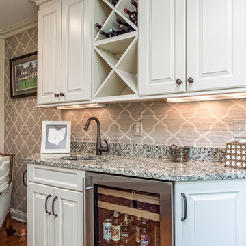
Award Winning & Highly Skilled Kitchen & Bath Designer in Columbus
 Vineyard Wine Cellars
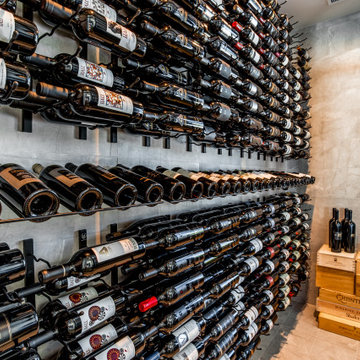
A tasting lounge in this lovely home in Austin, Texas is the perfect place to entertain friends or enjoy a quiet evening alone. The space is comfortable and inviting with a 700-bottle wine cellar as the main focal point. The insulated glass enclosure, treated walls, and ceiling ensure the wines are kept at the optimal temperature and humidity for storage and long-term aging. The mechanical and cooling system is fully self-contained and out of sight. The metal, matte black wine racks are striking against the white marble walls. The label forward, 3-deep display wine racks maximize the use of the space and one row of angled racking are perfect for larger format bottles. This tasting lounge is not only inviting but the perfect balance for form and function.
 Ohana Home & Design
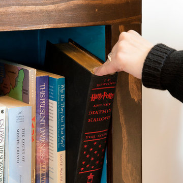
This is a secret bookcase! You have to pull the Harry Potter book to get the bookcase to open.
Inspiration for a huge transitional hallway remodel in Minneapolis
Inspiration for a huge transitional hallway remodel in Minneapolis
 ALVAREZ-DIAZ & VILLALON
Photography by Carlos Esteva.
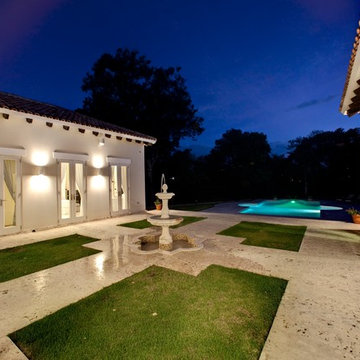
When this private client, a married couple, first approached Álvarez-Díaz & Villalón to build ‘the house of their dreams’ on the grounds of their sprawling family estate, the first challenge was to identify the exact location that would maximize the positive aspects of the topography while affording the most gracious views. Propped up on scaffolding, juggling digital cameras and folding ladders, the design team photographed the property from hundreds of angles before the ideal site was selected.
Once the site was selected, construction could begin.
The building’s foundation was raised slightly off the ground to disperse geothermal heat. In addition, the designers studied daily sunlight patterns and positioned the structure accordingly in order to warm the swimming pool during the cooler morning hours and illuminate the principal living quarters during the late afternoon. Finally, the main house was designed with functional balconies on all sides: each balcony meticulously planned ~ and precisely positioned ~ to
both optimize wind flow and frame the property’s most breath-taking views.
Stylistically, the goal was to create an authentic Spanish hacienda. Following Old World tradition, the house was anchored around a centralized interior patio
in the Moorish style: enclosed on three sides ~ yet
open on the fourth (similar to the Alcázar of Seville) ~ to reveal a reflecting pool ~ and mirror the water motif of the home’s magnificent marble fountain. A bell tower, horseshoe arches, a colonnaded,vineyard-style patio, and
ornamental Moorish mosaic tilework (“azulejos”) completed this picturesque portrait of a faraway fantasy world of castles, chivalry, and swordsplay, reminiscent of Medieval Spain.
Shortly after completion, this showcase home was showcased on the TVE Spanish television series Spaniards Around The World (Españoles Alrededor
Del Mundo) as a prime example of authentic Spanish architecture designed outside the peninsula. Not surprising. After all, the story of a fairy-tale retreat as
magical as this one deserves a happy ending.
 Irene Designs
Project Overview
This extensive home remodeling project transformed a dated and inefficient layout into a functional, open, and aesthetically cohesive living space. The original layout had several challenges:
• A kitchen with limited storage, no cabinets on the window side, a sink facing the wall, and a range crammed into the corner. The pantry closet was too deep and impractical.
• A living room that couldn’t accommodate furniture without interfering with traffic flow.
• A front foyer with wasted space.
• A claustrophobic hallway toilet room without a sink, located near the laundry room.
The Remodeling Concept
The scope of this project extended well beyond the kitchen. We proposed several layout options to address issues in all adjacent spaces, ultimately implementing a plan that:
• Removed two walls and moved doorways.
• Replaced the kitchen window.
• Converted the hallway toilet room into a storage space.
• Installed pocket doors to separate the laundry hallway from the living room.
Kitchen Transformation
• Open Concept: By removing the wall between the kitchen and dining room, the two spaces became a seamless open area.
• New Layout: Cabinets were relocated to the window side for more storage and natural light. A central island with storage and seating was added, and a coffee bar was installed in the dining room.
• Updated Pantry: The deep pantry closet was converted into a pullout pantry with a cabinet front for better accessibility.
• Design Details: Off-white kitchen cabinets pair beautifully with a light green island. Warm white quartz counters and an artisan tile backsplash complete the look.
Dining Room
• Expanded Space: Most of the wall separating the dining room and foyer was removed, creating a more spacious area while still accommodating all furniture thanks to careful measurements.
Living Room Improvements
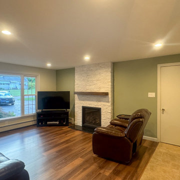
• Optimized Layout: Moving doorways and installing pocket doors allowed for better furniture placement, including a sofa that doesn’t interfere with traffic flow.
• Fireplace Upgrade: The brick fireplace was updated with a three-dimensional staggered stone veneer in a color matching the kitchen cabinets, creating a cohesive look. A TV was installed above the fireplace at a comfortable viewing angle.
Additional Updates
• New Flooring: All remodeled rooms now feature updated flooring.
• Ceilings: Popcorn ceilings were replaced with smooth, flat finishes, complemented by recessed lighting.
• Walls: Fresh paint throughout the space, with an accent wall in the living room matching the light green of the kitchen island.
• Lighting: Stylish sconces were added for a touch of elegance.
The Result
The homeowners are thrilled with the transformation, marveling at how their once cramped and inefficient home now feels spacious, functional, and beautifully cohesive. They can’t believe their house could ever look like this!
 Nicole Arnold Interiors
Room by room, we’re taking on this 1970’s home and bringing it into 2021’s aesthetic and functional desires. The homeowner’s started with the bar, lounge area, and dining room. Bright white paint sets the backdrop for these spaces and really brightens up what used to be light gold walls.
We leveraged their beautiful backyard landscape by incorporating organic patterns and earthy botanical colors to play off the nature just beyond the huge sliding doors.
Since the rooms are in one long galley orientation, the design flow was extremely important. Colors pop in the dining room chandelier (the showstopper that just makes this room “wow”) as well as in the artwork and pillows. The dining table, woven wood shades, and grasscloth offer multiple textures throughout the zones by adding depth, while the marble tops’ and tiles’ linear and geometric patterns give a balanced contrast to the other solids in the areas. The result? A beautiful and comfortable entertaining space!
 Studio BANAA
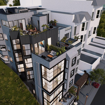
Five modern hillside condos in San Francisco’s Potrero Hill featuring three distinct towers with rooftop decks, angled bay windows for optimal light and views, and drought-tolerant landscaping that enhances the neighborhood corner. Interiors focus on natural light and connection to the surroundings with timeless materials.
 Louis Poulsen USA
Design: Arne Jacobsen
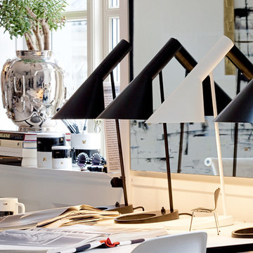
Concept: The fixture emits downward directed light. The angle of the shade can be adjusted to optimize light distribution. The shade is painted white on the inside to ensure a soft comfortable light.
Finish: Blue/Green, petroleum, red, sand, yellow/green, black, graphite grey or white, wet painted.
Material: Base: Die cast zinc. Shade: Spun steel. Stem: Steel.
Mounting: Cord type: Black except for white version: white. Cord length: 10’. Switch: On/off switch on the base.
Weight: Max. 6 lbs.
Label: cULus, Dry location. IBEW.
14