
Search results for "Originates" in Home Design Ideas
 Alair Homes Plano
Our clients house was built in 2012, so it was not that outdated, it was just dark. The clients wanted to lighten the kitchen and create something that was their own, using more unique products. The master bath needed to be updated and they wanted the upstairs game room to be more functional for their family.
The original kitchen was very dark and all brown. The cabinets were stained dark brown, the countertops were a dark brown and black granite, with a beige backsplash. We kept the dark cabinets but lightened everything else. A new translucent frosted glass pantry door was installed to soften the feel of the kitchen. The main architecture in the kitchen stayed the same but the clients wanted to change the coffee bar into a wine bar, so we removed the upper cabinet door above a small cabinet and installed two X-style wine storage shelves instead. An undermount farm sink was installed with a 23” tall main faucet for more functionality. We replaced the chandelier over the island with a beautiful Arhaus Poppy large antique brass chandelier. Two new pendants were installed over the sink from West Elm with a much more modern feel than before, not to mention much brighter. The once dark backsplash was now a bright ocean honed marble mosaic 2”x4” a top the QM Calacatta Miel quartz countertops. We installed undercabinet lighting and added over-cabinet LED tape strip lighting to add even more light into the kitchen.
We basically gutted the Master bathroom and started from scratch. We demoed the shower walls, ceiling over tub/shower, demoed the countertops, plumbing fixtures, shutters over the tub and the wall tile and flooring. We reframed the vaulted ceiling over the shower and added an access panel in the water closet for a digital shower valve. A raised platform was added under the tub/shower for a shower slope to existing drain. The shower floor was Carrara Herringbone tile, accented with Bianco Venatino Honed marble and Metro White glossy ceramic 4”x16” tile on the walls. We then added a bench and a Kohler 8” rain showerhead to finish off the shower. The walk-in shower was sectioned off with a frameless clear anti-spot treated glass. The tub was not important to the clients, although they wanted to keep one for resale value. A Japanese soaker tub was installed, which the kids love! To finish off the master bath, the walls were painted with SW Agreeable Gray and the existing cabinets were painted SW Mega Greige for an updated look. Four Pottery Barn Mercer wall sconces were added between the new beautiful Distressed Silver leaf mirrors instead of the three existing over-mirror vanity bars that were originally there. QM Calacatta Miel countertops were installed which definitely brightened up the room!
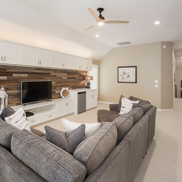
Originally, the upstairs game room had nothing but a built-in bar in one corner. The clients wanted this to be more of a media room but still wanted to have a kitchenette upstairs. We had to remove the original plumbing and electrical and move it to where the new cabinets were. We installed 16’ of cabinets between the windows on one wall. Plank and Mill reclaimed barn wood plank veneers were used on the accent wall in between the cabinets as a backing for the wall mounted TV above the QM Calacatta Miel countertops. A kitchenette was installed to one end, housing a sink and a beverage fridge, so the clients can still have the best of both worlds. LED tape lighting was added above the cabinets for additional lighting. The clients love their updated rooms and feel that house really works for their family now.
Design/Remodel by Hatfield Builders & Remodelers | Photography by Versatile Imaging
 Francois & Co
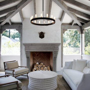
Each and every one of the François & Co. Period Reproduction pieces is born from the original antique – “The Master Piece”. We scrupulously follow molding techniques and the exacting processes used by museums to capture and preserve the integrity of master works of all kinds. We “seal” details down to the tiniest blemish —a labor-intensive process our skilled mold makers follow to deliver a product that is a beautiful thumbprint from the original artist.
 BLDG Workshop Inc.
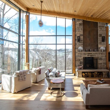
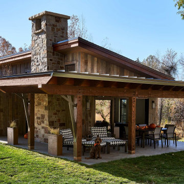
The owner of this Devil’s Glen Ski Resort chalet was determined to honour the original structure built by his father.
At the same time, a growing family created the need for an amplified space. The design for the enlarged chalet attempts to incorporate proportions and angles from the original craftsman styled structure while simultaneously taking cues from the challenging mountain site.
Stonework and timber beams create a framework for expansive glazing that affords sweeping views to the mountain, snow and sky. As a result, a new generation of skiers is engaged with the mountain and it’s community in the same way the owner’s father provided him.
Find the right local pro for your project
 Etelamaki Architecture
Mikiko Kikuyama
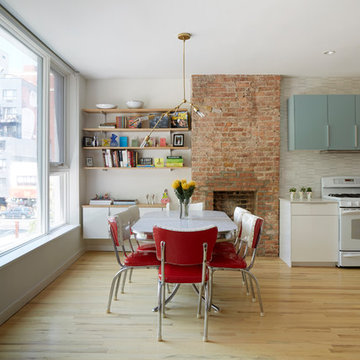
Example of a 1960s light wood floor dining room design in New York with beige walls, a standard fireplace and a brick fireplace
Example of a 1960s light wood floor dining room design in New York with beige walls, a standard fireplace and a brick fireplace
 PH Architects
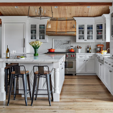
Example of a farmhouse l-shaped beige floor kitchen design in New York with white cabinets, white backsplash, subway tile backsplash, stainless steel appliances, an island and beaded inset cabinets
 Whiski Kitchen Design Studio
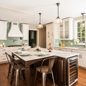
In this 1905 Tudor home, the intent of this design was to take advantage of the classic architecture of the home and incorporate modern conveniences.
Located in the Joseph Berry Subdivision in Detroit, this stellar home presented several design challenges. The most difficult challenge to overcome was the 11” slope from one end of the kitchen to the other, caused by 110 years of settling. All new floor joists were installed and the floor by the side door was then recessed down one step. This created a cozy nook when you first enter the kitchen. A tiered ceiling with strategically planned cabinetry heights and crown molding concealed the slope of the walls at the ceiling level.
The second challenge in this historic home was the awkward foot print of the kitchen. It’s likely that this kitchen had a butler’s pantry originally. However it was remodeled sometime in the 70’s and all original character was erased. Clever pantry storage was added to an awkward corner creating a space that mimicked the essence of a butler’s pantry, while providing storage desired in kitchens today.
Keeping the large footprint of the kitchen presented obstacles with the working triangle; the distance from the sink to the cooktop is several feet. The solution was installation of a pot filler over the cooktop that added convenience and elegance (not sure about this word). Not everything in this project was a challenge; the discovery of a brick chimney hiding behind plaster was a welcome surprise and brought character back honoring the historic charm of this beautiful home.
Kitchen Designer: Rebekah Tull of Whiski Kitchen Design Studio
Remodeling Contractor: Renaissance Restorations, Inc.
Counter Top Fabricator: Lakeside Solid Surfaces - Cambria
Cabinetry: Legacy Crafted Cabinets
Photographer: Shermin Photography
Lighting: Rejuvenation
Tile: TileBar.com


Sponsored
Columbus, OH

Wannemacher Interiors
Customized Award-Winning Interior Design Solutions in Franklin Cnty OH
 Planning Pretty
Photo: Camille Simmons © 2014 Houzz
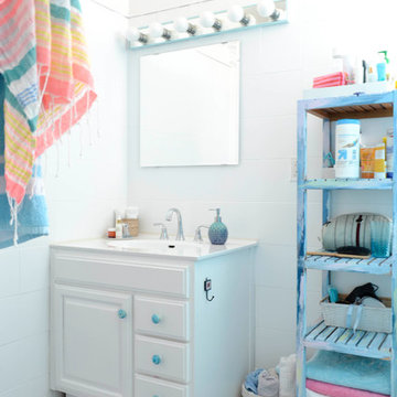
Small eclectic white tile mosaic tile floor and blue floor bathroom photo in San Francisco with raised-panel cabinets, white cabinets, white walls and white countertops
Small eclectic white tile mosaic tile floor and blue floor bathroom photo in San Francisco with raised-panel cabinets, white cabinets, white walls and white countertops
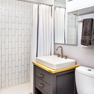
 MB architecture + design
Mountain style 3/4 white tile and subway tile porcelain tile, gray floor and single-sink bathroom photo in Burlington with gray cabinets, a one-piece toilet, gray walls, a vessel sink, wood countertops, a freestanding vanity and flat-panel cabinets
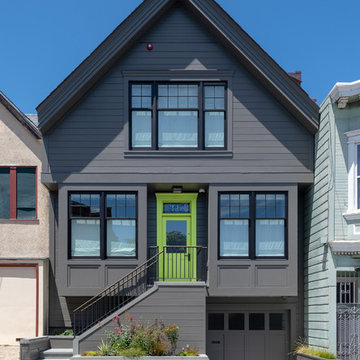
 Gast Architects
Ed Ritger Photography
Example of a transitional gray three-story exterior home design in San Francisco
Example of a transitional gray three-story exterior home design in San Francisco
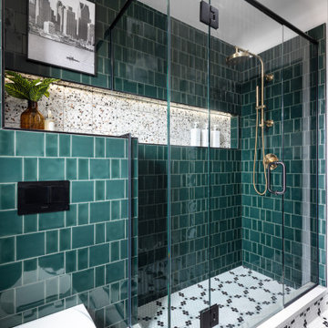

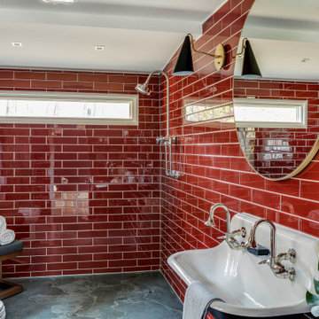
 JN Interior Spaces
The renovation of a mid century cottage on the lake, now serves as a guest house. The renovation preserved the original architectural elements such as the ceiling and original stone fireplace to preserve the character, personality and history and provide the inspiration and canvas to which everything else would be added. To prevent the space from feeling dark & too rustic, the lines were kept clean, the furnishings modern and the use of saturated color was strategically placed throughout.
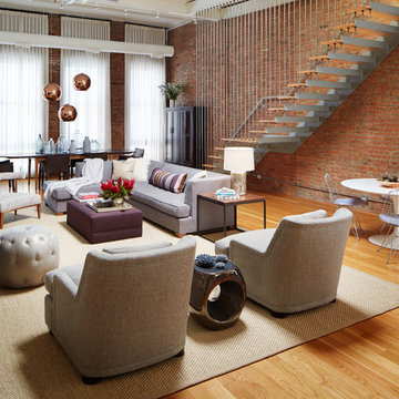
 Jessica Lagrange Interiors
Urban Loft, Jessica Lagrange Interiors LLC, Photo by Werner Straube
Example of a large trendy open concept medium tone wood floor and brown floor living room design in Chicago with brown walls
Example of a large trendy open concept medium tone wood floor and brown floor living room design in Chicago with brown walls

Sponsored
Columbus, OH
Wannemacher Interiors
Customized Award-Winning Interior Design Solutions in Franklin Cnty OH
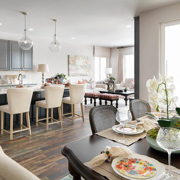
 Shea Homes Colorado
Inspiration for a timeless l-shaped dark wood floor open concept kitchen remodel in Denver with raised-panel cabinets, gray cabinets, stainless steel appliances and an island
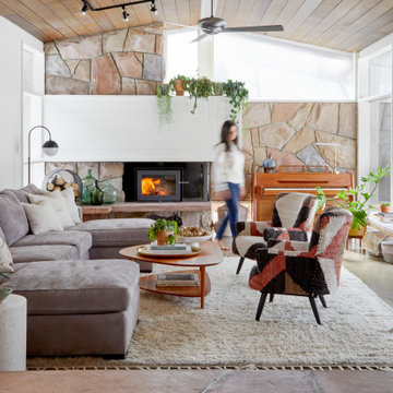
 Amy Pigliacampo Interiors
Example of a 1960s open concept concrete floor, gray floor, vaulted ceiling and wood ceiling living room design in Los Angeles with white walls
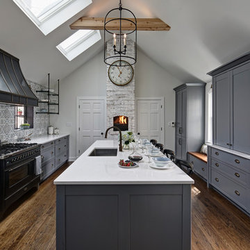
 Drury Design
This remodel was designed to celebrate the original use of the structure, focusing on a 1930’s automobile theme. The design features ample storage without overbearing wall cabinets and also, vintage looking appliances. The homeowner wanted to remove the soffit and rework the supply and return air to better balance the temperature in the space. To do so, the entire space was reinsulated with closed cell insulation to provide the best insulation for our cold winters and hot summers.
The homeowner opted for a custom artisan hood paired with metal open shelves to tie into the industrial era of the original space from the 1930s. The Matte Black with Bronze accents paired with vintage hardware on the range also picks up on the details of the Classic cars once parked in this coach house. The silkscreen marble tiles appear to be wallpaper yet is both heat resistant and effective for these aspiring chefs
The enlarged island now can seat four and houses a larger sink with trash bins that open with a tap of the knee. As per the client’s request, the refrigerator now blends into the cabinetry appearing more like the tall cabinets on the south wall than an appliance.
The new kitchen is not only stunning but practical as it has double the storage or the old kitchen without lining the room with cabinetry.
 Simply Home Decorating
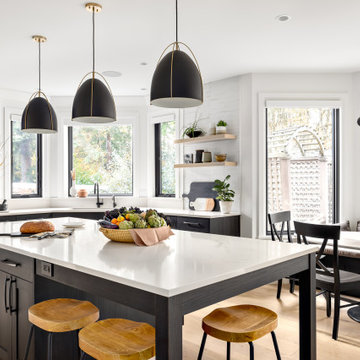
This beautiful North Vancouver home belongs to a nature-loving and health-conscious couple, Emma and Vince (names changed), their two young children, and their dog, Jasper. When they contacted us about renovating and furnishing their kitchen and family room, we walked in and saw a world of potential waiting to be uncovered.
Before: Larkhall Crescent Home:
Like many original North Vancouver homes, the interior was definitely dated. We encountered late ‘80s finishes in powder pink and teal green, old carpet, and a kitchen that wasn’t maximized to suit this family’s modern-day lifestyle. However, the size of the rooms offered us a ton of space with which to get creative.
Knowing our clients’ love of cooking, need for work spaces (Emma and Vince both work remotely), and growing family, we developed a design concept that would increase usable space, optimize storage, and create intimacy in this large area. As for the style, we were inspired by their European roots, inventing a new and modern take on “Belgian Farmhouse” style. Now, the home is truly one-of-a-kind.
After: Warm & Cozy Family Room:
Fresh, bright, and comfortable, this living area has been transformed! We started with the fireplace as a focal point, selecting aged brick tiles for added texture and a crisp wood mantle. The taupe-coloured sectional infuses the room with visual warmth and serves the added purpose of separating the family room from the kitchen.
Emma and Vince were also keen on using non-toxic materials in their home, and we were happy to oblige. To meet their needs, we sourced natural wood elements and sought out Canadian-made products - that adhere to high health standards - whenever possible.
Look closer at the elements of this space, and you will find this stunning, honeycomb-patterned rug in earthy gold, beige, and charcoal tones. It’s plush to the touch and full of visual texture that brings this room’s colour palette together. We sourced these two-tone chairs with caning, petrified wood side table, black sconces, and botanical prints in greyscale from local artist, Heather Johnston.
We topped off the space with this dark wood and rattan console that offers storage facing the kitchen and presents an opportunity to display cherished items. The result is a cozy lounging space brimming with comfort and functionality. It’s perfect for enjoying quality family time, or Emma can simply slide the coffee table away to make room for her morning yoga practice.
Now, let’s turn around and give some attention to the kitchen. Do you remember what the original kitchen looked like? If not, scroll back up, because the transformation is shocking…
Moody & Welcoming Kitchen for Healthy Living:
This kitchen looks very different from how it started, right? Though we didn’t touch any walls, the kitchen has almost doubled in usable space! We created a long, extended island with storage, an outlet for small appliances, and seating for comfortable prep, after-school snacking, or mingling among friends.
On the other side of the island, the family has even more storage and an integrated dishwasher within easy reach of the sink, perfect for quick clean-up. From this angle, you can also see the expansive custom Shaker cabinetry in white and the integrated double ovens. These facilitate their cooking experience and gave us the opportunity to add an additional surprise…
A coffee garage station and more hidden storage! Keeping these items located along the perimeter allows them to be accessed by the family or their guests without someone getting under the cook’s feet. These are the little details that make everyday life easier and more enjoyable.
Moving deeper into the kitchen, the seamless induction cooktop topped with a freestanding concealed hood fan commands attention in a soft yet prominent way. The natural wood accent mirrors the fireplace mantle, and the choice of off-black wood-grain cabinets not only continues our black-and-white colour palette but adds a sense of depth and contrast. The corner sink is located to the right and perfectly positioned with a view of their thriving backyard.
To invite more of this family’s character into the space, we mixed metals for interest — matte black, dark pewter, and warm brass — and created open shelves in white oak for their plants and decor. You can also glimpse the tumbled edge of the backsplash tile, which echoes the rustic brick of the fireplace. It adds that farmhouse charm while still feeling timeless and sophisticated.
Last but not least, we designed this dining banquette in the bay window (with integrated bench storage, of course), where the family can share a meal together, the kids can do homework, or Emma and Vince can work and enjoy a change of scenery from their offices. Like the other spaces in the home, it was designed to be beautiful, multi-functional, and long-lasting.
Praise from Our Clients:
It is clear that we love this home, but what did our clients have to say?
“Lori is a visionary and masters execution to the finest detail all at the same time. When she first met us to know more about who we are and how we live, she could right away envision how we could use the space in our kitchen and living room…The results exceeded our expectations.
Lori and her team were also a delight to work with — coordination with all the trades, fast problem-solving, regular updates, professional and friendly attitude of her entire team — made it the dream team. Thank you SHD for making our space so beautiful!”
In turn, we are so grateful for this family’s trust, their open communication, and for being wonderful people with whom to work. (So, thank you!)

Sponsored
Columbus, OH
Wannemacher Interiors
Customized Award-Winning Interior Design Solutions in Franklin Cnty OH
 NR Interiors
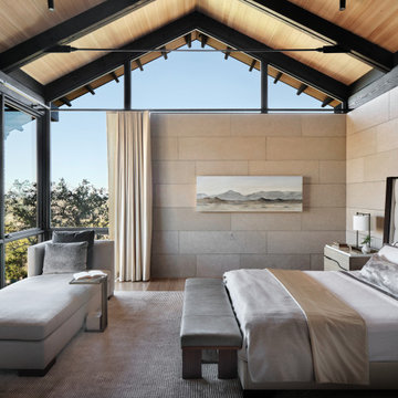
Designing the Master Suite custom furnishings, bedding, window coverings and artwork to compliment the modern architecture while offering an elegant, serene environment for peaceful reflection were the chief objectives. The color scheme remains a warm neutral, like the limestone walls, along with soft accents of subdued greens, sage and silvered blues to bring the colors of the magnificent, long Hill country views into the space. Special effort was spent designing custom window coverings that wouldn't compete with the architecture, but appear integrated and operate easily to open wide the prized view fully and provide privacy when needed. To achieve an understated elegance, the textures are rich and refined with a glazed linen headboard fabric, plush wool and viscose rug, soft leather bench, velvet pillow, satin accents to custom bedding and an ultra fine linen for the drapery with accents of natural wood mixed with warm bronze and aged brass metal finishes. The original oil painting curated for this room sets a calming and serene tone for the space with an ever important focus on the beauty of nature.
The original fine art landscape painting for this room was created by Christa Brothers, of Brothers Fine Art Marfa.
 TKS Design Group
Free ebook, Creating the Ideal Kitchen. DOWNLOAD NOW
The Klimala’s and their three kids are no strangers to moving, this being their fifth house in the same town over the 20-year period they have lived there. “It must be the 7-year itch, because every seven years, we seem to find ourselves antsy for a new project or a new environment. I think part of it is being a designer, I see my own taste evolve and I want my environment to reflect that. Having easy access to wonderful tradesmen and a knowledge of the process makes it that much easier”.
This time, Klimala’s fell in love with a somewhat unlikely candidate. The 1950’s ranch turned cape cod was a bit of a mutt, but it’s location 5 minutes from their design studio and backing up to the high school where their kids can roll out of bed and walk to school, coupled with the charm of its location on a private road and lush landscaping made it an appealing choice for them.
“The bones of the house were really charming. It was typical 1,500 square foot ranch that at some point someone added a second floor to. Its sloped roofline and dormered bedrooms gave it some charm.” With the help of architect Maureen McHugh, Klimala’s gutted and reworked the layout to make the house work for them. An open concept kitchen and dining room allows for more frequent casual family dinners and dinner parties that linger. A dingy 3-season room off the back of the original house was insulated, given a vaulted ceiling with skylights and now opens up to the kitchen. This room now houses an 8’ raw edge white oak dining table and functions as an informal dining room. “One of the challenges with these mid-century homes is the 8’ ceilings. I had to have at least one room that had a higher ceiling so that’s how we did it” states Klimala.
The kitchen features a 10’ island which houses a 5’0” Galley Sink. The Galley features two faucets, and double tiered rail system to which accessories such as cutting boards and stainless steel bowls can be added for ease of cooking. Across from the large sink is an induction cooktop. “My two teen daughters and I enjoy cooking, and the Galley and induction cooktop make it so easy.” A wall of tall cabinets features a full size refrigerator, freezer, double oven and built in coffeemaker. The area on the opposite end of the kitchen features a pantry with mirrored glass doors and a beverage center below.
The rest of the first floor features an entry way, a living room with views to the front yard’s lush landscaping, a family room where the family hangs out to watch TV, a back entry from the garage with a laundry room and mudroom area, one of the home’s four bedrooms and a full bath. There is a double sided fireplace between the family room and living room. The home features pops of color from the living room’s peach grass cloth to purple painted wall in the family room. “I’m definitely a traditionalist at heart but because of the home’s Midcentury roots, I wanted to incorporate some of those elements into the furniture, lighting and accessories which also ended up being really fun. We are not formal people so I wanted a house that my kids would enjoy, have their friends over and feel comfortable.”
The second floor houses the master bedroom suite, two of the kids’ bedrooms and a back room nicknamed “the library” because it has turned into a quiet get away area where the girls can study or take a break from the rest of the family. The area was originally unfinished attic, and because the home was short on closet space, this Jack and Jill area off the girls’ bedrooms houses two large walk-in closets and a small sitting area with a makeup vanity. “The girls really wanted to keep the exposed brick of the fireplace that runs up the through the space, so that’s what we did, and I think they feel like they are in their own little loft space in the city when they are up there” says Klimala.
Designed by: Susan Klimala, CKD, CBD
Photography by: Carlos Vergara
For more information on kitchen and bath design ideas go to: www.kitchenstudio-ge.com
 Katie Martinez Design
Aubrie Pick
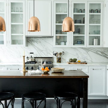
Transitional l-shaped dark wood floor kitchen photo in New York with glass-front cabinets, white cabinets, white backsplash, paneled appliances, an island and marble backsplash
Transitional l-shaped dark wood floor kitchen photo in New York with glass-front cabinets, white cabinets, white backsplash, paneled appliances, an island and marble backsplash
51