
Search results for "Pandemic" in Home Design Ideas
 M&P Design Group
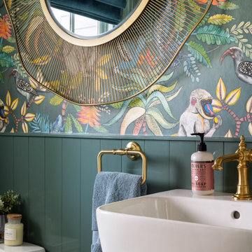
Powder room
Inspiration for a small eclectic mosaic tile floor, green floor and wallpaper powder room remodel in New York with a one-piece toilet, green walls and a wall-mount sink
Inspiration for a small eclectic mosaic tile floor, green floor and wallpaper powder room remodel in New York with a one-piece toilet, green walls and a wall-mount sink

 Kathleen Jennison
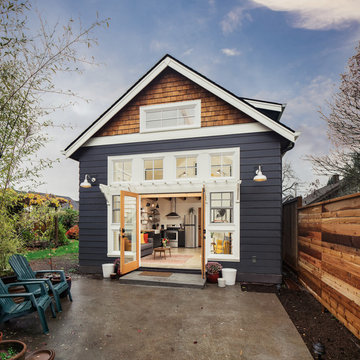
An Arts & Crafts Bungalow is one of my favorite styles of homes. We have quite a few of them in our Stockton Mid-Town area. And when C&L called us to help them remodel their 1923 American Bungalow, I was beyond thrilled.
As per usual, when we get a new inquiry, we quickly Google the project location while we are talking to you on the phone. My excitement escalated when I saw the Google Earth Image of the sweet Sage Green bungalow in Mid-Town Stockton. "Yes, we would be interested in working with you," I said trying to keep my cool.
But what made it even better was meeting C&L and touring their home, because they are the nicest young couple, eager to make their home period perfect. Unfortunately, it had been slightly molested by some bad house-flippers, and we needed to bring the bathroom back to it "roots."
We knew we had to banish the hideous brown tile and cheap vanity quickly. But C&L complained about the condensation problems and the constant fight with mold. This immediately told me that improper remodeling had occurred and we needed to remedy that right away.
The Before: Frustrations with a Botched Remodel
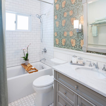
The bathroom needed to be brought back to period appropriate design with all the functionality of a modern bathroom. We thought of things like marble countertop, white mosaic floor tiles, white subway tile, board and batten molding, and of course a fabulous wallpaper.
This small (and only) bathroom on a tight budget required a little bit of design sleuthing to figure out how we could get the proper look and feel. Our goal was to determine where to splurge and where to economize and how to complete the remodel as quickly as possible because C&L would have to move out while construction was going on.
The Process: Hard Work to Remedy Design and Function
During our initial design study, (which included 2 hours in the owners’ home), we noticed framed images of William Morris Arts and Crafts textile patterns and knew this would be our design inspiration. We presented C&L with three options and they quickly selected the Pimpernel Design Concept.
We had originally selected the Black and Olive colors with a black vanity, mirror, and black and white floor tile. C&L liked it but weren’t quite sure about the black, We went back to the drawing board and decided the William & Co Pimpernel Wallpaper in Bayleaf and Manilla color with a softer gray painted vanity and mirror and white floor tile was more to their liking.
After the Design Concept was approved, we went to work securing the building permit, procuring all the elements, and scheduling our trusted tradesmen to perform the work.
We did uncover some shoddy work by the flippers such as live electrical wires hidden behind the wall, plumbing venting cut-off and buried in the walls (hence the constant dampness), the tub barely balancing on two fence boards across the floor joist, and no insulation on the exterior wall.
All of the previous blunders were fixed and the bathroom put back to its previous glory. We could feel the house thanking us for making it pretty again.
The After Reveal: Cohesive Design Decisions
We selected a simple white subway tile for the tub/shower. This is always classic and in keeping with the style of the house.
We selected a pre-fab vanity and mirror, but they look rich with the quartz countertop. There is much more storage in this small vanity than you would think.
The Transformation: A Period Perfect Refresh
We began the remodel just as the pandemic reared and stay-in-place orders went into effect. As C&L were already moved out and living with relatives, we got the go-ahead from city officials to get the work done (after all, how can you shelter in place without a bathroom?).
All our tradesmen were scheduled to work so that only one crew was on the job site at a time. We stayed on the original schedule with only a one week delay.
The end result is the sweetest little bathroom I've ever seen (and I can't wait to start work on C&L's kitchen next).
Thank you for joining me in this project transformation. I hope this inspired you to think about being creative with your design projects, determining what works best in keeping with the architecture of your space, and carefully assessing how you can have the best life in your home.
Find the right local pro for your project
 Signature Designs Kitchen | Bath | Interiors
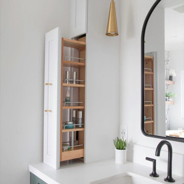
Black and White bathroom with forest green vanity cabinets. Pullout storage organizers.
Inspiration for a mid-sized cottage master white tile and porcelain tile porcelain tile, white floor, single-sink and wallpaper freestanding bathtub remodel in Denver with recessed-panel cabinets, green cabinets, a two-piece toilet, white walls, an undermount sink, quartz countertops, a hinged shower door, white countertops and a built-in vanity
Inspiration for a mid-sized cottage master white tile and porcelain tile porcelain tile, white floor, single-sink and wallpaper freestanding bathtub remodel in Denver with recessed-panel cabinets, green cabinets, a two-piece toilet, white walls, an undermount sink, quartz countertops, a hinged shower door, white countertops and a built-in vanity
 Design Build Advisors
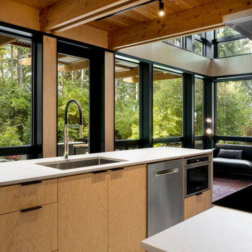
Kitchen showing maple europly cabinetry, Caesarstone Airy Concrete Honed, Bosch dishwasher and Microwave drawer
Grohe faucet, windows and doors by Anderson. Sofa and lamp by Muuto from DWR
 Outdoor Dreams
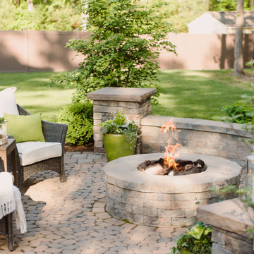
Example of a mid-sized classic backyard concrete paver patio design in Richmond with a fire pit and no cover
 MARGARITA BRAVO
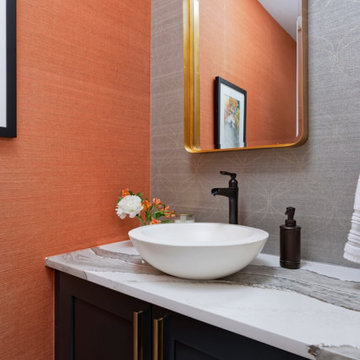
This is a super modern townhome with original pale tones, mainly a white canvas. Our sophisticated and well-traveled out-of-town clients purchased this townhome right in the middle of the pandemic. They needed a full-cycle interior design studio like ours to take on this project while they were in transit to Montecito.
The scope was the complete renovation and facelift of the kitchen, powder room, master bedroom, master bathroom, guest suites, basement, and outdoor areas. Our clients wanted to bring warm tones such as orange and red throughout the 4-story Montecito townhome. They were open to discovering and implementing different interior design ideas in each section of the house.
This project also features our SORELLA furniture pieces made exclusively by hand in Portugal and shipped to our clients in Montecito. You can find our TABATA Ottoman, our IKI Chair, and the ROCCO Table, adding that special touch to this beautiful townhome.
---
Project designed by Montecito interior designer Margarita Bravo. She serves Montecito as well as surrounding areas such as Hope Ranch, Summerland, Santa Barbara, Isla Vista, Mission Canyon, Carpinteria, Goleta, Ojai, Los Olivos, and Solvang.
For more about MARGARITA BRAVO, click here: https://www.margaritabravo.com/
To learn more about this project, click here:
https://www.margaritabravo.com/portfolio/denver-interior-design-eclectic-modern/
 Counterbalance Studio
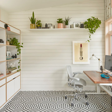
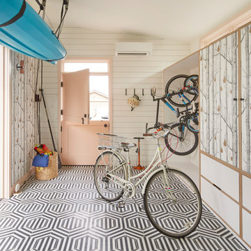
When it became apparent mid-pandemic that “working from home” was going to be more than a short-term gig, this repeat client decided it was time to seriously upgrade her professional digs. Having worked together previously, this owner-designer-builder team quickly realized that the dilapidated detached garage was the perfect She-Shed location, but a full-teardown was in order. Programmatically, the design team was tasked with accommodating sports equipment, stroller parking, an exercise bike, wine storage, a lounge area, and of course, a workstation for this busy mama.
 Counterbalance Studio
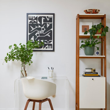
When it became apparent mid-pandemic that “working from home” was going to be more than a short-term gig, this repeat client decided it was time to seriously upgrade her professional digs. Having worked together previously, this owner-designer-builder team quickly realized that the dilapidated detached garage was the perfect She-Shed location, but a full-teardown was in order. Programmatically, the design team was tasked with accommodating sports equipment, stroller parking, an exercise bike, wine storage, a lounge area, and of course, a workstation for this busy mama.
 Cathie Hong Interiors
This artistic and design-forward family approached us at the beginning of the pandemic with a design prompt to blend their love of midcentury modern design with their Caribbean roots. With her parents originating from Trinidad & Tobago and his parents from Jamaica, they wanted their home to be an authentic representation of their heritage, with a midcentury modern twist. We found inspiration from a colorful Trinidad & Tobago tourism poster that they already owned and carried the tropical colors throughout the house — rich blues in the main bathroom, deep greens and oranges in the powder bathroom, mustard yellow in the dining room and guest bathroom, and sage green in the kitchen. This project was featured on Dwell in January 2022.
 Charter Custom Homes
The phone rings early in the morning, and it’s a long-time client who treats our team of skilled craftsmen like family, continually lauding our work. It’s these types of clients we all have and all love and, of course, will drop anything to help.
As I navigate my usual morning commute, I’m greeted by a forlorn sigh and the description of the freak-fire which destroyed their beloved outdoor living area (along with the home’s family room, kitchen, and master bedroom). Getting past the initial shock, we had to act quickly to ensure their safety. Quite the start to the morning.
Challenges with this project run deeper than just the build: security of the entire affected area, good and sensitive communication, and navigating a pandemic lockdown can cause even the strongest-willed person to throw their hands up and call it quits.
When the fire broke out, it took out the entire backyard and portions of the home, making the structure unlivable. We needed to mitigate the fire damage and make sure the house was secure against break-ins, but also, no damage existed that could cause harm to the neighbors.
It’s these moments where relationships matter. The client needed a trusted and established partner to begin the rebuilding process. Professional knowledge is only one part of the puzzle. It’s here an empathetic ear, and extra solace goes far to remind the client all can be rebuilt.
Lastly, none of us saw the difficulties a pandemic would bring. At a time when a person was about to use every square foot of their home to shelter-in-place, our client would be in the middle of a rebuild with no use of their beautiful outdoor living area to get through the day. Luckily, we were able to work with the city of Clyde Hill and continue through an emergency services waiver.
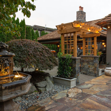
What was done? The outdoor living area included a complete rebuild of the gazebo, including a large sitting area and fire pit. Stone patios were replaced, and additional stone was chosen to create a secondary, uncovered living area with a fire pit to enjoy during the summer months.
The build is a testament to superb craftsmanship and design. However, we believe excellence also includes the holistic approach to listen deeply, empathize and understand a client’s history, external pressures of the world, and build community and relationship.
 NanaWall
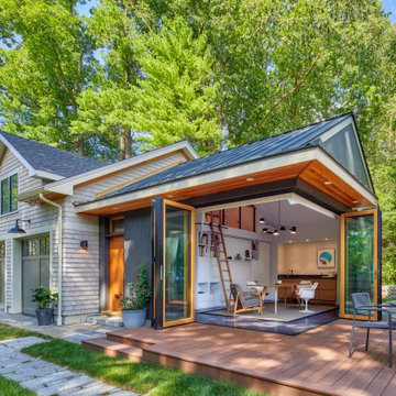
From it’s initial inception pre-pandemic, to it’s final completion this year, our small backyard house has been known by many names: The He Shed/She Shed, Garagemahal, and most recently The Red Pony. It all began in early 2019 with a trip to Goodwood in the heart of West Sussex England. The home we and rented overlooked the beautiful South Downs National Park.
As we came to love about Europe, the house had a set of doors that opened on the corner onto a deck where we were able to enjoy the most beautiful sunsets without interruption. Having no corner post was so fantastic that when we began our own project for a garage/art studio, we knew we had to figure out a way to engineer it into our plans.
It was well worth the long wait (pandemic related), but come late winter of 2021 our installer showed up and fitted the door in just 2 days. A true craftsman! From beginning to end Nanawall was 5-star! The doors have been trouble free ever since, from 2 foot snowdrifts to driving rains, not a drop of water inside. Read full story.
"Today, a year later, we are loving the indoor/outdoor nature of the space with the doors wide open — even if we’re not looking out over the moors in the UK. Even our backyard feels more beautiful!" - Homeowners
 Angela Westmore, LLC.
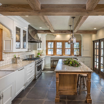
Example of a mid-sized classic l-shaped porcelain tile and gray floor enclosed kitchen design in Milwaukee with a farmhouse sink, recessed-panel cabinets, white cabinets, marble countertops, white backsplash, cement tile backsplash, paneled appliances, an island and multicolored countertops
 KURV Architecture DPC (Alex Hughes Architects)
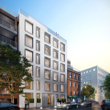
Located in the heart of Manhattan’s Lower East Side, the building was erected on a shallow commercial lot between two 120 year old masonry buildings and a new residential rental building. 330 Grand Street is a mix of 725 SF 1BRs and 1050 SF 2BR apartments. It also contains a 1100 SF two story duplex as well as private and public rooftop space, large private balconies for most units and two large private terraces for the ground floor units.
330 Grand Street was originally designed and approved at the NYC DOB as a prefabricated modular building. During the pandemic, as shipping costs skyrocketed putting the project at risk, we suggested redesigning the building as a reinforced cast-in-place concrete structure. Concrete was readily available and prices had not been affected by the demand increase that many other materials suffered in the pandemic. We took this opportunity to raise floor to ceiling heights, enlarge high performance windows and redistribute the buildings MEPFS and Structural Systems to create very open floor plans.
The challenge was to create a luxurious sensorial living experience with very limited means. In a city with very high construction costs, low cost residential buildings in the area are usually devoid of good quality, design and character. Our approach was to aim high for the end user, prioritizing natural light, open space with long visual perspectives, high ceilings and as always, rejecting the use of predefined building templates.
Our biggest challenge was to ensure that the small spaces feel as clean cut, large and bright as possible. Several unique design decisions were made to ensure low cost and high quality;
Floor plans were laid out so that spaces were wide open and free of clutter from mechanical or structural interruptions. Therefore all infrastructure was placed in lateral demising walls, which in turn act as the unit’s storage and kitchen. The apartments feel wide open, are super quiet and have more storage space than any other comparable apartment in the city.
To solve the problem of the site’s shallow commercial lot which is typically prone to dark interior spaces we focused our attention on the building’s envelope. Instead of the usual small punched window openings, oversized high performance windows were designed to ensure that light penetrated as far as possible into the units. In the smaller 1BR units, the full 50’ depth of the lot is perceived by partitioning spaces with sliding pocket doors that can be retracted to allow deep visual perspectives, making the sight lines in the space feel longer, larger, more ample than normal. In addition to the full height glazing, each unit above the 2nd floor receives a 7 foot covered balcony, adding 120 to 240 sf to each apartment, something unusual in New York City buildings. The space is large enough for a full size dining table, when the weather permits being outside.
We also worked hard to ensure modularity. For example, all kitchen units are all identical throughout the building. The idea of modularity and the economy of the repetitive unit is exercised to the maximum through the building.
Hardware, appliances, flooring, wall coverings and material finishes are all carefully selected to feel bespoke, high quality and unique.
It was important to KURV that the result of this work manifest into something that would deeply connect with the end user and sustain relationships with the consumers of this space.
All images by KURV Architecture ©
 KURV Architecture DPC (Alex Hughes Architects)
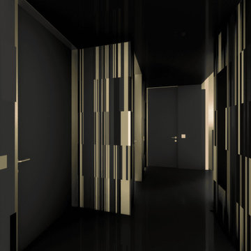
Located in the heart of Manhattan’s Lower East Side, the building was erected on a shallow commercial lot between two 120 year old masonry buildings and a new residential rental building. 330 Grand Street is a mix of 725 SF 1BRs and 1050 SF 2BR apartments. It also contains a 1100 SF two story duplex as well as private and public rooftop space, large private balconies for most units and two large private terraces for the ground floor units.
330 Grand Street was originally designed and approved at the NYC DOB as a prefabricated modular building. During the pandemic, as shipping costs skyrocketed putting the project at risk, we suggested redesigning the building as a reinforced cast-in-place concrete structure. Concrete was readily available and prices had not been affected by the demand increase that many other materials suffered in the pandemic. We took this opportunity to raise floor to ceiling heights, enlarge high performance windows and redistribute the buildings MEPFS and Structural Systems to create very open floor plans.
The challenge was to create a luxurious sensorial living experience with very limited means. In a city with very high construction costs, low cost residential buildings in the area are usually devoid of good quality, design and character. Our approach was to aim high for the end user, prioritizing natural light, open space with long visual perspectives, high ceilings and as always, rejecting the use of predefined building templates.
Our biggest challenge was to ensure that the small spaces feel as clean cut, large and bright as possible. Several unique design decisions were made to ensure low cost and high quality;
Floor plans were laid out so that spaces were wide open and free of clutter from mechanical or structural interruptions. Therefore all infrastructure was placed in lateral demising walls, which in turn act as the unit’s storage and kitchen. The apartments feel wide open, are super quiet and have more storage space than any other comparable apartment in the city.
To solve the problem of the site’s shallow commercial lot which is typically prone to dark interior spaces we focused our attention on the building’s envelope. Instead of the usual small punched window openings, oversized high performance windows were designed to ensure that light penetrated as far as possible into the units. In the smaller 1BR units, the full 50’ depth of the lot is perceived by partitioning spaces with sliding pocket doors that can be retracted to allow deep visual perspectives, making the sight lines in the space feel longer, larger, more ample than normal. In addition to the full height glazing, each unit above the 2nd floor receives a 7 foot covered balcony, adding 120 to 240 sf to each apartment, something unusual in New York City buildings. The space is large enough for a full size dining table, when the weather permits being outside.
We also worked hard to ensure modularity. For example, all kitchen units are all identical throughout the building. The idea of modularity and the economy of the repetitive unit is exercised to the maximum through the building.
Hardware, appliances, flooring, wall coverings and material finishes are all carefully selected to feel bespoke, high quality and unique.
It was important to KURV that the result of this work manifest into something that would deeply connect with the end user and sustain relationships with the consumers of this space.
All images by KURV Architecture ©
 Sweet Smiling Landscape Design
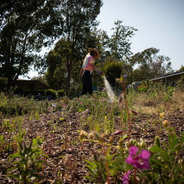
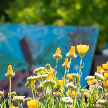
When the school garden teacher at my kid’s school asked if I would volunteer to design the schools learning garden I was excited by the prospect. I drew up some plans with hopes of inspiring the next generation to getting involved with stewardship of the land.
The goal was to create a space were children all abilities could have access to the process of growing food, tending to soils and recognizing the human connection with the natural world.
With an emphasis on edible plants, the garden also incorporates native plants, plants that attract pollinators and plants that build soil.
The garden includes a composting system, and a log circle to use as and out door classroom space. Unfortunately, half way through the installation of this garden the school was closed due to covid and no one was allowed on campus for 6 months. The garden fell into disrepair. As we slowly emerge from the pandemic the school is coming back to life and parent volunteers are allowed back on to campus. With that the garden is coming back as well. The rain harvesting nets and outdoor kitchen did not end up coming into reality. But through the pandemic we learned an even grater importance of outdoor class room space and the power of engaging with the outdoor world.
 Sweet Smiling Landscape Design
When the school garden teacher at my kid’s school asked if I would volunteer to design the schools learning garden I was excited by the prospect. I drew up some plans with hopes of inspiring the next generation to getting involved with stewardship of the land.
The goal was to create a space were children all abilities could have access to the process of growing food, tending to soils and recognizing the human connection with the natural world.
With an emphasis on edible plants, the garden also incorporates native plants, plants that attract pollinators and plants that build soil.
The garden includes a composting system, and a log circle to use as and out door classroom space. Unfortunately, half way through the installation of this garden the school was closed due to covid and no one was allowed on campus for 6 months. The garden fell into disrepair. As we slowly emerge from the pandemic the school is coming back to life and parent volunteers are allowed back on to campus. With that the garden is coming back as well. The rain harvesting nets and outdoor kitchen did not end up coming into reality. But through the pandemic we learned an even grater importance of outdoor class room space and the power of engaging with the outdoor world.
 Ashton Renovations
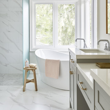
Renovated during the pandemic, this whole house renovation was renewed from top to bottom and included every area of the home. We began by removing walls on the 1st floor and closed in the opening on the 2nd floor. All the rooms were demolished and made way for new finishes that involved the 4 bathrooms, laundry, kitchen, bedrooms, and living areas. The bathrooms all involved heated flooring, towel warmers, and Schluter waterproofing systems. All the trades persevered during the Pandemic, and the end result was stunning!


12