
Search results for "Patients" in Home Design Ideas
 George Ocampo
Sunset Heights Renovation
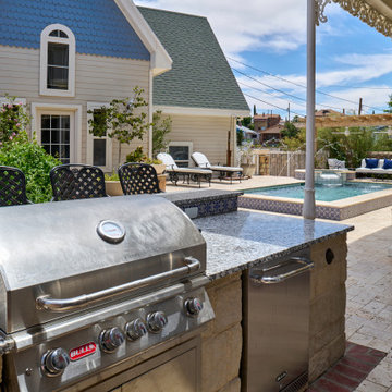
This Victorian style home was beautifully designed from the interior to the exterior. Our clients were looking to update the outdoor space, not only was it not functional, but it did not complement their Victorian home.
Although we had a yearlong waiting list for design, our clients were patient and hired us for 3D design.
Many times, our clients already have all the components in place, such as a pool, outdoor kitchen, fireplace, pergola etc., but they just don’t feel right.
The most important feature of our client’s new space was not only the components, but to be able to have a space that would allow them to create a lifetime of memories. From a visual perspective their existing space seemed limited and confined. Our design team was able to see past this and expanded its space to its full potential which allowed us to create multiple destinations for relaxation, enjoyment and most importantly entertainment.
As we began the design process, we were able to take a closer look at the existing space and noticed many safety concerns and how the existing materials did not accentuate the home either.
At the completion of their 3D design, we were able to present new ideas and materials that would enhance the value of the home as well as help them visualize the new space created with multiple destinations.
Ivory travertine coping & decking was a must as was the Talavera blue highlighted tiles for the newly renovated pool. A new working spa and functional outdoor kitchen with bar were two spaces we are sure they would enjoy while spending time outdoors. We enlarged the existing covered patio to expand the seating area to include chaise lounges, a loveseat and chairs under the pergola shade accent.
Newest favorite additions are the gas firepit and cabin play fort which can be highly utilized year-round. Our clients say, “The adults love hanging out in the fort too!”
Nestled in the Historic District, our client’s home is now filled with plenty of space and great energy for family gatherings, parties, watching sports, graduations and so much more. Who knows, maybe a future wedding or two! Memories of a lifetime will be made here for years to come!
Architecture and lifestyle are always our focus when designing feel good and functional spaces for our clients!
 Paintzen, Inc.
When it comes to finding inspiration for your house or apartment design, there are a variety of routes you can take. For some, it is important to dive into the latest trends in fashion and art, using only the most popular decor pieces and embracing the color palettes seen on runways or in home and garden magazines. But for others, it’s simply about discovering what feels most like “home.”
Ashley Steele, the creator of A Styled Affair, was part of the latter group. “Since my husband and I were moving into a space that was previously owned, I needed a way to make it feel like it was truly ours, and unique to us,” she told our team.
A Styled Affair sprang from Ashley’s passion for fashion, and need for a creative outlet. But it soon became more than that. She developed a following, and it quickly became a place where she could share her personal style, travel adventures, and lifestyle tips. “While the blogging industry has become overwhelmed with people sharing their favorite home decor or make-up tips, I think what sets A Styled Affair apart is my commitment to stay true to my unique taste. I have always marched to the beat of my own drum – and that carries through in the clothes I wear, the decor I select for our home, and the travels I plan.”
Paintzen connected with Ashley as she was settling into her new home in Boston’s Seaport District. Although she and her husband have lived in Boston for almost 8 years, they were used to smaller, more traditional spaces. Their new home is much bigger, and more modern, than any place they lived before. “I wanted to select colors of comfort, simplicity, and sophistication so we could elevate the space and make it feel more like a home.” Ashley also accurately pointed out that new construction can sometimes feel a little cold and sterile, almost industrial. “I wanted our home to feel like a peaceful oasis after coming in from the bustling city.”
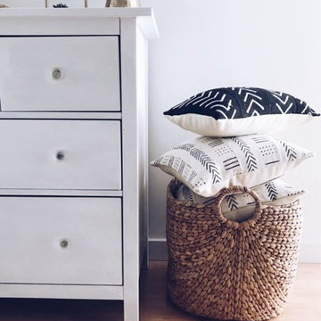
Ashley chose soft white paint for her walls to bring a sense of comfort and zen. With lots of wall decor, art work and carefully selected furniture, the walls serve as a clean and comfortable palette, and allowed her more freedom when making her other design decisions throughout the space. Ashley kept the overall palette fairly neutral, and incorporated “modern bohemian” inspired decor throughout the home; the final product was clean and simple, and catered to her style.
We asked Ashley what she was most excited for now. “I’m most excited to continue to find new decor pieces to compliment the paint colors and decor we’ve already found for the space. We have been really patient with decorating and selected each piece really careful to make sure it is cohesive and flows from room to room. I’m looking forward to enjoying the space with my husband and dog, and entertaining friends and family in the spring and summer!”
A few final questions for Ashley on her experience with Paintzen:
“I would highly recommend Paintzen to anyone, especially those that live in the city. There are so many different paint companies and contractors to choose from but going through Paintzen simplified the process and made me feel comfortable that we had the right team working on our space. Their platform for booking services and choosing paint colors made the process seamless and was a great way to keep track of what we booked and chose for colors. Most importantly, the customer service team was outstanding whenever we had a question or needed to make an adjustment.”
And advice she would give someone repainting their home:
“Patience. I would recommend taking your time and doing your research before selecting paint colors. Lighting changes every color so make sure to bring paint swatches and samples into the space and look at it throughout the day to see the different tones that the light will pick up. I would also recommend researching color trends and recommendations for colors in the family you are looking for. We found our living room color through a blog post listing top-used colors by interior designers and it looks amazing.”
 Srote & Co Architects | Planners | Interiors
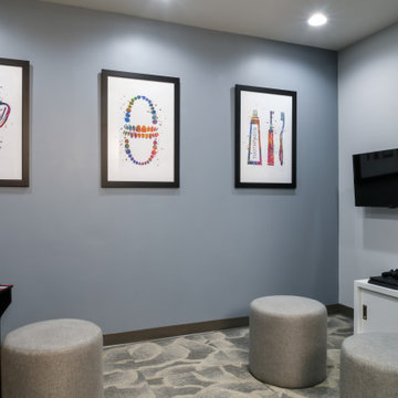
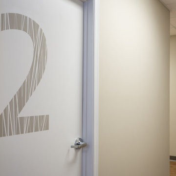
Our focus on this project was not only to provide a much needed update to the aesthetics, but also to nearly double the square footage. The goal was to better accommodate their growing practice by enlarging the waiting area, providing more private office space, adding another consultation room, and creating seating in the clinic itself.
With the new waiting area being nearly the size of the entire previous office, we were able to create features such as a laptop bar and an arcade.
The clinic updates focused on bringing in more natural and supplementary lighting to improve the functional task lighting, but to also cheer up a previously dreary space. By having the glass element on the partitions, we were able to increase patient privacy while also keeping things open and bright.
Find the right local pro for your project
 Landshapes
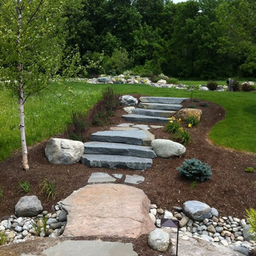
This pond has a 44 mil liner to ensure a leak free swimming structure. The liner material is sensitive to sunlight and will eventually breakdown over the years if it is exposed. As a result, our team spent 3 days meticulously covering the entire pond liner with stone. Each small boulder is hand placed to ensure a perfect fit and not tear the liner in the building process. The amount of patients and effort by our crew is incredible and the result is always beautiful! The waterfall which adds to the natural feel of the pond was created with large stone shelves and a bog for natural filtration. All of our water features use natural filtration processes and no chemicals. We create a simulated bog which the water is pumped into and cleaned naturally though various levels of sand, stone and wetland plants.
 Pure Design House
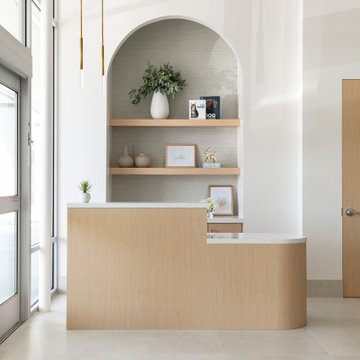
Specialty health care re-imagined. We joined forces with a developer looking to change the face of a very specialized approach to health care. Utilizing some of our well honed trauma-informed design techniques, we not only created a 20,000 sf surgery center but also a space that doctors and staff could thrive in. The concept was to create a wellness-driven environment that puts patients first.
 Renovisions
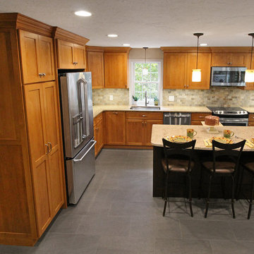
These Hanover, MA clients came to Renovisions as they wanted a local design-build company to rework and expand their small and outdated 1980’s colonial kitchen.
We collaborated and created an expanded 12’x15’ addition space to accommodate a newly designed kitchen which is now 21’x15’. Before we began with the construction process, proper structural engineering presented a challenge as the property was built on ledge. As expected, we determined that several concrete supports were necessary and needed to be built to support the expanded structure.
Our plan included both creative aesthetic and functional layout modifications to transform this ordinary kitchen into a spacious, well-lit, highly functional, stylish and welcoming space to cook, gather and entertain. The bump-out allowed for more functional cabinetry and a dining table which before was placed in a corner of the previous cramped kitchen. Now, there is a wide open space from the adjacent living room and a clear path to a 5’ French door opening to the pool deck. The homeowners also elected for us to extend a new roof over their existing deck creating a nice shaded space to entertain guests.
The island, which serves as the central gathering spot. is eye catching with contrasting dark cocoa colored cabinets and stunning natural looking Cambria quartz countertops. Large, easily accessible deep drawers provide much needed storage for pots, pans and lids as well as expansive countertop space for everyday prep and family get-togethers.
Overall, the clients were thrilled with their Renovision and cannot wait to throw a party to show off their stunning kitchen.
“There is not a single choice we aren’t happy with; it is so us! I love all of the storage and I have a feeling we are going to do a lot of entertaining this summer.”
“Dear Cathy and Ed, We are abundantly grateful for the entire Renovisions Team that have provided us with a beautiful kitchen and porch to enjoy. We will continue to make family memories for many years to come with this new addition. From the first time we met with you at the showroom, we were confident that high quality workmanship would go into our new construction. Mike, Brad, and Tom were very trustworthy and worked very hard every day they were on the job site. They were very flexible and always put the homeowners safety first. They even offered a bit of comic relief! Every night the site was cleaned meticulously, never leaving tools or sharp edges of any sort in the open space. We were also very pleased with the help offered when designing and choosing cabinets, tile and other finishes. Liz was always very helpful and patient to answer questions when we came by the showroom. We are extremely pleased with all the choices and on a daily basis we enjoy the warmth and amazing space it provides.
We recently hosted a retirement party for 70 people and it never felt crowed! We relax under the covered porch in the morning for coffee, the afternoon for lunch and to watch the grandkids in the pool. And of course in the evening while we read or catch up on emails. It is an amazing space! Thank you all again, for your hard work and passion for your craftsmanship. We will be in touch soon to set up a date for you all to drop by to see the finishing touches and to enjoy refreshments.”
- Paul & Beth H. (Hanover)

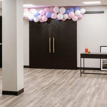
 LifestYle Brokers | Officehomes
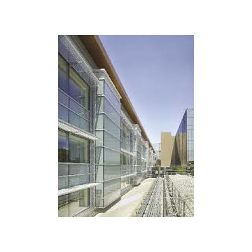
Exterior Glass Cladding & Rooftop HVAC modular units feed individual rooms through the bump outs along glass facade
Example of a huge trendy home design design in New York
Example of a huge trendy home design design in New York
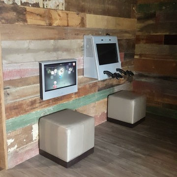
 Texas Iowa Reclaimed
Signature Smiles was the perfect client for our Original Paint Weathered Boards. The mix of modern and rustic in their children's dental office created a warm and inviting space for little patients.

 Lemon Grass Interior Architecture
Erik Rank Photography
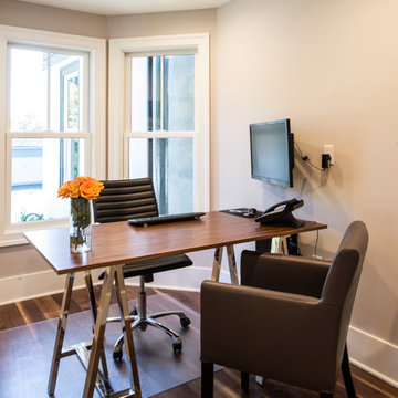
Home office - modern home office idea in New York
Home office - modern home office idea in New York
 Paintzen, Inc.
When it comes to finding inspiration for your house or apartment design, there are a variety of routes you can take. For some, it is important to dive into the latest trends in fashion and art, using only the most popular decor pieces and embracing the color palettes seen on runways or in home and garden magazines. But for others, it’s simply about discovering what feels most like “home.”
Ashley Steele, the creator of A Styled Affair, was part of the latter group. “Since my husband and I were moving into a space that was previously owned, I needed a way to make it feel like it was truly ours, and unique to us,” she told our team.
A Styled Affair sprang from Ashley’s passion for fashion, and need for a creative outlet. But it soon became more than that. She developed a following, and it quickly became a place where she could share her personal style, travel adventures, and lifestyle tips. “While the blogging industry has become overwhelmed with people sharing their favorite home decor or make-up tips, I think what sets A Styled Affair apart is my commitment to stay true to my unique taste. I have always marched to the beat of my own drum – and that carries through in the clothes I wear, the decor I select for our home, and the travels I plan.”
Paintzen connected with Ashley as she was settling into her new home in Boston’s Seaport District. Although she and her husband have lived in Boston for almost 8 years, they were used to smaller, more traditional spaces. Their new home is much bigger, and more modern, than any place they lived before. “I wanted to select colors of comfort, simplicity, and sophistication so we could elevate the space and make it feel more like a home.” Ashley also accurately pointed out that new construction can sometimes feel a little cold and sterile, almost industrial. “I wanted our home to feel like a peaceful oasis after coming in from the bustling city.”
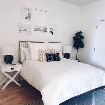
Ashley chose soft white paint for her walls to bring a sense of comfort and zen. With lots of wall decor, art work and carefully selected furniture, the walls serve as a clean and comfortable palette, and allowed her more freedom when making her other design decisions throughout the space. Ashley kept the overall palette fairly neutral, and incorporated “modern bohemian” inspired decor throughout the home; the final product was clean and simple, and catered to her style.
We asked Ashley what she was most excited for now. “I’m most excited to continue to find new decor pieces to compliment the paint colors and decor we’ve already found for the space. We have been really patient with decorating and selected each piece really careful to make sure it is cohesive and flows from room to room. I’m looking forward to enjoying the space with my husband and dog, and entertaining friends and family in the spring and summer!”
A few final questions for Ashley on her experience with Paintzen:
“I would highly recommend Paintzen to anyone, especially those that live in the city. There are so many different paint companies and contractors to choose from but going through Paintzen simplified the process and made me feel comfortable that we had the right team working on our space. Their platform for booking services and choosing paint colors made the process seamless and was a great way to keep track of what we booked and chose for colors. Most importantly, the customer service team was outstanding whenever we had a question or needed to make an adjustment.”
And advice she would give someone repainting their home:
“Patience. I would recommend taking your time and doing your research before selecting paint colors. Lighting changes every color so make sure to bring paint swatches and samples into the space and look at it throughout the day to see the different tones that the light will pick up. I would also recommend researching color trends and recommendations for colors in the family you are looking for. We found our living room color through a blog post listing top-used colors by interior designers and it looks amazing.”
 InnovationLand
Houston Interior Designer Lisha Maxey took this Museum District condo from the dated, mirrored walls of the 1980s to Mid Century Modern with a gallery look featuring the client’s art collection.
The place was covered with glued-down, floor-to-ceiling mirrors,” says Lisha Maxey, senior designer for Homescapes of Houston and principal at LGH Design Services in Houston. “When we took them off the walls, the walls came apart. We ended up taking them down to the studs."
The makeover took six months to complete, primarily because of strict condo association rules that only gave the Houston interior designers very limited access to the elevator – through which all materials and team members had to go.
“Monday through Friday, we could only be noisy from 10 a.m. to 2 p.m., and if we had to do something extra loud, like sawing or drilling, we had to schedule it with the management and they had to communicate that to the condo owners. So it was just a lot of coordination. But a lot of Inner City Loopers live in these kinds of buildings, so we’re used to handling that kind of thing.”
The client, a child psychiatrist in her 60s, recently moved to Houston from northeast Texas to be with friends. After being widowed three years ago, she decided it was time to let go of the traditionally styled estate that wasn’t really her style anyway. An avid diver who has traveled around the world to pursue her passion, she has amassed a large collection of art from her travels. Downsizing to 1,600 feet and wanting to go more contemporary, she wanted the display – and the look – more streamlined.
“She wanted clean lines and muted colors, with the main focus being her artwork,” says Maxey. “So we made the space a palette for that.”
Enter the white, gallery-grade paint she chose for the walls: “It’s halfway between satin and flat,” explains Maxey. “It’s not glossy and it’s not chalky – just very smooth and clean."
Adding to the gallery theme is the satin nickel track lighting with lamps aimed to highlight pieces of art. “This lighting has no wires,” notes Maxey. “It’s powered by a positive and negative conduit.”
The new flooring throughout is a blended-grey porcelain tile that looks like wood planks. “It’s gorgeous, natural-looking and combines all the beauty of wood with the durability of tile,” says Maxey. “We used it throughout the condo to unify the space.”
After Maxey started looking at the client’s bright, vibrant, colorful artwork, she felt the palette couldn’t stay as muted anymore. Hence the Mid Century Modern orange leather sofas from West Elm and bright green chairs from Joybird, plus the throw pillows in different textures, patterns and shades of gold, orange and green.
The concave lines of the Danish-inspired chairs, she notes, help them look beautiful from all the way around – a key to designing spaces for loft living.
“The table in the living room is very interesting,” notes Maxey. “It was handmade for the client in 1974 and has a signature on it from the artist. She was adamant about including the piece, which has all these hand-painted black-and-white art tiles on the top. I took one look at it and said ‘It’s not really going to go.’”
However, after cutting 6 inches off the bottom and making it look a little distressed, the table ended up being the perfect complement to the sofas.
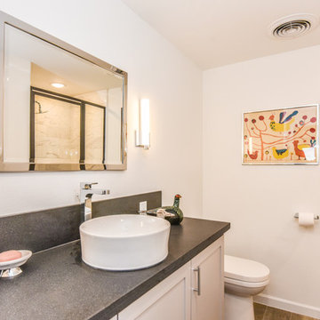
The dining room table – from Design Within Reach – is a solid piece of mahogany, the chair upholstery a mix of grey velvet and leather and the legs a shiny brass. “The side chairs are leather and the end ones are velvet,” says Maxey. “It’s a nice textural mix that lends depth and texture.”The galley kitchen, meanwhile, has been lightened and brightened, with new, white contemporary cabinetry, quartz countertops mimicking the look of Carrara marble, stainless steel appliances and a velvet green bench seat for a punch of color.The two bathrooms have been updated with contemporary white vanities and vessel sinks and the master bath now features a walk-in shower tiled in Dolomite white marble (the floor is Bianco Carrara marble mosaic, done in a herringbone pattern).In the master bedroom, Homescapes of Houston knocked down a wall between two smaller closets with swing doors to make one large walk-in closet with pocket doors. The closet in the guest bedroom also came out 13 more inches.The client’s artwork throughout personalizes the space and tells the story of a life. There’s a huge bowl of shells from the client’s diving adventures, framed art from her child psychiatry patients and a 16th century wood carving from a monastery that’s been in her family forever.
“Her collection is quite impressive,” says Maxey. “There’s even a framed piece of autographed songs written by John Lennon.” (You can see this black-framed piece of art on the wall in the photo above of two green chairs).
“We’re extremely happy with how the project turned out, and so is the client,” says Maxey. “No expense was spared for her. It was a labor of love and we were excited to do it.”
 Reico Kitchen & Bath
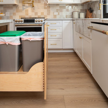
Lauren Hunt from Reico Kitchen and Bath in Charlotte, NC, worked with The Atta Group to design a transitional-inspired kitchen and bar using Masterpiece cabinetry. The kitchen features Masterpiece cabinets in the Martel Evercore doorstyle in a Frost finish on the perimeter.
The kitchen island and bar area both features the same doorstyle with a combination of two different finishes, Riverbed and Shortbread. The countertops are Calacatta Macchia Vecchia Sapien Stone Porcelain.
The client shared their experience, saying, “I love the range hood and the slatted island decor. Riverbed is a beautiful color in both sun and shade. Lauren’s advice to get samples and lay them out in different lighting was invaluable. She went above and beyond, even coming out in the parking lot on a hot summer day to help us. We truly couldn’t have done this without her. Lauren was always patient and supportive as we made decisions, and she never pressured us. Any future projects we have, we’ll 100% reach out to Lauren. She even welcomed our newborn to the showroom!”
Lauren shared, “The clients came with a clear aesthetic vision and plenty of inspiration photos, but they gave me the freedom to recommend and create a space that worked for their growing family while still looking great. We added design details like two-toned dining room cabinets, dark accent shelves in glass towers, an arched valance to match the doorways, and a custom hood that pulls from the island finishes. My favorite element is the slatted accent on the island, which the installers executed perfectly.
This renovation was a big project, starting with a blank slate, which can be overwhelming with so many options. But it was incredibly rewarding to work with these clients who had such a creative vision. We really worked together to create a space that met their needs while showcasing their style. It was a team effort, and I hope that comes through in the final design.”
Photos courtesy of Six Cents Media.
 InnovationLand
Houston Interior Designer Lisha Maxey took this Museum District condo from the dated, mirrored walls of the 1980s to Mid Century Modern with a gallery look featuring the client’s art collection.
The place was covered with glued-down, floor-to-ceiling mirrors,” says Lisha Maxey, senior designer for Homescapes of Houston and principal at LGH Design Services in Houston. “When we took them off the walls, the walls came apart. We ended up taking them down to the studs."
The makeover took six months to complete, primarily because of strict condo association rules that only gave the Houston interior designers very limited access to the elevator – through which all materials and team members had to go.
“Monday through Friday, we could only be noisy from 10 a.m. to 2 p.m., and if we had to do something extra loud, like sawing or drilling, we had to schedule it with the management and they had to communicate that to the condo owners. So it was just a lot of coordination. But a lot of Inner City Loopers live in these kinds of buildings, so we’re used to handling that kind of thing.”
The client, a child psychiatrist in her 60s, recently moved to Houston from northeast Texas to be with friends. After being widowed three years ago, she decided it was time to let go of the traditionally styled estate that wasn’t really her style anyway. An avid diver who has traveled around the world to pursue her passion, she has amassed a large collection of art from her travels. Downsizing to 1,600 feet and wanting to go more contemporary, she wanted the display – and the look – more streamlined.
“She wanted clean lines and muted colors, with the main focus being her artwork,” says Maxey. “So we made the space a palette for that.”
Enter the white, gallery-grade paint she chose for the walls: “It’s halfway between satin and flat,” explains Maxey. “It’s not glossy and it’s not chalky – just very smooth and clean."
Adding to the gallery theme is the satin nickel track lighting with lamps aimed to highlight pieces of art. “This lighting has no wires,” notes Maxey. “It’s powered by a positive and negative conduit.”
The new flooring throughout is a blended-grey porcelain tile that looks like wood planks. “It’s gorgeous, natural-looking and combines all the beauty of wood with the durability of tile,” says Maxey. “We used it throughout the condo to unify the space.”
After Maxey started looking at the client’s bright, vibrant, colorful artwork, she felt the palette couldn’t stay as muted anymore. Hence the Mid Century Modern orange leather sofas from West Elm and bright green chairs from Joybird, plus the throw pillows in different textures, patterns and shades of gold, orange and green.
The concave lines of the Danish-inspired chairs, she notes, help them look beautiful from all the way around – a key to designing spaces for loft living.
“The table in the living room is very interesting,” notes Maxey. “It was handmade for the client in 1974 and has a signature on it from the artist. She was adamant about including the piece, which has all these hand-painted black-and-white art tiles on the top. I took one look at it and said ‘It’s not really going to go.’”
However, after cutting 6 inches off the bottom and making it look a little distressed, the table ended up being the perfect complement to the sofas.
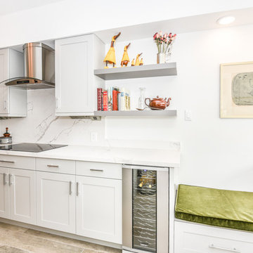
The dining room table – from Design Within Reach – is a solid piece of mahogany, the chair upholstery a mix of grey velvet and leather and the legs a shiny brass. “The side chairs are leather and the end ones are velvet,” says Maxey. “It’s a nice textural mix that lends depth and texture.”The galley kitchen, meanwhile, has been lightened and brightened, with new, white contemporary cabinetry, quartz countertops mimicking the look of Carrara marble, stainless steel appliances and a velvet green bench seat for a punch of color.The two bathrooms have been updated with contemporary white vanities and vessel sinks and the master bath now features a walk-in shower tiled in Dolomite white marble (the floor is Bianco Carrara marble mosaic, done in a herringbone pattern).In the master bedroom, Homescapes of Houston knocked down a wall between two smaller closets with swing doors to make one large walk-in closet with pocket doors. The closet in the guest bedroom also came out 13 more inches.The client’s artwork throughout personalizes the space and tells the story of a life. There’s a huge bowl of shells from the client’s diving adventures, framed art from her child psychiatry patients and a 16th century wood carving from a monastery that’s been in her family forever.
“Her collection is quite impressive,” says Maxey. “There’s even a framed piece of autographed songs written by John Lennon.” (You can see this black-framed piece of art on the wall in the photo above of two green chairs).
“We’re extremely happy with how the project turned out, and so is the client,” says Maxey. “No expense was spared for her. It was a labor of love and we were excited to do it.”

 Flamingo Bay Pools
Example of a mid-sized classic backyard concrete and rectangular lap pool fountain design in Austin
 InnovationLand
Houston Interior Designer Lisha Maxey took this Museum District condo from the dated, mirrored walls of the 1980s to Mid Century Modern with a gallery look featuring the client's art collection.
"The place was covered with glued-down, floor-to-ceiling mirrors," says Lisha Maxey, senior designer for Homescapes of Houston and principal at LGH Design Services in Houston. "When we took them off the walls, the walls came apart. We ended up taking them down to the studs."
The makeover took six months to complete, primarily because of strict condo association rules that only gave the Houston interior designers very limited access to the elevator - through which all materials and team members had to go.
"Monday through Friday, we could only be noisy from 10 a.m. to 2 p.m., and if we had to do something extra loud, like sawing or drilling, we had to schedule it with the management and they had to communicate that to the condo owners. So it was just a lot of coordination. But a lot of Inner City Loopers live in these kinds of buildings, so we're used to handling that kind of thing."
The client, a child psychiatrist in her 60s, recently moved to Houston from northeast Texas to be with friends. After being widowed three years ago, she decided it was time to let go of the traditionally styled estate that wasn't really her style anyway. An avid diver who has traveled around the world to pursue her passion, she has amassed a large collection of art from her travels. Downsizing to 1,600 feet and wanting to go more contemporary, she wanted the display - and the look - more streamlined.
"She wanted clean lines and muted colors, with the main focus being her artwork," says Maxey. "So we made the space a palette for that."
Enter the white, gallery-grade paint she chose for the walls: "It's halfway between satin and flat," explains Maxey. "It's not glossy and it's not chalky - just very smooth and clean."
Adding to the gallery theme is the satin nickel track lighting with lamps aimed to highlight pieces of art. "This lighting has no wires," notes Maxey. "It's powered by a positive and negative conduit."
The new flooring throughout is a blended-grey porcelain tile that looks like wood planks. "It's gorgeous, natural-looking and combines all the beauty of wood with the durability of tile," says Maxey. "We used it throughout the condo to unify the space."
After Maxey started looking at the client's bright, vibrant, colorful artwork, she felt the palette couldn't stay as muted anymore. Hence the Mid Century Modern orange leather sofas from West Elm and bright green chairs from Joybird, plus the throw pillows in different textures, patterns and shades of gold, orange and green.
The concave lines of the Danish-inspired chairs, she notes, help them look beautiful from all the way around - a key to designing spaces for loft living.
"The table in the living room is very interesting," notes Maxey. "It was handmade for the client in 1974 and has a signature on it from the artist. She was adamant about including the piece, which has all these hand-painted black-and-white art tiles on the top. I took one look at it and said 'It's not really going to go.'"
However, after cutting 6 inches off the bottom and making it look a little distressed, the table ended up being the perfect complement to the sofas.
The dining room table - from Design Within Reach - is a solid piece of mahogany, the chair upholstery a mix of grey velvet and leather and the legs a shiny brass. "The side chairs are leather and the end ones are velvet," says Maxey. "It's a nice textural mix that lends depth and texture."
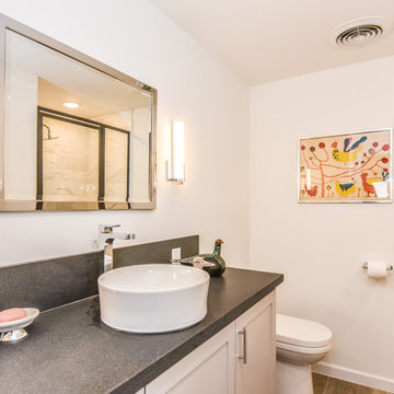
The galley kitchen, meanwhile, has been lightened and brightened, with white quartz countertops and backsplashes mimicking the look of Carrara marble, stainless steel appliances and a velvet green bench seat for a punch of color. The cabinets are painted a cool grey color called "Silverplate."
The two bathrooms have been updated with contemporary white vanities and vessel sinks and the master bath now features a walk-in shower tiled in Dolomite white marble (the floor is Bianco Carrara marble mosaic, done in a herringbone pattern.
In the master bedroom, Homescapes of Houston knocked down a wall between two smaller closets with swing doors to make one large walk-in closet with pocket doors. The closet in the guest bedroom also came out 13 more inches.
The client's artwork throughout personalizes the space and tells the story of a life. There's a huge bowl of shells from the client's diving adventures, framed art from her child psychiatry patients and a 16th century wood carving from a monastery that's been in her family forever.
"Her collection is quite impressive," says Maxey. "There's even a framed piece of autographed songs written by John Lennon." (You can see this black-framed piece of art on the wall in the photo above of two green chairs).
"We're extremely happy with how the project turned out, and so is the client," says Maxey. "No expense was spared for her. It was a labor of love and we were excited to do it."
 Reico Kitchen & Bath
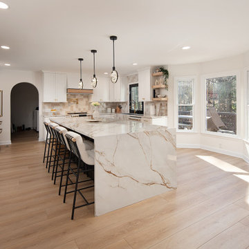
Lauren Hunt from Reico Kitchen and Bath in Charlotte, NC, worked with The Atta Group to design a transitional-inspired kitchen and bar using Masterpiece cabinetry. The kitchen features Masterpiece cabinets in the Martel Evercore doorstyle in a Frost finish on the perimeter.
The kitchen island and bar area both features the same doorstyle with a combination of two different finishes, Riverbed and Shortbread. The countertops are Calacatta Macchia Vecchia Sapien Stone Porcelain.
The client shared their experience, saying, “I love the range hood and the slatted island decor. Riverbed is a beautiful color in both sun and shade. Lauren’s advice to get samples and lay them out in different lighting was invaluable. She went above and beyond, even coming out in the parking lot on a hot summer day to help us. We truly couldn’t have done this without her. Lauren was always patient and supportive as we made decisions, and she never pressured us. Any future projects we have, we’ll 100% reach out to Lauren. She even welcomed our newborn to the showroom!”
Lauren shared, “The clients came with a clear aesthetic vision and plenty of inspiration photos, but they gave me the freedom to recommend and create a space that worked for their growing family while still looking great. We added design details like two-toned dining room cabinets, dark accent shelves in glass towers, an arched valance to match the doorways, and a custom hood that pulls from the island finishes. My favorite element is the slatted accent on the island, which the installers executed perfectly.
This renovation was a big project, starting with a blank slate, which can be overwhelming with so many options. But it was incredibly rewarding to work with these clients who had such a creative vision. We really worked together to create a space that met their needs while showcasing their style. It was a team effort, and I hope that comes through in the final design.”
Photos courtesy of Six Cents Media.

 Brittanys Design
"Crisp Lodge on the River"
These clients were so patient as they had to move out for 6 months while we took over the renovation of the whole house! The biggest change and always the starting point of every project is the floorpan! The goal was to create a more functional kitchen, dining and living space to accommodate this growing family. The rosemary painted island really sets the tone for all the other cabinetry, flooring, countertops and the rustic rich backsplash along with the stacked slate fireplace tile.
 AquaTerra Outdoors
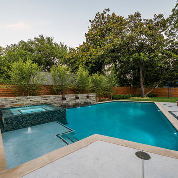
This project was a challenging outdoor renovation. During design process we had to work closely with the City because of the close proximity to drainage easements. Our client was very patient and great to work with as we went through the design process. Based on the end result, the wait was worth it. We were able to design and install a new pool, water feature, raised infinity edge spa, wood deck with fire feature, new fence and all new landscape.
Photography: Wade Griffith
21