
Search results for "Paying extremely" in Home Design Ideas
 Cure Design Group
KITCHEN RENOVATION CURRENT CRAFTSMAN
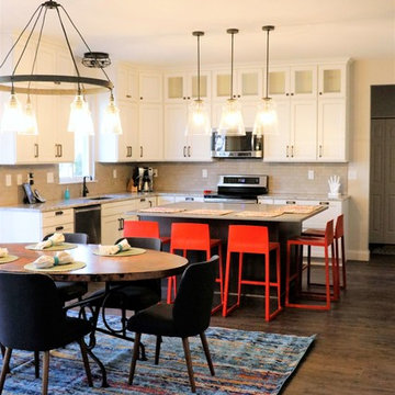
This client started off just being curious about our services - what we could do, and if we could even help her update her kitchen. She and her husband with their two teenage kids have lived in their home for several years without updating anything since the house was originally built. They didn’t quite have a budget in mind yet. They didn’t know their style, or even if they had one. Their timeline was simple, “as fast as you can so we’re not without a kitchen for very long” (usually what we hear for kitchen updates).
After a very productive consultation: determining the scope of work and zeroing in on a budget, I was very excited to update this underwhelming space to something that is modern but timeless, something that is theirs. And, it was easy to see what type of design style they gravitated toward looking at the pieces they already own: Craftsman/Prairie Style. I left the meeting so excited to weave in yet another genre of design to my CDG portfolio! We circled in our contractor to discuss the changes they were looking to make and the scope of work that would be theirs. Then I was off to get designing:
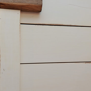
// Because the kitchen’s footprint and the defined breakfast space delineated by the bay, we kept the perimeter cabinetry as it was originally laid out. We updated these cabinets to a beautiful soft Alabaster White with a Barn Wood Glaze to highlight the simplicity of the shaker style doors. We added transom cabinets above the uppers, with only the back wall having seeded glass inserts to highlight some of their collectables.
// The original shaped island was counter-productive (See what I did there?) in functionality and design. We squared this off to reduce some of the angles and gain more storage. We highlighted the new island with a contrasting oak cabinet in a dark finish, to pay our respects to the craftsman style, and topped with a concrete-like countertop as a nod to the Prairie Style, allowing the homeowners to gain two extra seats and a massive -uninterrupted- work surface.
// The small section of cabinetry between the garage entry and fridge now is the perfect dump-station for mail, electronics, whatever is in their hands when they come into the house; and completely hidden by the refrigerator.
// The disconnected cabinetry in the breakfast area makes for a great place to have a working office. Accessible from the kitchen or the adjacent great room, this is the perfect place for the kids to do their homework while mom and dad are putting together dinner. The base cabinets are built out for office-type storage: paper and pencil drawers, filing systems, and cord management. Additionally, the long counter provides a ton of worksurface to spread out.
// The largest transformation was the pantry. We raised the height of the doorway and added huge custom designed bypass sliding barndoors. Finished with a dark stain to compliment the island and cut to inset 4 stained glass windows, typical of this style of design, and driving home the concept for the whole space.
// They were desperate to replace their flooring with something extremely durable to flow throughout the kitchen and the whole main level. This beautiful new flooring is actually a textured LVT(!) Which allowed them to save on overall cost and extend the life of their new flooring purchase.
// They loved their copper table, so we kept it and added new simple, mid-century modern chairs around it and a shiny new craftsman-style chandelier above. We added bright barstools in a burnt orange-red accent, and a bright woven rug to tie it all together.
// Because the kitchen renovation was shaping up to be pretty spectacular, they decided they needed to now replace their ‘now-these-look-a-little-too-old’ upholstered seating in the neighboring great room with 2 new sofas. We found the perfect sage-y-grey fabric which we covered on sofa frames that have and exposed oak-wood base, which we finished in a warm weathered grey.
// As every designer knows, a room isn’t finished until there’s something on the windows. Now that the new flooring was installed and every other room on the main level ‘seemed’ to be updated, we needed to update the window treatments in the dining, and great rooms to reflect their new design concept.
I hope you find the ‘after’ photos refreshing (as refreshing as it was for me to work on something that’s not a “Farm House” style that’s saturating the industry right now!) This was such a fun project and a great collaboration with our contractor.
 Gallery KBNY
The owner of this historic and landmarked town-home renovation in Hudson Square, originally built in 1826, hired Gallery Kitchen and Bath to fully gut-renovate this 3-unit row-home. The scope of work included a full-scale renovation of the owners unit, including the renovation of the kitchen, one 4-piece master ensuite bathroom, one 3-piece bathroom with a walk-in steam shower, and a beautiful powder room. Additional work in the owners unit also included flooring, electrical upgrade, major plumbing work, new HVAC system, restoration of a fireplace, installation of a fully integrated smart home system and landmarked approved windows.
CELLAR RENOVATION IN NYC LANDMARKED TOWN-HOME
Rounding out the owners unit we renovated the cellar, which was converted into an entertainment space and featured a custom glass curtain wall, along with a custom staircase with an exposed brick wall. During the demolition phase of the cellar, our team discovered 56 wine jugs filled with wine from the prohibition era, leading us to name this project the prohibition house. For the two tenant units, Gallery Kitchen and Bath undertook the renovation of 2 kitchens, 4 bathrooms, new hardwood flooring throughout, along with detailed carpentry work in the entire home.
WHY GALLERY KITCHEN AND BATH
After interviewing multiple contractors, our client decided on Gallery Kitchen and Bath primarily because of our turnkey design, selection, and build process. In a renovation of this magnitude it is crucial to have a centralized full service contractor under one roof to handle all of the aspects and simultaneous moving parts of the project. Decentralizing the entire process by having multiple unaffiliated vendors handle various parts of the process can easily become chaotic, time consuming, and costly.
Because Gallery Kitchen and Bath undertook the entire process, from the design of the entire space to the selection and procurement of all finishes and fixtures, down to the procurement of all permits and LPC filings, it made a seemingly chaotic project a’lot more manageable.
PHASE 1: DESIGN, SELECTION, PROCUREMENT
Our client wanted the renovation to incorporate a fully modern design into his Hudson Square town-house. Being that this is a landmarked property, the exterior facade had to be restored and kept with the original aesthetic, the interior of the home however was a whole different story.
In keeping up with the modern aesthetic, our designers went to work to design a custom kitchen that included fully custom flat panel base cabinets in a white high gloss finish and an absolute matte black appliance/pantry wall. The kitchen design also included a white quartz countertop and backsplash with a waterfall edge island. To bring warmth to the modern kitchen, our designers incorporated a rifted and quartered select oak wood floor in a herringbone pattern, and custom blended stain with matte polyurethane finish. For continuity, the wood floor was also extended throughout the entire owners unit.
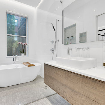
In the ensuite bathroom we created a “wet area” which houses a standalone soaking tub as well as a beautiful rainfall shower, completely leveled with the rest of the floor in the bathroom. Some highlights within this space include a tiled square drain, large niche cutouts with a carrera marble accents. Once again, to bring warmth to this modern bathroom, our designers incorporated a floating rustic oak vanity and carrera marble mosaic floor tile.
Last on the list on the owners unit floor was the cellar, which our client wanted to utilize as an entertainment space for his friends and family. During the design phase, we incorporated an open concept layout, wedding the indoor and outdoor space with a custom glass curtain wall. The design also included custom walnut built-ins that serve as a custom wet bar and storage piece.
With the design approved and selections made our office liaisons moved to procure all of the material selections and finishes.
PHASE 2: DEMO
Because this home is almost two centuries old, we had to take extra precaution during the interior demolition phase of the project. One specific area that we had to pay special attention to was the existing brick. Over time the mortar in old brick homes deteriorates and turns into dust – for this reason it was extremely important that a thorough and ongoing inspection of the exteriors and interior walls took place during the demolition of the space.
After 14 30-yard debris containers and 56 wine filled jugs from the prohibition era later , the demolition of this historic Hudson Square town-home came to an end. If you are wondering whether we tried the wine? After notifying the owner we agreed to open one of the jugs and try them together – nothing but vinegar.
PHASE 3: BUILD
One of the challenges in a renovation project of this scope is nailing down the logistics and delivery of fixtures and finish material. Adding to this challenge was a narrow entry door that required us to use a boom truck in order to deliver some of the larger materials on site. To ensure a succinct time schedule, we boomed all of the materials through the 3rd floor for the entire project and worked our renovation work from top floor to cellar. This technique also insured that any unexpected water issues during the renovation process would not damage a finished floor.
With all roughing and framing complete, the Gallery KBNY team proceeded to execute on the design plan.
THE REVEAL
From what was once a dilapidated town-home with nothing but potential, to a glamorous and luxurious modern interior space – the prohibition house was complete. Ready to speak with us about your renovation project? Contact us to schedule your free consultation and let Gallery KBNY show you why our all-inclusive approach to your renovation is the smartest way to renovating in NYC.
 Whitt Carpet One Floor & Home
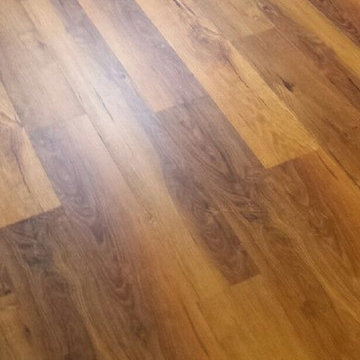
Mannington Adura LVT Napa, color Tanin
Elegant vinyl floor bedroom photo
Elegant vinyl floor bedroom photo
Find the right local pro for your project

 Lodi Tile Works, Inc
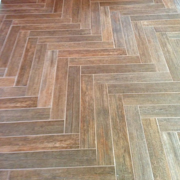
Wood-look tile floor using porcelain plank tiles in a herringbone pattern.
Living room - traditional porcelain tile living room idea in Sacramento
Living room - traditional porcelain tile living room idea in Sacramento
 In Your Space Interior Design
Designed By Runa Novak
In Your space Interior Design
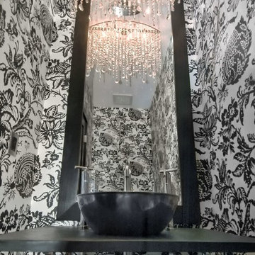
Example of a small minimalist medium tone wood floor powder room design in Chicago with a wall-mount sink
Example of a small minimalist medium tone wood floor powder room design in Chicago with a wall-mount sink

 Florida Design Works
Thanks to Gin Williams for sending this in from Fort Myers.
Pucci Tile: Installer
Green Coast Custom Homes is the Builder
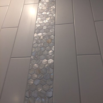
Florida Tile streamline. 4x16 Arctic Matte
Vertical accent stripes: MIR mosaic SMA-007 Miami
Shower floor: DSA 2x2 Fresh color: Light Grey
 L.Bonadies General Contracting
Joseph Narcisse
Mid-sized mountain style enclosed dark wood floor family room photo in New York with beige walls and a wall-mounted tv
Mid-sized mountain style enclosed dark wood floor family room photo in New York with beige walls and a wall-mounted tv
 Lori Ramsay Design
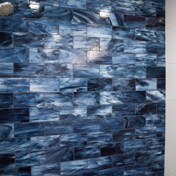
Blue and white ocean inspired bath with New Ravenna blue glass tile and glass mosaic shower pan. White all drawer vanity with Drawer Doc electrical outlets maximize storage and functionality.
 T.A. French - Custom Builder
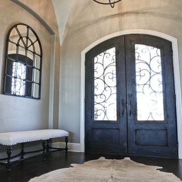
Example of a mid-sized transitional dark wood floor and brown floor double front door design in Austin with gray walls and a black front door
 The Artists Hands - Faux Finishes
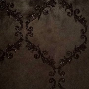
This remodeled bedroom was upgraded to an elegant and sophisticated master retreat. Using metallic plasters and various techniques of application with this beautiful repeat stencil pattern, this accent wall is a stunning focal feature of this master bedroom. Copyright © 2016 The Artists Hands

 IQnewswire
The End of the Ultra-Slim Wedding Suit
For several years, men’s formalwear was dominated by narrow lapels, short jackets and trousers cut close to the leg. The style created a sharp outline, but it often left little room for sitting, dancing or eating comfortably. Current tailoring is moving towards a more balanced shape, with cleaner shoulders, a defined waist and trousers that follow the leg without gripping it.This change does not mean that wedding suits have become oversized. The newer approach sits between skinny and loose. It keeps the structure expected of formal clothing while allowing the cloth to hang properly. For grooms, that balance is useful during a day that may involve a ceremony, photographs, dinner and several hours on the dance floor.
Look For Shape Rather Than Tightness
A well-fitted suit should create a clear outline without relying on tension. Collections of Marc Darcy suits include tailored three-piece designs, checks and textured fabrics that suit the current preference for visible structure and considered proportions.
The jacket should sit close enough to define the waist, but the front button should fasten without pulling the cloth into an X-shaped crease. At the shoulders, the seam should finish close to the natural shoulder point. Extra width can make the jacket look borrowed, while a shoulder that is too narrow may cause the upper sleeve to collapse.
Fit should be assessed while moving as well as standing. Reach forward, sit down and raise both arms. A tailored jacket will never feel like casual sportswear, but it should allow the groom to carry out ordinary movements without sharp restriction across the back or chest.
Give The Jacket Enough Length
Very short suit jackets became common alongside skinny trousers, but they can disrupt the proportions of a three-piece outfit. If the jacket finishes too high, the waistcoat may appear longer than the outer layer and the trousers may look as though they begin too low.
A more traditional jacket length usually covers most of the seat and divides the body more evenly. This can make the legs appear longer without shortening the jacket excessively. The correct length depends on height and body proportions, so two men wearing the same chest size may still need different jacket lengths.
View the suit from the back and side rather than relying on a front-facing mirror. The vents should lie flat, and the hem should not lift away from the body. A side photograph can reveal an unbalanced jacket more clearly than the changing-room mirror.
Choose Trousers That Fall Cleanly
The move away from very tight tailoring is most noticeable in suit trousers. A modern tailored leg can still be neat at the ankle, but it should provide enough room through the seat and thigh for the fabric to fall without horizontal lines.
Trouser pockets offer a useful fit check. If they pull open while standing, the waist or hips may be too tight. The fly should lie flat, and the waistband should remain in place without depending on an overtightened belt. Higher-rise trousers can work particularly well with a waistcoat because they reduce the chance of shirt fabric appearing between the two pieces.
The hem should make gentle contact with the shoe rather than gathering heavily around it. A short hem can work with narrow trousers but taking it too far may make the suit look dated once the current cropped style moves on. A slight break is easier to wear with different formal shoes and tends to look balanced in full-length wedding photographs.
Let The Waistcoat Support the Silhouette
A waistcoat adds structure through the centre of the outfit, but only when it fits correctly. It should lie flat against the shirt and cover the trouser waistband. Tightening the back strap cannot correct a waistcoat that is the wrong size or too short.
Current three-piece styling often places greater emphasis on the waistcoat. Double-breasted designs, contrasting fabrics and wider openings can distinguish the groom without requiring a brightly coloured jacket. When the groom removes the jacket later, the waistcoat keeps the outfit looking complete.
Allow room for a full meal and several hours of wear. A waistcoat that feels acceptably close during a brief fitting may become uncomfortable at dinner. Sit down with every button fastened and check whether the lower edge presses into the waist or causes the front to bow.
Use Stronger Lapels Carefully
Wider notch and peak lapels are returning after years of extremely narrow designs. A broader lapel can frame the shirt and tie, balance the shoulders and give the jacket a more formal character. Peak lapels create a particularly strong line on double-breasted jackets and evening suits.
The lapel width should still suit the wearer. A very broad lapel can overwhelm a smaller frame, while an extremely narrow one may look out of proportion on a broad chest. The shirt collar, tie width and lapel should relate to one another without matching exactly.
A wider lapel also leaves less need for decorative extras. A simple buttonhole flower or plain pocket square may be enough. Large lapel pins can crowd the upper part of the jacket, especially when the cloth already contains a check.
Avoid Buying According to the Size Label Alone
The same labelled size can fit differently across designs because cut, fabric and construction affect the garment. Begin with accurate chest, waist, inside-leg and approximate jacket-length measurements. Compare those figures with the retailer’s size information rather than ordering the size worn in another brand without checking.
If the jacket fits at the shoulders but needs slight shaping through the waist, a tailor can often make the adjustment. Sleeves and trouser hems are also commonly altered. Major changes to the shoulder line or jacket length are more difficult and may not be economical.
Do not choose the smallest size that can be fastened. A suit that looks tight in the fitting room is unlikely to become more comfortable during a long wedding day. Cloth should skim the body and return to a clean position after movement.
Balance a checked suit with simple styling
Texture and checks remain popular in wedding tailoring, particularly for country houses, converted barns and traditional venues. These fabrics already add depth to the outfit, so the cut should remain controlled and the accessories relatively quiet.
A plain white, pale blue or cream shirt gives a checked suit a clear foundation. Choose a tie from one of the secondary colours in the cloth rather than introducing another strong pattern. A white pocket square works when the suit contains several shades and does not need further decoration.
Shoes should support the proportions of the trousers. A very slim shoe may appear too small beneath a fuller hem, while a heavy casual sole can pull attention away from the tailoring. Oxfords, Derbies and refined brogues usually provide enough visual weight without looking bulky.
Coordinate the wedding party without forcing one fit
Matching groomsmen suits can become difficult when every member of the party has a different build. Insisting on an identical close fit may leave some men comfortable and others visibly restricted. A better approach is to keep the cloth, colour and main design consistent while adjusting jacket and trouser sizes for each person.
The groom can stand apart through a waistcoat, lapel shape or accessory rather than wearing a suit cut much tighter than everyone else. This creates a connection across the group without treating one silhouette as suitable for every body.
Arrange fittings early enough to identify size and alteration issues. Group orders should be checked well before the wedding, particularly when trousers need hemming or jackets require sleeve adjustments. Each person should try the complete outfit with the intended shirt and shoes.
Judge the suit by the whole day
A wedding fitting often lasts less than half an hour, while the suit may be worn for twelve hours or more. Comfort should therefore be tested under realistic conditions. Sit for several minutes, walk upstairs and check the waistband after moving around.
Pay attention to the parts that cannot be seen clearly in a mirror. The collar should remain close to the shirt at the back of the neck. Jacket vents should not pull apart, and the trouser seat should follow the body without sagging or strain.
The current move towards balanced tailoring gives grooms more room to choose clothes that look formal without feeling restrictive. Clean shoulders, a shaped jacket and trousers with a natural fall will outlast extreme proportions. A suit that allows the groom to stand, sit and celebrate comfortably is also more likely to look composed in photographs taken throughout the day.
 Custom Surface Solutions
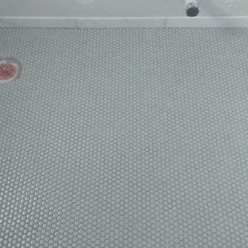
Custom Surface Solutions (www.css-tile.com) - Owner Craig Thompson (512) 430-1215. This project shows the remodel of a small 1950's vintage home master bathroom. 8"" x 18" Calcutta gold marble tile was used on the shower walls and floor wall base and ceramic gray penny tile on the floor. Shower includes curbless pan / floor, dual shower boxes, frameless glass slider, trough duel fixture sink and chrome fixtures.
 Custom Surface Solutions
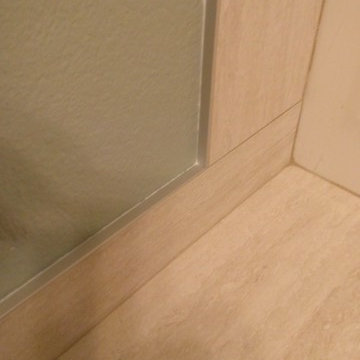
Custom Surface Solutions (www.css-tile.com) - Owner Craig Thompson (512) 430-1215. This project shows new 12 x 24 tile installed vertically with offset layout pattern on wall and floor. Includes shower box with linear glass accent tile back and vertical glass accent band. Tile edges are finished with Schluter Jolly satin aluminum profile edge trim.

 threshold interiors
Location: New York, NY, United States
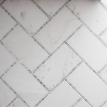
This Loft was tastefully renovated back in the '90s, but was due for an update and an expansion of the kitchen and dining areas to accommodate the client's cooking skills and entertaining needs. EnlargIing the island and adding cabinetry to delineate the office, bar and dining areas was a priority. The bathroom was updated to feel like a tranquil spa with beautiful new tile, plumbing fixtures and cabinets. Our biggest challenge was coordinating the entire renovation while our client was out of town for the Summer!
Photographed by: James Salomon
 TreHus Architects+Interior Designers+Builders
Example of a large classic u-shaped dark wood floor eat-in kitchen design in Minneapolis with a double-bowl sink, recessed-panel cabinets, white cabinets, white backsplash, stainless steel appliances, an island and black countertops

 Ranger Glass And Mirror
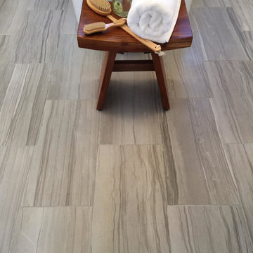
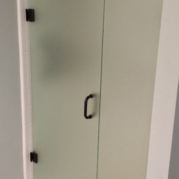
Inspiration for a mid-sized transitional 3/4 white tile and porcelain tile porcelain tile and beige floor alcove shower remodel in Dallas with gray walls and a hinged shower door
 User
UserDECO Window Fashions
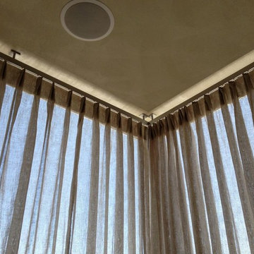
Sheer pleated custom made drapes, ceiling mount metal rod.
Trendy bedroom photo in Austin
Trendy bedroom photo in Austin
6