
Search results for "People additionally" in Home Design Ideas
 W. S. Feldt General Contractor, Inc.
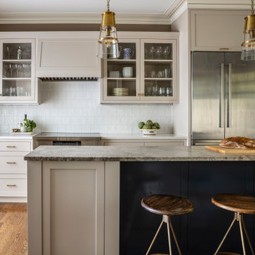
When only one or two people can reasonably be in the kitchen at a given time in a household that is full of people, it’s time to think about possibilities for creating a space where everyone has a spot to fit in. The kitchen in this 1920s Tudor home was dark, constrained, and cut off from the rest of the house. These aspects made for limited functionality when entertaining guests. The goal of this renovation, designed by Kasa Architecture and K&L Interiors, sought to eliminate those characteristics while keeping in the period of the home.
One of the first things completed was to widen the opening which connects the dining room and kitchen. This created more space for the movement of people during a gathering and brightened up both rooms. The fixtures, hardware, and wallpaper were thoughtfully chosen by K&L Interiors to unite the spaces in a style reminiscent of the 1920s. The crown molding throughout the kitchen and the entryway was custom made to match the original.
Next, an extended island was added to the kitchen to provide versatile counter space for entertaining as well as a casual seating area. The island was designed to accommodate a beverage fridge at one end which in turn saves room in the main refrigerator for other things.
Additionally, the doorway at the back of the kitchen was widened and new French doors were installed. This enhanced the kitchen by adding light and easier access to the back deck. In order to widen the back door, the original exterior brick had to be removed. To keep the house looking true to its original appearance, the brick had to be matched and replaced once the doors were installed.
In a small kitchen maximizing space is essential. The design of this renovation accomplished this by re-purposing an existing coat closet. One of the walls in the closet was extended into the entryway of the home and then that space was turned into a walk-in pantry. Other ways storage was generated and counter space maximized was to put a knife block and coffee station enclosed behind cabinet doors.
The end result of this renovation is a bright and open space defined by the period and style of the 1920s with added functionality and practicality of modern times which encompasses casual and formal gatherings.

 KE Interior Solutions
The warmth of the Walnut Cabinetry is juxtaposed beautifully against the grade two maple floors. This is a compilation of many textures that all work together in a visual quilt of textural intrigue.

 Metropolis Drafting and Construction Inc
Clean as clean can be. This super bright and white bathroom is a perfect design for whomever wants a easy on the eyes color scheme and a feeling of cleanliness.
The bathroom was constructed as an addition to the master bedroom. The vanity and the toilet are floating and mounted to the wall to give a light weight feeling and openness.
the huge double shower is perfect for two people to enjoy simultaneously and the curbless design (no step in) \ the open walk in area makes it easy and fun to use.
the floor tile are the contrasting touch and together with the peitra gray top of the shower benches give the color punch that a white bathroom needs.
Find the right local pro for your project

 Bella Cucina Designs LLC
This kitchen was updated by removing a peninsula and adding a center island. The contemporary flat panel door is warmed by the soft color of the textured laminate and then sharpened by the use of 2mm 3d brushed aluminum edge. This simple laminate door with the granite countertops and glass tile in neutral shades of green add an organic touch. The Microwave was built into a wall of tall storage for easy access. This wall provides multiple areas for storage. Floating cabinets were added on the wall near the table to provide an additional serving area. By updating the cabinetry along the half wall which looks into the dining room, this socially active couple can entertain a large group of people by utilizing both areas.
 W. S. Feldt General Contractor, Inc.
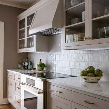
When only one or two people can reasonably be in the kitchen at a given time in a household that is full of people, it’s time to think about possibilities for creating a space where everyone has a spot to fit in. The kitchen in this 1920s Tudor home was dark, constrained, and cut off from the rest of the house. These aspects made for limited functionality when entertaining guests. The goal of this renovation, designed by Kasa Architecture and K&L Interiors, sought to eliminate those characteristics while keeping in the period of the home.
One of the first things completed was to widen the opening which connects the dining room and kitchen. This created more space for the movement of people during a gathering and brightened up both rooms. The fixtures, hardware, and wallpaper were thoughtfully chosen by K&L Interiors to unite the spaces in a style reminiscent of the 1920s. The crown molding throughout the kitchen and the entryway was custom made to match the original.
Next, an extended island was added to the kitchen to provide versatile counter space for entertaining as well as a casual seating area. The island was designed to accommodate a beverage fridge at one end which in turn saves room in the main refrigerator for other things.
Additionally, the doorway at the back of the kitchen was widened and new French doors were installed. This enhanced the kitchen by adding light and easier access to the back deck. In order to widen the back door, the original exterior brick had to be removed. To keep the house looking true to its original appearance, the brick had to be matched and replaced once the doors were installed.
In a small kitchen maximizing space is essential. The design of this renovation accomplished this by re-purposing an existing coat closet. One of the walls in the closet was extended into the entryway of the home and then that space was turned into a walk-in pantry. Other ways storage was generated and counter space maximized was to put a knife block and coffee station enclosed behind cabinet doors.
The end result of this renovation is a bright and open space defined by the period and style of the 1920s with added functionality and practicality of modern times which encompasses casual and formal gatherings.
 STAK Architecture
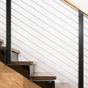
Nestled in a historic residential neighborhood this 1950s Baptist Church was outgrown by its congregation. The building was left unused for 12 years until it was adapted for reuse as a single family home. The home, for a young family of four, was designed with the healthy building principles in mind. The completed house is net zero ready, meaning that all of the systems necessary to convert this house to a net zero home are in place, all that is needed are solar panels. Though the original building was in very rough shape, the design team worked hard to retain as much of the original form as possible. The addition distinguishes itself from the original through materiality and structural articulation. The new form hovers on cantilevers, creating a light touch with the ground plane, in contrast to the heavy form of the original masonry structure. Even though the new building has a modern aesthetic it had to conform to some of the historic neighborhood ordinances of the city. The completed product is loved by the neighborhood, with many people taking their evening walks to pass by their new favorite house.

 Thompson Remodeling
The owners of this beautiful historic farmhouse had been painstakingly restoring it bit by bit. One of the last items on their list was to create a wrap-around front porch to create a more distinct and obvious entrance to the front of their home.
Aside from the functional reasons for the new porch, our client also had very specific ideas for its design. She wanted to recreate her grandmother’s porch so that she could carry on the same wonderful traditions with her own grandchildren someday.
Key requirements for this front porch remodel included:
- Creating a seamless connection to the main house.
- A floorplan with areas for dining, reading, having coffee and playing games.
- Respecting and maintaining the historic details of the home and making sure the addition felt authentic.
Upon entering, you will notice the authentic real pine porch decking.
Real windows were used instead of three season porch windows which also have molding around them to match the existing home’s windows.
The left wing of the porch includes a dining area and a game and craft space.
Ceiling fans provide light and additional comfort in the summer months. Iron wall sconces supply additional lighting throughout.
Exposed rafters with hidden fasteners were used in the ceiling.
Handmade shiplap graces the walls.
On the left side of the front porch, a reading area enjoys plenty of natural light from the windows.
The new porch blends perfectly with the existing home much nicer front facade. There is a clear front entrance to the home, where previously guests weren’t sure where to enter.
We successfully created a place for the client to enjoy with her future grandchildren that’s filled with nostalgic nods to the memories she made with her own grandmother.
"We have had many people who asked us what changed on the house but did not know what we did. When we told them we put the porch on, all of them made the statement that they did not notice it was a new addition and fit into the house perfectly.”
– Homeowner
Sponsored
Columbus, OH

Structural Remodeling
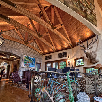
Franklin County's Heavy Timber Specialists | Best of Houzz 2020!
 W. S. Feldt General Contractor, Inc.
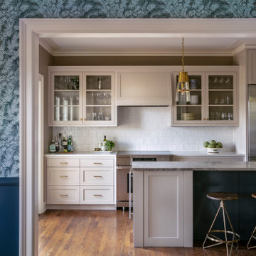
When only one or two people can reasonably be in the kitchen at a given time in a household that is full of people, it’s time to think about possibilities for creating a space where everyone has a spot to fit in. The kitchen in this 1920s Tudor home was dark, constrained, and cut off from the rest of the house. These aspects made for limited functionality when entertaining guests. The goal of this renovation, designed by Kasa Architecture and K&L Interiors, sought to eliminate those characteristics while keeping in the period of the home.
One of the first things completed was to widen the opening which connects the dining room and kitchen. This created more space for the movement of people during a gathering and brightened up both rooms. The fixtures, hardware, and wallpaper were thoughtfully chosen by K&L Interiors to unite the spaces in a style reminiscent of the 1920s. The crown molding throughout the kitchen and the entryway was custom made to match the original.
Next, an extended island was added to the kitchen to provide versatile counter space for entertaining as well as a casual seating area. The island was designed to accommodate a beverage fridge at one end which in turn saves room in the main refrigerator for other things.
Additionally, the doorway at the back of the kitchen was widened and new French doors were installed. This enhanced the kitchen by adding light and easier access to the back deck. In order to widen the back door, the original exterior brick had to be removed. To keep the house looking true to its original appearance, the brick had to be matched and replaced once the doors were installed.
In a small kitchen maximizing space is essential. The design of this renovation accomplished this by re-purposing an existing coat closet. One of the walls in the closet was extended into the entryway of the home and then that space was turned into a walk-in pantry. Other ways storage was generated and counter space maximized was to put a knife block and coffee station enclosed behind cabinet doors.
The end result of this renovation is a bright and open space defined by the period and style of the 1920s with added functionality and practicality of modern times which encompasses casual and formal gatherings.

 TKS Design Group
Free ebook, Creating the Ideal Kitchen. DOWNLOAD NOW
We went with a minimalist, clean, industrial look that feels light, bright and airy. The island is a dark charcoal with cool undertones that coordinates with the cabinetry and transom work in both the neighboring mudroom and breakfast area. White subway tile, quartz countertops, white enamel pendants and gold fixtures complete the update. The ends of the island are shiplap material that is also used on the fireplace in the next room.
In the new mudroom, we used a fun porcelain tile on the floor to get a pop of pattern, and walnut accents add some warmth. Each child has their own cubby, and there is a spot for shoes below a long bench. Open shelving with spots for baskets provides additional storage for the room.
Designed by: Susan Klimala, CKBD
Photography by: LOMA Studios
For more information on kitchen and bath design ideas go to: www.kitchenstudio-ge.com

 User
The magnificent Casey Flat Ranch Guinda CA consists of 5,284.43 acres in the Capay Valley and abuts the eastern border of Napa Valley, 90 minutes from San Francisco.
There are 24 acres of vineyard, a grass-fed Longhorn cattle herd (with 95 pairs), significant 6-mile private road and access infrastructure, a beautiful ~5,000 square foot main house, a pool, a guest house, a manager's house, a bunkhouse and a "honeymoon cottage" with total accommodation for up to 30 people.
Agriculture improvements include barn, corral, hay barn, 2 vineyard buildings, self-sustaining solar grid and 6 water wells, all managed by full time Ranch Manager and Vineyard Manager.The climate at the ranch is similar to northern St. Helena with diurnal temperature fluctuations up to 40 degrees of warm days, mild nights and plenty of sunshine - perfect weather for both Bordeaux and Rhone varieties. The vineyard produces grapes for wines under 2 brands: "Casey Flat Ranch" and "Open Range" varietals produced include Cabernet Sauvignon, Cabernet Franc, Syrah, Grenache, Mourvedre, Sauvignon Blanc and Viognier.
There is expansion opportunity of additional vineyards to more than 80 incremental acres and an additional 50-100 acres for potential agricultural business of walnuts, olives and other products.
Casey Flat Ranch brand longhorns offer a differentiated beef delight to families with ranch-to-table program of lean, superior-taste "Coddled Cattle". Other income opportunities include resort-retreat usage for Bay Area individuals and corporations as a hunting lodge, horse-riding ranch, or elite conference-retreat.

 Cascade West Development
The Willow - Transitional Family Home on Acreage in Brush Prairie, Washington by Cascade West Development Inc.
Another key ingredient was a long term solution for a growing family. With a teen, preteen and a toddler it was well understood that this family would be growing, in many different ways, for years to come. A great way to plan for the future is to build in adaptability. This meant multi-use rooms, nooks and convertible flex spaces. Some of the flex features wee rooms with closets and other additional storage that could be used for personal or family effects. This included additions to the den, craft room and lots of spaces in-between. Two dining areas allow for added entertaining, either formal or informal. And underground plumbing designed for expansion will make it easy to set-up a detached garage, for the teenage years, or an in-law suite for when older relatives get a little late in their years.
Cascade West Facebook: https://goo.gl/MCD2U1
Cascade West Website: https://goo.gl/XHm7Un
These photos, like many of ours, were taken by the good people of ExposioHDR - Portland, Or
Exposio Facebook: https://goo.gl/SpSvyo
Exposio Website: https://goo.gl/Cbm8Ya

 Klopf Architecture
Sebastian and Tanja DiGrande's quest for natural light and open, modern design led them to Klopf Architecture in San Francisco. Working hand-in-hand with homeowner/designer Tanja DiGrande, Klopf collaborated on a modern addition to the rear of a traditional-style home. The idea was to depart from the original style completely to draw a distinction between the original house and any later additions, as well as observe a very minimal, clean, gallery-like modern style against which changing daylight, art, furniture, and of course the people provide the color and motion.
With its dark gray stuccoed walls, dark steel railing, and floor-to-ceiling windows, the exterior of the addition is at the same time an open, modern box as well as a receding volume that acts almost as a backdrop for the house, receding visually out of respect for the original home. From the interior, windows bring in nature and views from all around the lush property. They also allow views of the original house. Up on the roof deck the views magnify. The owners use a boom and crank to bring up food and drinks when entertaining!
Inside, the simple clean-lined spaces showcase the couple’s minimal, modern taste. The open bathroom epitomizes the clean, minimal style of the addition. On the exterior, steel elements bring a more industrial modern feeling to the addition from the rear.
Klopf Architecture Project Team: John Klopf, AIA, Geoff Campen, and Angela Todorova
Co-Designer: Tanja DiGrande
Contractor: Jose Ramirez & J-C General Contractors Inc.
Photography ©2015 Mariko Reed
Location: Orinda, CA
Year completed: 2014
 Klopf Architecture
Sebastian and Tanja DiGrande's quest for natural light and open, modern design led them to Klopf Architecture in San Francisco. Working hand-in-hand with homeowner/designer Tanja DiGrande, Klopf collaborated on a modern addition to the rear of a traditional-style home. The idea was to depart from the original style completely to draw a distinction between the original house and any later additions, as well as observe a very minimal, clean, gallery-like modern style against which changing daylight, art, furniture, and of course the people provide the color and motion.
With its dark gray stuccoed walls, dark steel railing, and floor-to-ceiling windows, the exterior of the addition is at the same time an open, modern box as well as a receding volume that acts almost as a backdrop for the house, receding visually out of respect for the original home. From the interior, windows bring in nature and views from all around the lush property. They also allow views of the original house. Up on the roof deck the views magnify. The owners use a boom and crank to bring up food and drinks when entertaining!
Inside, the simple clean-lined spaces showcase the couple’s minimal, modern taste. The open bathroom epitomizes the clean, minimal style of the addition. On the exterior, steel elements bring a more industrial modern feeling to the addition from the rear.
Klopf Architecture Project Team: John Klopf, AIA, Geoff Campen, and Angela Todorova
Co-Designer: Tanja DiGrande
Contractor: Jose Ramirez & J-C General Contractors Inc.
Photography ©2015 Mariko Reed
Location: Orinda, CA
Year completed: 2014
Sponsored
Columbus, OH
Structural Remodeling
Franklin County's Heavy Timber Specialists | Best of Houzz 2020!

 Lawrence Park Development
Toronto's Premier Luxury Custom Home Builders We are a Toronto based, developer, builder and custom home specialist serving Toronto & Greater Toronto Area clients., toronto luxury home builders, toronto luxury homes, toronto custom homes, luxury custom homes, luxury design, luxury homes, huge homes, design, luxury amenities, elevator, luxury staircase, As a Tarion registered builder we stick to the highest of the standards in all of our developments making it a home for life for our clients. Our philosophy is to craft homes that welcome those who enter, designed for people & not for our egos. Our aim is to design & build the buildings of the future. Services Provided
Accessory Dwelling Units (ADUs), Custom Home, Demolition, Energy-Efficient Homes, Floor Plans, Foundation Construction, Green Building, Guesthouse Design & Construction, Historic Building Conservation, Home Additions, Home Extensions, Home Remodeling, Home Restoration, House Framing, House Plans, Land Surveying, Multigenerational Homes, New Home Construction, Pool House Design & Construction, Project Management, Roof Waterproofing, Site Planning, Site Preparation, Structural Engineering, Sustainable Design, Universal Design, Waterproofing
 Klopf Architecture
Sebastian and Tanja DiGrande's quest for natural light and open, modern design led them to Klopf Architecture in San Francisco. Working hand-in-hand with homeowner/designer Tanja DiGrande, Klopf collaborated on a modern addition to the rear of a traditional-style home. The idea was to depart from the original style completely to draw a distinction between the original house and any later additions, as well as observe a very minimal, clean, gallery-like modern style against which changing daylight, art, furniture, and of course the people provide the color and motion.
With its dark gray stuccoed walls, dark steel railing, and floor-to-ceiling windows, the exterior of the addition is at the same time an open, modern box as well as a receding volume that acts almost as a backdrop for the house, receding visually out of respect for the original home. From the interior, windows bring in nature and views from all around the lush property. They also allow views of the original house. Up on the roof deck the views magnify. The owners use a boom and crank to bring up food and drinks when entertaining!
Inside, the simple clean-lined spaces showcase the couple’s minimal, modern taste. The open bathroom epitomizes the clean, minimal style of the addition. On the exterior, steel elements bring a more industrial modern feeling to the addition from the rear.
Klopf Architecture Project Team: John Klopf, AIA, Geoff Campen, and Angela Todorova
Co-Designer: Tanja DiGrande
Contractor: Jose Ramirez & J-C General Contractors Inc.
Photography ©2015 Mariko Reed
Location: Orinda, CA
Year completed: 2014
 Klopf Architecture
Sebastian and Tanja DiGrande's quest for natural light and open, modern design led them to Klopf Architecture in San Francisco. Working hand-in-hand with homeowner/designer Tanja DiGrande, Klopf collaborated on a modern addition to the rear of a traditional-style home. The idea was to depart from the original style completely to draw a distinction between the original house and any later additions, as well as observe a very minimal, clean, gallery-like modern style against which changing daylight, art, furniture, and of course the people provide the color and motion.
With its dark gray stuccoed walls, dark steel railing, and floor-to-ceiling windows, the exterior of the addition is at the same time an open, modern box as well as a receding volume that acts almost as a backdrop for the house, receding visually out of respect for the original home. From the interior, windows bring in nature and views from all around the lush property. They also allow views of the original house. Up on the roof deck the views magnify. The owners use a boom and crank to bring up food and drinks when entertaining!
Inside, the simple clean-lined spaces showcase the couple’s minimal, modern taste. The open bathroom epitomizes the clean, minimal style of the addition. On the exterior, steel elements bring a more industrial modern feeling to the addition from the rear.
Klopf Architecture Project Team: John Klopf, AIA, Geoff Campen, and Angela Todorova
Co-Designer: Tanja DiGrande
Contractor: Jose Ramirez & J-C General Contractors Inc.
Photography ©2015 Mariko Reed
Location: Orinda, CA
Year completed: 2014

 Custom Design & Construction
The homeowners had just purchased this home in El Segundo and they had remodeled the kitchen and one of the bathrooms on their own. However, they had more work to do. They felt that the rest of the project was too big and complex to tackle on their own and so they retained us to take over where they left off. The main focus of the project was to create a master suite and take advantage of the rather large backyard as an extension of their home. They were looking to create a more fluid indoor outdoor space.
When adding the new master suite leaving the ceilings vaulted along with French doors give the space a feeling of openness. The window seat was originally designed as an architectural feature for the exterior but turned out to be a benefit to the interior! They wanted a spa feel for their master bathroom utilizing organic finishes. Since the plan is that this will be their forever home a curbless shower was an important feature to them. The glass barn door on the shower makes the space feel larger and allows for the travertine shower tile to show through. Floating shelves and vanity allow the space to feel larger while the natural tones of the porcelain tile floor are calming. The his and hers vessel sinks make the space functional for two people to use it at once. The walk-in closet is open while the master bathroom has a white pocket door for privacy.
Since a new master suite was added to the home we converted the existing master bedroom into a family room. Adding French Doors to the family room opened up the floorplan to the outdoors while increasing the amount of natural light in this room. The closet that was previously in the bedroom was converted to built in cabinetry and floating shelves in the family room. The French doors in the master suite and family room now both open to the same deck space.
The homes new open floor plan called for a kitchen island to bring the kitchen and dining / great room together. The island is a 3” countertop vs the standard inch and a half. This design feature gives the island a chunky look. It was important that the island look like it was always a part of the kitchen. Lastly, we added a skylight in the corner of the kitchen as it felt dark once we closed off the side door that was there previously.
Repurposing rooms and opening the floor plan led to creating a laundry closet out of an old coat closet (and borrowing a small space from the new family room).
The floors become an integral part of tying together an open floor plan like this. The home still had original oak floors and the homeowners wanted to maintain that character. We laced in new planks and refinished it all to bring the project together.
To add curb appeal we removed the carport which was blocking a lot of natural light from the outside of the house. We also re-stuccoed the home and added exterior trim.
Sponsored
Columbus, OH
Structural Remodeling
Franklin County's Heavy Timber Specialists | Best of Houzz 2020!

 Renovisions
These South Shore of Boston homeowners are no different than many recent clients who show an interest in upgrading their dated and aged bathrooms. They are looking to modernize, reflecting today’s bath trends but also desire increased re-sale value with new fixtures, tile and ventilation system. Given the time we spend in our baths, it is not surprising. (A recent Houzz, survey found that 60% of people occupy their bathrooms for at least one hour per day plus 58% of people surveyed said they use their smart phone or tablet to handle a multitude of activities.)
This stunning full bath Renovision involved replacing the existing builder-grade vanity, sink and faucet with striking dark blue cabinetry featuring a bank of three deep drawers on each side of a two-door sink base. This client likes the new standard vanity height, no 34.5” which allows more storage space for cosmetic and cleaning supply items.
Silestone’s Blanco Zeus countertop clearly modernizes the look and feel of this bath and doesn’t take away from the grey wood-look planked porcelain tiled floor which is on trend. The tub/shower walls with niche for shampoos and 3”x6” white subway tiles reflect a classic, clean and fresh look. The curved shower rod provides additional room while showering and its chrome finish ties in with the new shiny fixtures.
Adding a few architectural elements definitely enhanced this bath. Renovisions re-worked the existing closet space with a custom built piece which included open shelving to store bath towels and door(s) on the bottom to accommodate laundry hamper.
This furniture-look closet along with the window, trims and plantation shutters were color matched in the same white painted finish; stylish and sensible indeed!
 Metropolis Drafting and Construction Inc
Clean as clean can be. This super bright and white bathroom is a perfect design for whomever wants a easy on the eyes color scheme and a feeling of cleanliness.
The bathroom was constructed as an addition to the master bedroom. The vanity and the toilet are floating and mounted to the wall to give a light weight feeling and openness.
the huge double shower is perfect for two people to enjoy simultaneously and the curbless design (no step in) \ the open walk in area makes it easy and fun to use.
the floor tile are the contrasting touch and together with the peitra gray top of the shower benches give the color punch that a white bathroom needs.
 Metropolis Drafting and Construction Inc
Clean as clean can be. This super bright and white bathroom is a perfect design for whomever wants a easy on the eyes color scheme and a feeling of cleanliness.
The bathroom was constructed as an addition to the master bedroom. The vanity and the toilet are floating and mounted to the wall to give a light weight feeling and openness.
the huge double shower is perfect for two people to enjoy simultaneously and the curbless design (no step in) \ the open walk in area makes it easy and fun to use.
the floor tile are the contrasting touch and together with the peitra gray top of the shower benches give the color punch that a white bathroom needs.
78